33 Clinical Practice Data Analyst - Perioperative Services Resume Templates with Example 2026 (ATS-Optimized)
This guide shows you how to build a Clinical Practice Data Analyst - Perioperative Services resume that is clear, focused, and easy to review. It helps you present evidence in a format that supports accurate screening and practical resume decisions.
You will learn how to organize healthcare reporting experience, analytical skills, and operational results into strong resume sections. The examples address Epic EMR, Vizient, Press Ganey, Power BI, SQL, Excel, KPI monitoring, quality audits, regulatory reporting, and data validation when these details match your background.
The page presents one role-focused resume example across 33 layouts, with guidance on ATS-readable structure, measurable bullet points, projects, education, certifications, and skills. Use the formats to compare how each layout supports quick review of perioperative data work.
What Makes a Great Clinical Practice Data Analyst - Perioperative Services Resume in 2026
A strong resume is accurate, easy to scan, and centered on operational, quality, and financial reporting. It connects perioperative analysis to dashboards, data validation, regulatory support, and clear communication with clinical and administrative teams.
Use keywords such as Epic EMR, Power BI, SQL, case volume, turnover time, utilization, first case on-time starts, quality audits, and regulatory reporting only when they reflect your experience. Support them with concise bullets that show the data, action, and business or patient-care value.
The examples shown below are intentionally detailed to demonstrate a range of experiences, skills, accomplishments and relevant keywords. We prefer detailed resumes as they provide more context to the hiring managers and also help the ATS systems identify relevant qualifications and score your resume better for a match. But the length of a resume is an individual choice. If you want a one page resume, just keep the most relevant experience and information for the job. Note: Resume examples are created for educational purposes; references to real organizations do not imply affiliation or endorsement.
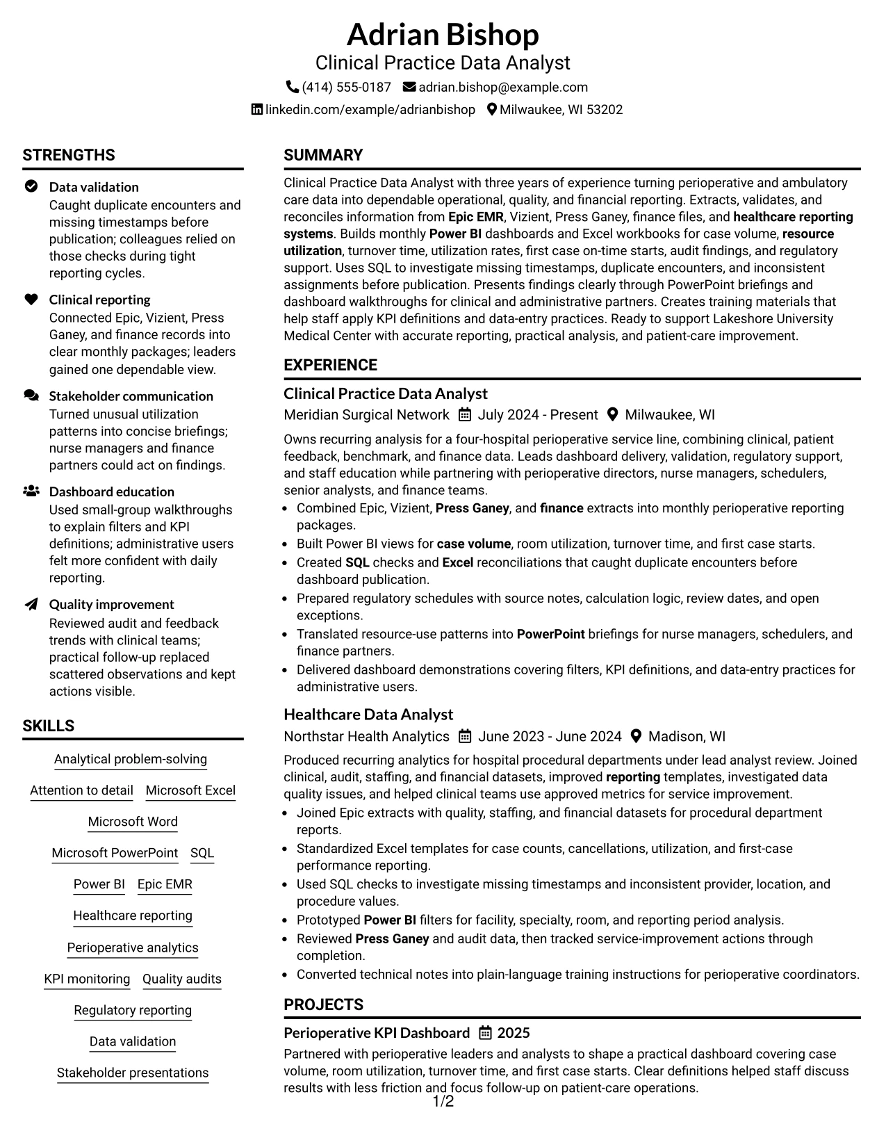
#1 Plain Two Column Format Resume Example
The Plain Two Column Format separates core experience from supporting details, so recruiters can scan the resume in a clear order. The main column gives space to the professional summary, work history, projects, and measurable reporting results. The secondary column groups education, certifications, skills, and tools without competing with the experience section.
For a Clinical Practice Data Analyst resume, this structure supports ATS-friendly keywords such as Epic EMR, Power BI, SQL, data validation, regulatory reporting, and perioperative analytics. Short bullet points show how reporting work improved accuracy, dashboard delivery, and operational review.
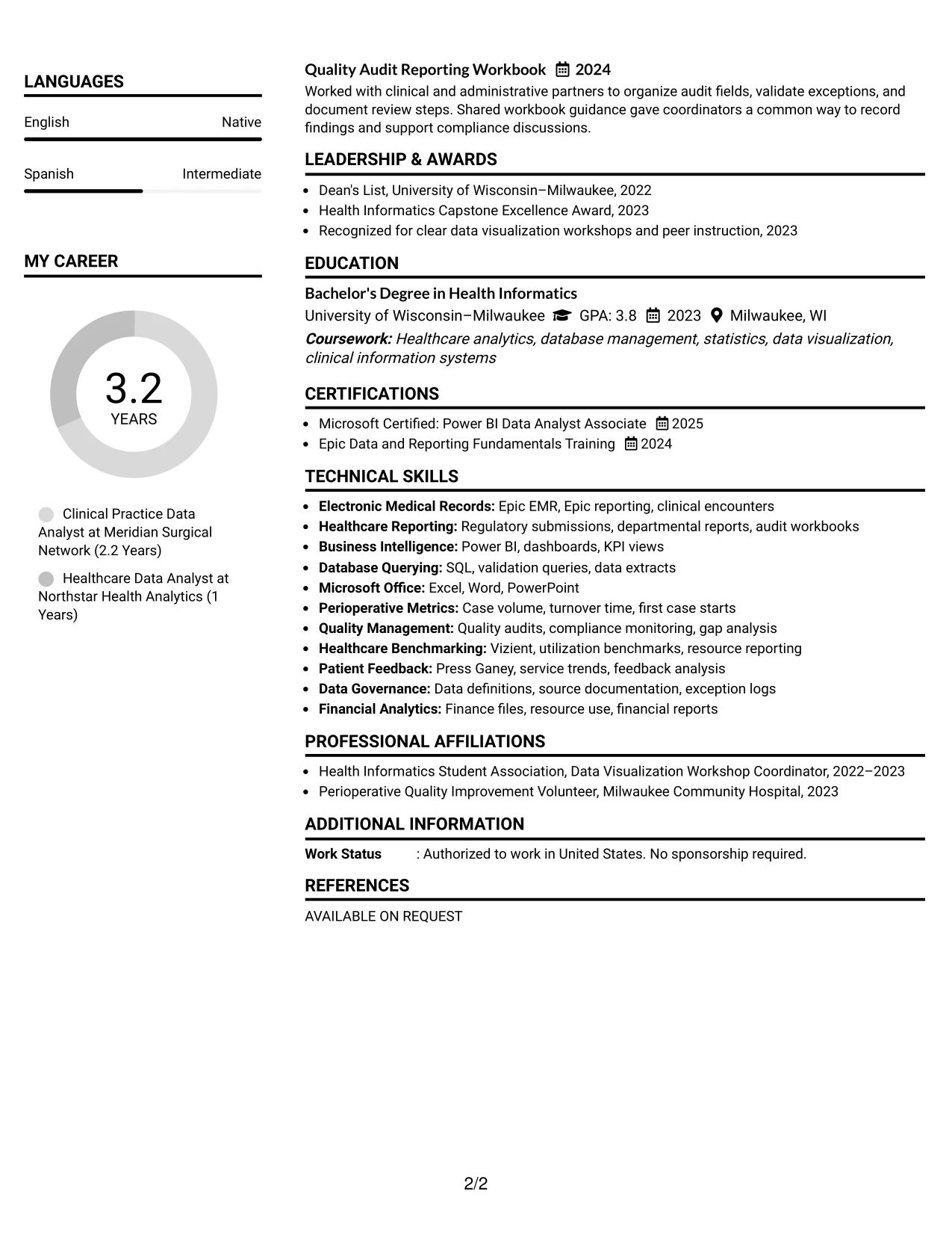
Resume Snapshot
- Clinical Practice Data Analyst with three years of experience in perioperative and healthcare reporting.
- Power BI dashboards cover case volume, room utilization, turnover time, and first case starts.
- SQL checks and Excel reconciliations identify duplicate encounters and missing timestamps.
- Bachelor's degree in Health Informatics plus Power BI certification and Epic reporting training.
Why the Plain Two Column Format Works for a Resume
- The two-column hierarchy lets reviewers find experience and skills quickly.
- A wide main column supports detailed achievement bullets without excessive wrapping.
- A compact sidebar keeps certifications, education, and tools easy to locate.
- ATS-relevant terms can appear in both the summary and dedicated skills area.
- Bullets connect data validation, dashboard development, and stakeholder reporting to practical results.
- The structure preserves room for projects and compliance work while keeping sections distinct.
Resume Keywords
- Clinical Practice Data Analyst
- perioperative service
- Bachelor's Degree
- Health Informatics
- statistics
- finance
- Business
- Analytical problem-solving
- Attention to detail
- Excel
- Word
- PowerPoint
- SQL
- Power BI
- Epic EMR
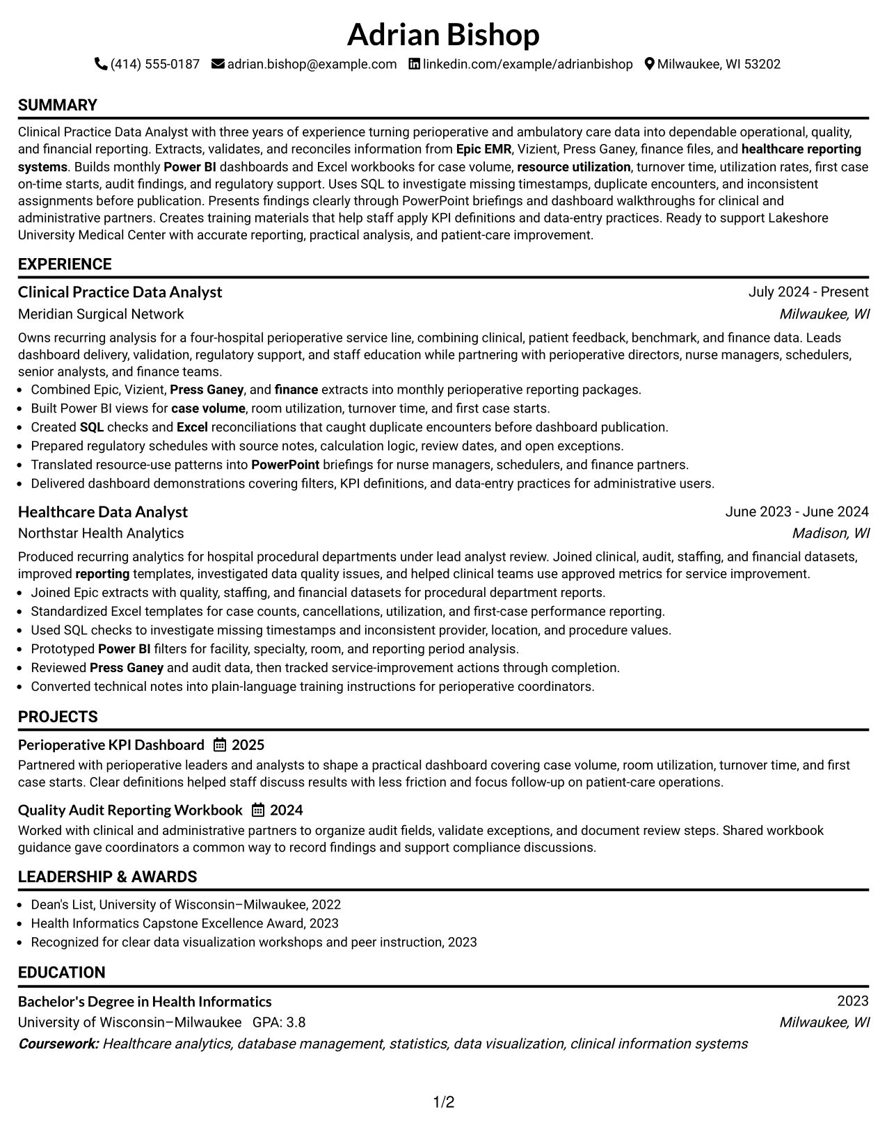
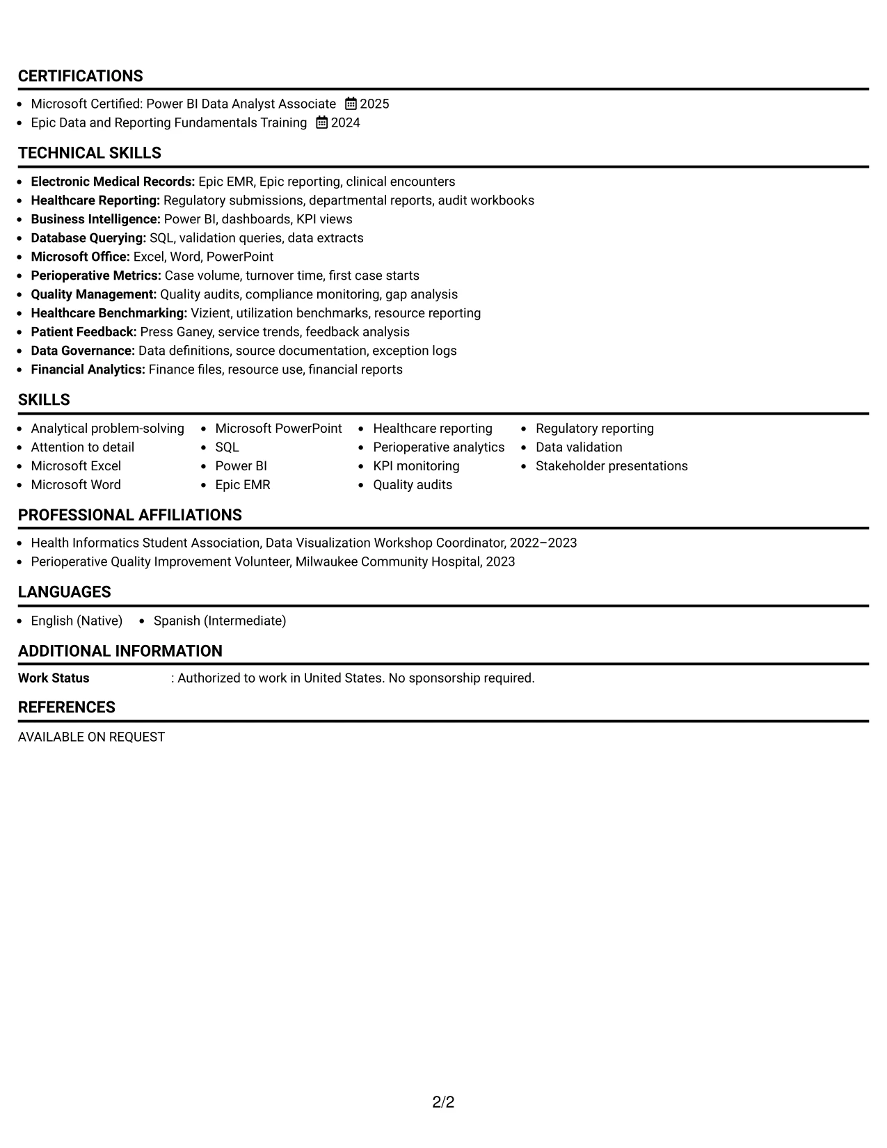
#2 Simple One Column Format Resume Example
A recruiter moves from the summary to experience, then to education, certifications, projects, and skills in one uninterrupted path. That reading order makes the Simple One Column Format useful when every section needs equal access and the resume contains several related data responsibilities.
The format gives each bullet full page width, which helps describe reporting cycles, validation checks, dashboard work, and training support with clear action-and-result wording. Standard headings and a single text flow also support reliable ATS parsing for the Clinical Practice Data Analyst role.
Why the Simple One Column Format Works for a Resume
- One reading path reduces visual switching during an initial resume review.
- Full-width bullets make detailed healthcare reporting work easier to understand.
- Standard section headings help ATS systems identify experience, education, and skills.
- The format accommodates two analyst roles, projects, awards, and certifications without a narrow sidebar.
- Dates and employers remain easy to compare across the work history.
- The uncluttered structure supports both digital review and clean PDF presentation.
Best For
- Resumes with several sections that deserve the same reading priority
- Detailed work histories that need full-width achievement bullets
- ATS submissions where simple headings and linear text support parsing
- Candidates combining experience, projects, education, certifications, and awards
- Applications that require clear chronological review of reporting responsibilities
- Documents with longer skill lists that should remain readable without a sidebar
- Resume versions intended for easy printing or conversion to PDF
#3 Clean Two Column Sidebar Format Resume Example
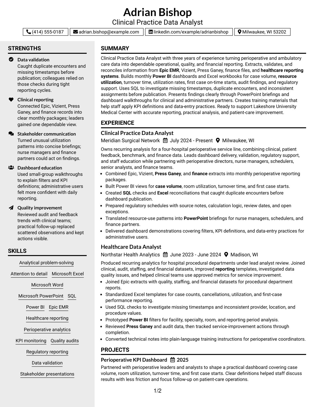
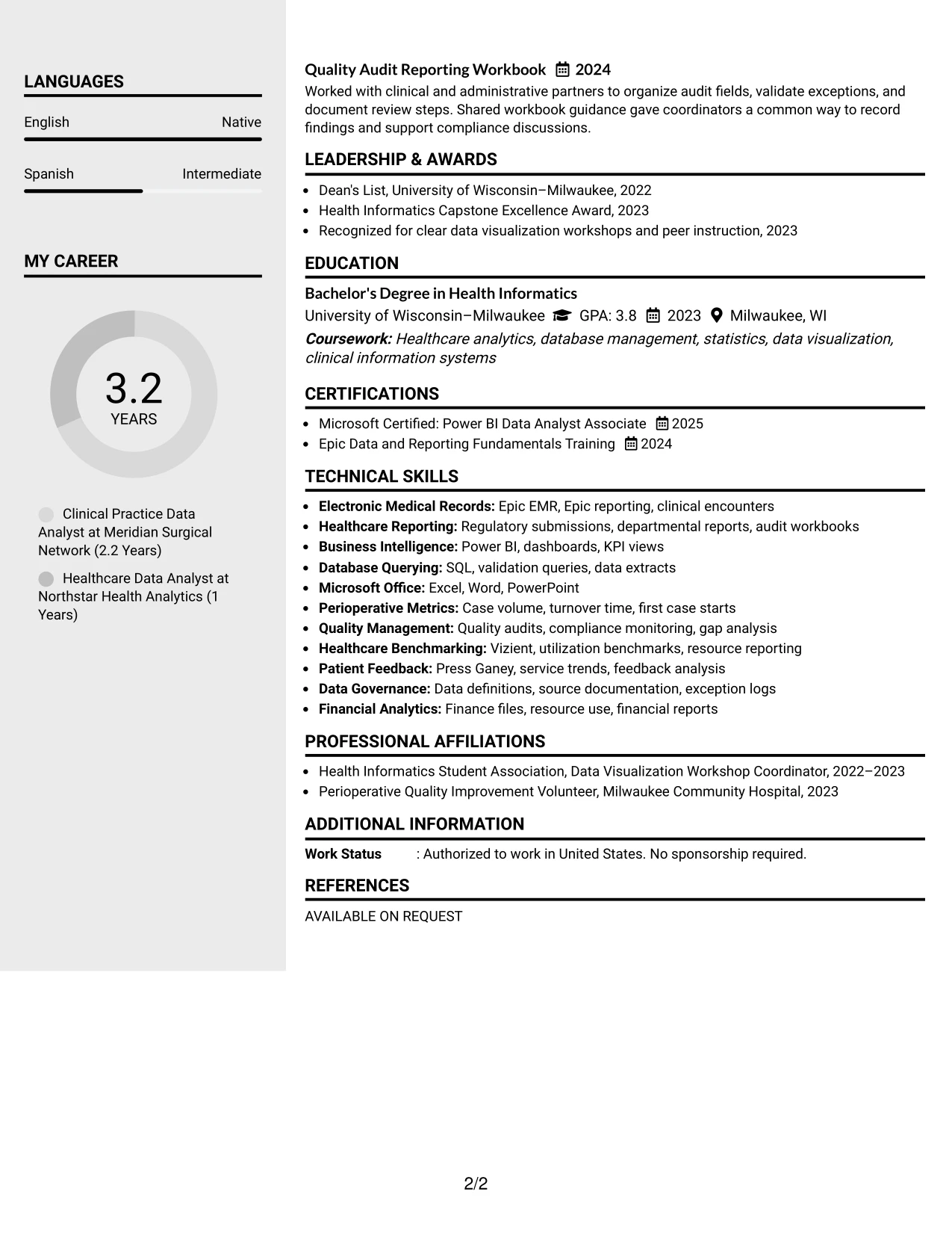
Duplicate encounters, missing timestamps, dashboard controls, and audit findings receive priority because they show how the candidate protects reporting quality. The Clean Two Column Sidebar Format gives those evidence-rich bullets a prominent main area while placing skills, certifications, and education in a compact sidebar.
For this Clinical Practice Data Analyst resume, the layout makes both technical evidence and operational context visible. Readers can connect SQL validation, Excel reconciliation, Power BI development, and regulatory schedules with the reporting needs of perioperative services.
Why the Clean Two Column Sidebar Format Works for a Resume
- The main column gives strong evidence room to explain data checks and reporting outcomes.
- A sidebar keeps technical tools and credentials available during experience review.
- Short bullets make anomalies, validation steps, and follow-up actions easy to scan.
- Distinct visual zones separate proof of work from supporting qualifications.
- The structure helps reviewers compare operational, quality, and financial reporting experience.
- Clear hierarchy prevents a long skills list from overwhelming the work history.
Best For
- Resumes where data-quality evidence should lead the review
- Candidates who need to show both technical checks and operational follow-through
- Applications that benefit from a dedicated space for tools and credentials
- Work histories with audit, compliance, or exception-management examples
- Readers who scan for proof before reviewing supporting qualifications
- Documents that combine dashboard outputs with validation and reconciliation work
- Professional resumes needing a strong distinction between evidence and profile details
#4 Two Column Format Resume Example
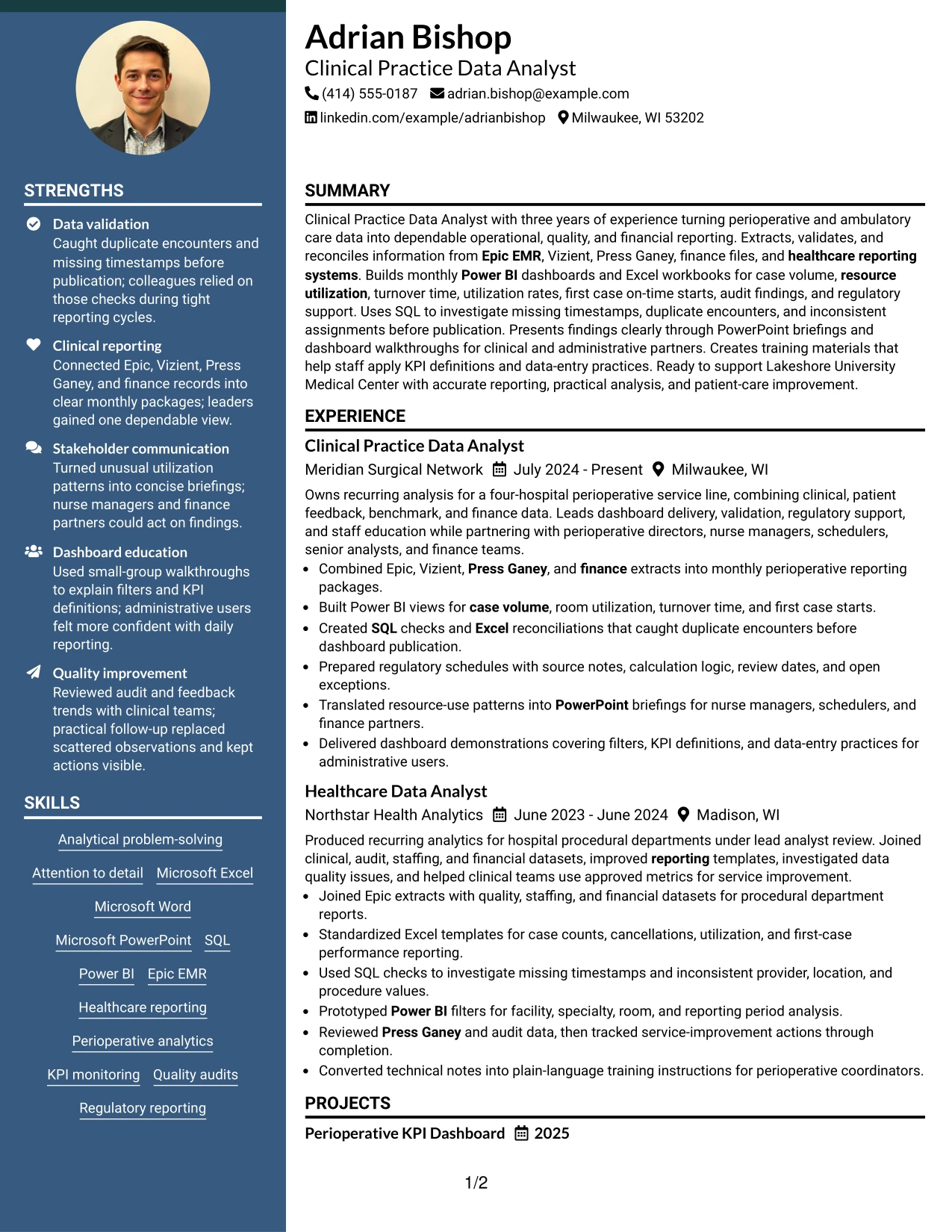
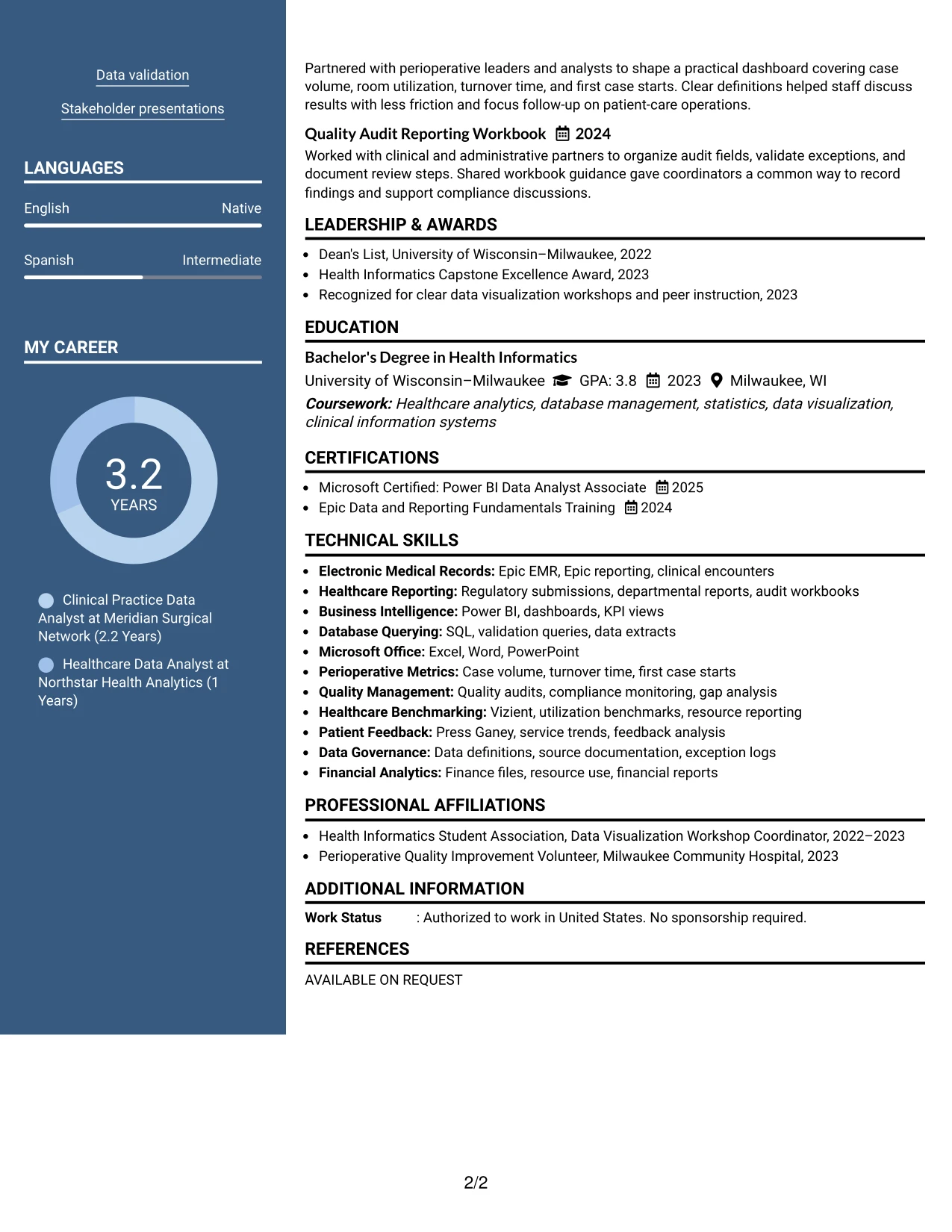
Operational, quality, and financial reporting details are balanced across two columns so the resume stays informative without becoming dense. The Two Column Format can give the main column to summary and experience while using the secondary area for skills, education, certifications, and selected projects.
That balance fits a resume aimed at Lakeshore University Medical Center because the content must show technical capability and practical collaboration. Bullets can highlight case volume, resource utilization, KPI monitoring, audit support, and training without burying the core qualifications.
Why the Two Column Format Works for a Resume
- Two columns create a practical balance between detailed experience and quick-reference facts.
- The main area supports bullets with clear actions, tools, and reporting outcomes.
- The secondary area keeps education, certifications, and skills visible near the top.
- The structure suits applications that ask for complete education and certification details.
- Projects can reinforce dashboard and quality-audit experience without interrupting the work history.
- Whitespace between sections makes a data-heavy resume easier to review.
- The format supports both technical keywords and plain-language descriptions for non-technical readers.
Best For
- Applications that need a balanced view of experience and credentials
- Resumes pairing detailed reporting bullets with a compact qualifications area
- Candidates presenting technical tools alongside operational or quality work
- Healthcare applications that request complete education and certification information
- Documents with selected projects that should remain visible but secondary
- Reviewers who need quick access to skills while reading chronological experience
- Resume versions that must show depth without using a crowded page-wide layout
#5 Photo Header Two Column Format Resume Example
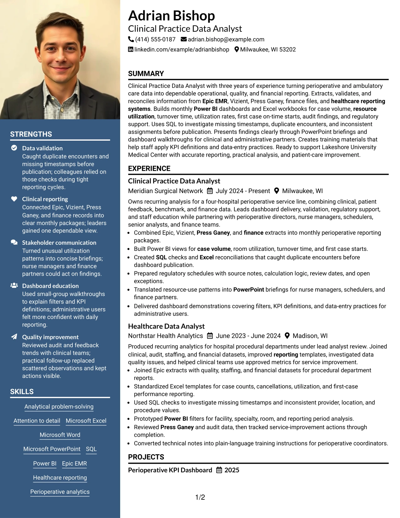
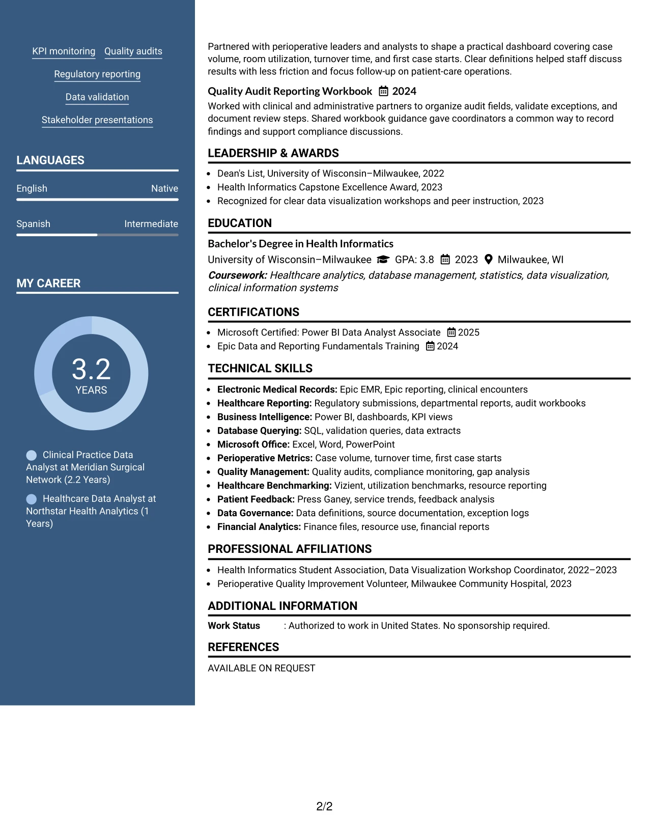
For an application that values a polished first impression, the header can establish identity and contact details before the reader reaches the two-column content. The Photo Header Two Column Format places the summary and experience in the main area while organizing skills, education, certifications, and projects alongside them.
A photo should be used only when it is appropriate for the application context and accepted by the employer. The resume content remains the decision-making core: Epic EMR, Vizient, Press Ganey, Power BI, SQL, regulatory support, and measurable data-quality contributions should stay prominent.
Why the Photo Header Two Column Format Works for a Resume
- The header creates a defined identity area before the technical content begins.
- Two columns let the resume combine detailed experience with concise qualification lists.
- The main section can display dashboard, validation, and reporting achievements clearly.
- A side section gives certifications and tools a consistent location for quick review.
- The format can suit settings where a polished personal presentation is accepted.
- Photo use should follow employer, industry, and application guidance rather than replace evidence.
- The visual header remains separate from ATS-critical text and resume keywords.
Best For
- Applications where a polished header is appropriate and explicitly accepted
- Candidates who want contact details and professional identity grouped at the top
- Resumes combining substantial experience bullets with a concise qualifications column
- Documents that need visible space for certifications, tools, and education
- Portfolio-linked applications where visual presentation supports, but does not replace, evidence
- Readers who prefer a defined header before reviewing a two-column work history
- Situations requiring careful separation of presentation elements from ATS-critical content
#6 Colored Two Column Format Resume Example
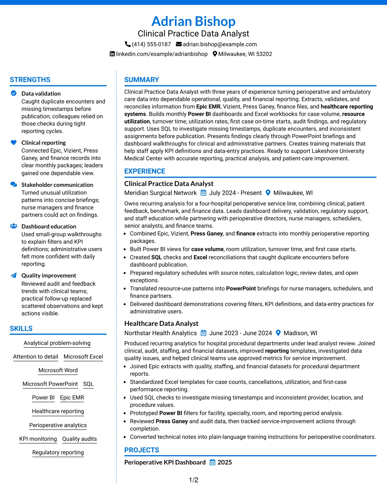
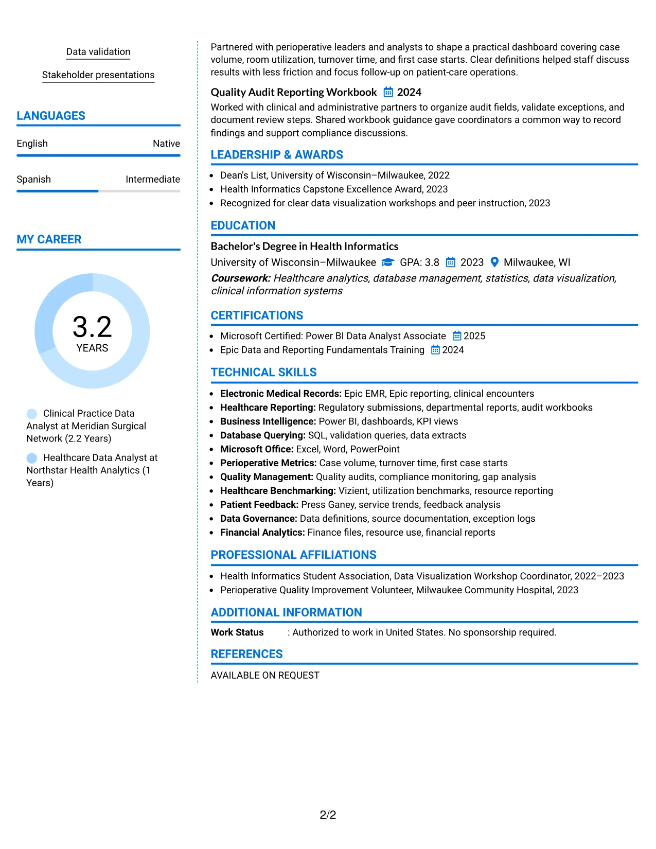
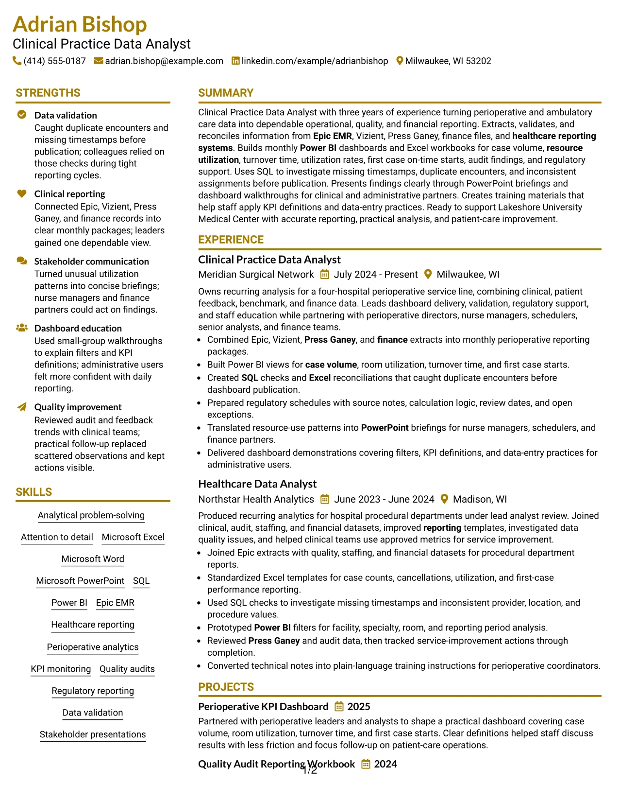
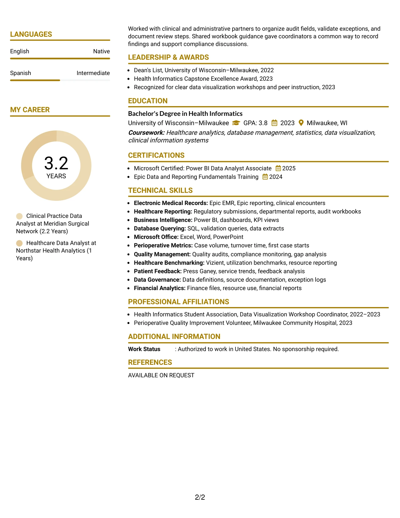
A restrained visual hierarchy separates the professional summary, experience, and projects from the supporting skills and credentials. The Colored Two Column Format uses color to guide attention while keeping the content aligned with a Clinical Practice Data Analyst resume.
The design works best when color supports role alignment rather than decoration. Clear section labels can direct reviewers to Power BI dashboards, SQL validation, healthcare reporting, quality audits, and stakeholder presentations, while the main bullets explain the evidence behind each capability.
Why the Colored Two Column Format Works for a Resume
- Color-coded sections help reviewers locate role-relevant information without changing the reading order.
- The main column can connect tools to specific reporting and validation work.
- A supporting column keeps skills, certifications, and education easy to scan.
- Visual emphasis can draw attention to KPI monitoring and quality-improvement evidence.
- The format supports a professional appearance while retaining recognizable resume sections.
- Moderate styling keeps keywords and dates more important than decoration.
- The layout helps separate technical capabilities from communication and training experience.
Best For
- Candidates whose resume needs clear visual alignment with a defined target role
- Applications where restrained color can improve section navigation
- Professionals showing technical tools alongside stakeholder and training responsibilities
- Documents that benefit from separating evidence bullets from supporting credentials
- Readers who want quick visual cues without a highly decorative design
- Resumes combining healthcare reporting, quality work, and dashboard development
- Candidates needing a polished format that still preserves conventional resume structure
#7 Stylish Two Column Designer Format Resume Example
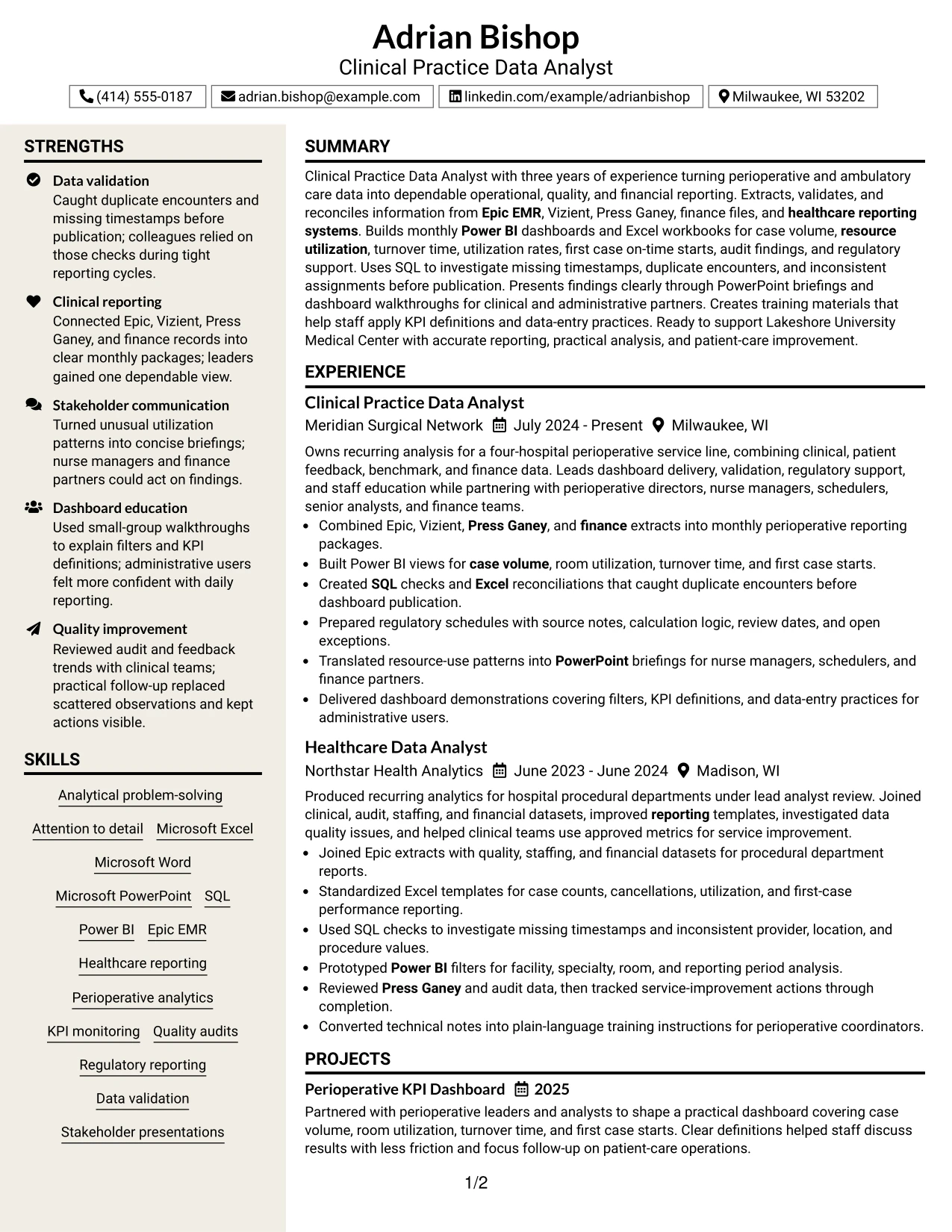
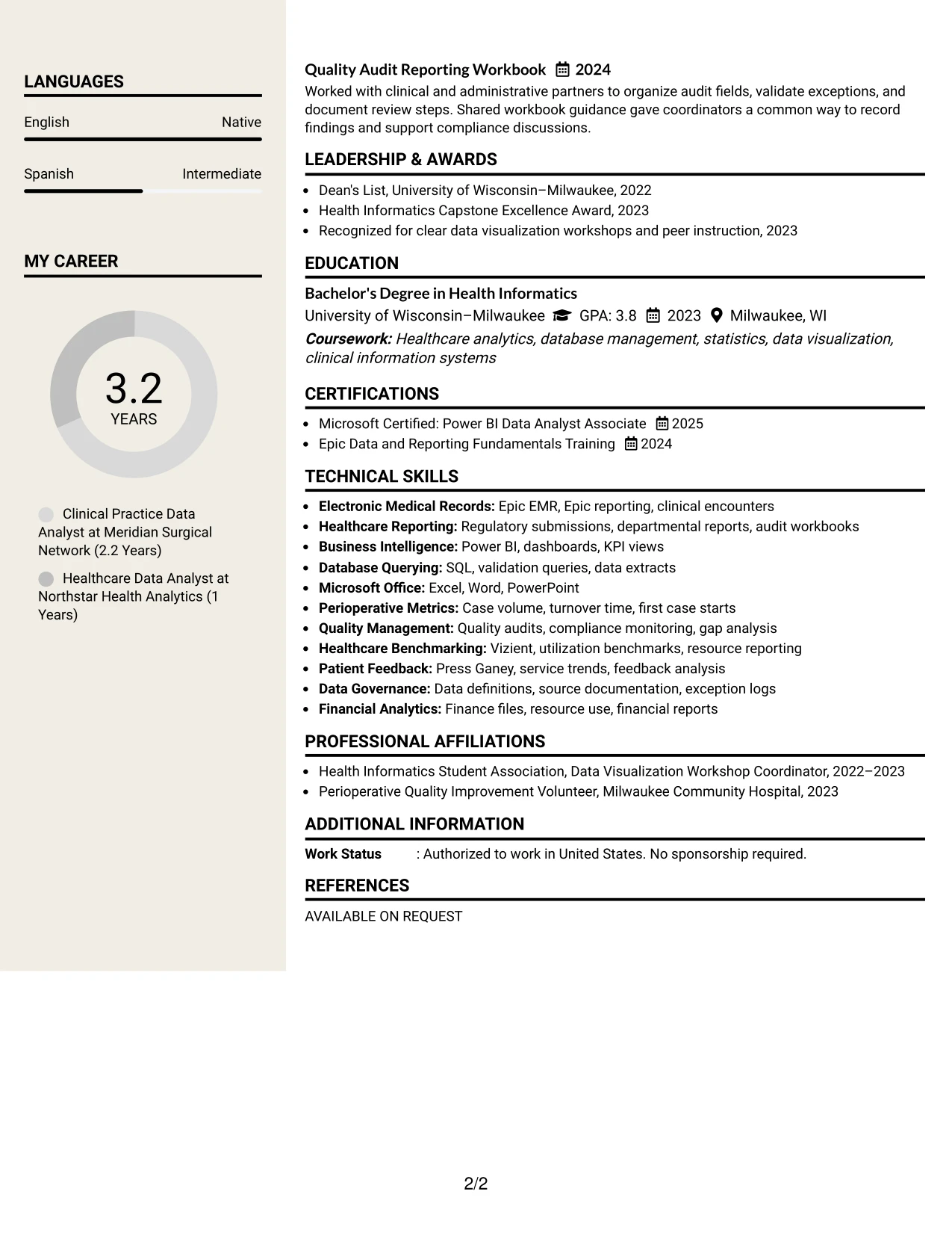
The Stylish Two Column Designer Format organizes the resume into a strong content column and a focused sidebar, with visual markers helping readers move between sections. Experience bullets can carry the detailed proof, while skills, education, certifications, awards, and activities remain easy to find.
For this resume, the design should support scan-and-structure goals rather than compete with evidence. The strongest bullets describe dependable monthly reporting, dashboard delivery, data reconciliation, regulatory support, and plain-language education for administrative users.
Why the Stylish Two Column Designer Format Works for a Resume
- A defined content column gives work achievements enough room for useful detail.
- Sidebar markers help readers move quickly between supporting sections.
- The structure keeps awards, activities, and certifications from interrupting chronology.
- Visual grouping makes a varied background easier to scan without hiding keywords.
- Bullets can follow a consistent action, tool, and result pattern.
- The format gives projects a clear place when they support the professional story.
- Moderate design adds distinction while preserving familiar resume navigation.
Best For
- Resumes that need a memorable structure without losing standard section order
- Candidates with awards, activities, certifications, and projects to organize
- Applications where a sidebar can reduce scanning time across supporting details
- Work histories using consistent achievement bullets and clearly labeled tools
- Documents that need visual distinction while keeping evidence easy to verify
- Professionals presenting both recurring reporting work and special projects
- Readers who prefer section markers and grouped information during an initial scan
#8 Modern Icon Format Resume Example
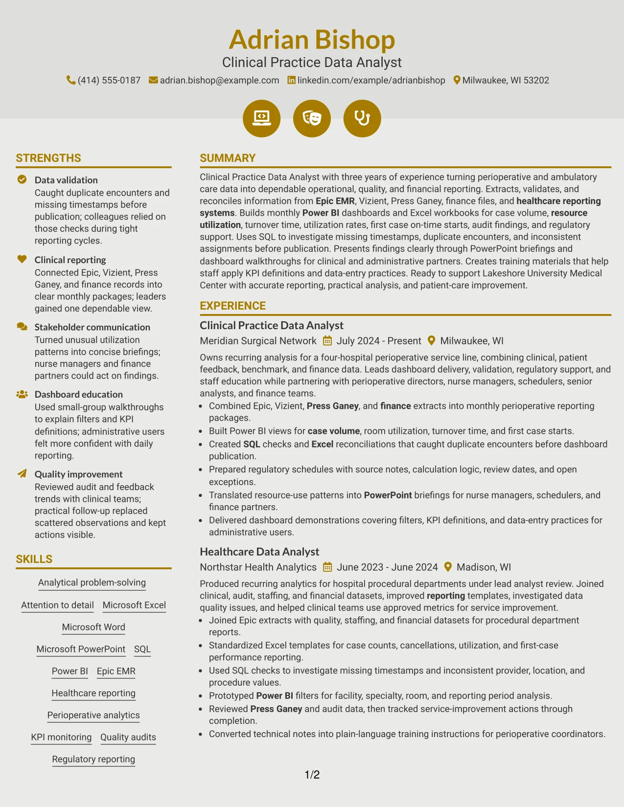
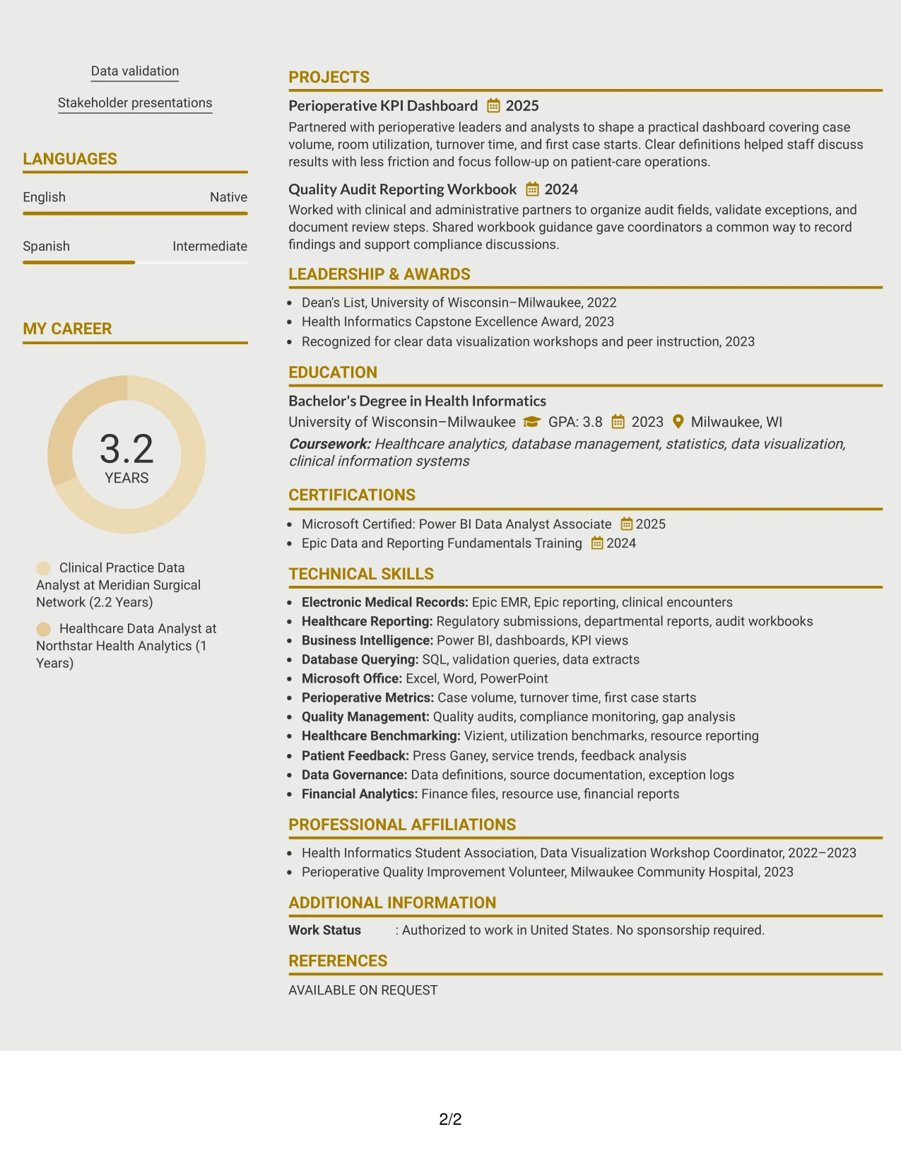
Readers move through a single column guided by clear section markers, making the Modern Icon Format easy to follow from summary to experience and credentials. The icon treatment can distinguish work history, projects, education, certifications, and skills without requiring a second content stream.
This format gives substantial space to the resume's reporting record. Full-width bullets can explain Epic and finance extracts, Power BI dashboards, SQL checks, audit workbooks, and training materials, while familiar headings preserve ATS and recruiter readability.
Why the Modern Icon Format Works for a Resume
- A single column keeps every section in a predictable review sequence.
- Icons can provide visual landmarks without replacing written section headings.
- Full-width content supports detailed bullets and project descriptions.
- The design accommodates tools, certifications, education, and awards in one flow.
- Clear text remains available for ATS parsing and keyword matching.
- The format works well when the experience section carries most of the evidence.
- Consistent spacing prevents visual markers from distracting from reporting outcomes.
Best For
- Resumes with a substantial experience section that should remain the main focus
- Candidates who want visual section landmarks in a one-column document
- Applications requiring projects, certifications, education, and awards in one sequence
- Documents where full-width bullets need room for tools and reporting context
- ATS-conscious users who want modest visual guidance with standard text headings
- Readers who prefer predictable movement from summary through qualifications
- Professional resumes that need to present many related details without a sidebar
#9 Modern Full Background Two Column Format Resume Example
Case volume, utilization, turnover time, and first case on-time starts receive priority because they show direct use of perioperative data. The Modern Full Background Two Column Format can place these evidence-based achievements in the dominant content area while grouping credentials and tools in a secondary column.
The background treatment should remain restrained enough for accurate review. Clear contrast and consistent headings help readers connect Power BI dashboard work, SQL validation, quality audits, regulatory schedules, and financial reporting to the target role.
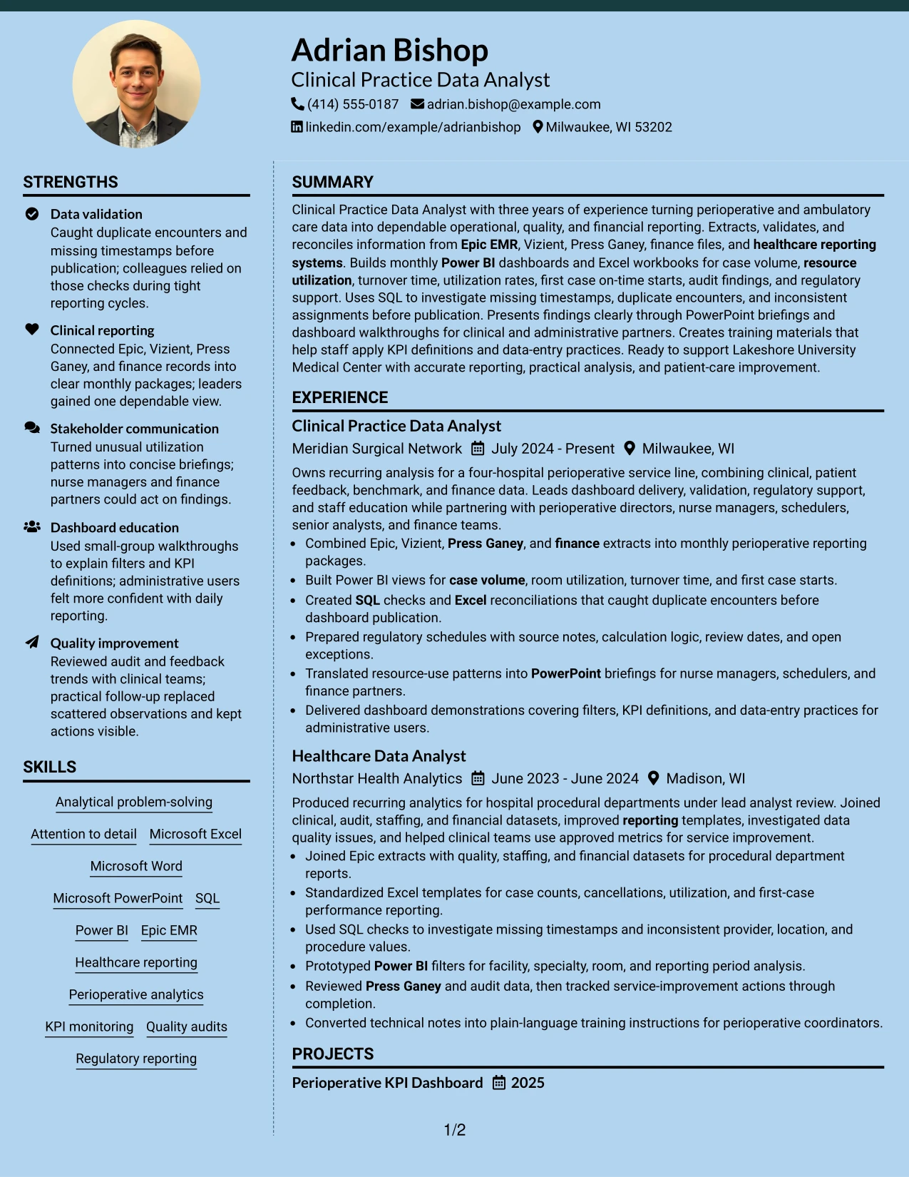
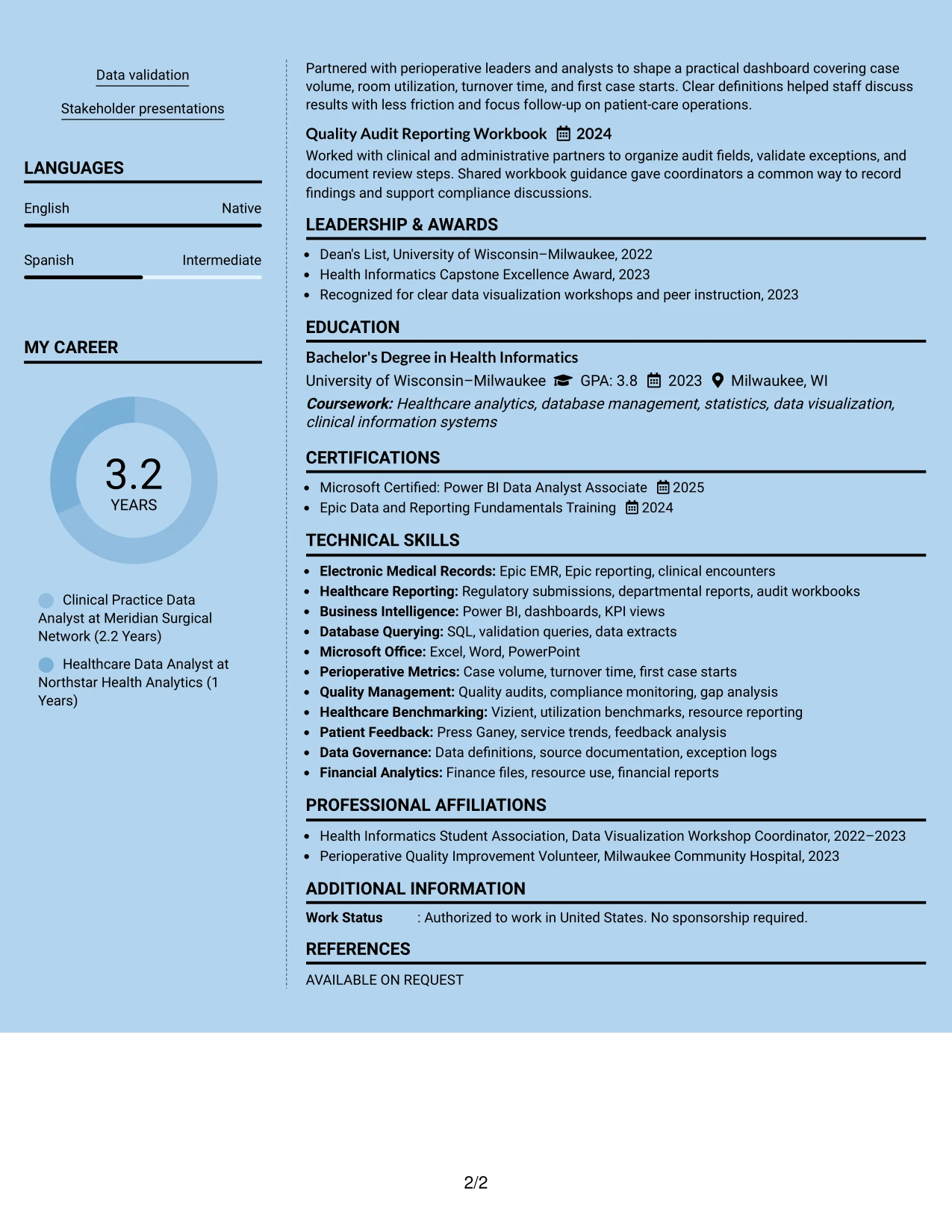
Why the Modern Full Background Two Column Format Works for a Resume
- A strong content area gives operational metrics and results clear priority.
- The secondary column keeps tools and credentials available without diluting evidence.
- Two columns support both detailed bullets and fast qualification checks.
- Consistent contrast helps readers follow headings, dates, and employer names.
- The layout can show technical, quality, and financial evidence together.
- Short bullets make dashboard and validation outcomes easier to compare.
- The design remains useful when visual treatment is controlled for readability and parsing.
Best For
- Resumes where operational metrics should lead the initial review
- Candidates presenting evidence across utilization, quality, and financial reporting
- Applications that need detailed achievements beside a compact tools section
- Documents where strong section contrast can improve navigation
- Readers comparing several types of measurable reporting work
- Professionals who want a modern appearance without removing conventional resume hierarchy
- Submissions requiring visible credentials while keeping results in the primary column
#10 Dark Mode Two Column Format Resume Example
Balanced spacing keeps the resume readable while allowing the work history and supporting qualifications to share the page. The Dark Mode Two Column Format can give Adrian Bishop's summary and experience the larger column, with education, certifications, skills, and projects arranged in a focused secondary area.
Dark styling should never reduce text contrast or hide ATS-relevant information. In this resume, clear bullets can show monthly reporting, Power BI development, SQL checks, regulatory support, and stakeholder briefings in a format suited to a polished digital application.
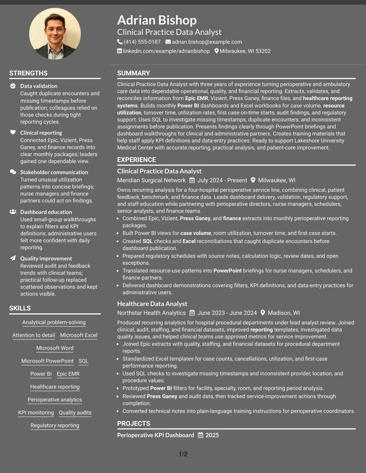
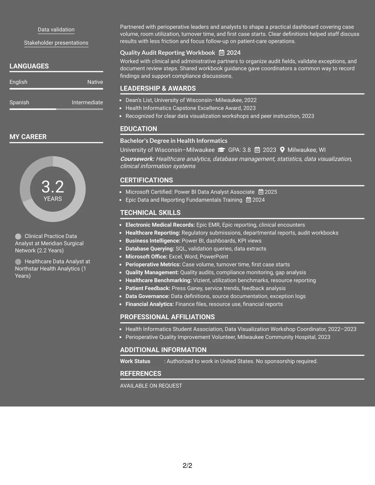
Why the Dark Mode Two Column Format Works for a Resume
- Balanced columns prevent supporting qualifications from disappearing below a long work history.
- The main column provides space for detailed reporting and data-quality bullets.
- A focused secondary area makes certifications, skills, and education easy to locate.
- Strong contrast is essential for reading dates, headings, and ATS-relevant text.
- The format fits digital review when the final file remains accessible and easy to print.
- Projects can be included without disrupting the chronological experience section.
- The structure presents technical work and stakeholder communication as connected strengths.
Best For
- Digital applications where a polished, high-contrast presentation is appropriate
- Candidates balancing detailed experience with a compact qualifications area
- Resumes that need visible space for certifications, education, projects, and skills
- Applications where reporting evidence should remain stronger than visual styling
- Reviewers comparing technical analysis with stakeholder briefing experience
- Documents that will be checked for readability across screens and printed pages
- Professionals wanting a distinctive layout while preserving standard resume hierarchy
#11 Dark Mode Box Header Format Resume Example
A practical application view starts with a clear boxed header, then moves through the resume in a single column. The Dark Mode Box Header Format gives the summary, experience, projects, education, certifications, and skills one consistent reading path while using the header to separate contact details from professional evidence.
For a Clinical Practice Data Analyst application, the format can present keywords and achievements without crowding the page. The content should emphasize Epic EMR, Vizient, Press Ganey, Power BI, SQL, data validation, regulatory reporting, and training support in concise sections.
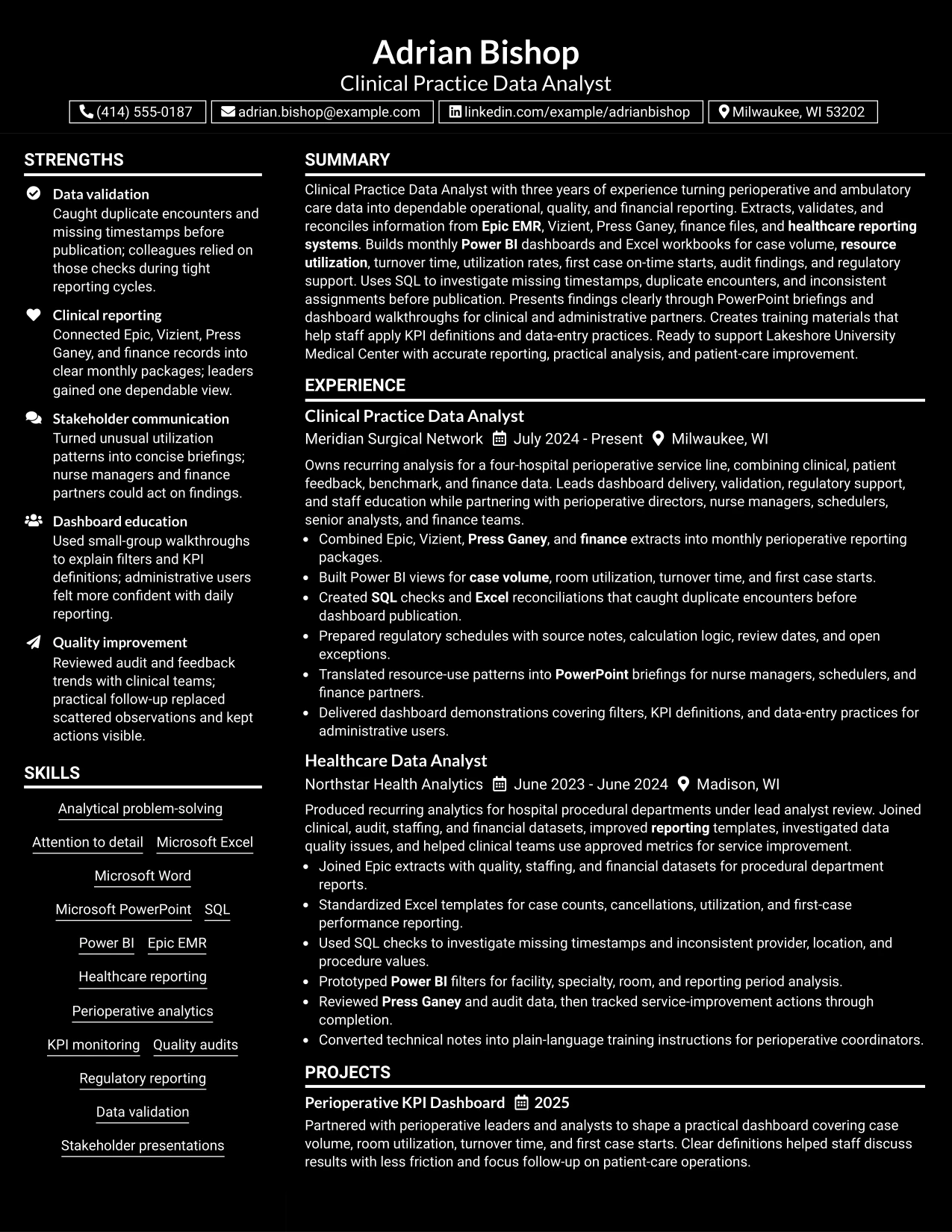
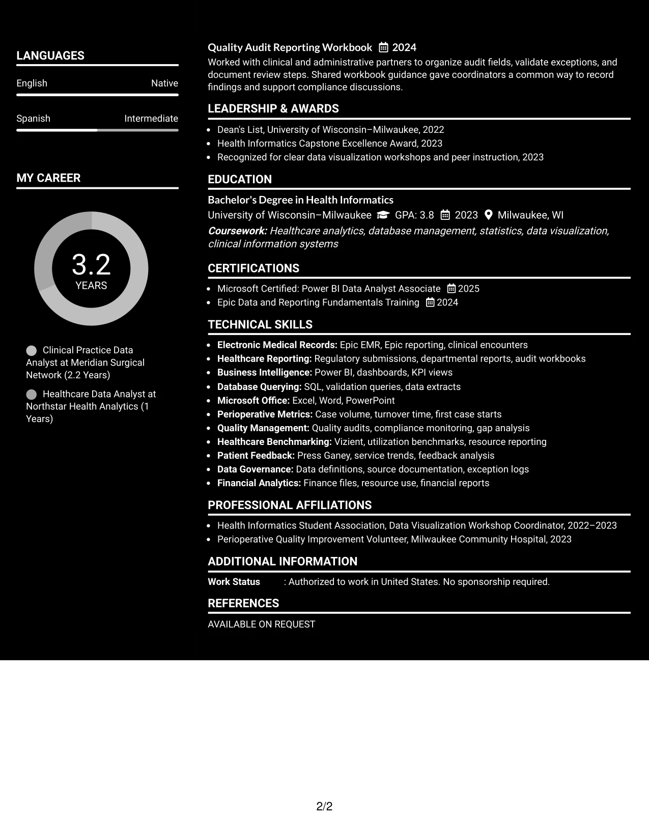
Why the Dark Mode Box Header Format Works for a Resume
- The boxed header makes contact details and the target role easy to identify first.
- A single-column sequence supports complete review of experience and credentials.
- Full-width bullets provide room for healthcare reporting and validation details.
- Consistent headings help ATS tools and human reviewers locate key sections.
- The format keeps projects and certifications visible without a separate sidebar.
- Dark styling can create a polished digital presentation when contrast remains strong.
- The structure is practical for applications that require a complete, clearly ordered resume.
Best For
- Applications needing a clear header followed by a complete linear resume
- Candidates who want contact details and role identification grouped in one block
- Documents with detailed healthcare reporting bullets that need full-width space
- ATS-conscious submissions using conventional headings and predictable section order
- Digital resumes where a polished header adds structure without hiding evidence
- Applications requiring visible projects, education, certifications, and skills
- Professionals who prefer one-column readability with a distinctive top section
#12 Elegant Full Background Two Column Format Resume Example
A restrained visual hierarchy gives this resume a polished first impression while keeping the content easy to review. The two-column structure separates supporting details such as skills, certifications, and education from the main summary and experience record.
The format supports a strong role match by placing Clinical Practice Data Analyst near the top and giving technical evidence room to stand out. Epic EMR, Power BI, SQL, regulatory reporting, and perioperative analytics appear as searchable terms, while concise bullets show data validation, dashboard development, and stakeholder presentations.
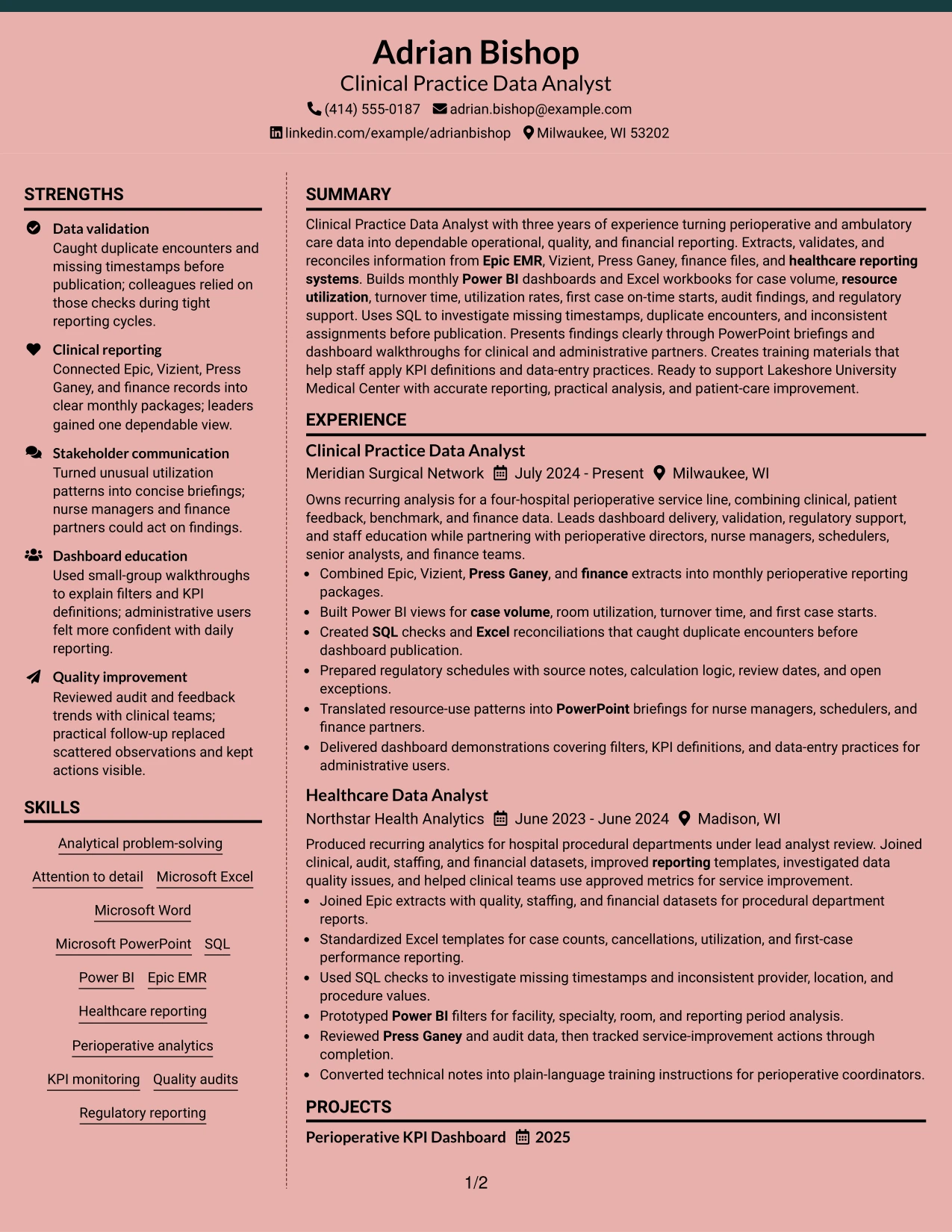
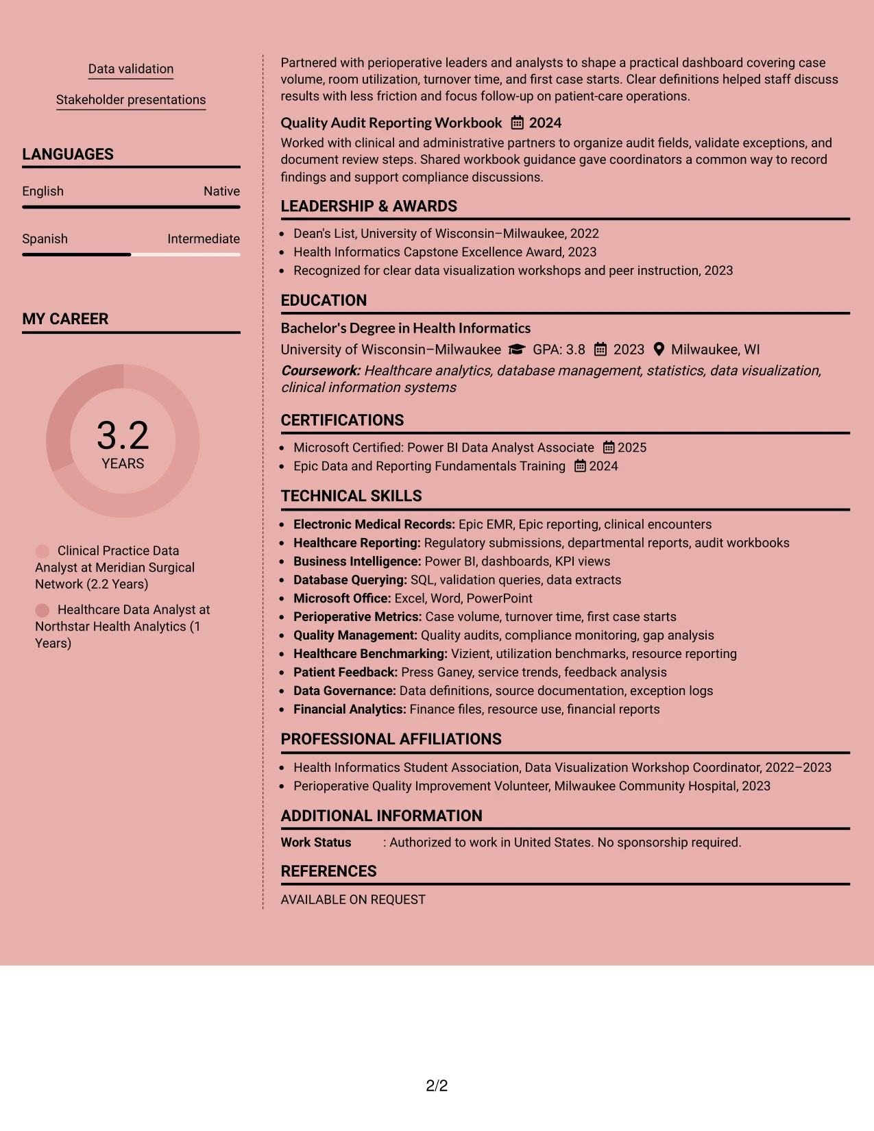
Why the Elegant Full Background Two Column Format Works for a Resume
- A clear top section establishes the target role before the reader reaches detailed experience.
- Two columns organize skills, certifications, and education without crowding the work history.
- The main column gives measurable or evidence-based bullets enough space for quick review.
- Technical keywords such as Epic EMR, Power BI, SQL, and healthcare reporting remain easy to locate.
- Short experience bullets show data validation, dashboard development, and regulatory reporting as practical contributions.
- The format supports a clean separation between core qualifications and supporting credentials.
- Consistent headings help both human reviewers and ATS tools identify major resume sections.
Best For
- Resumes that need a polished visual structure without losing professional restraint.
- Candidates who want skills and certifications visible beside detailed experience.
- Applications where role alignment depends on both technical terms and operational evidence.
- Professionals presenting several reporting tools, data sources, and performance measures.
- Documents that benefit from a strong summary followed by focused achievement bullets.
- Readers who prefer a balanced page with supporting information separated from career history.
- Resume reviews where quick access to education and credentials matters.
- Candidates who need a refined format while keeping sections easy to scan.
#13 Creative Two Tone Format Resume Example
The Creative Two Tone Format uses one continuous column with clear visual shifts between major resume sections. That structure keeps the reading path direct while using restrained color contrast to distinguish the summary, experience, projects, education, and skills.
For this Clinical Practice Data Analyst resume, the single-column flow helps connect healthcare reporting experience to the target role. Bullets carry the evidence: monthly dashboards, SQL validation checks, Excel reconciliations, audit workbooks, and training materials. The design adds personality without hiding important ATS terms.
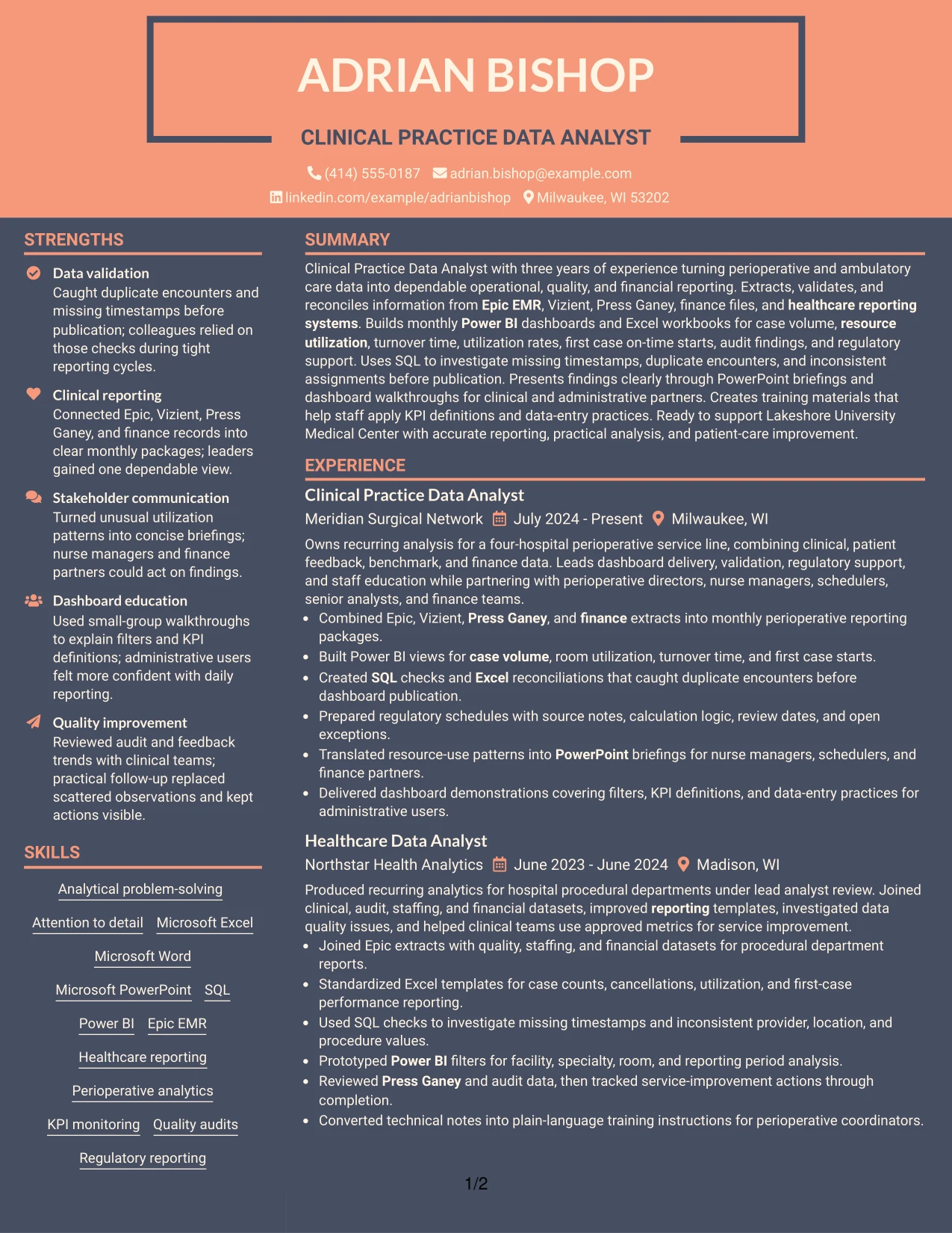
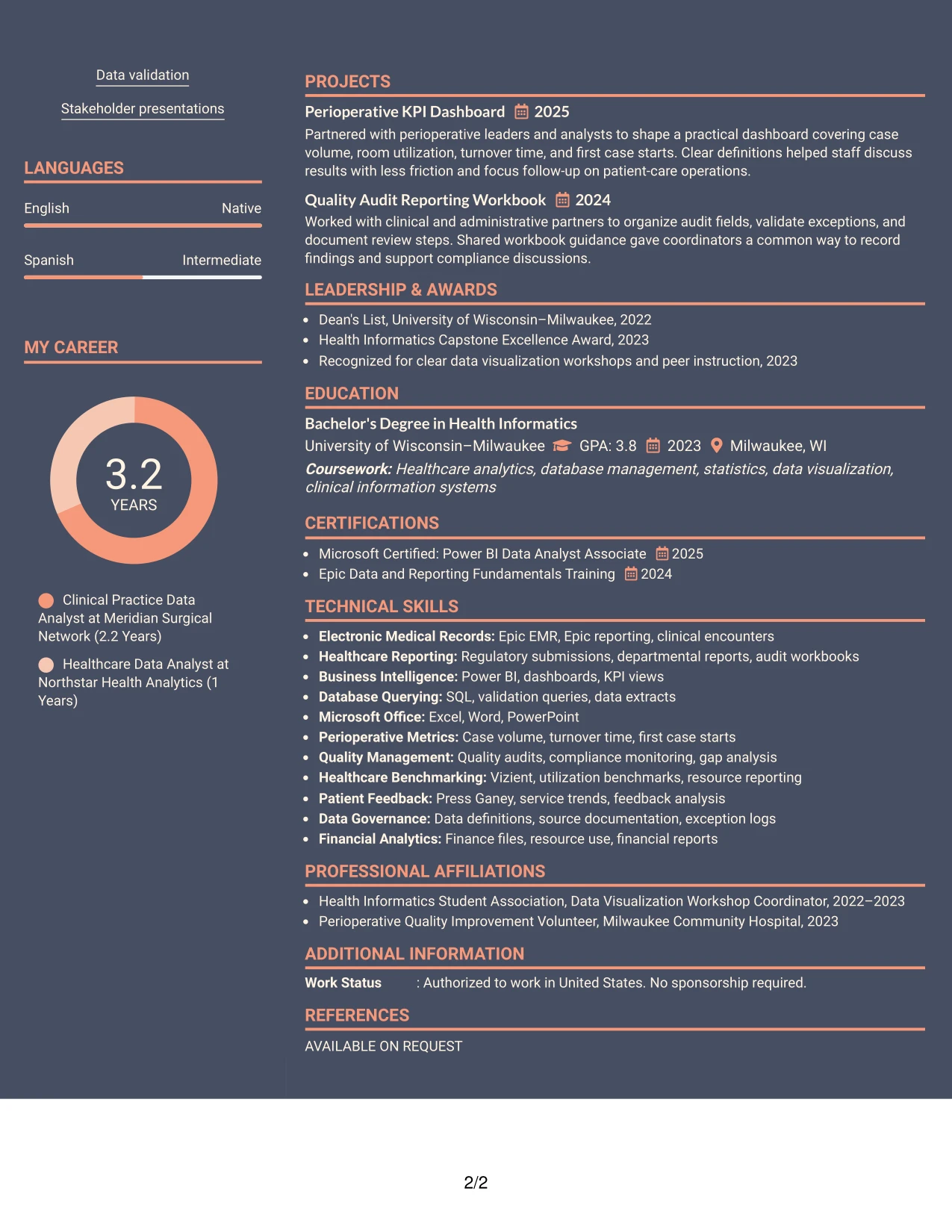
Why the Creative Two Tone Format Works for a Resume
- A single reading path lets reviewers move from summary to experience without searching across columns.
- Two visual tones separate sections while preserving a consistent information hierarchy.
- Bullets make technical work easier to compare across two analyst positions.
- Project entries add evidence of dashboard and quality audit work without interrupting the employment record.
- Skills and certifications remain visible as distinct sections for keyword review.
- The format supports ATS-friendly wording because color does not replace text labels.
- Clear section boundaries help readers locate education, tools, and professional credentials quickly.
Best For
- One-page resumes that need visual distinction without a complex page structure.
- Candidates who want creative styling with a familiar chronological reading order.
- Applications that require experience, projects, and credentials to remain in one scan path.
- Resumes with several short sections that benefit from clear visual separation.
- Readers who compare roles, projects, and skills from top to bottom.
- Candidates using strong keywords that should remain visible in plain text.
- Documents that need a modern appearance while preserving straightforward navigation.
#14 Minimal Header Format Resume Example
Recruiters begin with the centered header, then move through the summary, experience, skills, education, and certifications in a simple downward path. The restrained opening leaves more room for the evidence that follows.
This format suits a resume with substantial technical content because it keeps the page focused on reporting work and results. The experience section can show Power BI dashboards, Epic data extracts, SQL checks, and regulatory schedules, while the skills section reinforces the exact tools named in the target role.
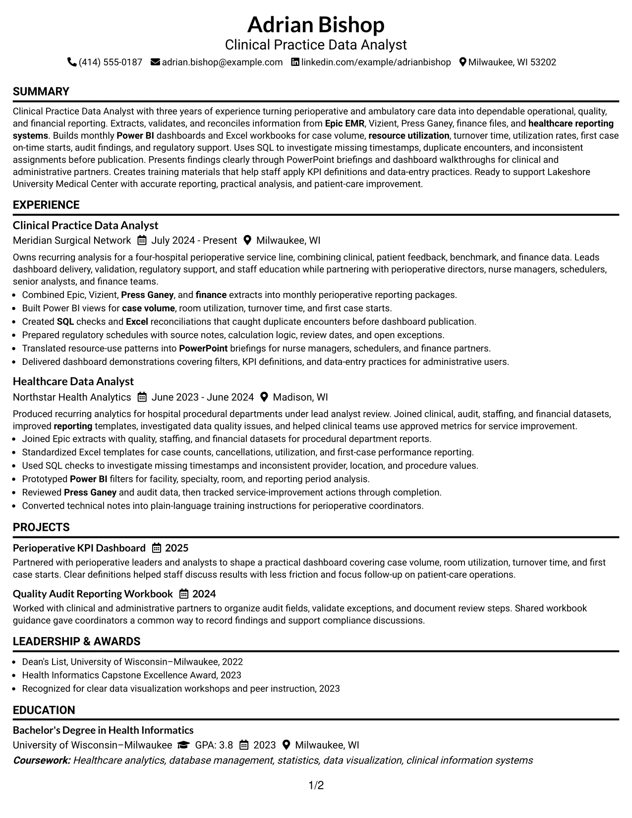
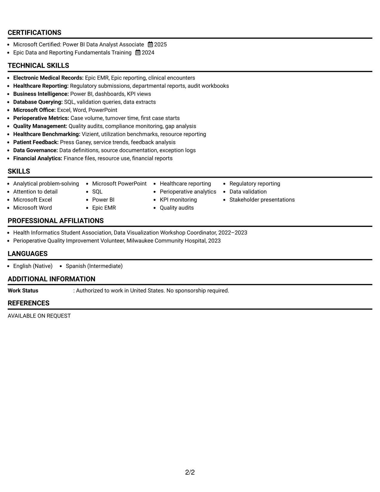
Why the Minimal Header Format Works for a Resume
- A compact header protects page space for experience and achievement bullets.
- The one-column sequence makes employment dates and role progression easy to follow.
- A focused summary gives context before the reader reaches detailed evidence.
- Technical skills can be grouped without competing with the work history.
- Project and certification sections add relevant proof while maintaining a clean page.
- Simple spacing supports fast review on screen and in printed form.
- Plain section labels help ATS systems recognize experience, education, and skills.
Best For
- Resumes with a large amount of relevant work history and limited space.
- Candidates who want the header to support rather than dominate the page.
- Applications where dates, titles, and bullet evidence must be reviewed quickly.
- Documents combining employment history with projects, certifications, and education.
- Readers who prefer a quiet layout with minimal visual interruption.
- Candidates who need room for several technical skills and reporting tools.
- Resume submissions that benefit from predictable one-column ATS parsing.
#15 Plain One Column with Shaded Labels Resume Example
Data validation and reporting evidence receive priority in this resume. Shaded labels mark each section, allowing reviewers to identify the summary, experience, projects, skills, and credentials before reading the supporting bullets.
The one-column design gives each achievement a clear place in the sequence. It can show how duplicate encounters, missing timestamps, audit findings, and inconsistent assignments were investigated, documented, and escalated. This makes the evidence relevant to a Clinical Practice Data Analyst role without relying on decorative elements.
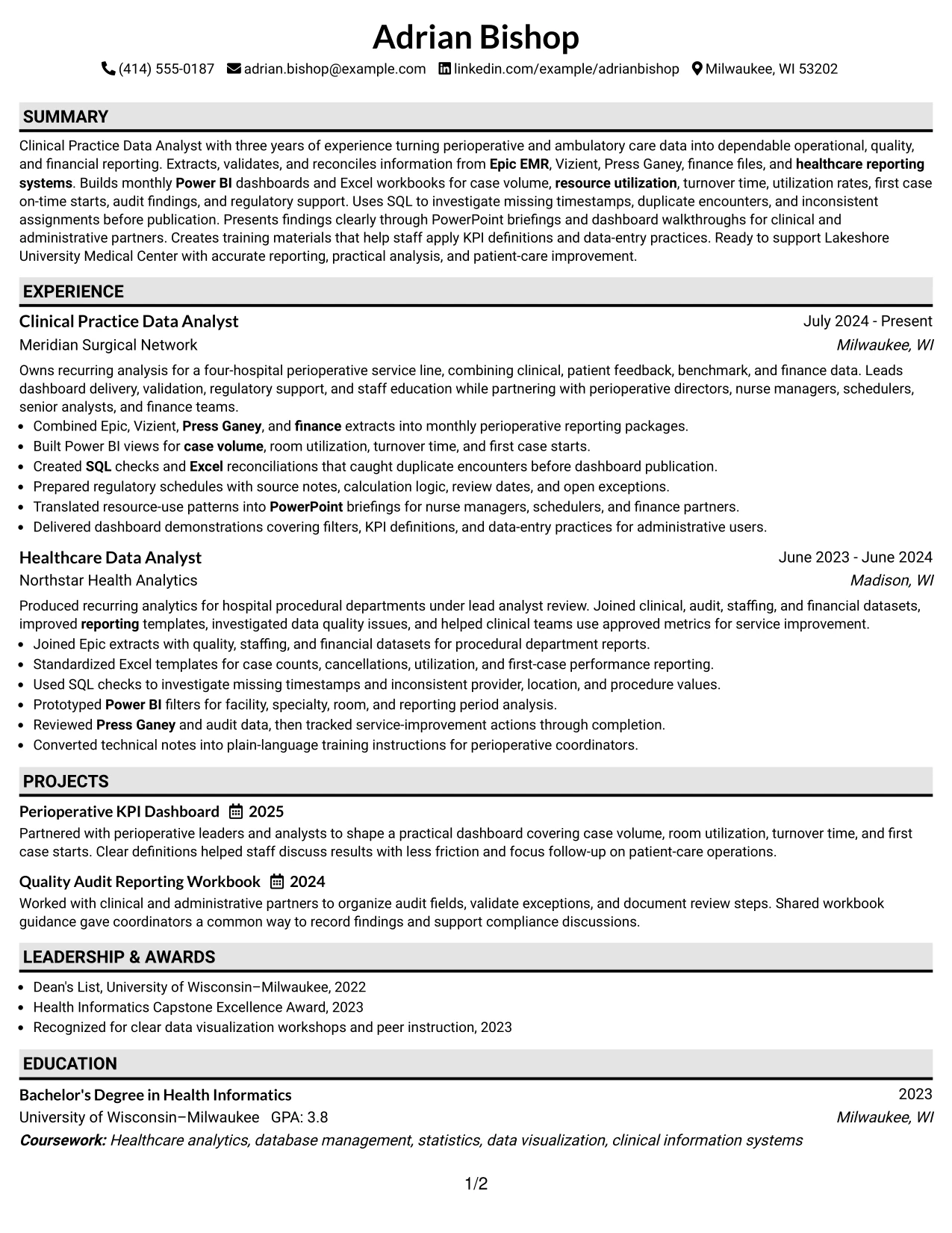
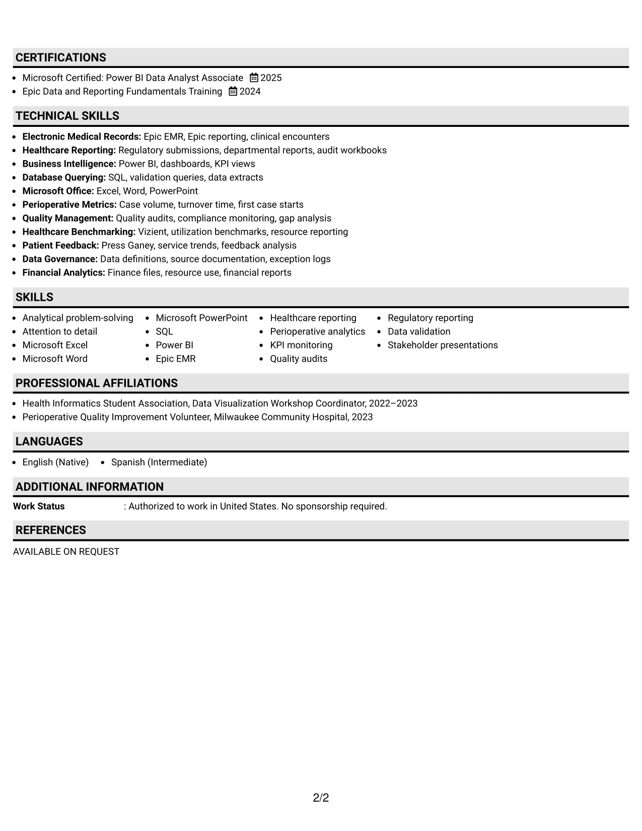
Why the Plain One Column with Shaded Labels Format Works for a Resume
- Shaded labels make section boundaries clear during a fast review.
- The layout gives data-quality evidence a direct place beside the related role and date.
- Bullets can explain validation checks, reporting duties, and follow-up actions in plain language.
- A dedicated skills section supports keyword matching for Power BI, SQL, Excel, and Epic EMR.
- Projects provide additional evidence without being confused with formal employment.
- Education and certifications remain easy to confirm near the end of the document.
- The simple structure keeps text available to ATS parsing and human review.
Best For
- Resumes where data-quality checks and audit evidence are central to the application.
- Candidates who need each section label to stand out during a quick review.
- Applications that rely on detailed bullets rather than visual portfolios.
- Documents showing how findings were validated, documented, and escalated.
- Professionals combining operational reporting with quality or compliance work.
- Candidates who want a direct structure for tools, projects, and credentials.
- Resume reviewers who need to trace evidence from a role to its supporting skills.
#16 Text/Fang Style Resume Example
Content is balanced through generous text space, orderly headings, and a steady one-column rhythm. The page gives experience bullets enough room to explain the source, analysis, and use of healthcare data without forcing several details into a narrow area.
That balance is useful for applications that require practical context. The resume can connect Epic, Vizient, Press Ganey, finance files, and Power BI work to monthly reporting, KPI monitoring, quality audits, and process improvement. Projects and training materials add proof of application beyond the formal job history.
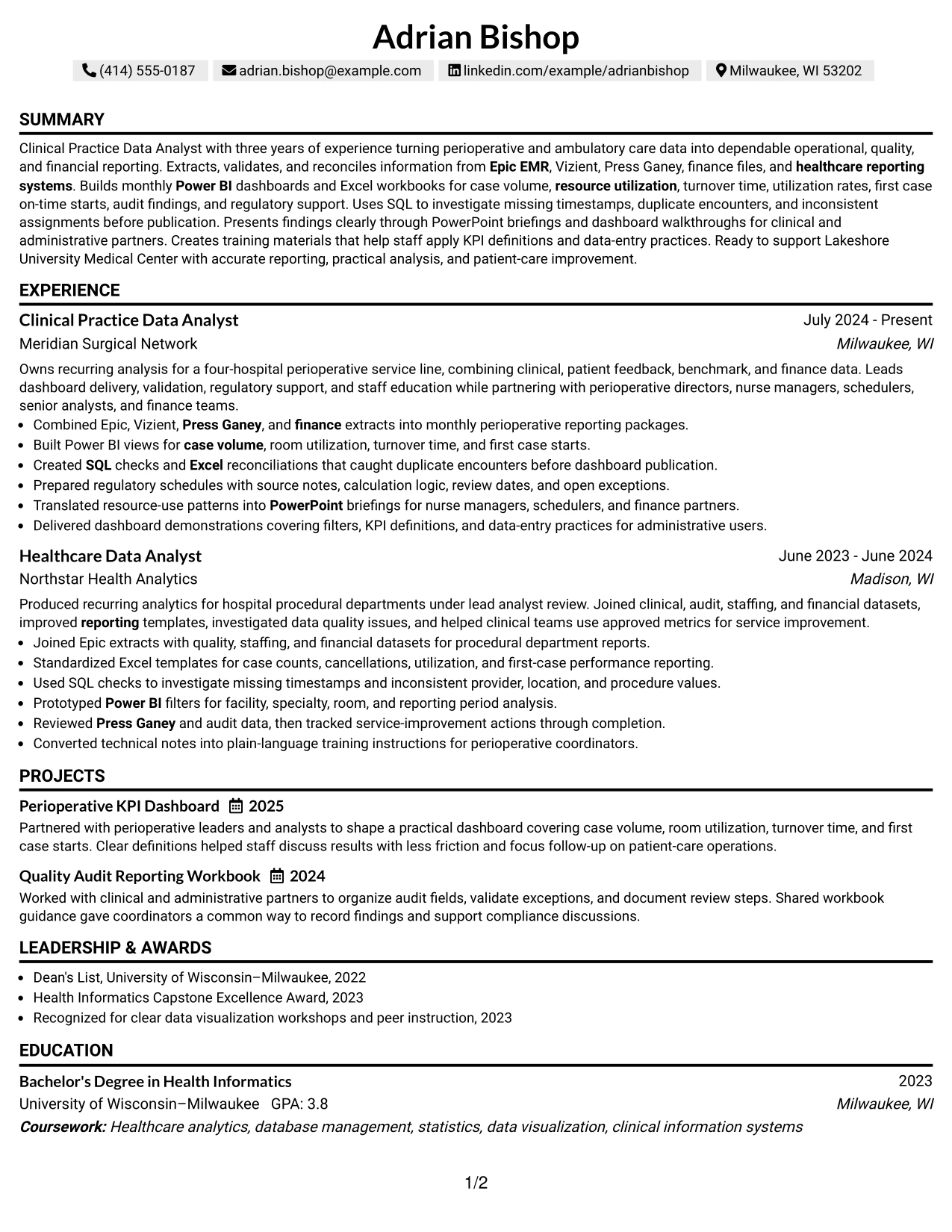
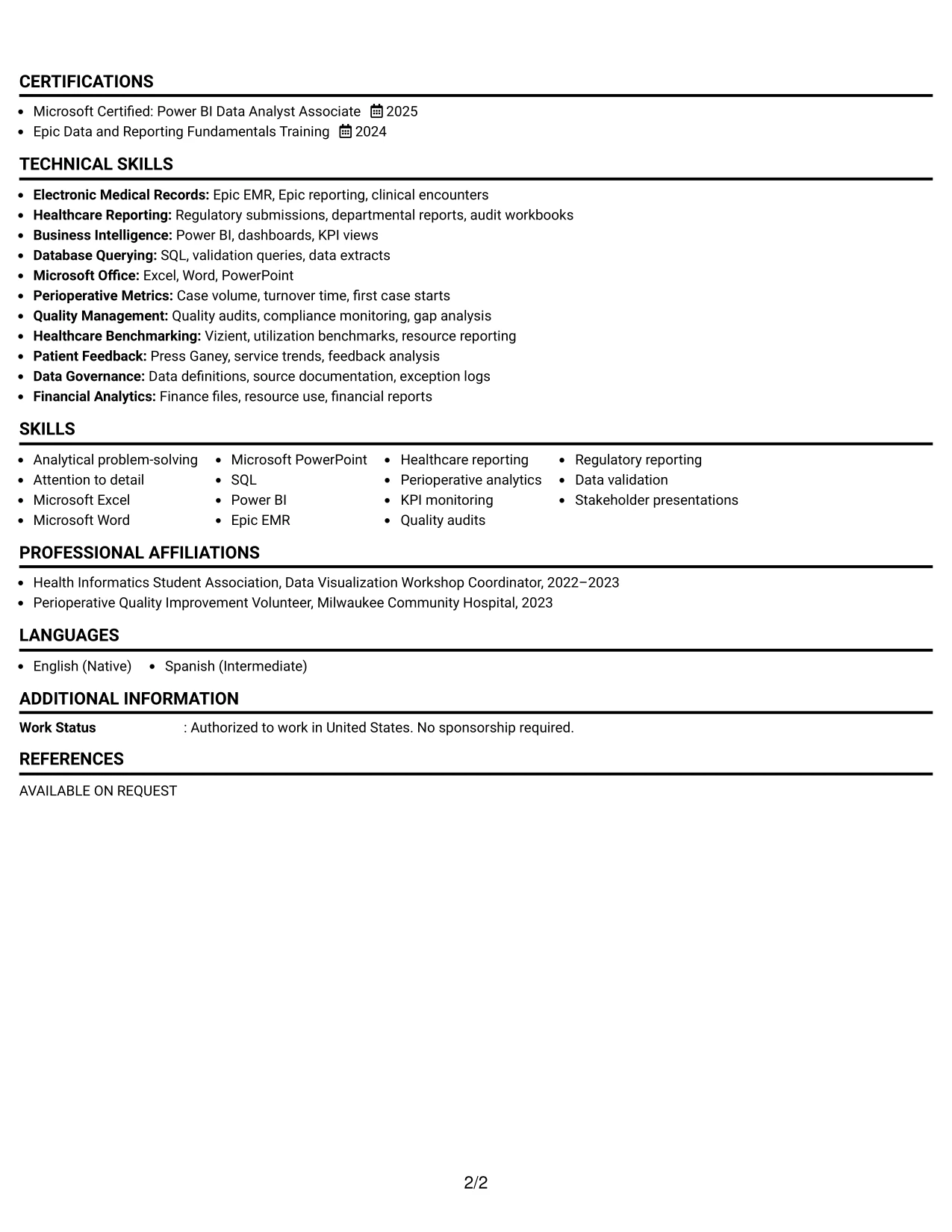
Why the Text/Fang Style Works for a Resume
- A spacious text structure supports clear explanations of analytical work.
- The one-column format keeps job titles, dates, and evidence in a predictable order.
- Bullets can show both the data source and the business or clinical reporting purpose.
- Projects expand the evidence base without competing with employment history.
- A focused skills section reinforces software, reporting, and quality terms.
- Education and certifications remain visible for qualification checks.
- The format gives non-technical readers enough context to understand technical contributions.
Best For
- Applications that require context around data sources, reporting steps, and results.
- Candidates whose strongest evidence comes from detailed but concise work bullets.
- Resumes presenting projects alongside employment without using a portfolio layout.
- Professionals who need room to explain operational, quality, and financial reporting.
- Readers who value a steady text flow over strong visual decoration.
- Candidates translating technical analysis into language that clinical or administrative teams can follow.
- Documents where training, documentation, and stakeholder work are part of the application case.
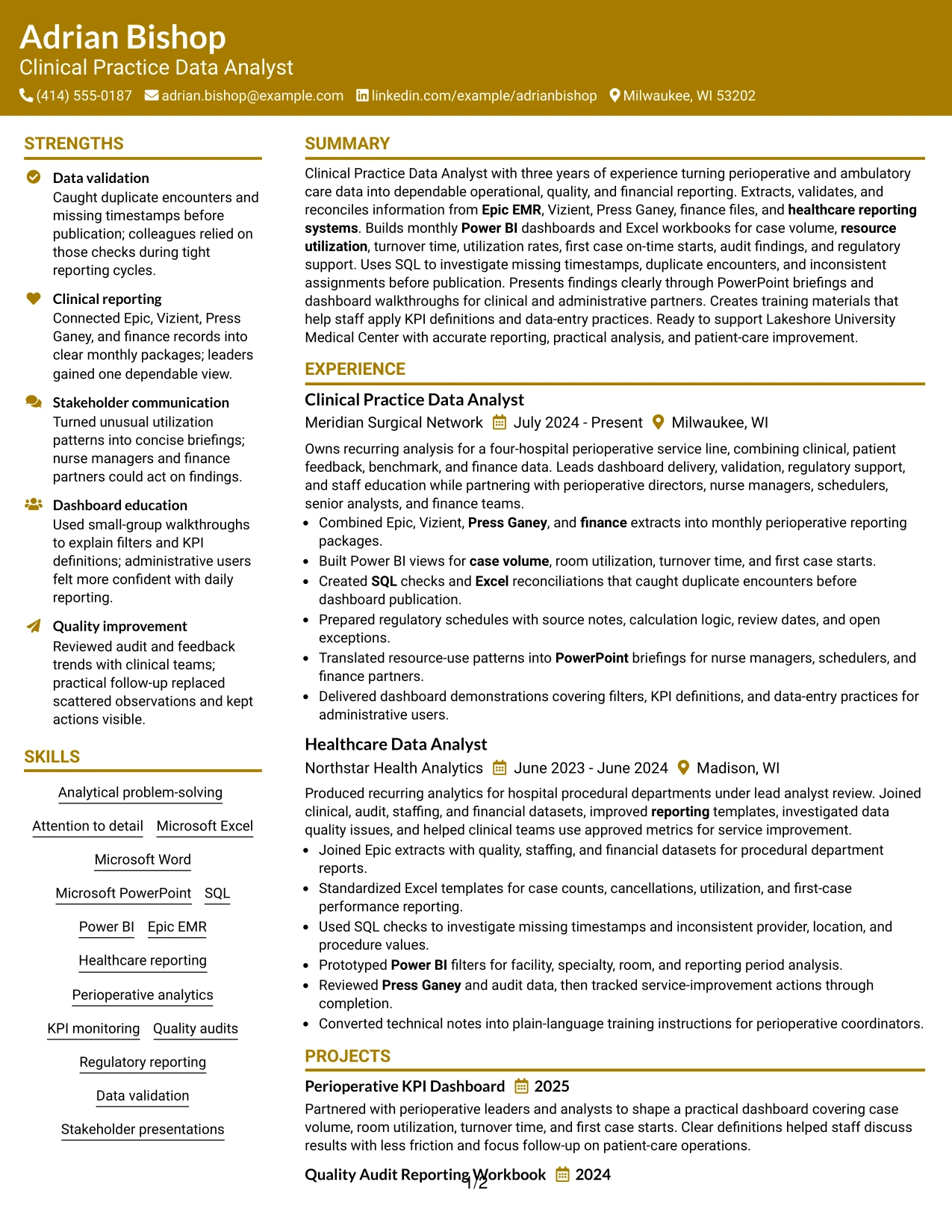
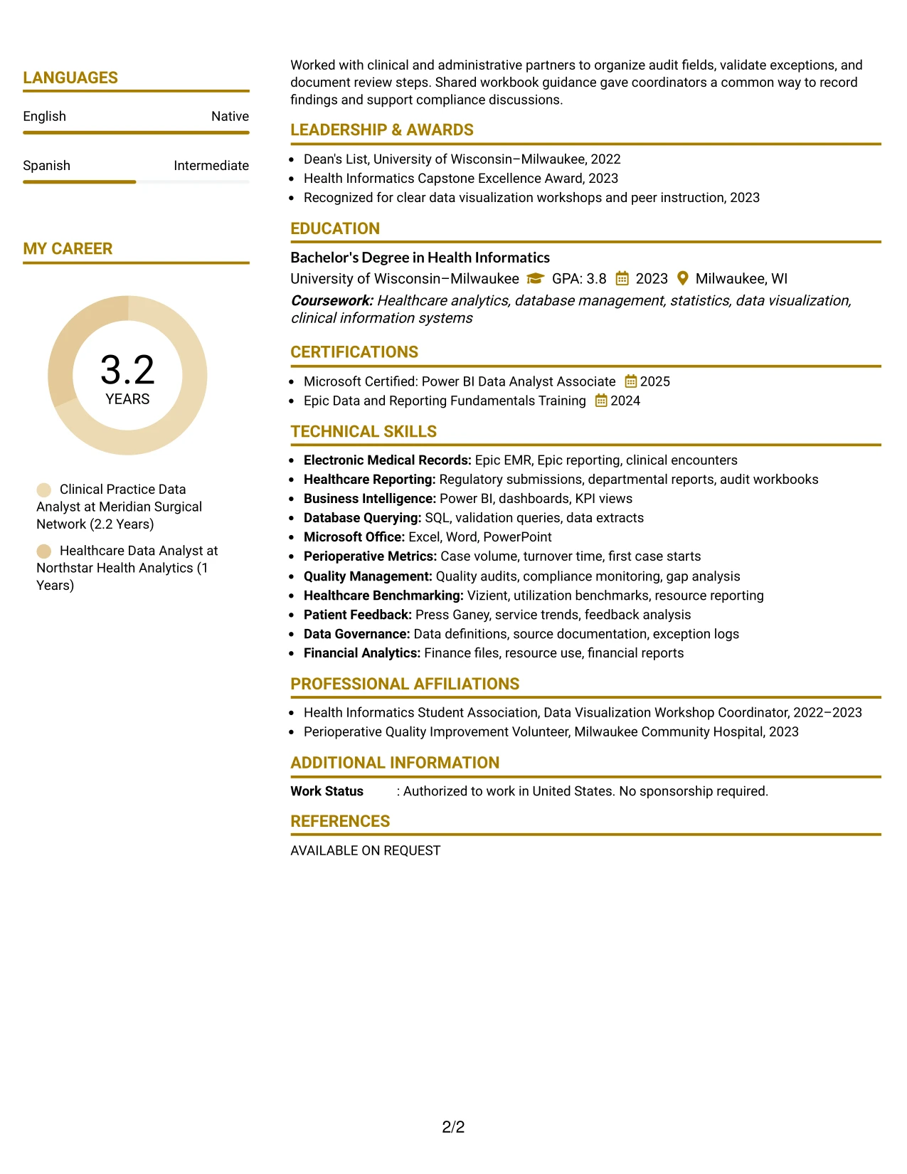
#17 Bold Color Header Professional Format Resume Example
For an application that needs immediate orientation, the top header identifies the target role and frames the rest of the page. A controlled color block creates visual focus, while the body keeps the content professional and readable.
The resume then uses a direct sequence for summary, experience, projects, skills, education, and certifications. That sequence supports the Clinical Practice Data Analyst target by pairing healthcare reporting keywords with evidence such as Power BI dashboard delivery, SQL investigation, regulatory support, and staff education.
Why the Bold Color Header Professional Format Works for a Resume
- A strong header helps the target role stand out at the start of the review.
- The single-column body keeps the visual emphasis from disrupting ATS-readable text.
- Experience bullets connect tools to reporting tasks and quality outcomes.
- Projects give the resume a place to show dashboard and audit workbook work.
- A dedicated skills area supports searches for Epic EMR, SQL, Power BI, and Excel.
- Credentials and education remain easy to verify after the evidence sections.
- The format combines a memorable top area with a conventional resume information order.
Best For
- Applications where the target role should be visible immediately.
- Candidates who want a professional visual accent without multiple content columns.
- Resumes pairing technical tools with operational or quality reporting evidence.
- Documents that need a strong header and a conventional body structure.
- Readers scanning for role title, experience, skills, and certifications in sequence.
- Candidates with projects that reinforce the main employment record.
- Resume submissions that need visual distinction while preserving text-based parsing.
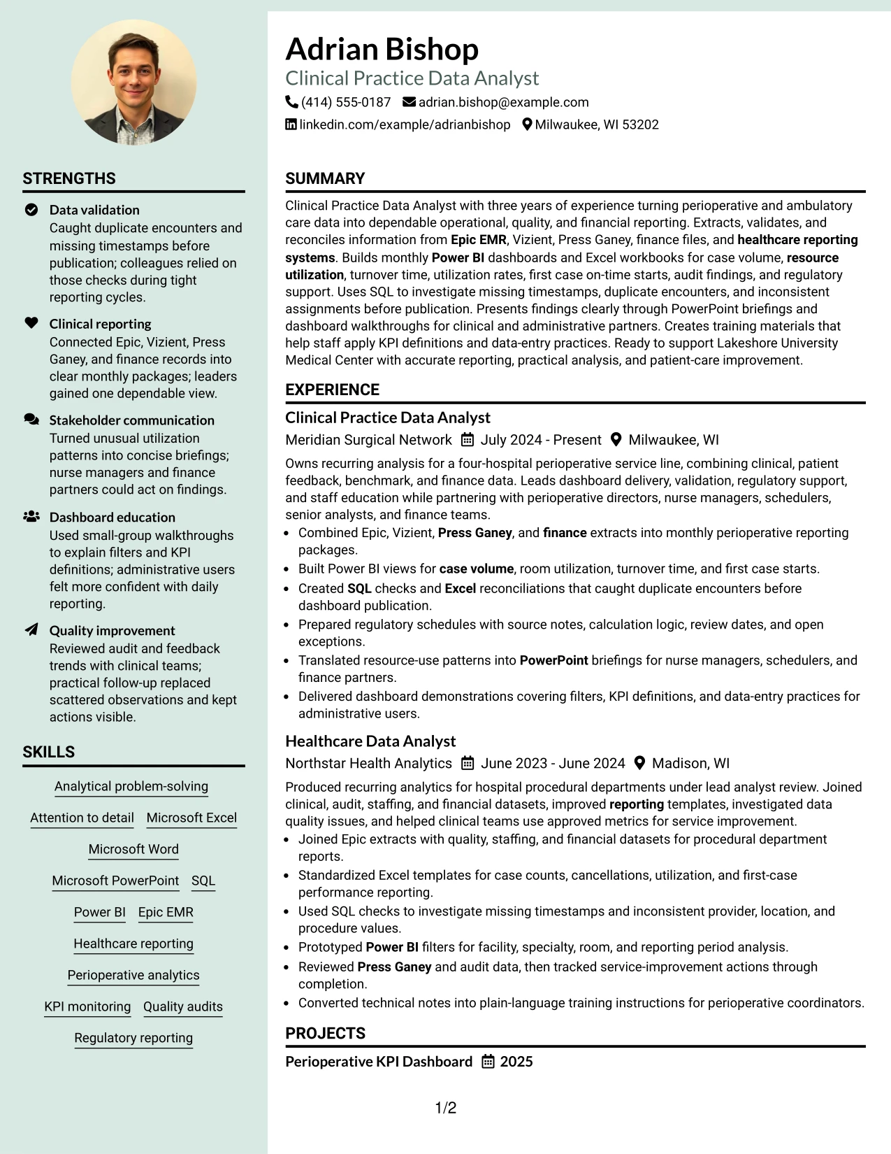
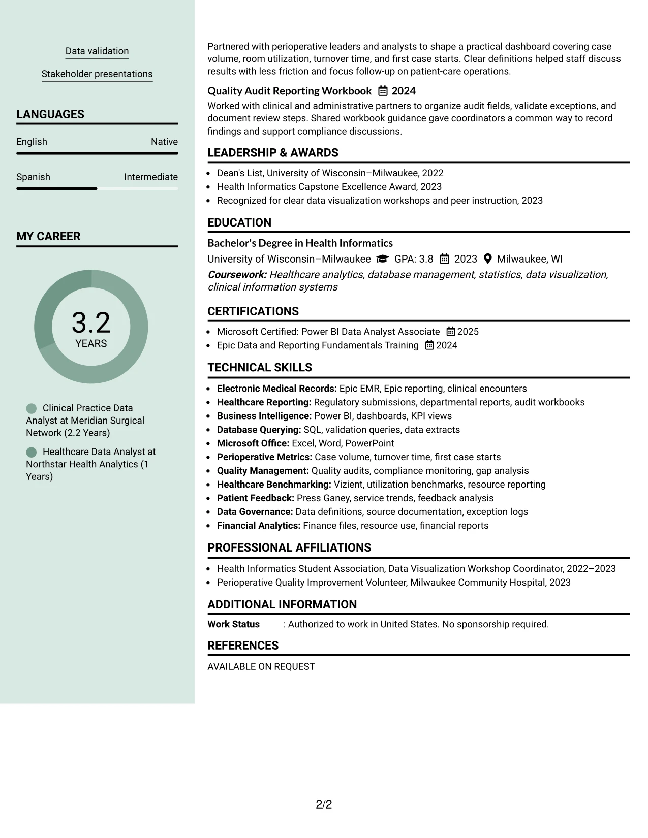
#18 Photo Header Color Sidebar Format Resume Example
A controlled visual hierarchy combines a prominent header with a colored sidebar, giving the resume a recognizable structure before the reader reaches the detailed sections. The layout can place contact details and selected qualifications in the sidebar while reserving the main area for the summary and experience record.
For this resume, the main content should carry the strongest evidence: Epic, Vizient, Press Ganey, Power BI, SQL, monthly dashboards, regulatory schedules, and quality audit work. A professional photo may support a consistent personal presentation when appropriate for the application, but it should never replace searchable text or measurable evidence.
Why the Photo Header Color Sidebar Format Works for a Resume
- The sidebar creates a clear home for contact details, skills, and certifications.
- The main column preserves room for experience bullets and project descriptions.
- A prominent header makes the target role easy to identify before detailed review.
- Technical keywords remain in text so they can support ATS and recruiter searches.
- The structure separates quick-reference qualifications from full evidence of work performed.
- Projects and education can be added without weakening the main experience narrative.
- Photo use remains optional and should follow the expectations of the specific application.
Best For
- Applications where a polished personal presentation supports the overall document.
- Candidates who want quick-reference skills separated from detailed experience.
- Resumes combining technical reporting evidence with projects and certifications.
- Documents that benefit from a distinct sidebar and a strong main content area.
- Candidates presenting several data sources, tools, and KPI responsibilities.
- Readers who need to review contact details and qualifications before work history.
- Applications where a photo is acceptable and the image can remain secondary to resume evidence.
#19 Top Left Header Color Accent Format Resume Example
The Top Left Header Color Accent Format starts with a compact identity block and uses a small visual accent to separate the header from the content below. The result is a familiar one-column resume that gives the reader a clear starting point without taking space from the evidence.
Experience, projects, skills, education, and certifications then follow in a straightforward order. This supports a precise role match by presenting healthcare reporting systems, dashboard development, data validation, KPI monitoring, and stakeholder presentations where reviewers can find them quickly.
Why the Top Left Header Color Accent Format Works for a Resume
- A top-left header gives the reader an immediate starting point.
- The one-column structure keeps sections in a familiar review order.
- A small accent improves visual separation without turning headings into graphics.
- Experience bullets can show tools, data checks, reporting outputs, and follow-up actions.
- Projects provide focused proof of dashboard and quality reporting capabilities.
- Skills and certifications remain easy to scan for qualification and keyword checks.
- The format keeps core text prominent for both ATS processing and human review.
Best For
- Resumes that need a modest visual accent with a highly familiar structure.
- Candidates who want the top role and contact information easy to locate.
- Applications requiring fast comparison of experience bullets and technical skills.
- Documents that include projects, education, and certifications without a dense sidebar.
- Readers who prefer left-to-right scanning from a compact header into one column.
- Candidates balancing healthcare reporting keywords with clear evidence statements.
- Resume submissions where simple structure and quick section recognition matter.
#20 Centered Header Classic Two Column Format Resume Example
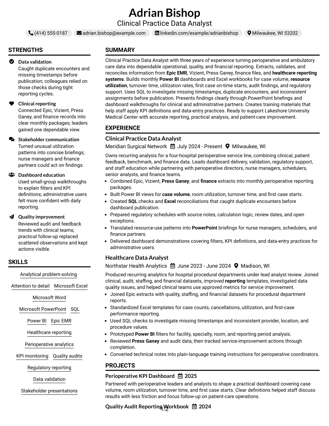
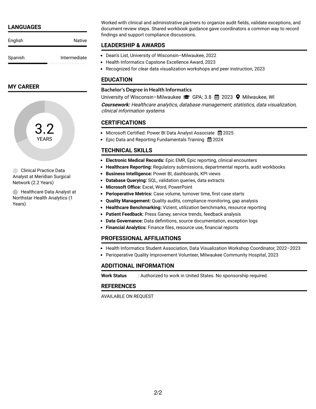
Reviewers can start at the centered header, then move through the main experience column while using the secondary column for skills, education, certifications, and related details. This division makes a substantial resume easier to navigate without losing the chronological work record.
The structure gives the resume room to present three years of healthcare analytics experience, two analyst roles, projects, and credentials. Adrian Bishop's content can show Power BI dashboards, SQL validation, Epic reporting, quality audits, and regulatory support while keeping supporting keywords visible in the adjacent column.
Why the Centered Header Classic Two Column Format Works for a Resume
- The centered header creates a clear entry point for the full document.
- A wide main column supports detailed experience and project bullets.
- The secondary column keeps skills, education, certifications, and activities accessible.
- Two analyst roles can be reviewed without pushing supporting qualifications too far down the page.
- Bullets preserve evidence of dashboards, validation checks, audits, and training.
- The format supports a larger content volume while maintaining section boundaries.
- Consistent headings and plain text improve navigation for both people and ATS tools.
Best For
- Resumes with multiple roles, projects, credentials, and supporting qualifications.
- Candidates who need detailed experience beside a compact qualifications column.
- Applications where content volume is high but section order must stay clear.
- Professionals presenting both technical tools and stakeholder-facing responsibilities.
- Readers who want to compare work evidence with skills and education at a glance.
- Documents that include activities or honors without allowing them to overshadow experience.
- Candidates needing a classic structure for a multi-section professional resume.
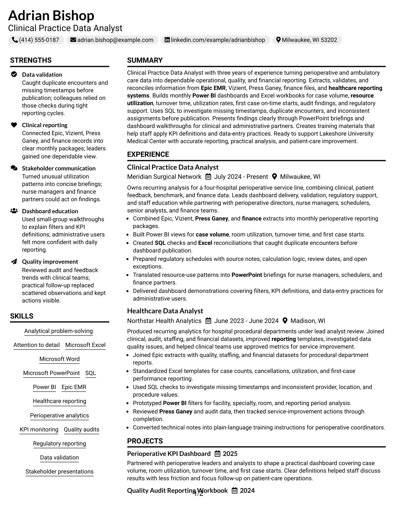
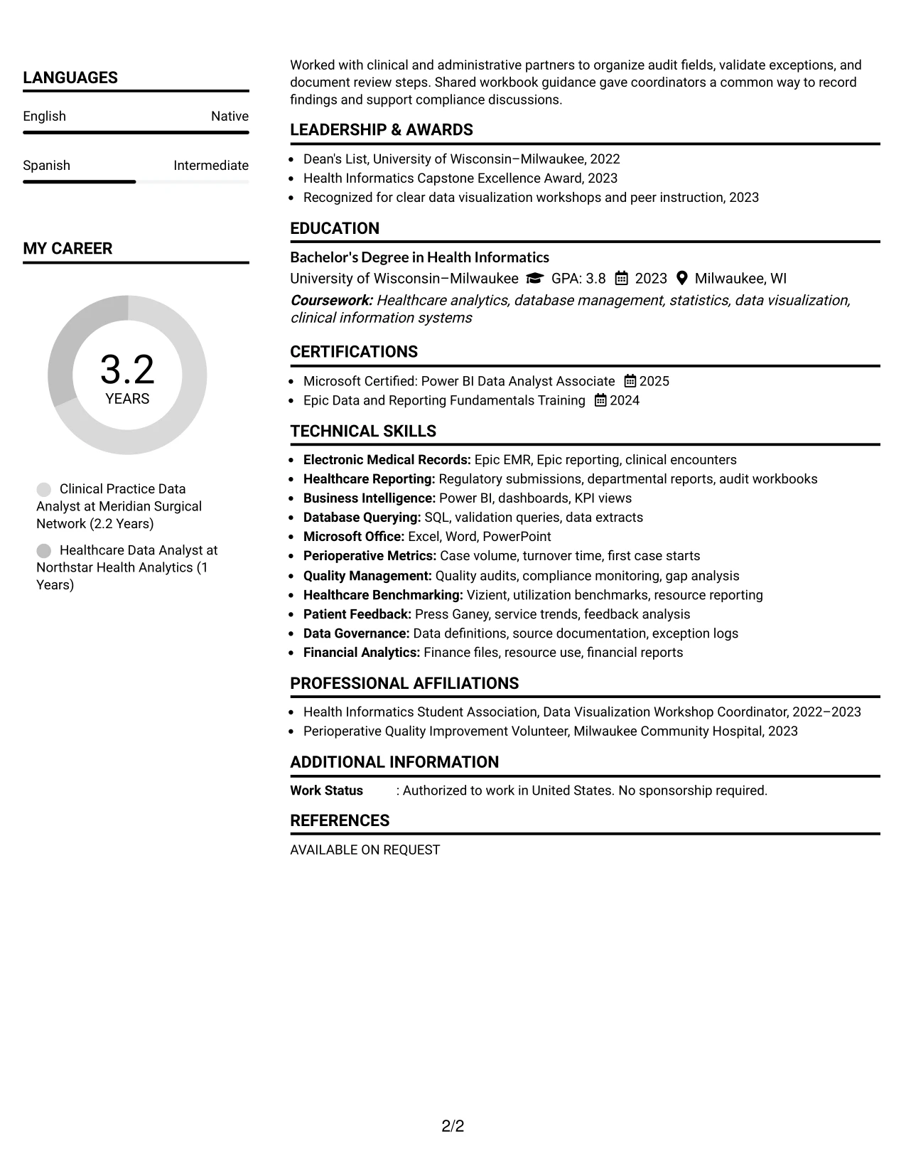
#21 Left Aligned Header Clean Two Column Format Resume Example
Data and achievement evidence lead the review, with the left-aligned header placing the target role and contact details in a practical starting position. The two-column structure then separates the detailed experience record from compact supporting qualifications.
That division works well for a resume built around validation, reporting, and process improvement. The main area can explain monthly dashboards, reconciliation workbooks, audit schedules, and stakeholder briefings, while the supporting column keeps Power BI, SQL, Epic EMR, education, and certifications visible for quick matching.
Why the Left Aligned Header Clean Two Column Format Works for a Resume
- The left-aligned header presents role and contact information in a familiar position.
- The main column gives achievement bullets enough room for source, action, and outcome.
- A secondary column keeps skills and credentials available during the first scan.
- The layout supports evidence from both formal roles and focused projects.
- Technical terms remain grouped for quick review without interrupting the work history.
- Education and certifications can be confirmed without competing with professional evidence.
- Clean section labels support predictable navigation and ATS interpretation.
Best For
- Resumes where validation, reporting, and process evidence should lead the review.
- Candidates who want detailed experience separated from quick-reference qualifications.
- Applications that require several tools and credentials to remain visible at once.
- Professionals presenting both technical analysis and communication with operational teams.
- Readers who compare achievement bullets with skills during an initial scan.
- Documents with projects that reinforce the main evidence without creating a third column.
- Candidates who prefer a practical, left-aligned entry point and clean two-column organization.
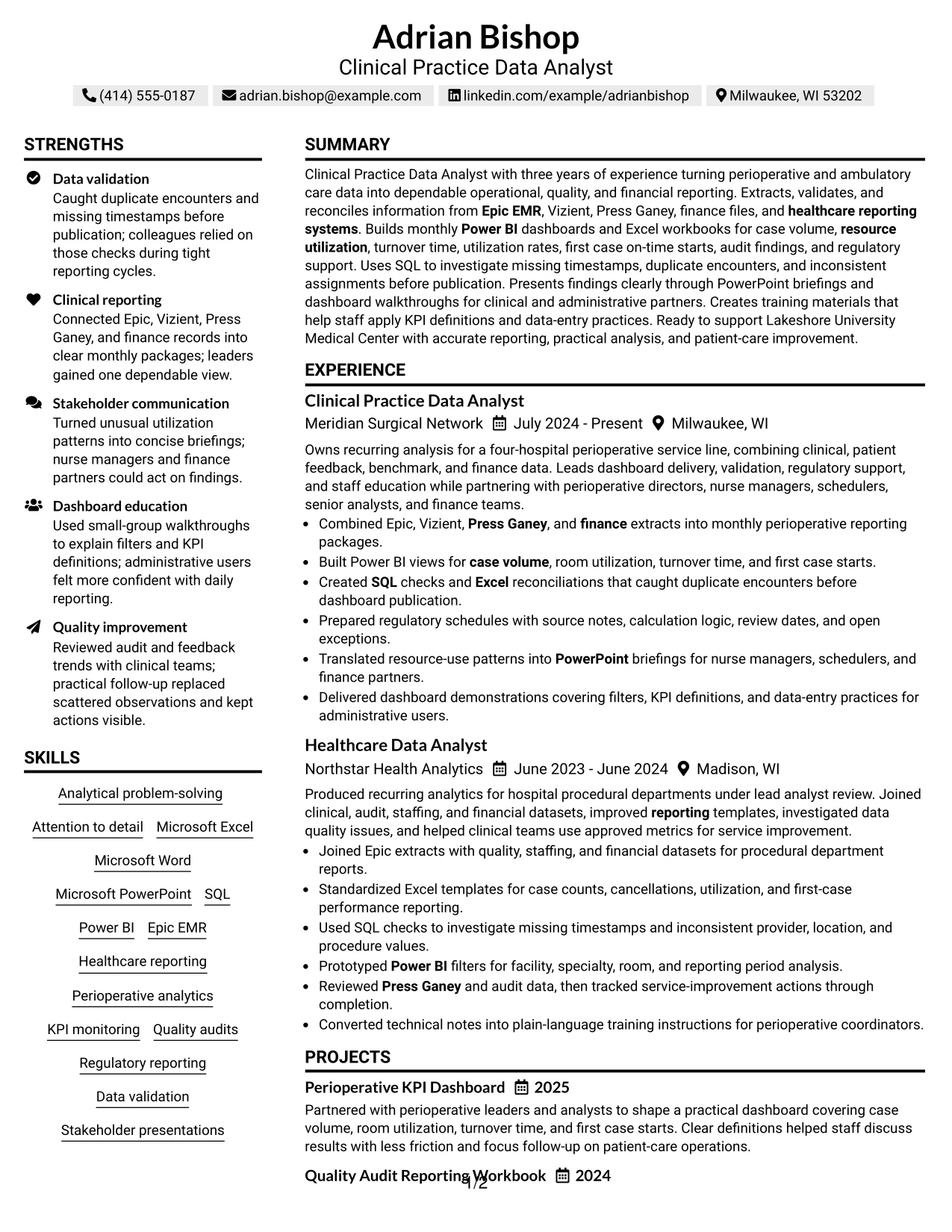
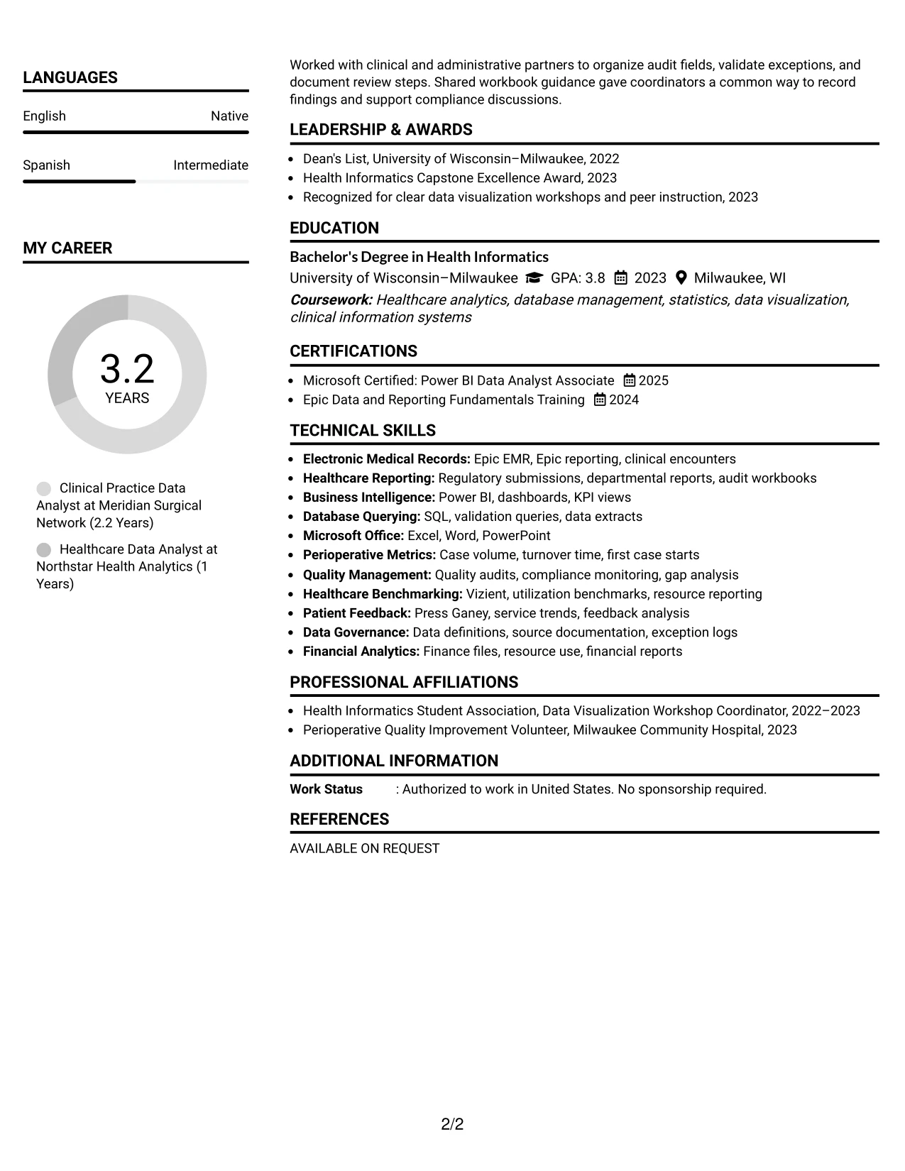
#22 Simple Two Column Format Resume Example
Balanced space gives the resume a calm, practical reading experience. One column can carry the summary, experience, and projects, while the other holds skills, education, certifications, awards, and activities in a compact but visible form.
This application context favors clear evidence over decoration. The resume can connect perioperative analytics to case volume, turnover time, utilization, first case starts, quality audits, and financial reporting. The two-column arrangement keeps those details readable while making credentials and tools easy to confirm.
Why the Simple Two Column Format Works for a Resume
- Balanced columns prevent supporting credentials from being buried below the main experience.
- The main column provides a clear place for role descriptions and achievement bullets.
- The secondary column groups tools, education, certifications, honors, and activities efficiently.
- Projects can show applied dashboard and audit reporting work without disrupting chronology.
- The format supports a broad evidence set while keeping each section visually contained.
- Relevant keywords remain easy to locate during a quick qualification review.
- Simple spacing helps the document remain readable across screen and print review.
Best For
- Resumes that must present experience and supporting qualifications at the same time.
- Candidates with projects, honors, certifications, and activities that add useful context.
- Applications where operational, quality, and financial evidence all matter.
- Professionals needing room for tools and credentials without a crowded skills block.
- Readers who prefer balanced sections over a long single-column page.
- Documents that combine detailed bullets with concise qualification lists.
- Candidates seeking a practical format for healthcare analytics and reporting applications.
#23 Accent Divider Modern Two Column Format
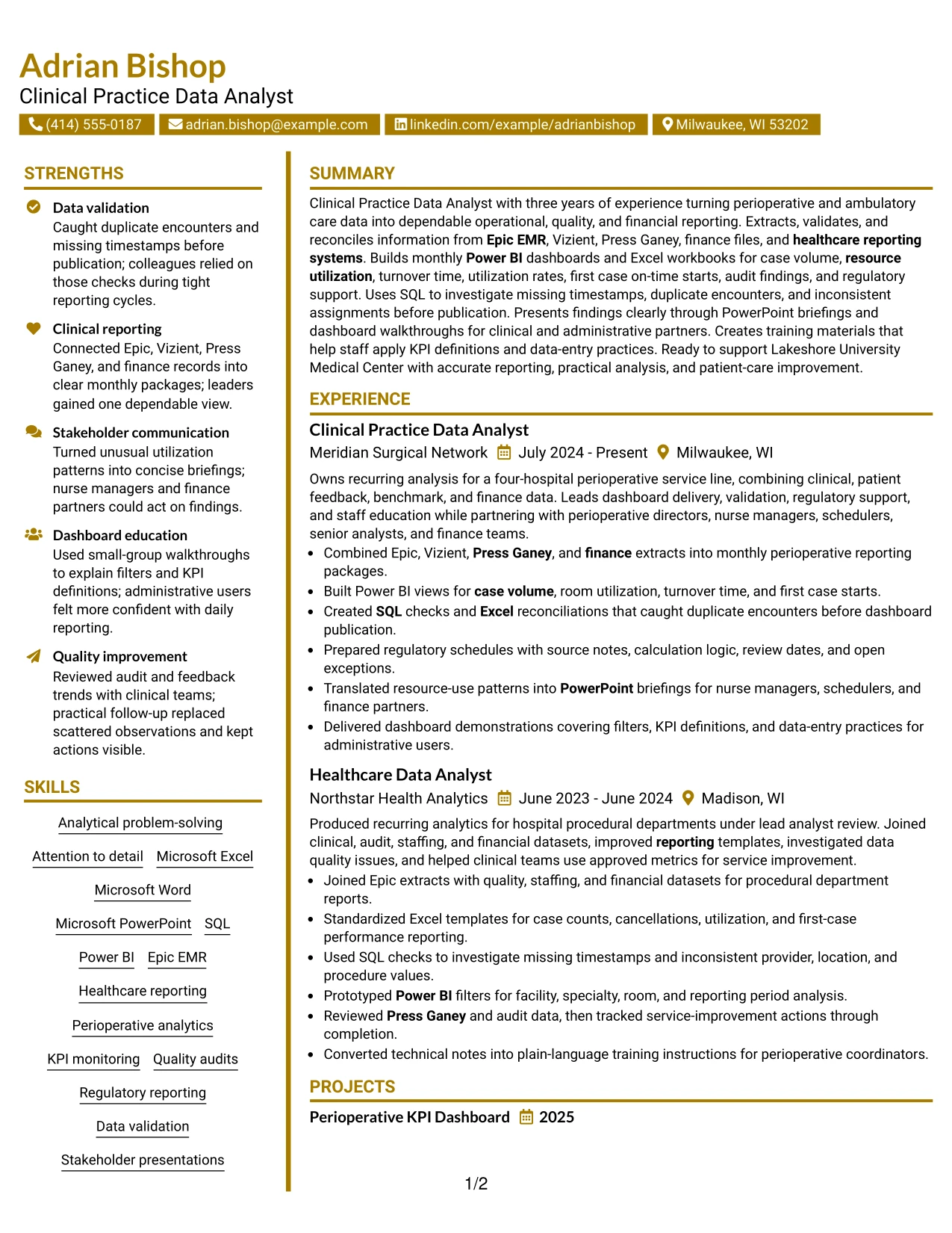
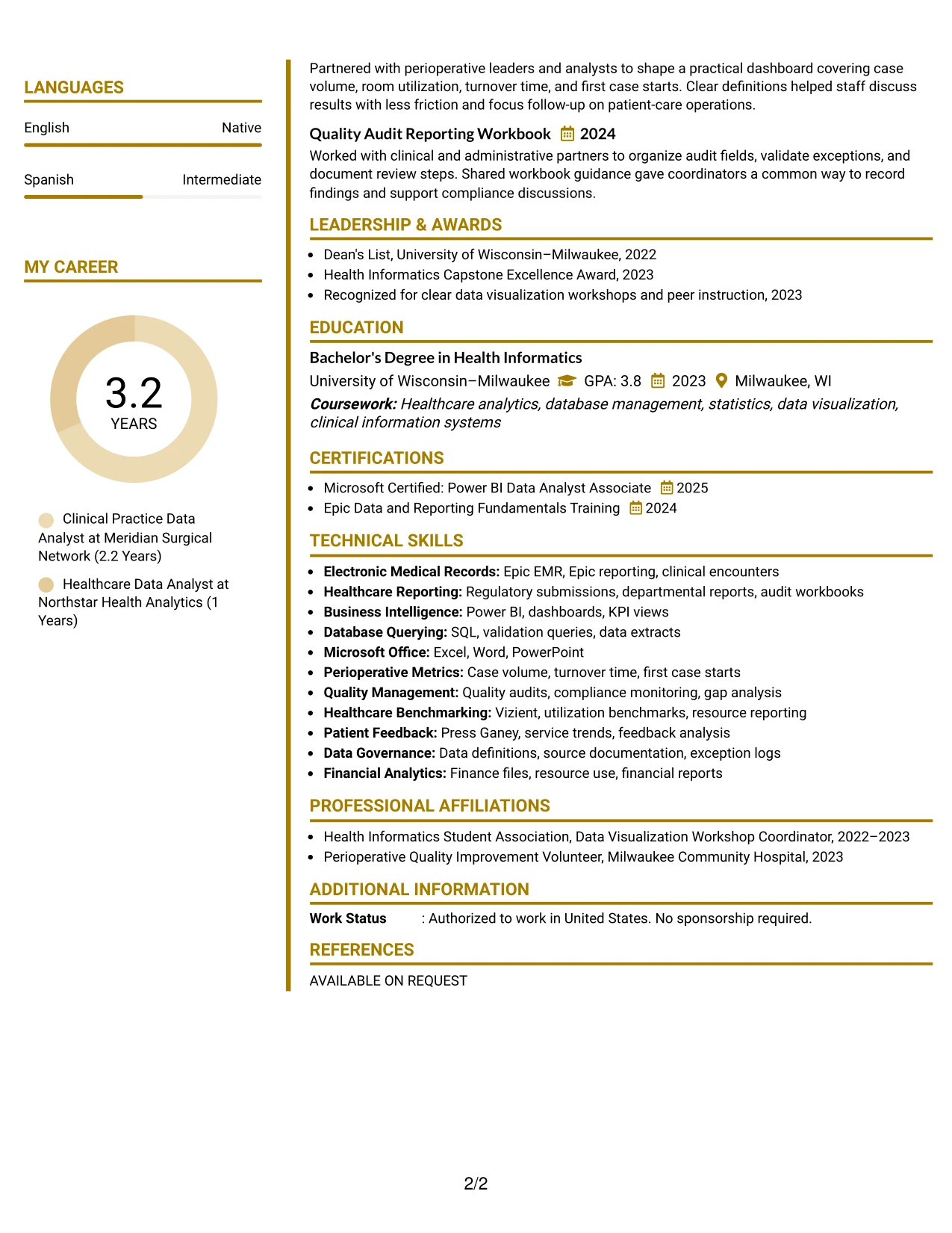
For a Clinical Practice Data Analyst resume, a two-column structure helps separate contact details and core skills from the main evidence. Accent dividers guide readers from the professional summary to experience, education, certifications, and projects without interrupting the review flow.
The left column can carry compact keyword groups such as Power BI, SQL, Epic EMR, data validation, and healthcare reporting. The wider column gives measurable work evidence room to stand out, including four-hospital reporting, 22 operating rooms, monthly dashboards, regulatory schedules, and duplicate-encounter checks.
Why the Accent Divider Modern Two Column Format Works for a Resume
- Clear dividers create a visible hierarchy for summary, skills, experience, education, and certifications.
- Two columns place high-value keywords near the top while preserving space for detailed experience bullets.
- Short bullet points support fast recruiter scanning and make tools such as SQL, Power BI, and Excel easy to locate.
- The main column can show measurable scope, including four hospitals and 22 operating rooms, without crowding the page.
- Projects and quality work can sit below employment history as supporting evidence rather than competing with core experience.
- The structure separates technical tools from results, helping readers connect each skill to actual reporting work.
- A restrained accent supports a modern presentation while keeping the resume readable and practical.
Best For
- Readers who need a clear split between skills and detailed experience evidence
- Resumes with many technical keywords that still require strong bullet-point context
- Candidates presenting dashboards, validation work, reports, and projects in one document
- Applications where quick scanning of tools and certifications matters
- Professionals who want compact education and certification details beside fuller work history
- Two-column resumes that need organized sections without dense visual clutter
- Applications supported by ATS-friendly text and straightforward section labels
#24 Shaded Labels Clean Two Column Format
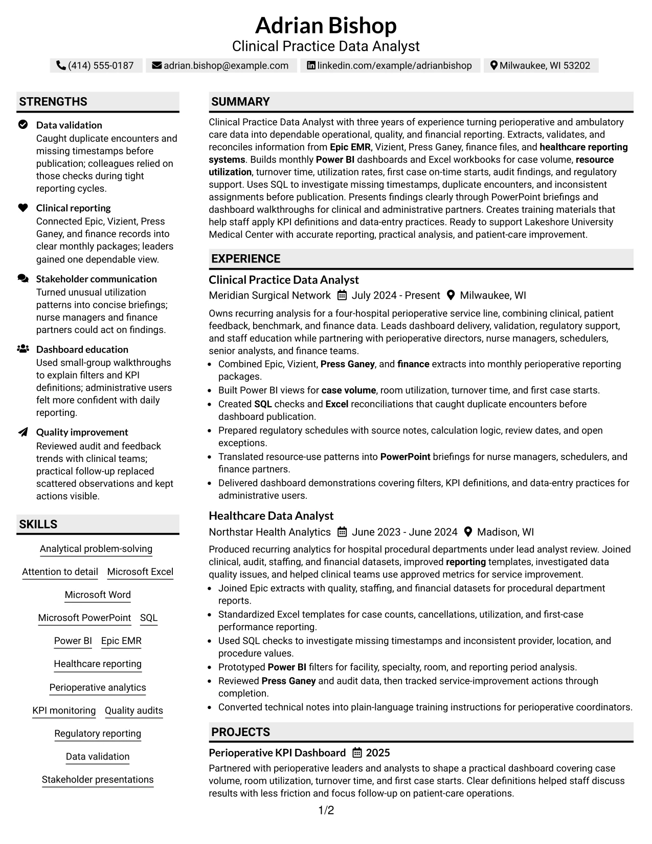
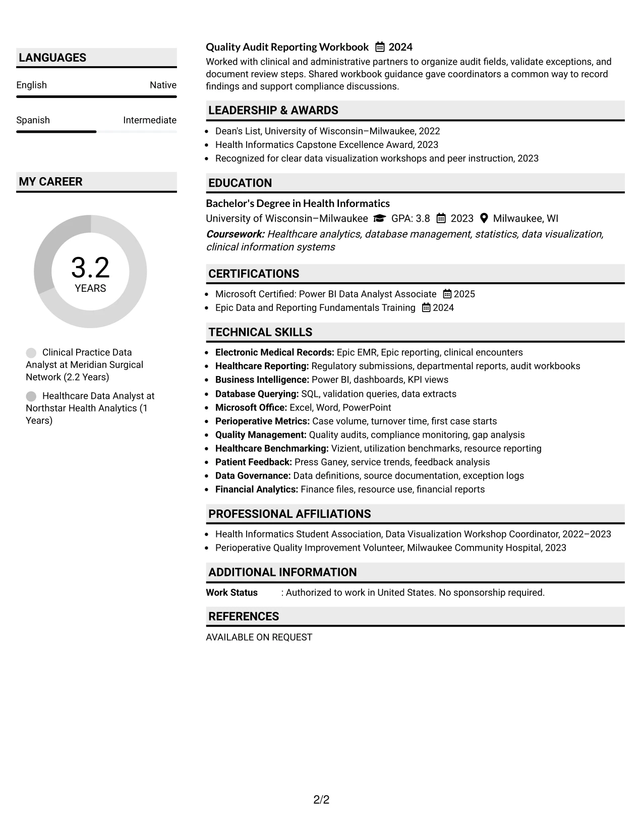
A calm visual hierarchy helps readers identify the resume's purpose before they examine each section. Shaded labels can mark Professional Summary, Skills, Experience, Education, Certifications, and Projects while keeping the page easy to navigate.
For this Clinical Practice Data Analyst application, the layout aligns role-specific evidence with the labels that matter most: Epic EMR, Vizient, Press Ganey, Power BI, SQL, regulatory reporting, and KPI monitoring. The two-column arrangement keeps supporting details compact and leaves the strongest accomplishment bullets in view.
Why the Shaded Labels Clean Two Column Format Works for a Resume
- Shaded labels make section boundaries easy to recognize during a quick review.
- The two-column grid supports a clean relationship between skills, certifications, and employment evidence.
- Role-specific terms remain visible without turning the resume into a disconnected keyword list.
- Experience bullets can explain how data was collected, validated, reconciled, and reported.
- The format gives projects and audit workbooks a defined place below the main career history.
- Simple labels help readers find education and Microsoft certification details quickly.
- The clean presentation supports professional credibility without relying on decorative complexity.
Best For
- Resumes that need strong alignment between section labels and target-role requirements
- Applications where technical systems and reporting methods should be easy to find
- Candidates combining operational analysis, quality audits, and financial reporting evidence
- Readers who prefer organized information blocks over long uninterrupted text
- Documents that must present education, certifications, projects, and experience in a compact structure
- Professionals who want keywords visible while preserving readable achievement bullets
- Two-column resumes designed for consistent section scanning across different review settings
#25 Photo Header Color Accent International Format
The Photo Header Color Accent International Format places the identity block and professional target at the top, followed by a single-column sequence of summary, skills, experience, education, and certifications. That structure makes the resume familiar to readers who expect a strong header and a full-width evidence trail.
A restrained color accent can distinguish section headings while the main column carries detailed bullets. The resume can therefore show healthcare reporting systems, Power BI dashboards, SQL validation, regulatory support, and stakeholder presentations in a logical order.
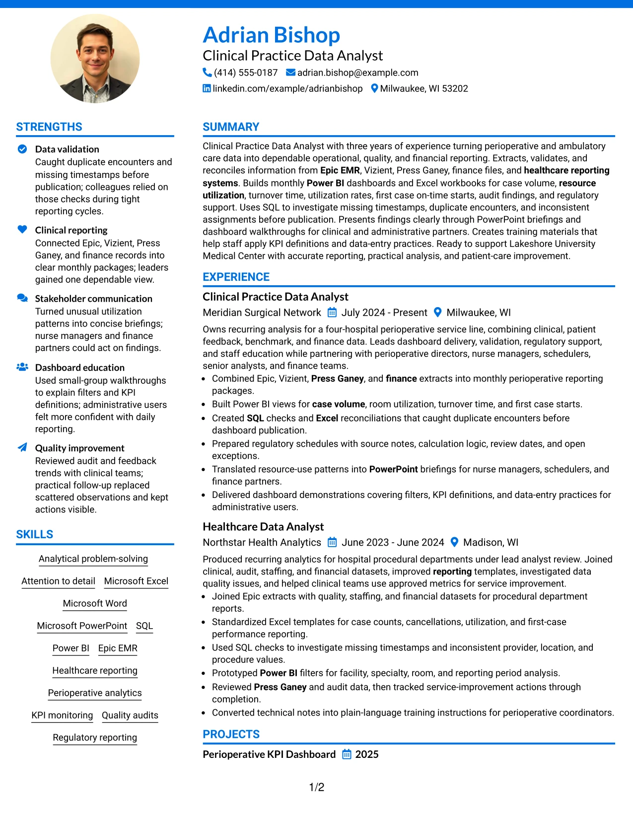
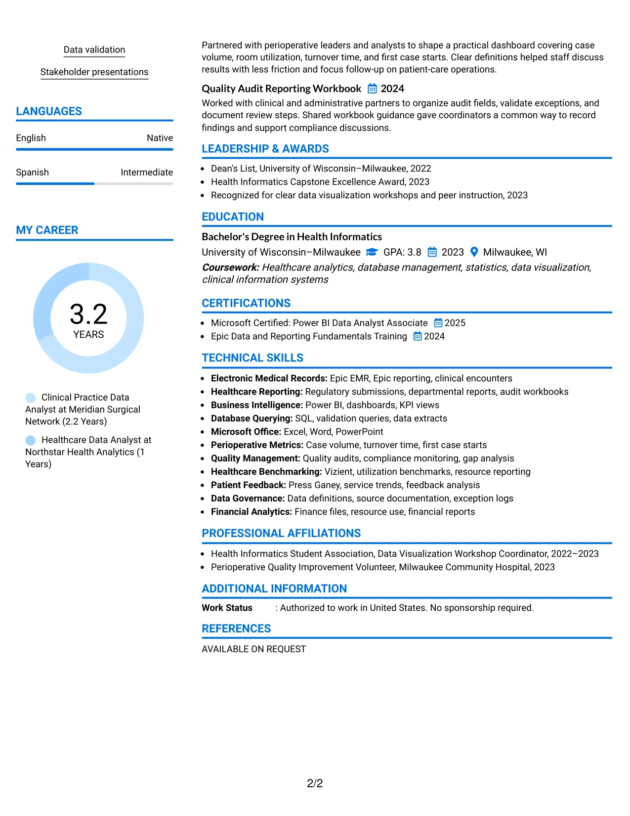
Why the Photo Header Color Accent International Format Works for a Resume
- A full-width header establishes the candidate's target role and contact information immediately.
- A single column keeps experience bullets in one reading path from newest to oldest.
- Color accents can separate sections without hiding ATS-readable text.
- The summary gives context before the resume presents tools, metrics, and employment evidence.
- Detailed bullets can connect Power BI, SQL, and Excel work to reporting outcomes.
- Education, certifications, projects, and activities remain easy to locate below experience.
- The photo area may suit application settings where a professional visual identity is appropriate, subject to local hiring norms.
Best For
- Applications that permit a visually distinctive identity header
- Resumes where a single reading path should carry detailed experience evidence
- Candidates who need room for full-width bullets about dashboards, audits, and reporting
- International application contexts where a formal visual header may be customary
- Documents that combine technical skills with education, certifications, and projects
- Readers who want the target role and contact details established before detailed review
- Professional resumes that benefit from restrained color rather than heavy decoration
#26 Large Profile Photo International Two Column Format
Recruiters can move from the large profile header to compact supporting details, then across to the main experience column. This navigation pattern gives the resume a clear starting point while preserving space for employment bullets, projects, education, and certifications.
The two-column design supports a high content volume when information is grouped carefully. A narrow area can hold skills, certifications, and languages, while the primary area explains monthly reporting, Power BI dashboard delivery, SQL checks, quality audits, and training materials.
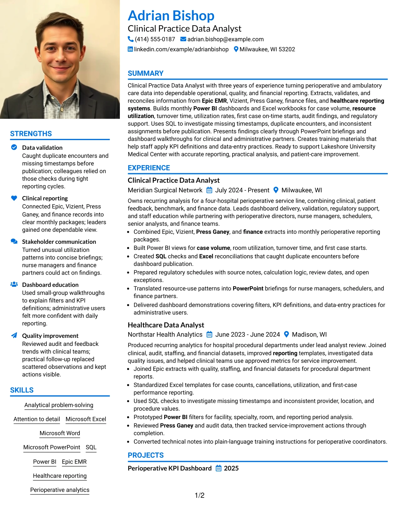
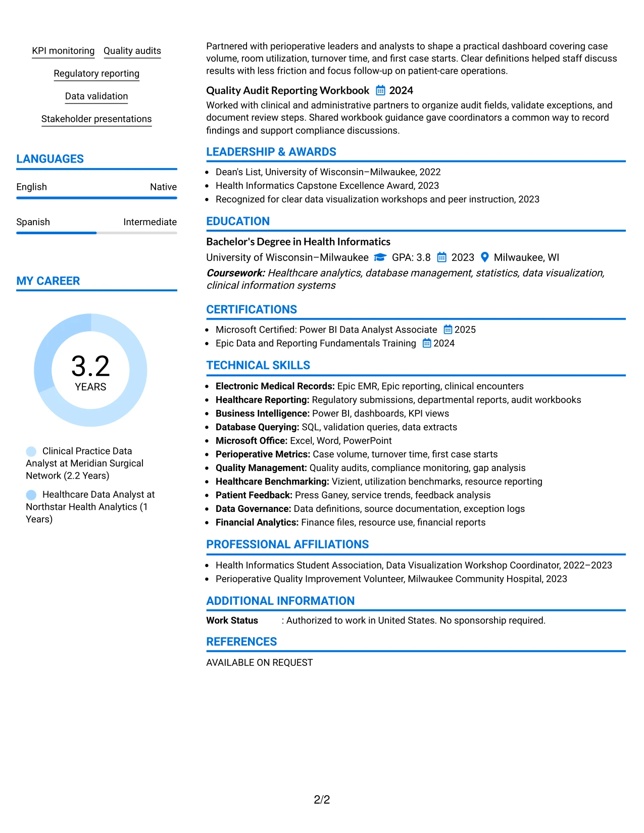
Why the Large Profile Photo International Two Column Format Works for a Resume
- The header creates a strong entry point before readers move into professional evidence.
- Two columns allow supporting details such as skills, certifications, and languages to stay compact.
- The main column provides room for multiple positions and complete achievement bullets.
- Projects can reinforce employment evidence without taking attention away from the work history.
- The structure supports a broad keyword set, including Epic EMR, Vizient, SQL, and Power BI.
- A large profile area can suit international presentation preferences where such visuals are accepted.
- Clear grouping reduces the risk that education or certifications disappear in a high-information resume.
Best For
- Resumes with substantial experience, project, certification, and skills content
- Applications where a two-column split can protect the main evidence from crowding
- Candidates presenting several reporting systems alongside detailed work history
- International contexts that commonly use a prominent profile header
- Documents that need a compact place for languages, tools, and credentials
- Professionals whose project work adds evidence to a full employment record
- Readers who want supporting facts available without breaking the main experience narrative
#27 One Column Format with Photo
The strongest evidence should appear early: a focused summary, relevant skills, and recent results. A one-column format supports that priority by placing each section in a direct sequence, from the target role through experience, education, certifications, and projects.
The full-width page gives achievement bullets enough room to explain data validation, dashboard development, regulatory support, and stakeholder communication. A professional photo can support the header where appropriate, but the resume's credibility should come from documented scope, tools, and outcomes.
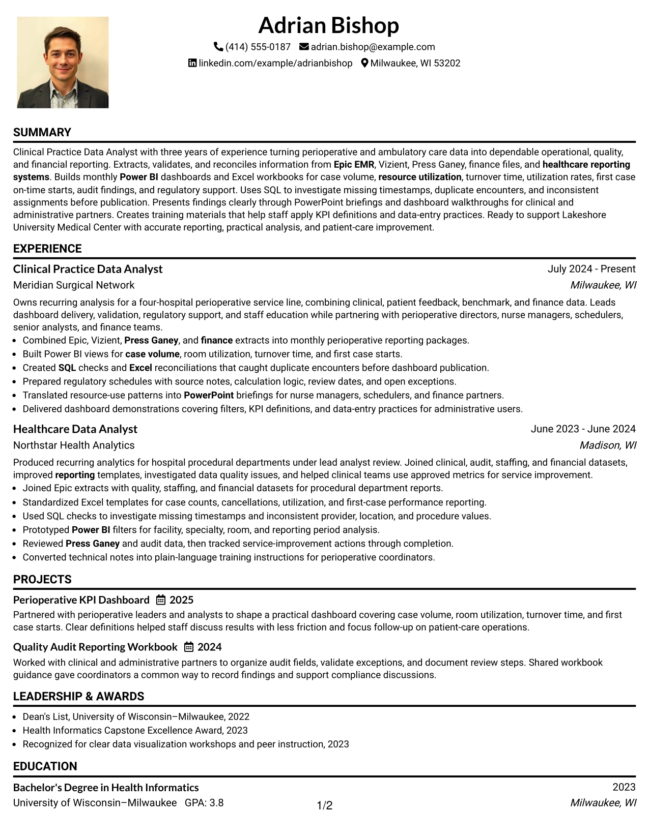
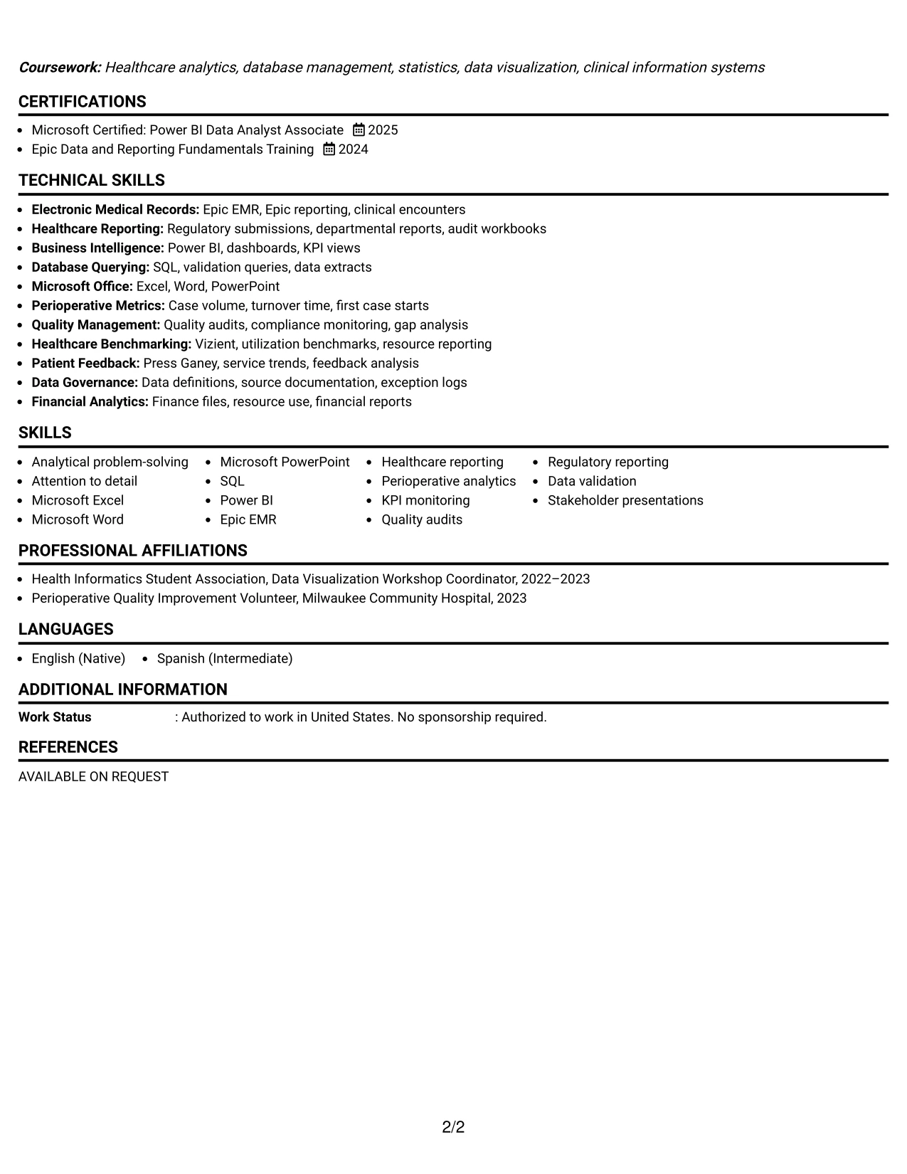
Why the One Column Format with Photo Works for a Resume
- A single column presents summary, skills, and experience in a predictable order.
- Recent work can lead with evidence such as monthly dashboards and reporting for four hospitals.
- Full-width bullets make validation steps and operational results easier to understand.
- Technical tools can be tied directly to outcomes instead of appearing as an isolated list.
- Projects and certifications can follow experience without competing with the main evidence.
- The structure supports ATS-readable headings and conventional resume section order.
- The photo can add a formal identity element when the application context permits it.
Best For
- Resumes where recent achievements should receive immediate attention
- Candidates who need full-width space for detailed evidence bullets
- Applications requiring a conventional sequence of summary, skills, experience, and education
- Professionals connecting tools such as SQL and Power BI to measurable reporting work
- Documents that include projects, certifications, awards, and activities after employment history
- Readers who prefer one direct path through a complete resume
- Application settings where a professional photo is accepted and useful
#28 One Column Format with Photo Right
Content balance matters when a resume combines a visual header with detailed professional evidence. Keeping the document in one column lets the summary, skills, experience, education, and certifications share a consistent width, while the photo position adds visual separation at the top rather than interrupting the work history.
This application benefits from a practical sequence: target role, reporting strengths, employment results, projects, and credentials. Full-width bullets can describe case volume, room utilization, turnover time, first case starts, audit findings, and data-entry training without forcing key details into narrow text blocks.
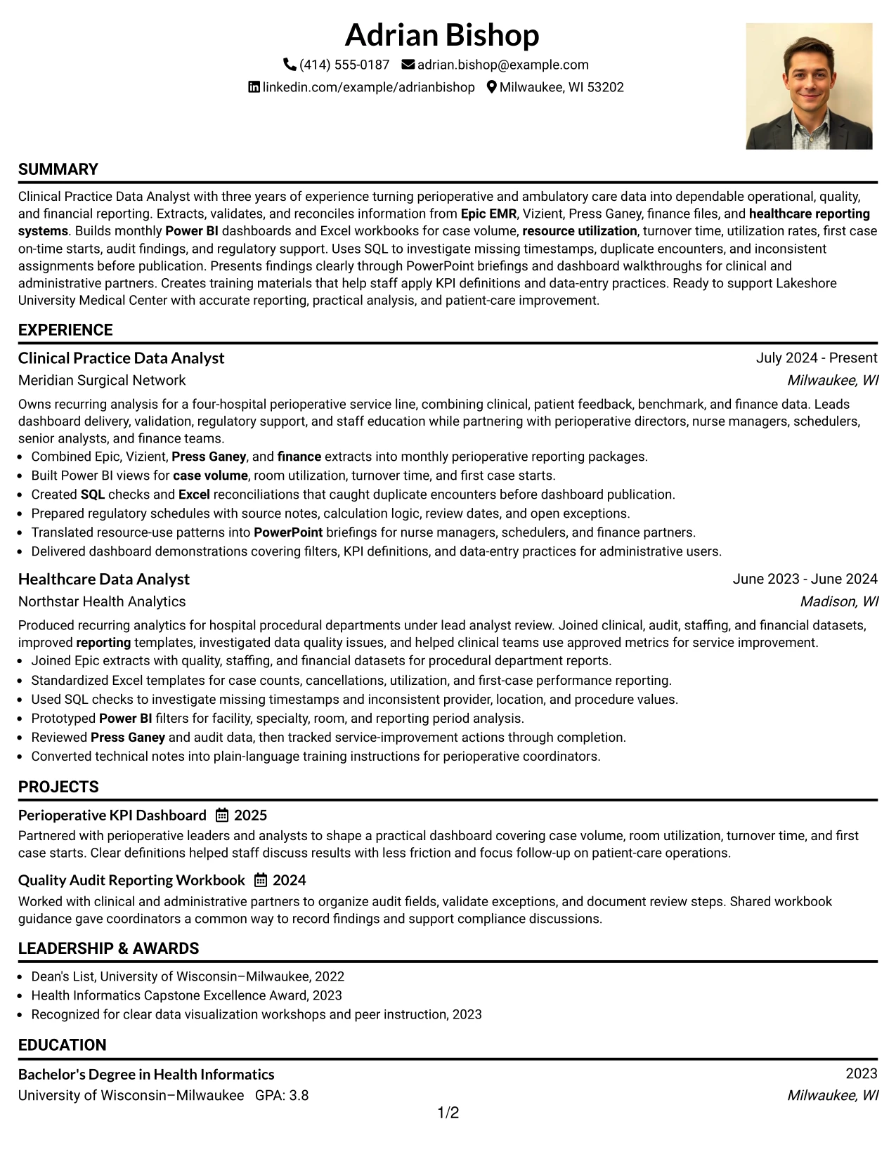
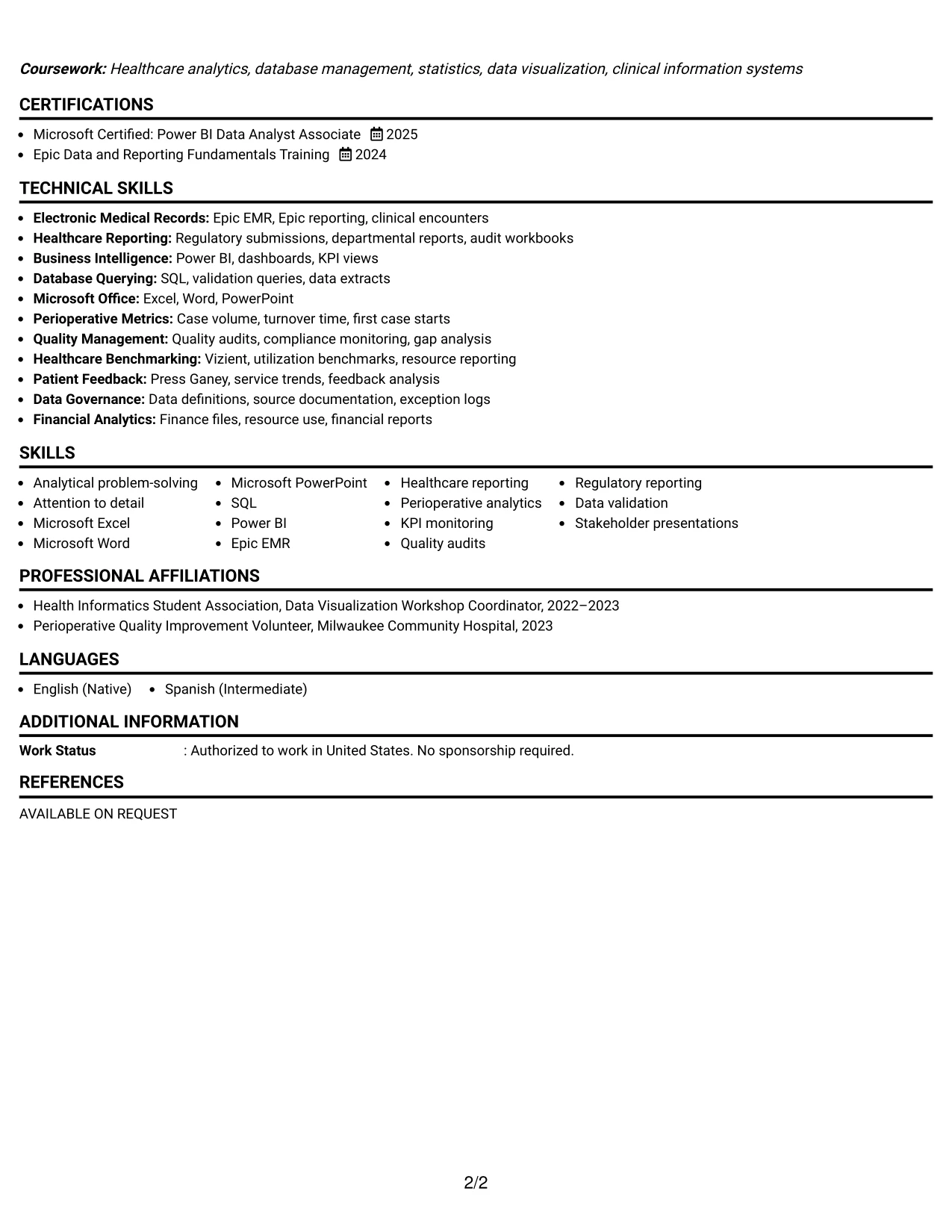
Why the One Column Format with Photo Right Works for a Resume
- A right-aligned photo keeps the identity area distinct from the main evidence path.
- One-column spacing gives every experience bullet consistent reading width.
- The summary can quickly establish healthcare analytics, reporting, and validation strengths.
- A logical sequence helps readers connect metrics to the tools used to produce them.
- Projects and quality work can add evidence without disrupting employment chronology.
- Certifications and education remain visible in the same clean vertical flow.
- The layout can support a polished application where a photo is suitable and requested.
Best For
- Applications that need a balanced header with a separate visual identity area
- Resumes containing detailed bullets about operational, quality, and financial reporting
- Candidates who want a single reading path for experience and supporting credentials
- Documents where metrics and evidence should remain at a consistent full-page width
- Professionals presenting projects after work history without adding a second content column
- Readers who value orderly section progression and comfortable text spacing
- Application contexts where a professional photo is accepted under local expectations
#29 One Column Boxed Contact Header Format
For an application that depends on accurate reporting evidence, a boxed contact header provides a practical starting point without taking space from the resume body. The page can then move directly through the summary, skills, experience, education, certifications, projects, and awards.
The single-column structure supports clear bullets about Epic extracts, Vizient benchmarks, Press Ganey data, finance files, Power BI dashboards, SQL checks, and Excel reconciliations. A contained header adds visual order while the evidence remains text-first and easy to review.
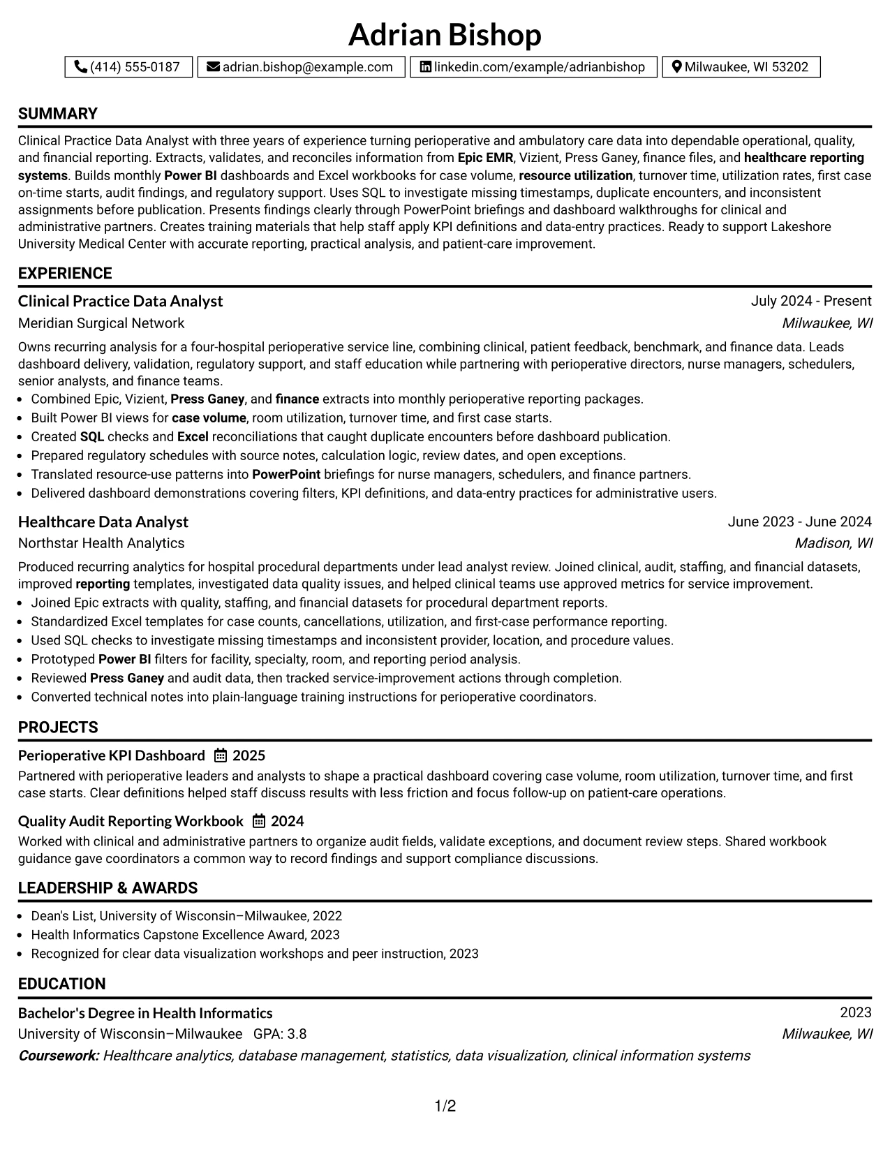
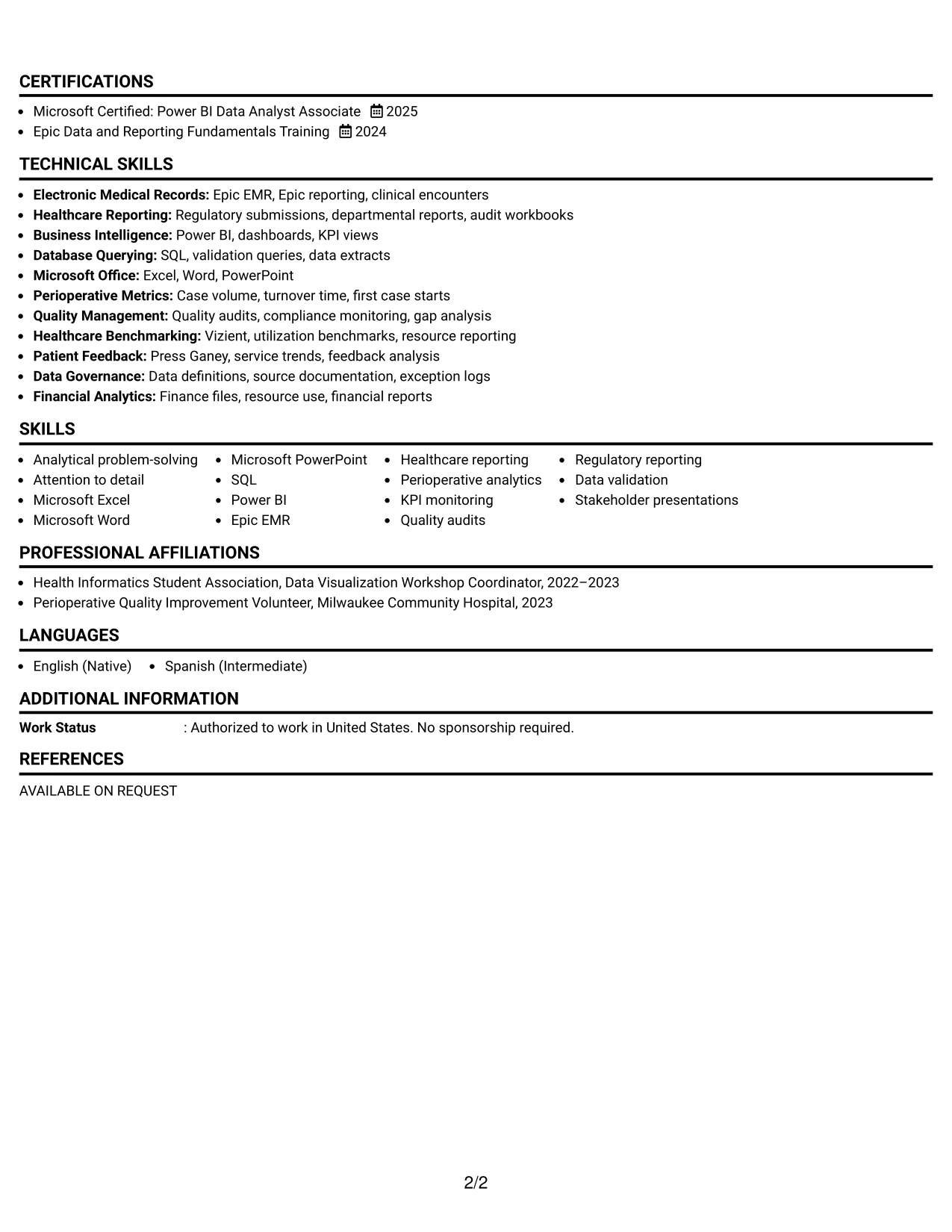
Why the One Column Boxed Contact Header Format Works for a Resume
- The boxed header keeps contact information separate from professional evidence.
- One-column reading makes chronological experience simple to follow.
- Full-width bullets can explain data sources, validation methods, and reporting outcomes.
- The format supports conventional headings that are easy for ATS tools to parse.
- Skills and certifications can appear in a clear sequence after the summary or experience.
- Projects and awards can add useful evidence without creating competing visual panels.
- The restrained structure keeps attention on scope, accuracy, and measurable work.
Best For
- ATS-conscious resumes that need conventional section order and readable text
- Candidates presenting several data sources within detailed work bullets
- Applications where contact information should be prominent but compact
- Professionals who want one consistent width for experience and project descriptions
- Documents that include awards, certifications, education, and activities
- Readers who prefer a focused format with minimal visual distraction
- Resumes that need to show data accuracy and reporting processes clearly
#30 One Column Shaded Contact Header Format
A quiet visual treatment helps the resume present Adrian Bishop's target role and qualifications with immediate clarity. The shaded contact header can establish the document's identity, while straightforward labels lead readers through the summary, skills, experience, education, certifications, and projects.
Role alignment comes from the evidence rather than decoration: Epic EMR and healthcare reporting experience, Power BI dashboards, SQL validation, regulatory schedules, quality audits, and staff education all match the documented requirements. The one-column flow keeps those connections easy to verify.
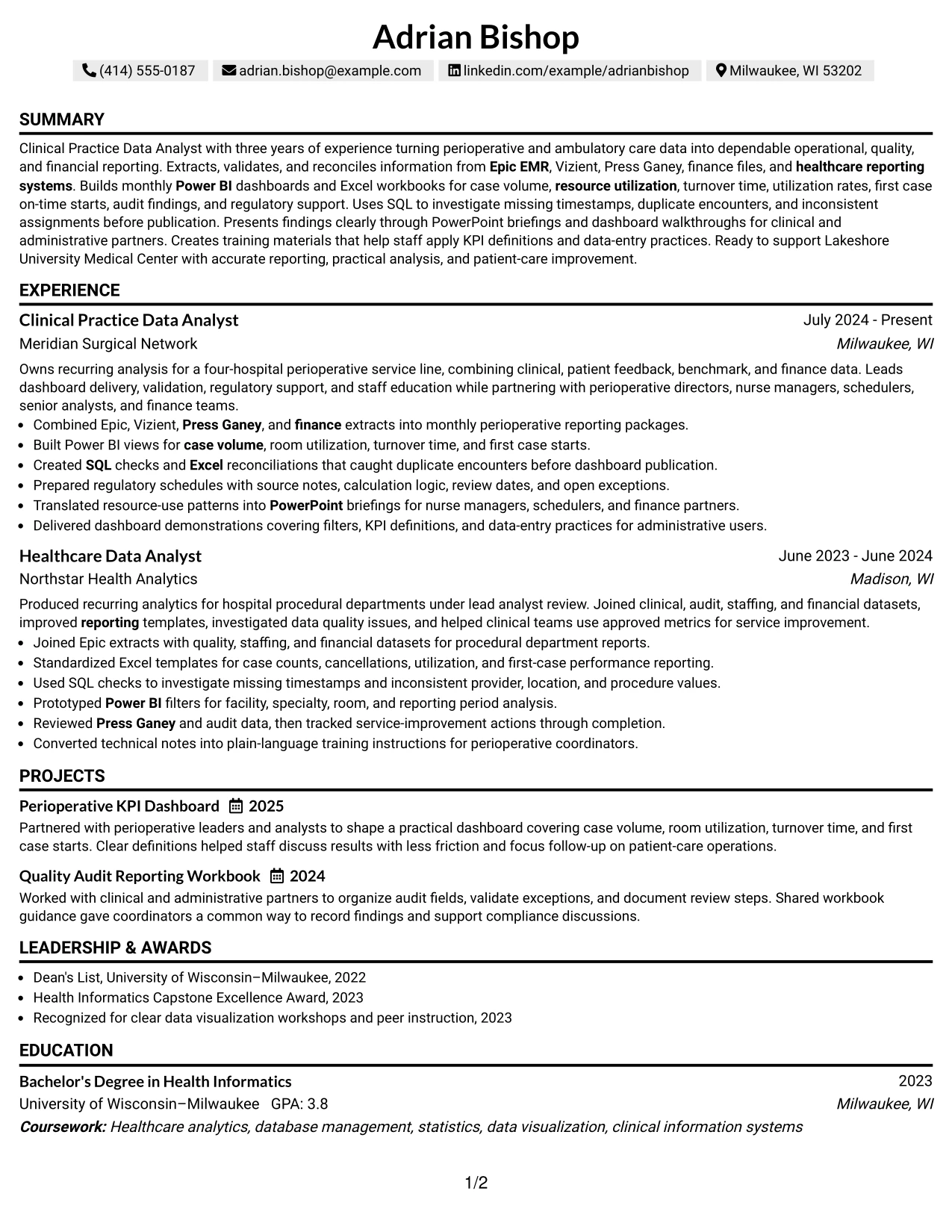
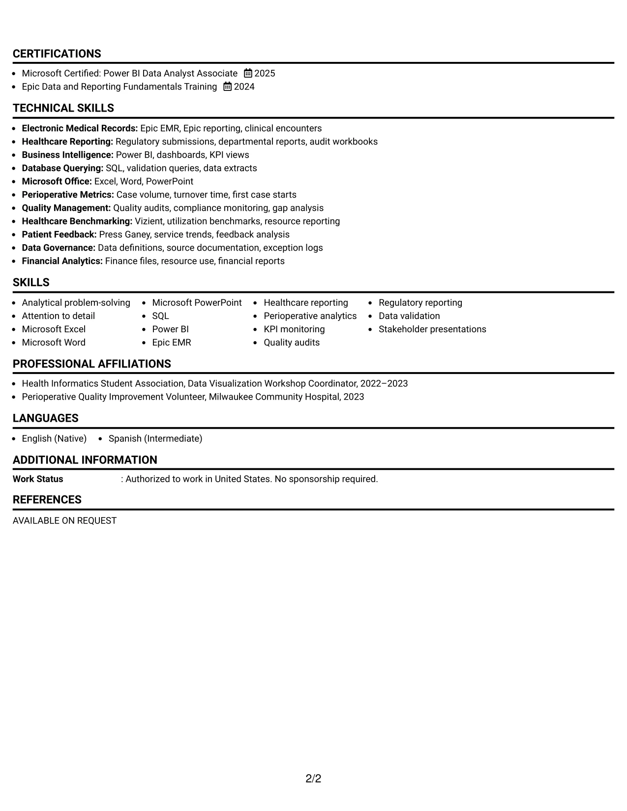
Why the One Column Shaded Contact Header Format Works for a Resume
- The shaded header creates a clear first reference point for the target role and contact details.
- A single column keeps the resume aligned with familiar review habits.
- Section labels help readers connect qualifications to the documented role requirements.
- Bullets can show both technical methods and operational results in full-width text.
- Education and certifications remain visible rather than being compressed into a side area.
- Projects and quality improvement work can reinforce the primary experience record.
- The restrained visual treatment supports a polished presentation without weakening ATS readability.
Best For
- Applications where role requirements should map clearly to resume sections
- Candidates whose evidence includes systems, reporting, validation, and staff education
- Readers who prefer a simple one-column document with visible section labels
- Resumes that need space for detailed experience and project descriptions
- Professionals presenting education and certifications as direct qualification evidence
- Documents where a shaded header adds distinction without heavy visual styling
- Applications requiring clear alignment between the target role and supporting achievements
#31 Boxed Contact Header with Job Title Format
The Boxed Contact Header with Job Title Format gives the target role a defined position before the reader reaches the detailed evidence. From there, the resume follows a familiar sequence through the professional summary, skills, experience, projects, education, certifications, and awards.
That structure supports strong keyword placement without sacrificing context. The experience section can show how Epic, Vizient, Press Ganey, Power BI, SQL, Excel, and regulatory reporting were used to produce accurate perioperative information and practical guidance for clinical and administrative teams.
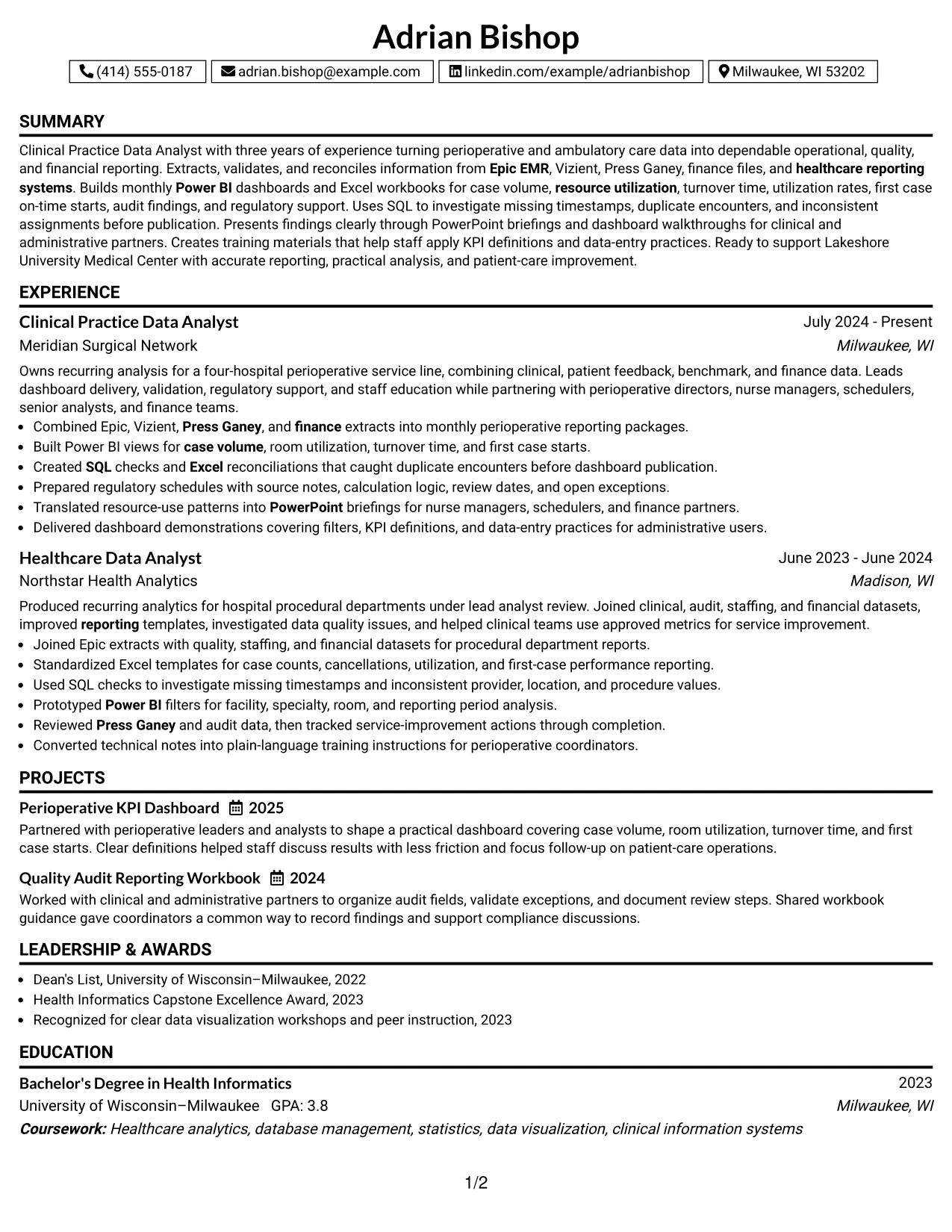
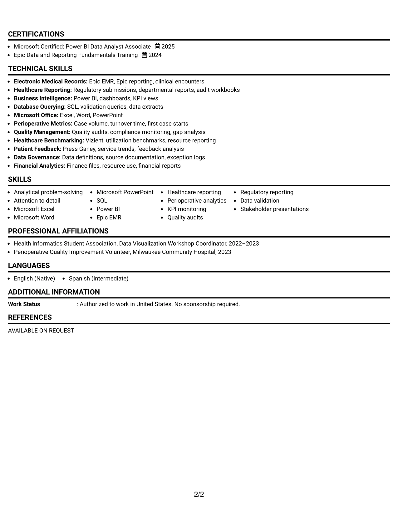
Why the Boxed Contact Header with Job Title Format Works for a Resume
- The job title appears beside the contact information, so the resume's purpose is immediately clear.
- A boxed header separates identity details from the evidence that follows.
- The single-column structure supports standard chronological experience review.
- Skills can be reinforced through bullets that explain systems, methods, and reporting outcomes.
- Projects and certifications can support the target role without interrupting work history.
- Clear headings help ATS tools and readers locate education and credentials.
- The format balances strong role identification with practical, evidence-based content.
Best For
- Applications where the target job title should be visible at the top of the page
- Resumes that need clear separation between contact details and professional evidence
- Candidates translating technical tools into operational and quality reporting results
- Documents with a conventional sequence of experience, projects, education, and certifications
- Readers who scan for role alignment before reviewing detailed bullets
- Professionals who want a defined header without using a multi-column layout
- ATS-friendly applications that benefit from explicit, familiar section labels
#32 Plain Professional Layout with Job Title & Shaded Labels
Readers can start with the job title and move downward through clearly marked sections without searching across the page. Shaded labels organize a substantial record that includes three years of analysis, two healthcare analytics positions, projects, education, certifications, awards, activities, and technical skills.
The plain professional layout gives content volume a controlled sequence. It can present detailed bullets for dashboard development, SQL investigation, Excel reconciliation, quality audit review, regulatory support, and training documentation while keeping the target role and core qualifications easy to locate.
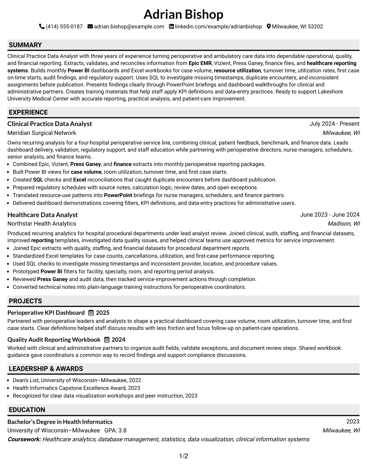
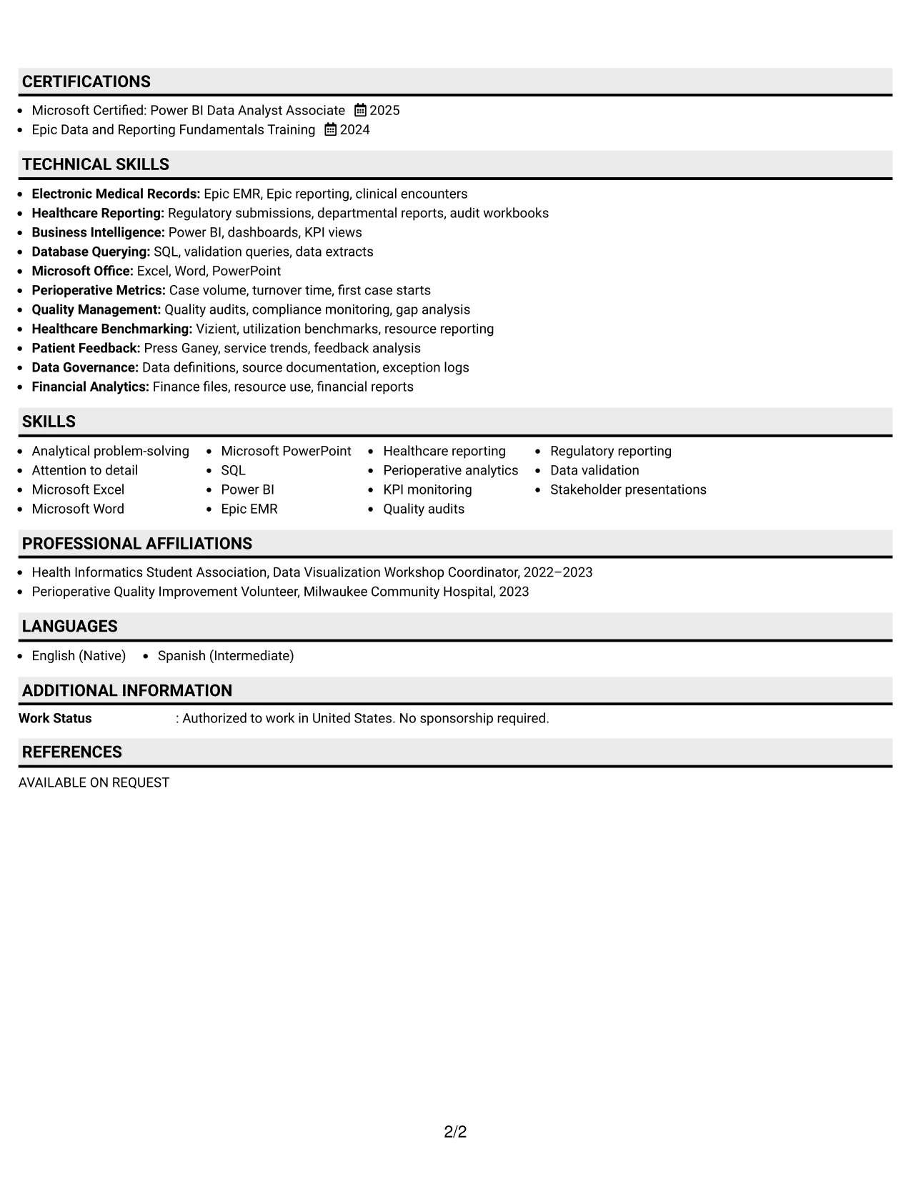
Why the Plain Professional Layout with Job Title & Shaded Labels Works for a Resume
- The top job title gives readers immediate context for the rest of the document.
- Shaded labels divide a high-information resume into manageable review points.
- A one-column flow provides room for complete bullets across two analyst roles.
- Experience evidence can connect tools to data quality, reporting, and process improvement.
- Projects, awards, activities, and certifications can be included without a crowded side panel.
- The plain presentation keeps attention on scope, responsibilities, and results.
- Consistent labels support both human scanning and ATS section recognition.
Best For
- Resumes with several sections that need a clear vertical review path
- Candidates presenting multiple roles, projects, awards, activities, and credentials
- Applications where content volume matters more than decorative styling
- Professionals who need room for complete bullets about validation and reporting work
- Readers who scan headings first and details second
- Documents that must keep technical skills visible alongside substantial experience
- ATS-aware applications using familiar labels and a straightforward page structure
#33 Classic One Column Resume Format
Reliable evidence receives priority in this classic resume structure. The opening summary can establish healthcare analytics experience, followed by skills and chronological employment bullets that document reporting scope, validation work, dashboards, audits, and stakeholder education.
A traditional one-column sequence also gives education, certifications, projects, awards, and activities a clear place after experience. For this application, conventional headings and focused bullets make qualifications such as Health Informatics, Power BI, SQL, Epic EMR, and regulatory reporting easy to verify.
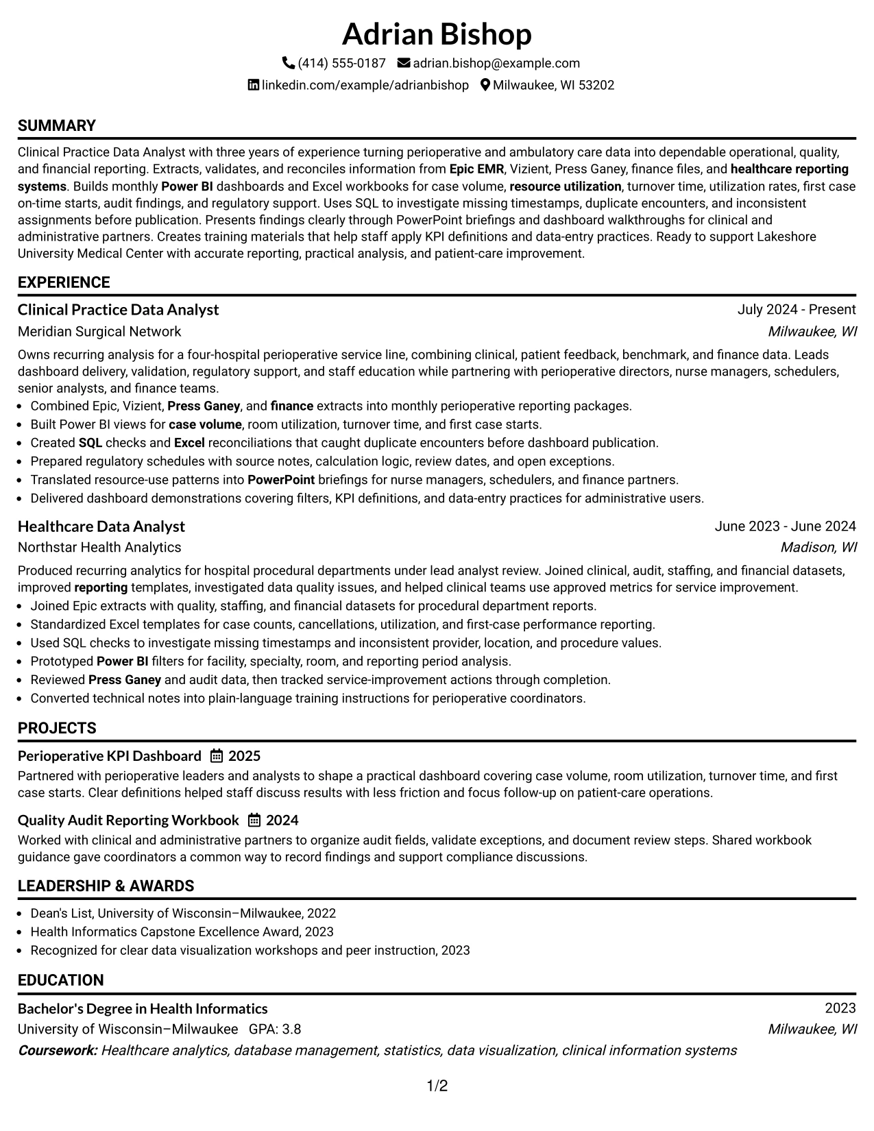
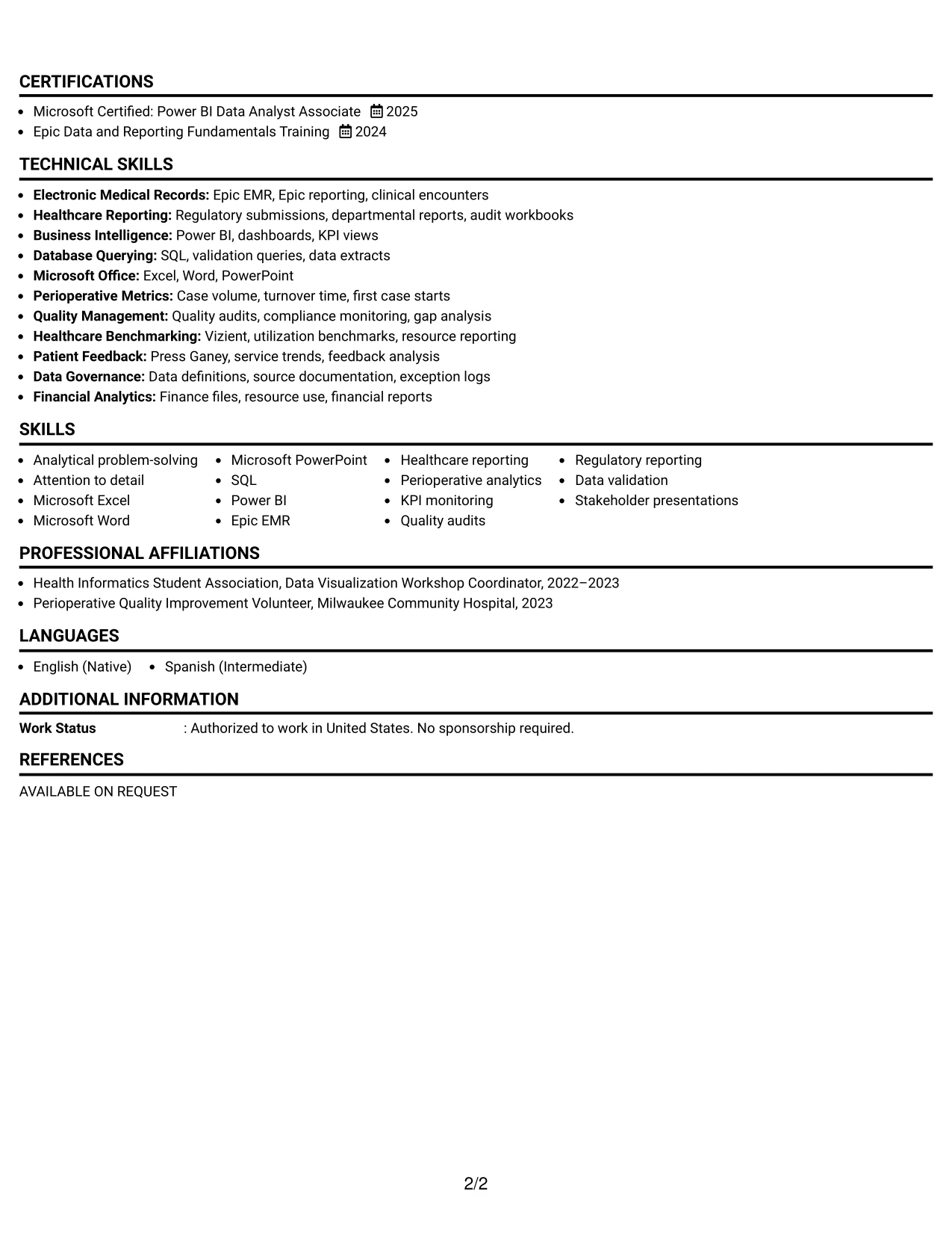
Why the Classic One Column Resume Format Works for a Resume
- The familiar structure lets readers focus on evidence instead of learning a new navigation pattern.
- Chronological bullets show progression from healthcare data analysis to perioperative reporting ownership.
- The summary and skills section place important role terms near the top.
- Full-width text supports clear explanations of validation checks, dashboards, audits, and reports.
- Education and certifications are easy to find in a standard closing sequence.
- Projects and activities can demonstrate applied knowledge without overpowering employment history.
- Conventional headings support ATS parsing and dependable recruiter review.
Best For
- ATS-focused applications that favor conventional resume organization
- Candidates whose strongest evidence comes from chronological employment history
- Professionals presenting technical skills through detailed achievement bullets
- Documents that need a clear place for education, certifications, projects, and awards
- Readers who value familiar section order and direct evidence
- Applications where healthcare reporting terms should appear naturally in context
- Resumes that prioritize credibility, completeness, and easy verification
Why Build Your Clinical Practice Data Analyst - Perioperative Services Resume with ResumeInMinutes
ResumeInMinutes helps you turn healthcare analytics work into a structured resume that is easier to review and adapt. You can present reporting systems, technical tools, quality work, projects, and stakeholder communication without burying the evidence in long paragraphs.
- Multiple resume formats
- ATS-readable section structure
- Role-focused keyword guidance
- Clear experience and project presentation
- Free PDF resume previews
- Resume customization support
For this role, a well-organized resume can make your work with clinical data, reporting systems, dashboards, audit findings, and process improvement easier to assess. Choose a format that keeps dates, job titles, tools, education, and measurable contributions visible.
See Also
- 33 Clinical Practice Data Analyst Resume Templates with Example 2026 (ATS-Optimized)
- 33 Clinical Data Analyst Resume Templates with Example 2026 (ATS-Optimized)
- 33 Inpatient Coder - Clinical Data Analyst Resume Templates with Example 2026 (ATS-Optimized)
- 7 Analyst/Associate: Equity Research - Telecommunication, Data Center and Tower Resume Templates with Example
- 33 Analyst, Data Analytics Resume Templates with Example 2026 (ATS-Optimized)
- 33 Associate Actuarial Data Analyst, Reserving Resume Templates with Example 2026 (ATS-Optimized)
- 33 Associate Data Analyst Resume Templates with Example 2026 (ATS-Optimized)
- 33 Associate eCommerce Data Analyst Resume Templates with Example 2026 (ATS-Optimized)
- 30+ Clinical Practice Data Analyst Cover Letter Templates with Example 2026
- 30+ Clinical Data Analyst Cover Letter Templates with Example 2026
Frequently Asked Questions
Are these Clinical Practice Data Analyst - Perioperative Services resume templates ATS-friendly?
Yes. The layouts use readable headings and organized sections that help parsing systems and reviewers find experience, education, skills, certifications, and role-specific terms such as Epic EMR, Power BI, SQL, and healthcare reporting.
Are these separate resumes?
No. The guide presents one Clinical Practice Data Analyst - Perioperative Services resume example in multiple layouts and design styles. The content can be adjusted to match your own evidence.
What should a Clinical Practice Data Analyst - Perioperative Services resume include?
Include a focused summary, relevant experience, education, technical skills, projects, certifications, and measurable reporting contributions. Highlight data collection, validation, dashboards, KPI monitoring, quality audits, regulatory work, and communication with non-technical stakeholders when applicable.
Which keywords matter for this resume?
Useful terms may include Epic EMR, Vizient, Press Ganey, Power BI, SQL, Microsoft Excel, case volume, resource utilization, turnover time, first case on-time starts, quality audit data, regulatory reporting, and data validation. Include only keywords supported by your background.
Can I download the resume templates as PDFs?
Yes. Each resume design offers a free PDF download so you can review the layout and select a format that keeps your information readable.
Which resume style works best for this position?
A clean one-column or simple two-column format usually works well because it keeps technical skills, reporting experience, education, and achievements easy to scan. Avoid design elements that make dates, headings, or keywords difficult for ATS software to read.
How can I show analytical achievements on this resume?
Use concise bullet points that identify the data source, analysis or validation step, and result. Examples include catching duplicate encounters, improving reporting consistency, preparing regulatory schedules, building KPI dashboards, or helping teams act on utilization and quality findings when those results are accurate for you.
Should I include a photo on my resume?
For applications in the United States, a no-photo resume is usually the safer choice. Use the space for relevant skills, experience, certifications, projects, or measurable achievements.
Can I customize these resume templates?
Yes. You can update the resume text, sections, skills, dates, design style, and PDF layout to reflect your Clinical Practice Data Analyst - Perioperative Services qualifications accurately.