33 Data Analytics Intern - Summer 2026 - IntelliScript Resume Templates with Example 2026 (ATS-Optimized)
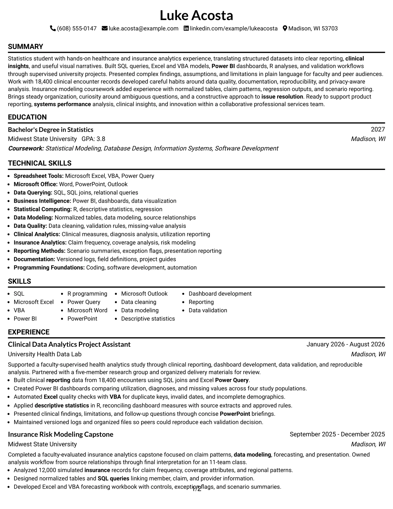
This guide shows you how to create a clear, focused Data Analytics Intern - Summer 2026 - IntelliScript resume. It helps you organize relevant evidence and compare professional resume formats so your qualifications are easy to review.
Strong resumes for this role connect education, analytics projects, and practical experience to the work described in the posting. This guide explains how to present SQL queries, Excel and VBA work, Power BI dashboards, R analysis, data validation, reporting, and clear presentations without overcrowding the page.
The resume example is presented in 33 ATS-friendly layouts, with guidance on section order, keyword placement, measurable bullet points, technical skills, certifications, and project descriptions. Use the examples to select a format that supports fast scanning and accurate ATS parsing.
What Makes a Great Data Analytics Intern - Summer 2026 - IntelliScript Resume in 2026
An effective resume is focused, evidence-based, and easy to scan. It connects statistics education with analytics projects, reporting work, data quality habits, and clear communication.
Use relevant keywords such as SQL, Microsoft Excel, VBA, Power BI, R, data modeling, data visualization, data validation, clinical insights, reporting, and descriptive statistics when they accurately reflect your background.
The examples shown below are intentionally detailed to demonstrate a range of experiences, skills, accomplishments and relevant keywords. We prefer detailed resumes as they provide more context to the hiring managers and also help the ATS systems identify relevant qualifications and score your resume better for a match. But the length of a resume is an individual choice. If you want a one page resume, just keep the most relevant experience and information for the job. Note: Resume examples are created for educational purposes; references to real organizations do not imply affiliation or endorsement.
#1 Simple One Column Format Resume Example
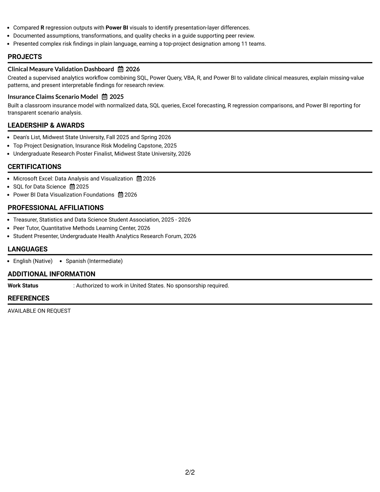
Simple One Column Format places the professional summary, experience, education, projects, certifications, and skills in one steady reading path. For Luke Acosta's Data Analytics Intern resume, that order gives early visibility to SQL, Excel, VBA, Power BI, R, and healthcare analytics experience.
A single column supports reliable ATS parsing and quick review. Short bullets show measurable scope, such as 18,400 clinical encounters and four study populations, while clear section headings separate technical tools from education, awards, and leadership.
Why the Simple One Column Format Works for a Resume
- A single reading path helps ATS systems process section headings and resume text in sequence.
- The summary can connect statistics education with healthcare and insurance analytics evidence.
- Experience bullets keep tools such as SQL, Excel, VBA, Power BI, and R close to the results they support.
- Measured scope, including 18,400 encounters and 12,000 simulated records, adds credibility without lengthy explanation.
- Projects can reinforce the experience section by showing data modeling, forecasting, validation, and reporting work.
- Education, certifications, awards, and activities remain easy to find near the end of the document.
- Consistent spacing reduces visual distractions and supports a fast recruiter scan.
Best For
- Applicants who want one clear path from summary to skills and experience
- Resumes that need dependable ATS parsing across common application systems
- Candidates with technical tools that should appear beside related accomplishments
- Documents that include both academic projects and supervised experience
- Readers who prefer familiar headings and straightforward bullet points
- Applications where measurable data volume strengthens the evidence
- Resumes that must present education, certifications, and awards without competing columns
Resume Keywords
- healthcare
- insurance
- Data Analysis
- reporting
- systems performance
- clinical insights
- innovation
- Excel
- VBA
- Power BI
- SQL
- Data Modeling
- R
- Programming
- Coding
#2 Plain One Column with Shaded Labels Resume Example
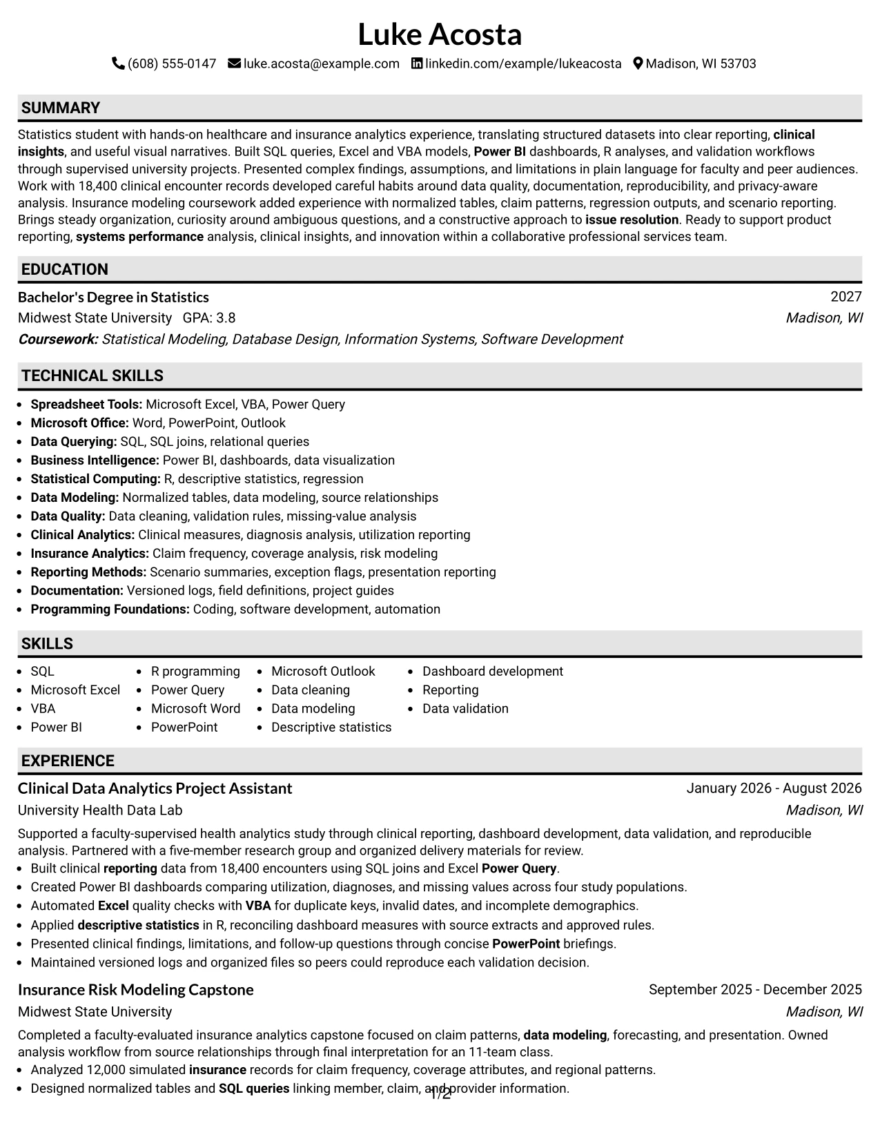
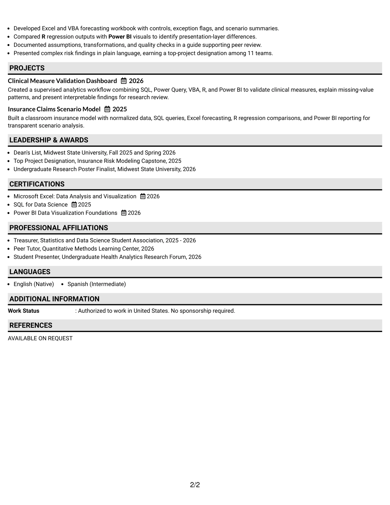
A recruiter moves from the summary into labeled sections, then down through experience, projects, education, and skills. Plain One Column with Shaded Labels makes each transition visible without interrupting the evidence in the bullets.
The format can hold substantial content for a data analytics internship. It gives room for SQL queries, Excel and VBA modeling, Power BI dashboards, R analysis, certifications, and detailed project work while keeping the page orderly and ATS-readable.
Why the Plain One Column with Shaded Labels Works for a Resume
- Shaded labels create clear signposts for Summary, Experience, Education, Projects, and Skills.
- A full-width column gives longer bullets enough room to explain actions and outcomes.
- The format supports keyword placement in both the skills section and accomplishment bullets.
- Technical tools remain connected to evidence instead of appearing as an isolated list.
- Academic projects can receive enough detail to show analysis, modeling, documentation, and presentation.
- Certifications and awards can be added without forcing important experience into narrow spaces.
- Simple hierarchy helps a reviewer compare sections quickly and helps parsing software read the content in order.
Best For
- Resumes with several content groups that need strong section signposts
- Applicants presenting both supervised work and substantial academic projects
- Documents with detailed technical bullets that benefit from full-width lines
- Candidates who need room for certifications, honors, and student activities
- Applications where ATS-friendly hierarchy matters more than decorative design
- Readers who want a calm page with visible transitions between topics
- Resumes that must show tools, methods, and results without compressing the evidence
#3 One Column Format with Photo Right Resume Example
The strongest evidence receives priority: the summary states the analytics focus, and the experience bullets then prove it with clinical reporting, dashboard development, validation, and insurance modeling. One Column Format with Photo Right keeps that evidence in a familiar sequence while reserving a defined area for the supplied photo treatment.
For this Data Analytics Intern application, the resume can lead with SQL, Excel, VBA, Power BI, R, and measurable project scope. The photo should remain secondary to readable headings, ATS-friendly text, and bullets that explain data quality and reporting work.
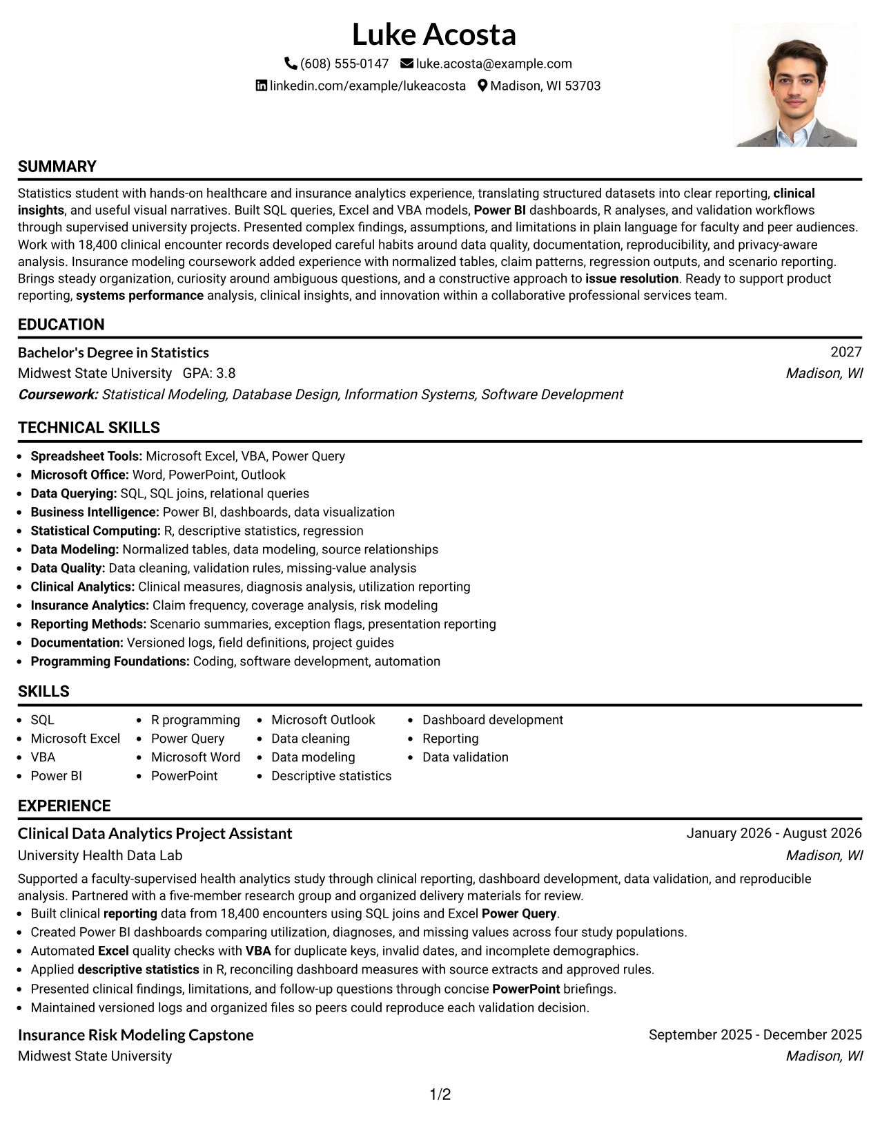
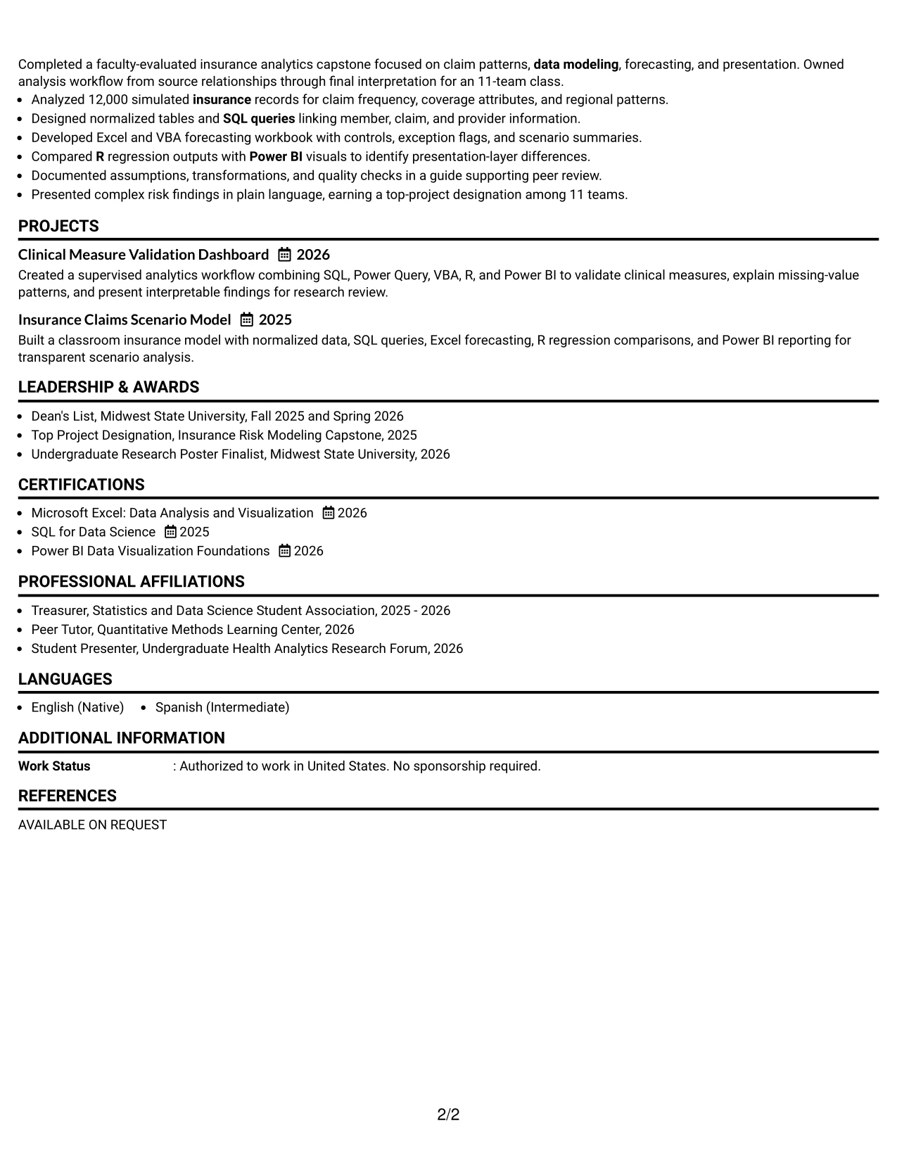
Why the One Column Format with Photo Right Works for a Resume
- The primary text column keeps experience and project evidence easy to follow.
- A defined right-side photo area can add visual identity without displacing the main resume content.
- The summary quickly links statistics education to healthcare and insurance analytics.
- Bullets show practical use of SQL, Excel, VBA, Power BI, R, and Power Query.
- Data volumes and comparison groups make the analytical work more concrete.
- Education and certifications remain in the same predictable sequence as the experience evidence.
- Clear text hierarchy helps preserve usability when the resume is reviewed digitally or parsed by software.
Best For
- Applicants who want a defined photo area while keeping evidence in one text column
- Resumes where experience and projects should remain in a familiar top-to-bottom order
- Applications that benefit from a concise visual identity alongside strong technical content
- Candidates with measurable datasets, validation work, and reporting outcomes to foreground
- Documents that need room for tool-specific bullets rather than compressed side content
- Readers who value a clear summary-to-experience progression
- Use cases where the photo treatment is appropriate and the text remains the primary information source
#4 Clean Two Column Sidebar Format Resume Example
Content is balanced between a focused main column and a compact sidebar. Clean Two Column Sidebar Format can place the summary, experience, and projects in the main area while reserving the sidebar for skills, certifications, education, and selected awards.
That arrangement suits an application that asks for both technical preparation and clear communication. The main column can carry results from 18,400 clinical encounters and 12,000 simulated insurance records, while the sidebar makes SQL, Excel, VBA, Power BI, R, and certifications easy to locate.
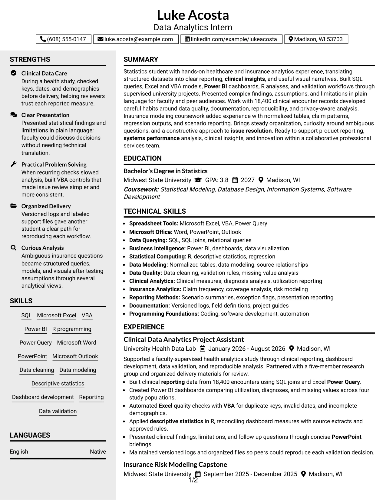
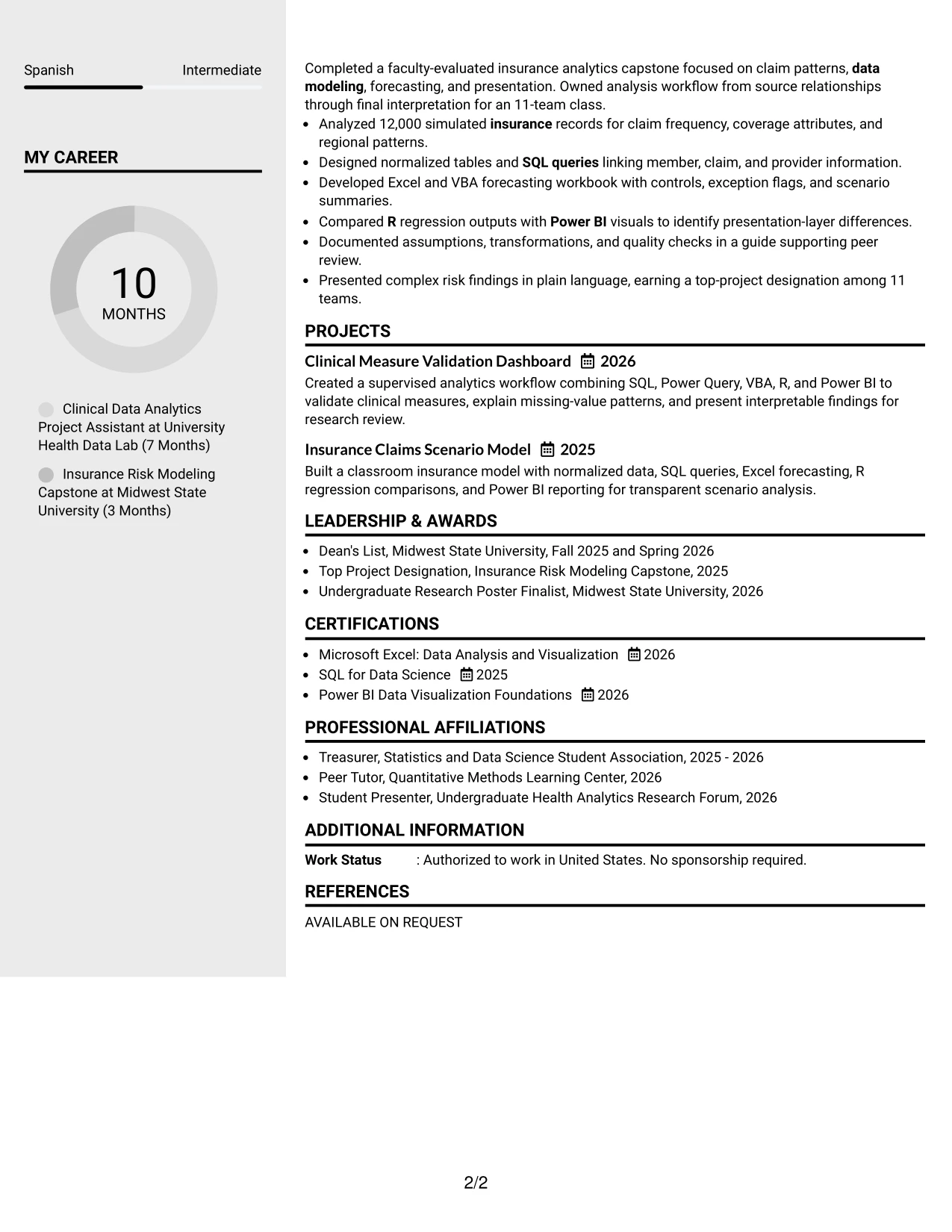
Why the Clean Two Column Sidebar Format Works for a Resume
- The main column gives accomplishment bullets enough space for actions, methods, and results.
- A sidebar gathers high-value scan items such as skills, certifications, and education.
- The format supports a quick match between job requirements and documented evidence.
- Technical keywords remain visible without crowding the experience narrative.
- Projects can show data modeling, forecasting, validation, and presentation work in the main column.
- A concise sidebar helps reviewers locate Microsoft Office proficiency and analytics tools.
- Balanced columns give the resume a professional structure while retaining readable section hierarchy.
Best For
- Applications that require both detailed evidence and a fast skills check
- Resumes with a strong set of tools, certifications, and education details to group together
- Candidates who want projects and experience to receive the widest reading area
- Documents matching a technical job description with a compact keyword sidebar
- Readers who scan qualifications first and then review accomplishment bullets
- Applications that benefit from separating supporting credentials from core evidence
- Resumes with enough content to justify two columns without forcing long bullets into narrow widths
#5 Two Column Format Resume Example
A practical application resume needs to show both technical range and proof of use. Two Column Format can place the summary, experience, and projects in one area while organizing skills, education, certifications, awards, and activities in the other.
For the Data Analytics Intern role, this visual fit keeps the core story focused on reporting, systems performance, clinical insights, and innovation. It also makes related qualifications visible without repeating them throughout the experience bullets.
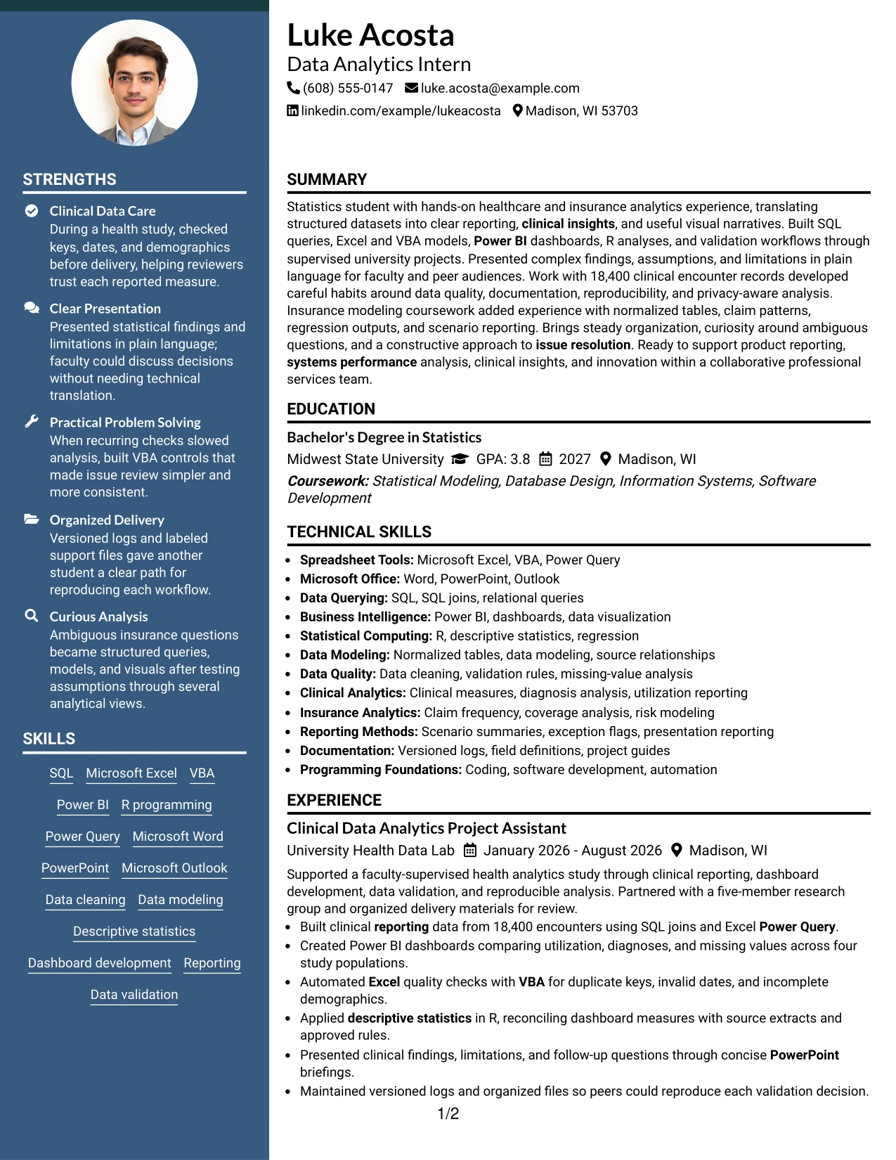
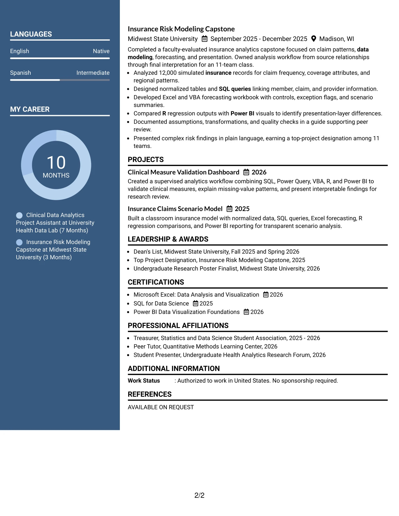
Why the Two Column Format Works for a Resume
- Two columns distinguish core evidence from supporting qualifications.
- The main area can carry complete bullets about SQL joins, dashboards, validation, and presentations.
- A secondary area can group Excel, VBA, Power BI, R, Microsoft Office, and data modeling.
- Projects can sit near experience so academic work receives appropriate weight.
- Education and certifications remain visible without taking attention from measurable results.
- The format helps a reviewer compare the resume with a structured internship description.
- Careful spacing keeps the design useful while avoiding excessive repetition of keywords.
Best For
- Applicants whose resume combines technical evidence with several supporting credentials
- Documents that need a visible skills area without placing skills above all experience
- Candidates presenting academic projects alongside supervised analytics work
- Applications with distinct groups for education, certifications, awards, and activities
- Readers who prefer a clear split between accomplishments and qualification details
- Resumes that benefit from compact organization across a moderate amount of content
- Use cases where visual balance matters but the experience bullets must remain complete
#6 Photo Header Two Column Format Resume Example
A restrained visual hierarchy keeps the photo header separate from the resume evidence. Photo Header Two Column Format can introduce the candidate and contact details at the top, then divide the page between accomplishment-focused experience and concise supporting information.
The role alignment is clear when the main column emphasizes clinical reporting, insurance modeling, dashboards, SQL, and data validation. The secondary column can hold education, certifications, skills, and awards so the page supports both technical review and a polished professional presentation.
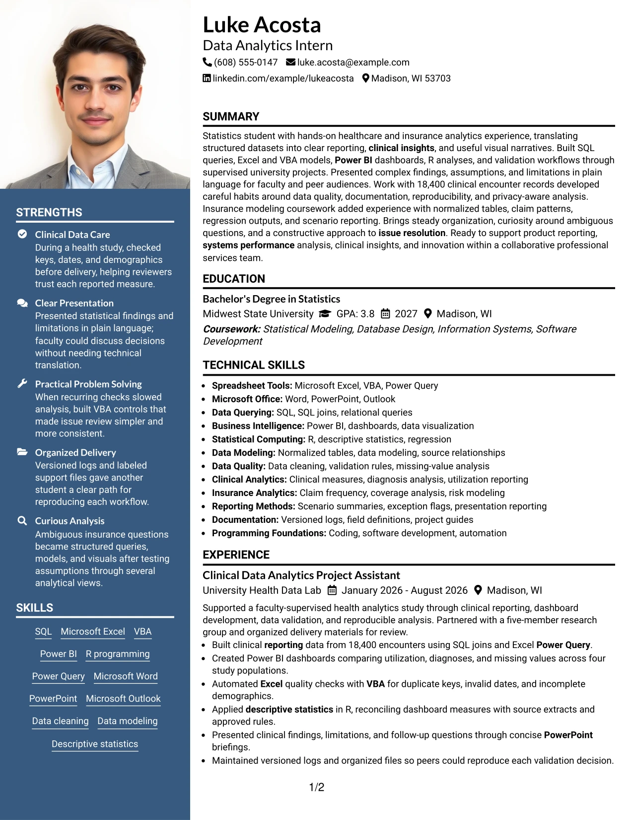
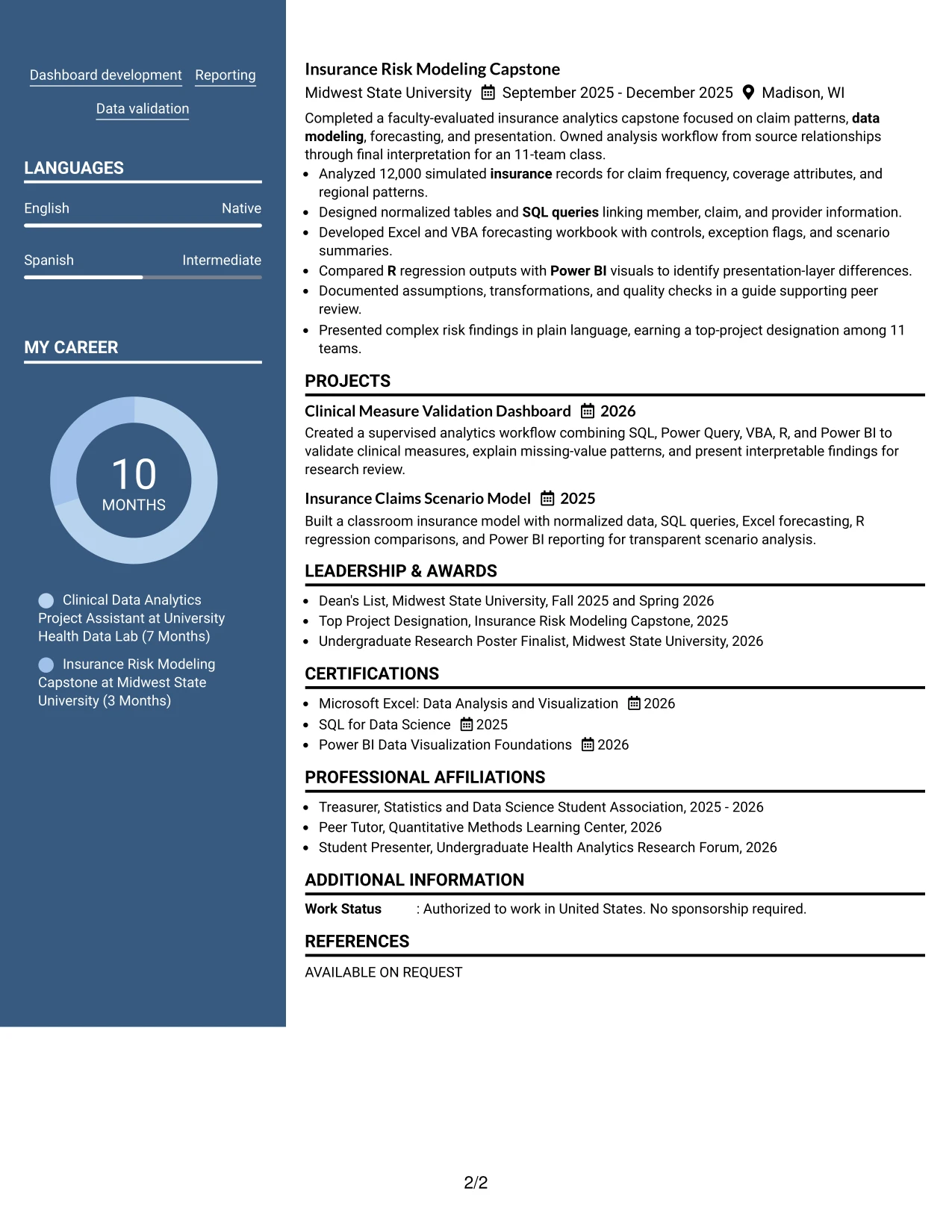
Why the Photo Header Two Column Format Works for a Resume
- A defined photo header creates a clear top identity area without replacing the professional summary.
- The main column gives analytics accomplishments room to explain methods and results.
- The secondary column keeps skills, certifications, education, and awards available for quick review.
- The layout can align directly with requirements for Excel, VBA, Power BI, SQL, R, and Microsoft Office.
- Clinical and insurance projects provide evidence for reporting, modeling, and data quality work.
- The two-column structure separates detailed proof from compact qualification lists.
- A restrained hierarchy keeps the photo treatment from competing with readable resume content.
Best For
- Applicants using a photo header where that presentation is appropriate for the application context
- Resumes that need a clear split between accomplishment evidence and qualification details
- Candidates aligning technical tools with a data analytics internship description
- Documents that include both clinical and insurance analytics projects
- Readers who want contact information and identity elements separated from the work history
- Applications that benefit from a polished header and concise supporting sidebar
- Resumes with enough distinct content to support two columns without reducing readability
#7 Simple Two Column Format Resume Example
Simple Two Column Format divides the resume into two direct information zones without adding unnecessary visual complexity. One side can carry the summary, experience, and projects; the other can present skills, education, certifications, awards, and activities.
The structure supports quick scanning while preserving evidence. A reviewer can see SQL queries, Excel and VBA forecasting, Power BI dashboards, R analysis, and presentation results without searching through a dense single block of text.
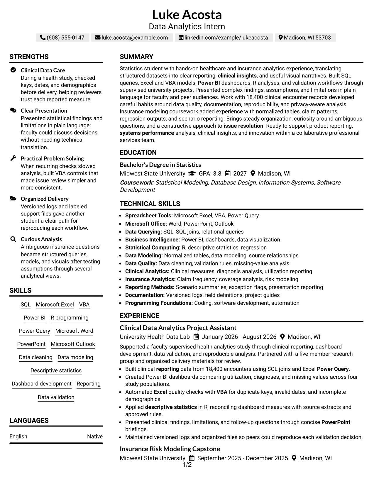
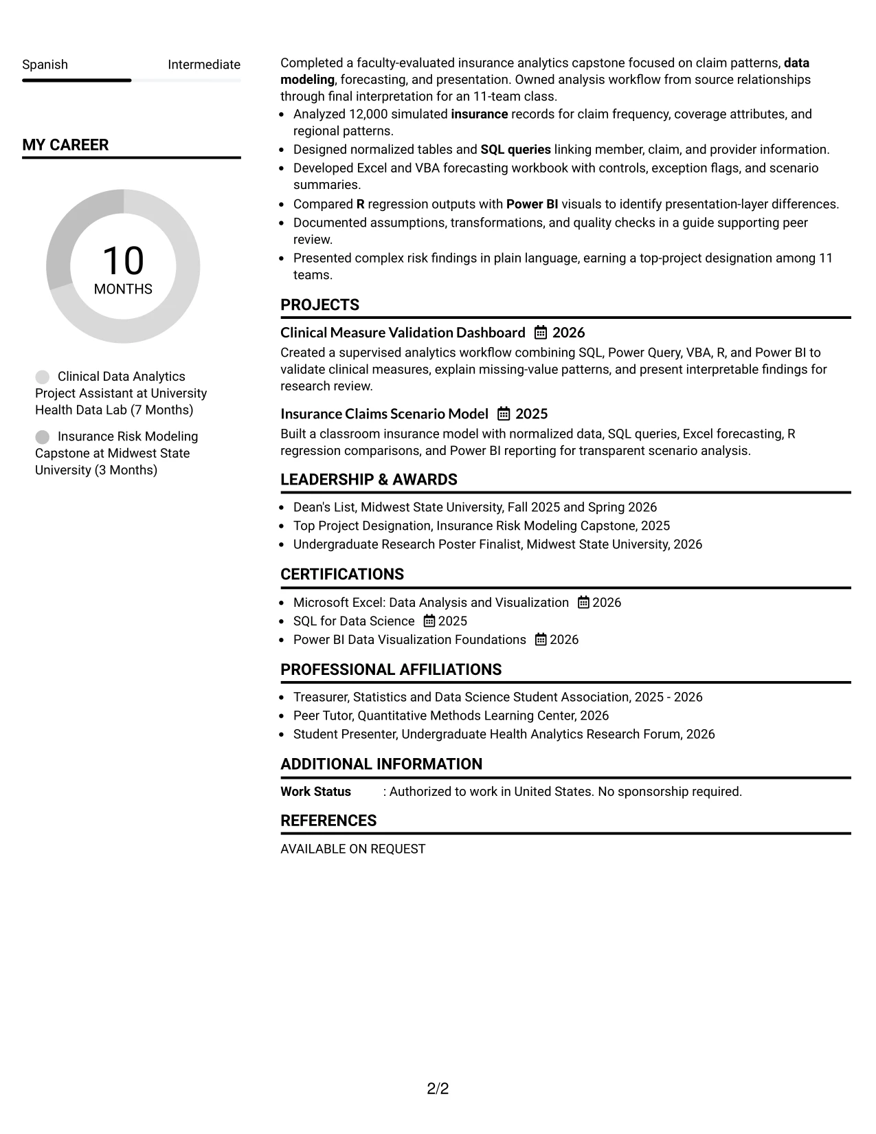
Why the Simple Two Column Format Works for a Resume
- Two straightforward zones make the document easy to scan from the summary to supporting details.
- The main section can preserve complete accomplishment bullets and measurable outcomes.
- The companion section can group tools, certifications, education, awards, and activities.
- Simple bullets keep technical evidence readable at a glance.
- The layout supports both ATS-conscious text and human review when spacing is controlled.
- Projects can demonstrate data modeling, validation, forecasting, and visual reporting.
- A restrained structure reduces decoration and keeps attention on qualifications.
Best For
- Resumes that need a clear division between experience and supporting information
- Applicants with a compact but varied set of skills, projects, and credentials
- Candidates who want technical bullets to remain prominent during a quick scan
- Applications where straightforward organization is more useful than elaborate styling
- Documents combining academic preparation with practical analytics evidence
- Readers who prefer short lists beside a complete experience narrative
- Resumes that need two-column efficiency without heavy visual elements
#8 Text/Fang Style Resume Example
Readers can move from a centered introduction through experience, projects, education, and skills in a measured sequence. Text/Fang Style gives each section room for explanatory bullets, which helps connect technical methods with the decisions or checks they supported.
For this internship resume, the format can carry SQL joins, Power Query, VBA quality checks, Power BI comparisons, R statistics, and presentation work without reducing the supporting context. The result is a text-forward document with clear hierarchy and useful content volume.
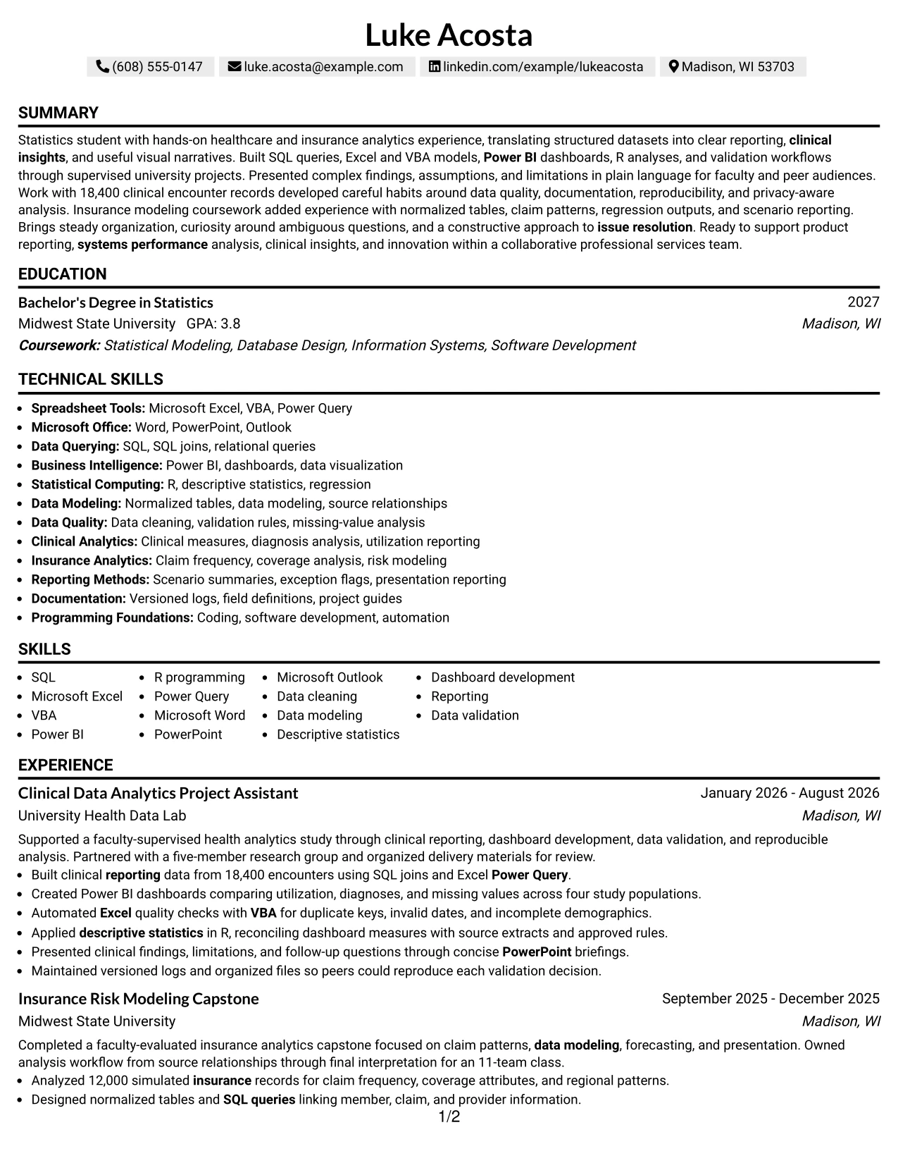
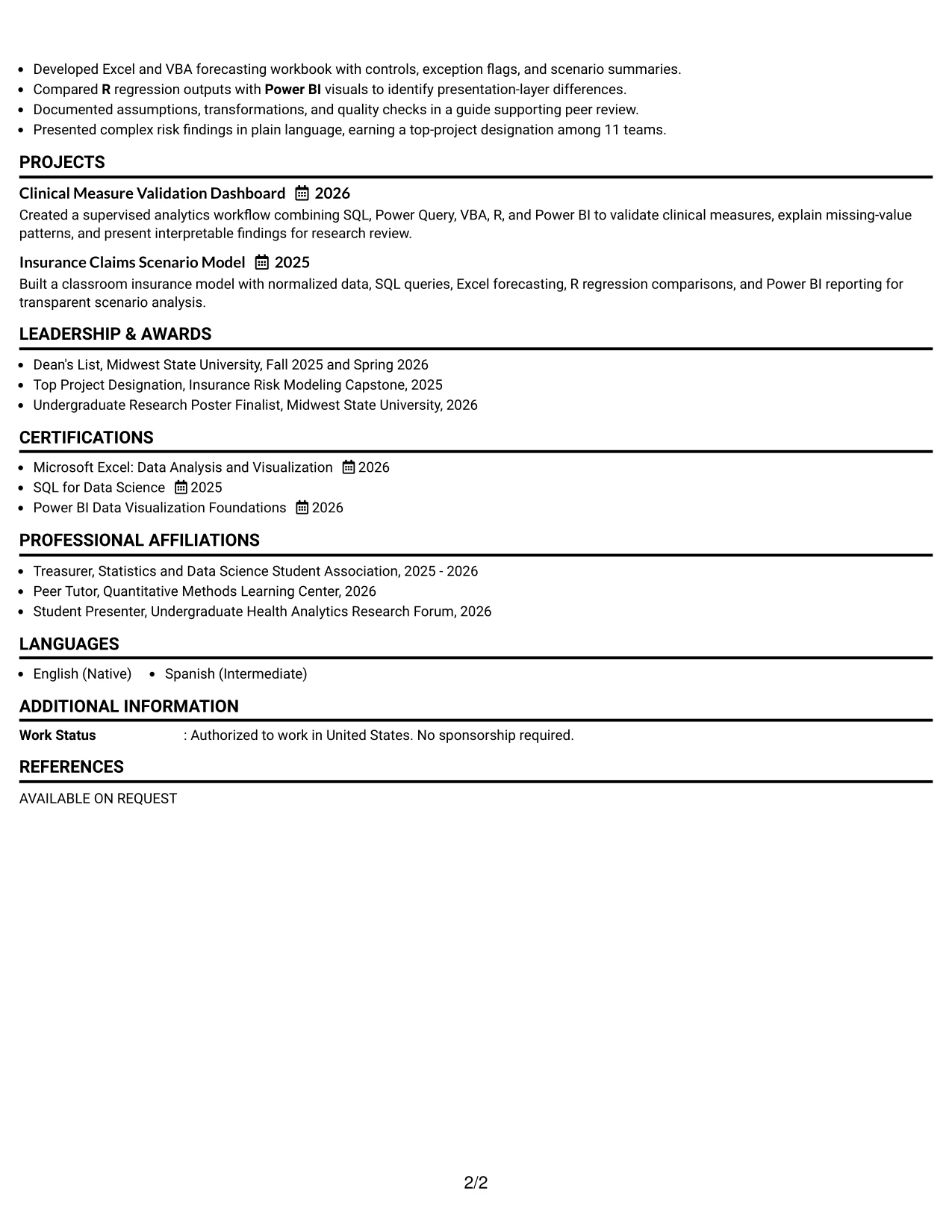
Why the Text/Fang Style Works for a Resume
- A text-forward structure gives each section enough room for meaningful detail.
- Experience bullets can state the tool, analytical action, and resulting review value.
- Project entries can explain assumptions, transformations, and quality checks clearly.
- The format supports keyword coverage for SQL, Excel, VBA, Power BI, R, and data visualization.
- Longer content remains organized through consistent headings and spacing.
- Education, certifications, honors, and activities can follow the evidence without appearing disconnected.
- A calm reading sequence supports careful review of technical and communication strengths.
Best For
- Resumes with detailed project explanations that need more than short keyword lists
- Applicants who want methods and results presented together in readable bullets
- Candidates with multiple analytical tools to explain through real examples
- Documents that include assumptions, limitations, validation, and documentation details
- Applications where content volume is important but section hierarchy must remain clear
- Readers who prefer a text-led review of experience and academic work
- Resumes that need room for both technical evidence and presentation experience
#9 One Column Boxed Contact Header Format Resume Example
The evidence begins beneath a clearly defined contact header, allowing the reviewer to confirm the target role and then assess the summary, experience, projects, and skills. One Column Boxed Contact Header Format gives the document a firm starting point without dividing the main content into narrow areas.
For the Data Analytics Intern application, the resume can feature healthcare reporting, insurance risk modeling, and measurable data-quality work in a direct sequence. The boxed header stays functional, while the body carries keywords such as SQL, Excel, VBA, Power BI, R, and data visualization.
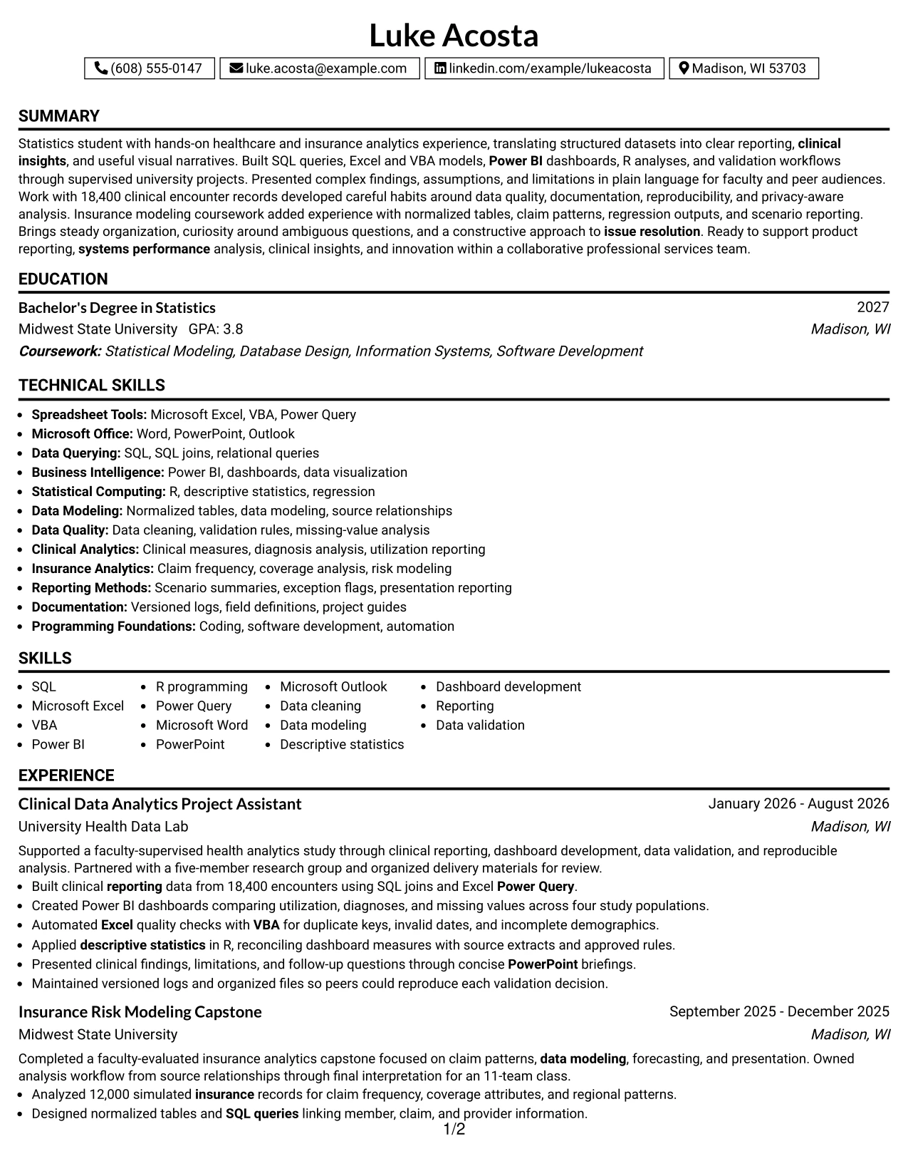
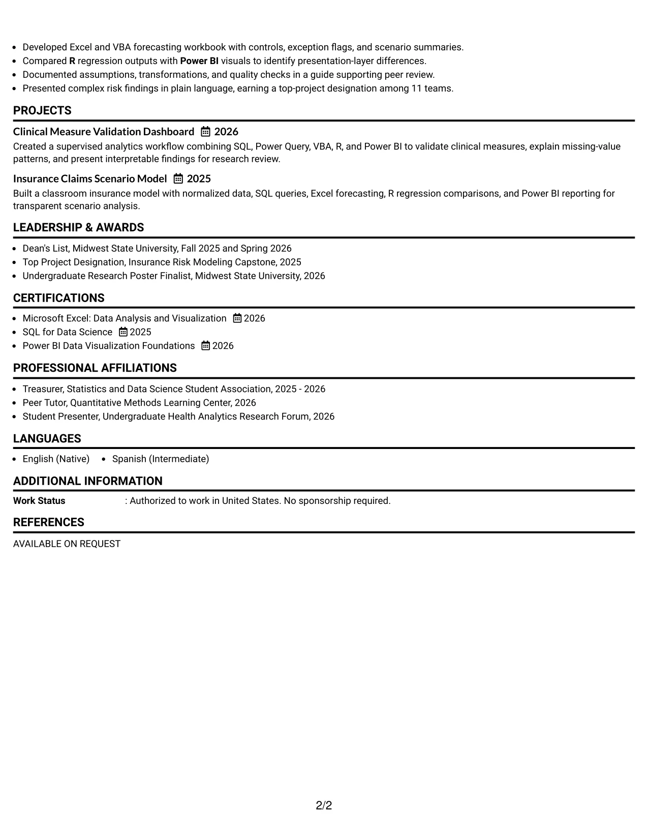
Why the One Column Boxed Contact Header Format Works for a Resume
- A defined contact header makes identity and contact details easy to confirm.
- The one-column body keeps experience and project evidence in a predictable order.
- The summary can establish statistics education and applied healthcare analytics experience.
- Bullets provide direct proof through encounter counts, study populations, and team presentation work.
- Technical keywords appear naturally in skills, projects, and accomplishment statements.
- Education, certifications, awards, and activities remain easy to locate below the core evidence.
- The format supports a polished first impression without sacrificing ATS-readable text.
Best For
- Applicants who want contact details clearly separated from the resume body
- Resumes where evidence should begin immediately below a strong identification area
- Candidates with measurable project scope that benefits from a direct reading sequence
- Applications requiring visible alignment with tools such as SQL, Excel, VBA, and Power BI
- Documents combining healthcare reporting with insurance analysis
- Readers who prefer one-column review and clearly bounded contact information
- Resumes that need a polished header while preserving straightforward ATS structure
#10 Plain Two Column Format Resume Example
Content is balanced across two readable columns so an application reviewer can compare core experience with supporting qualifications. Plain Two Column Format gives the main column space for the summary, experience, and projects, while the other column can present education, certifications, skills, and selected achievements.
Luke Acosta's resume can use that balance to connect a Statistics degree, clinical analytics work, insurance modeling, and relevant tools with the Data Analytics Intern requirements. The snapshot below highlights the strongest evidence for quick review before the full resume sections.
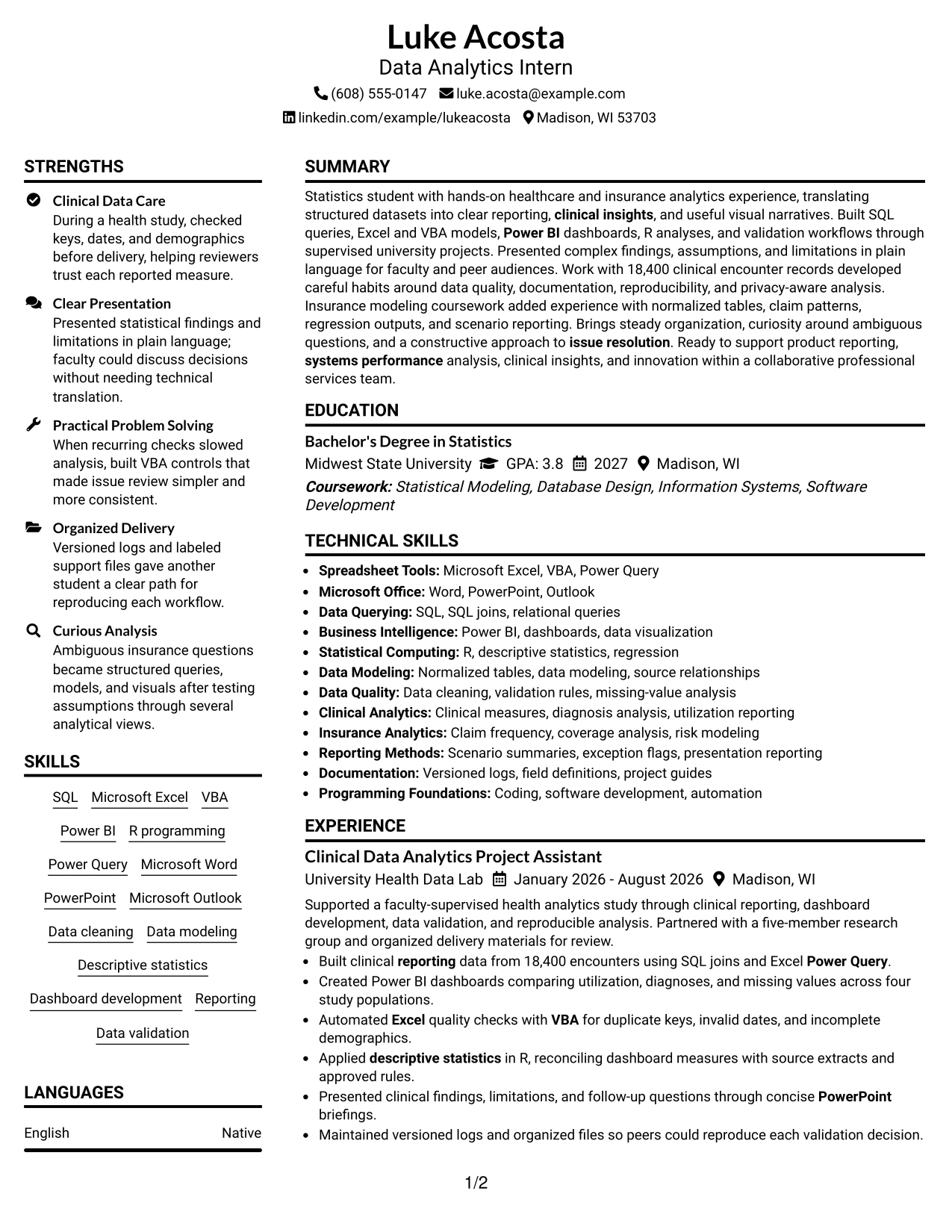
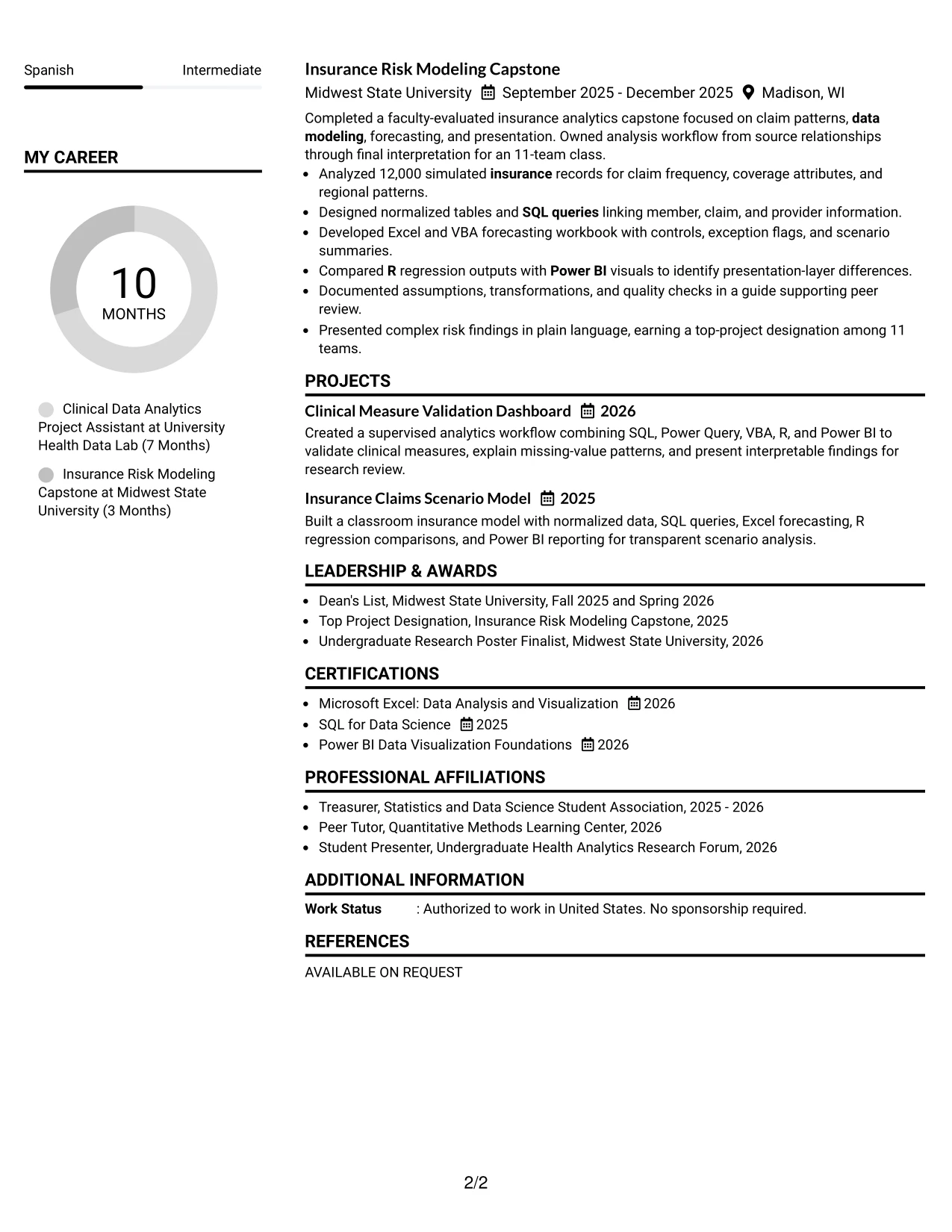
Resume Snapshot
- Statistics student pursuing a Bachelor of Science degree through May 2027
- Built clinical reporting data from 18,400 encounters using SQL joins and Excel Power Query
- Created Power BI dashboards and VBA checks for reporting and data validation
- Completed insurance modeling work with 12,000 simulated records, SQL, Excel, R, and Power BI
Why the Plain Two Column Format Works for a Resume
- The two-column structure balances detailed experience with compact qualification information.
- The snapshot gives a reviewer four quick facts before the full section review.
- The main column can show actions, tools, data scope, and measurable outcomes.
- A supporting column can organize skills, education, certifications, and awards.
- The layout reflects the role's need for analysis, reporting, communication, and attention to detail.
- Plain styling keeps section headings and keywords easy to recognize.
- Projects and experience can remain distinct while still appearing within one coherent document.
#11 Colored Two Column Format Resume Example
A practical application benefits from clear contrast between the main evidence and supporting qualifications. Colored Two Column Format can use restrained color to separate the summary, experience, and projects from skills, education, certifications, and awards without changing the resume's content hierarchy.
For this Data Analytics Intern application, the visual fit is strongest when color remains secondary to proof. The main content can show clinical reporting, SQL, Excel, VBA, Power BI, R, and insurance modeling, while the companion column supports quick qualification checks.
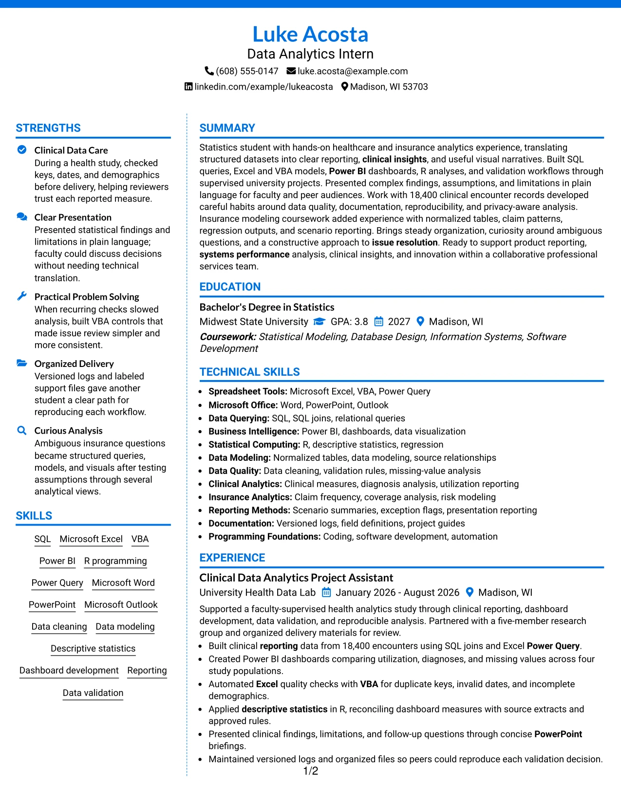
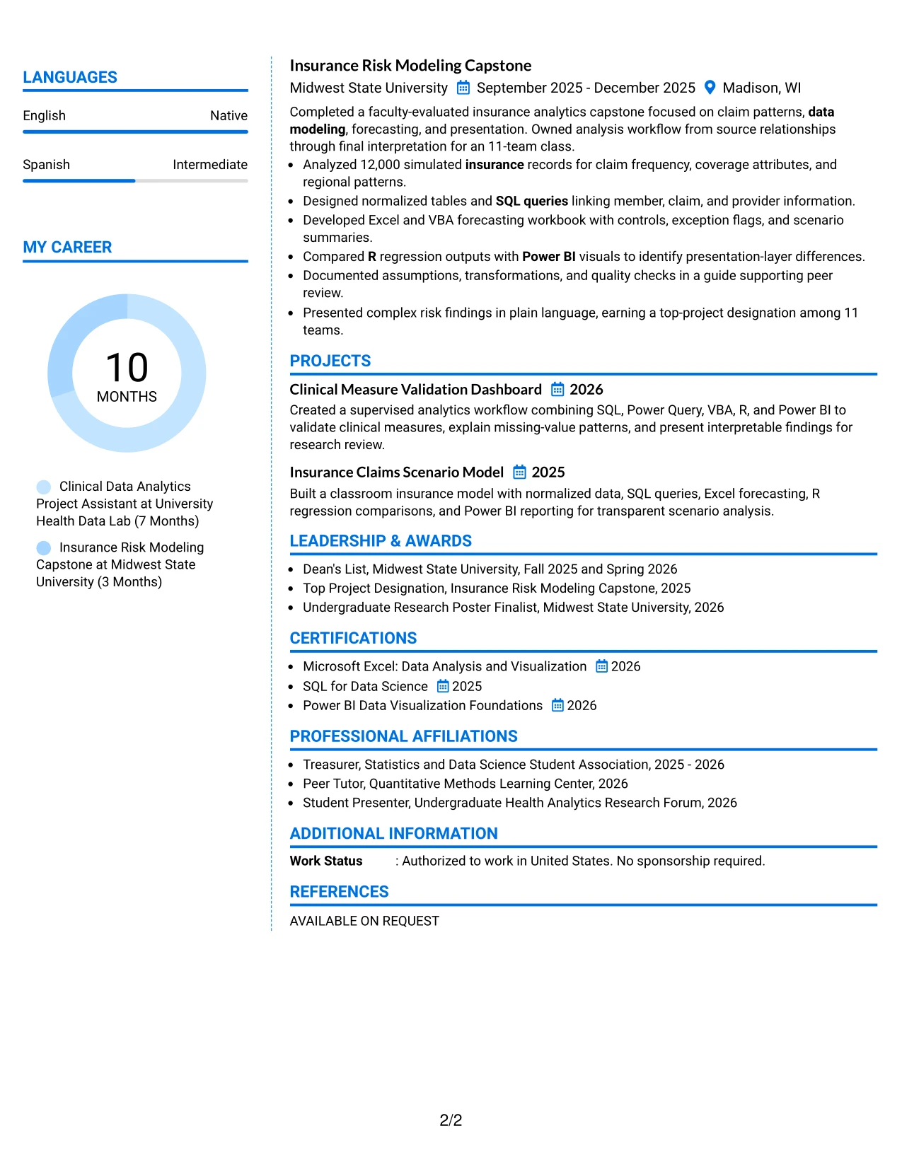
Why the Colored Two Column Format Works for a Resume
- Color can distinguish columns while consistent headings preserve resume navigation.
- The main column provides room for complete evidence about analytics projects and supervised work.
- The supporting column can group skills, education, certifications, awards, and activities.
- Technical keywords remain visible without overwhelming the accomplishment bullets.
- Measured scope helps the design communicate substance rather than relying on decoration.
- The format can support a quick comparison with requirements for Excel, SQL, Power BI, R, and communication.
- Restrained color keeps the presentation professional and allows the content to remain central.
Best For
- Applicants who want gentle color to separate two information groups
- Resumes that need a strong visual distinction between evidence and qualifications
- Candidates with enough content for a main experience area and a compact support column
- Applications where technical keywords should be easy to locate during a quick review
- Documents pairing healthcare analytics with insurance modeling or related project evidence
- Readers who appreciate visual organization but still need familiar resume structure
- Resumes that use color carefully so ATS-readable text and measurable results remain central
#12 One Column Shaded Contact Header Format Resume Example
A restrained shaded header gives the resume a clear professional hierarchy without distracting from the evidence. Contact details and the target role are easy to identify, while the single-column structure keeps education, experience, projects, and skills in a natural reading order.
For a Data Analytics Intern application, this format can present SQL, Excel, VBA, Power BI, R, and data validation near the top of the document. Strong bullets then connect those tools to 18,400 clinical encounters, four study populations, 12,000 simulated insurance records, and reproducible reporting workflows.
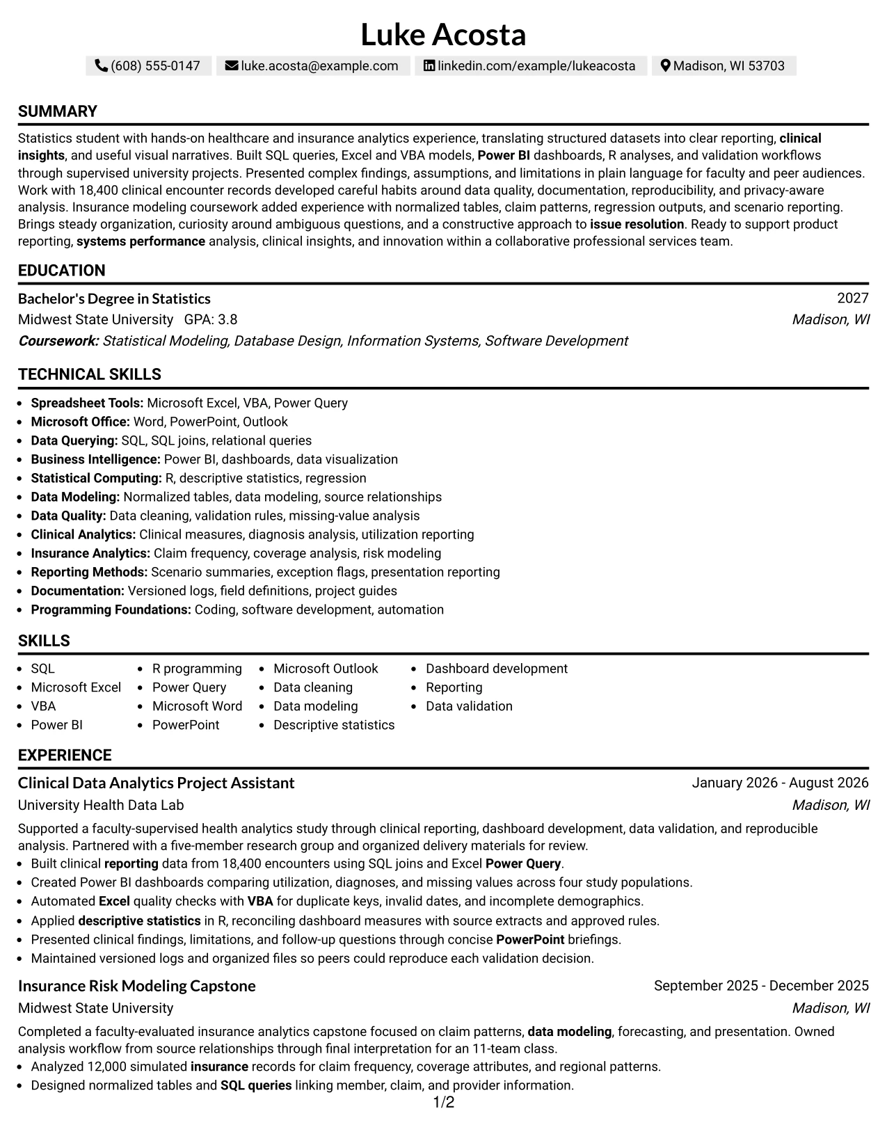
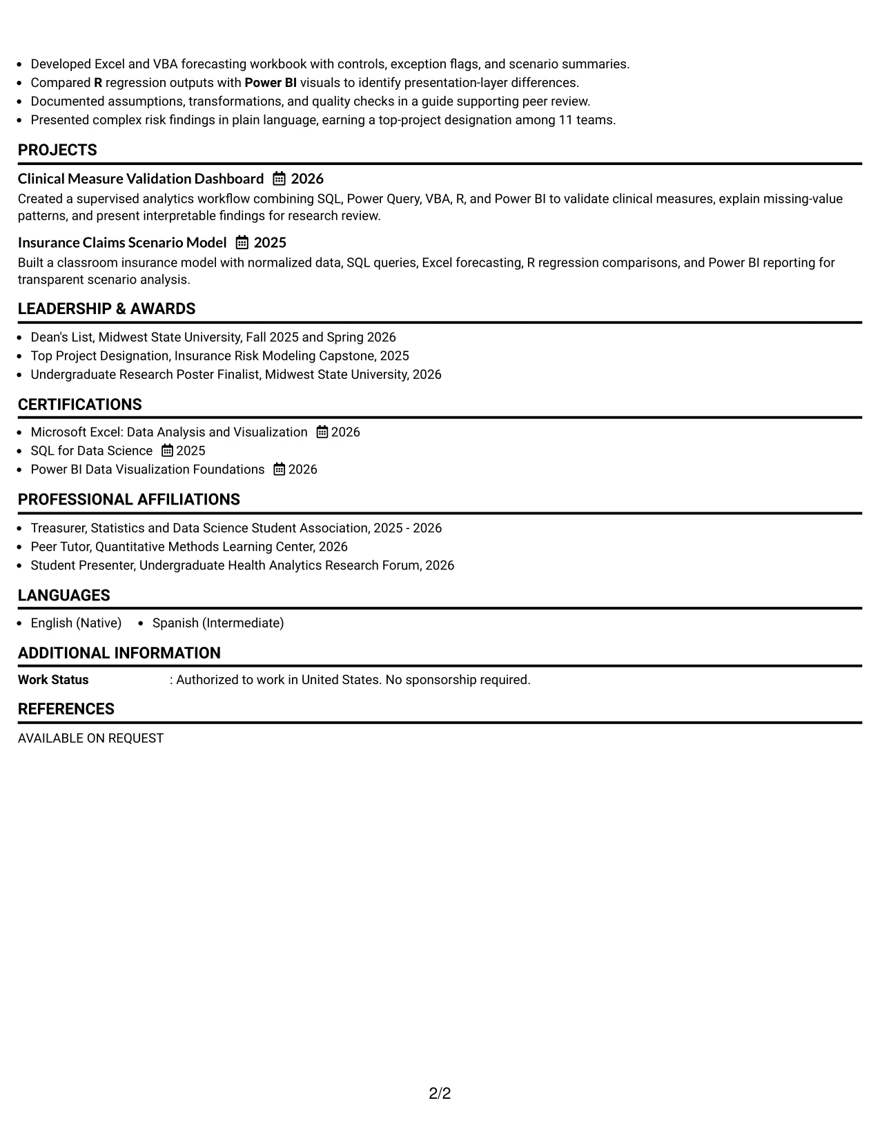
Why the One Column Shaded Contact Header Format Works for a Resume
- The shaded contact area separates personal details from the main resume content.
- A single column supports reliable ATS parsing and predictable section order.
- The job title can appear near the contact details for immediate role alignment.
- A professional summary gives reviewers context before they reach the experience bullets.
- Technical skills can be grouped clearly without competing with achievement statements.
- Numbered results such as 18,400 encounters and four study populations stand out in readable bullets.
- Education, certifications, projects, and activities remain easy to scan from top to bottom.
Best For
- Applicants who want a direct visual connection between the resume and the Data Analytics Intern role.
- Resumes that need one-column ATS readability with a modest visual distinction.
- Candidates presenting several technical tools alongside short, evidence-based bullets.
- Applications where education and supervised project work should appear in a clear sequence.
- Documents that benefit from a shaded contact area without adding visual complexity.
- Resumes combining healthcare analytics, insurance modeling, and reporting evidence.
- Readers who need to move quickly from the summary to measurable project results.
#13 Boxed Contact Header with Job Title Format Resume Example
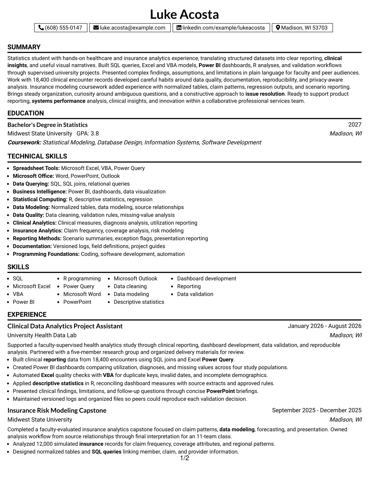
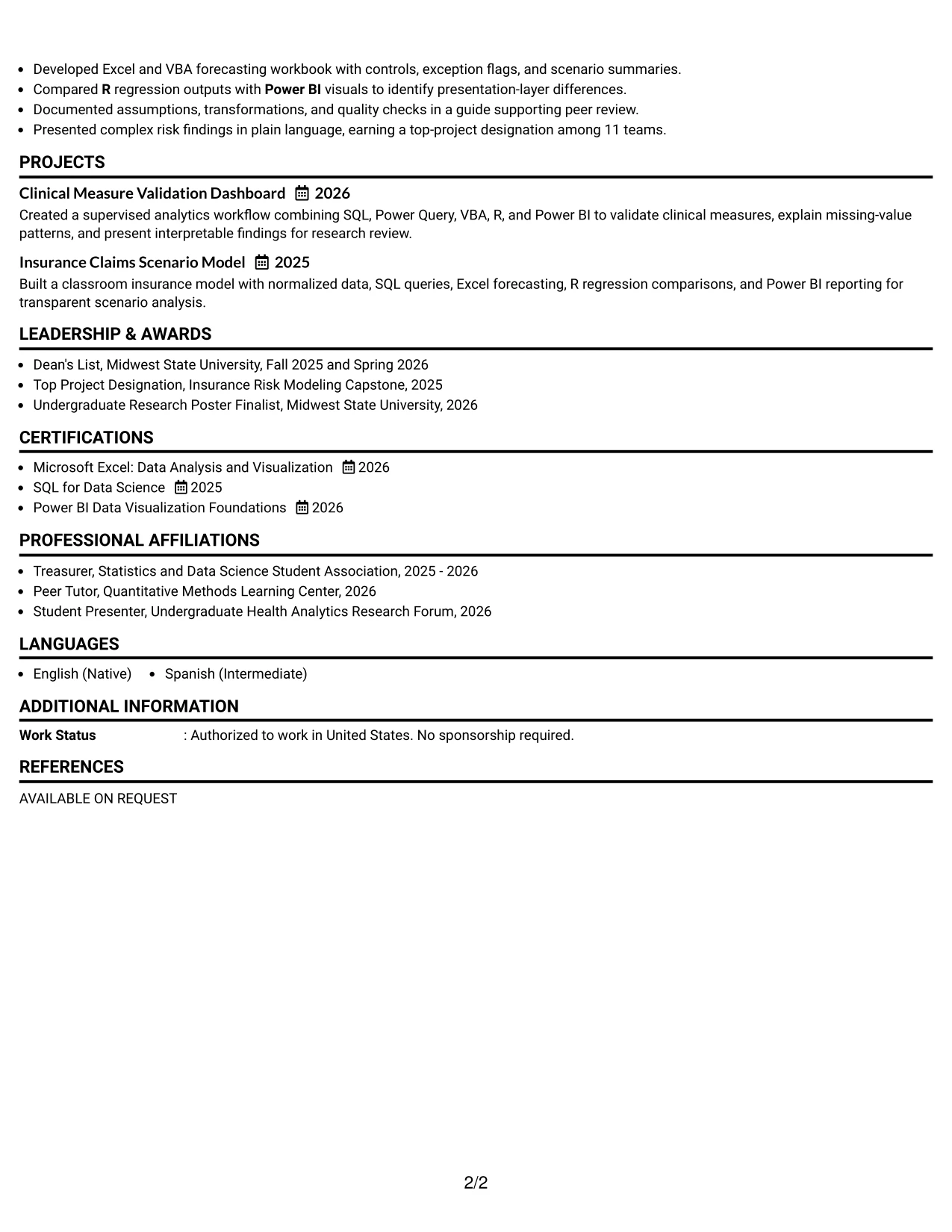
The Boxed Contact Header with Job Title Format places the target role and contact information inside a defined top section. Below it, the resume can move through summary, experience, projects, education, certifications, and skills with clear boundaries between content groups.
That structure suits a data analytics application because the resume contains both technical keywords and detailed project evidence. SQL queries, Excel and VBA modeling, Power BI dashboards, R analysis, reporting, and documentation can be presented in focused sections that remain easy to locate.
Why the Boxed Contact Header with Job Title Format Works for a Resume
- The boxed header makes the target role visible during the first resume scan.
- A dedicated title area supports alignment with the posted Data Analytics Intern position.
- One-column reading order helps ATS tools identify headings and bullet content.
- Separated sections prevent technical skills from being buried under project descriptions.
- Experience bullets can show actions, tools, and outcomes in a consistent pattern.
- Education and certifications remain visible for a student pursuing a statistics degree.
- The format supports concise presentation without removing important analysis details.
Best For
- Applications that require the intended role to be visible before the experience section.
- Resumes with several distinct sections that benefit from boxed visual separation.
- Candidates who want a structured one-column document for ATS review.
- Student resumes balancing coursework, certifications, projects, and applied experience.
- Readers comparing technical keywords with the evidence that supports each skill.
- Applications where clear headings can speed review across analytics, reporting, and modeling content.
- Documents that need a formal layout while keeping the page easy to follow.
#14 Stylish Two Column Designer Format Resume Example
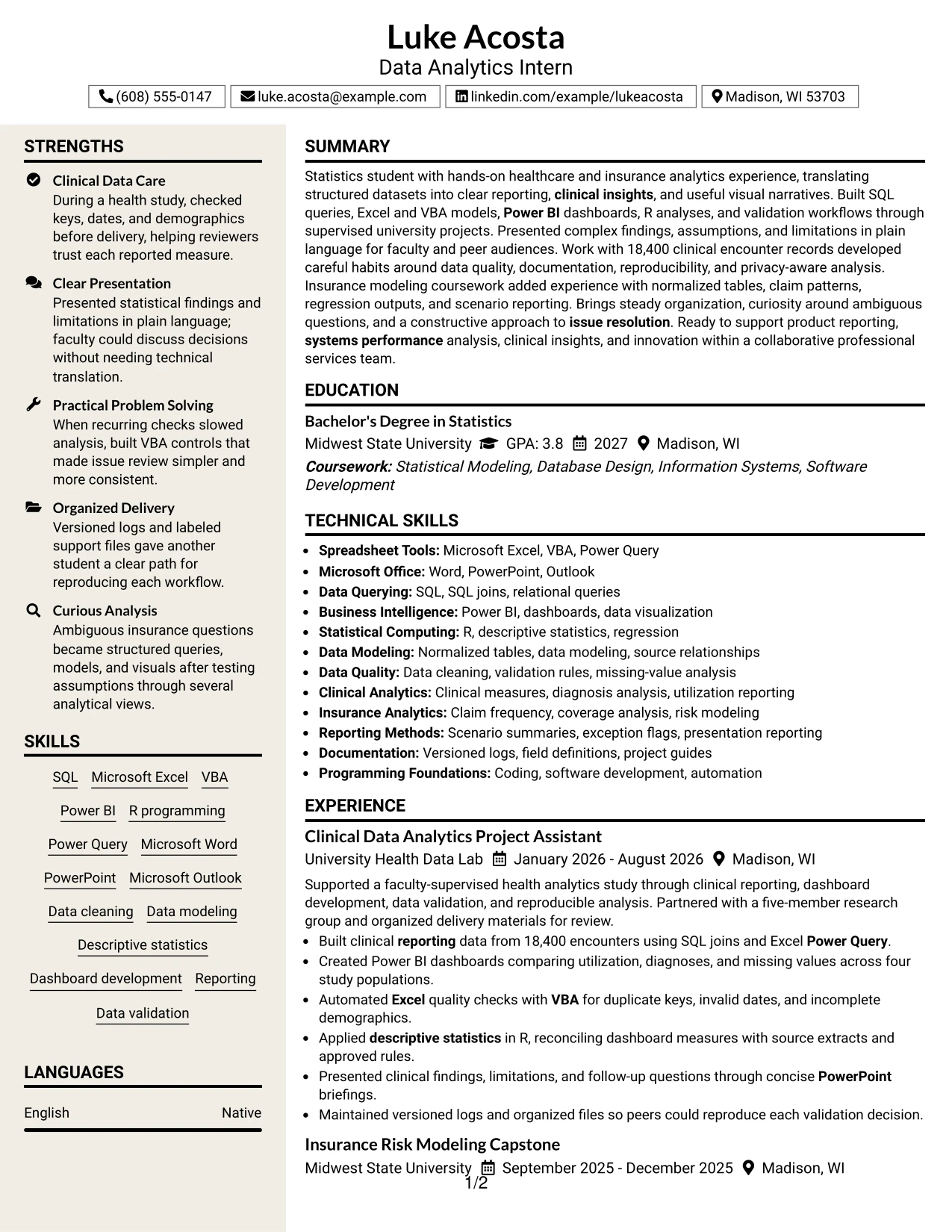
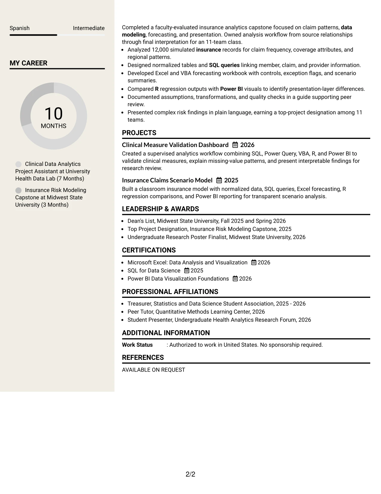
Readers can move through this two-column resume by using the sidebar for compact facts and the main column for detailed evidence. The sidebar can hold skills, certifications, education, or tools, while the wider area gives experience and project bullets room to explain the analysis.
This division is useful for a profile that combines clinical reporting, insurance modeling, statistical computing, and presentation work. A focused sidebar can surface SQL, Microsoft Excel, VBA, Power BI, R, and Power Query while the main column documents validation checks, dashboards, forecasting, and research communication.
Why the Stylish Two Column Designer Format Works for a Resume
- Two columns separate quick-reference information from detailed professional evidence.
- The sidebar can keep tools and certifications visible during a fast review.
- The main column provides space for complete accomplishment bullets.
- Distinct sections help reviewers connect skills to SQL, dashboard, and modeling examples.
- The format can display education and activities without pushing experience too far down the page.
- Short labels support scanning while longer bullets preserve context and results.
- A balanced design gives a substantial student resume a clear information hierarchy.
Best For
- Resumes with enough content to support a meaningful sidebar and a detailed main column.
- Applicants who need technical tools visible while experience bullets receive more space.
- Documents combining clinical analytics, insurance analysis, projects, and academic credentials.
- Readers who prefer quick skill references beside fuller evidence statements.
- Applications with multiple certifications, activities, or project entries to organize.
- Candidates presenting both statistical methods and business-facing reporting work.
- Resumes that need higher information density without creating a long uninterrupted text block.
#15 Modern Icon Format Resume Example
The evidence receives priority in this format: the strongest project results, technical methods, and communication examples should appear where they are easy to find. Simple visual markers can guide the eye to sections without replacing the words that ATS systems and reviewers need to evaluate.
For this application, the resume can lead with clinical data work, SQL joins, Power BI dashboards, VBA quality checks, and R validation. Bullets can then show scale and reliability through 18,400 encounter records, four study populations, documented field definitions, and reproducible analysis logs.
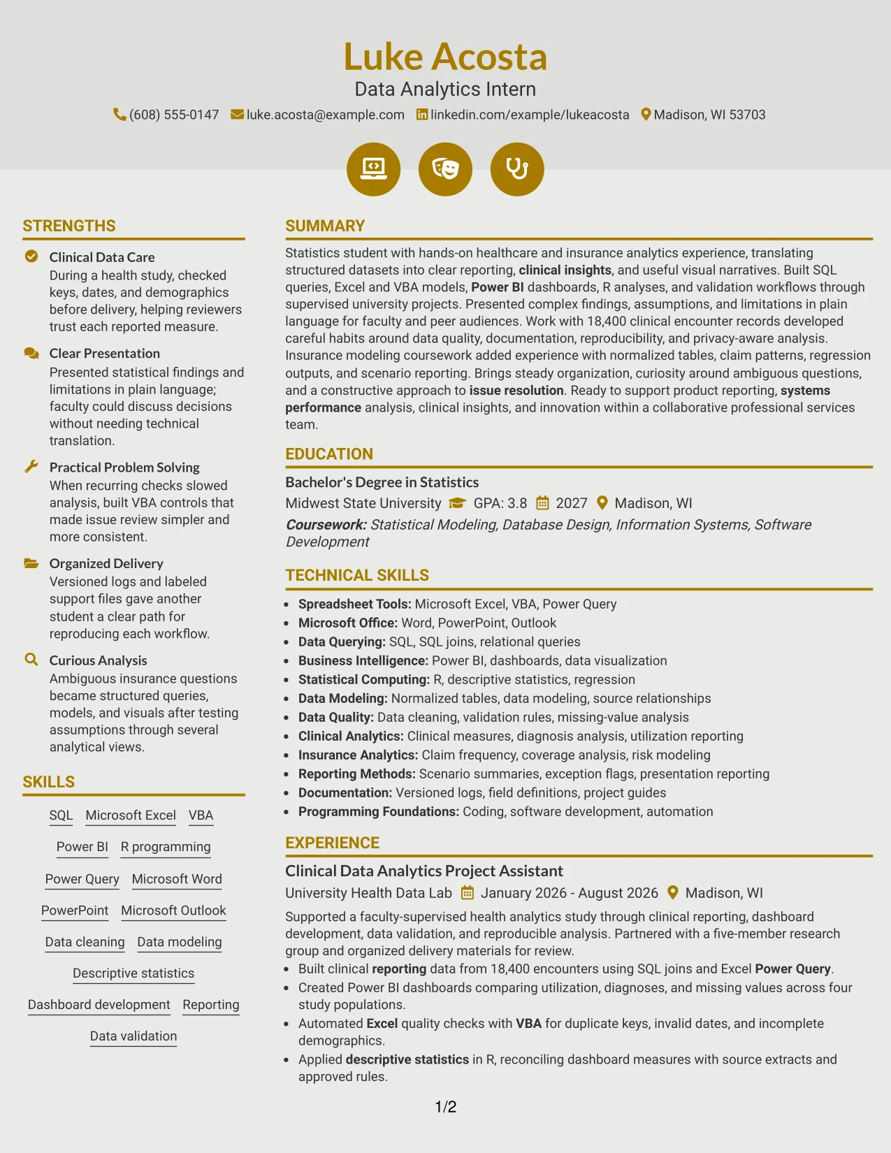
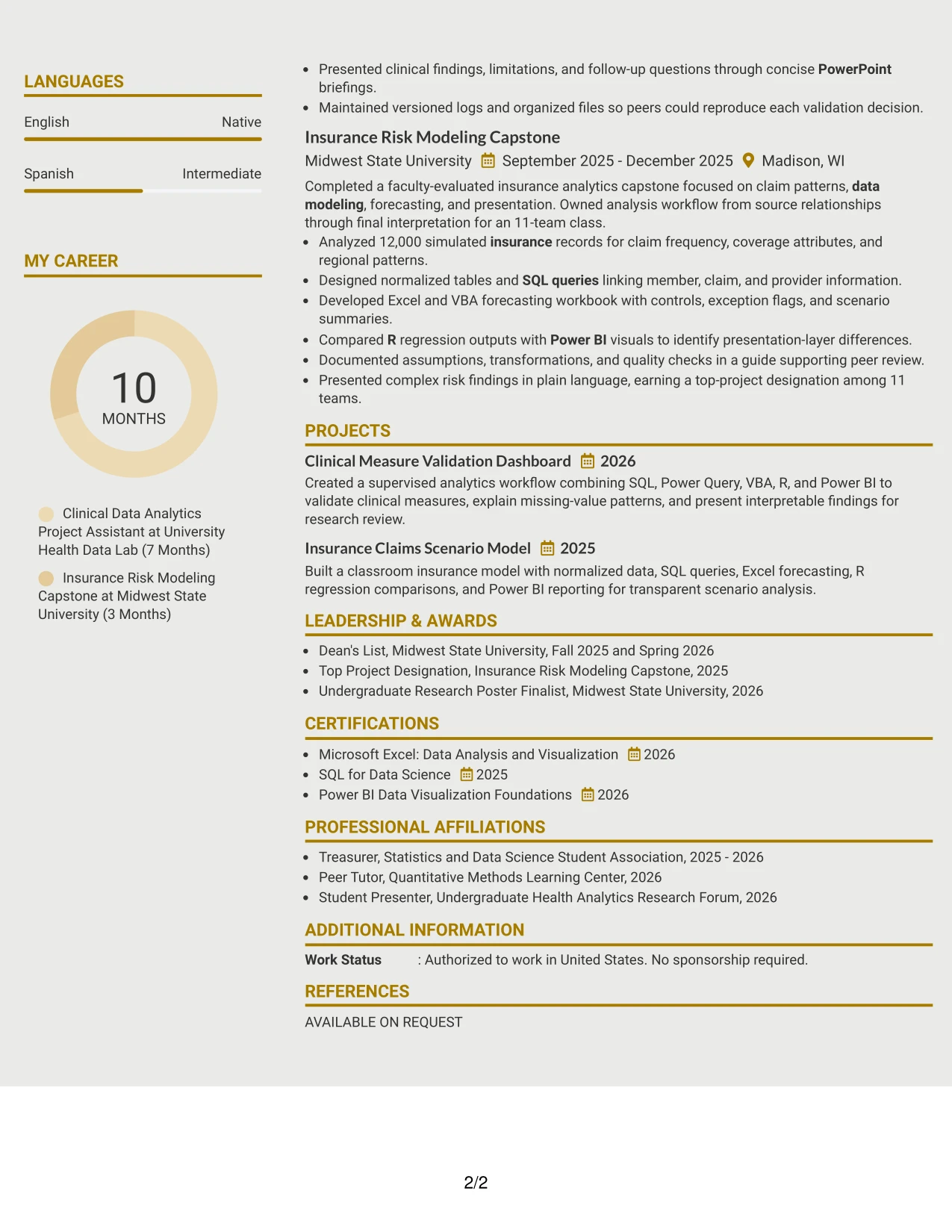
Why the Modern Icon Format Works for a Resume
- Visual markers help distinguish sections while the text remains the primary source of information.
- Achievement bullets can lead with actions and follow with tools or measurable scope.
- The layout gives clinical analytics evidence a prominent place in the experience section.
- Skills can be grouped by data querying, visualization, statistical computing, and quality control.
- Project entries can reinforce experience without repeating every detail from the work history.
- A clear hierarchy helps reviewers find the summary, experience, education, and certifications quickly.
- The format can remain readable when icons are used as supporting cues rather than essential labels.
Best For
- Applicants whose strongest selling points are measurable project results and technical evidence.
- Resumes that need to distinguish several analytical methods without adding long descriptions.
- Candidates showing a progression from data preparation to visualization and validation.
- Documents where project outcomes should receive equal attention with formal experience.
- Readers who appreciate light visual guidance while reviewing dense technical content.
- Applications combining tools, methods, and presentation examples in a compact structure.
- Resumes that need modern styling but must keep achievement language prominent.
#16 Plain Professional Layout with Job Title and Shaded Labels Resume Example
Content is balanced through a straightforward page structure, with shaded labels guiding the reader from the target role to summary, experience, education, projects, and skills. The restrained treatment keeps attention on the facts while giving each resume section a dependable visual starting point.
This approach fits an internship application that must show both academic preparation and hands-on analysis. The resume can connect a Bachelor of Science in Statistics with clinical reporting, insurance risk modeling, SQL, Excel, VBA, Power BI, R, data validation, and clear presentations.
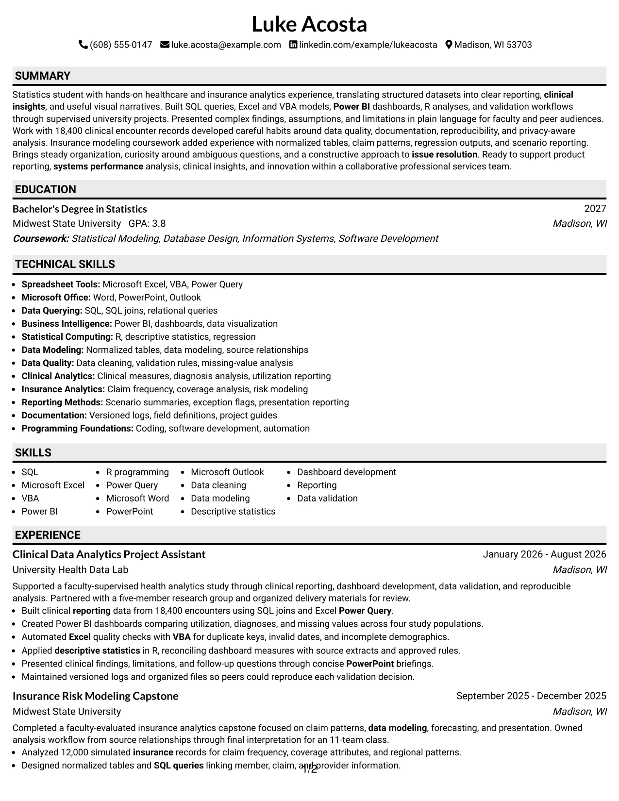
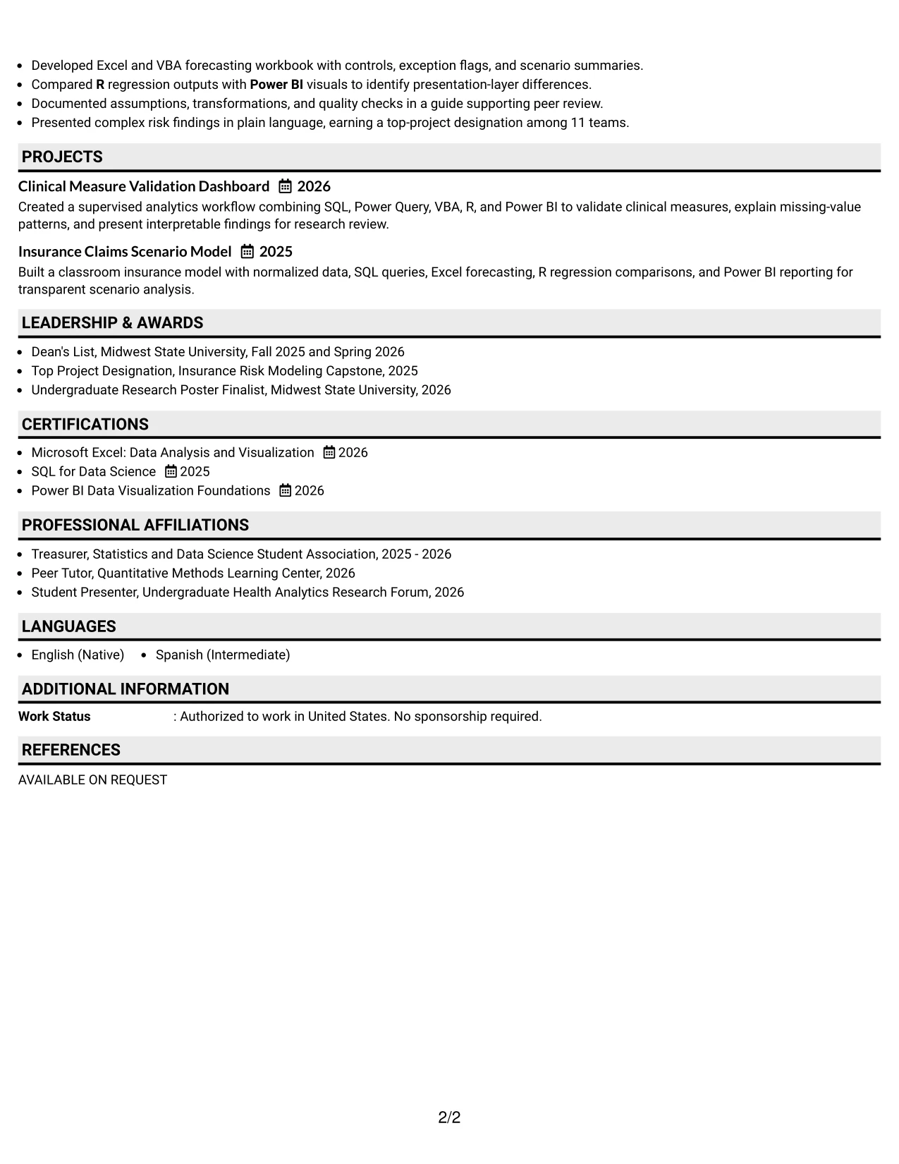
Why the Plain Professional Layout with Job Title and Shaded Labels Works for a Resume
- Shaded labels make each resume section easy to locate without excessive decoration.
- The job title provides immediate context for the application.
- A plain structure supports consistent ATS reading across all major sections.
- Experience bullets can explain technical work in a professional, direct style.
- Education and certifications receive enough visibility for an active statistics student.
- Skills can mirror the job description while the experience section supplies proof.
- The layout leaves room for documentation, communication, and organizational strengths alongside technical work.
Best For
- Applications needing a polished format that fits a professional services setting.
- Students who want education and applied project experience to share the page evenly.
- Resumes where shaded labels can guide review across many standard sections.
- Candidates aligning SQL, Excel, Power BI, and R with specific evidence bullets.
- Documents that must present technical and communication strengths without visual clutter.
- Readers who value predictable navigation from summary through certifications and activities.
- Applications requiring a practical balance between ATS structure and light visual organization.
#17 Classic One Column Resume Format Resume Example
A practical application such as a summer internship benefits from a familiar one-column resume that lets reviewers compare the summary, experience, education, and skills in order. The classic structure reduces visual effort and leaves the available space for specific bullets about analysis and results.
Here, the document can present a statistics degree, supervised healthcare analytics, an insurance modeling capstone, certifications, and relevant activities without forcing the reader to interpret an unusual navigation pattern. Standard headings also make keywords such as SQL, Excel, VBA, Power BI, R, and data visualization easy to identify.
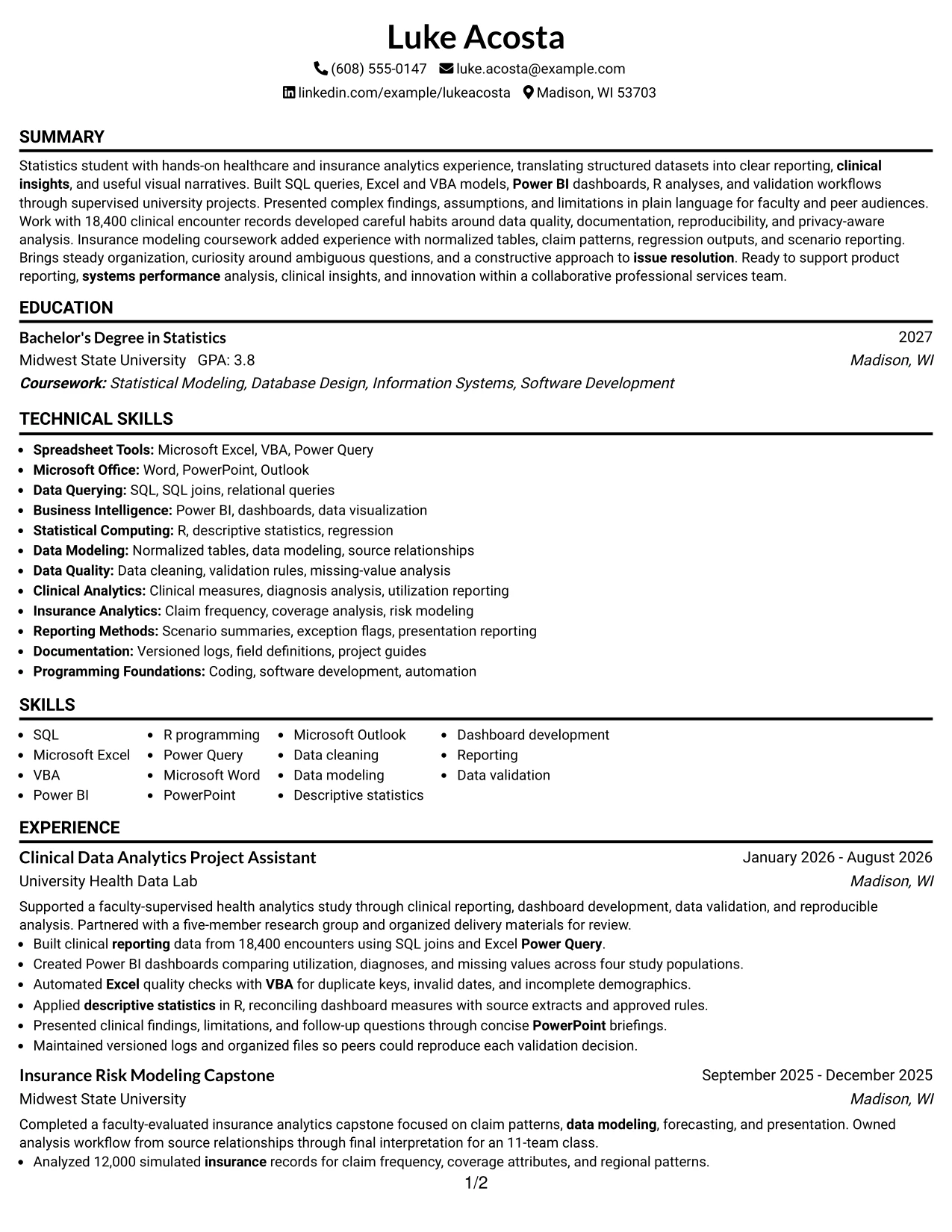
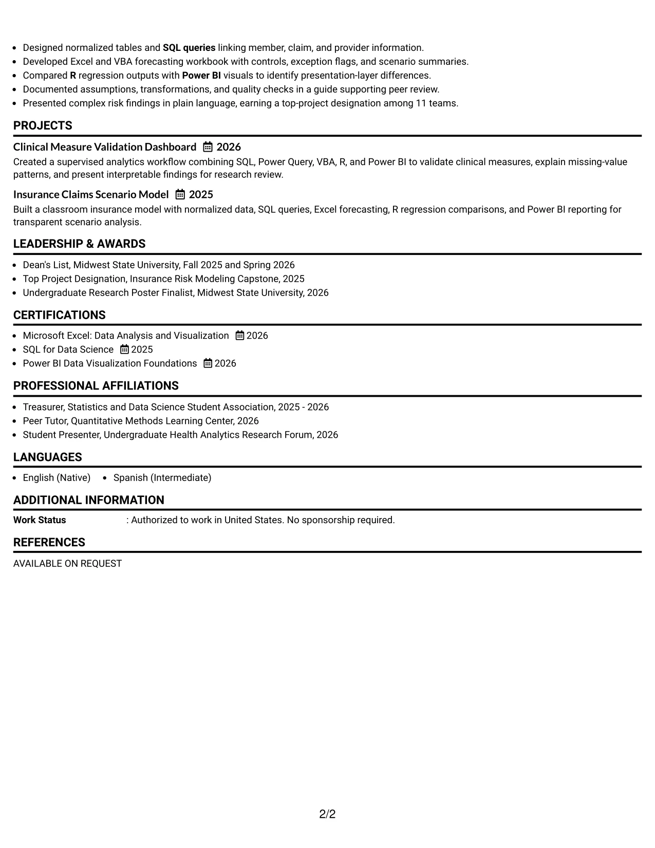
Why the Classic One Column Resume Format Works for a Resume
- A familiar structure supports fast review by both people and ATS systems.
- One-column reading keeps dates, employers, roles, and bullets in a consistent path.
- Standard headings make education, experience, projects, and certifications easy to locate.
- Technical keywords can appear in a focused skills section and within supporting bullets.
- The format gives measurable work scope, including 18,400 encounters and 12,000 records, room to stand out.
- Academic awards and activities can strengthen the document without interrupting the main evidence.
- A classic presentation keeps attention on qualifications rather than decorative elements.
Best For
- Internship applications where dependable, familiar resume navigation matters most.
- Candidates with a mix of academic projects, supervised work, and technical certifications.
- Documents intended for broad ATS compatibility and straightforward recruiter scanning.
- Applicants who want dates, employers, and achievements to be compared quickly.
- Resumes with strong standard sections but no need for a complex visual treatment.
- Applications where measurable analysis results should speak louder than design features.
- Readers who prefer a clean progression from education to experience and skills.
#18 One Column Format with Photo Resume Example
A restrained visual presentation combines a single reading path with a prominent photo area, while the written content still carries the qualification story. The page can introduce the target role, then move through summary, experience, projects, education, certifications, and skills without splitting the evidence across columns.
For this Data Analytics Intern application, the written sections should emphasize healthcare and insurance analysis, SQL queries, Excel and VBA automation, Power BI dashboards, R, and data validation. The photo should remain secondary to concrete evidence such as 18,400 encounters, four study populations, and a top-project designation among 11 teams.
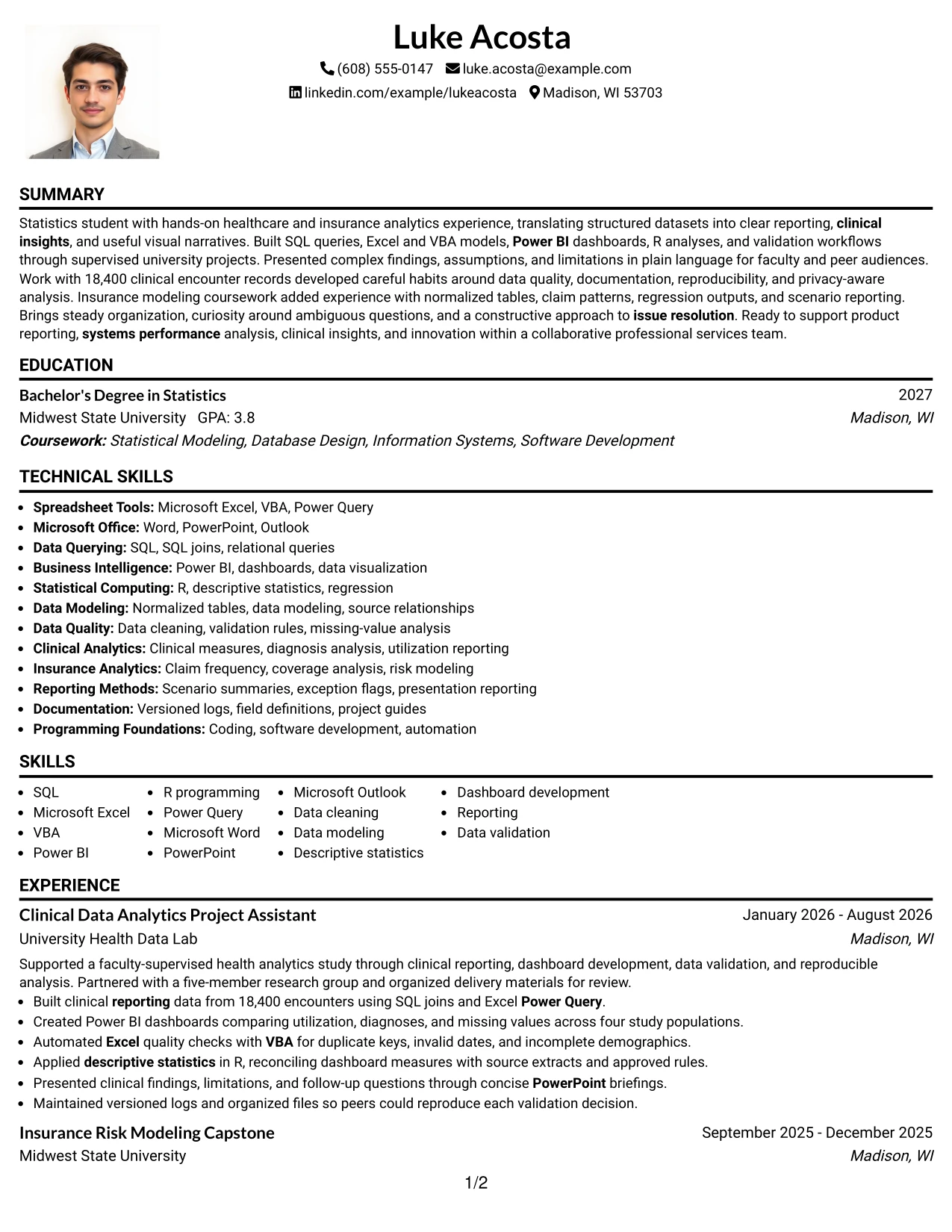
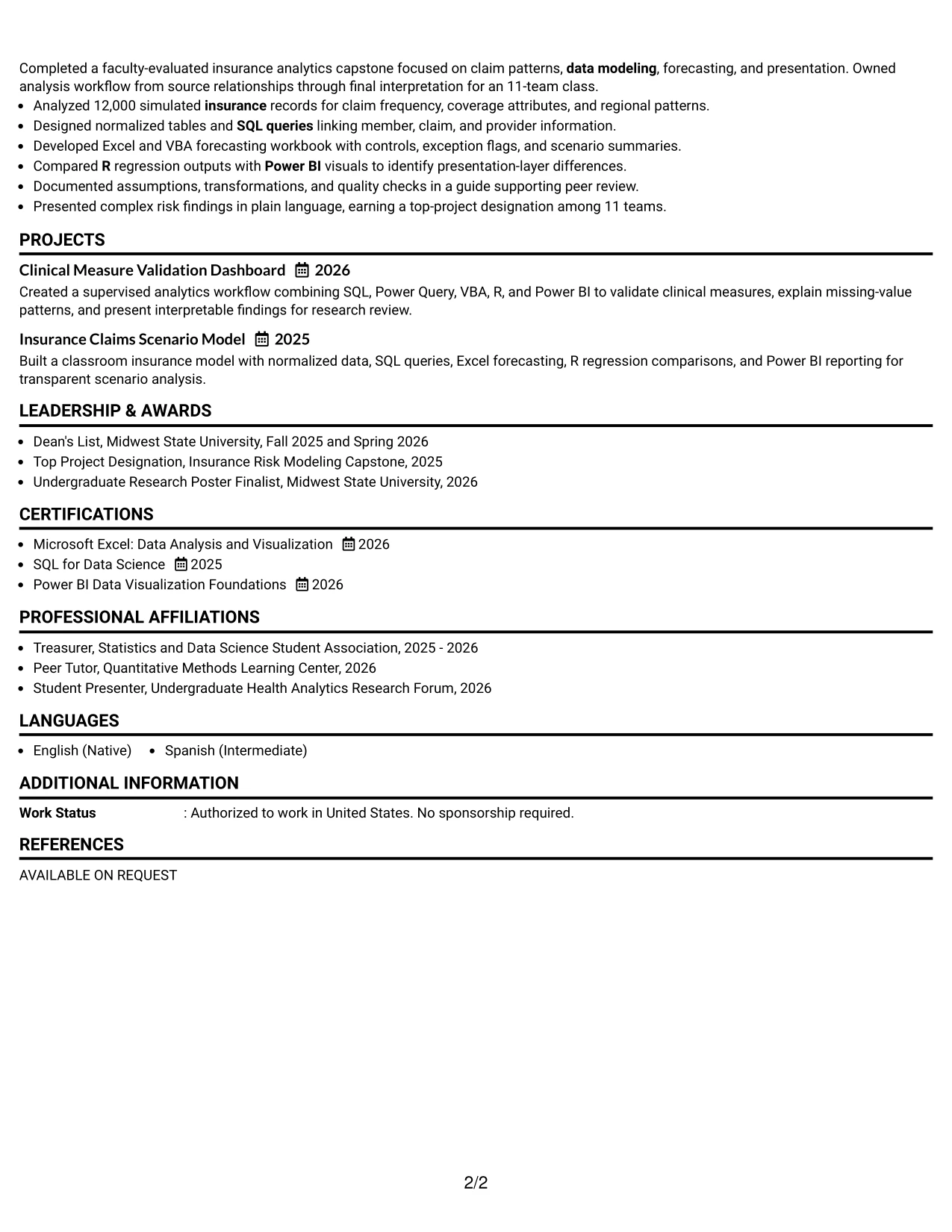
Why the One Column Format with Photo Works for a Resume
- The single-column structure keeps the written resume easy to follow.
- A prominent photo area creates a defined personal presentation at the top of the page.
- The target role can appear beside or below contact information for alignment.
- Experience bullets preserve space for technical methods and measurable scope.
- Projects can demonstrate applied analysis without competing with the main work history.
- Education, certifications, and activities remain visible in a familiar sequence.
- The written hierarchy ensures the photo supports presentation rather than replacing qualification evidence.
Best For
- Applications where a personal visual element is appropriate under the relevant submission norms.
- Candidates who want a single reading path for technical and academic information.
- Resumes combining project evidence, certifications, and a clear role target.
- Documents that need to present tools and measurable results more prominently than design detail.
- Readers who prefer one-column navigation with a defined personal header area.
- Applications where clinical and insurance analytics need room for complete bullets.
- Candidates who can use a professional, suitable photo without reducing space for evidence.
#19 Minimal Header Format Resume Example
The Minimal Header Format starts with a compact contact and role area, then gives the rest of the page to the resume content. Its simple structure allows a reviewer to reach the summary, experience bullets, education, projects, and skills with little visual interruption.
That economy works well when the document must communicate a focused analytics profile. The resume can place SQL, Microsoft Excel, VBA, Power BI, R, Power Query, and reporting in clear sections, while bullets explain clinical validation, insurance modeling, dashboard development, and presentation results.
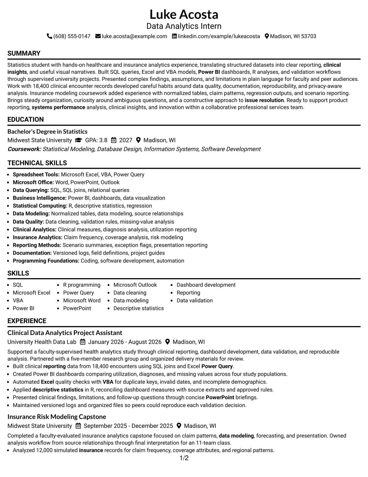
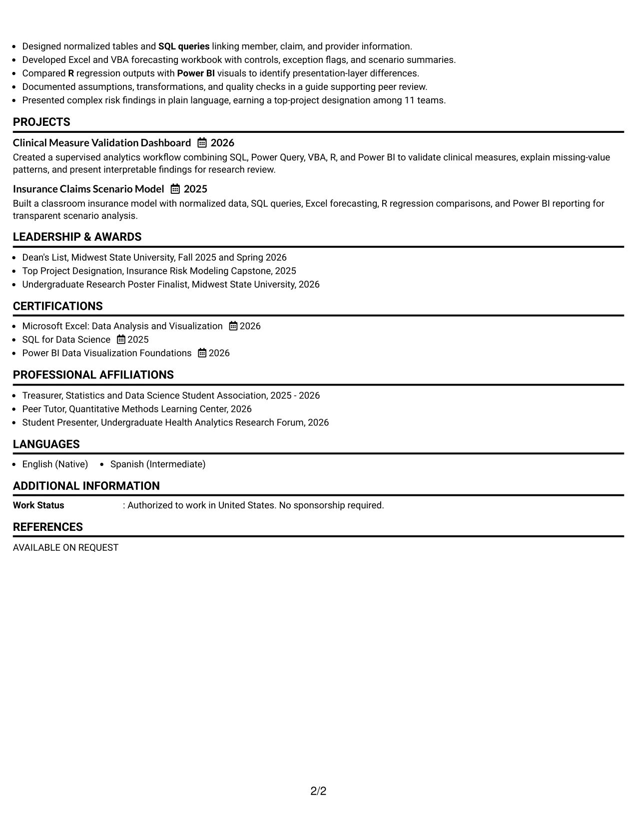
Why the Minimal Header Format Works for a Resume
- A compact header preserves page space for qualification evidence.
- The target role remains visible without taking attention from the experience section.
- One-column organization supports dependable ATS parsing and fast scanning.
- Short section headings create a clean path through the resume.
- Technical skills can be listed efficiently while bullets provide supporting proof.
- Projects and certifications fit naturally beneath experience and education.
- Minimal styling keeps dates, tools, actions, and results easy to compare.
Best For
- Applications where maximum page space should go to experience and project evidence.
- Candidates who prefer a low-distraction format for technical qualifications.
- Resumes with many relevant tools that need a concise, searchable skills section.
- Readers scanning quickly for SQL, Excel, VBA, Power BI, R, and reporting terms.
- Student applications that must fit education, certifications, awards, and activities efficiently.
- Documents where ATS parsing and standard section order are central priorities.
- Candidates whose measurable work examples are stronger than decorative presentation.
#20 Modern Full Background Two Column Format Resume Example
A reviewer can start with the compact sidebar for contact details, role alignment, education, and skills, then move to the wider column for experience and projects. The full-background treatment creates a strong visual frame, while the two-column structure helps separate quick facts from detailed evidence.
Luke Acosta’s resume has enough relevant material to use that division effectively: clinical reporting, insurance modeling, SQL queries, Excel and VBA forecasting, Power BI visuals, R analysis, certifications, and research presentation. The main column can retain complete bullets while the sidebar keeps core keywords available during scanning.
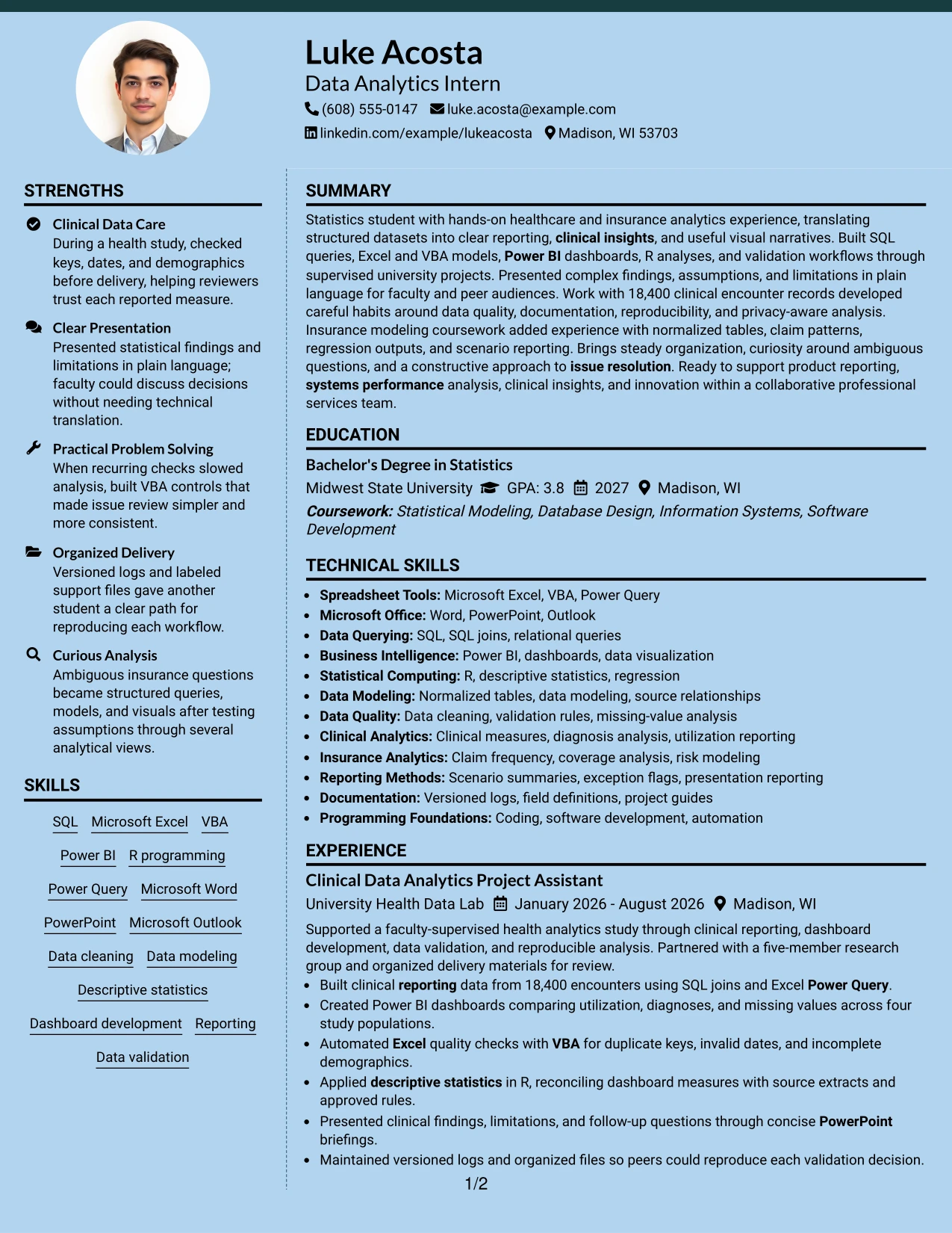
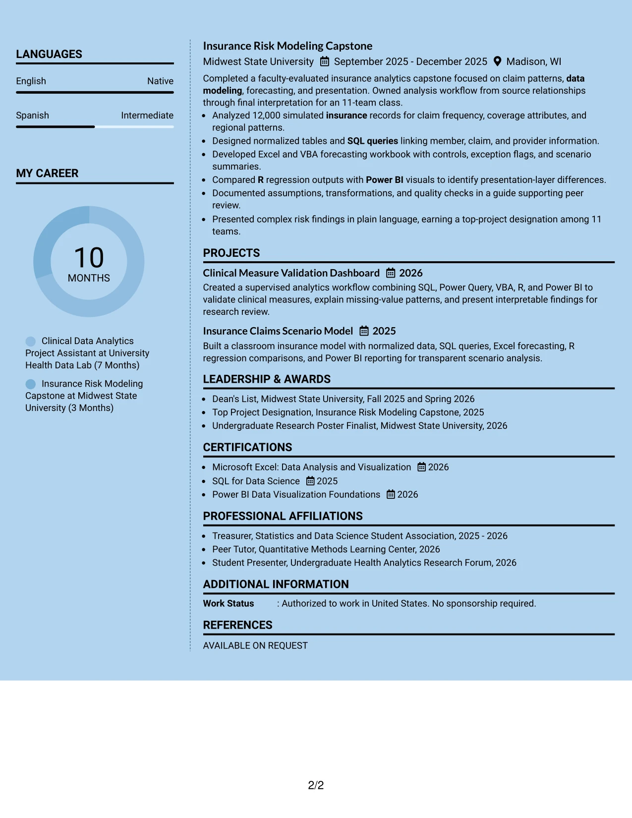
Why the Modern Full Background Two Column Format Works for a Resume
- Two columns create a clear distinction between summary facts and detailed accomplishments.
- A full background treatment gives the page a cohesive modern identity.
- The sidebar can keep education, certifications, and technical tools in view.
- The main column provides room for clinical and insurance analytics bullets.
- Separate areas help reviewers connect keywords with evidence without repeated long lists.
- Projects can supplement formal experience while remaining visually distinct.
- Strong contrast and consistent headings can support navigation when the text stays readable.
Best For
- Resumes with substantial technical and project content that need two levels of emphasis.
- Applicants who want quick-reference skills beside fuller analytical evidence.
- Documents combining education, certifications, activities, and multiple project examples.
- Applications where a modern visual frame supports a professional presentation.
- Readers who review tools first and then want detailed proof in the main column.
- Candidates presenting both clinical reporting and insurance modeling in one document.
- Resumes that can support higher information density without losing section boundaries.
#21 Dark Mode Two Column Format Resume Example
The strongest evidence should remain prominent against the dark visual treatment: applied analytics, measurable scope, technical tools, and communication results. A two-column structure can place concise skills and credentials in one area while reserving the larger area for experience and project bullets.
For this role, the main evidence includes SQL work on 18,400 encounters, Power BI dashboards across four study populations, VBA checks for data quality, R analysis, and a 12,000-record insurance capstone. Clear contrast, short sections, and complete bullet text help the visual design support rather than obscure those facts.
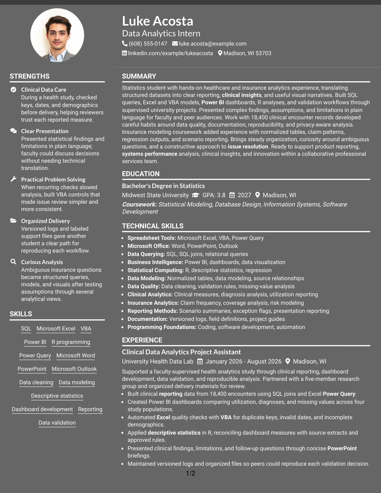
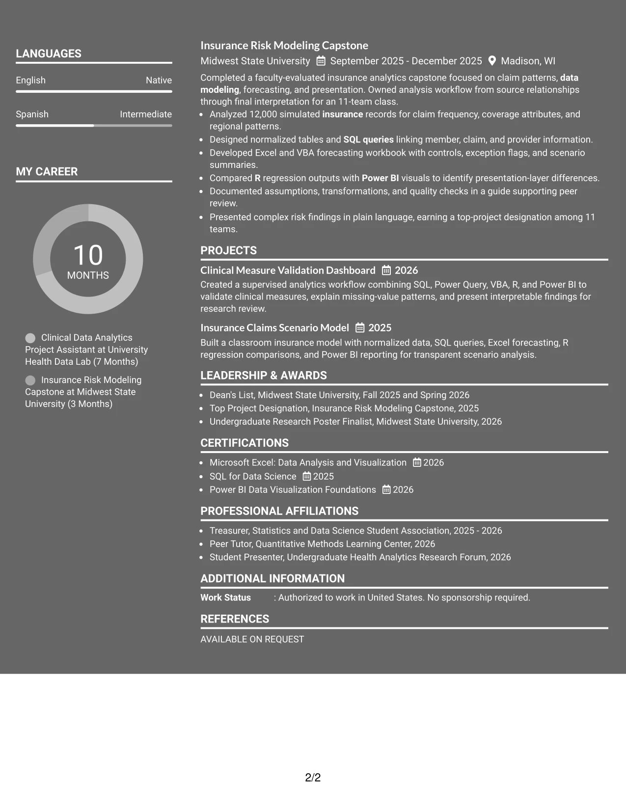
Why the Dark Mode Two Column Format Works for a Resume
- The two-column structure separates quick facts from detailed evidence.
- High contrast can make section boundaries and selected keywords easy to identify.
- The main column gives measurable analytics work enough room for context.
- The sidebar can group SQL, Excel, VBA, Power BI, R, and related methods.
- Projects and experience can show both technical execution and interpretation.
- A consistent hierarchy helps reviewers find education, certifications, and activities quickly.
- Readable text and restrained visual elements keep ATS-relevant content accessible.
Best For
- Candidates whose strongest evidence can be organized into a clear main column and sidebar.
- Applications that benefit from visible technical keywords beside detailed project results.
- Resumes presenting measurable data work, validation methods, and presentation outcomes together.
- Readers comfortable with a high-contrast layout that still uses standard section labels.
- Documents with enough content to support two distinct information zones.
- Applicants who want project work and formal experience to receive separate visual emphasis.
- Resumes where modern presentation should reinforce, not replace, achievement bullets.
#22 Dark Mode Box Header Format Resume Example
Content is balanced between a defined dark header and a clean body, giving the target role and contact details a strong starting point without crowding the sections below. Boxed labels can then guide the reader through summary, experience, projects, education, certifications, and skills in a single column.
This practical balance is useful for an analytics internship resume with varied evidence. The body can connect statistics education to SQL, Excel, VBA, Power BI, R, clinical measures, insurance risk modeling, documentation, and plain-language presentations, keeping each qualification tied to a specific project or result.
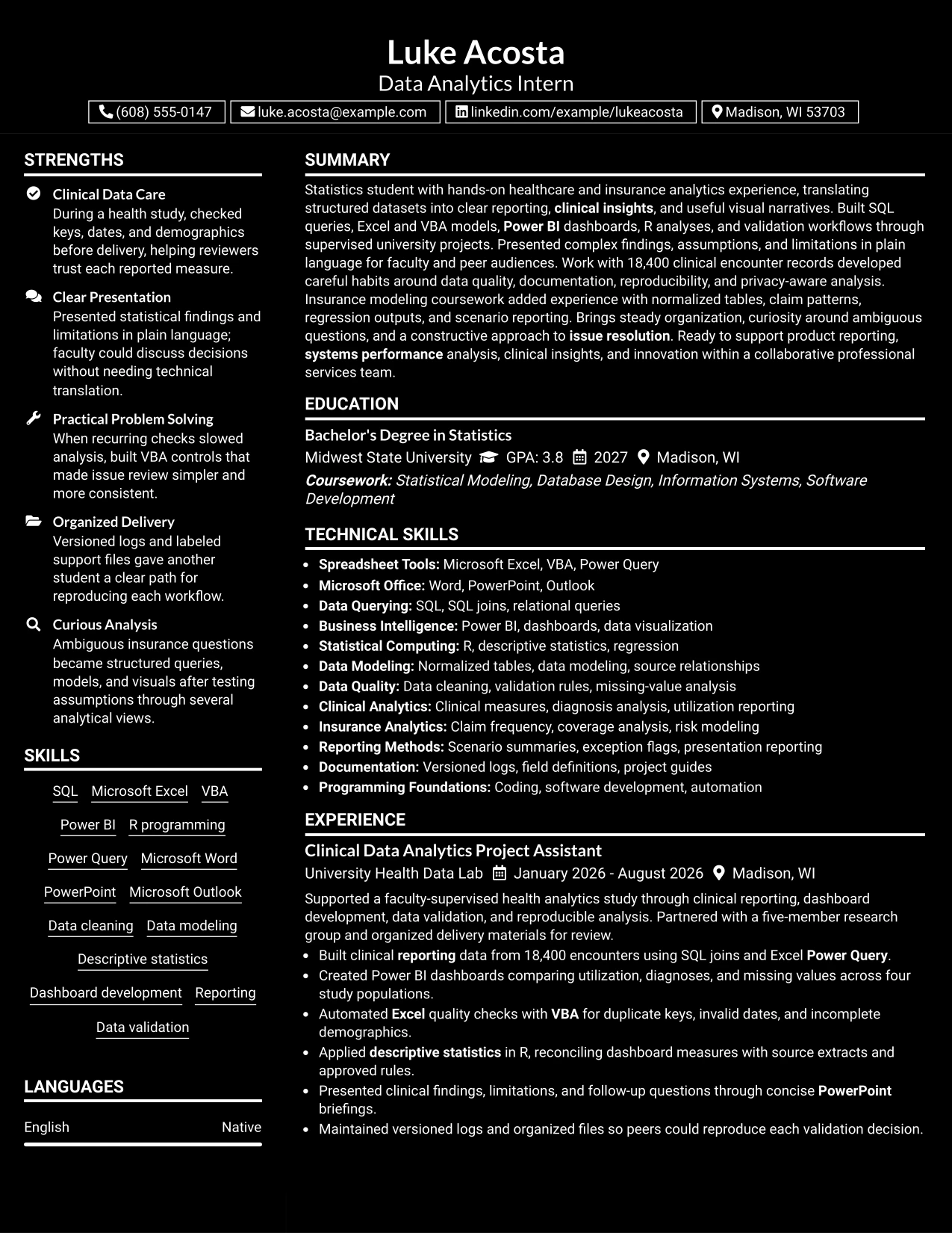
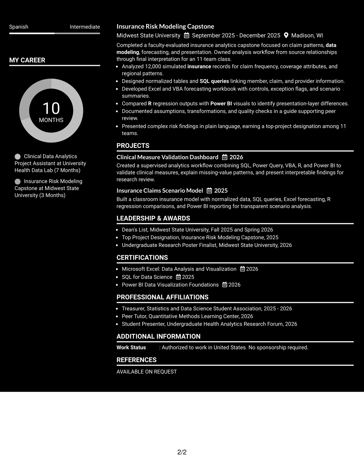
Why the Dark Mode Box Header Format Works for a Resume
- The dark box gives the target role and contact details a clear visual starting point.
- A single-column body keeps the resume accessible and easy to scan.
- Section labels separate technical skills from experience evidence.
- Bullets can show tools, actions, scope, and results in a consistent sequence.
- Projects provide a practical place to reinforce clinical and insurance analytics work.
- Education and certifications remain easy to find for a student applicant.
- A strong header adds distinction while the body preserves standard resume mechanics.
Best For
- Applications that need a distinctive header with a conventional one-column content area.
- Candidates aligning a statistics education with applied analytics projects.
- Resumes where role targeting should be visible before detailed qualifications.
- Readers who want clear labels for skills, experience, projects, and credentials.
- Documents that combine healthcare data, insurance modeling, and reporting evidence.
- Applicants needing a professional layout that supports ATS-friendly section order.
- Resumes where a strong top section can frame detailed, evidence-based bullets.
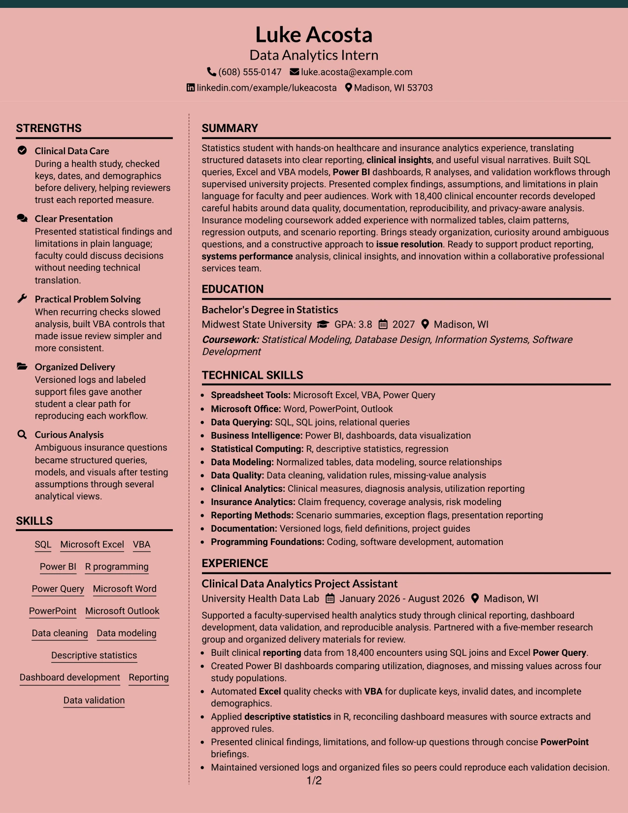
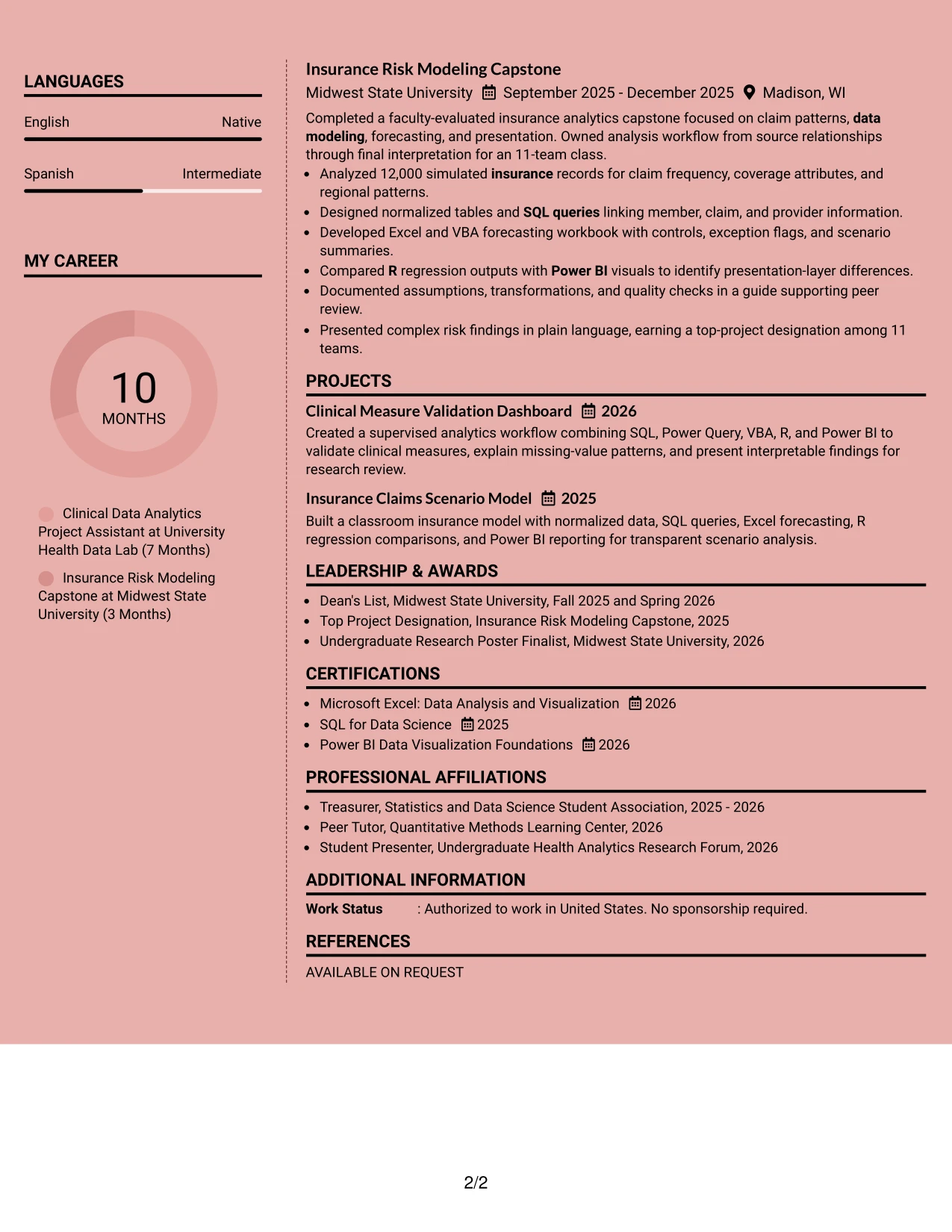
#23 Elegant Full Background Two Column Format Resume Example
For a Data Analytics Intern application, a two-column page can place the summary, education, certifications, and skills beside experience, projects, and awards. This arrangement gives SQL, Excel, VBA, Power BI, R, and data validation clear locations without making the resume feel crowded.
The full background treatment adds polish while the white content areas protect readability. Short bullets can show work with 18,400 clinical encounters, Power BI dashboards, automated quality checks, and a 12,000-record insurance model. Clear headings also help readers find education, tools, and measurable results quickly.
Why the Elegant Full Background Two Column Format Works for a Resume
- The two-column structure separates supporting details from the main evidence.
- A visible summary introduces statistics study and healthcare analytics experience.
- Skills can be grouped by tools, analysis methods, and reporting strengths.
- Experience bullets keep measurable evidence such as 18,400 encounters and 12,000 records easy to scan.
- Projects and certifications add relevant proof without interrupting the work history.
- Distinct section headings support quick review of education, awards, and activities.
- The format can present substantial student experience while maintaining visual balance.
Best For
- Resumes that need two clear reading zones for skills and experience.
- Applicants combining academic projects, supervised work, and certifications.
- Applications where SQL, Excel, VBA, Power BI, and R should be visible early.
- Readers who want a polished design with concise, well-separated sections.
- Resumes that include measurable dataset, dashboard, or validation evidence.
- Candidates who need room for awards, activities, and project documentation.
- Professional services applications that value organized presentation and clear reporting.
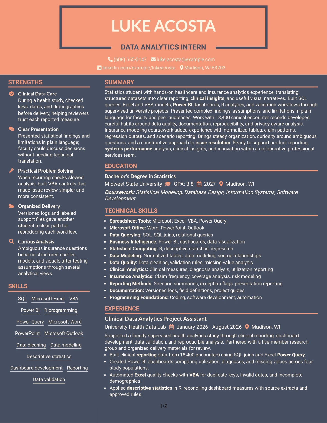
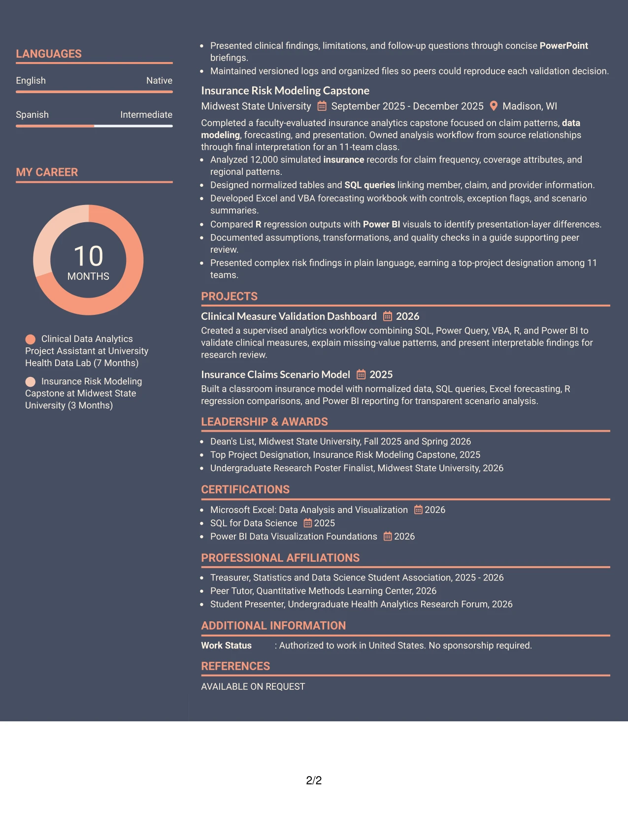
#24 Creative Two Tone Format Resume Example
A restrained visual hierarchy gives this resume a confident first impression while keeping the content professional. The two-tone treatment can distinguish the contact and summary area from the detailed sections, helping readers move from the target role to skills, experience, projects, and education.
The single-column flow supports a straightforward review of SQL queries, Excel and VBA modeling, Power BI dashboards, R analysis, and data validation. Strong bullets can connect each tool to evidence, including four study populations, recurring quality checks, and a top-project designation among 11 teams.
Why the Creative Two Tone Format Works for a Resume
- The restrained color contrast adds interest without competing with resume evidence.
- A single reading path supports consistent review by people and ATS software.
- The summary can connect statistics education with clinical and insurance analytics.
- Tool names appear naturally beside the work or project results they support.
- Bullets can show both technical work and clear presentation of complex information.
- Projects and certifications remain visible without creating a dense page.
- The design suits a professional application that welcomes thoughtful visual presentation.
Best For
- Single-column resumes that need a creative but controlled visual identity.
- Applicants presenting technical tools alongside clear business or research outcomes.
- Applications where a reader should move smoothly from summary to experience.
- Resumes that balance dashboards, data models, coursework, and certifications.
- Candidates who want color distinction without sacrificing ATS-friendly text flow.
- Professional services roles that value adaptable, organized problem solving.
- Documents where concise bullets must carry both technical and communication evidence.
#25 Bold Color Header Professional Format Resume Example
The Bold Color Header Professional Format uses a prominent opening block to identify the target role, summary, and contact details before the reader reaches the evidence. From there, a single-column sequence can present experience, projects, education, certifications, and skills in a familiar order.
That structure makes keyword review efficient for a Data Analytics Intern resume. Terms such as SQL, Excel, VBA, Power BI, R, data modeling, reporting, and clinical insights can appear in the summary and be supported by concise achievement bullets. The header adds distinction, while the body keeps the information practical.
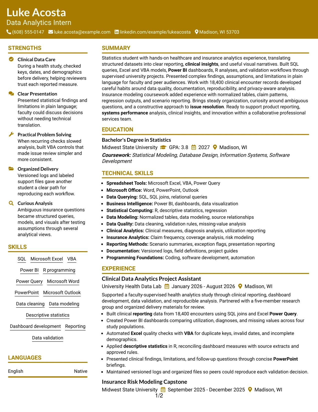
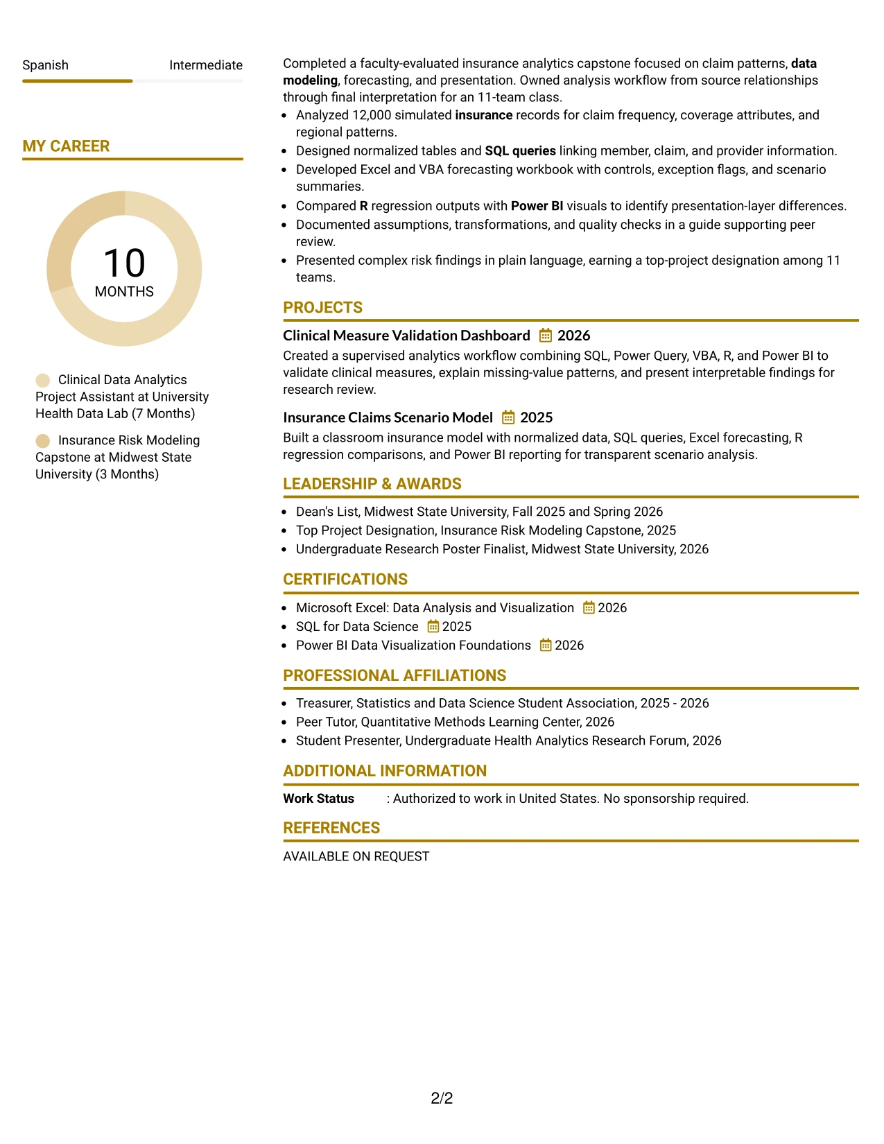
Why the Bold Color Header Professional Format Works for a Resume
- The prominent header gives the target role and contact information immediate visibility.
- A familiar single-column order supports fast scanning and reliable ATS parsing.
- The summary can place healthcare analytics and statistics education near the top.
- Experience bullets connect technical keywords to specific analysis and reporting work.
- Projects provide additional evidence for SQL, forecasting, regression, and visualization.
- Education and certifications remain easy to locate near the supporting sections.
- The format presents a professional appearance without reducing content clarity.
Best For
- ATS-conscious resumes that need a strong but simple opening hierarchy.
- Applicants who want the target role and core tools identified immediately.
- Documents with several technical keywords that require clear section placement.
- Resumes where experience and projects should follow one uninterrupted reading path.
- Applications that benefit from concise evidence rather than decorative elements.
- Candidates combining university study with supervised analytics work.
- Professional resumes that need visual distinction while preserving conventional structure.
#26 Photo Header Color Sidebar Format Resume Example
Readers can begin with the contact area and summary, then follow the color sidebar to the main evidence. The sidebar can hold compact details such as skills, certifications, and education, while the central column gives experience and projects enough room for complete achievement bullets.
For this Data Analytics Intern resume, that division supports both technical breadth and readable detail. The main area can explain SQL joins, Power BI dashboards, VBA checks, R statistics, and insurance forecasting, while the supporting column keeps Microsoft Office tools and credentials easy to find.
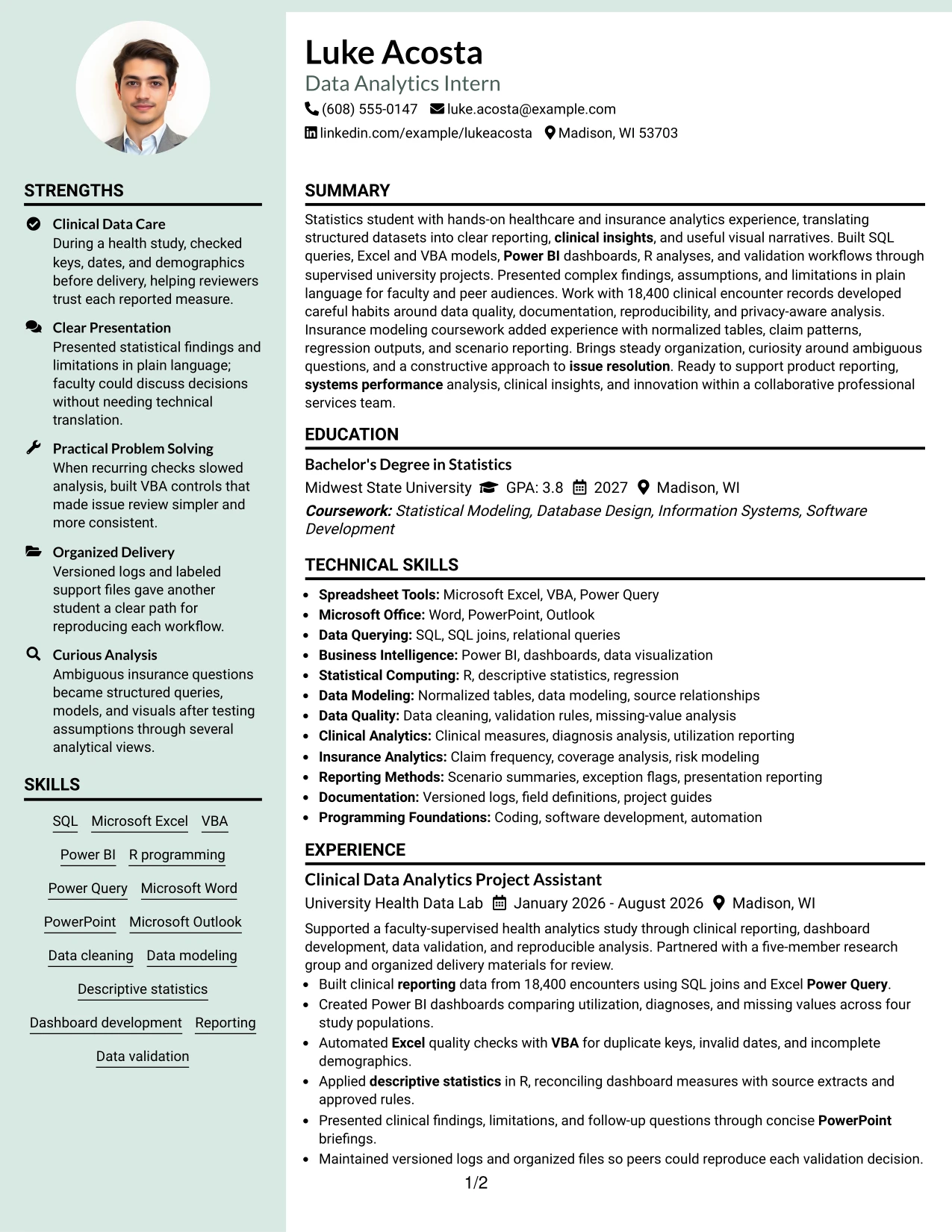
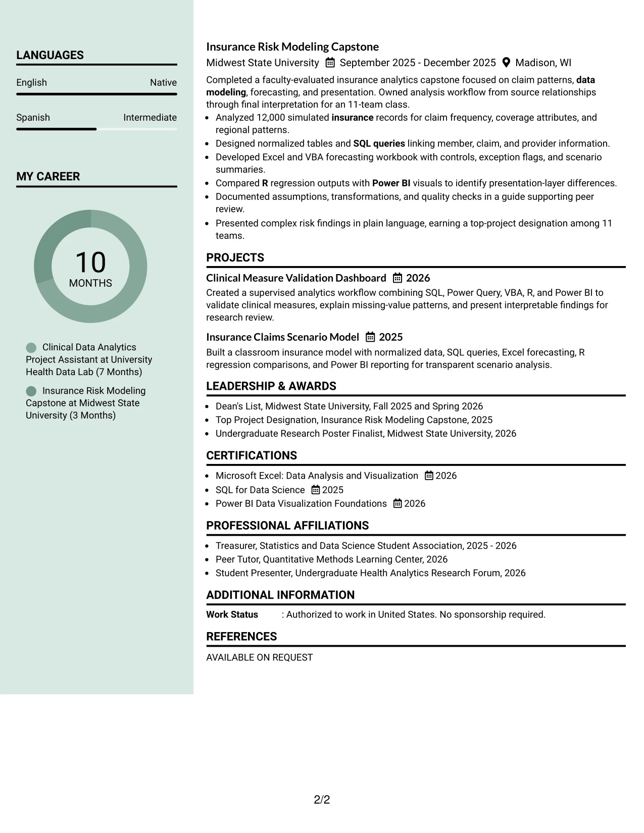
Why the Photo Header Color Sidebar Format Works for a Resume
- The header establishes identity and target role before the detailed review begins.
- A sidebar keeps compact skills and certifications separate from longer experience bullets.
- The main column provides space for dataset sizes, comparison groups, and project outcomes.
- Color coding helps readers return to important sections during a longer review.
- The structure can show both technical capability and organized project delivery.
- Education and certifications remain visible without interrupting the evidence sequence.
- The format supports a substantial student resume with clear content volume.
Best For
- Resumes with enough project and experience detail to need a supporting sidebar.
- Applicants who want skills and certifications visible beside fuller achievement bullets.
- Applications combining technical analysis with presentation and documentation evidence.
- Documents that need compact organization for Microsoft Office and analytics tools.
- Readers who prefer a strong central evidence column with quick-reference details.
- Candidates presenting clinical and insurance analytics in one coherent document.
- Professional applications where content volume matters more than a minimal page.
#27 Top Left Header Color Accent Format Resume Example
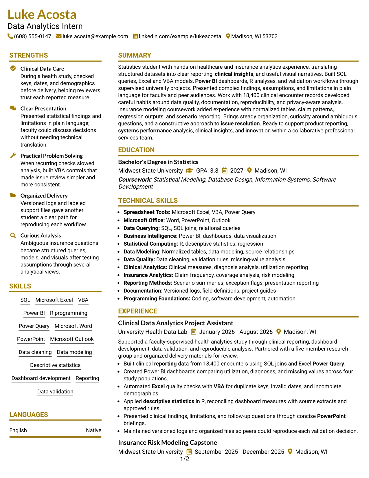
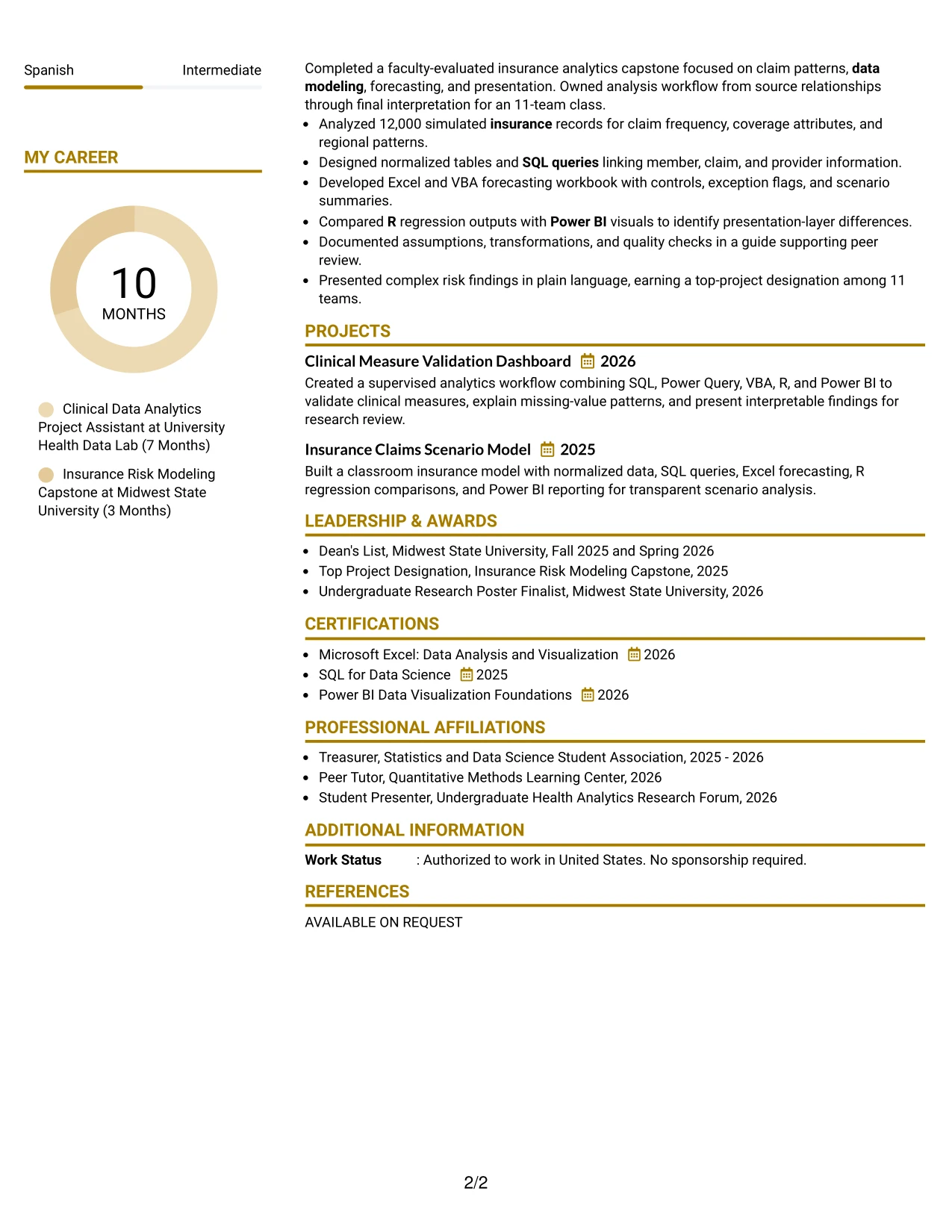
The strongest evidence belongs near the top: a focused summary can quickly establish statistics study, healthcare data work, and readiness for data analysis, reporting, and clinical insights. The resume can then support that claim with experience bullets, projects, tools, education, and certifications.
A top-left header gives the document a clear starting point, while a restrained accent helps separate sections without hiding the facts. Results such as four study populations, 18,400 encounter records, recurring validation checks, and a top-project designation give the reader concrete proof behind the keyword set.
Why the Top Left Header Color Accent Format Works for a Resume
- The opening position gives the summary and target role immediate priority.
- Concrete evidence follows the introduction instead of being buried in later sections.
- Accent treatment separates headings while preserving a clean text structure.
- Bullets can show scale, such as 18,400 encounters and four study populations.
- Technical skills gain credibility when paired with dashboards, queries, and validation work.
- Projects and honors reinforce the main evidence without taking over the page.
- The format supports direct review of qualifications for a focused internship application.
Best For
- Resumes that need strong evidence near the top of the first page.
- Applicants with measurable project scope and clear technical outcomes.
- Applications where a short summary should lead directly into relevant experience.
- Documents that combine clinical reporting, insurance modeling, and statistical analysis.
- Candidates who want subtle visual emphasis without a decorative layout.
- Readers comparing required tools with proof from projects and work history.
- Resumes where awards and certifications should support, not replace, core evidence.
#28 Centered Header Classic Two Column Format Resume Example
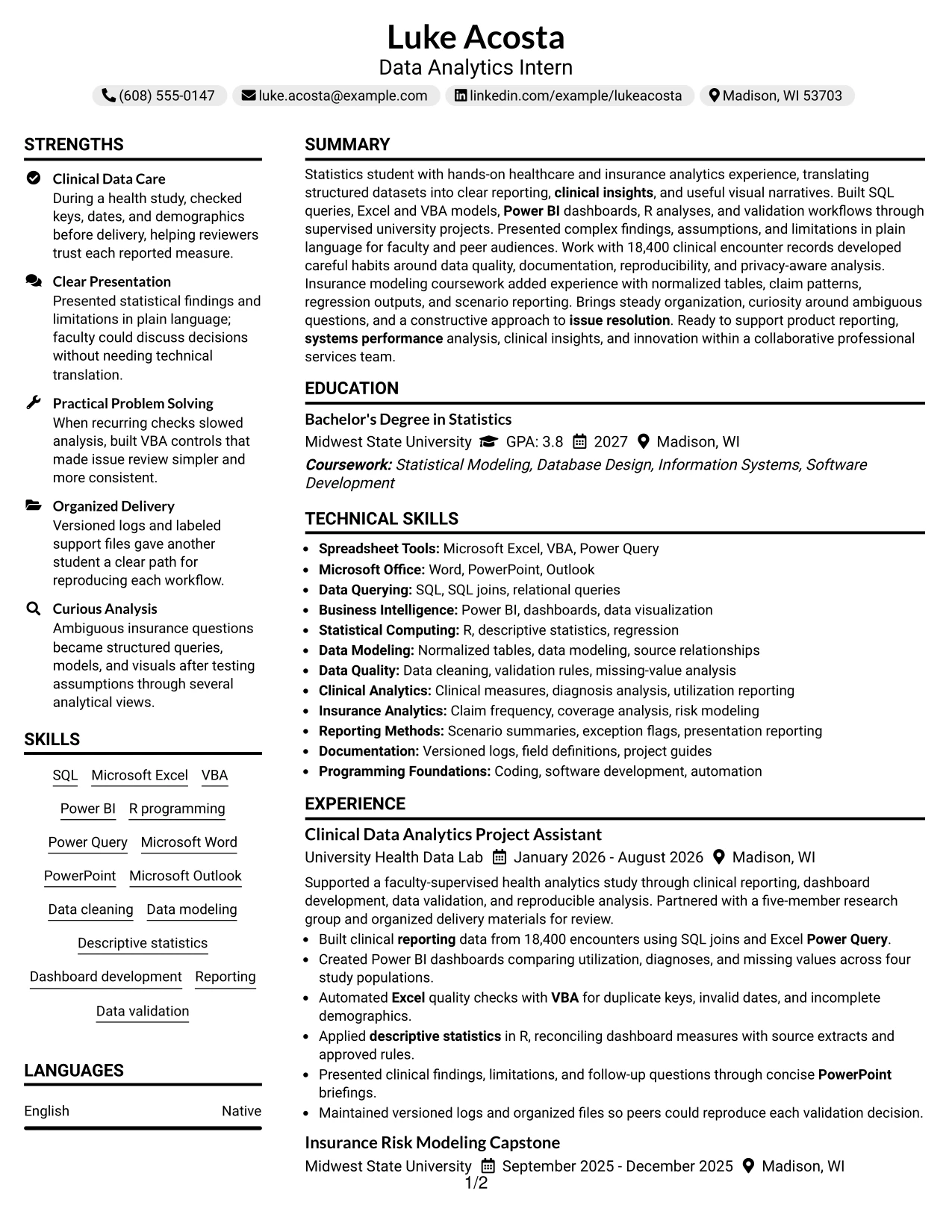
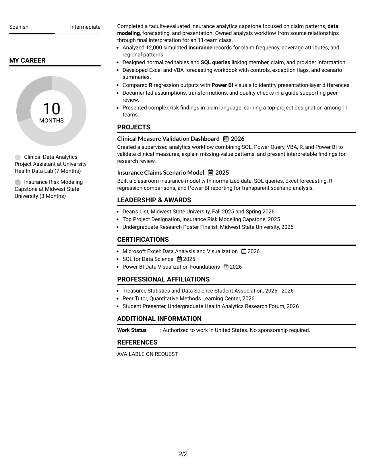
Balanced content distribution helps this resume serve both quick review and detailed reading. A centered header introduces the target role and summary, while two columns divide the supporting information from the experience, project, and achievement evidence.
The classic structure works well when education, certifications, and skills need to remain visible beside substantial bullets. It can present SQL, Power Query, VBA, Power BI, R, reporting, and data modeling without forcing the reader to search through a long single column. Bullet-led entries keep each result easy to verify.
Why the Centered Header Classic Two Column Format Works for a Resume
- The centered header creates a stable visual entry point for the resume.
- Two columns balance compact qualifications with detailed experience evidence.
- Bullet points make technical actions and outcomes easy to compare.
- Skills and certifications can stay visible while projects receive adequate space.
- Education supports the internship requirement without displacing applied analytics work.
- The classic presentation is familiar to readers across professional services settings.
- Balanced sections help the resume remain complete without appearing overloaded.
Best For
- Applicants who need a traditional presentation with efficient two-column organization.
- Resumes pairing detailed project bullets with compact education and certification entries.
- Applications where skills should remain visible during experience review.
- Candidates with evidence across clinical datasets, insurance records, and reporting.
- Readers who value familiar bullets and predictable section locations.
- Documents that need room for awards and activities without losing balance.
- Professional applications requiring a polished format with practical information density.
#29 Left Aligned Header Clean Two Column Format Resume Example
For a practical internship application, a left-aligned header makes the target role, contact details, and summary easy to locate at the start of the page. Two clean columns can then organize skills, education, and certifications alongside experience, projects, awards, and activities.
The clean design gives technical details room to breathe. SQL joins, Excel forecasting, Power BI visualization, R regression comparisons, and documentation can appear in short bullets with clear supporting context. This helps a reviewer understand not only which tools are known, but how they were used.
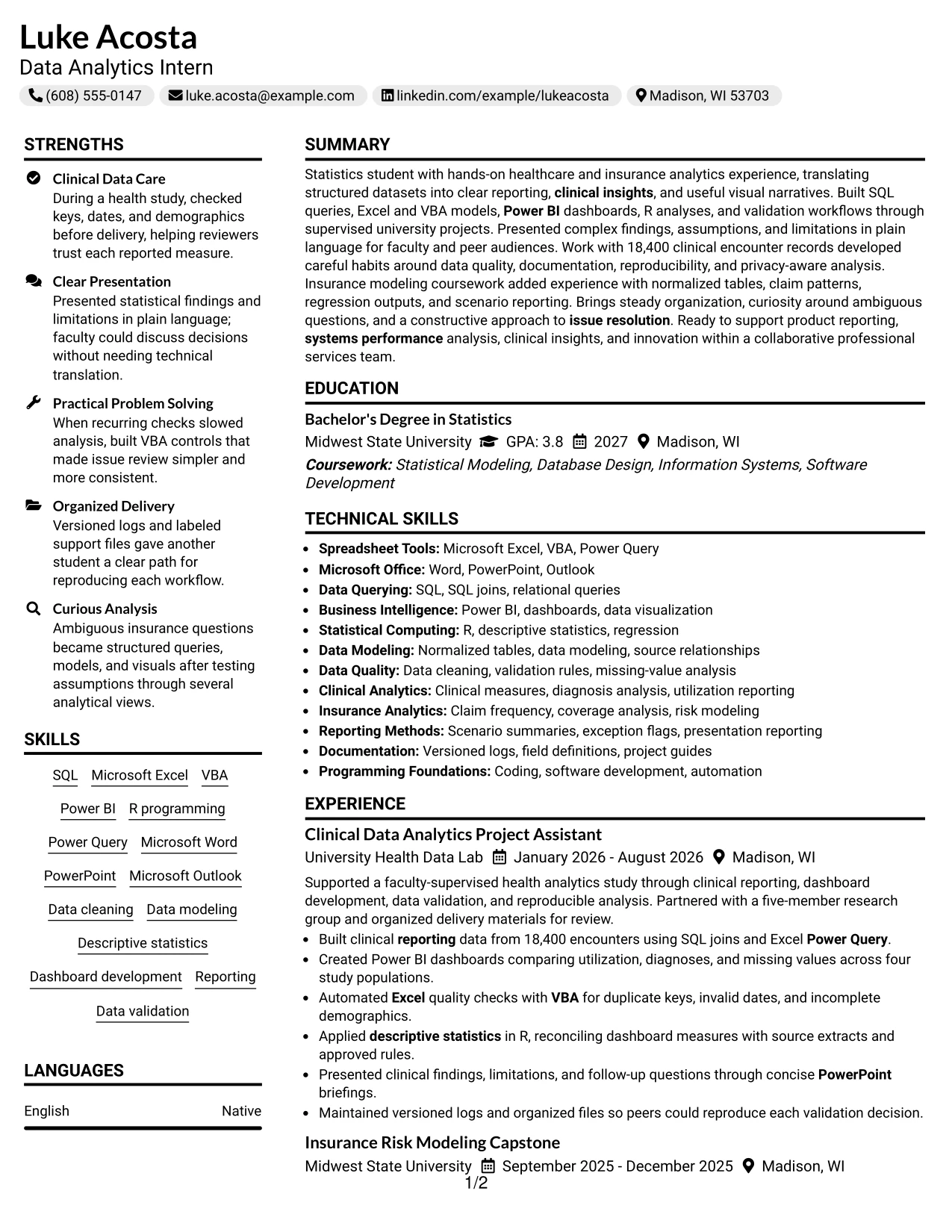
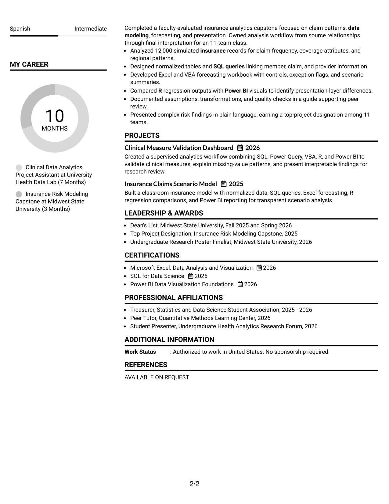
Why the Left Aligned Header Clean Two Column Format Works for a Resume
- The left-aligned opening supports direct navigation from role to evidence.
- Two columns create useful separation between qualifications and work history.
- Clean spacing helps technical terms remain readable during a fast review.
- Bullets explain how tools were applied to data, dashboards, models, and checks.
- Projects can demonstrate capability when formal employment history is limited.
- Education, certifications, and activities remain available as supporting evidence.
- The uncluttered format keeps the resume professional and easy to revisit.
Best For
- Resumes needing practical two-column organization without heavy visual treatment.
- Applicants whose tools need context through concise project and experience bullets.
- Applications that combine academic work, supervised analysis, and leadership activities.
- Readers looking for clear separation between qualifications and detailed evidence.
- Candidates with several certifications or awards that should remain easy to scan.
- Documents where clean spacing supports technical terms and measurable outcomes.
- Professional services applications that value organized, dependable presentation.
#30 Accent Divider Modern Two Column Format Resume Example
A modern visual character comes from the restrained accent dividers and square bullets, not from extra decoration. Luke Acosta's resume can use these cues to separate the summary, skills, experience, projects, education, and certifications while keeping the technical content easy to read.
Two columns support a clear match between role needs and evidence. SQL, Excel, VBA, Power BI, R, data modeling, and clinical reporting can be grouped efficiently, while bullets document dashboards, validation workflows, normalized tables, and scenario summaries. The result feels current but remains grounded in resume mechanics.
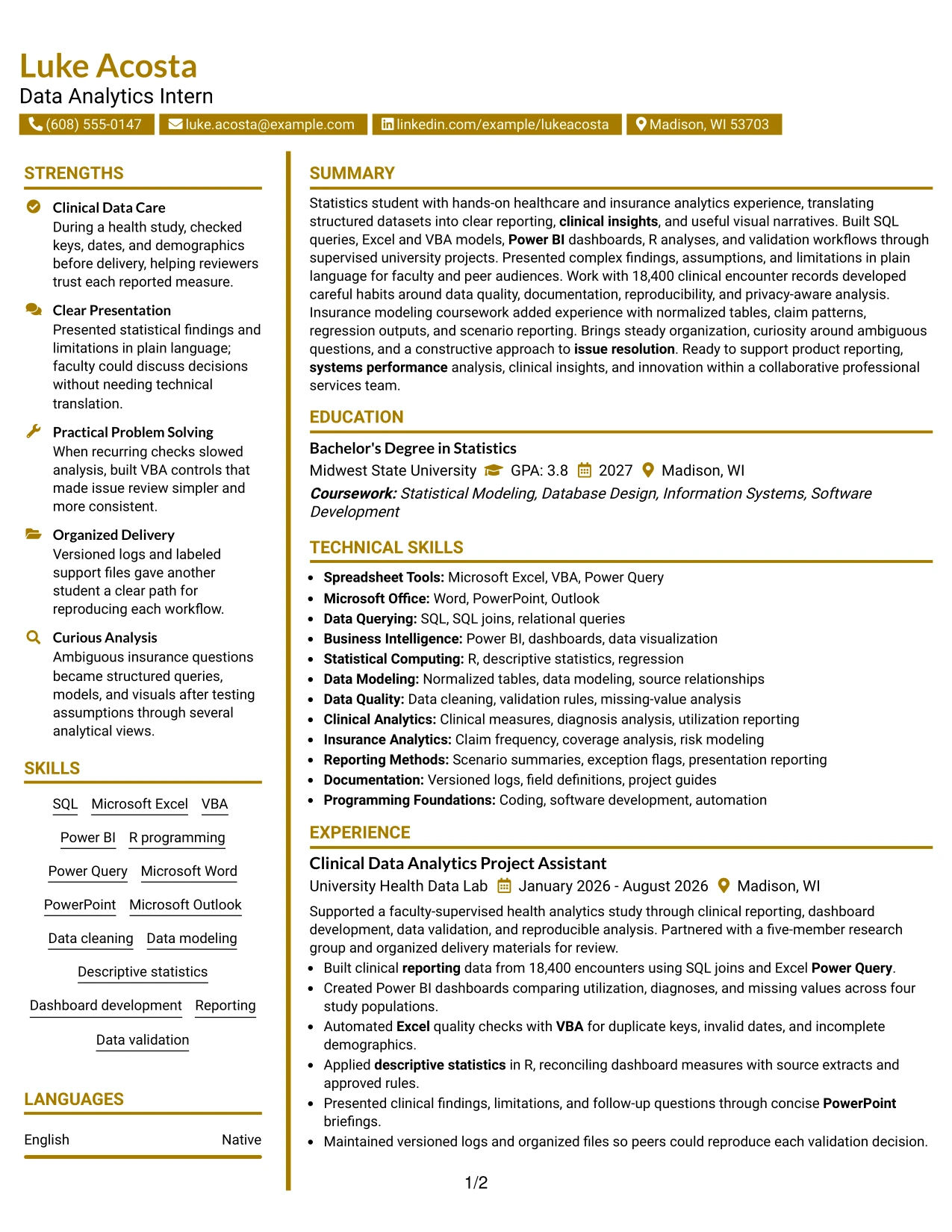
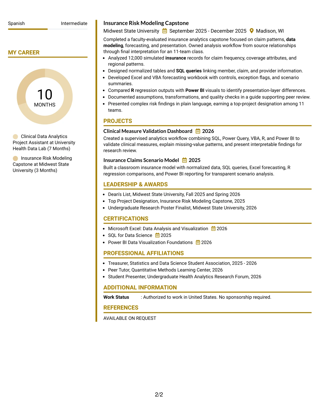
Why the Accent Divider Modern Two Column Format Works for a Resume
- Accent dividers give each section a clear boundary without adding unnecessary decoration.
- The two-column structure supports efficient comparison of skills and experience.
- Square bullets create consistent visual markers for technical achievements.
- Role-related keywords appear beside evidence from clinical and insurance projects.
- The format gives project work enough visibility to supplement experience entries.
- A modern hierarchy can still preserve readable education and certification details.
- The design suits an analytical resume that should look current and organized.
Best For
- Applicants seeking a modern format with disciplined section separation.
- Resumes where two columns can connect tools with the work that used them.
- Applications needing visible evidence for dashboards, validation, and data modeling.
- Candidates presenting both clinical reporting and insurance scenario analysis.
- Readers who prefer concise bullets with clear visual markers.
- Documents that need contemporary styling without sacrificing professional restraint.
- Technical resumes that must balance keywords, project scope, and readable detail.
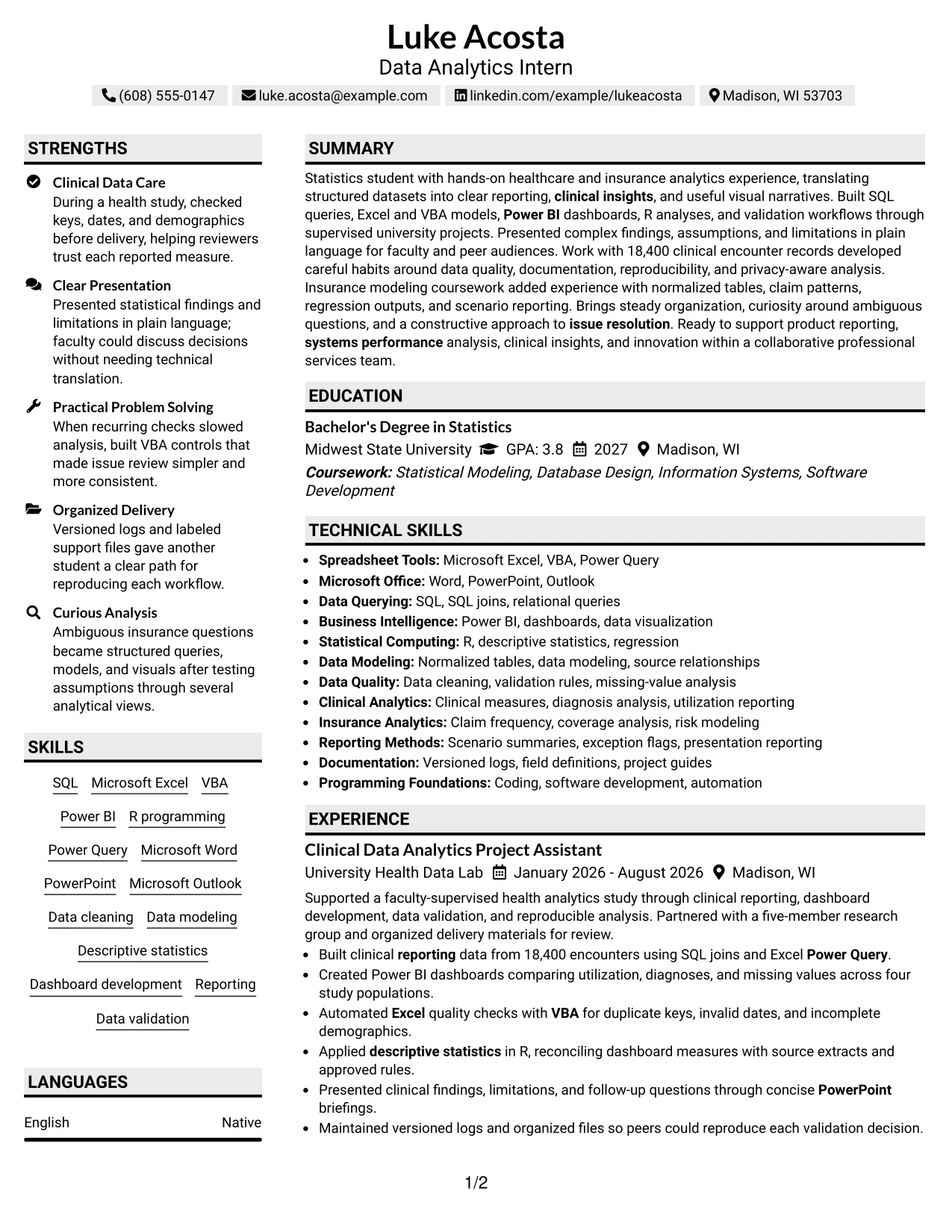
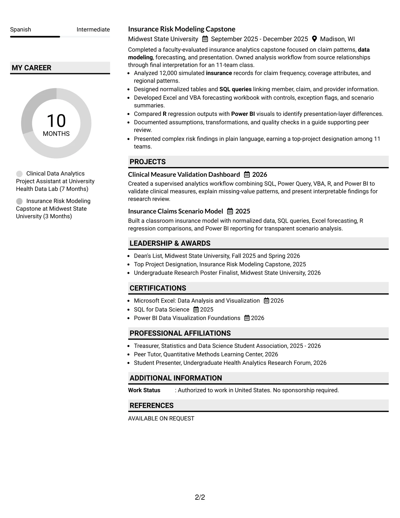
#31 Shaded Labels Clean Two Column Format Resume Example
The Shaded Labels Clean Two Column Format uses structured labels to make the resume sections recognizable at a glance. A reader can move from the summary to experience, projects, skills, education, certifications, awards, and activities without losing the document's overall hierarchy.
Two columns make the information efficient, while square bullets keep results distinct. The resume can show Power BI dashboards across four study populations, VBA checks for duplicate keys and invalid dates, SQL work with normalized tables, and R comparisons in a format built for careful scanning.
Why the Shaded Labels Clean Two Column Format Works for a Resume
- Shaded labels make section boundaries easy to identify during a quick review.
- Two columns reduce unnecessary vertical length while preserving useful detail.
- Square bullets distinguish separate actions, tools, and outcomes.
- Technical keywords remain connected to evidence rather than appearing as an isolated list.
- The format supports clear comparison of work experience and academic projects.
- Awards and certifications can be included without weakening the main hierarchy.
- A clean structure helps readers verify qualifications in a logical order.
Best For
- Resumes that benefit from highly visible labels and predictable section placement.
- Applicants with several evidence types, including projects, awards, and certifications.
- Applications where ATS terms should remain in clean, readable text blocks.
- Candidates needing space for SQL, Power BI, VBA, R, and data quality work.
- Readers who scan for specific sections before reviewing every bullet.
- Documents that must show technical breadth without becoming visually busy.
- Professional applications where orderly presentation reinforces attention to detail.
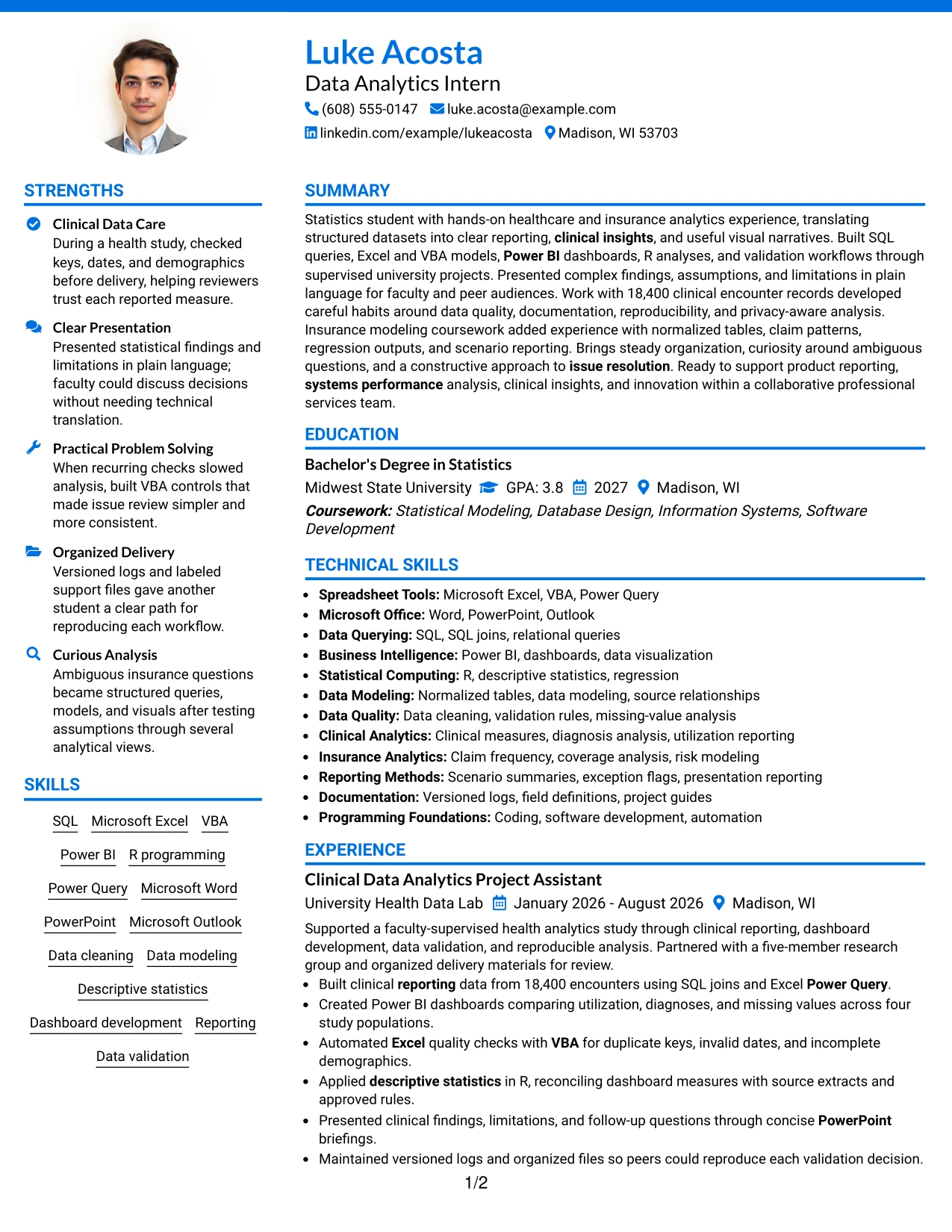
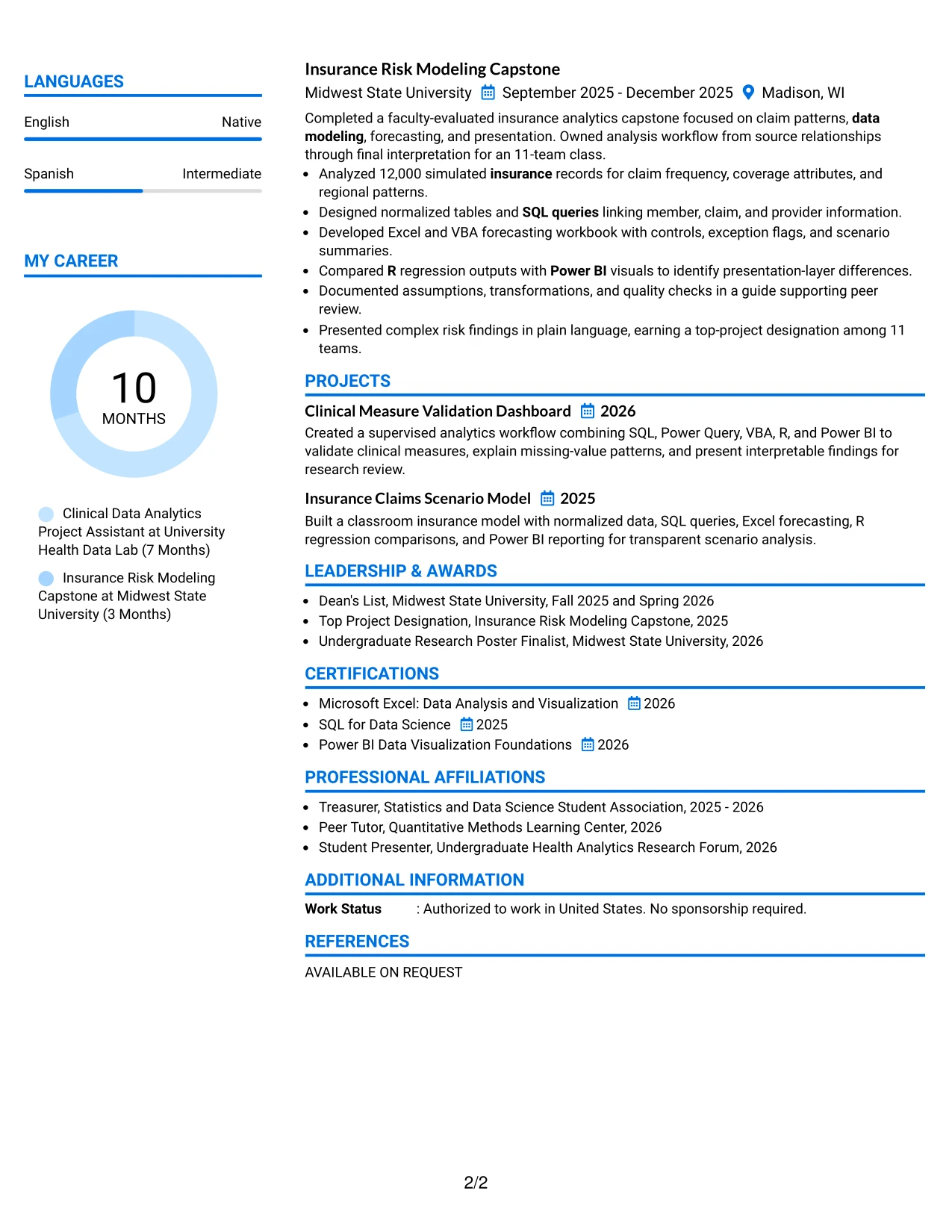
#32 Photo Header Color Accent International Format Resume Example
Readers can start with the header and summary, then use the accented sections to move through experience, projects, education, skills, and certifications. The single-column sequence gives each part of the resume a clear place while allowing the document to present a broad technical profile.
This format can accommodate healthcare and insurance analytics, reporting, documentation, and presentation evidence in one continuous review path. SQL, Excel, VBA, Power BI, R, Microsoft Office, and data validation remain visible as practical qualifications, supported by project scope and clear results.
Why the Photo Header Color Accent International Format Works for a Resume
- The header gives the target role and contact details a clear starting point.
- A single-column flow keeps the full content sequence easy to follow.
- Color accents help readers locate experience, projects, and supporting qualifications.
- The format can hold a broad tool set without separating related evidence too far.
- Healthcare and insurance analytics appear as connected areas of applied work.
- Presentation, documentation, and validation add depth beyond technical keywords.
- The structure supports a complete resume when content volume is substantial.
Best For
- Resumes with broad technical and supporting qualifications in one reading path.
- Applicants combining healthcare analytics, insurance modeling, and statistics study.
- Applications where tools, projects, and certifications should be reviewed in sequence.
- Candidates with substantial documentation and presentation evidence.
- Readers who want clear visual markers across a longer single-column resume.
- Documents that need space for Microsoft Office and analytics software together.
- Professional applications where content breadth is an important strength.
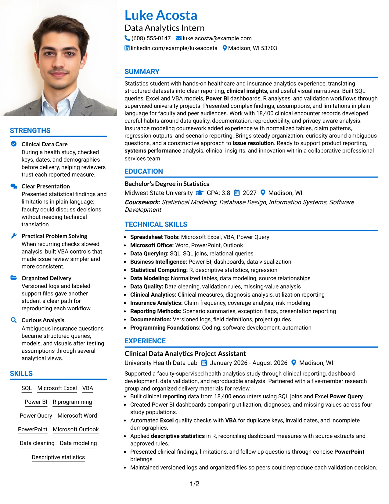
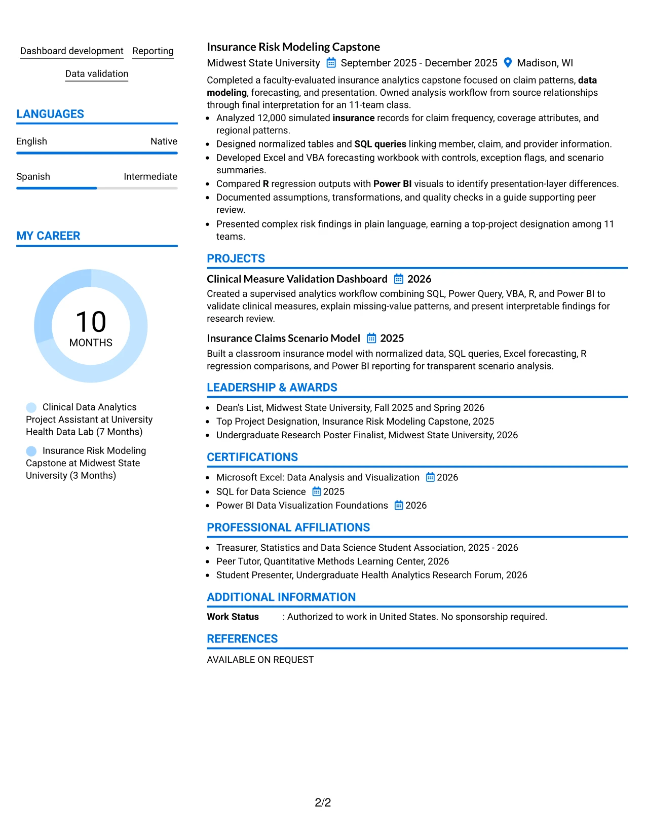
#33 Large Profile Photo International Two Column Format Resume Example
Evidence receives priority in the main column, where experience and project bullets can explain data work in a logical sequence. The second column can keep skills, education, certifications, awards, and activities available as quick supporting references.
This two-column arrangement is useful for a detailed Data Analytics Intern resume because it accommodates both technical breadth and proof of application. SQL joins, Excel and VBA automation, Power BI dashboards, R analysis, and documented validation decisions can stand out without crowding the supporting sections.
Why the Large Profile Photo International Two Column Format Works for a Resume
- The main column gives applied evidence priority during the first detailed review.
- A supporting column keeps qualifications and credentials easy to revisit.
- Two-column organization accommodates a broad student analytics profile.
- Bullets can show dataset scale, validation actions, and reporting outcomes.
- Projects reinforce experience with modeling, forecasting, regression, and visualization.
- Education and certifications remain visible without competing with achievement evidence.
- The format supports a content-rich resume with a clear evidence hierarchy.
Best For
- Resumes where applied evidence should occupy the most prominent reading area.
- Applicants with multiple projects that demonstrate tools through real analysis tasks.
- Applications combining experience, education, certifications, and academic recognition.
- Candidates who need quick-reference skills beside fuller achievement bullets.
- Readers assessing both technical breadth and documented project results.
- Documents with enough content to benefit from a main column and support column.
- Professional applications where evidence hierarchy matters more than minimal presentation.
Why Build Your Data Analytics Intern - Summer 2026 - IntelliScript Resume with ResumeInMinutes
ResumeInMinutes helps you turn coursework, analytics projects, technical tools, and supervised experience into a structured resume that is easy to scan and adapt for the target role.
- ATS-friendly section structure
- Keyword-focused resume content
- Skills and tools organization
- Project and experience guidance
- Free PDF resume previews
- Resume customization support
Build a resume that presents SQL queries, Excel forecasting, VBA automation, Power BI dashboards, R analysis, data modeling, clinical reporting, insurance analysis, and measurable project results in a professional format.
See Also
- 33 Analyst, Data Analytics Resume Templates with Example 2026 (ATS-Optimized)
- 33 Data Analyst - Healthcare Analytics Resume Templates with Example
- 33 Data Analyst - Human Resources Analytics Resume Templates with Example 2026 (ATS-Optimized)
- 33 Data Analyst with Tableau or Salesforce, Adobe Analytics Resume Templates with Example 2026 (ATS-Optimized)
- 33 Data Analytics Intern Resume Templates with Example 2026 (ATS-Optimized)
- 33 Data Science & Analytics Intern Resume Templates with Example 2026 (ATS-Optimized)
- 7 Data Solutions & Analytics Senior Analyst Resume Templates with Example
- 7 Director, AI Data & Analytics GTM Resume Templates with Example
- 30+ Analyst, Data Analytics Cover Letter Templates with Example 2026
- 30+ Data Analyst with Tableau or Salesforce, Adobe Analytics Cover Letter Templates with Example 2026
Frequently Asked Questions
Are these Data Analytics Intern - Summer 2026 - IntelliScript resume templates ATS-friendly?
Yes. The templates use clear headings, readable formatting, and space for accurate keywords such as SQL, Microsoft Excel, VBA, Power BI, R, data visualization, data modeling, and reporting.
Are these 33 different resumes?
No. The guide presents one Data Analytics Intern - Summer 2026 - IntelliScript resume example in different layouts and design themes.
What should a Data Analytics Intern - Summer 2026 - IntelliScript resume include?
Include a focused summary, statistics education, relevant experience or projects, technical skills, data tools, certifications, and bullets that show analysis, validation, reporting, documentation, or presentations.
Which keywords matter for this data analytics intern resume?
Use accurate terms from the target role, including Excel, VBA, Power BI, SQL, R, data modeling, programming, data visualization, clinical insights, systems performance, reporting, and data validation.
Which resume style works best for a Data Analytics Intern - Summer 2026 - IntelliScript application?
A clean one-column layout or a simple two-column format usually works well. Choose readable headings, consistent spacing, standard section names, and a design that keeps technical evidence easy to find.
Can a statistics student with limited professional experience create a strong resume?
Yes. Coursework, supervised analytics work, capstone projects, dashboards, SQL queries, data validation, presentations, certifications, and campus activities can show relevant preparation when described with specific results.
Should I include a photo on my resume?
For applications in the United States, a no-photo resume is generally the safer choice. Use a photo only when local customs or application instructions clearly require one.
Can I customize these resume templates?
Yes. You can adjust the resume text, section order, layout, design style, and PDF format to present your verified qualifications for the Data Analytics Intern - Summer 2026 - IntelliScript role.