33 Front End Web Applications Developer - Mid-Level JavaScript Resume Templates with Example 2026 (ATS-Optimized)
This guide shows you how to build a Front End Web Applications Developer - Mid-Level JavaScript resume that is clear, focused, and easy to adapt. You will learn how to organize technical evidence, present front-end delivery work, and compare professional formats in 33 layouts.
Strong resumes for this role connect front-end engineering work to business and user outcomes. The examples explain how to present JavaScript, HTML5, CSS, REST API integration, XML and JSON handling, interactive UI/UX components, performance work, documentation, and code reviews with concise, evidence-first bullets.
The guide also shows how to align resume sections with work involving SAP Analytics Cloud Analytics Designer, Budget and Spend applications, enterprise planning, reporting dashboards, federal and higher education environments, and standard SDLC, agile, and lean practices. Each format is designed to support ATS matching and fast review without weakening the technical detail recruiters need.
What Makes a Great Front End Web Applications Developer - Mid-Level JavaScript Resume in 2026
An effective resume for this position is keyword-aligned, technically precise, and built around verifiable delivery evidence. It should make the relationship between requirements, implementation, performance, collaboration, and application support easy to understand during a fast review.
- Use a focused summary that names the exact role and establishes strengths in JavaScript, front-end web applications, and interactive planning or reporting solutions.
- Organize experience bullets around delivered features, API integration, debugging, performance improvements, UI/UX feasibility reviews, and release readiness.
- Present technical skills in clear groups, including JavaScript, HTML5, CSS, SAP Analytics Cloud Analytics Designer, REST APIs, XML, JSON, object-oriented programming, responsive design, and browser debugging.
- Show measurable or observable outcomes, such as more reliable workflows, fewer duplicate logic paths, improved handling of large reporting datasets, or clearer release reviews.
ATS alignment should support accurate resume content rather than replace it. Relevant terms for this role include Front End Web Applications Developer, JavaScript, HTML5, CSS, SAP Analytics Cloud, SAC Analytics Designer, enterprise planning, reporting applications, interactive UI/UX components, front-end performance, scalability, REST APIs, XML, JSON, object-oriented design, debugging, technical feasibility, code reviews, Public Trust clearance, U.S. citizenship, SDLC, agile, and lean practices.
The resume examples below use an evidence-first approach so formatting supports role-specific clarity, ATS matching, and fast review. Each layout gives JavaScript delivery, SAP Analytics Cloud work, API integration, interactive UI/UX development, performance judgment, and measurable application outcomes a clear place in the document.
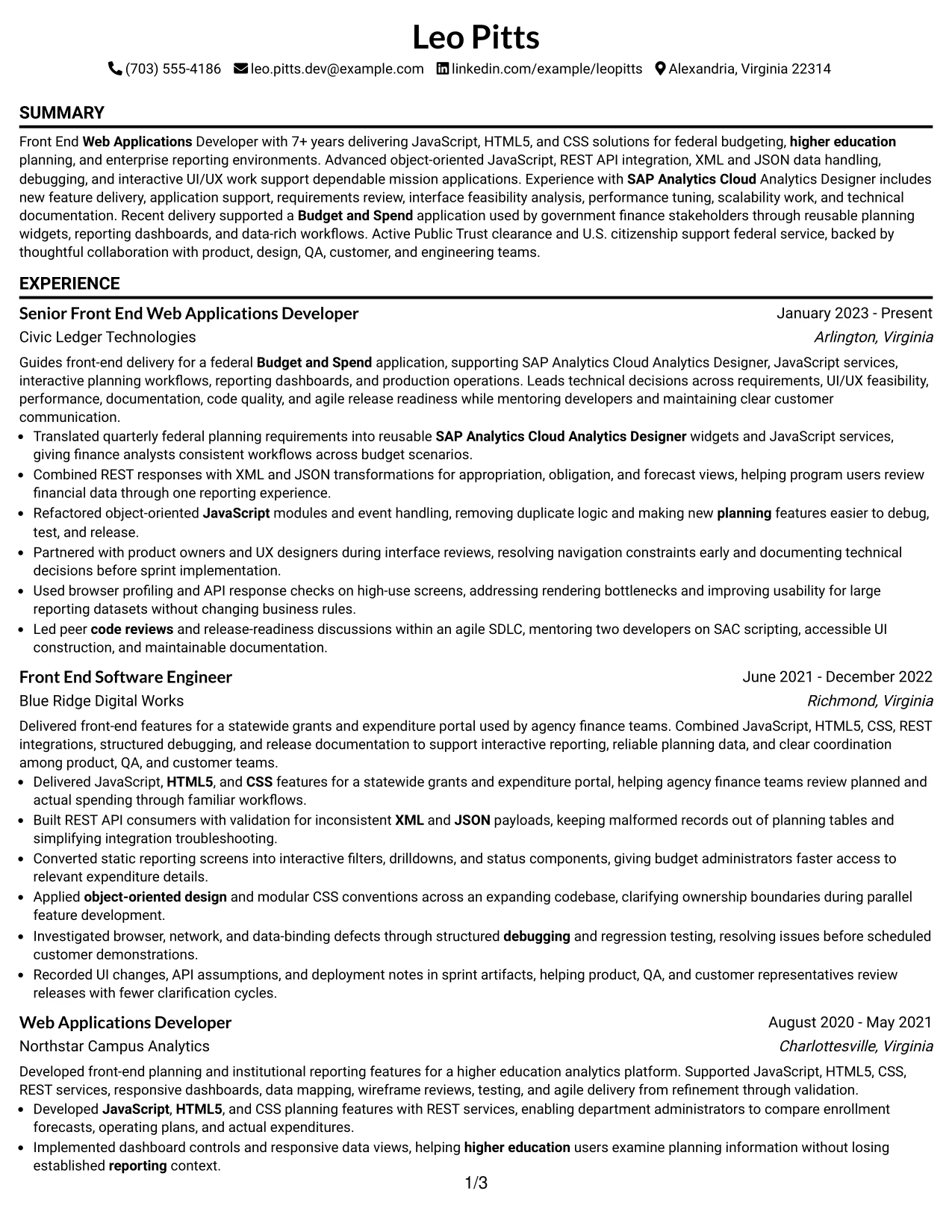
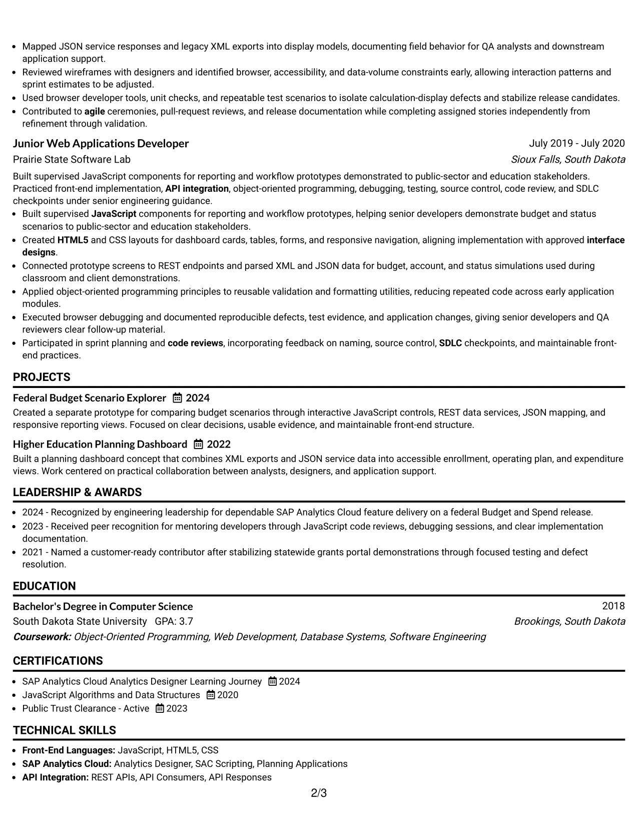
#1 Simple One Column Format Resume Example
The Simple One Column Format places the resume in a clear top-to-bottom order. A professional summary leads into experience, projects, education, certifications, and skills, so the reader can review the full career story without moving between columns.
For a Front End Web Applications Developer, this structure gives JavaScript, HTML5, CSS, REST APIs, SAP Analytics Cloud, and measurable delivery evidence a direct path through the page. Short bullet points support fast scanning, while consistent section labels help ATS software identify the resume content.
Why the Simple One Column Format Works for a Resume
- A single reading path makes experience easy to review from the latest role backward.
- Standard section order supports reliable ATS parsing and recruiter scanning.
- Separate skills and certification areas keep technical keywords visible.
- Full-width bullets provide room for REST API, XML, and JSON details.
- Project entries can show practical application without crowding the work history.
- Consistent spacing gives accomplishments and responsibilities equal structure.
- The format keeps federal budgeting and reporting experience connected to the target role.
Best For
- Resumes that need a straightforward top-to-bottom review path
- Candidates with several related roles that benefit from clear chronology
- ATS-focused applications using familiar section headings
- Technical resumes with detailed experience bullets and project entries
- Applicants who need room for programming languages, APIs, and data formats
- Documents that combine experience, education, certifications, and clearance details
- Online applications where simple text structure supports reliable parsing
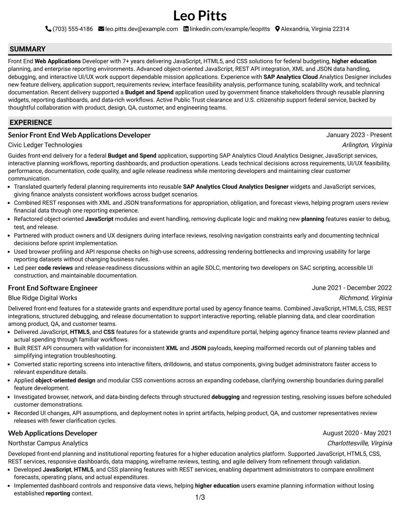
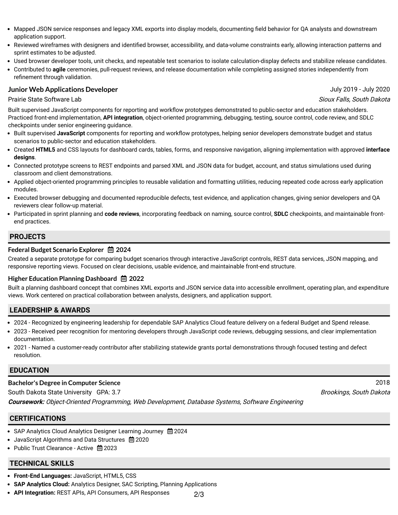
#2 Plain One Column with Shaded Labels Resume Example
Readers move through this resume from the summary to labeled sections, then into recent experience and supporting qualifications. Shaded labels create visual stops without interrupting the chronological order, making a longer document easier to follow.
That organization suits a technical record with seven or more years of front-end work. It leaves enough width for bullets covering interactive UI/UX components, API integration, debugging, performance work, documentation, projects, education, and certifications while keeping the page readable.
Why the Plain One Column with Shaded Labels Works for a Resume
- Shaded labels separate major sections without adding a complex layout.
- The full-width design accommodates six-bullet experience entries.
- Chronological work history keeps recent delivery responsibility prominent.
- Skills can carry exact terms such as Object-Oriented Programming and JSON.
- Project descriptions have space to explain planning dashboards and reporting views.
- Clear labels help readers locate education, certifications, and clearance information.
- Plain visual treatment keeps the document suitable for ATS review and digital submission.
Best For
- Resumes with substantial technical content across multiple positions
- Applications that require detailed project and experience descriptions
- Candidates who want visual section markers without a sidebar
- Documents that must preserve generous width for accomplishment bullets
- ATS submissions that still need light visual hierarchy for human readers
- Career histories combining federal, state, and higher education applications
- Resumes with several supporting sections beyond core employment
#3 One Column Format with Photo Right Resume Example
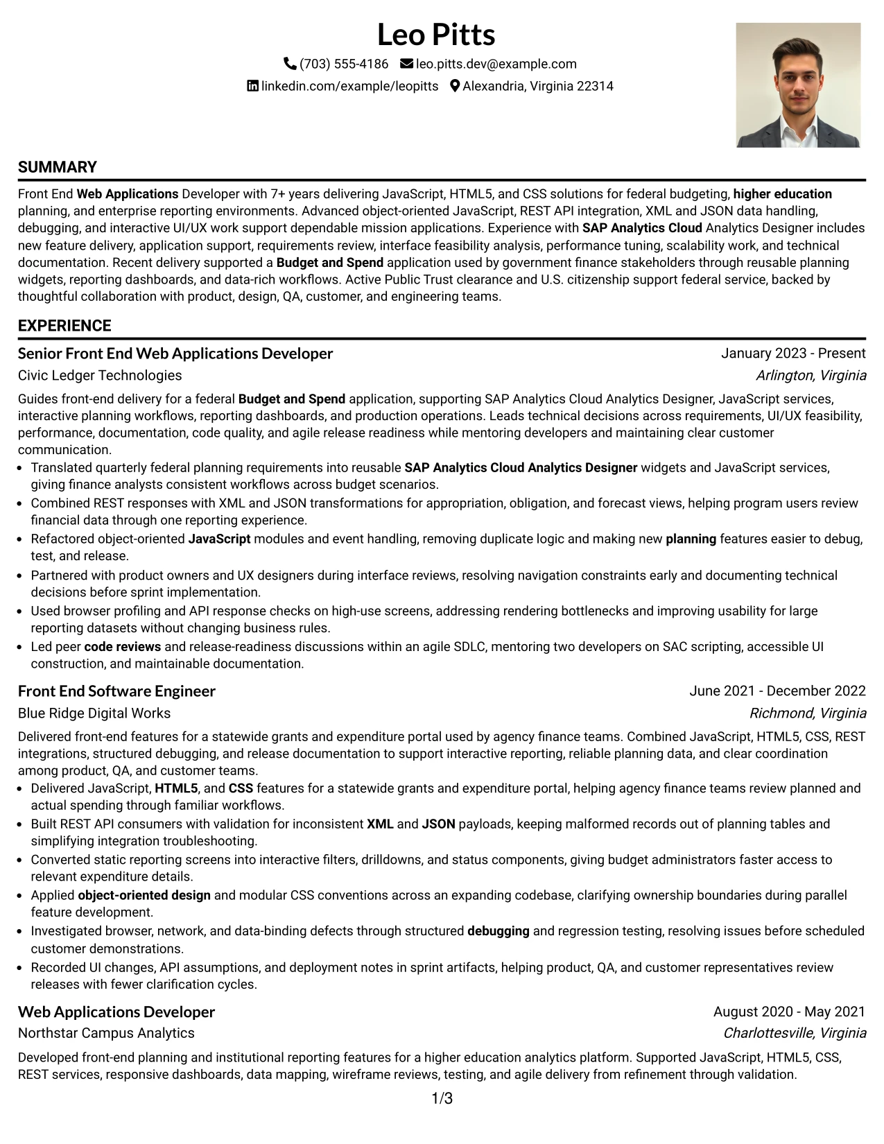
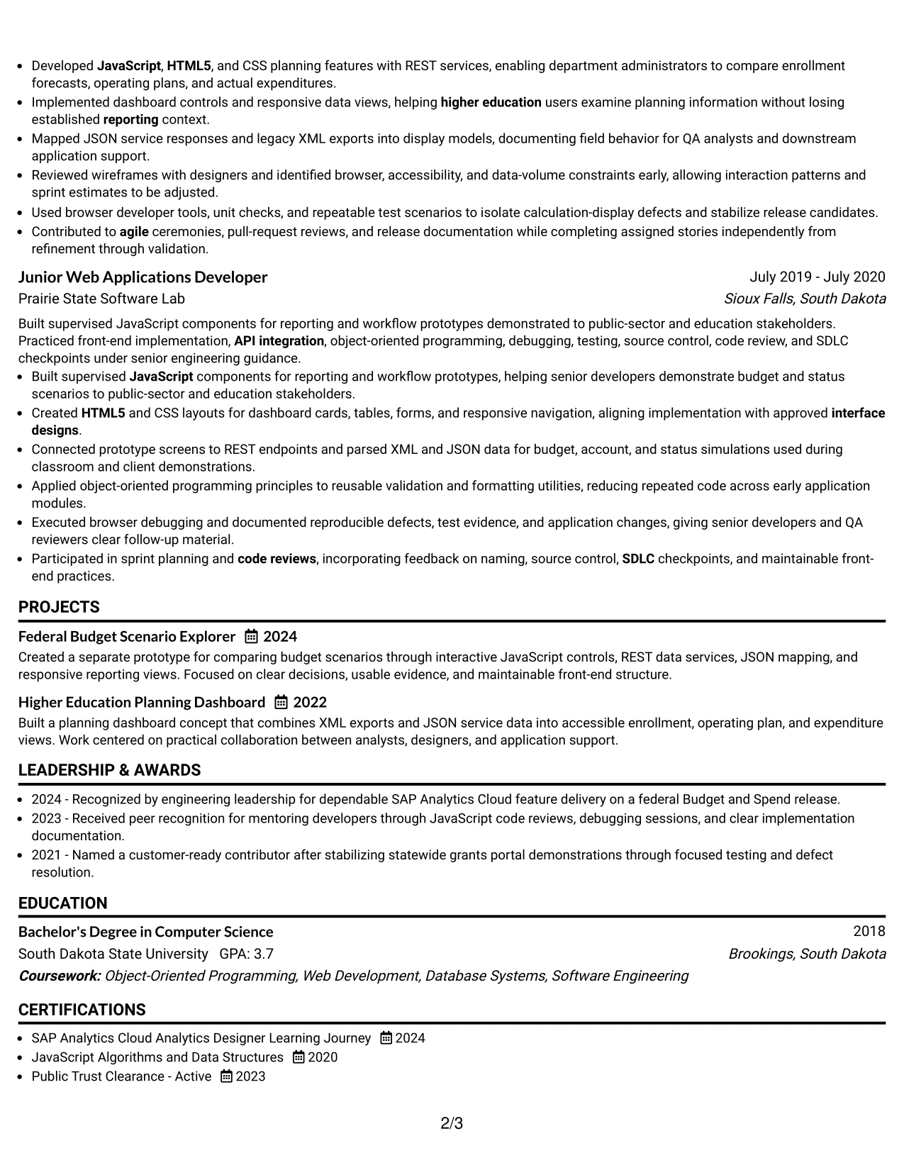
The strongest evidence appears early: the summary, front-end experience, and technical capabilities establish the resume's value before supporting sections. A right-side photo area adds a personal visual element while the main column preserves a familiar reading sequence.
For this Front End Web Applications Developer resume, the main content can give priority to SAP Analytics Cloud delivery, JavaScript services, REST integrations, performance improvements, code reviews, and federal Budget and Spend work. The photo should remain secondary so it does not compete with qualifications or ATS-readable text.
Why the One Column Format with Photo Right Works for a Resume
- The main column gives experience and technical evidence the greatest visual weight.
- A right-side photo area adds identity without breaking the primary content flow.
- Full-width bullets make complex application work easier to explain.
- Recent Budget and Spend delivery can appear before older experience.
- Projects provide a separate place for prototype and dashboard evidence.
- Skills and certifications remain easy to find beneath the experience record.
- The layout keeps the visual element subordinate to searchable resume text.
Best For
- Applications where experience evidence should dominate the first review
- Candidates who want a traditional one-column record with a personal visual area
- Resumes that need wide bullets for technical implementation details
- Documents presenting both production delivery and independent projects
- Roles where a polished personal presentation supports, but does not replace, qualifications
- Applications that benefit from a clear hierarchy between core evidence and supporting sections
- Candidates who can keep the photo professional and secondary to ATS-readable content
#4 Clean Two Column Sidebar Format Resume Example
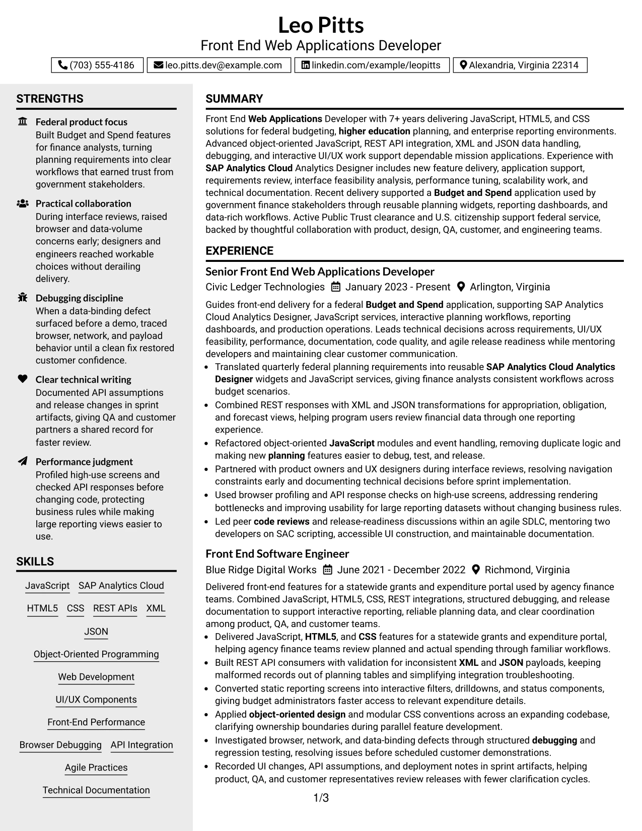
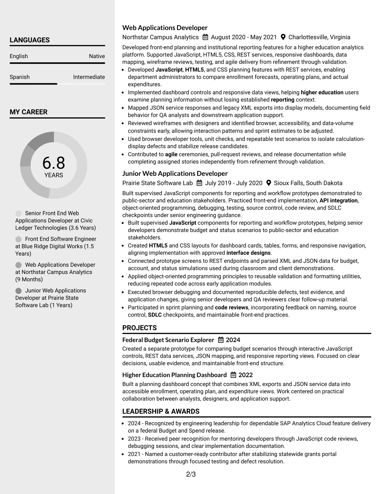
Content is balanced between a broad main column and a compact sidebar. The main area carries the summary and experience bullets, while the sidebar can hold skills, education, certifications, clearance, and selected project details for quick reference.
This arrangement supports a practical review of a front-end resume. The reader sees delivery evidence in the main column and can confirm JavaScript, HTML5, CSS, REST APIs, XML, JSON, SAP Analytics Cloud, and agile practices without searching through every bullet.
Why the Clean Two Column Sidebar Format Works for a Resume
- The main column protects space for detailed achievement bullets.
- A sidebar keeps high-value skills visible during the experience review.
- Education and certifications remain accessible without interrupting chronology.
- Compact labels help surface Public Trust clearance and U.S. citizenship.
- The structure separates evidence from reference information in a logical way.
- Project summaries can support the main employment record without taking over the page.
- Balanced columns create a professional application document for federal technology work.
Best For
- Applications that need both detailed evidence and quick-reference qualifications
- Candidates with a broad skills list that would crowd a single column
- Federal submissions where clearance and education should stay easy to locate
- Resumes combining production roles with selected project summaries
- Readers who compare experience bullets with tools and methods at the same time
- Documents needing a compact sidebar for certifications and contact details
- Applicants seeking a structured layout that supports both review speed and content depth
#5 Two Column Format Resume Example
For a practical application, the Two Column Format gives a resume a compact way to present extensive technical information. One column can carry professional experience and projects, while the other organizes skills, education, certifications, and clearance details.
The format fits a candidate whose record includes federal budgeting, higher education planning, and enterprise reporting. It can show JavaScript, REST API integration, XML and JSON handling, responsive design, browser debugging, and performance work without making the experience section feel disconnected from the technical profile.
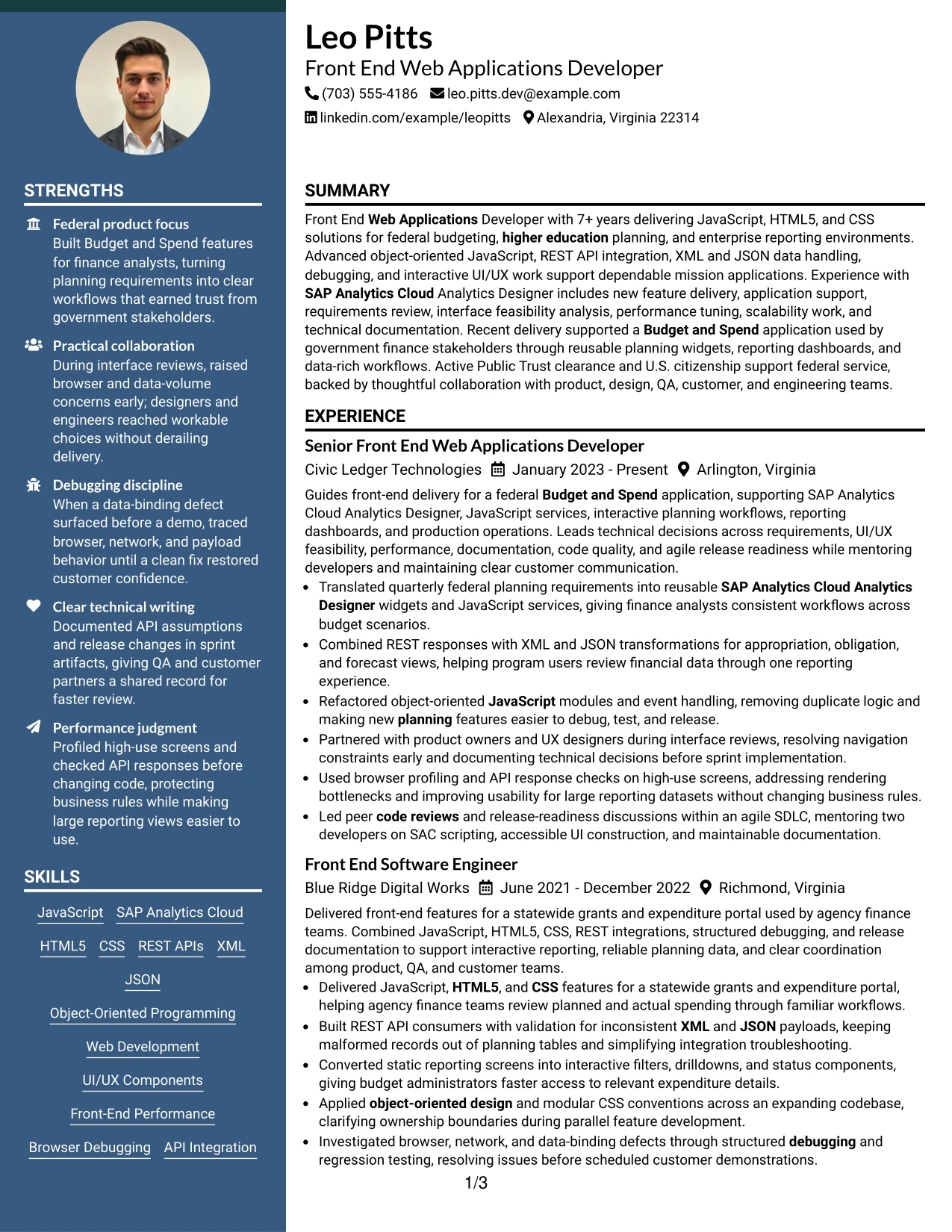
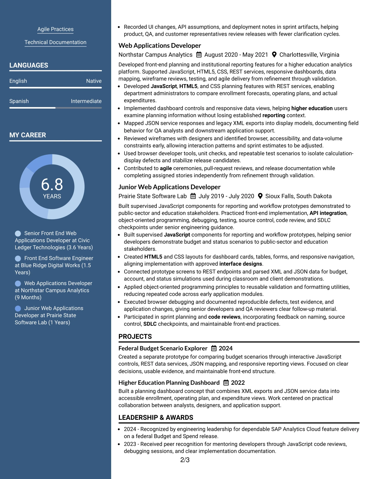
Why the Two Column Format Works for a Resume
- Two columns reduce unused space when the resume contains many qualification types.
- The experience column can preserve detailed bullets and project context.
- A companion column keeps core technologies visible during a quick review.
- Technical skills can be grouped by language, integration, design, and delivery method.
- Education and certifications have a defined area instead of competing with work history.
- The format supports a focused summary followed by evidence-rich employment entries.
- Clear separation helps readers connect application work to the required technology stack.
Best For
- Resumes that must present a complete technical profile in limited space
- Candidates balancing detailed work history with a broad skills inventory
- Applications that include projects, certifications, and education alongside employment
- Readers who need to compare tools with delivery evidence quickly
- Documents with grouped technical categories such as languages, APIs, and testing
- Candidates presenting public-sector and higher education work in one record
- Digital resumes that need visual economy without removing substantive content
#6 Photo Header Two Column Format Resume Example
A restrained visual hierarchy places the name and photo in the header, then divides the remaining content into two useful reading areas. This gives the document a clear identity while allowing experience and projects to occupy one column and skills, education, certifications, and clearance to occupy the other.
The format can align well with a polished application for a Front End Web Applications Developer when the photo is appropriate for the submission context. The resume should still lead with evidence such as SAC Analytics Designer delivery, interactive dashboards, API integration, performance tuning, and code reviews.
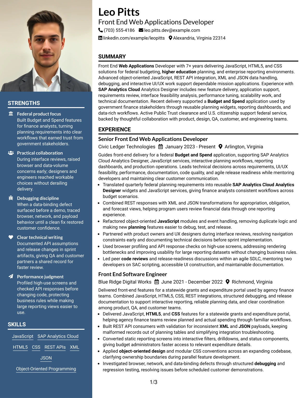
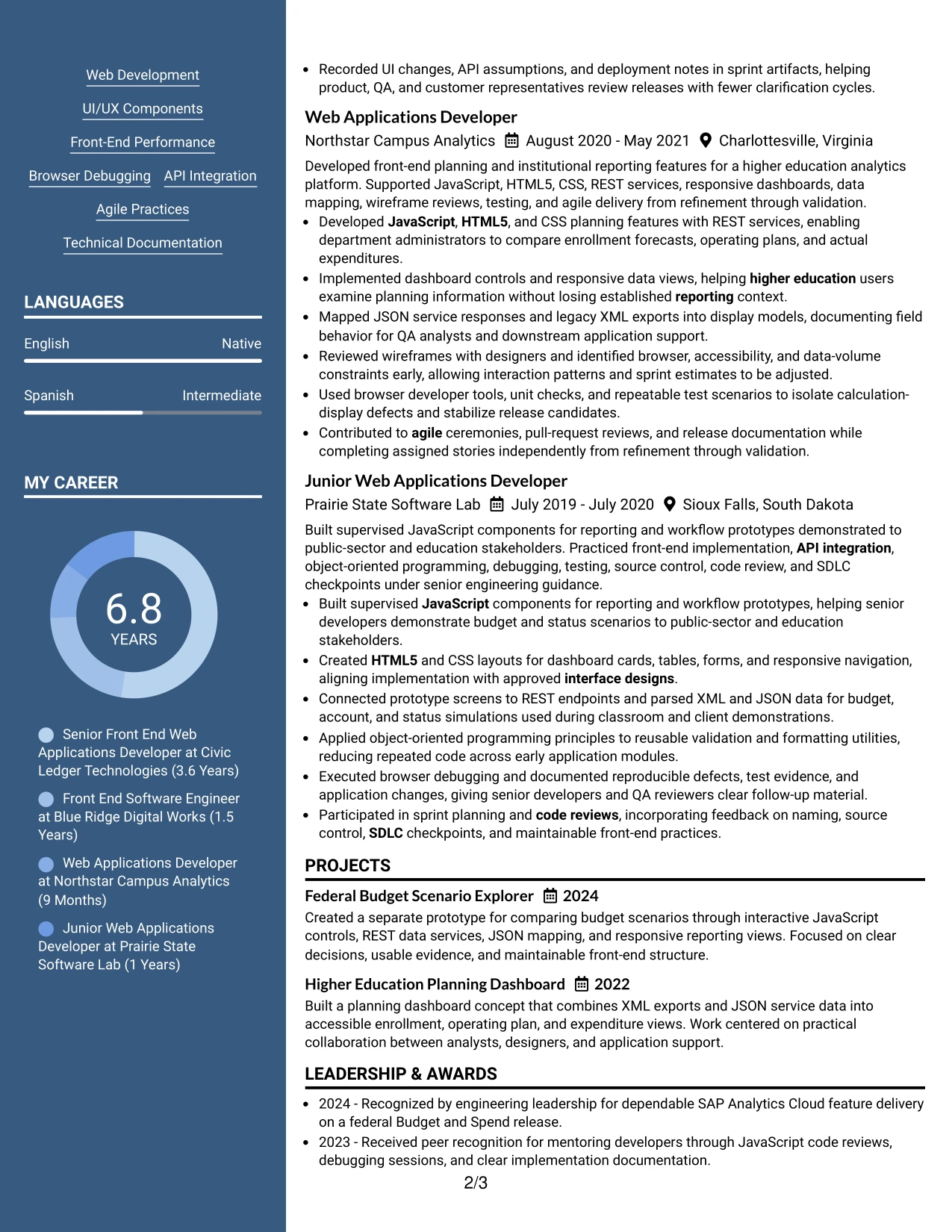
Why the Photo Header Two Column Format Works for a Resume
- The header creates a distinct first impression without taking space from the body.
- Two columns separate detailed experience from concise qualification data.
- The photo can support personal presentation when the application context permits it.
- A strong header keeps the target role and contact details immediately visible.
- Skills and certifications can be reviewed beside, rather than after, employment evidence.
- Project entries can demonstrate practical front-end delivery in a compact area.
- The hierarchy keeps technical proof more important than decorative design.
Best For
- Applications where a polished header is appropriate and a photo is professionally accepted
- Candidates needing separate zones for experience and technical qualifications
- Resumes that combine production applications with project-based evidence
- Roles requiring quick review of clearance, certifications, and education
- Documents with enough content to benefit from two-column grouping
- Applicants who want personal presentation while preserving searchable technical details
- Submissions where the visual header can complement, not replace, measurable delivery evidence
#7 Simple Two Column Format Resume Example
The Simple Two Column Format groups related information into two direct paths. Experience and projects can occupy the wider area, while skills, education, certifications, and clearance sit in a supporting column that remains visible during review.
Its restrained structure works well for a resume with strong technical evidence. The page can feature JavaScript and HTML5 delivery, REST API consumers, XML and JSON transformations, debugging, responsive interfaces, and agile collaboration without requiring the reader to navigate a dense design.
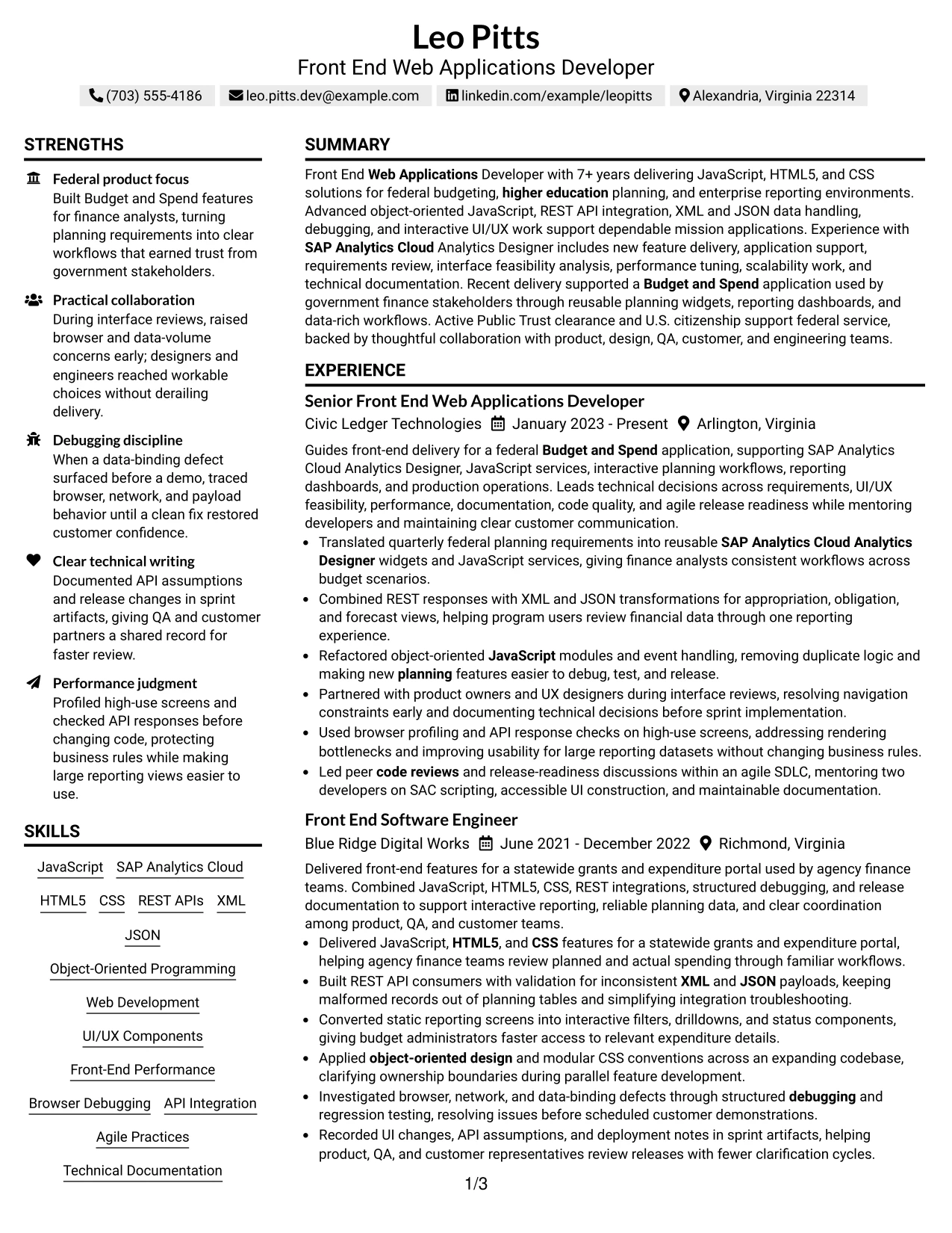
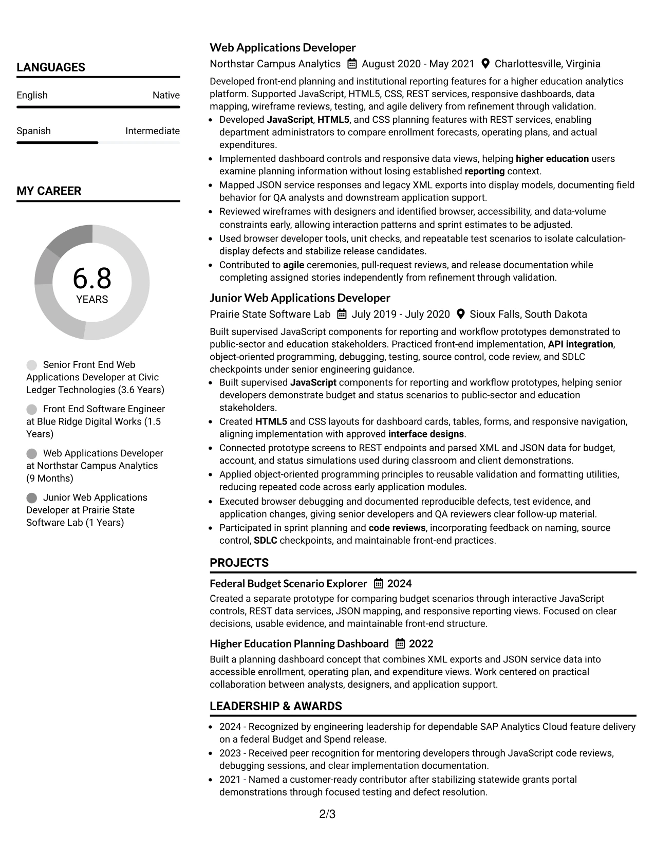
Why the Simple Two Column Format Works for a Resume
- Two direct content paths make a broad qualification set easier to scan.
- The primary column leaves room for accomplishment-focused experience bullets.
- The supporting column keeps skills and credentials available at a glance.
- Simple section labels reduce visual noise and support ATS-friendly reading.
- Projects can reinforce application delivery without interrupting job chronology.
- The format makes technical categories easier to compare with work examples.
- A restrained presentation keeps attention on results, tools, and responsibilities.
Best For
- Resumes needing a clean split between evidence and qualification details
- Candidates with multiple front-end technologies to organize by category
- Applications where projects should remain visible beside employment history
- Readers who scan for skills before reviewing every experience bullet
- Documents that need efficient use of page width without decorative complexity
- Candidates presenting API, data, UI, and testing experience together
- Digital submissions that benefit from simple headings and predictable sections
#8 Text/Fang Style Resume Example
Readers move through the Text/Fang Style as a continuous, text-led record with clear section breaks. The format favors a steady review of the summary, experience, projects, education, certifications, and skills rather than relying on visual panels or complex navigation.
That approach gives detailed front-end work room to explain context and results. Bullets can connect SAP Analytics Cloud Analytics Designer, JavaScript, REST services, data mapping, debugging, performance checks, and technical documentation to the applications and stakeholders they supported.
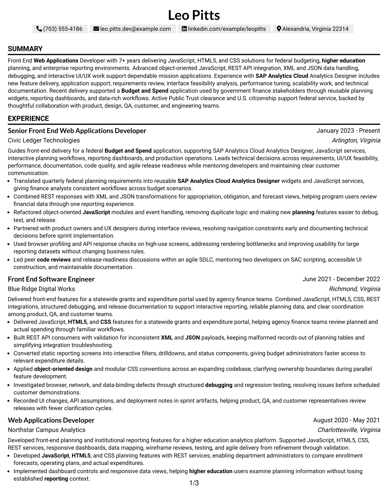
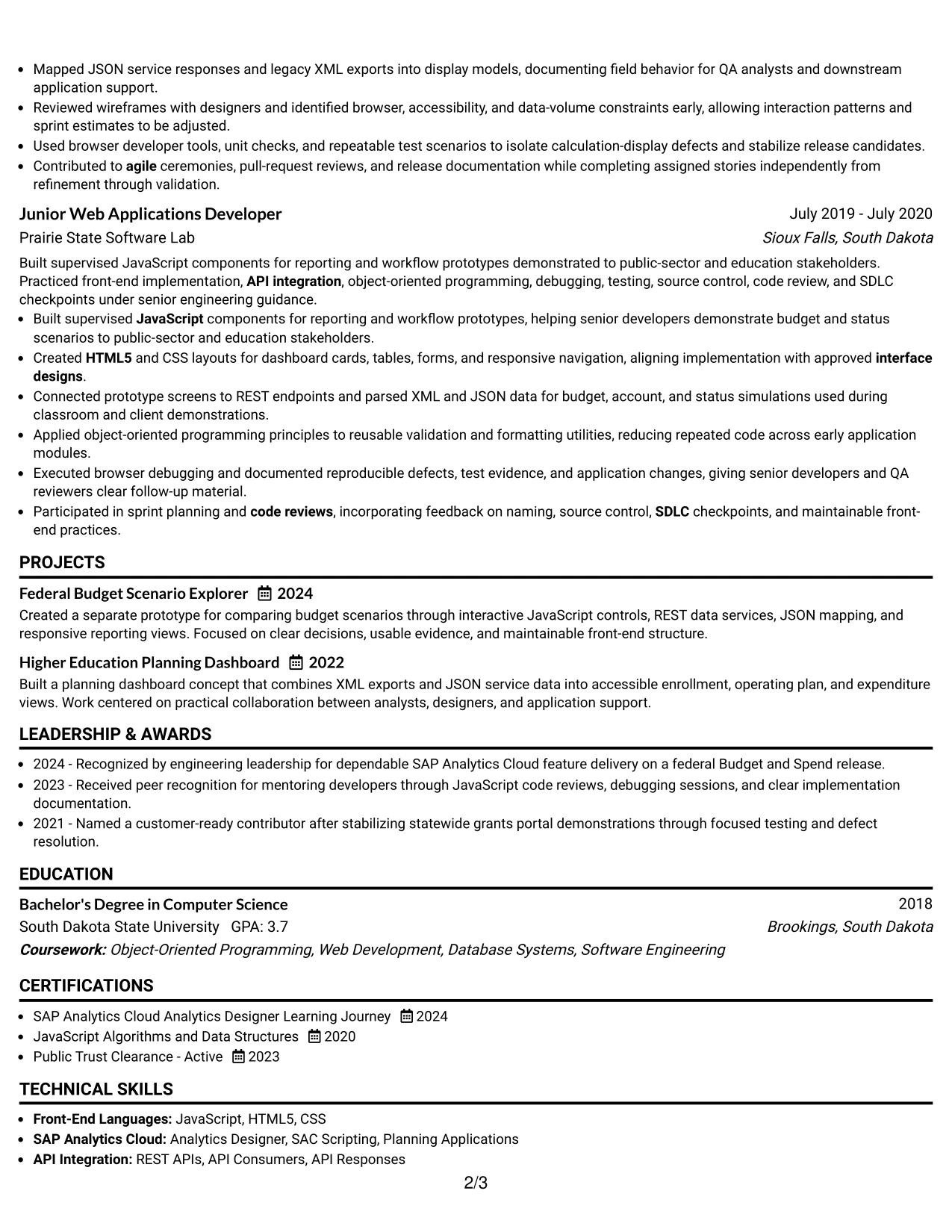
Why the Text/Fang Style Works for a Resume
- A text-led structure keeps the professional story easy to follow.
- Full-width content supports context around technical decisions and results.
- Experience bullets can explain data handling without severe space limits.
- Projects offer room to describe prototypes, dashboards, and user needs.
- Skills remain searchable through clear text rather than visual symbols.
- The format supports detailed documentation, testing, and collaboration evidence.
- Simple presentation works well for digital review and standard application systems.
Best For
- Resumes where explanation and context matter as much as keyword coverage
- Candidates with detailed bullets about systems, data, and delivery decisions
- Applications that include multiple projects needing short narrative descriptions
- Readers who prefer a continuous text review over visual side panels
- Documents with technical documentation and testing evidence to preserve
- Candidates whose qualifications span application build, support, and implementation
- Digital submissions that prioritize readable text and predictable section order
#9 One Column Boxed Contact Header Format Resume Example
The strongest evidence can begin immediately below a boxed contact header. With the name, target role, location, and contact details contained in one defined area, the remaining page can focus on the summary, experience, projects, skills, education, and certifications.
This format is effective when the resume must establish both identity and technical value quickly. The experience section can emphasize interactive UI/UX components, API integration, browser debugging, scalability, performance, and federal Budget and Spend delivery while the header keeps contact information easy to verify.
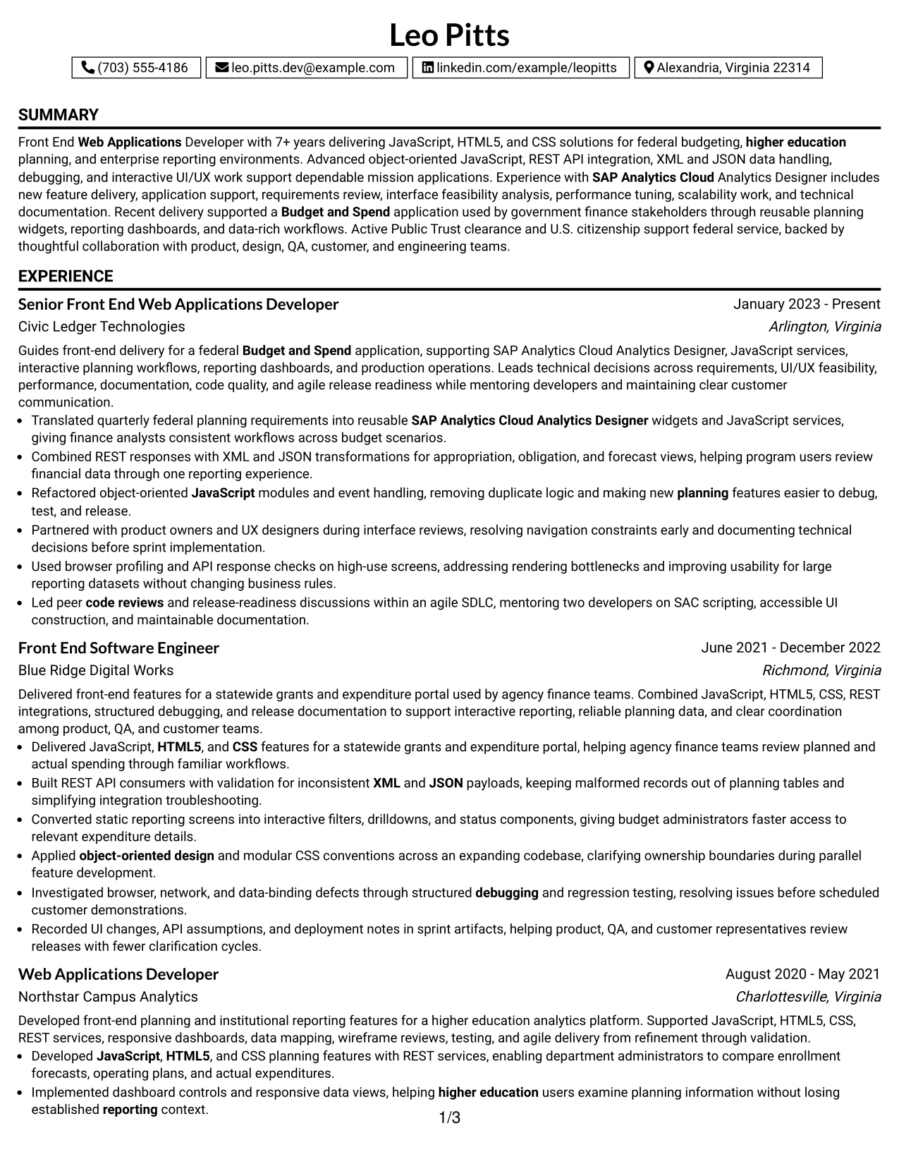
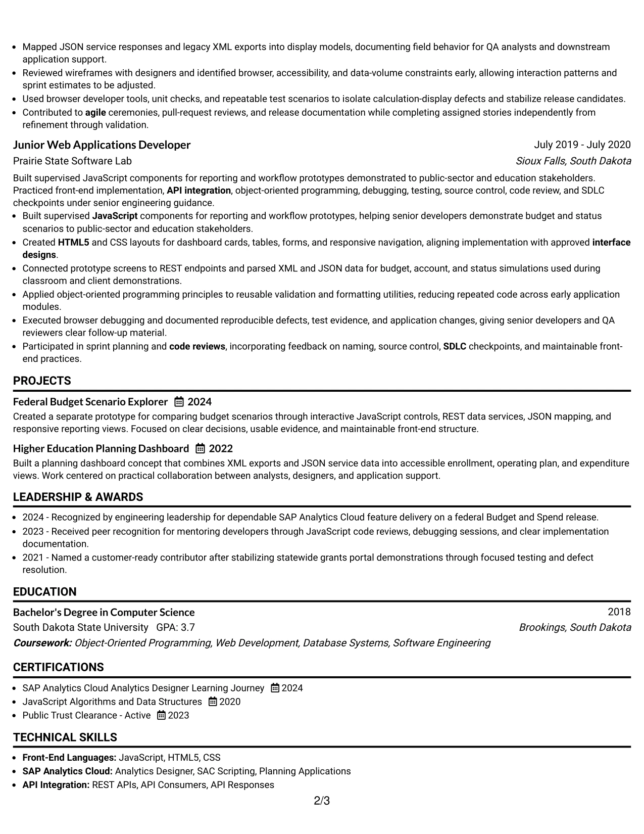
Why the One Column Boxed Contact Header Format Works for a Resume
- The boxed header makes contact details and the target role easy to confirm.
- A single body column gives achievement bullets consistent reading width.
- The summary can connect technical strengths to the target application need.
- Experience entries remain chronological and simple to parse.
- Projects can add evidence of JavaScript controls and reporting views.
- Skills and certifications fit naturally after the primary evidence sections.
- The format separates identity information from the qualifications that support it.
Best For
- Applications needing a prominent but compact contact area
- Candidates who want the target role visible before detailed experience
- Resumes with strong project and employment evidence in one column
- Readers making a quick first check of location, contact, and role information
- Documents emphasizing interactive interfaces, APIs, and performance work
- ATS submissions that need a clean body beneath a visually defined header
- Documents that use the One Column Boxed Contact Header Format to make professional details easy to review.
#10 Plain Two Column Format Resume Example
Content is balanced between a main evidence column and a concise qualification column. This practical distribution helps the reader review experience and projects while keeping key skills, education, certifications, and clearance within immediate reach.
Leo Pitts's resume can use the structure to present front-end delivery alongside a focused keyword set. The snapshot may call out seven-plus years, SAP Analytics Cloud, JavaScript and HTML5, REST APIs, and active Public Trust clearance before the detailed work history begins.
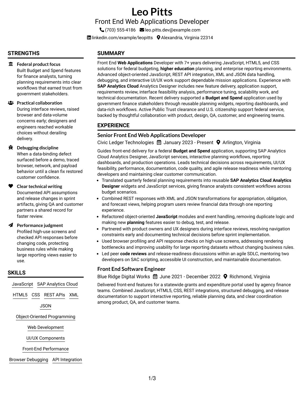
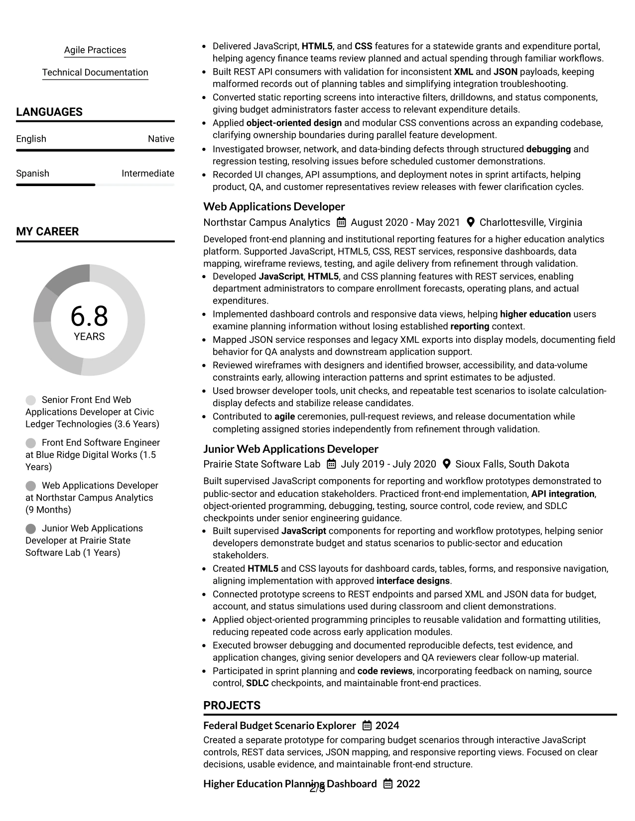
Resume Snapshot
- 7+ years delivering front-end web applications
- JavaScript, HTML5, CSS, REST APIs, XML, and JSON
- SAP Analytics Cloud Analytics Designer and planning applications
- Active Public Trust clearance and U.S. citizenship
Why the Plain Two Column Format Works for a Resume
- The split layout balances experience detail with quick-reference qualifications.
- A resume snapshot surfaces the strongest evidence before deeper scanning.
- The main column can hold full employment bullets and project descriptions.
- The secondary column keeps exact ATS terms visible and grouped.
- Education and certifications remain easy to locate without extending the main flow.
- Plain styling limits distractions and supports professional digital review.
- The structure works for applications requiring both keyword coverage and readable evidence.
Resume Keywords
- Front End Web Applications Developer
- JavaScript
- HTML5
- CSS
- SAP Analytics Cloud Analytics Designer
- REST APIs
- XML and JSON
- Object-Oriented Programming
- interactive UI/UX components
- front-end performance
- Public Trust clearance
- Federal Budget and Spend
#11 Colored Two Column Format Resume Example
For an application that needs clear visual grouping, the Colored Two Column Format uses restrained color to distinguish the main evidence area from supporting qualifications. Experience and projects can lead the review, while skills, education, certifications, and clearance receive a separate, easy-to-scan position.
The color should guide attention rather than compete with the record. In this resume, the most important evidence remains the delivery of JavaScript and HTML5 applications, SAC Analytics Designer features, REST integrations, responsive dashboards, performance improvements, and documented agile releases.
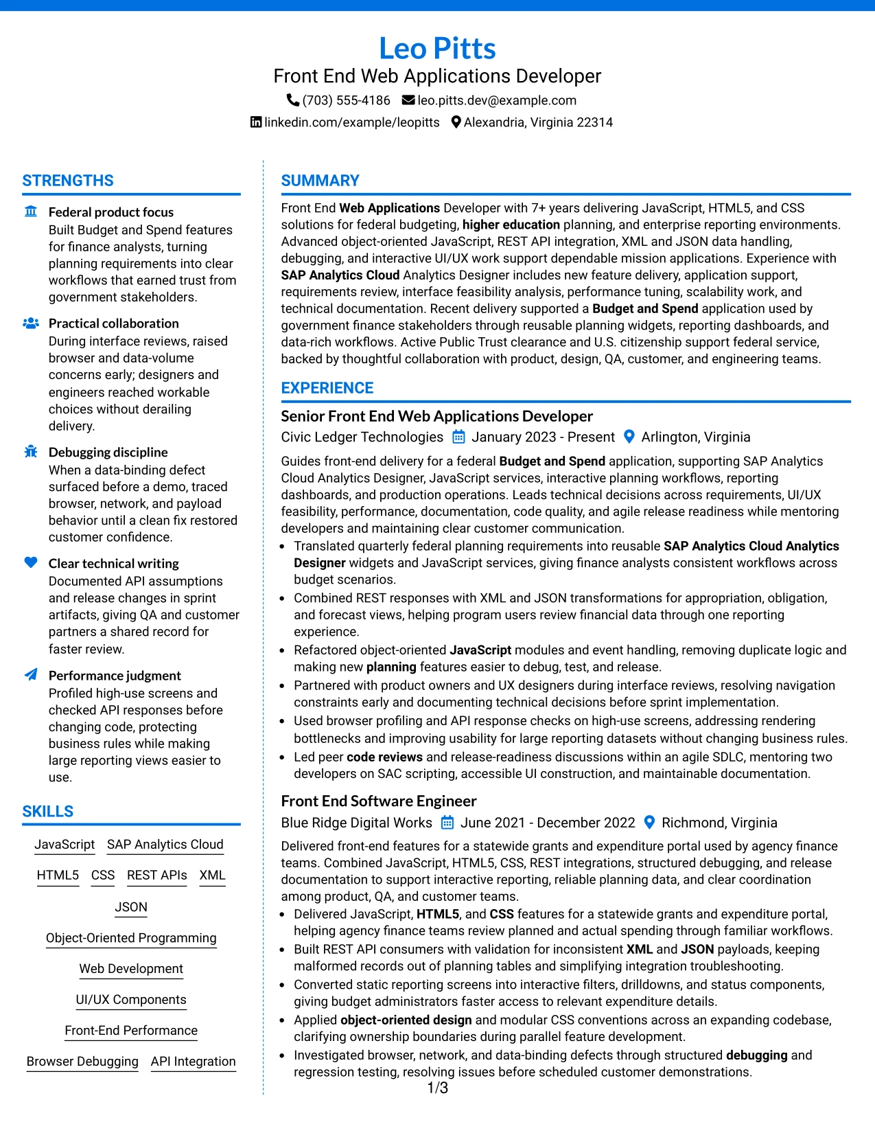
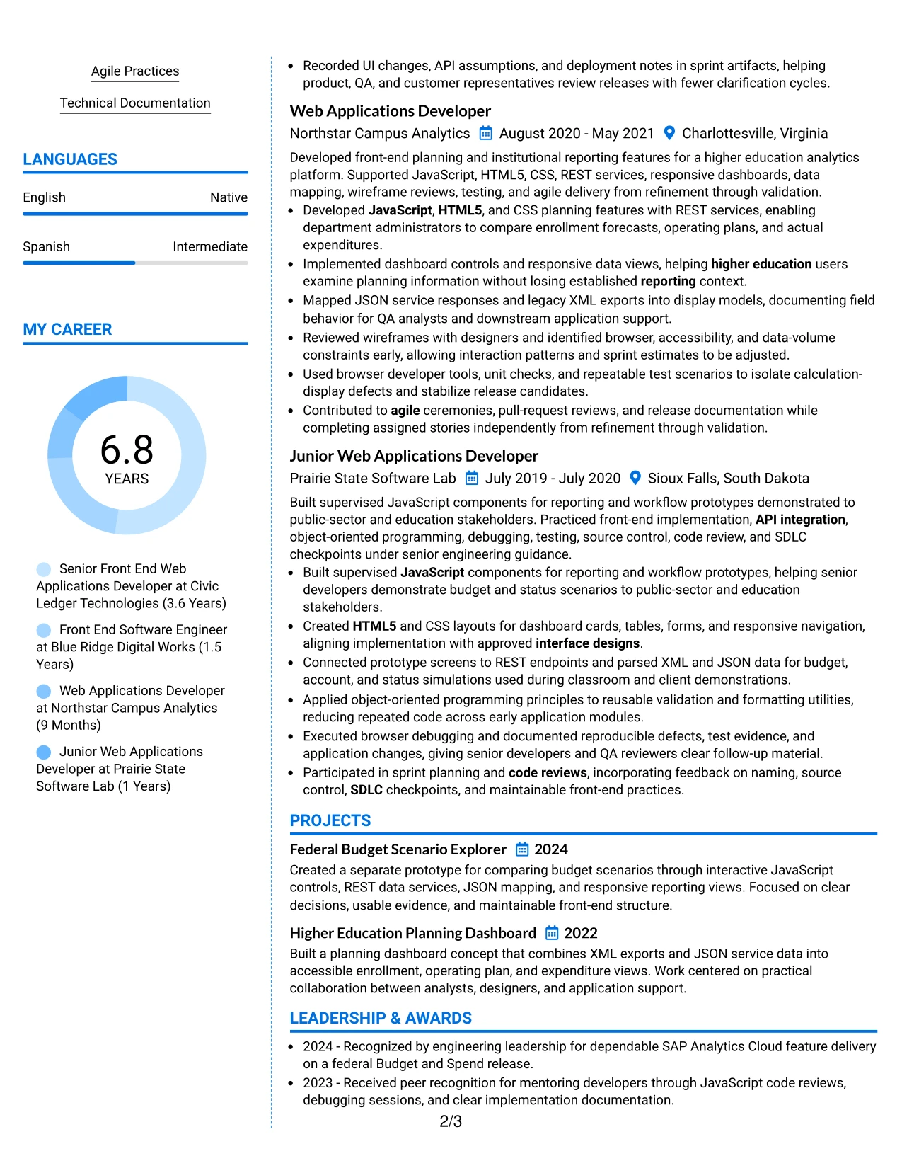
Why the Colored Two Column Format Works for a Resume
- Color creates section separation while the two-column structure preserves efficiency.
- The main column keeps application delivery and measurable evidence prominent.
- The supporting area groups technologies, credentials, and education for quick review.
- A restrained palette can improve navigation without weakening professional tone.
- Project summaries add proof of planning and reporting application work.
- Clear contrast helps readers distinguish skills from employment history.
- The format supports a polished presentation while keeping technical content central.
Best For
- Resumes that need visual grouping without a highly decorative design
- Candidates presenting detailed application work beside a broad qualification set
- Applications where skills and certifications must remain visible during scanning
- Documents combining federal, state, and higher education delivery evidence
- Readers who benefit from color cues between experience and supporting sections
- Candidates with project examples that should sit near, but not inside, work history
- Digital resumes where controlled contrast can improve section navigation
#12 One Column Shaded Contact Header Format Resume Example
A restrained visual hierarchy gives the contact header clear authority while keeping the rest of the resume easy to scan. The one-column structure places the professional summary, experience, education, certifications, and skills in a direct sequence.
For a Front End Web Applications Developer resume, this format gives priority to role alignment and searchable terms such as JavaScript, SAP Analytics Cloud, REST APIs, HTML5, CSS, and Public Trust clearance. Short achievement bullets can show interface delivery, performance work, API integration, and technical leadership without visual distractions.
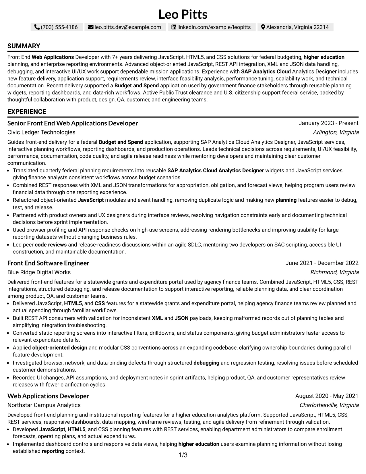
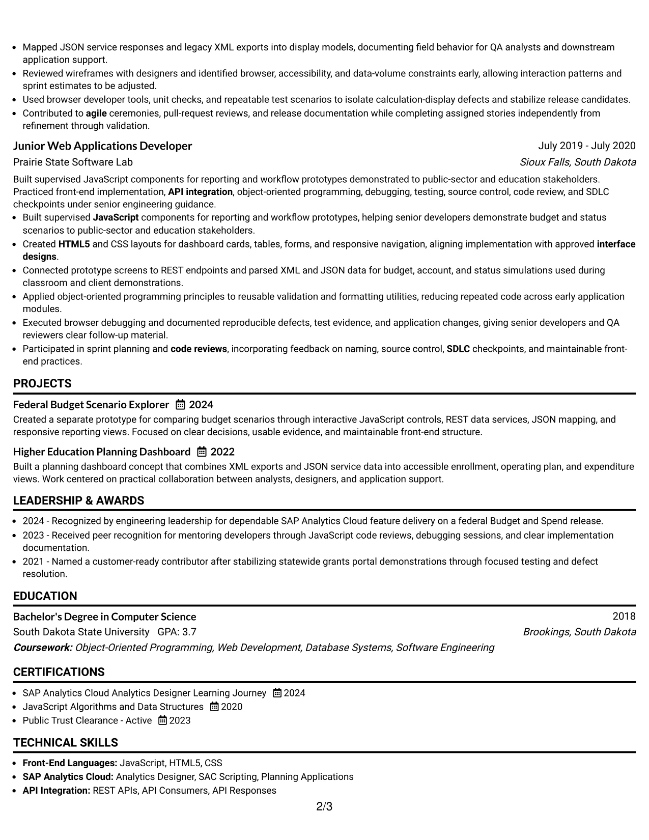
Why the One Column Shaded Contact Header Format Works for a Resume
- The centered contact header establishes a clear starting point for review.
- A single reading path supports fast recruiter scanning and reliable ATS parsing.
- The job title can connect the summary to the target role immediately.
- Shaded labels separate resume sections without taking space from achievement bullets.
- Experience entries can carry detailed evidence while maintaining a clean hierarchy.
- Skills and certifications remain easy to locate during a qualification review.
- The restrained presentation supports a polished, leadership-focused professional profile.
Best For
- Resumes that need direct alignment between the target role and the opening summary.
- One-column reading that keeps experience, education, and skills in a predictable order.
- ATS-focused applications where standard section hierarchy matters.
- Professionals presenting technical keywords alongside detailed accomplishment bullets.
- Applications that require clearance, certification, or domain information to be easy to find.
- Candidates who want a focused presentation without a complex visual structure.
- Roles where measurable delivery, technical judgment, and collaboration should lead the review.
#13 Boxed Contact Header with Job Title Format Resume Example
The Boxed Contact Header with Job Title Format organizes the resume from a prominent identity block into clearly labeled sections. The job title sits close to the contact details, creating an immediate connection between the document and the intended position.
That structure supports a strong review of a Front End Web Applications Developer resume by placing the summary before experience and grouping technical skills in a searchable area. Bullets can then demonstrate JavaScript delivery, interactive UI/UX work, API integration, debugging, and performance improvement with clear evidence.
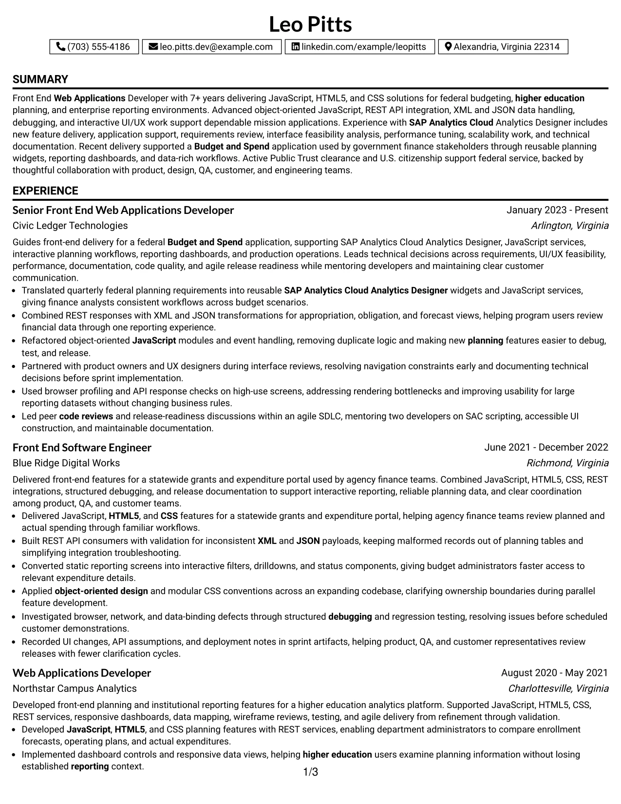
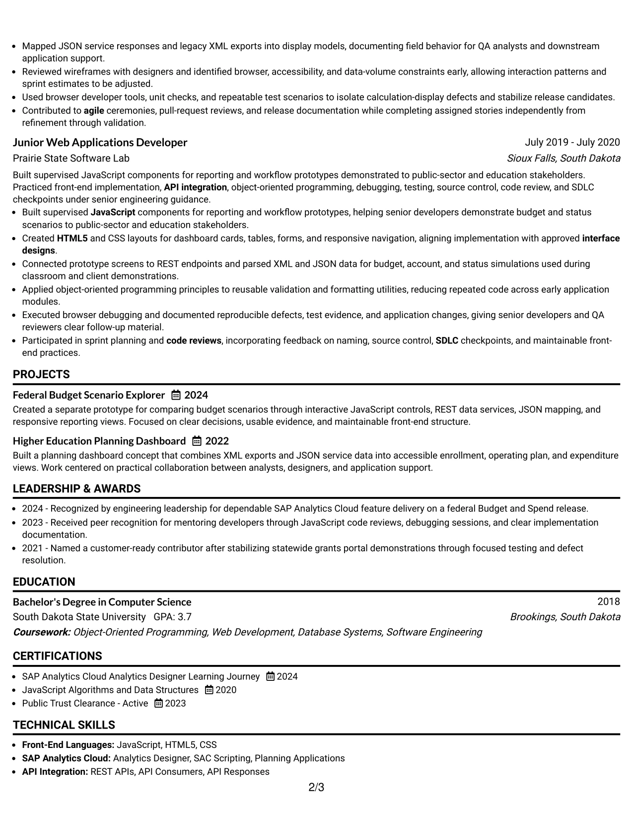
Why the Boxed Contact Header with Job Title Format Works for a Resume
- The boxed header gives the document a defined visual entry point.
- The visible job title improves immediate role recognition.
- Clear labels help readers move from summary to experience and skills.
- A one-column structure supports consistent ATS section parsing.
- Bullets remain available for detailed technical achievements and results.
- The format keeps education, certifications, and clearance information organized.
- The hierarchy works well when a resume must balance technical depth with fast review.
Best For
- Applications where the target title should be visible before the professional summary.
- Resumes that benefit from strong separation between contact details and content sections.
- ATS-friendly documents with conventional headings and a single reading path.
- Technical professionals with several skills, tools, and delivery methods to organize.
- Applications that need experience bullets to carry substantial evidence without crowding the page.
- Candidates who want certifications and education to remain prominent but secondary to experience.
- Resume reviews where structured presentation supports quick qualification checks.
#14 Stylish Two Column Designer Format Resume Example
Readers can move from the compact sidebar to the broader experience area, then return to skills, education, or certifications as needed. That navigation pattern makes good use of two columns while preserving a clear distinction between supporting information and career evidence.
For this Front End Web Applications Developer resume, the wider column can hold detailed achievement bullets, projects, and employment history. The sidebar can carry JavaScript, HTML5, CSS, REST APIs, XML, JSON, SAP Analytics Cloud, clearance, and education, giving the document room for substantial content.
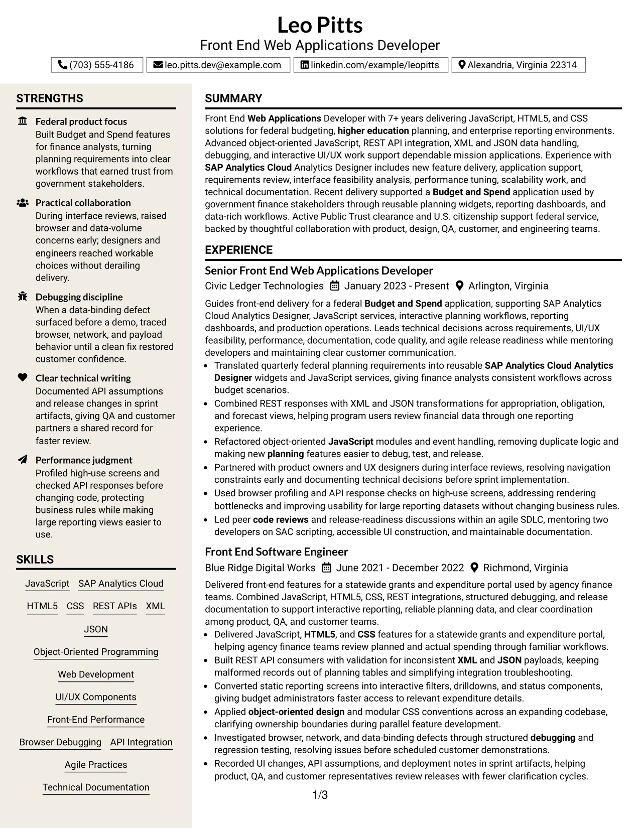
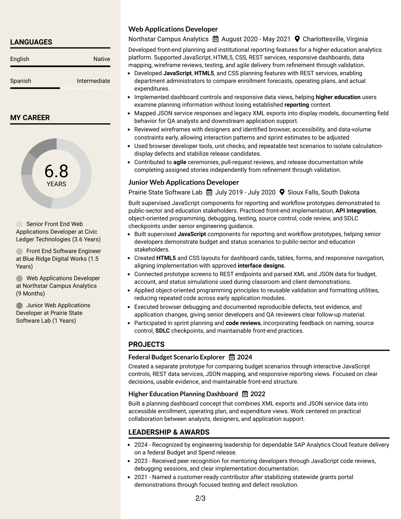
Why the Stylish Two Column Designer Format Works for a Resume
- Two columns separate core experience from supporting qualifications.
- A sidebar makes technical skills and certifications available at a glance.
- The wider content area supports detailed bullets and project descriptions.
- Distinct section zones help readers navigate a content-rich resume.
- The format can show both delivery evidence and a broad technical toolkit.
- Visual grouping reduces the need to repeat keywords inside every bullet.
- Careful spacing keeps a substantial resume readable without losing structure.
Best For
- Resumes with extensive experience that need a clear primary and secondary content area.
- Technical profiles combining detailed work history with a broad skills inventory.
- Applications where projects, certifications, and education need space beside experience.
- Readers who prefer quick access to keywords before reviewing achievement bullets.
- Documents that must present API, interface, performance, and testing evidence together.
- Candidates with enough content to benefit from two-column organization without overcrowding.
- Resume reviews that require both depth of evidence and efficient navigation.
#15 Modern Icon Format Resume Example
The strongest evidence should appear where the reader expects it: in the summary, recent experience, and achievement bullets. A modern visual system can support that priority by guiding attention to the content that proves technical capability and delivery ownership.
On this Front End Web Applications Developer resume, the format can highlight interactive UI/UX components, JavaScript services, REST API integration, browser debugging, and front-end performance work. Icons should support navigation, while the text remains responsible for communicating scope, tools, collaboration, and results.
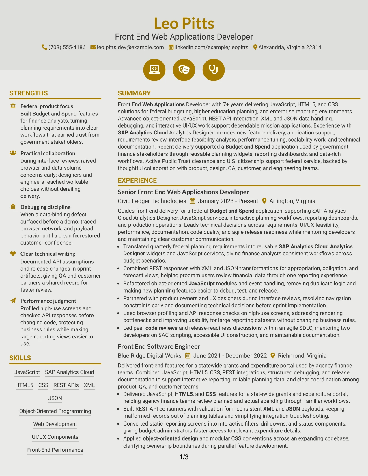
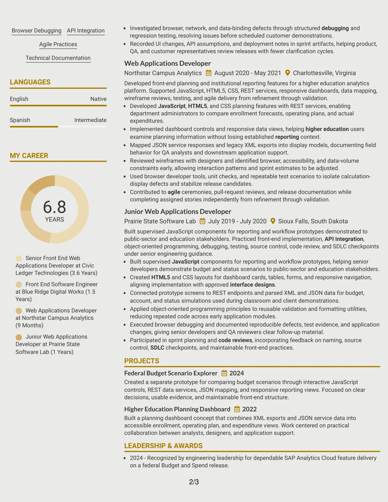
Why the Modern Icon Format Works for a Resume
- Visual markers help readers identify sections without replacing written labels.
- Recent experience can receive the strongest emphasis through position and spacing.
- Achievement bullets remain the primary source of technical evidence.
- Icons can distinguish skills, certifications, projects, and contact details efficiently.
- The format supports keyword visibility while keeping the page visually current.
- A clear hierarchy helps balance technical detail with leadership evidence.
- Text-first organization preserves useful information for ATS review and human scanning.
Best For
- Resumes that need to emphasize recent technical delivery and ownership.
- Applications where projects and certifications should be easy to locate beside experience.
- Professionals presenting both implementation skills and cross-team collaboration.
- Documents that benefit from visual section cues without relying on dense design.
- Technical applications requiring clear evidence of APIs, debugging, and performance work.
- Candidates who want a modern presentation while preserving conventional resume content.
- Reviews where concise visual navigation can direct attention to high-value achievements.
#16 Plain Professional Layout with Job Title & Shaded Labels Resume Example
Content is balanced through a plain structure, a visible job title, and shaded labels that divide the page without competing with the evidence. The result gives experience bullets enough room while keeping skills, education, certifications, and projects easy to find.
This format fits a resume aimed at a Front End Web Applications Developer role because it supports both technical detail and straightforward review. The document can present JavaScript, HTML5, CSS, SAP Analytics Cloud, XML, JSON, REST APIs, and measurable delivery contributions in a disciplined sequence.
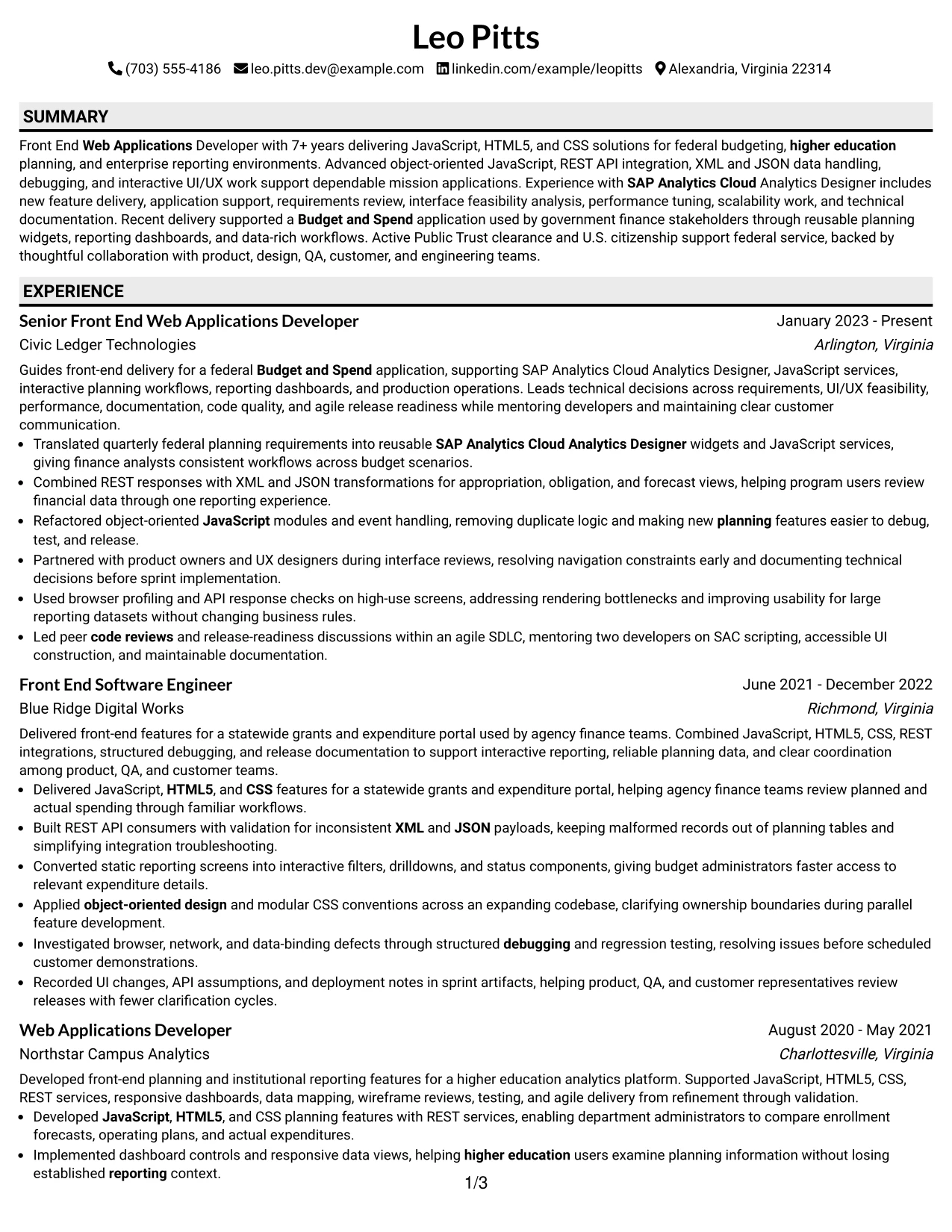
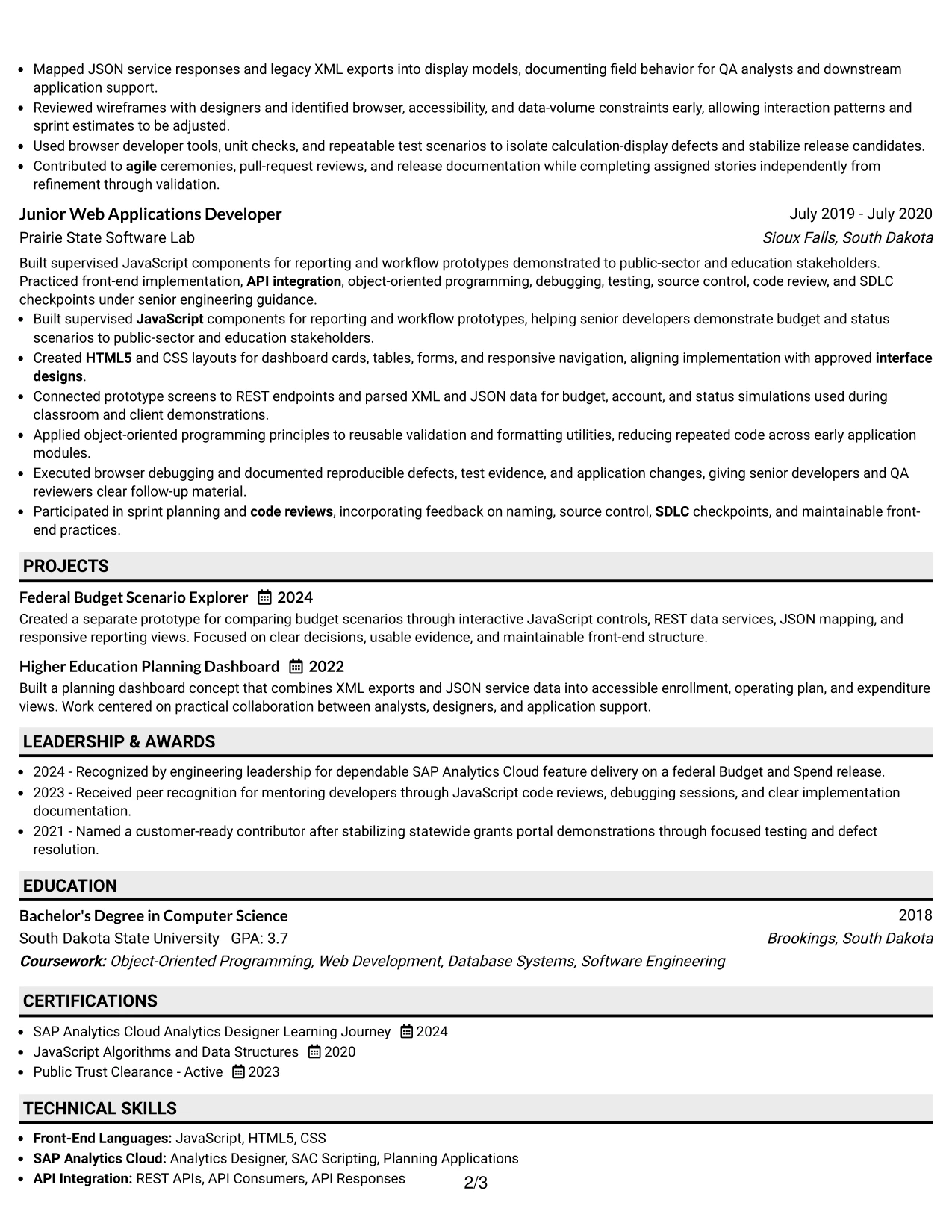
Why the Plain Professional Layout with Job Title & Shaded Labels Works for a Resume
- A visible job title confirms the document's target before detailed review begins.
- Shaded labels create section boundaries without reducing content space.
- The plain presentation keeps experience bullets central to the page.
- A single column supports predictable ATS parsing and human scanning.
- Technical skills can be grouped without interrupting the employment timeline.
- Education and certifications remain distinct from professional achievements.
- The format supports a credible presentation for technical and public-sector applications.
Best For
- Applications that require a practical, professional resume with minimal visual complexity.
- Technical roles where experience bullets should carry the main qualification evidence.
- ATS-oriented submissions using standard sections and clear text hierarchy.
- Resumes that must balance skills, projects, education, and certifications in one path.
- Professionals presenting public-sector or enterprise work in a restrained format.
- Candidates who want the target title visible without making the design feel crowded.
- Review processes where clarity and application context matter more than decorative styling.
#17 Classic One Column Resume Format Resume Example
For a practical application, a classic one-column resume remains a dependable choice when reviewers need to confirm qualifications quickly. Its familiar sequence lets the reader assess the summary, experience, education, certifications, projects, and skills without learning a new visual system.
The format is well suited to a technical resume with several years of delivery history. Strong bullets can document Budget and Spend work, interactive dashboards, object-oriented JavaScript, API integration, performance tuning, code reviews, and technical documentation in a conventional structure.
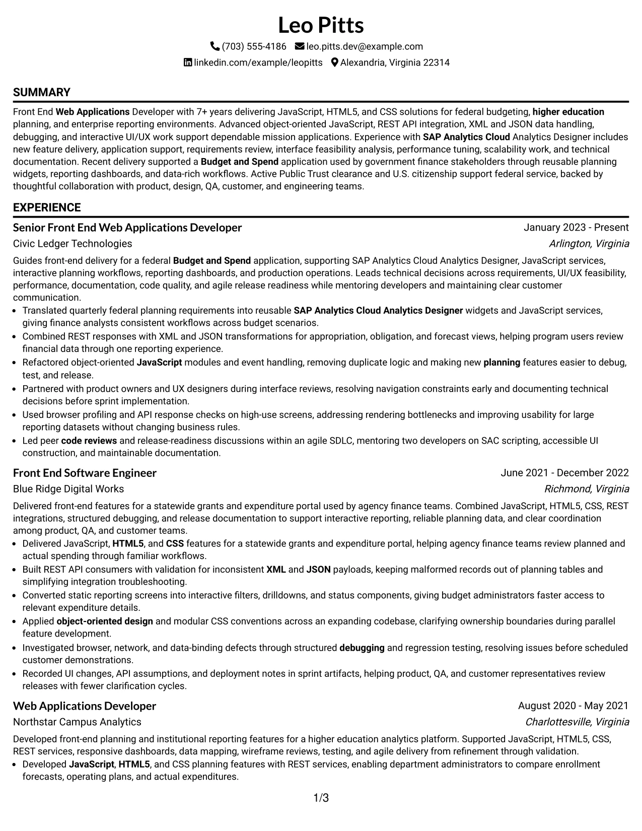
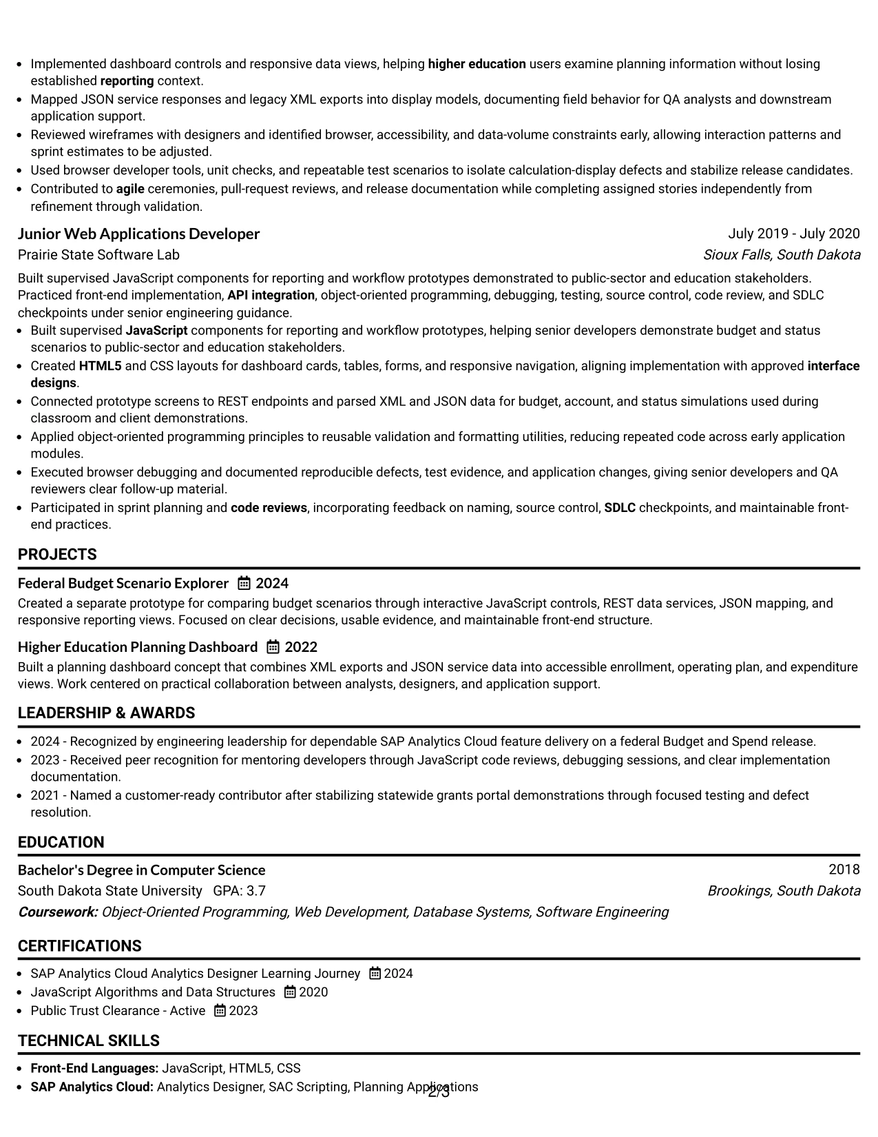
Why the Classic One Column Resume Format Works for a Resume
- A familiar structure reduces effort during an initial qualification review.
- One-column sequencing supports reliable ATS parsing across common resume sections.
- The employment timeline can show increasing responsibility with clear dates and titles.
- Bullets provide space for technical actions, scope, and outcomes.
- Skills can reinforce the same keywords used in the experience section.
- Projects and certifications can add evidence without changing the main reading path.
- The classic presentation works across formal, technical, and public-sector application settings.
Best For
- Applications using standard resume review processes and conventional section order.
- Professionals whose work history is the strongest source of qualification evidence.
- ATS submissions where a simple one-column structure reduces parsing risk.
- Candidates with projects, certifications, and education that need orderly placement.
- Technical resumes requiring clear dates, titles, employers, and achievement bullets.
- Roles where credibility depends on documented delivery rather than visual novelty.
- Readers who need to compare experience, skills, and requirements with minimal navigation.
#18 One Column Format with Photo Resume Example
A restrained visual hierarchy combines a single reading path with a prominent personal presentation area. When a photo is appropriate for the application context, it should remain secondary to the resume's qualifications and never displace the summary, experience, skills, education, or certifications.
For this Front End Web Applications Developer resume, the one-column structure keeps technical evidence easy to follow while allowing the header treatment to add personal presence. The content should still lead with JavaScript, SAP Analytics Cloud, REST APIs, UI/UX components, debugging, performance, and federal delivery experience.
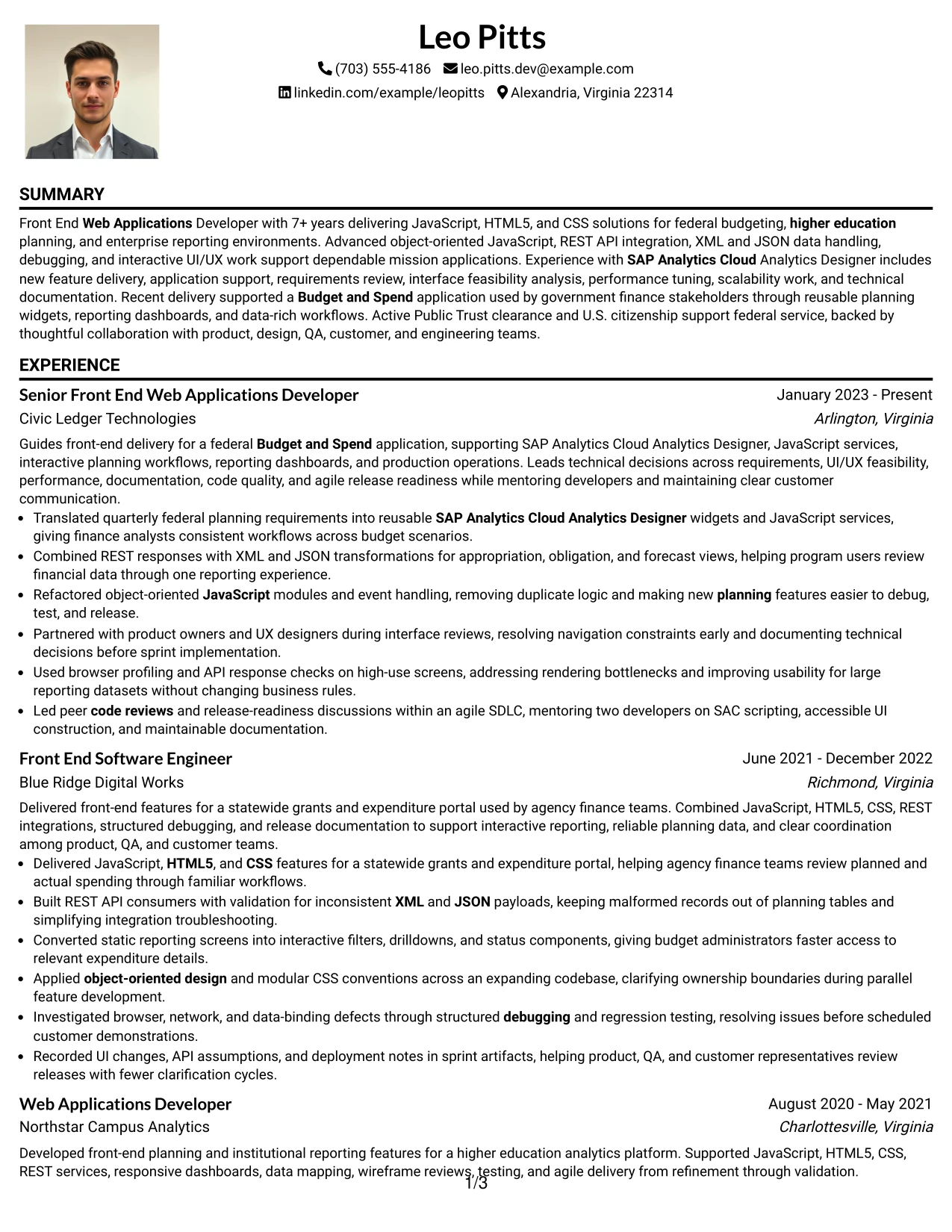
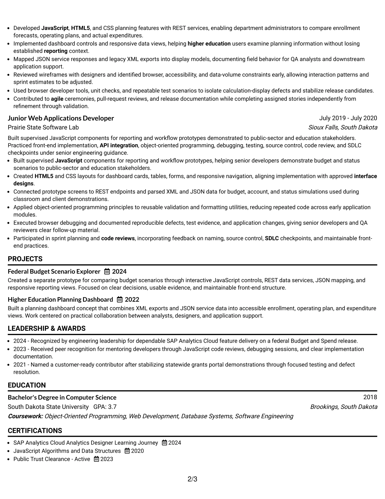
Why the One Column Format with Photo Works for a Resume
- The single reading path keeps the qualification review orderly.
- A prominent header creates a clear identity area before the resume content begins.
- The photo treatment can add personal presence when the application context supports it.
- Experience bullets remain the main evidence of technical capability and delivery.
- Standard sections preserve keyword visibility for skills, tools, and certifications.
- The format can present leadership, collaboration, and independent delivery in sequence.
- A controlled hierarchy prevents the visual header from overwhelming substantive content.
Best For
- Applications where a personal presentation element is accepted and useful.
- Resumes that benefit from one-column readability across experience and technical skills.
- Professionals who want a strong identity area while keeping evidence in standard sections.
- Documents combining detailed project work with certifications and education.
- Roles requiring the target title and core technical qualifications to appear early.
- Candidates whose experience bullets need uninterrupted space for scope and results.
- Review settings where visual presence can support, but not replace, qualification evidence.
#19 Minimal Header Format Resume Example
The Minimal Header Format begins with only the information needed to identify the document and then moves directly into its resume sections. That efficient structure gives the summary and recent experience more room while keeping the contact details easy to locate.
A Front End Web Applications Developer resume can use this approach to make technical evidence highly accessible. Standard headings and focused bullets can present JavaScript, HTML5, CSS, REST APIs, XML, JSON, object-oriented design, performance optimization, and Public Trust clearance without unnecessary visual layering.
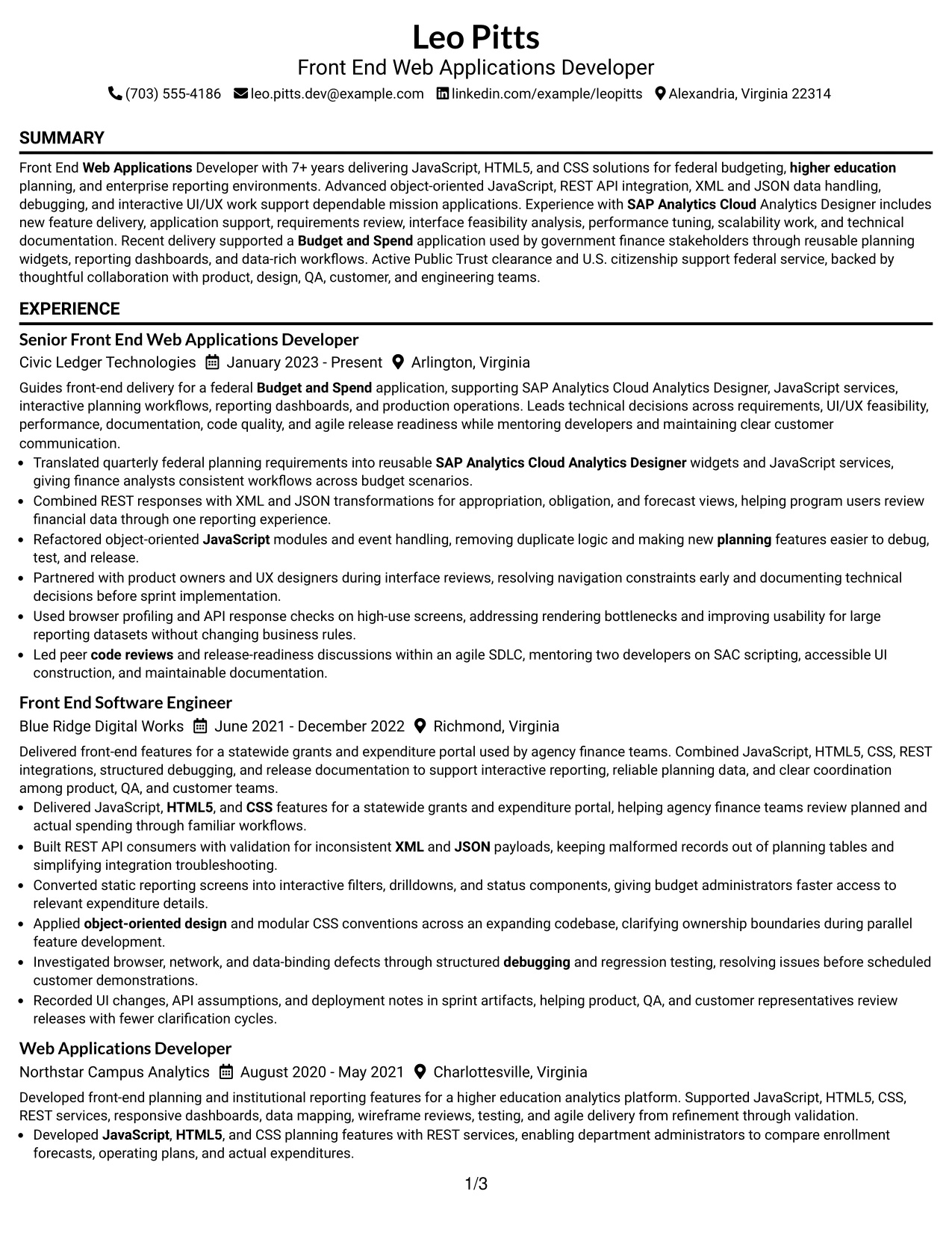
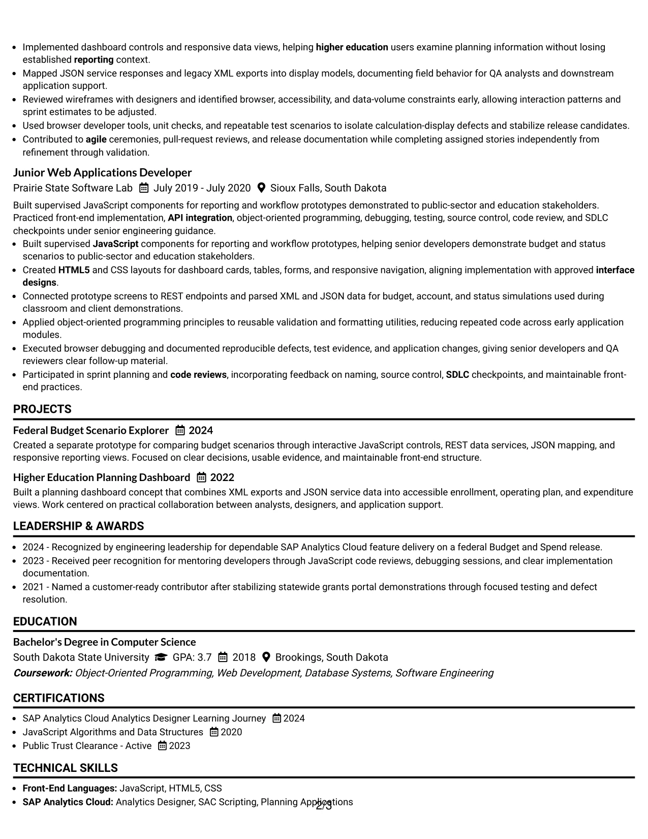
Why the Minimal Header Format Works for a Resume
- A compact header moves the reader quickly to qualification evidence.
- The single-column sequence supports fast scanning from summary to experience.
- Minimal decoration leaves more room for accomplishment-focused bullets.
- Standard headings help ATS systems identify skills, education, and employment history.
- Technical keywords remain visible without being hidden in complex design elements.
- The format supports a focused presentation of projects and certifications.
- A clean hierarchy suits reviewers who value speed, clarity, and substance.
Best For
- Applications where the first review must reach experience evidence quickly.
- ATS-focused resumes using standard headings and a compact contact area.
- Technical professionals with strong keywords that should remain highly visible.
- Documents that need room for detailed bullets without decorative space demands.
- Candidates presenting projects, certifications, and education in a direct sequence.
- Roles where technical scope and measurable delivery should outweigh visual styling.
- Resume reviews that reward concise organization and efficient information retrieval.
#20 Modern Full Background Two Column Format Resume Example
Readers can use the secondary column for quick qualification checks before moving through the larger experience area. That sequence is valuable when the resume contains a high volume of technical skills, projects, certifications, and detailed employment evidence.
Leo Pitts's resume can use the main column for Budget and Spend delivery, interactive planning workflows, API integration, and leadership results, while the supporting column organizes keywords and credentials. The full-background treatment should frame the information without reducing contrast, readability, or ATS-friendly text structure.
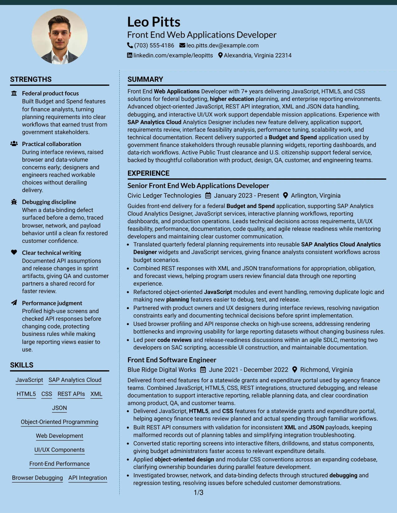
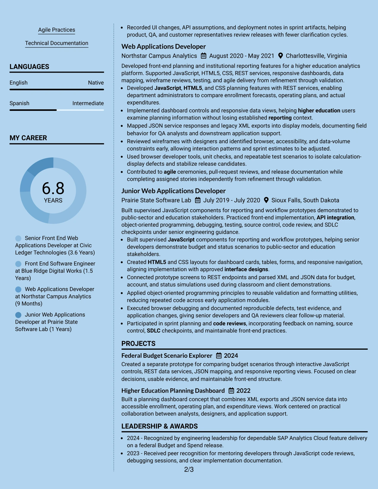
Why the Modern Full Background Two Column Format Works for a Resume
- Two-column navigation supports a substantial amount of resume content.
- The supporting column can surface skills, certifications, clearance, and education early.
- The main column preserves room for detailed experience and project evidence.
- A modern background treatment creates hierarchy across distinct information zones.
- The format can show technical breadth without shortening important achievement bullets.
- Clear contrast and spacing protect readability despite the stronger visual treatment.
- A well-ordered document gives both human reviewers and ATS tools access to core text.
Best For
- Content-rich resumes with extensive technical skills and multiple project examples.
- Applications where reviewers need qualifications visible before reading full experience.
- Professionals combining detailed federal delivery with broad front-end expertise.
- Documents that benefit from separate areas for evidence, keywords, and credentials.
- Candidates with enough substantive content to support a two-column structure.
- Reviews requiring quick comparison of requirements against tools, certifications, and clearance.
- Applications where a modern presentation can coexist with disciplined resume organization.
#21 Dark Mode Two Column Format Resume Example
The evidence receives priority in the main column, where recent experience and project work can carry detailed bullets. A secondary column then supports the review with skills, education, certifications, and other qualification details.
For a Front End Web Applications Developer resume, this arrangement can spotlight JavaScript, SAP Analytics Cloud Analytics Designer, REST APIs, XML and JSON handling, UI/UX implementation, debugging, and performance optimization. The dark treatment should remain controlled so the content stays legible and searchable.
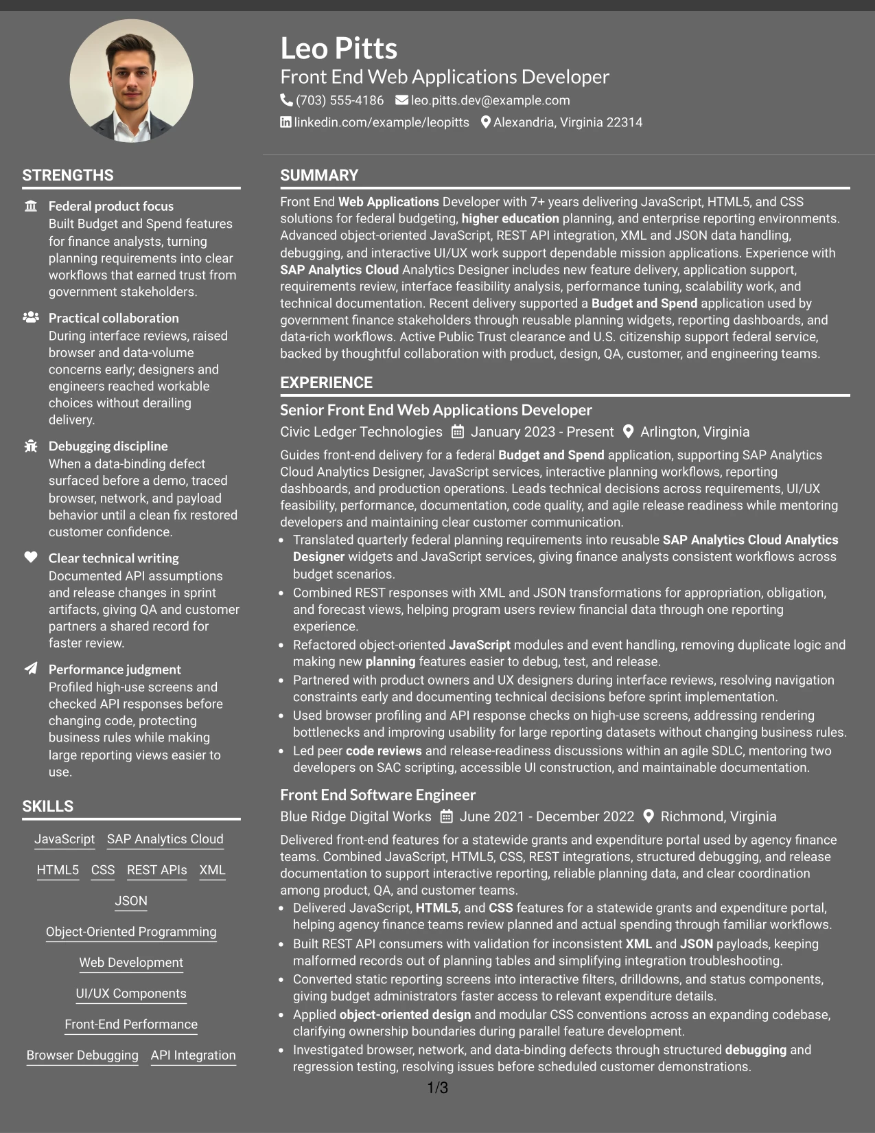
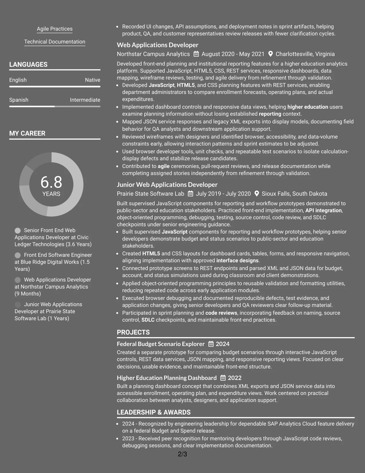
Why the Dark Mode Two Column Format Works for a Resume
- The main column gives recent experience the strongest evidence position.
- A second column keeps technical keywords and credentials available at a glance.
- Two-column organization supports detailed projects without extending every section vertically.
- The dark visual treatment creates clear separation between content zones.
- Strong contrast and consistent labels help preserve readability.
- Bullets can connect tools and methods to specific delivery responsibilities.
- The format balances visual distinction with the need for ATS-accessible resume text.
Best For
- Resumes where recent accomplishments should dominate the first qualification review.
- Technical applications requiring both detailed evidence and a compact skills area.
- Professionals presenting projects, certifications, and education alongside employment history.
- Documents with substantial content that benefits from two clearly defined reading zones.
- Candidates who want a distinctive presentation without removing standard resume sections.
- Reviews focused on connecting front-end tools to implementation and support outcomes.
- Applications where readable contrast and organized evidence are essential.
#22 Dark Mode Box Header Format Resume Example
Content is balanced through a strong boxed header followed by a focused single-column sequence. The header establishes identity and role alignment, while the body gives equal visual discipline to the summary, experience, skills, education, certifications, and projects.
This format can present a Front End Web Applications Developer resume with clear evidence of JavaScript development, interactive UI/UX implementation, REST API work, debugging, scalability, and technical documentation. A dark visual treatment adds distinction, but readable labels and concise bullets must remain the foundation.
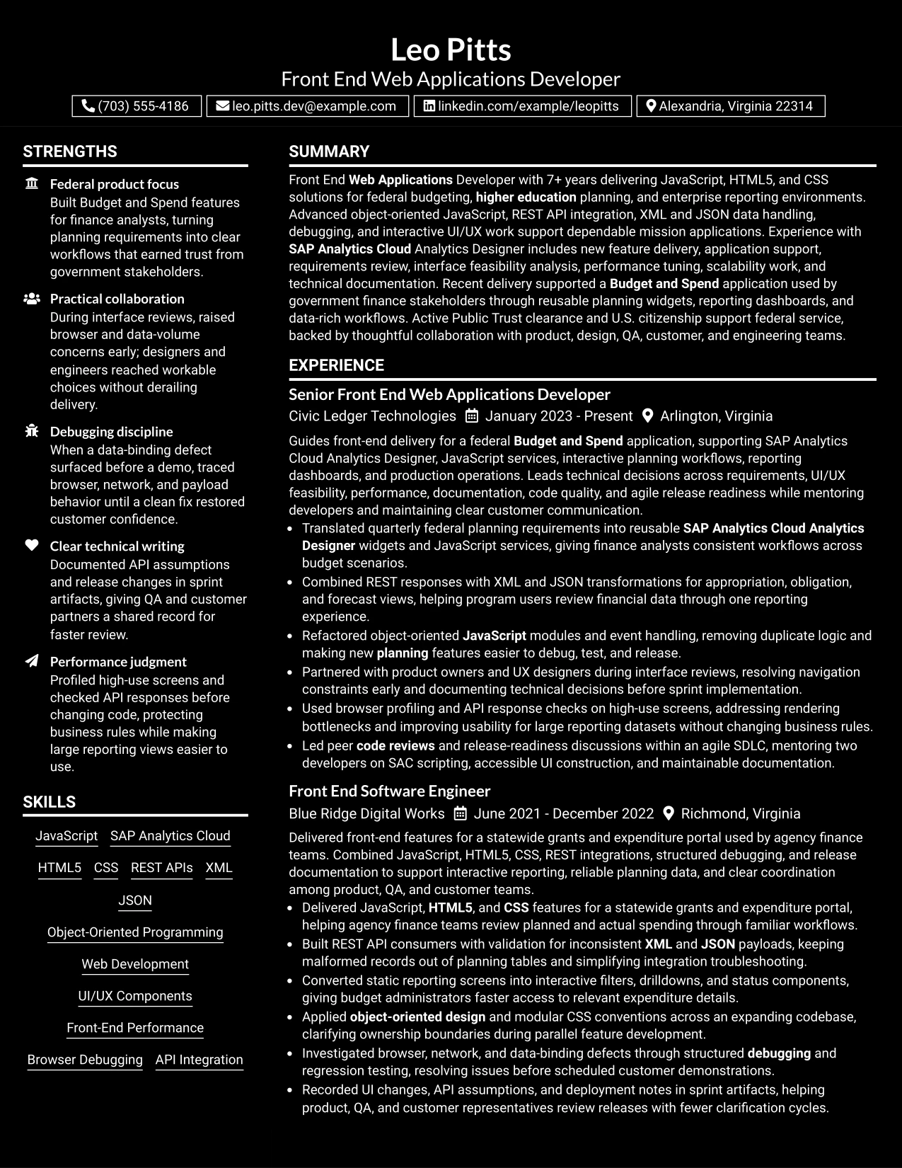
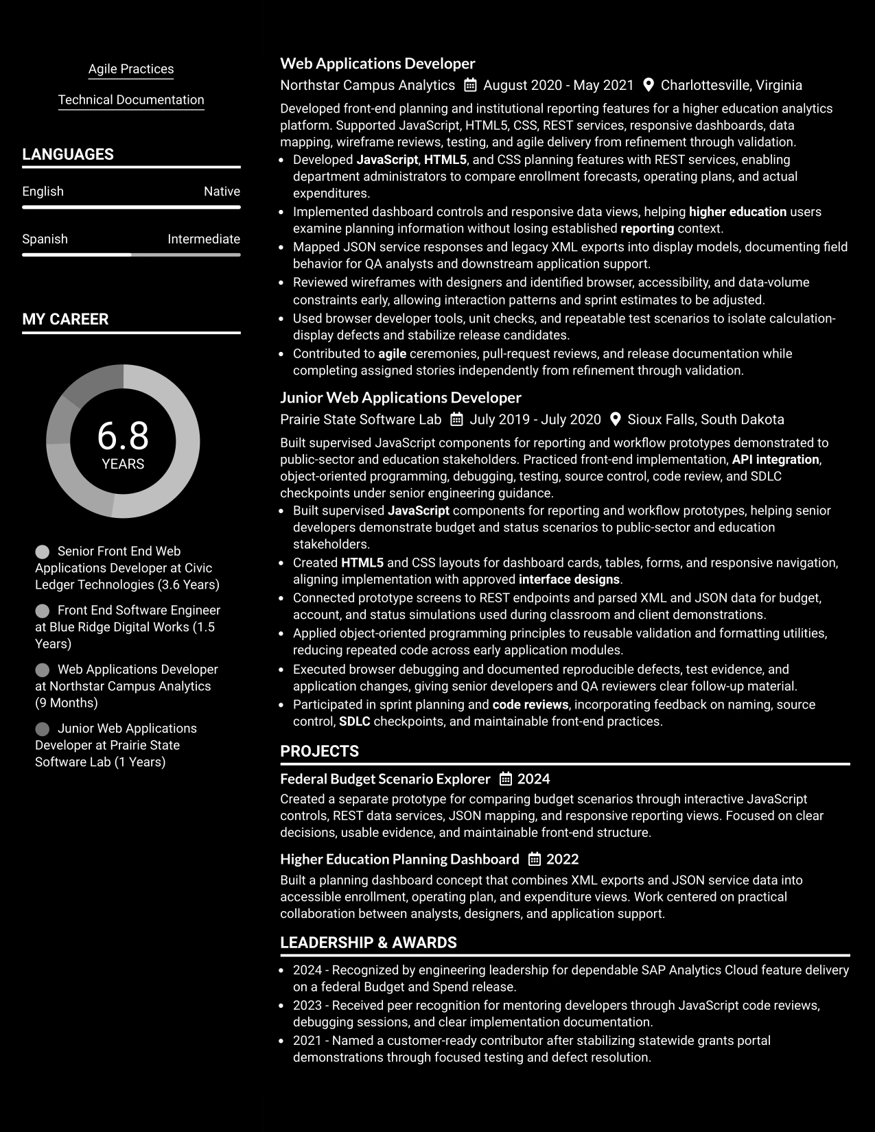
Why the Dark Mode Box Header Format Works for a Resume
- The boxed header makes identity and target role immediately visible.
- A single-column body keeps the full resume easy to follow.
- Strong section labels help separate technical evidence from supporting credentials.
- The format supports concise bullets with clear actions and outcomes.
- Keywords can appear naturally across the summary, skills, and experience sections.
- Education, certifications, and clearance remain easy to verify.
- Controlled contrast gives the document a distinctive look without weakening structure.
Best For
- Applications that need a clear target title before the main resume content.
- One-column documents where experience and supporting sections should remain equally accessible.
- Technical professionals presenting implementation, debugging, and documentation evidence.
- ATS-conscious submissions that still allow a distinctive but organized visual treatment.
- Candidates who need a strong header and enough body space for detailed achievements.
- Reviews where skills, certifications, and clearance must be verified quickly.
- Application settings that value disciplined presentation, readable contrast, and clear hierarchy.
#23 Elegant Full Background Two Column Format
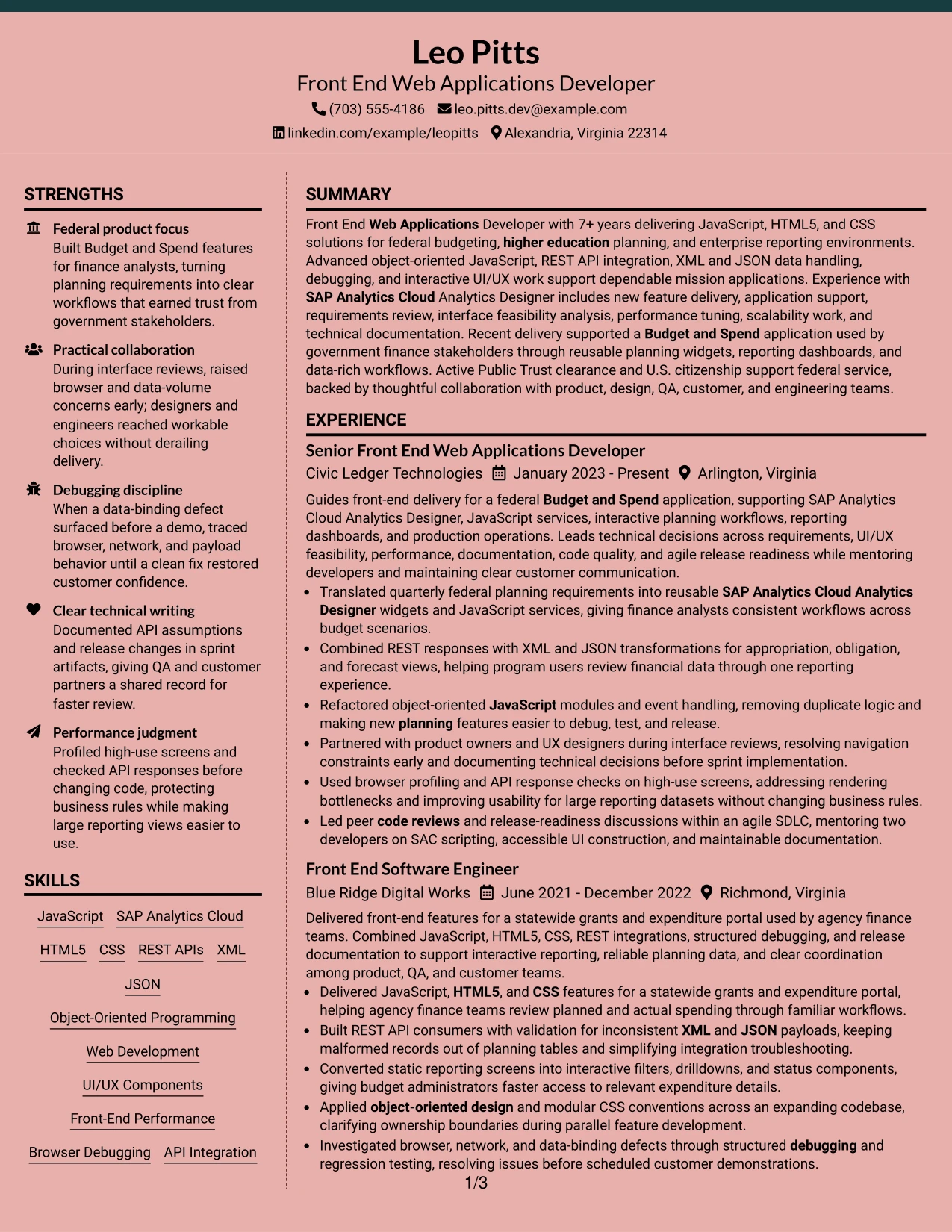
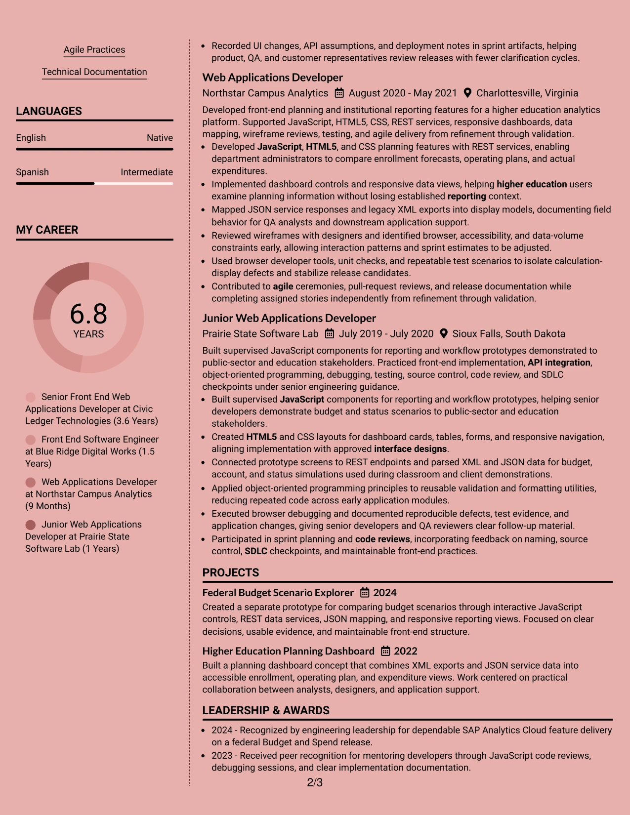
For a technical resume with substantial experience, two balanced columns create a clear path from the professional summary and skills to detailed experience, projects, education, and certifications. The broad background keeps the page polished while preserving space for evidence such as Budget and Spend delivery, REST API integration, and performance work.
The main column can carry achievement-focused experience bullets, while the supporting column groups JavaScript, HTML5, CSS, SAP Analytics Cloud Analytics Designer, clearance, and education. This structure supports recruiter scanning and keeps important keywords visible without weakening ATS readability.
Why the Elegant Full Background Two Column Format Works for a Resume
- A strong summary can establish 7+ years of front-end experience near the top.
- The wider column gives measurable results and technical decisions room to stand out.
- A compact skills area keeps JavaScript, REST APIs, XML, and JSON easy to find.
- Two columns separate supporting details from the main career record.
- Projects can add evidence of interactive dashboards and planning workflows.
- Education and certifications remain visible without interrupting experience bullets.
- Clear headings help readers review the resume in a consistent order.
Best For
- Professionals who need to present both technical depth and broad delivery experience.
- Resumes that combine a detailed experience record with a focused skills column.
- Applications where ATS-friendly headings and familiar section order matter.
- Candidates who want projects and certifications visible beside employment history.
- Technical resumes with many related keywords that still need visual restraint.
- Readers who prefer a balanced page over a long single-column presentation.
- Applications that require front-end achievements, tools, and education to be reviewed quickly.
#24 Creative Two Tone Format
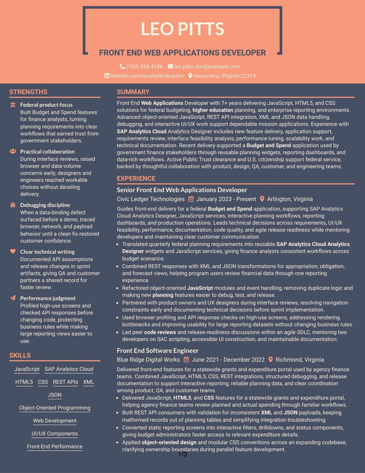
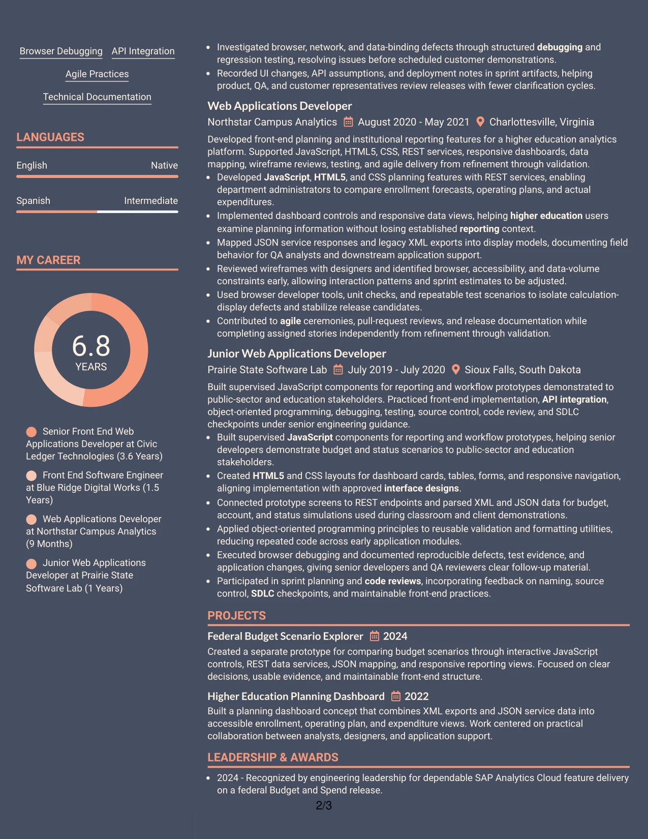
A restrained two-tone hierarchy gives the resume a distinct visual character while keeping the content professional. The single-column flow can move from the summary to skills, experience, projects, education, and certifications without forcing the reader to switch between content tracks.
The color change can guide attention to section labels and achievement bullets, while standard wording keeps the document practical for ATS review. Keywords such as JavaScript, HTML5, CSS, REST APIs, SAP Analytics Cloud, and Public Trust clearance remain in searchable text rather than depending on design alone.
Why the Creative Two Tone Format Works for a Resume
- A single reading path reduces friction during a quick resume review.
- Two controlled tones add distinction without competing with achievement bullets.
- The summary can connect front-end delivery to federal and higher education work.
- Skills can appear before experience so core technologies are found early.
- Experience bullets can show API integration, debugging, and UI/UX results.
- Projects provide a focused place for dashboard and scenario-explorer evidence.
- Plain text headings help preserve keyword clarity for ATS parsing.
Best For
- Technical professionals who want a modern look without losing a conventional structure.
- Applications where a single-column flow supports fast review on smaller screens.
- Resumes that need visible separation between summary, skills, and experience.
- Candidates presenting a mix of enterprise delivery, projects, and certifications.
- Front-end roles where interactive UI/UX work should remain central to the page.
- Job searches that value readable keywords more than decorative graphics.
- Professionals who want visual character while keeping evidence easy to verify.
#25 Bold Color Header Professional Format
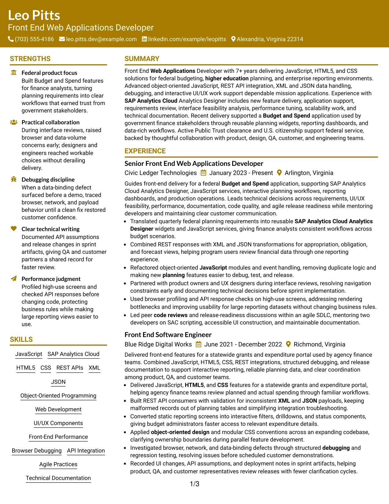
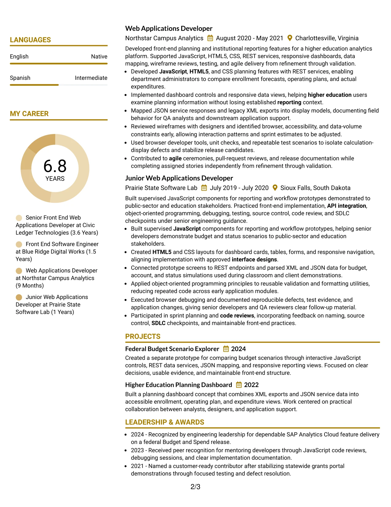
The bold header establishes the target role, professional summary, and primary contact details before the reader reaches the resume body. A single-column structure then gives experience, skills, projects, education, and certifications a predictable sequence that supports rapid review.
Strong section boundaries make achievement bullets easy to scan, especially those covering reusable SAC Analytics Designer widgets, object-oriented JavaScript, API validation, performance checks, and code reviews. The color should support hierarchy, while the written evidence carries the professional weight.
Why the Bold Color Header Professional Format Works for a Resume
- The top header makes the target role immediately visible.
- A clear summary connects technical strengths with relevant application delivery.
- Single-column ordering supports reliable ATS parsing and human review.
- Bold section labels help readers locate experience and skills quickly.
- Bullets can foreground technical actions, results, and delivery context.
- Projects can reinforce planning, reporting, and responsive interface capability.
- Education, certifications, and clearance can close the document in a logical order.
Best For
- Resumes that need immediate role positioning at the top of the page.
- Applications reviewed through both ATS systems and rapid human scanning.
- Professionals with several technical areas that need a clear priority order.
- Candidates who want experience bullets to remain the main visual focus.
- Front-end applications requiring visible evidence of performance and scalability work.
- Documents that combine a strong summary with projects and formal credentials.
- Readers who benefit from prominent section labels and limited visual decoration.
#26 Photo Header Color Sidebar Format
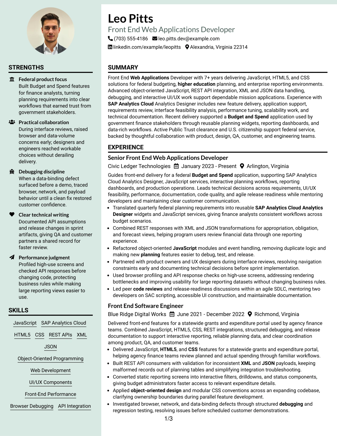
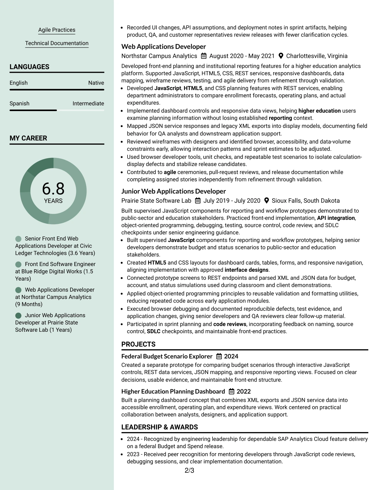
Recruiters can move from the header and summary into the color sidebar, then continue through the main experience record. That route gives contact details, skills, clearance, and education a compact home while the primary column carries detailed work, projects, and certifications.
The photo header adds a personal visual element, but the resume remains evidence-led. Strong bullets can document Budget and Spend workflows, REST integrations, interactive UI/UX components, debugging, and front-end performance improvements without crowding the supporting information.
Why the Photo Header Color Sidebar Format Works for a Resume
- The header combines identity, target role, and contact details in one visible area.
- A sidebar keeps skills and credentials available throughout the review.
- The main column protects space for detailed experience bullets.
- The summary can frame technical scope before the reader reaches employment history.
- Projects can show practical application of JavaScript and data integration.
- Photo placement is separated from ATS-relevant text and achievement evidence.
- Color contrast helps distinguish supporting information from core experience.
Best For
- Professionals who want a photo header paired with a structured technical resume.
- Applications where a sidebar can hold skills, education, and clearance details.
- Resumes with substantial experience that needs a wider primary content area.
- Candidates balancing detailed work history with a compact credentials section.
- Roles where project evidence should sit beside, not beneath, the main career record.
- Readers who prefer a visual entry point followed by a focused evidence column.
- Documents that need content volume without making every section full width.
#27 Top Left Header Color Accent Format
Reusable application features and dependable delivery evidence receive priority in this resume presentation. The top-left header can state the target role and summary, followed by bullets that show SAC Analytics Designer delivery, JavaScript refactoring, data transformation, and performance tuning.
A restrained color accent separates sections without taking attention from the evidence. Skills, tools, projects, education, certifications, and clearance can follow in a direct order, giving both ATS systems and human readers access to the resume's strongest technical signals.
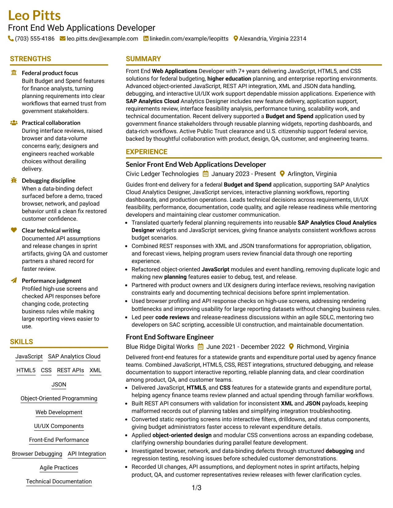
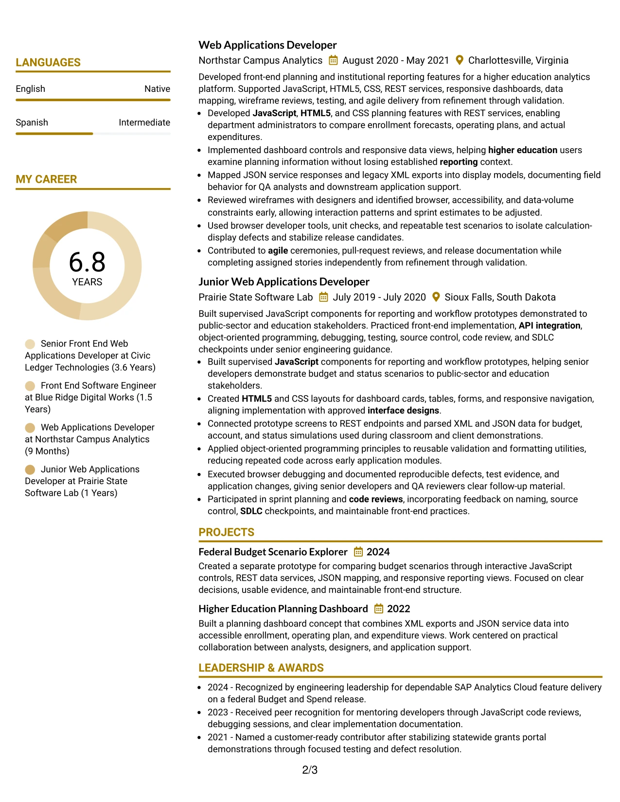
Why the Top Left Header Color Accent Format Works for a Resume
- The upper-left position gives the target role immediate prominence.
- Achievement bullets can lead with actions and explain the resulting value.
- Technical keywords remain in standard text that ATS tools can process.
- A focused summary introduces front-end, API, and UI/UX capability.
- Skills can reinforce the tools used across the experience section.
- Projects add direct evidence of planning and reporting application work.
- The accent creates hierarchy without reducing space for professional content.
Best For
- Resumes where technical achievements should appear before extensive background detail.
- Applications that depend on clear evidence of feature delivery and system support.
- Professionals who need keywords and results visible near the top.
- Candidates presenting API work, debugging, and interface feasibility experience.
- Documents that must remain simple to parse while using a modest visual accent.
- Technical roles where projects can validate skills beyond formal employment bullets.
- Readers who scan from the upper left and want the strongest evidence first.
#28 Centered Header Classic Two Column Format
Content can be balanced between a centered identity block, a supporting information column, and a main record of experience. That distribution works well when the resume must present detailed technical work while keeping skills, education, certifications, and clearance easy to locate.
Classic bullet treatment gives each achievement a defined stopping point. The main column can cover interactive planning applications, REST API consumers, debugging, and code reviews, while the secondary column provides a compact index of tools and credentials for a remote application review.
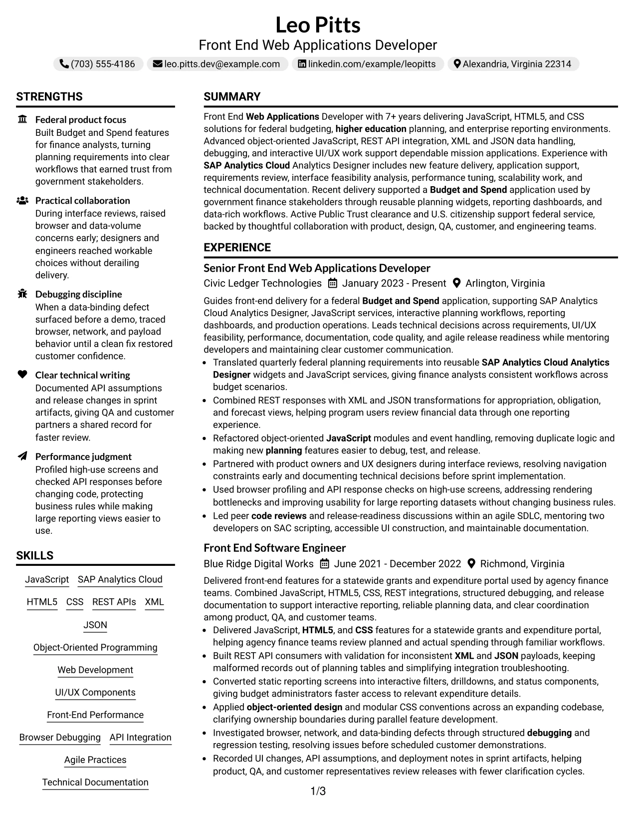
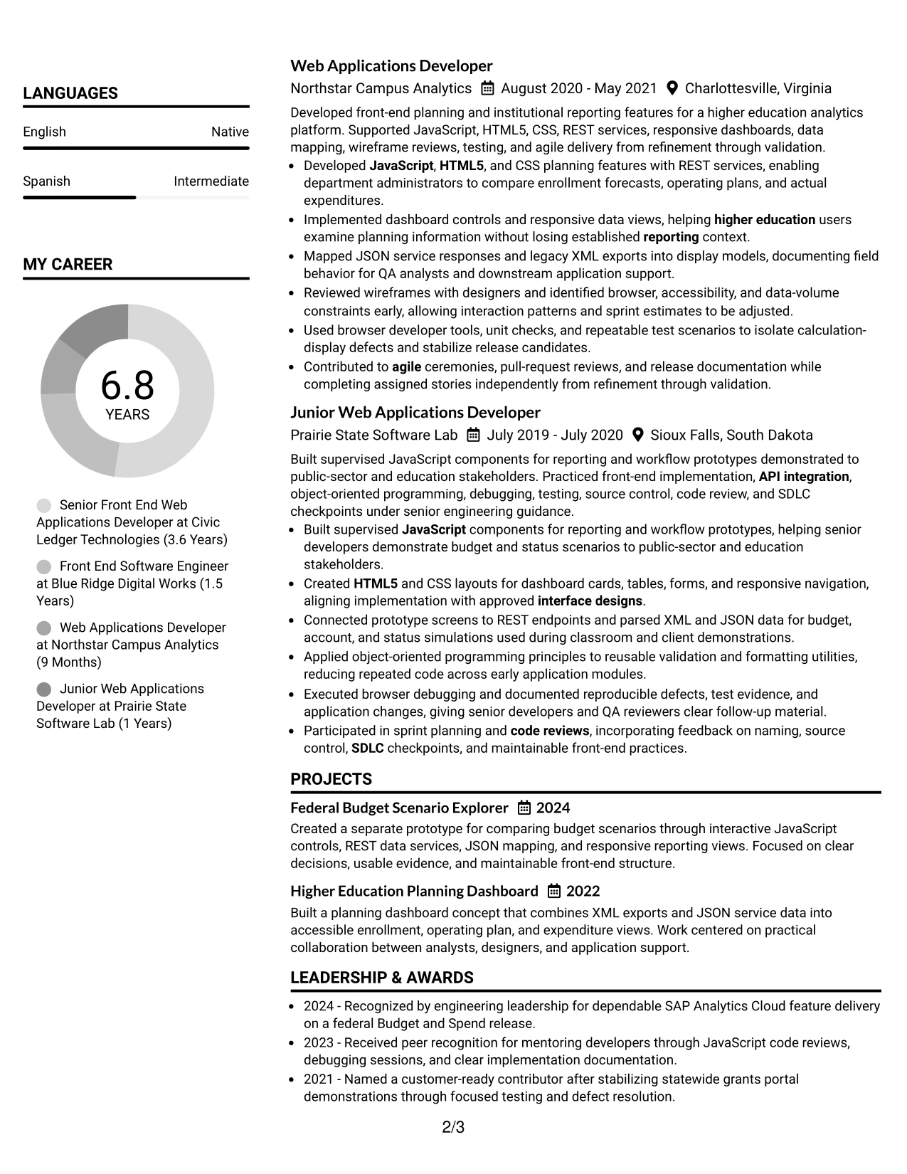
Why the Centered Header Classic Two Column Format Works for a Resume
- The centered header creates a stable starting point for the review.
- Two columns separate high-detail experience from supporting credentials.
- Classic bullets make responsibilities and results easy to compare.
- A dedicated skills area keeps core technologies visible without repetition.
- Education and certifications can sit outside the main work narrative.
- Projects can demonstrate applied JavaScript and reporting experience.
- The structure supports a polished document without relying on complex graphics.
Best For
- Applications that call for a traditional resume with efficient use of page space.
- Professionals who need a complete skills and credentials index beside experience.
- Remote reviews where a centered header provides a clear visual starting point.
- Candidates with multiple projects that should remain visible during a quick scan.
- Resumes combining technical delivery, education, certifications, and clearance.
- Readers who prefer familiar bullets and predictable two-column organization.
- Documents where supporting information should remain separate from detailed evidence.
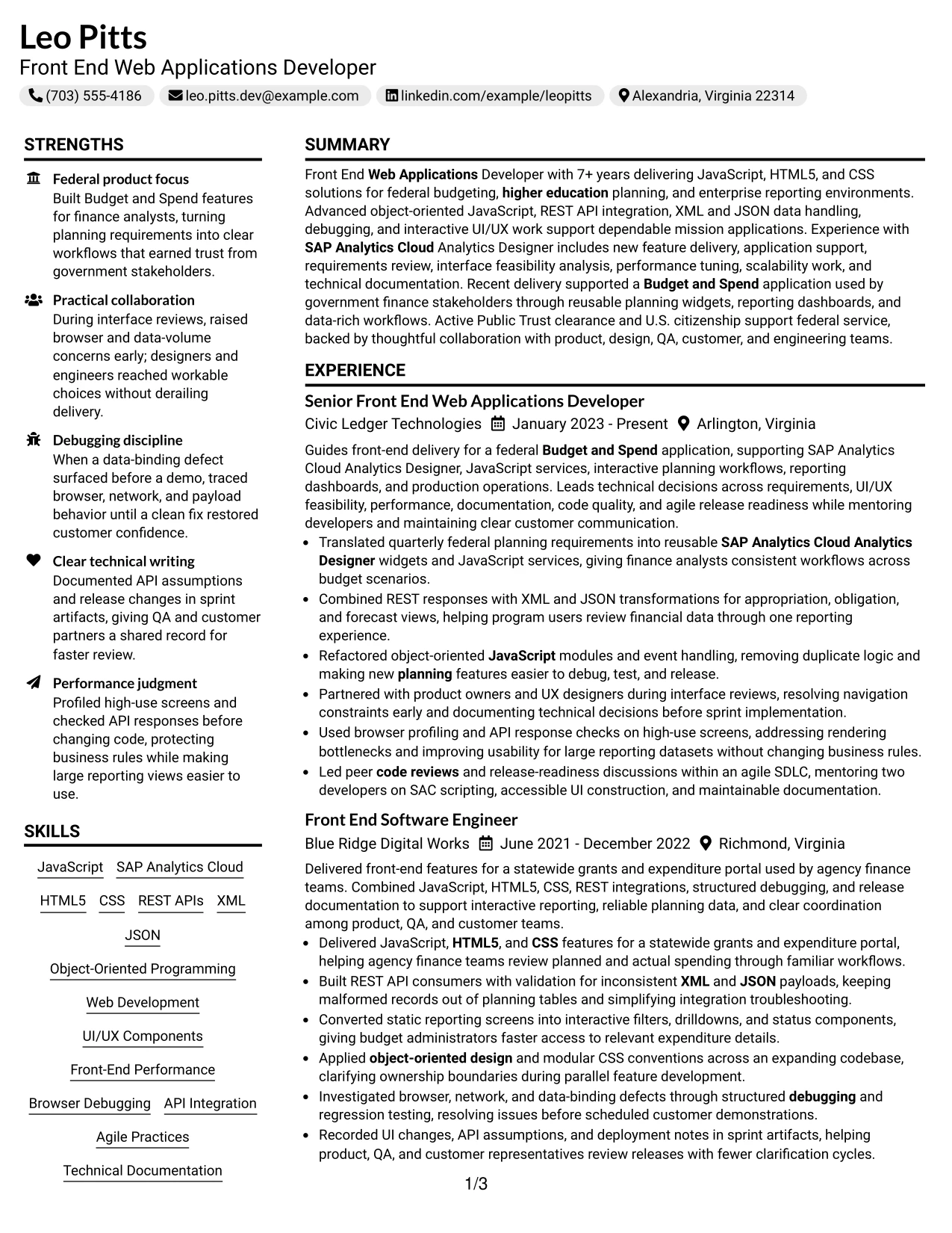
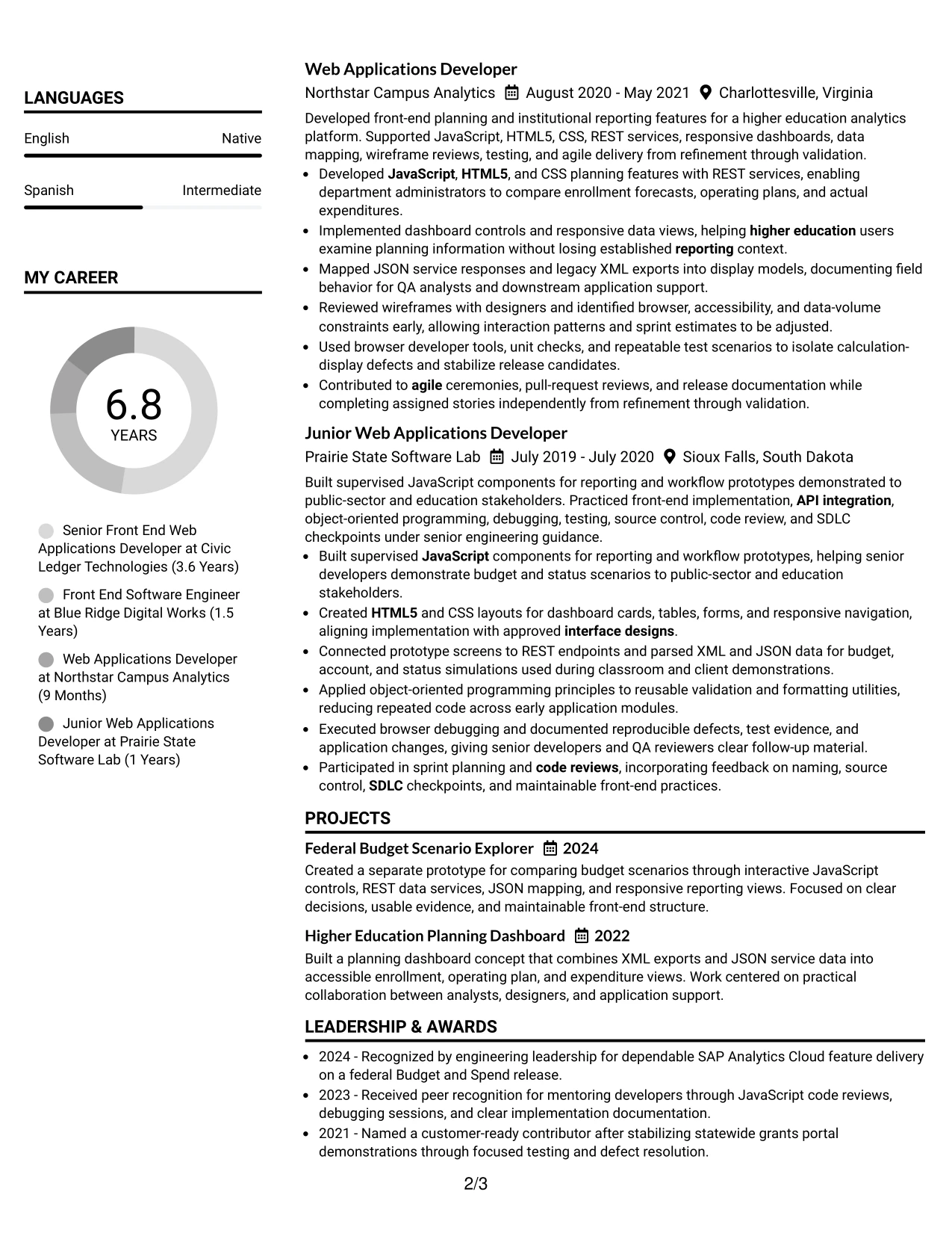
#29 Left Aligned Header Clean Two Column Format
For practical resume review, a left-aligned header and clean two-column structure let the reader start quickly with the role and summary. The main column can hold experience and project evidence, while the narrower column organizes skills, education, certifications, and clearance.
Simple bullet styling keeps the page focused on delivery rather than decoration. It gives room to explain reusable JavaScript services, responsive dashboards, XML and JSON mapping, browser profiling, and technical documentation in language that remains easy to scan.
Why the Left Aligned Header Clean Two Column Format Works for a Resume
- Left alignment supports a natural scan from contact details to career evidence.
- The main column gives complex technical bullets enough room for context.
- A secondary column keeps skills and credentials easy to retrieve.
- Clean spacing helps separate jobs, projects, and education.
- Keywords can be repeated only where they add useful evidence.
- Bullets make debugging, API integration, and performance work concrete.
- The uncluttered structure remains suitable for digital and printed review.
Best For
- Professionals seeking a clean format for technical and public-sector applications.
- Resumes that need detailed experience without giving up a compact skills index.
- Candidates whose projects and credentials should stay visible beside employment history.
- Applications reviewed on screens where left-to-right navigation matters.
- Front-end professionals presenting both implementation work and documentation practice.
- Documents that benefit from strong spacing and minimal visual distraction.
- Readers who want a direct route from the summary to verified achievements.
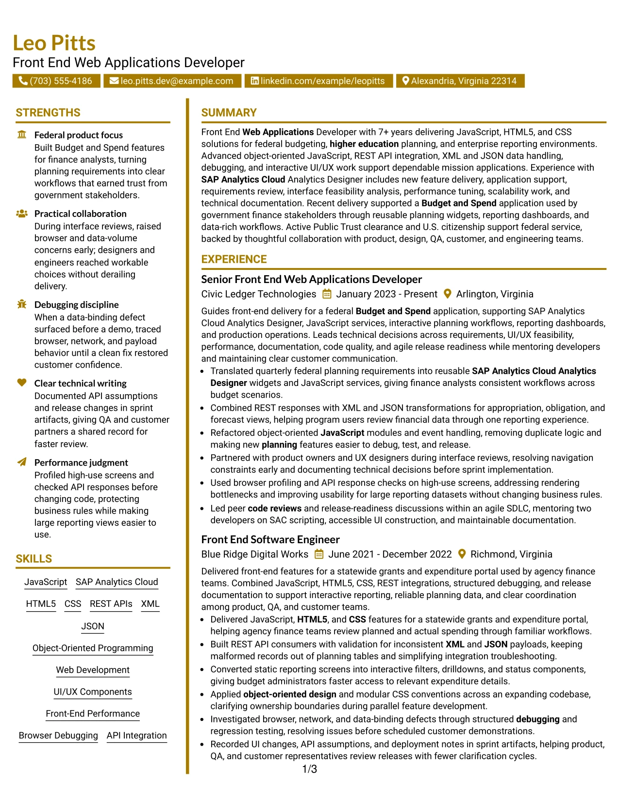
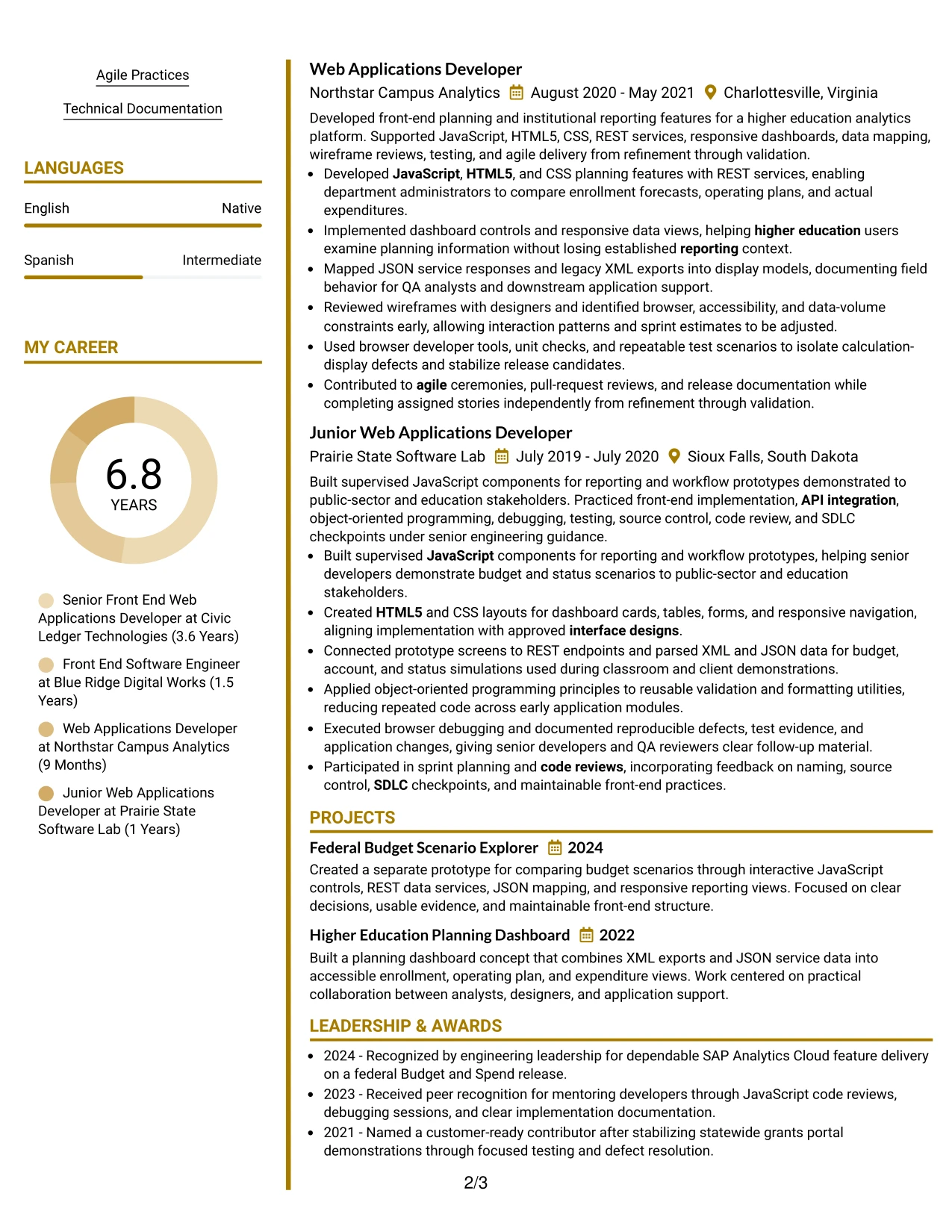
#30 Accent Divider Modern Two Column Format
Modern section dividers give Leo Pitts's resume a clear visual rhythm without changing the review order. The main column can present front-end delivery, projects, and measurable evidence, while the companion column groups JavaScript, SAP Analytics Cloud, API integration, education, certifications, and clearance.
Square accents can mark transitions between roles and supporting sections, helping readers locate relevant content quickly. The resume remains grounded in evidence: interactive Budget and Spend features, object-oriented design, performance checks, code reviews, and clear technical documentation.
Why the Accent Divider Modern Two Column Format Works for a Resume
- Dividers create visible boundaries between distinct resume sections.
- Two columns keep technical keywords close to the evidence that supports them.
- A modern structure can present experience without excessive visual complexity.
- Project entries can extend the story beyond day-to-day employment bullets.
- Skills and certifications remain accessible during a fast review.
- Bullets can emphasize scalable features, debugging, and release readiness.
- The layout gives the target role a clear place at the top of the document.
Best For
- Professionals who want a modern two-column resume with clear section boundaries.
- Applications where technical keywords should sit near related achievement evidence.
- Candidates presenting a substantial experience record alongside projects and credentials.
- Front-end roles that value visible structure around UI, API, and performance work.
- Documents needing a distinct visual rhythm without sacrificing readable text.
- Readers who scan by section and benefit from prominent divider cues.
- Resumes that must connect tools, delivery methods, and results efficiently.
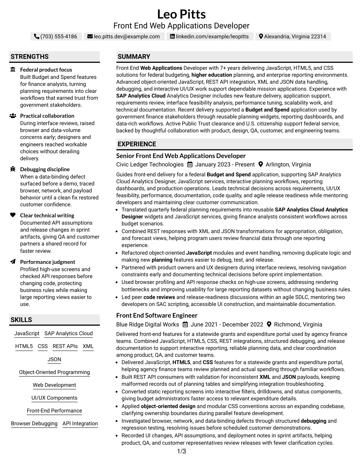
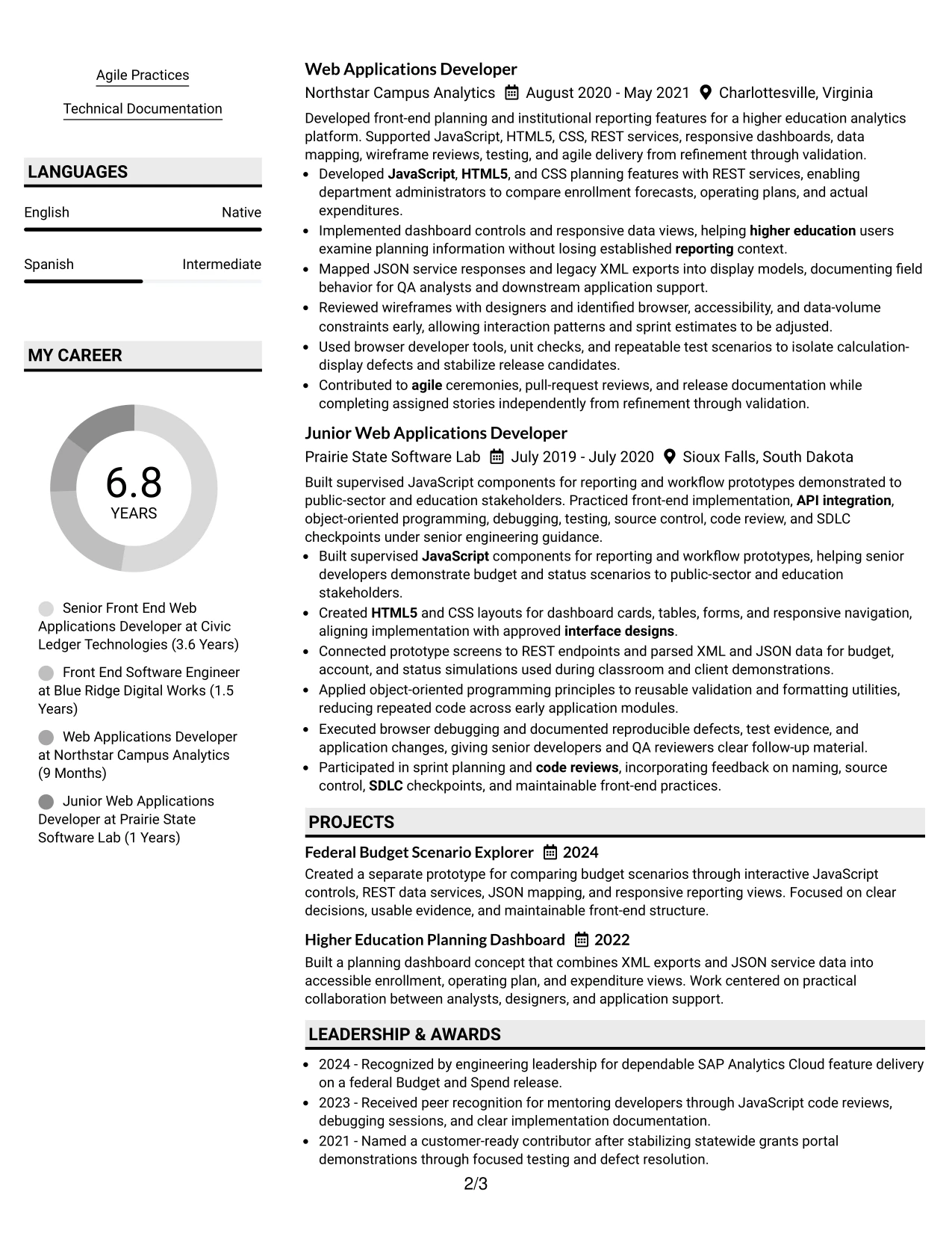
#31 Shaded Labels Clean Two Column Format
Shaded labels organize the resume into predictable blocks for the summary, skills, experience, projects, education, certifications, and clearance. The two-column structure keeps the main employment record prominent while the supporting column acts as a quick reference for tools and qualifications.
Centered square labels add a modest visual marker, but the content remains the primary signal. Detailed bullets can show REST API work, XML and JSON handling, responsive design, browser debugging, agile delivery, and documentation without forcing the reader through dense paragraphs.
Why the Shaded Labels Clean Two Column Format Works for a Resume
- Shaded labels make each resume section easy to identify.
- The two-column split supports both detailed evidence and quick reference content.
- A clean main column keeps career progression easy to follow.
- Skills can be grouped by technology, design, testing, and delivery methods.
- Project summaries add focused proof of applied web application work.
- Education and certifications remain visible without competing with experience.
- Standard section names and text support dependable ATS interpretation.
Best For
- Technical resumes that need labeled sections and efficient two-column organization.
- Applications where a supporting column can summarize tools and credentials.
- Professionals with enough evidence to benefit from clear visual grouping.
- Candidates who want projects separated from, but adjacent to, employment history.
- Documents requiring readable keywords for both ATS systems and people.
- Roles where testing, documentation, and delivery methods deserve explicit space.
- Readers who prefer section markers over large decorative design elements.
#32 Photo Header Color Accent International Format
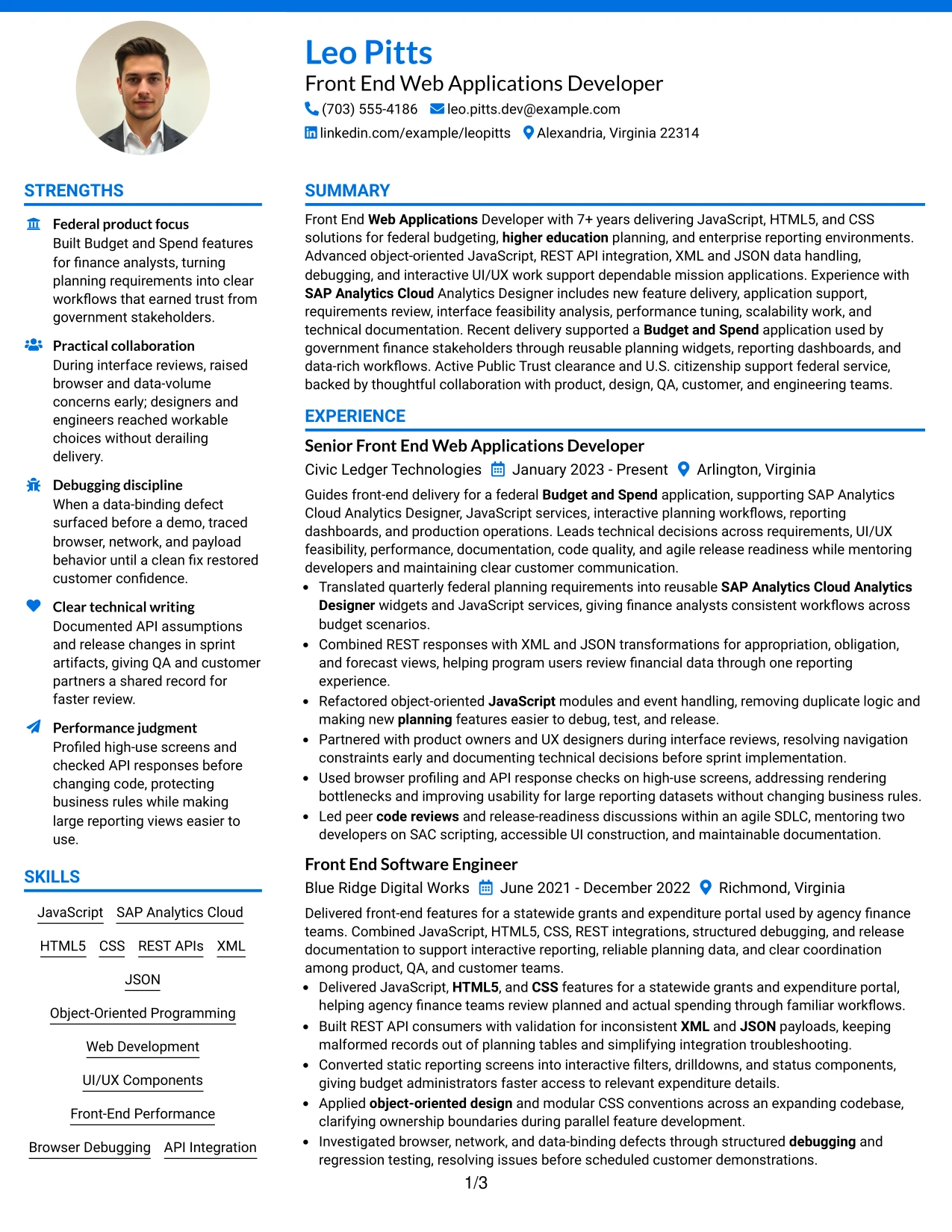
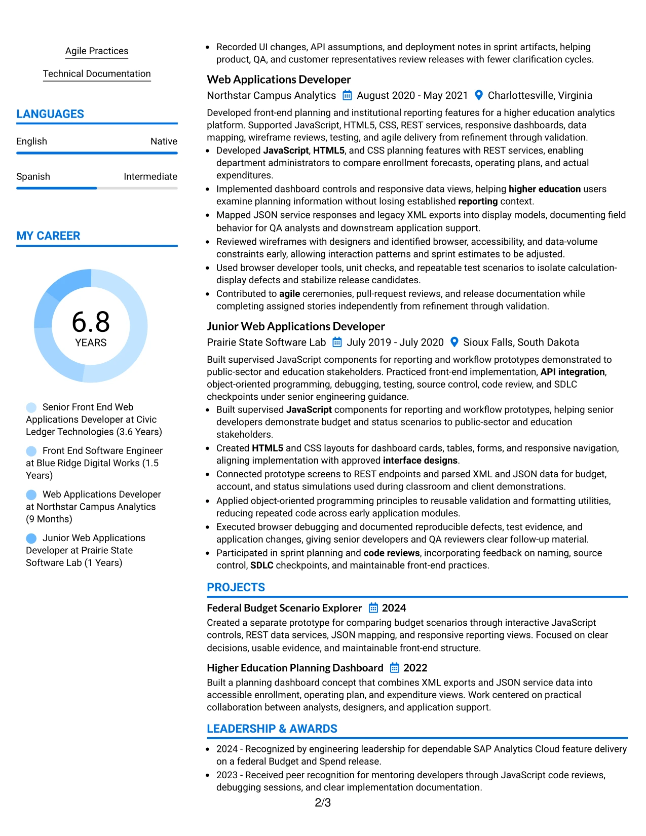
Readers can begin with the photo header and summary, move through the color-accented skills area, and then review experience, projects, education, and certifications in a single column. This sequence keeps the document approachable while giving each technical section enough room for plain, searchable wording.
The international presentation can support clear contact and language details alongside evidence of JavaScript, SAP Analytics Cloud, REST APIs, UI/UX components, and agile delivery. The photo is a visual introduction, while achievements and keywords remain the basis for professional evaluation.
Why the Photo Header Color Accent International Format Works for a Resume
- The header brings identity, contact information, and target role together.
- A single-column flow supports consistent reading across all sections.
- The color accent helps readers move from summary to technical evidence.
- Language information can be included without disrupting experience bullets.
- Projects offer space for applied planning and reporting examples.
- The photo adds a personal element while the text carries ATS-relevant content.
- Certifications, education, and clearance can follow a clear closing sequence.
Best For
- Professionals who want a photo header and a globally familiar single-column structure.
- Applications where language details belong near, but not inside, core experience.
- Candidates presenting technical work, projects, education, and certifications in full width.
- Resumes that need a clear reading path for reviewers in different locations.
- Front-end applications where concise keywords must remain easy to translate and scan.
- Documents combining a personal visual introduction with evidence-led content.
- Readers who value a complete content flow over a split-page arrangement.
#33 Large Profile Photo International Two Column Format
Evidence receives priority in the main column, where experience bullets can explain front-end delivery, application support, interactive dashboards, API integration, and performance work. A secondary column can hold skills, languages, education, certifications, projects, and clearance, while the large profile photo anchors the identity area.
The two-column arrangement gives a substantial work history a structured home without making supporting details difficult to find. Clear headings and standard keywords keep the resume useful for ATS review, while the visual treatment creates a confident international presentation.
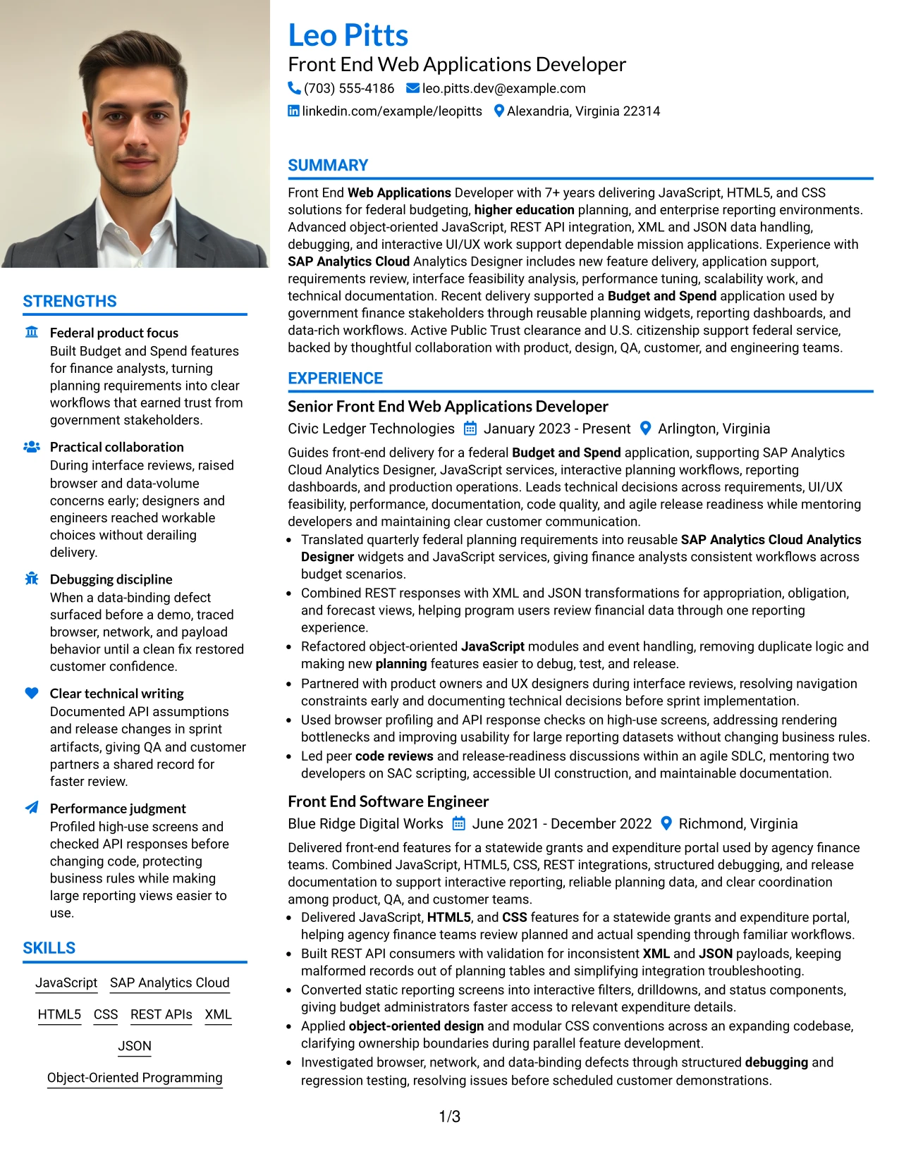
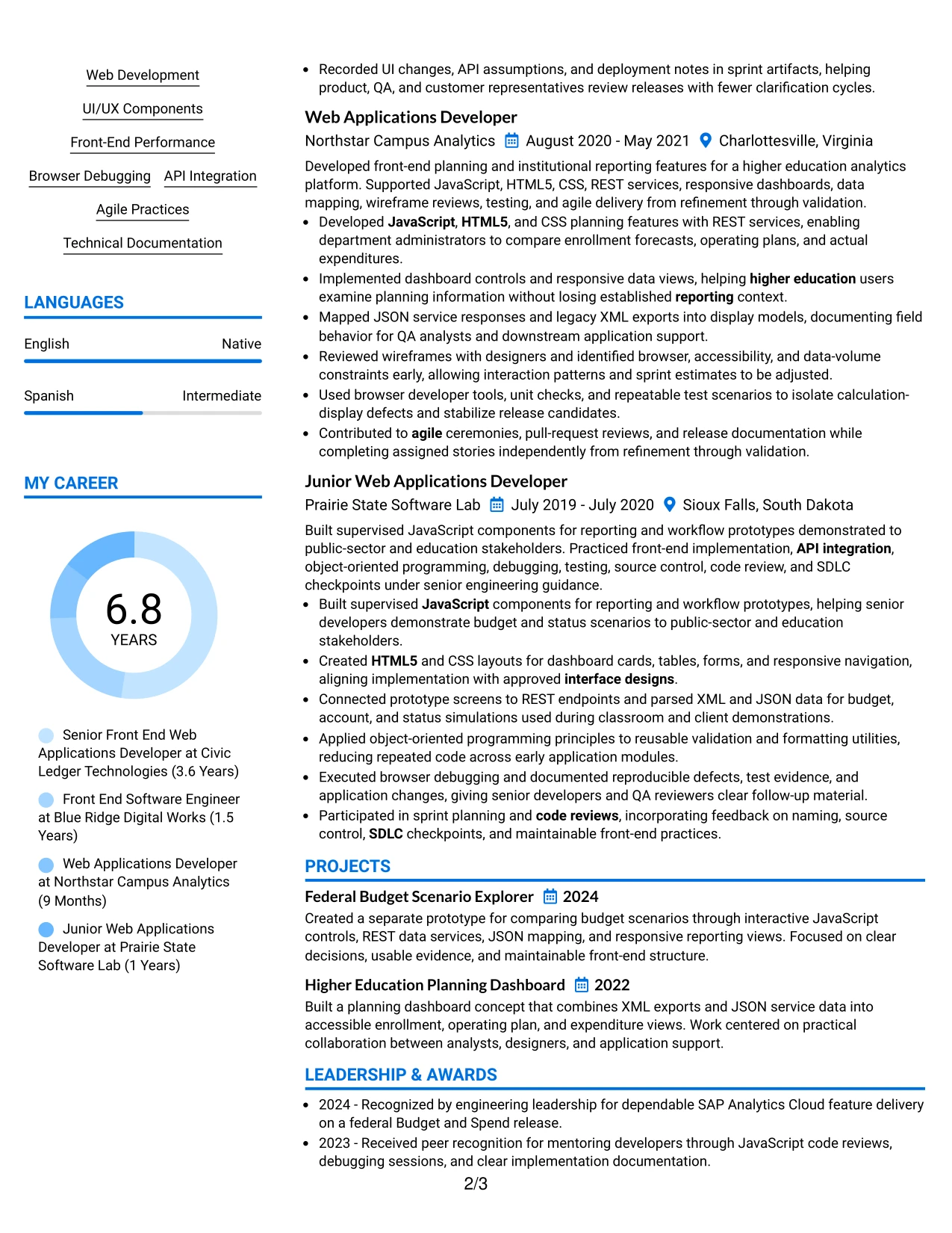
Why the Large Profile Photo International Two Column Format Works for a Resume
- The main column gives achievements the strongest position on the page.
- A large profile photo creates a clear identity anchor in the header.
- The supporting column can group languages, skills, and credentials efficiently.
- Detailed bullets can explain technical decisions and delivery outcomes.
- Projects add evidence of interactive planning and reporting applications.
- Standard headings protect keyword clarity for digital resume systems.
- Two-column balance prevents supporting information from overwhelming the work record.
Best For
- Professionals who need a large photo area alongside a detailed evidence column.
- Applications where languages and international contact details need visible space.
- Candidates with substantial technical experience and several supporting credentials.
- Resumes that should present projects without extending every section into full width.
- Front-end roles where achievement bullets need priority over decorative elements.
- Documents combining a personal profile treatment with ATS-readable text.
- Readers who want a strong visual identity and a separate, detailed career record.
Why Build Your Front End Web Applications Developer - Mid-Level JavaScript Resume with ResumeInMinutes
ResumeInMinutes helps you turn front-end delivery evidence into a structured resume that is easy to scan, revise, and align with a technical job description. The format supports clear positioning of engineering scope, domain experience, tools, certifications, education, and project work.
- ATS-friendly section structure
- Role-specific keyword organization
- JavaScript and front-end skills grouping
- Achievement-focused experience bullets
- Project and certification placement
- Free PDF resume previews
The examples support resumes for front-end web application work involving JavaScript services, SAP Analytics Cloud Analytics Designer, federal budgeting and reporting, REST integrations, data-rich interfaces, performance review, and collaborative agile delivery.
See Also
- 33 Senior FinTech AI Front End Software Developer Resume Templates with Example 2026 (ATS-Optimized)
- 33 Associate .NET Developer: Craft Web Apps with C#, SQL Resume Templates with Example 2026 (ATS-Optimized)
- 33 Software Engineer Web Developer Resume Templates with Example 2026 (ATS-Optimized)
- 33 Web Developer Intern Resume Templates with Example 2026 (ATS-Optimized)
- 33 Mobile Application Developer Intern Resume Templates with Example 2026 (ATS-Optimized)
- 33 Senior Application Developer - Securitized Products Resume Templates with Example 2026 (ATS-Optimized)
- 33 Senior Application Developer - Securitized Products Technology Resume Templates with Example 2026 (ATS-Optimized)
- 33 Associate JavaScript Frontend Developer Resume Templates with Example 2026 (ATS-Optimized)
- 30+ Front End Web Applications Developer - Mid-Level JavaScript Cover Letter Templates with Example 2026
- 30+ Senior FinTech AI Front End Software Developer Cover Letter Templates with Example 2026
Frequently Asked Questions
Are these Front End Web Applications Developer - Mid-Level JavaScript resume templates ATS-friendly?
Yes. The templates use clear headings, readable structure, and role-specific terms such as JavaScript, HTML5, CSS, SAP Analytics Cloud, REST APIs, XML, JSON, debugging, and front-end performance.
Are these 33 different resumes?
No. The guide presents one role-focused resume example through different layouts and design themes. The content can be adjusted while the format changes.
What should a Front End Web Applications Developer - Mid-Level JavaScript resume include?
Include a targeted summary, technical skills, professional experience, projects, education, certifications or clearance information, and concise bullets that show JavaScript delivery, API integration, UI/UX work, debugging, performance, documentation, and results.
Should SAP Analytics Cloud Analytics Designer appear on the resume?
Yes, when it reflects your actual background. List SAP Analytics Cloud or SAC Analytics Designer in the skills section and explain how you used it for widgets, dashboards, planning applications, reporting, or feature delivery.
Which resume style works well for this front-end developer role?
A clean one-column format or a restrained two-column format usually works well. Choose a layout with readable headings, consistent dates, strong section hierarchy, and enough space for technical keywords and achievement bullets.
How can I show front-end achievements without inventing metrics?
Describe observable results supported by your work. You can show improved usability, clearer workflows, reduced duplicate logic, more reliable data handling, faster troubleshooting, stabilized releases, or better coordination when exact numbers are unavailable.
Should Public Trust clearance and U.S. citizenship appear on the resume?
Include active Public Trust clearance and U.S. citizenship when they are accurate and relevant to the position. Place them in a certification, clearance, or additional-information section where they are easy to find.
Can I customize these resume templates?
Yes. You can revise the resume text, section order, layout, and design to present your JavaScript experience, SAP Analytics Cloud work, projects, education, certifications, and target keywords accurately.