33 Insurance Sales Agent - Customer Service Resume Templates with Example 2026
This guide shows you how to create an Insurance Sales Agent - Customer Service resume that is clear, focused, and easy to adapt. You will learn how to organize your evidence so customers, sales results, and service responsibilities are easy to review.
Strong resume content connects personal lines and nonstandard auto insurance knowledge with customer service, inbound lead conversion, coverage education, follow-up, and accurate transaction handling. It also shows useful systems and strengths, such as CRM workflows, agency management systems, bilingual English-Spanish service, and careful documentation.
The complete example is presented in 33 layouts, with format guidance to help you compare resume structure, ATS readability, section order, skills, licenses, projects, and measurable work evidence for this exact role.
What Makes a Great Insurance Sales Agent - Customer Service Resume in 2026
A strong resume is customer-focused, sales-driven, accurate, and easy to scan. It connects coverage recommendations, relationship building, follow-up, and production support to clear resume sections and concise achievement bullets.
Use keywords such as personal lines, Property and Casualty, nonstandard auto insurance, inbound sales leads, CRM, currency transactions, bilingual English-Spanish service, and policy quoting when they match your background.
The examples shown below are intentionally detailed to demonstrate a range of experiences, skills, accomplishments and relevant keywords. We prefer detailed resumes as they provide more context to the hiring managers and also help the ATS systems identify relevant qualifications and score your resume better for a match. But the length of a resume is an individual choice. If you want a one page resume, just keep the most relevant experience and information for the job. Note: Resume examples are created for educational purposes; references to real organizations do not imply affiliation or endorsement.
#1 Plain Two Column Format Resume Example
Plain Two Column Format gives the resume a clear split between core experience and supporting details. The main column can carry the professional summary, work history, projects, and measurable evidence, while the side column groups licenses, education, languages, and tools for quick review.
For the Insurance Sales Agent - Customer Service target, this structure keeps customer service, personal lines sales, policy quoting, and follow-up easy to find. Short bullets also support ATS parsing while giving readers a fast view of more than 100 monthly opportunities, bilingual service, and accurate currency transactions.
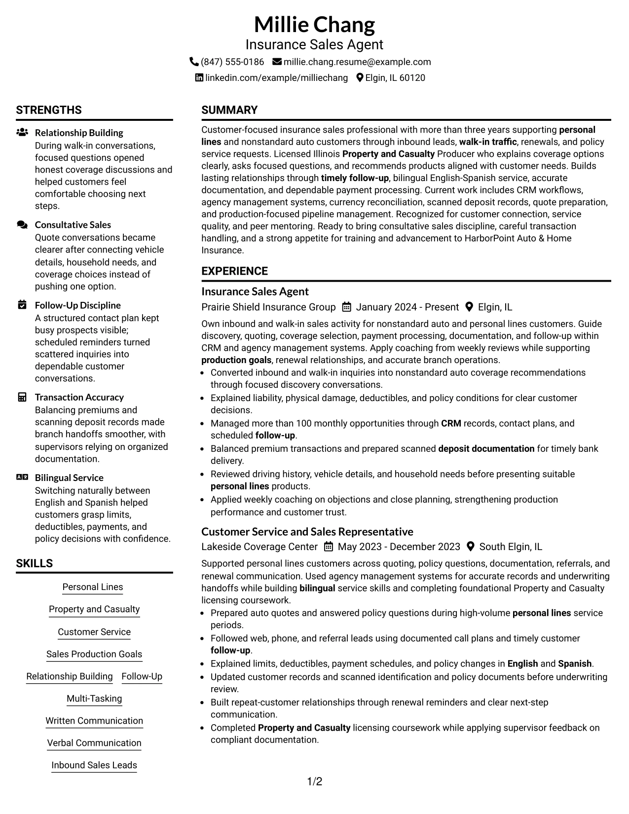
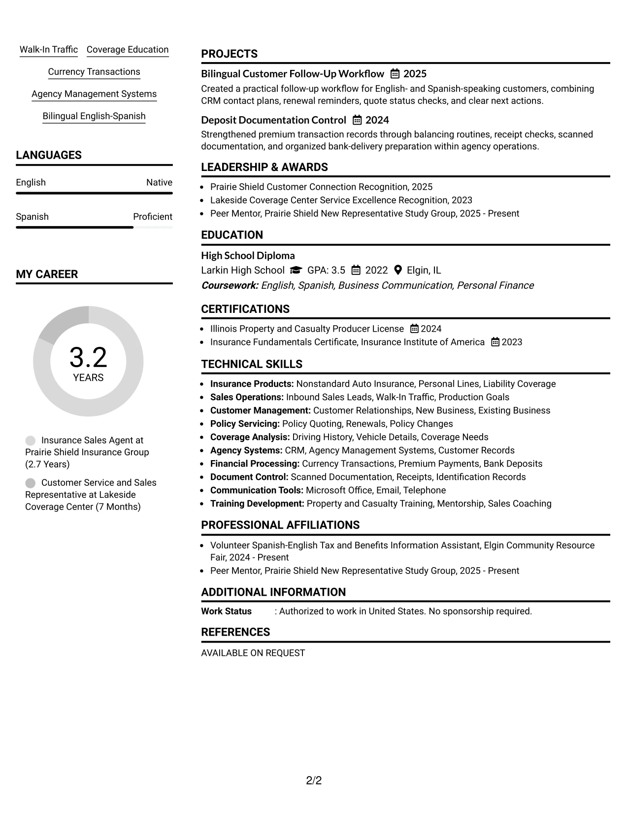
Resume Snapshot
- Licensed Illinois Property and Casualty Producer with more than three years of personal lines and nonstandard auto experience.
- More than 100 monthly opportunities managed through CRM records, contact plans, and scheduled follow-up.
- Bilingual English-Spanish service covering coverage education, policy questions, payments, and renewals.
- Premium transactions balanced with scanned deposit documentation prepared for timely bank delivery.
Why the Plain Two Column Format Works for a Resume
- The main column gives work history enough space for strong action bullets and relevant results.
- The side column makes licenses, education, languages, and systems easy to scan.
- Separate content zones help readers find customer service and sales evidence quickly.
- Short sections improve readability without removing important insurance keywords.
- ATS-friendly text remains more useful than decorative graphics or complex visual elements.
- The layout supports both recruiter scanning and a detailed review of transaction accuracy.
Resume Keywords
- Insurance Sales Agent
- Customer Service
- Personal Lines
- Property and Casualty
- Bilingual English-Spanish
- Inbound sales leads
- Policy quoting
- CRM
- Currency transactions
- Deposit documentation
#2 Simple One Column Format Resume Example
A recruiter moves from the summary to recent experience, then to skills, licenses, education, and supporting projects in one steady path. That reading order reduces visual jumps and makes the document easy to review on a screen or in an ATS.
The resume can use the full page width for concise bullets about inbound leads, walk-in traffic, coverage education, payment processing, and follow-up. This is useful when several related qualifications need room without forcing information into narrow sidebars.
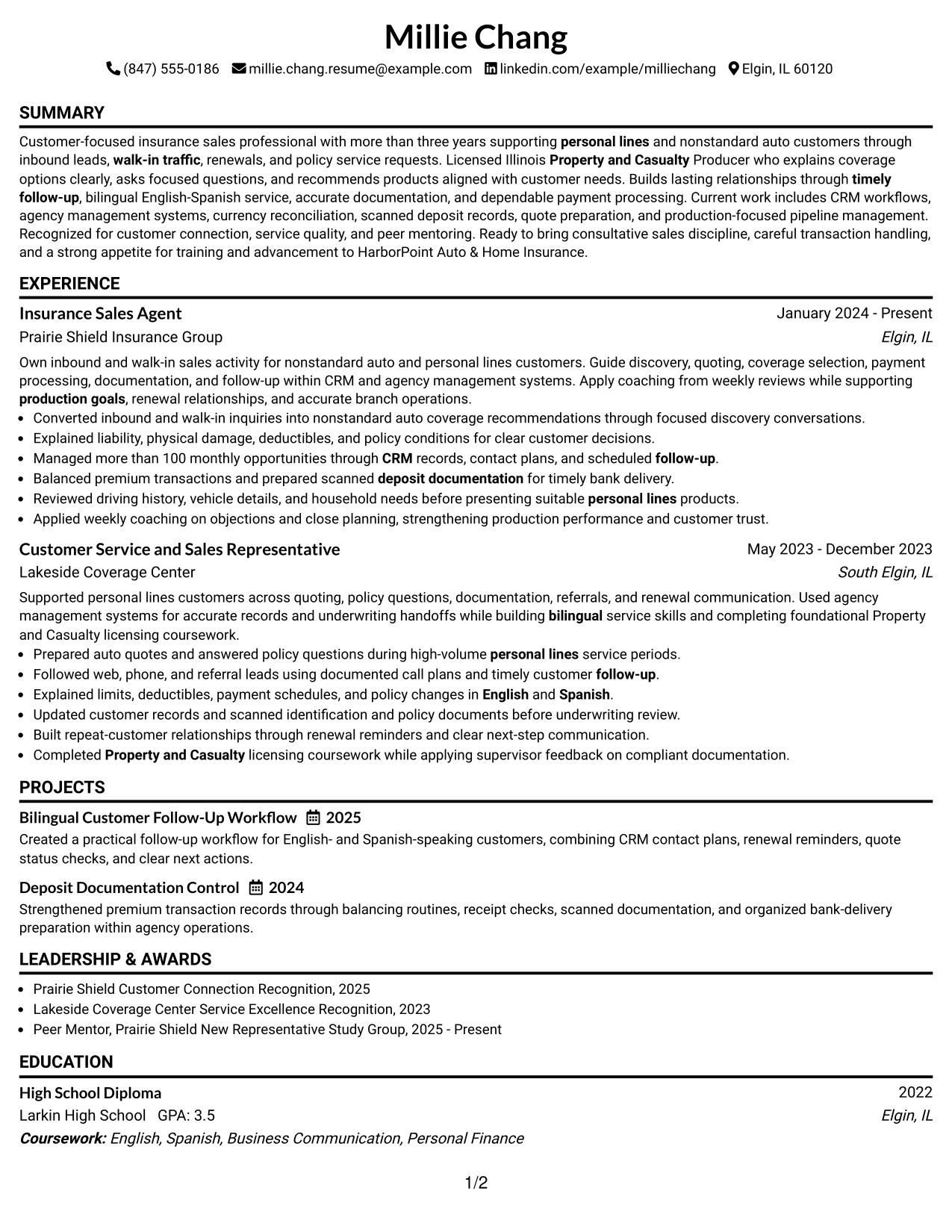
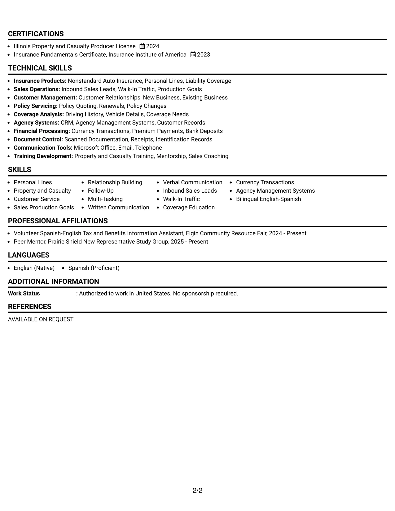
Why the Simple One Column Format Works for a Resume
- A single reading path helps reviewers understand the candidate's experience in sequence.
- Full-width bullets allow complete descriptions of policy quoting and customer service work.
- The format gives equal visibility to employment, projects, certifications, and skills.
- Simple text structure supports reliable ATS parsing and keyword matching.
- Dates, employers, and job titles remain easy to locate during a quick scan.
- The design works well when the resume needs substantial content without visual crowding.
Best For
- Resumes that need a direct summary-to-experience reading path
- Candidates combining sales, customer service, and policy service evidence
- Documents with several detailed work bullets and supporting projects
- ATS submissions where straightforward text order matters
- Applications reviewed on small screens or shared as plain PDF files
- Resumes that need room for licenses, languages, systems, and education
- Job searches that require clear chronological experience and follow-up evidence
#3 Clean Two Column Sidebar Format Resume Example
Evidence receives priority in this resume, with customer-facing work and documented results placed where readers see them first. Bullets can show coverage recommendations, quote preparation, renewal follow-up, and careful payment handling without burying those details in a long skills list.
A compact sidebar then holds credentials and quick-reference information. The contrast between evidence and supporting data helps readers connect the Illinois Property and Casualty Producer License, bilingual service, CRM work, and personal lines experience to the target role.
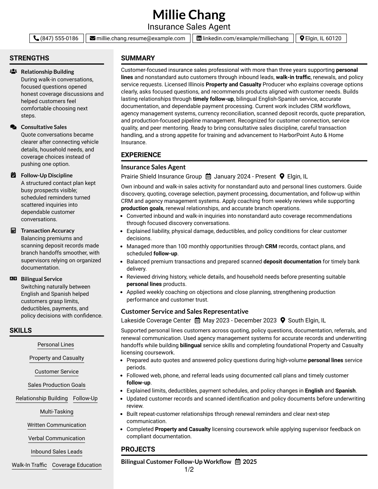
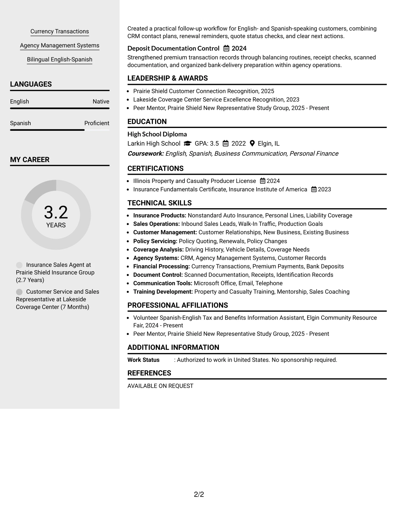
Why the Clean Two Column Sidebar Format Works for a Resume
- Experience bullets lead with actions that show customer service and sales ability.
- The sidebar keeps licenses, languages, and systems visible without interrupting the work history.
- Evidence such as more than 100 monthly opportunities adds credibility to the sales record.
- Coverage education and policy details can be explained in focused, readable bullets.
- The format separates proof of performance from quick-reference qualifications.
- Clean spacing supports fast review while preserving useful ATS keywords.
Best For
- Resumes where customer-facing achievements should receive the strongest visual emphasis
- Candidates with clear evidence from quoting, renewals, and lead follow-up
- Applications that need licenses and bilingual ability visible beside experience
- Documents that combine narrative work bullets with compact qualification data
- Readers who want proof of service quality before reviewing secondary details
- Insurance applications requiring both coverage knowledge and transaction accuracy
- Resumes that benefit from a focused evidence area and a restrained sidebar
#4 Two Column Format Resume Example
Content is balanced across two useful areas: one for the professional story and one for supporting qualifications. This keeps the resume from giving too much space to either job history or keyword-rich details such as systems, licenses, languages, and policy services.
For a customer service insurance application, the balance supports both quick screening and deeper review. Readers can see inbound sales leads, relationship building, and follow-up alongside currency transactions, agency management systems, and coverage analysis.
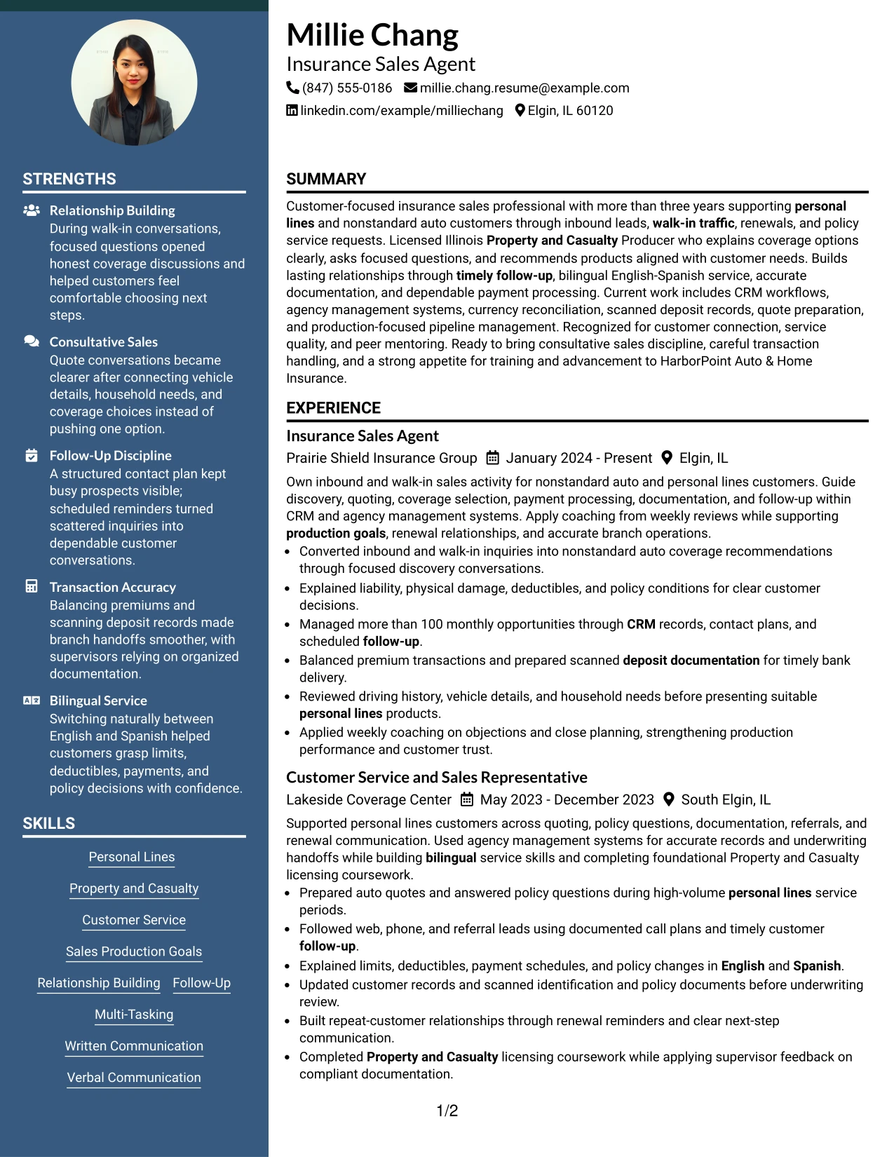
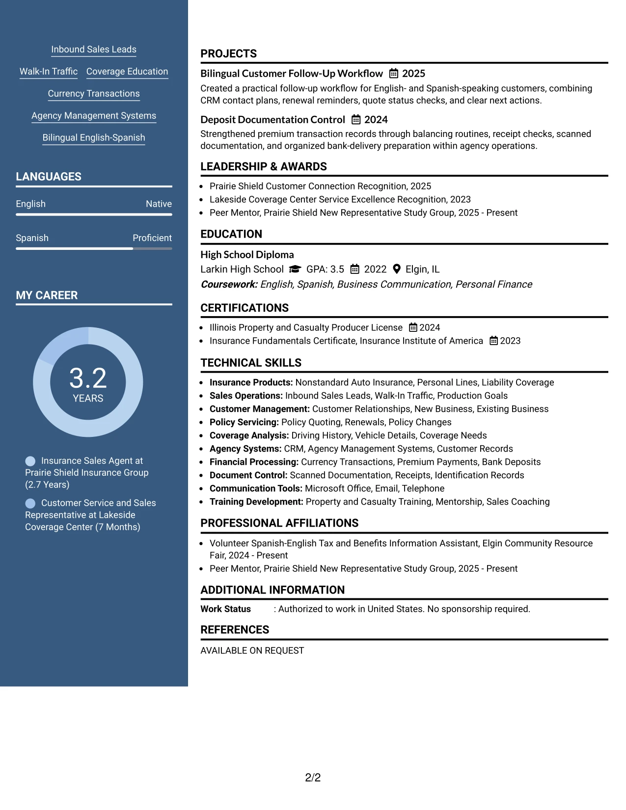
Why the Two Column Format Works for a Resume
- Two columns distribute experience and qualifications without creating a crowded page.
- The primary area can show action, context, and customer results in readable bullets.
- The secondary area keeps skills, credentials, and languages available for quick matching.
- Relevant terms appear near the content that proves them through work examples.
- The structure supports a balanced review of sales production and operational accuracy.
- Clear grouping helps readers compare customer service strengths with system knowledge.
- The format can present projects and recognition without weakening the employment section.
Best For
- Applications that need equal attention on experience and supporting qualifications
- Resumes pairing relationship building with accurate financial or document processing
- Candidates presenting both customer-facing work and agency system knowledge
- Job searches where licenses, languages, and follow-up skills must be easy to locate
- Readers who prefer a balanced page over a single long content stream
- Applications that include projects, recognition, and community service alongside employment
- Resumes needing organized evidence for inbound leads and existing customer support
#5 Photo Header Two Column Format Resume Example
A practical application review often starts with a quick look at the candidate's role, contact details, and strongest qualifications. The two-column arrangement then separates employment evidence from supporting information, helping readers move from the summary to sales results, licenses, languages, and systems.
For this resume, the format can present personal lines experience and customer service evidence in a polished header-led design. The main content should still rely on readable text, direct bullets, and ATS-friendly section labels rather than visual decoration.
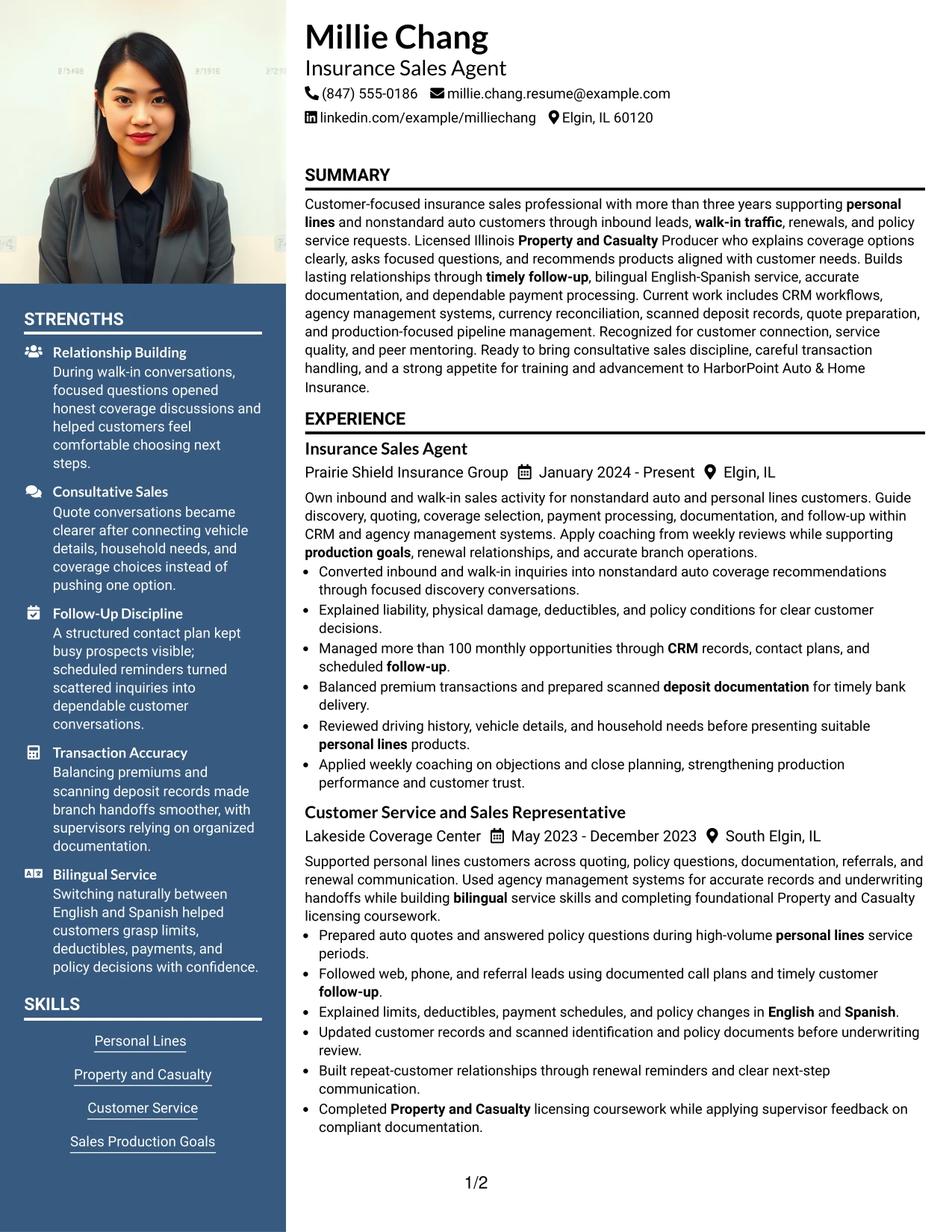
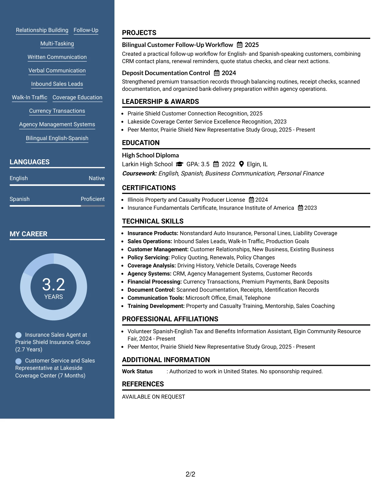
Why the Photo Header Two Column Format Works for a Resume
- The header creates a clear first point of reference for the target role and contact details.
- Two content areas keep work history separate from skills, education, and licenses.
- The main column gives room to explain coverage recommendations and follow-up actions.
- The supporting column can surface English-Spanish service and agency systems quickly.
- Readable section labels keep the resume useful in digital and printed review.
- A polished presentation supports customer-facing applications while evidence remains central.
- The layout can show recognition and community activity without competing with experience.
Best For
- Customer-facing applications that benefit from a polished, organized first impression
- Resumes needing a strong header followed by clearly separated evidence areas
- Candidates combining sales achievements with licenses, languages, and systems
- Applications reviewed both visually and through ordinary text extraction
- Documents where contact details and target role must be immediately visible
- Resumes presenting a professional summary before detailed personal lines experience
- Job searches that value balanced presentation without sacrificing readable work bullets
#6 Colored Two Column Format Resume Example
A restrained visual hierarchy makes the role, recent experience, and strongest qualifications stand out without overwhelming the reader. Color can guide the eye to section headings, while the written content carries the proof through concise bullets and clear labels.
The resume aligns well with work that combines customer contact and careful operations. Personal lines sales, coverage education, CRM records, currency reconciliation, and timely follow-up can be grouped so the reader sees both relationship skills and dependable process control.
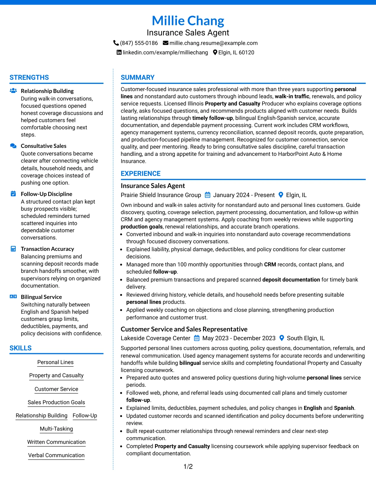
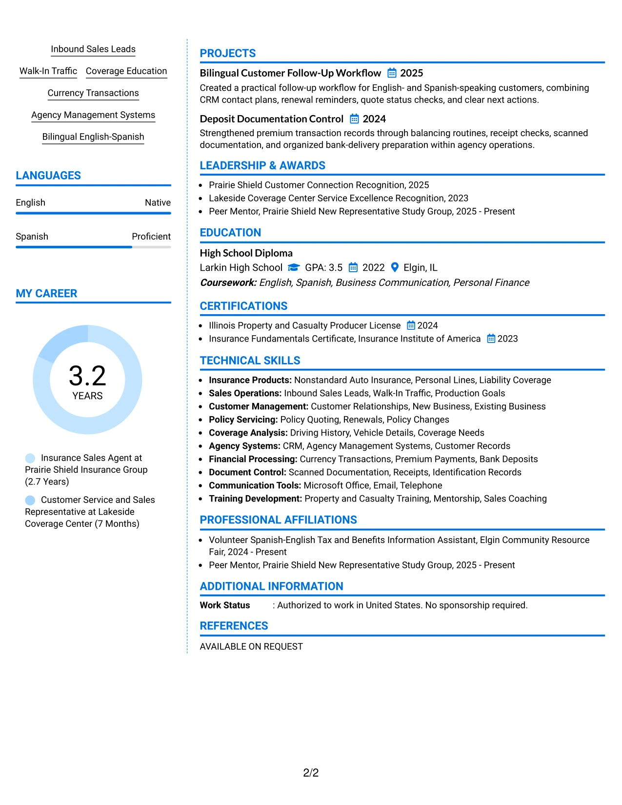
Why the Colored Two Column Format Works for a Resume
- Controlled color creates hierarchy while keeping the employment section easy to scan.
- Two columns connect role-related evidence with supporting skills and credentials.
- Bullets can show customer education, policy quoting, and renewal follow-up clearly.
- A side area gives visibility to CRM, agency systems, and currency reconciliation.
- Simple labels help readers match the resume to customer service requirements.
- The format keeps recognition and community activity visible without crowding experience.
Best For
- Customer service resumes that need clear visual grouping without heavy decoration
- Applications combining relationship skills with accurate administrative processes
- Candidates who want sales evidence and systems knowledge visible at the same time
- Documents where section hierarchy should guide a fast recruiter scan
- Resumes presenting bilingual service, follow-up, and policy education together
- Insurance applications that benefit from distinct but readable qualification areas
- Job seekers who need a polished format while keeping text and keywords central
#7 Stylish Two Column Designer Format Resume Example
Stylish Two Column Designer Format places the resume into defined content blocks, giving each section a clear role. The main area can carry the summary and experience bullets, while compact blocks organize skills, licenses, education, projects, and recognition.
That structure supports fast scanning without reducing the evidence behind the application. Customer discovery, coverage explanations, more than 100 monthly opportunities, deposit documentation, and bilingual service can each appear as focused proof rather than as a dense keyword list.
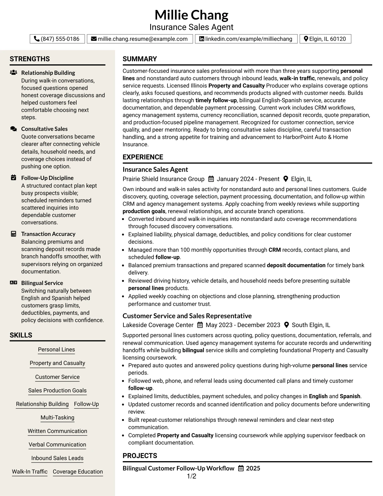
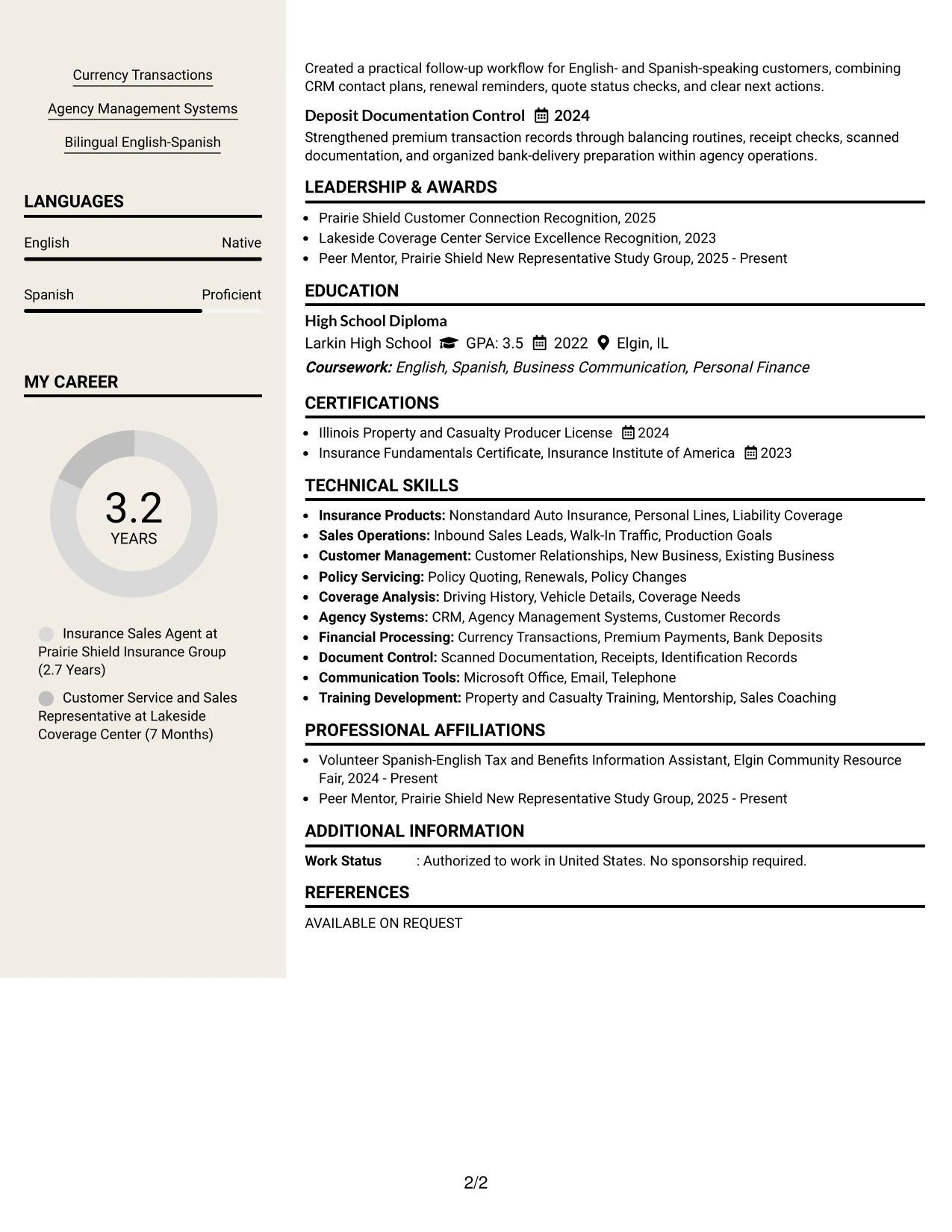
Why the Stylish Two Column Designer Format Works for a Resume
- Defined blocks help readers separate experience from supporting qualifications.
- The main column provides room for action bullets and measurable workload evidence.
- Compact sections make licenses, languages, and tools easy to locate.
- Projects can show practical work such as follow-up workflow and deposit control.
- Visual grouping supports scanning while keeping text-based ATS information intact.
- The format prevents unrelated skills from blending into the employment record.
- Recognition and mentoring can add context without taking attention from core experience.
Best For
- Resumes with several content types that need clear section boundaries
- Candidates presenting work history, projects, recognition, and community activity together
- Applications where measurable workload evidence should stand apart from general skills
- Documents that need an organized skills and license area beside detailed experience
- Readers who scan by section before deciding which bullets to read closely
- Resumes combining customer communication with documentation and payment controls
- Job searches that benefit from a structured designer presentation with readable text
#8 Modern Icon Format Resume Example
Readers move through this one-column resume from the summary into experience, skills, certifications, education, and projects, with small visual markers helping them recognize each section. The single path keeps the document easy to follow while icons add light orientation.
The content remains the main focus. Bullets can explain inbound lead conversion, coverage education, CRM management, and payment accuracy, while the skills and certification sections reinforce the keywords required for an Insurance Sales Agent - Customer Service application.
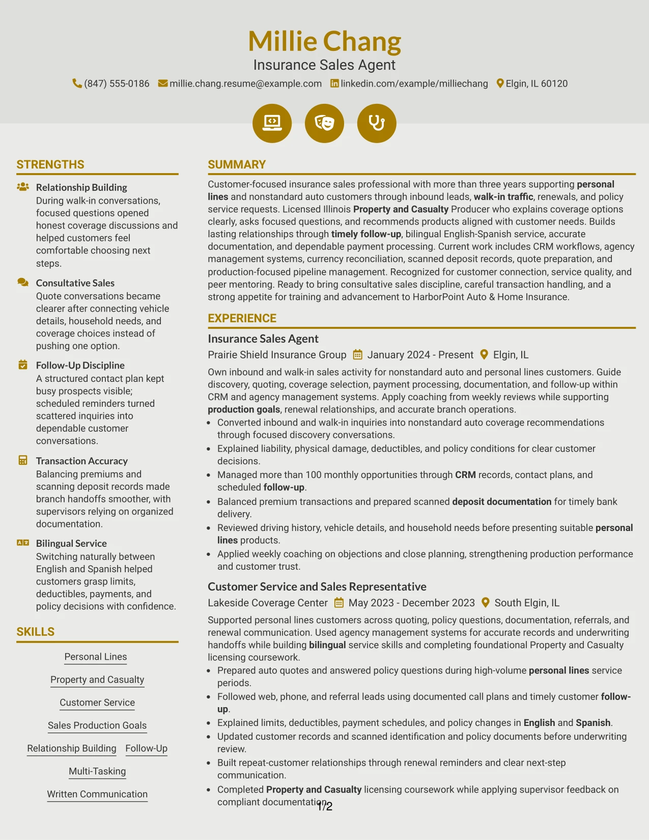
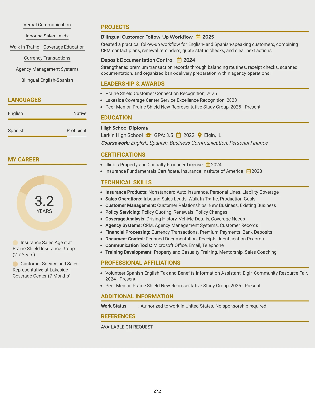
Why the Modern Icon Format Works for a Resume
- One-column order keeps the complete career story easy to follow.
- Small section markers help readers locate skills, licenses, projects, and education.
- Full-width bullets give customer service and sales evidence enough room.
- The format can include detailed systems and transaction keywords without a narrow sidebar.
- Simple text labels preserve ATS value alongside the visual navigation cues.
- A consistent sequence helps readers compare recent and earlier experience.
- Projects and recognition can be added without disrupting the main review path.
Best For
- Resumes needing a clear one-column path with light section navigation
- Candidates with several qualifications that require full-width descriptions
- Applications where project details should sit naturally beside employment history
- Documents reviewed on screens where consistent vertical flow improves reading
- Job searches requiring strong visibility for CRM, quoting, and coverage terms
- Resumes combining certifications, languages, activities, and work evidence
- Readers who prefer visual cues but still need straightforward ATS-readable content
#9 Modern Full Background Two Column Format Resume Example
Evidence leads the review in this format, so the summary and strongest work bullets should establish relevance before secondary details. The two-column structure gives the resume a clear place for sales production, customer relationships, and operational accuracy, with supporting qualifications nearby.
For this application, the evidence can include inbound and walk-in lead handling, coverage recommendations, more than 100 monthly opportunities, balanced premium transactions, and bilingual explanations. These details show both customer impact and reliable process execution.
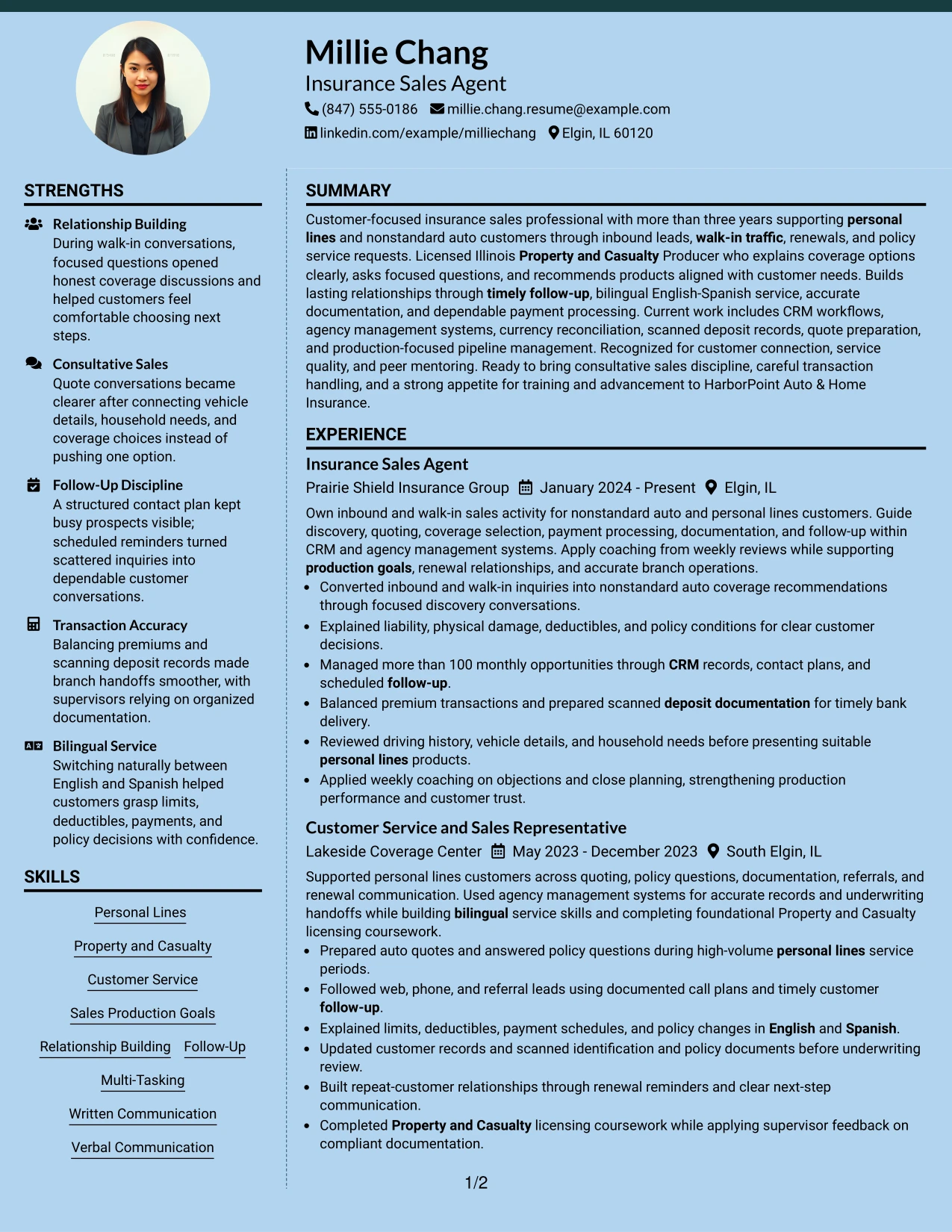
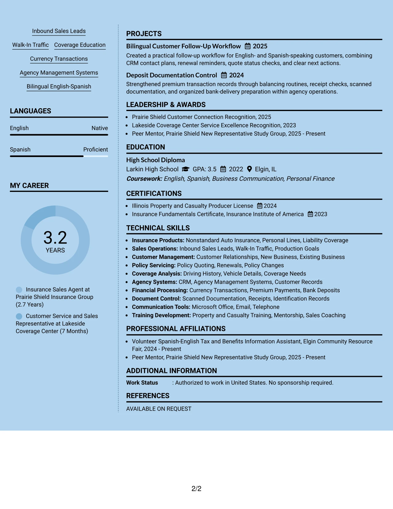
Why the Modern Full Background Two Column Format Works for a Resume
- The strongest employment evidence can appear before less relevant supporting detail.
- Two columns keep production, customer service, and operations easy to compare.
- Specific workload evidence gives more weight to claims about pipeline management.
- Coverage explanations show the ability to support informed customer decisions.
- License and language information remain visible without taking over the page.
- The structure supports a focused review of both sales and documentation accuracy.
- Clear text sections help preserve resume usefulness when submitted electronically.
Best For
- Applications where measurable workload and customer results should lead the review
- Candidates with evidence from inbound leads, walk-in traffic, and renewal support
- Resumes that must show both consultative service and transaction control
- Documents pairing coverage knowledge with clear operational documentation
- Readers who want proof of capability before reviewing secondary qualifications
- Insurance submissions where personal lines and bilingual service need strong visibility
- Job searches requiring a confident evidence-first presentation without long paragraphs
#10 Dark Mode Two Column Format Resume Example
Content is balanced between a strong professional summary, detailed experience, and compact supporting sections. The darker visual treatment can separate major areas, but the resume still needs generous spacing, clear contrast, and short bullets for reliable reading.
This format gives Millie Chang's resume room to present customer relationships, personal lines sales, bilingual communication, licensing, and agency systems in an organized way. Experience should remain the largest content area, with projects and credentials supporting the main evidence.
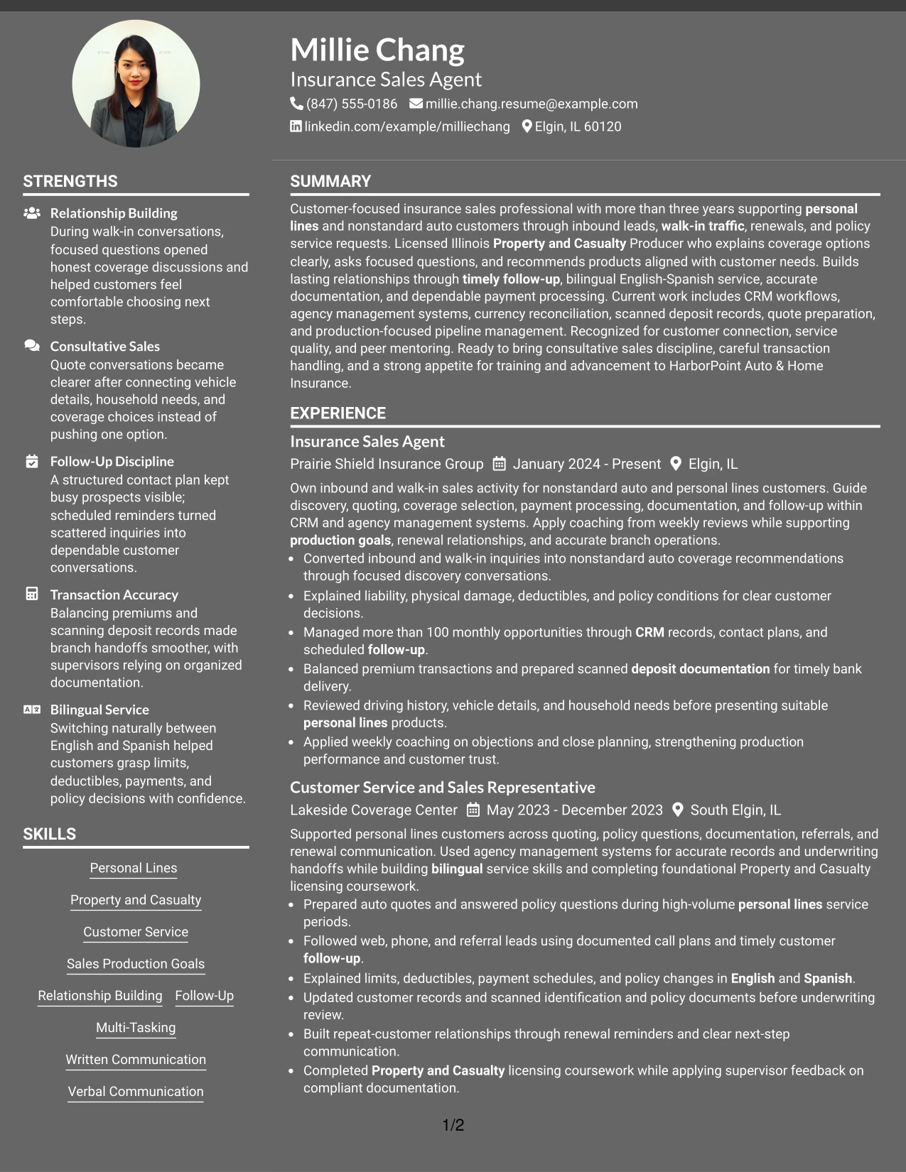
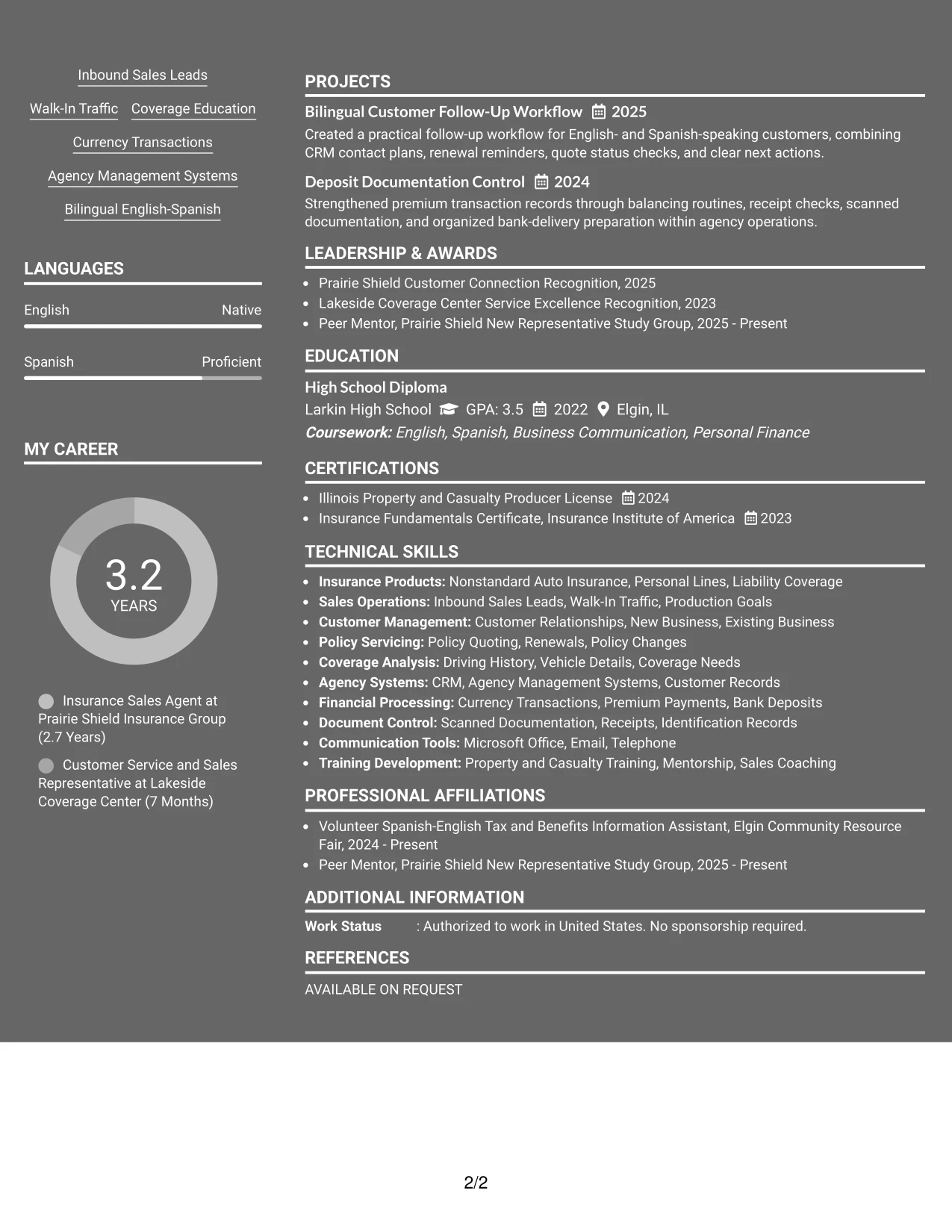
Why the Dark Mode Two Column Format Works for a Resume
- Balanced columns help connect detailed work history with quick-reference qualifications.
- Strong contrast between sections can guide attention to role titles and dates.
- Short bullets keep customer service and sales evidence readable in a darker design.
- The format provides a dedicated place for licenses, languages, and systems.
- Projects and recognition can support the work history without competing with it.
- Clear hierarchy helps readers find coverage education and follow-up experience quickly.
- Plain text section labels preserve useful resume structure for digital review.
Best For
- Customer-facing applications that need balanced evidence and qualification sections
- Resumes presenting sales activity beside licenses, languages, and agency systems
- Candidates who want a distinctive presentation with disciplined content spacing
- Documents where recent experience should occupy the largest visual area
- Applications reviewed as digital files with clear contrast and readable text
- Job searches combining relationship building, follow-up, and transaction accuracy
- Resumes that need projects and recognition included without weakening the main work record
#11 Dark Mode Box Header Format Resume Example
A practical application review benefits from a strong boxed header that identifies the target role and key contact details immediately. Below it, the one-column structure lets readers follow the summary, experience, skills, certifications, education, and projects in a consistent order.
The resume can use that focused sequence to present customer service and insurance sales evidence without splitting attention across sidebars. Direct bullets about coverage recommendations, follow-up, CRM records, and accurate premium processing keep the content useful for both human review and ATS screening.
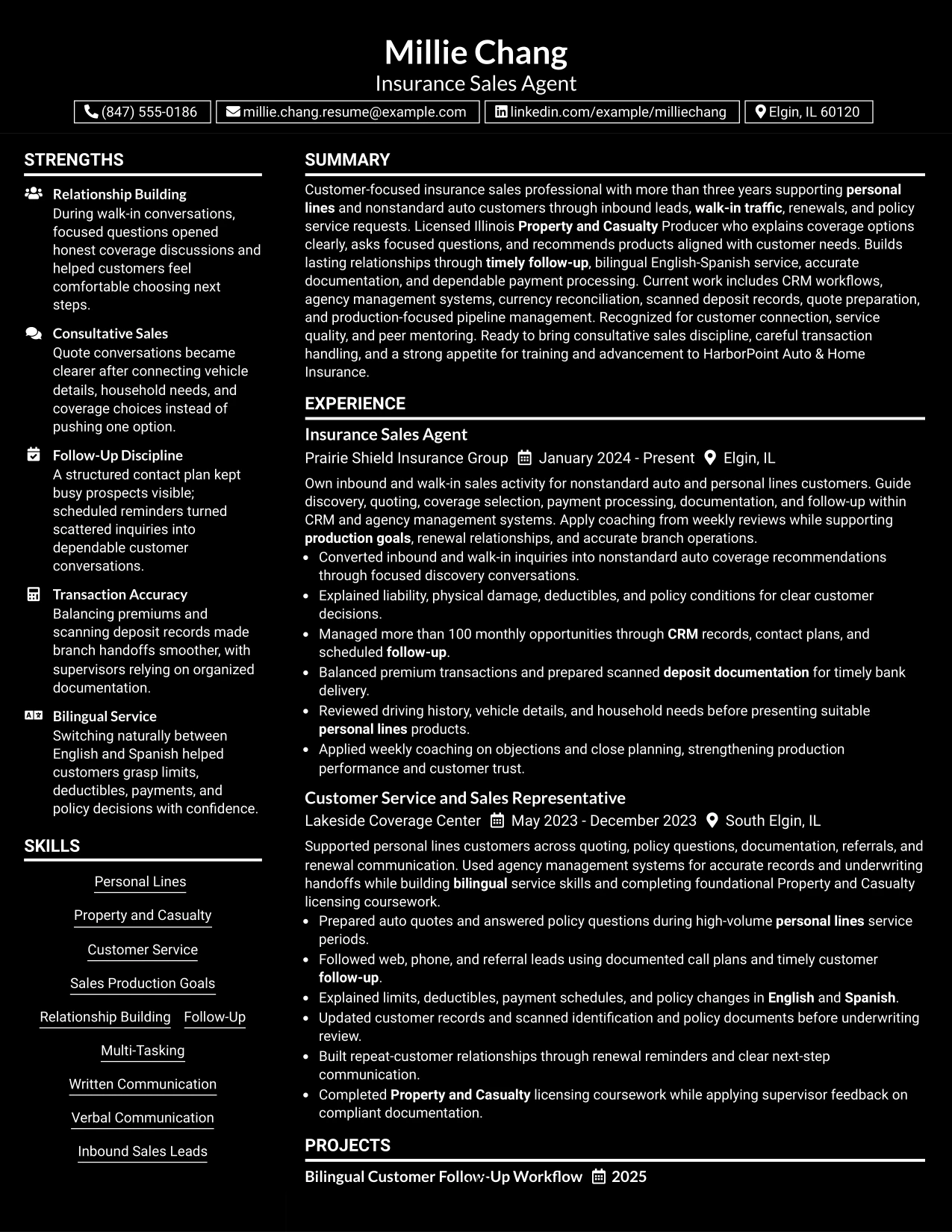
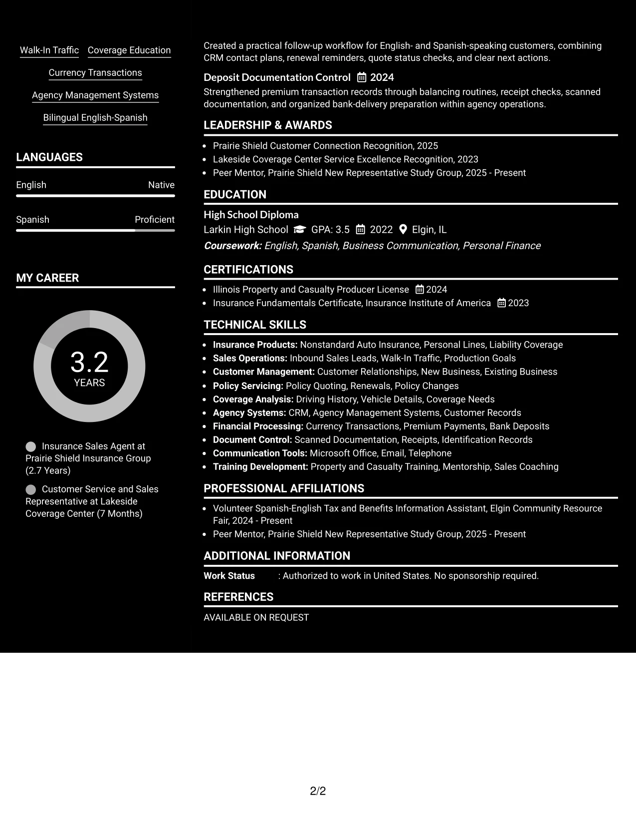
Why the Dark Mode Box Header Format Works for a Resume
- The boxed header makes the target role and contact information easy to identify.
- A single content stream supports a steady review from summary through experience.
- Full-width bullets provide room for customer service and sales evidence.
- Skills and certifications remain visible without interrupting the work history.
- The format can include projects and recognition in a clear supporting sequence.
- Strong section separation improves navigation while keeping the page organized.
- Direct text and familiar labels support ATS screening and human review.
Best For
- Applications that need the target role and contact details visible at once
- Customer service resumes best reviewed in a consistent top-to-bottom order
- Candidates with detailed work bullets that need full-page width
- Documents combining insurance experience, licenses, projects, and education
- Digital applications where clear section separation improves navigation
- Job searches requiring readable evidence for quoting, follow-up, and payment handling
- Resumes that want a distinctive header while keeping the content simple and accessible
#12 Elegant Full Background Two Column Format Resume Example
A restrained visual hierarchy gives the resume a polished first impression while keeping the Insurance Sales Agent target clear. Two columns separate contact details, skills, licenses, and languages from experience, education, projects, and recognition.
The structure helps readers connect customer service strengths with practical evidence such as more than 100 monthly opportunities, accurate premium transactions, bilingual coverage explanations, and CRM follow-up. It also keeps important Property and Casualty keywords easy to locate.
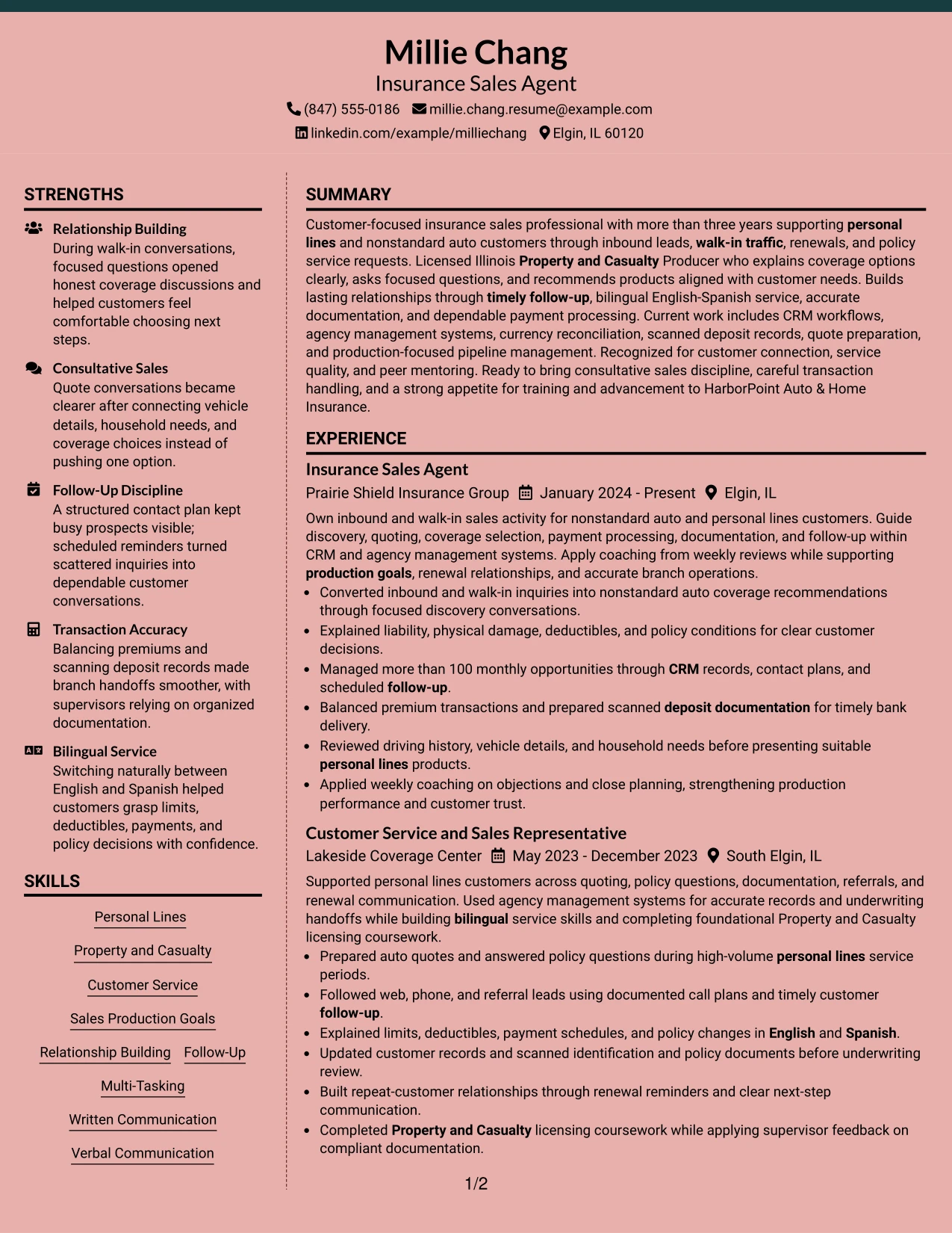
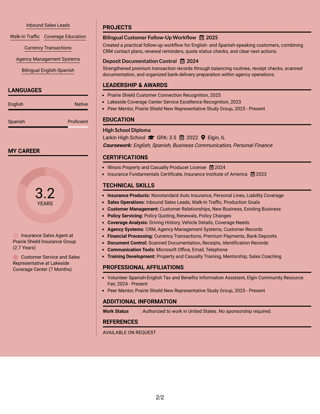
Why the Elegant Full Background Two Column Format Works for a Resume
- The two-column structure separates supporting details from career evidence.
- A clear top section makes the target role visible before the reader reviews work history.
- Skills such as Personal Lines, Coverage Education, and Follow-Up appear in a compact area.
- Experience bullets show customer conversations, policy quoting, and transaction accuracy.
- The license and certificate section adds fast proof of insurance knowledge.
- Projects and recognition provide useful evidence beyond daily job duties.
- Simple headings and standard text help readers scan the document quickly.
Best For
- Candidates who need to show both customer-facing results and supporting qualifications.
- Resumes that benefit from separating licenses, languages, and systems from employment history.
- Applications where a polished two-column presentation supports quick review.
- Professionals with several evidence areas, including projects, recognition, and activities.
- Readers who want key sales and service strengths available beside the main experience section.
- Applications that need visible bilingual service and Property and Casualty credentials.
- A balanced resume that presents measurable activity without making the page feel crowded.
#13 Creative Two Tone Format Resume Example
The Creative Two Tone Format organizes the resume as a single, continuous reading path with clear visual changes between major sections. The format name adds personality, but standard headings keep the document focused on sales, service, and insurance evidence.
Readers can move from the professional summary to experience, skills, licenses, education, and projects without searching across columns. Strong bullets highlight inbound lead conversion, coverage education, renewal follow-up, and documented CRM activity while preserving ATS-friendly wording.
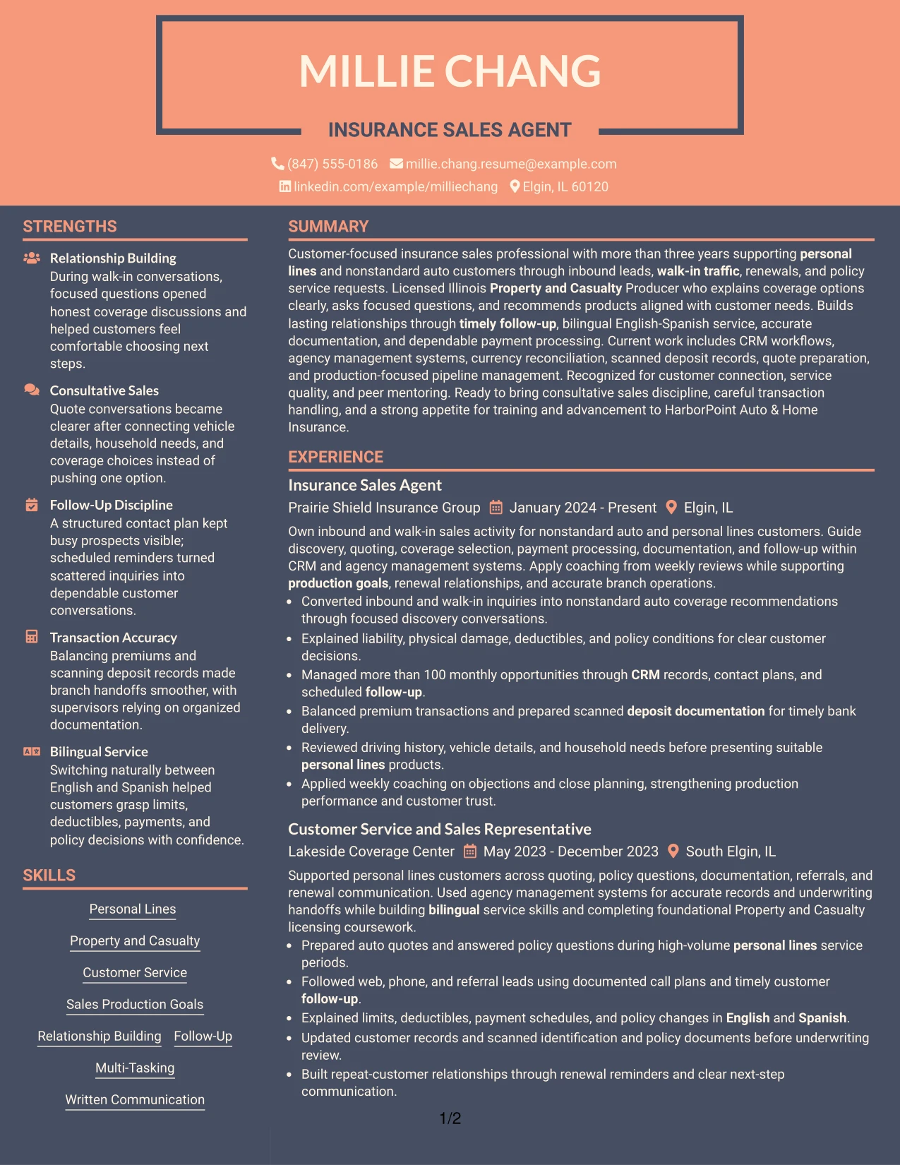
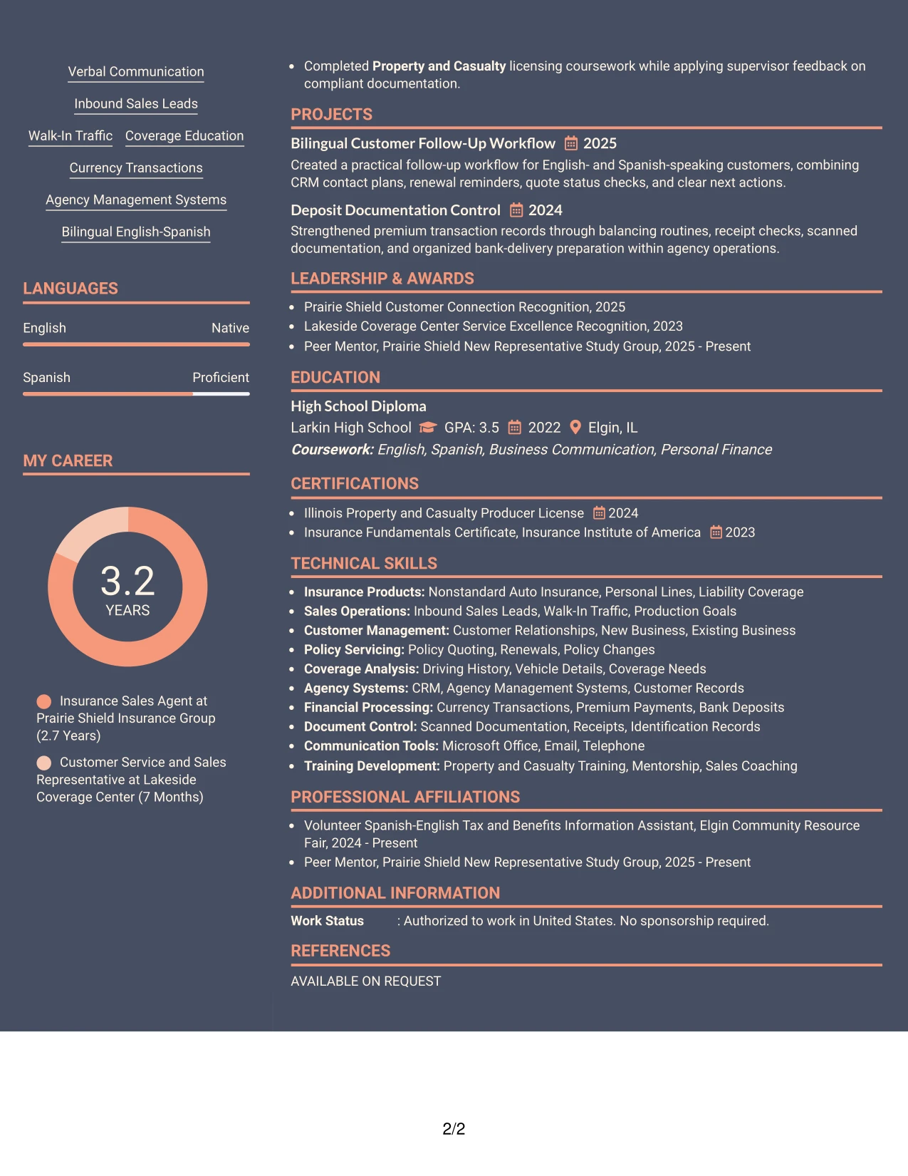
Why the Creative Two Tone Format Works for a Resume
- One-column reading keeps work history in a natural chronological sequence.
- Visual contrast can distinguish headings without replacing standard section labels.
- The summary quickly connects customer service, sales, licensing, and bilingual support.
- Bullets give measurable activity, including management of more than 100 monthly opportunities.
- Skills and systems remain searchable through familiar terms such as CRM and agency management systems.
- Licenses and certificates receive their own section for fast qualification review.
- The layout supports a strong visual identity while keeping resume content readable.
Best For
- Applications that need a clear one-column route from summary to experience.
- Candidates who want visual distinction without hiding standard resume sections.
- Resumes with several short sections that need consistent separation.
- Documents where ATS-readable wording matters as much as presentation.
- Readers comparing customer service, sales production, and follow-up evidence in sequence.
- Applications that combine employment history with projects and recognition.
- A resume that should feel modern while keeping qualifications easy to find.
#14 Minimal Header Format Resume Example
Recruiters can begin with the centered header, move into the summary, and then review experience in a direct top-to-bottom path. This makes the Insurance Sales Agent target, contact information, and core value easy to find before detailed sections begin.
The compact presentation gives room to explain policy quoting, coverage education, renewal follow-up, payment processing, and customer relationships. A focused hierarchy prevents supporting sections such as education, certifications, and projects from competing with the strongest work evidence.
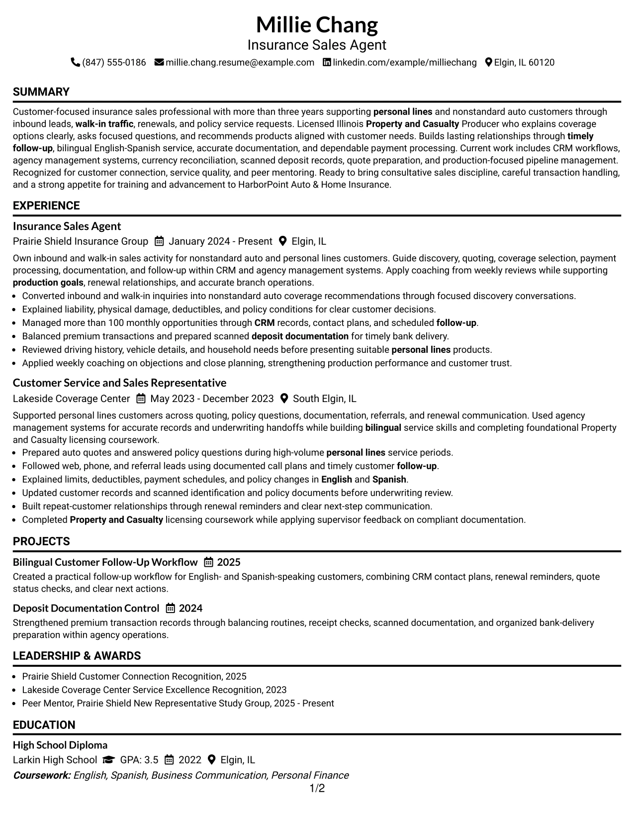
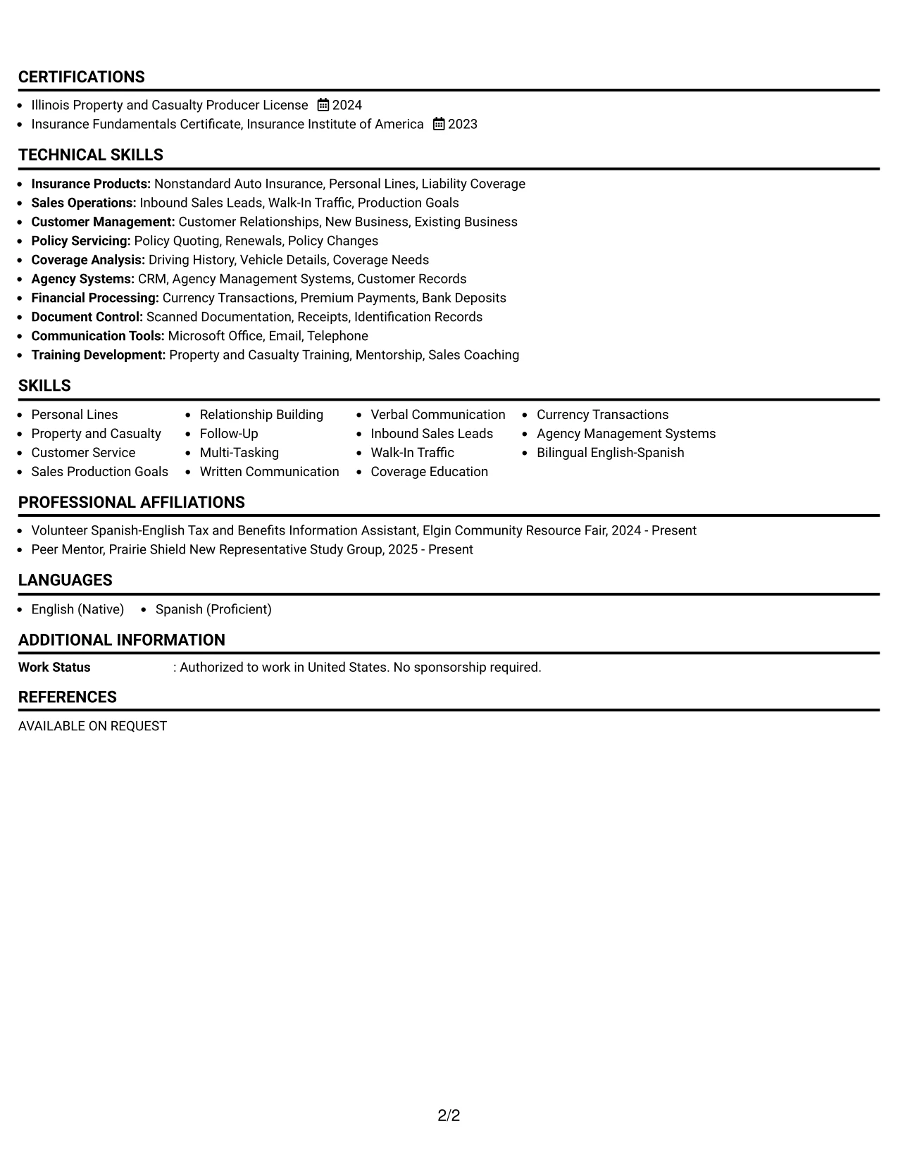
Why the Minimal Header Format Works for a Resume
- The header presents the target role and contact details without visual clutter.
- A focused summary gives context before the reader reaches detailed bullets.
- Experience remains the main content area for sales and service evidence.
- Short skills groups make CRM, agency systems, and bilingual service easy to scan.
- The license section places the Illinois credential near other qualifications.
- Project entries show process improvement in follow-up and deposit documentation.
- A clean sequence supports both quick review and careful reading.
Best For
- Resumes with a strong work history that should receive most of the page.
- Applications where a centered header creates a calm entry point.
- Candidates who need space for detailed experience bullets and supporting sections.
- Documents reviewed from top to bottom on screen or in print.
- Applications that combine sales activity with policy service responsibilities.
- Resumes where certifications and projects should support, not overshadow, experience.
- Readers who value direct navigation and low visual distraction.
#15 Plain One Column with Shaded Labels Resume Example
Coverage recommendations, customer follow-up, and transaction accuracy receive priority because they show direct value for the target role. The resume places these results in clear experience bullets, supported by a summary, skills, licenses, and education.
Shaded labels guide the eye from one section to the next without taking attention away from evidence. Details such as more than 100 monthly opportunities, scanned deposit documentation, bilingual explanations, and policy quoting give the reader specific proof of capability.
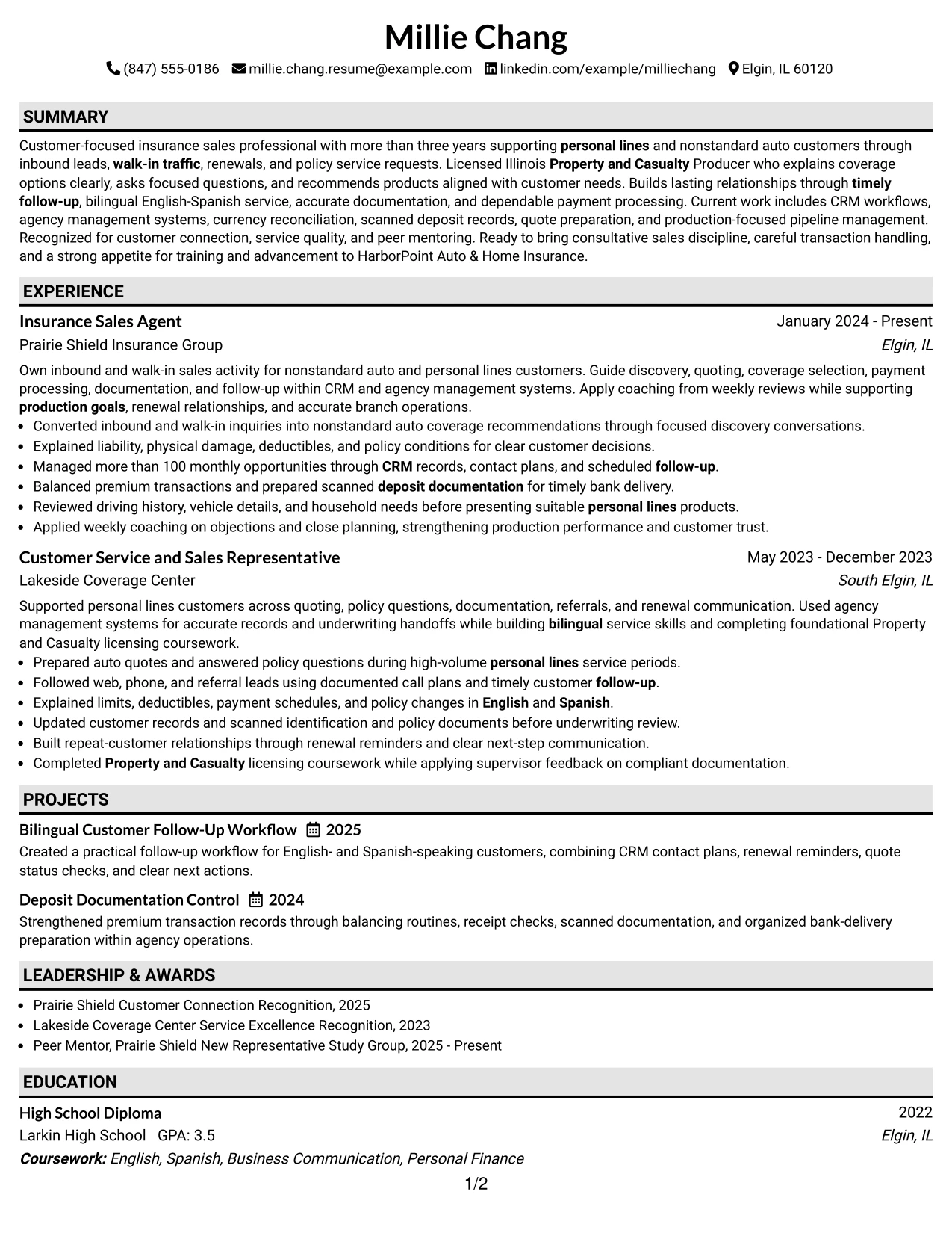
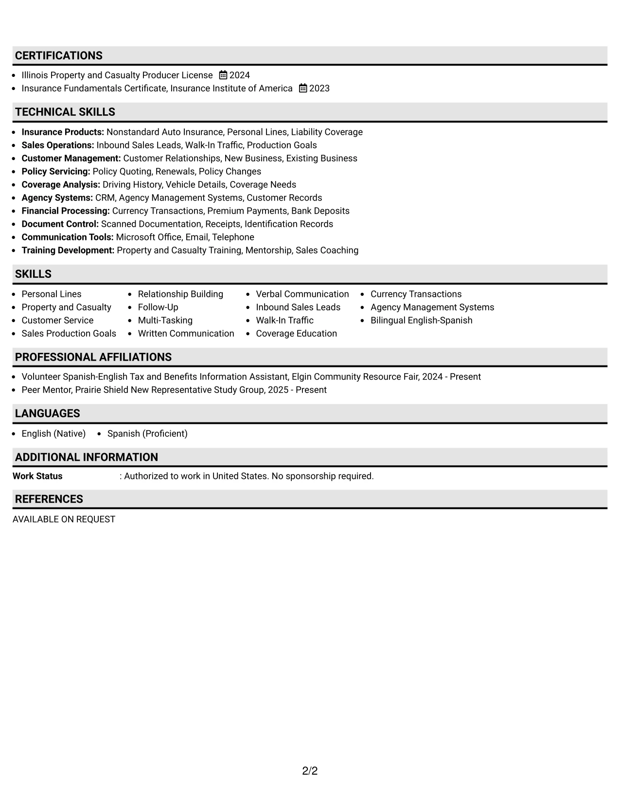
Why the Plain One Column with Shaded Labels Format Works for a Resume
- Evidence-led bullets show how customer needs become coverage recommendations.
- A one-column structure keeps each achievement in a clear reading order.
- Shaded labels separate experience, skills, licenses, and education.
- The resume includes both production activity and careful documentation work.
- Bilingual English-Spanish service appears as a practical customer benefit.
- Projects add evidence of repeatable follow-up and deposit control.
- Plain text and familiar headings support reliable scanning.
Best For
- Applications that depend on specific proof rather than decorative design.
- Candidates with customer-facing achievements that need full-width bullet space.
- Resumes where transaction handling and documentation deserve equal visibility.
- Readers who prefer clear section labels and a steady one-column flow.
- Applications requiring visible licenses, certificates, and bilingual service.
- Documents that must present both sales production and service accuracy.
- A straightforward format for reviewing evidence by employment period.
#16 Text/Fang Style Resume Example
Content is balanced between detailed experience evidence and concise supporting sections, so the resume can show customer relationships without losing clarity. The Text/Fang Style keeps the page centered on readable wording, standard headings, and practical resume content.
The main section can carry policy quoting, coverage explanations, follow-up plans, currency reconciliation, and CRM records, while skills and credentials stay easy to locate. This balance supports an application that must communicate both sales ability and dependable branch operations.
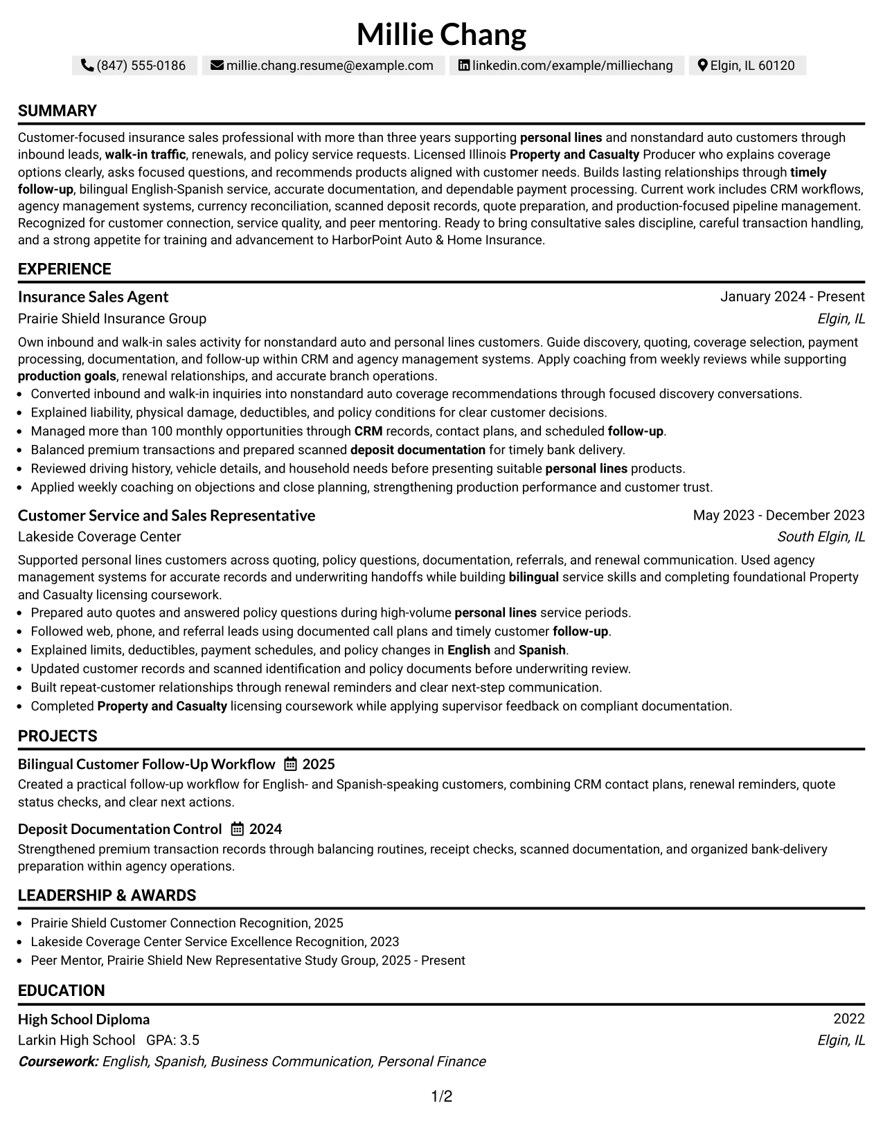
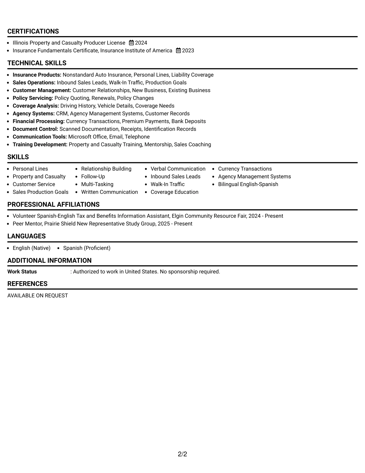
Why the Text/Fang Style Works for a Resume
- Balanced spacing gives detailed bullets enough room to remain readable.
- The experience section can show both customer interaction and operational control.
- Standard headings support scanning for skills, licenses, and education.
- The summary connects consultative sales with bilingual service and follow-up.
- Project entries reinforce organized workflows beyond the job description.
- Recognition adds independent evidence of customer connection and service quality.
- The format keeps technical system terms visible without overwhelming the reader.
Best For
- Applications that need equal attention on sales conversations and back-office accuracy.
- Candidates with several related responsibilities across quoting, service, and follow-up.
- Documents where balanced spacing improves reading of longer experience bullets.
- Resumes reviewed by readers who want context before assessing credentials.
- Applications that include projects, awards, activities, and formal qualifications.
- A practical layout for presenting customer service within a sales-focused application.
- Readers who need a complete picture without a dense visual arrangement.
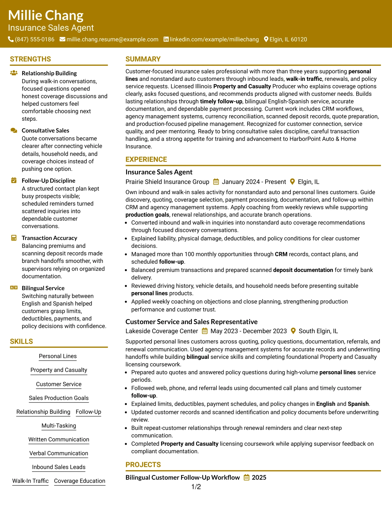
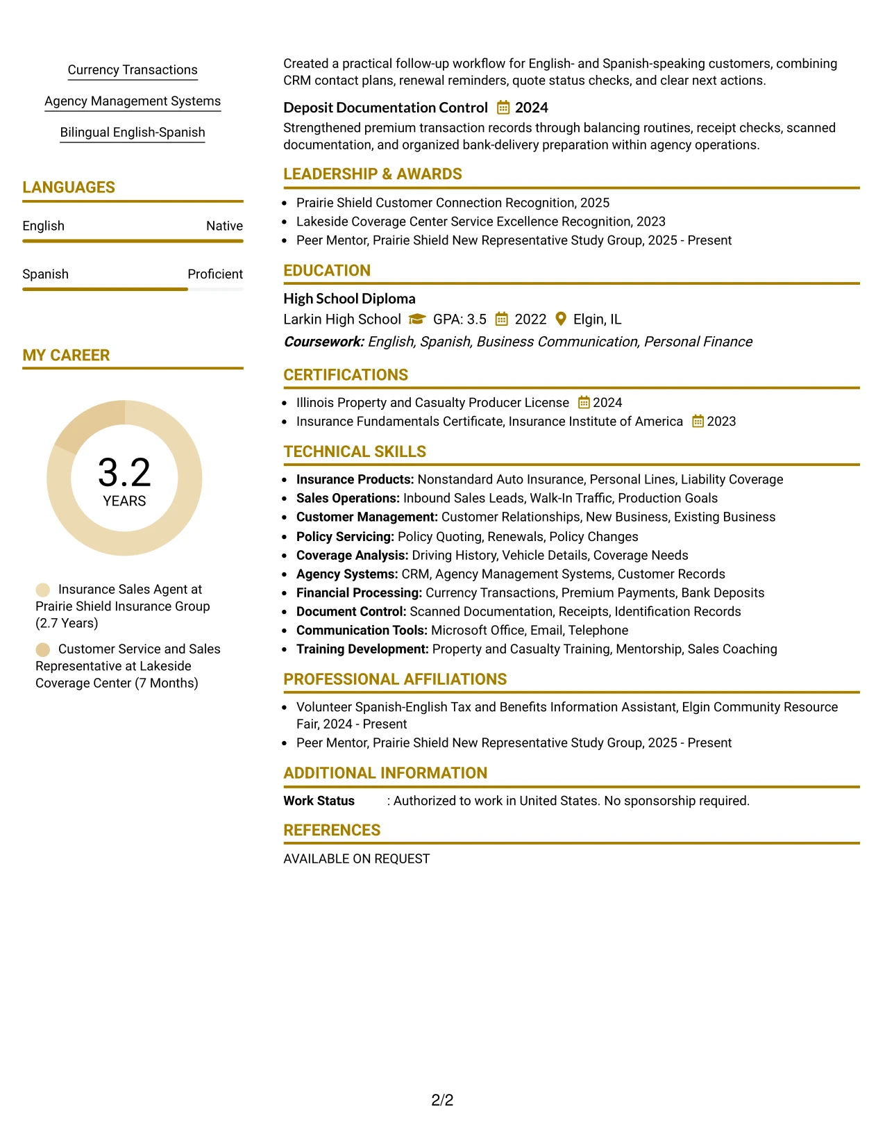
#17 Bold Color Header Professional Format Resume Example
For a practical application, the resume should make the target role, relevant license, and customer-facing strengths visible within seconds. The Bold Color Header Professional Format creates that entry point, then lets standard sections carry the detailed evidence.
The strong header can frame experience bullets about nonstandard auto coverage, inbound leads, production goals, and timely follow-up. A focused skills area adds CRM, agency management systems, currency transactions, and English-Spanish service without turning the resume into a keyword list.
Why the Bold Color Header Professional Format Works for a Resume
- A strong header creates a clear starting point for review.
- The summary can connect the role target with licensed insurance experience.
- Full-width bullets leave room for customer and production evidence.
- Skills remain easy to scan for CRM, quoting, and coverage education.
- The experience section supports both new business and existing-customer work.
- Certifications make the Illinois Property and Casualty license prominent.
- Standard content blocks keep the visual treatment professional and readable.
Best For
- Applications where the target role must stand out immediately.
- Candidates who want a confident presentation for sales and service work.
- Resumes with full-width bullets that explain customer needs and next actions.
- Documents that need visible production, follow-up, and documentation evidence.
- Applications where a strong header adds distinction without changing section order.
- Readers who scan first for licenses, sales systems, and communication strengths.
- A professional format for combining visual confidence with practical resume detail.
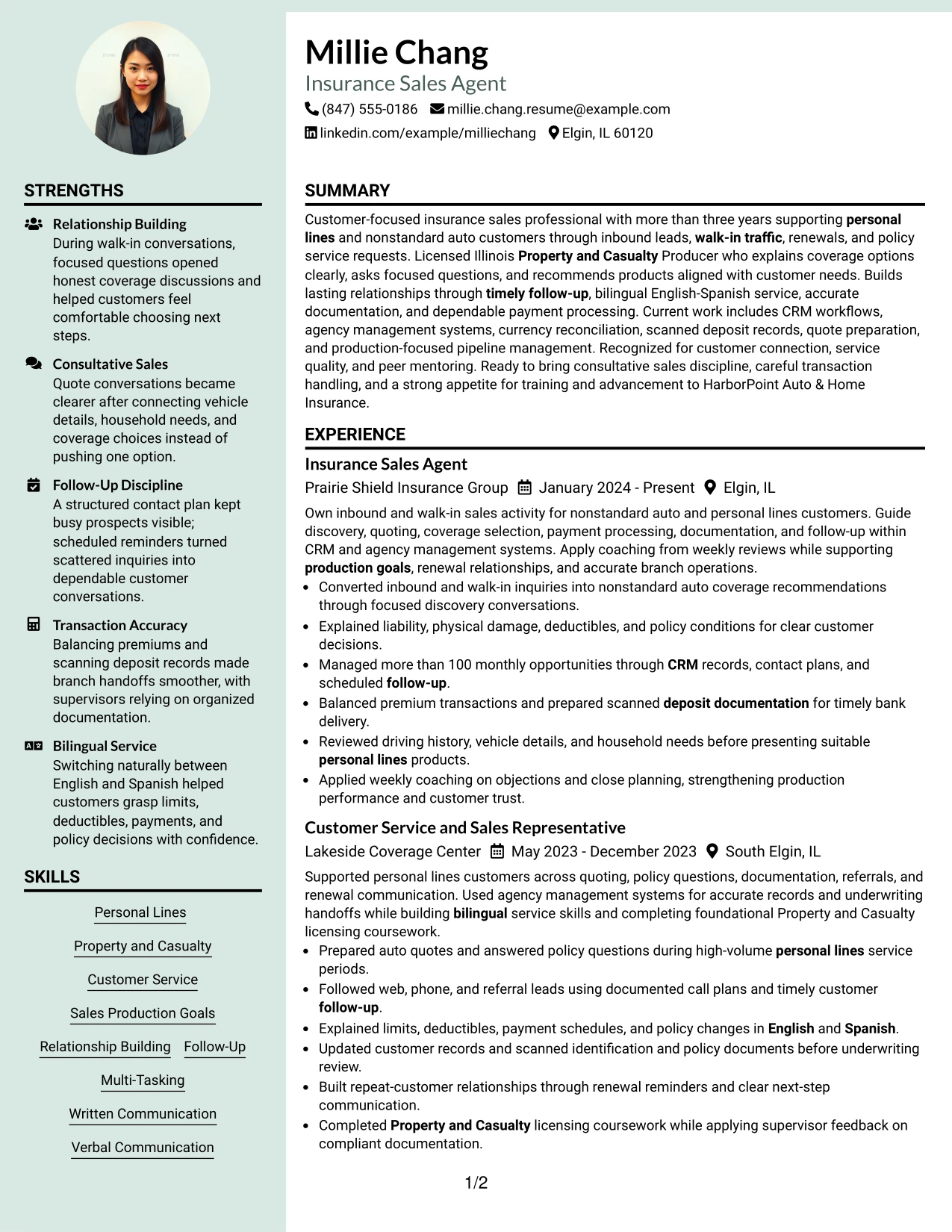
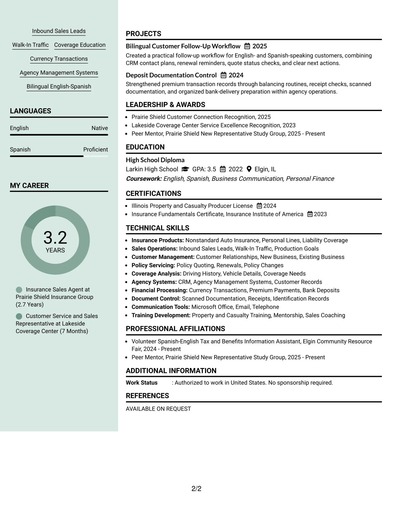
#18 Photo Header Color Sidebar Format Resume Example
A calm visual hierarchy combines the header, sidebar, and main content so the resume feels organized before the reader reaches the employment details. The format can support a polished presentation while keeping the Insurance Sales Agent target and customer service strengths prominent.
The sidebar can group languages, skills, credentials, and contact details, leaving the main area for coverage recommendations, follow-up, payment processing, and relationship building. The resume should use the available visual space carefully so evidence remains more important than decoration.
Why the Photo Header Color Sidebar Format Works for a Resume
- The sidebar creates a compact home for skills, languages, and licenses.
- The main content area gives experience bullets room to explain customer results.
- A clear header supports quick recognition of the target role.
- Bilingual service can appear near other customer-facing strengths.
- The experience section shows both sales activity and accurate transaction handling.
- Projects and recognition can reinforce reliability and customer connection.
- A consistent hierarchy helps readers separate qualifications from career evidence.
Best For
- Applications where a polished visual presentation supports a relationship-focused profile.
- Candidates who want supporting qualifications grouped beside detailed experience.
- Resumes that need a dedicated area for languages, licenses, and systems.
- Documents with enough evidence to fill a main content area without crowding.
- Applications where customer connection and professional presentation work together.
- Readers who prefer quick access to skills before reviewing employment history.
- A format that balances a distinctive header with practical resume organization.
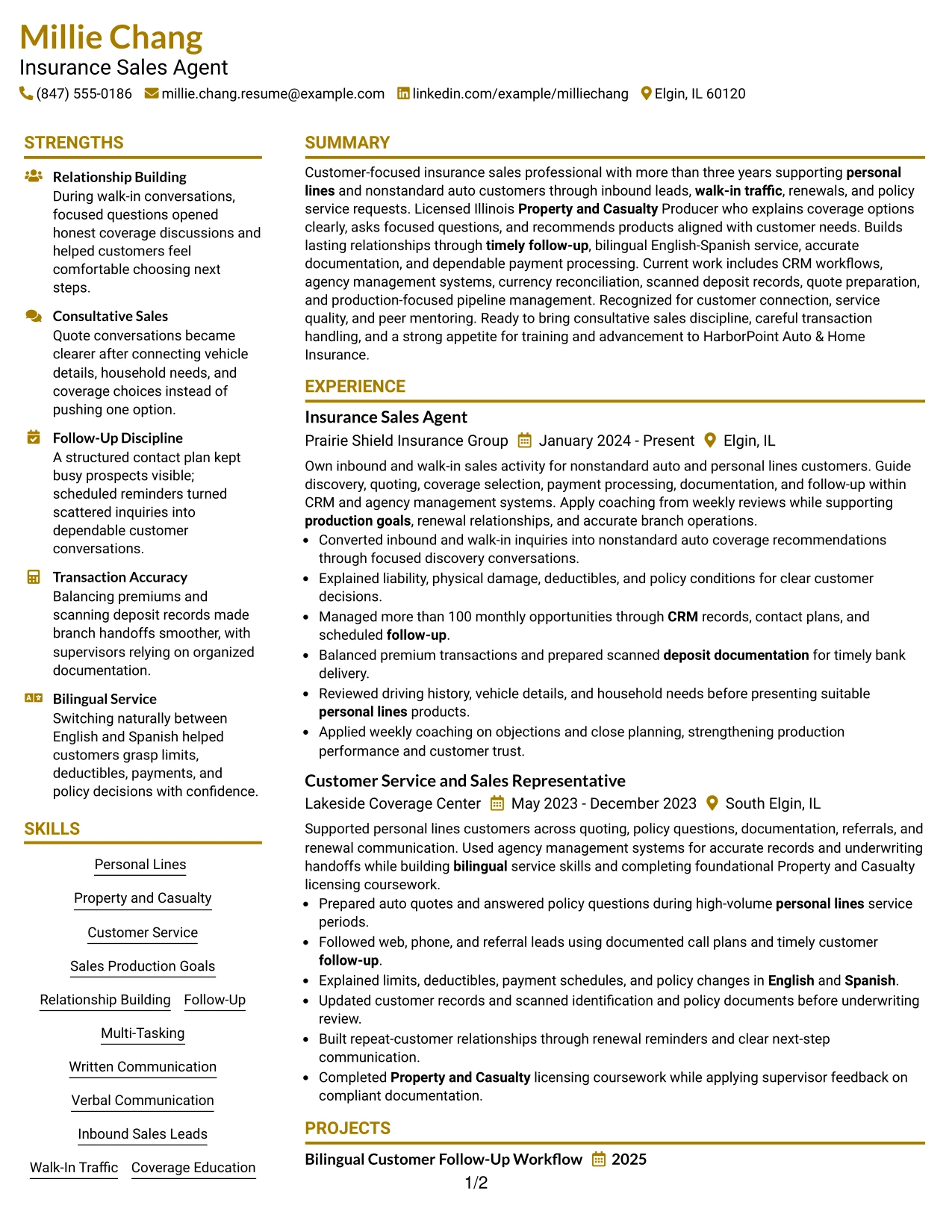
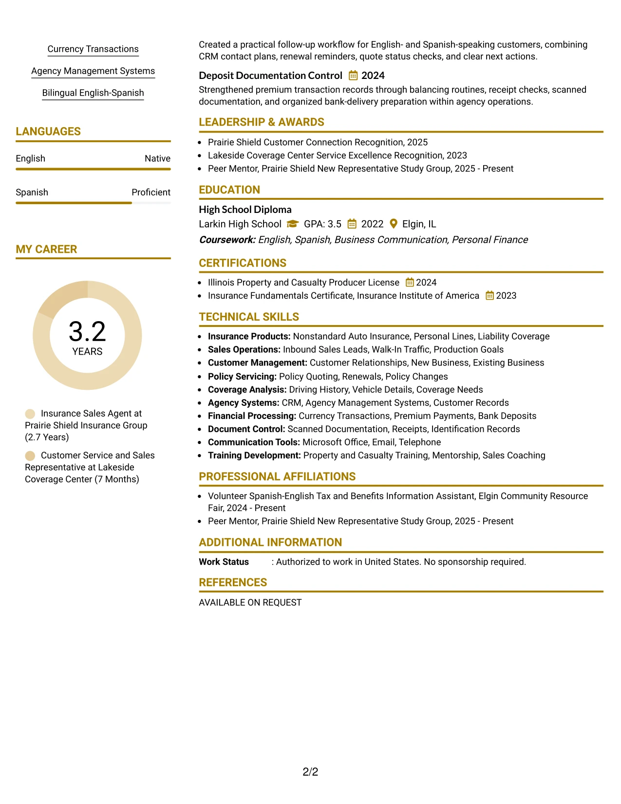
#19 Top Left Header Color Accent Format Resume Example
The Top Left Header Color Accent Format creates a straightforward path from the role target to the professional summary and then to experience. Its structure keeps the page easy to scan while allowing a restrained accent to separate sections and emphasize key information.
The resume can present nonstandard auto experience, policy quoting, customer follow-up, and currency documentation in a clear sequence. Skills, licenses, education, projects, and recognition remain searchable supporting sections rather than competing with the work history.
Why the Top Left Header Color Accent Format Works for a Resume
- The left-aligned header gives readers an immediate starting point.
- A single-column flow keeps employment history in chronological order.
- Color accents can mark sections without replacing standard headings.
- Bullets provide space for coverage education and follow-up evidence.
- The skills section supports keyword review for CRM and agency systems.
- Licenses and certificates are easy to find near other qualifications.
- The structure works well for both quick scans and detailed reading.
Best For
- Applications that benefit from a familiar left-to-right reading path.
- Candidates who want a small visual accent without a complex layout.
- Resumes where employment history should remain the main evidence source.
- Documents that need clear keyword placement for sales and insurance terms.
- Readers reviewing several sections in a predictable order.
- Applications combining work history with licenses, projects, and recognition.
- A clean presentation for customer service and production-focused experience.
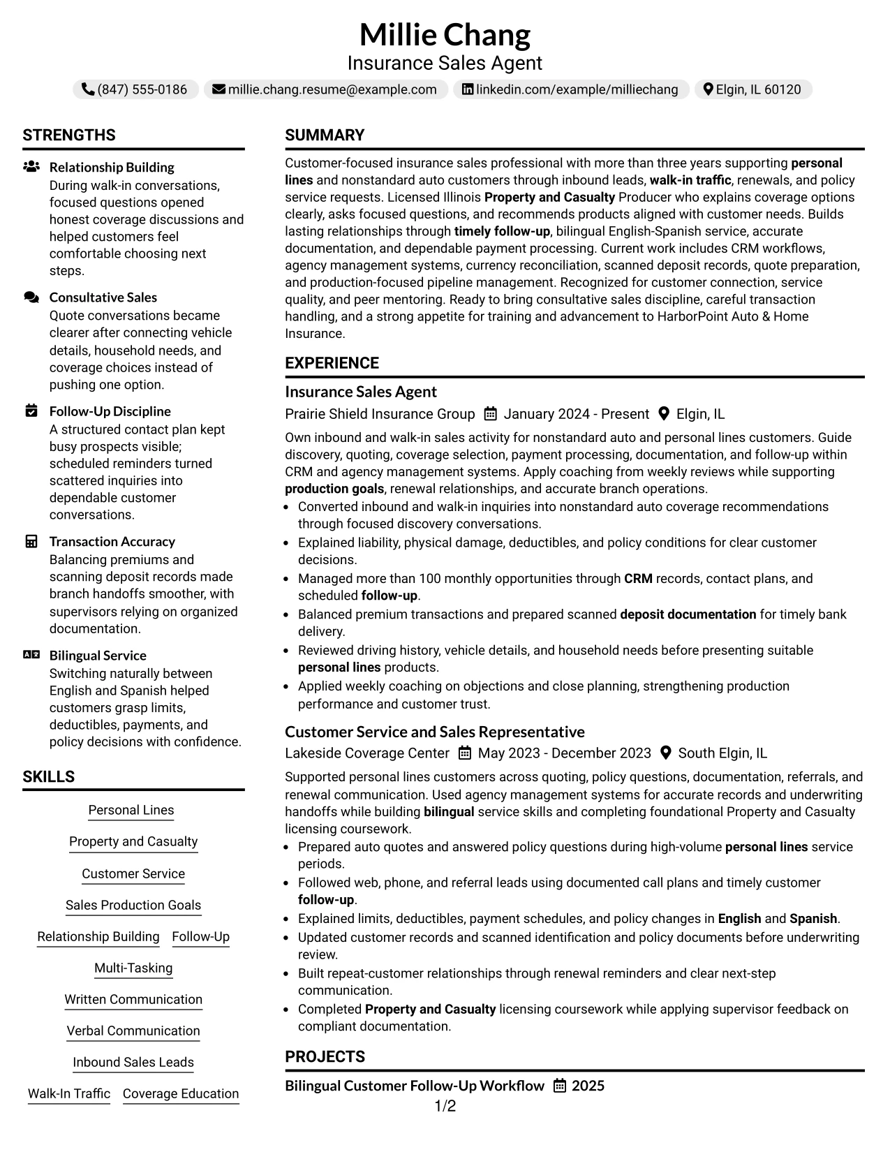
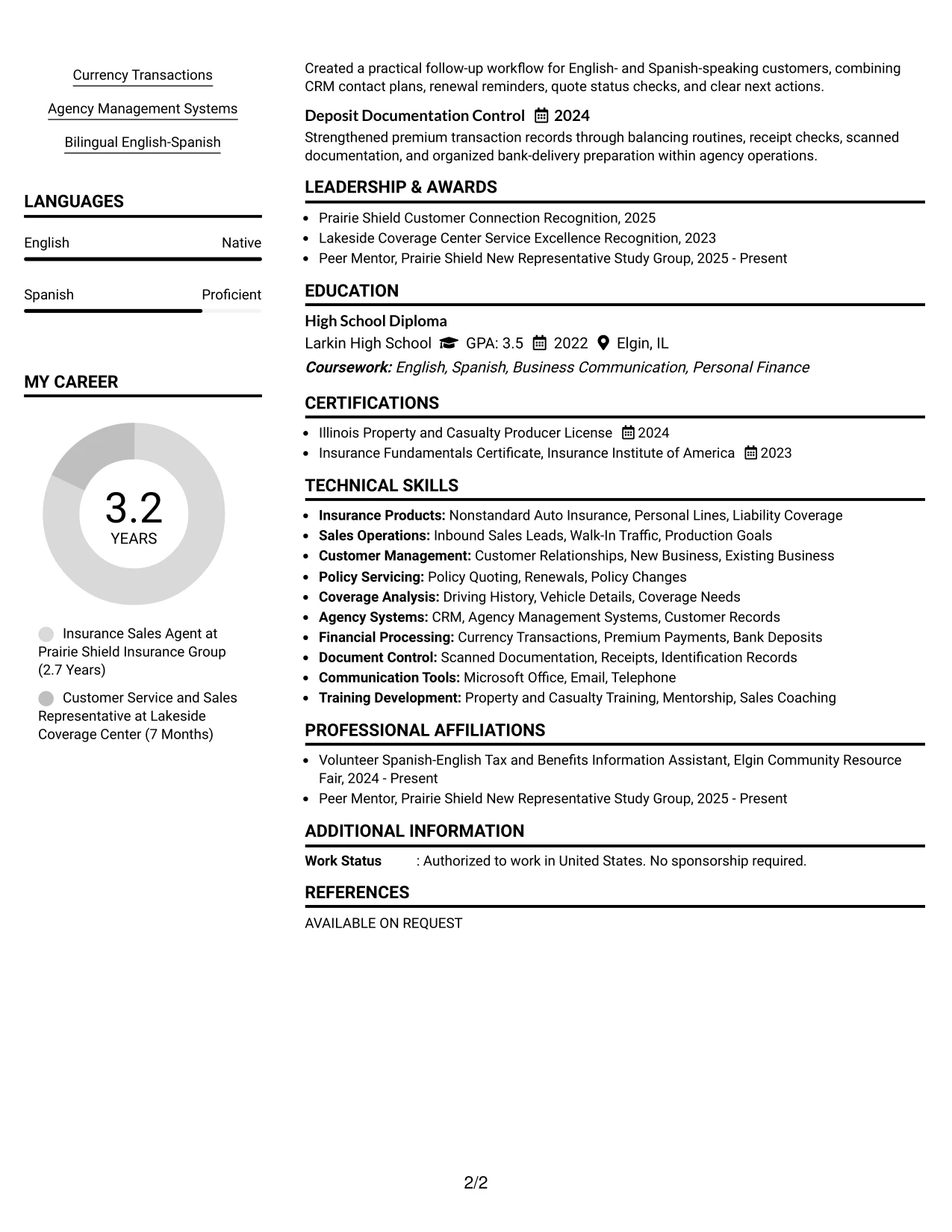
#20 Centered Header Classic Two Column Format Resume Example
Readers can start at the centered header, scan the summary, and then use the two-column structure to compare supporting qualifications with detailed experience. This path helps Millie Chang present a substantial sales and service record without making the page feel overloaded.
One column can hold skills, licenses, education, and languages, while the other carries work history, projects, and recognition. The arrangement makes evidence such as more than 100 monthly opportunities, coverage explanations, and accurate deposits easy to connect to the target role.
Why the Centered Header Classic Two Column Format Works for a Resume
- The centered header gives the document a balanced entry point.
- Two columns make room for a broad set of qualifications and experience.
- The main work area can carry detailed bullets without losing supporting information.
- A separate skills area helps surface insurance and customer service keywords.
- Licenses and education remain visible without interrupting the career timeline.
- Projects and recognition add depth to the evidence set.
- Bullet-based sections support fast review of actions and results.
Best For
- Resumes with enough content to benefit from two-column organization.
- Applications where qualifications and experience need equal visual access.
- Candidates who want detailed bullets without pushing licenses off the page.
- Readers comparing customer service, sales, and operational evidence at once.
- Documents that include languages, certifications, projects, and recognition.
- Applications where a centered header creates a formal first impression.
- A structured format for presenting Millie Chang’s broad insurance resume content.
#21 Left Aligned Header Clean Two Column Format Resume Example
Coverage recommendations, customer follow-up, and accurate records provide the strongest evidence for this application, so the resume should place those achievements where they are easy to read. A left-aligned header begins that process with a direct, practical presentation.
The clean two-column structure can keep skills, licenses, languages, and systems beside a detailed experience section. That arrangement supports quick review of inbound lead conversion, personal lines service, CRM activity, premium handling, and bilingual communication.
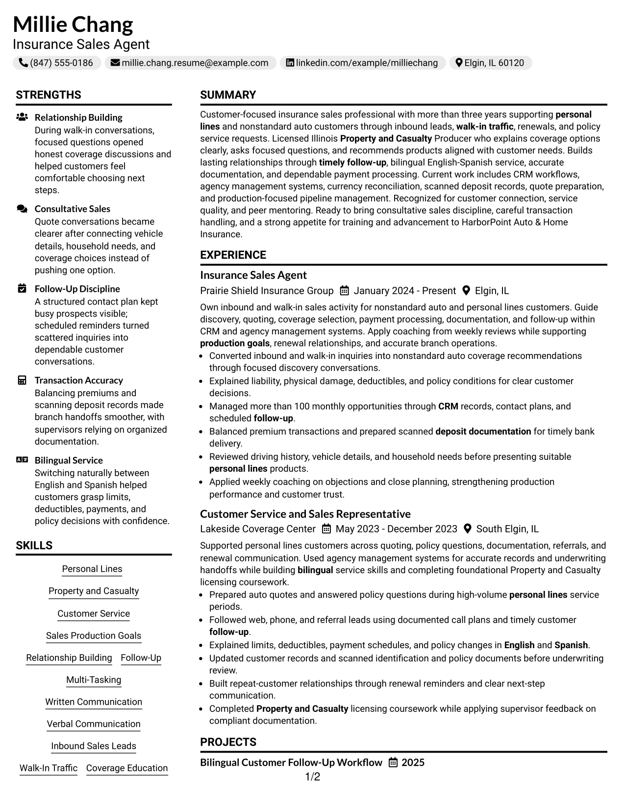
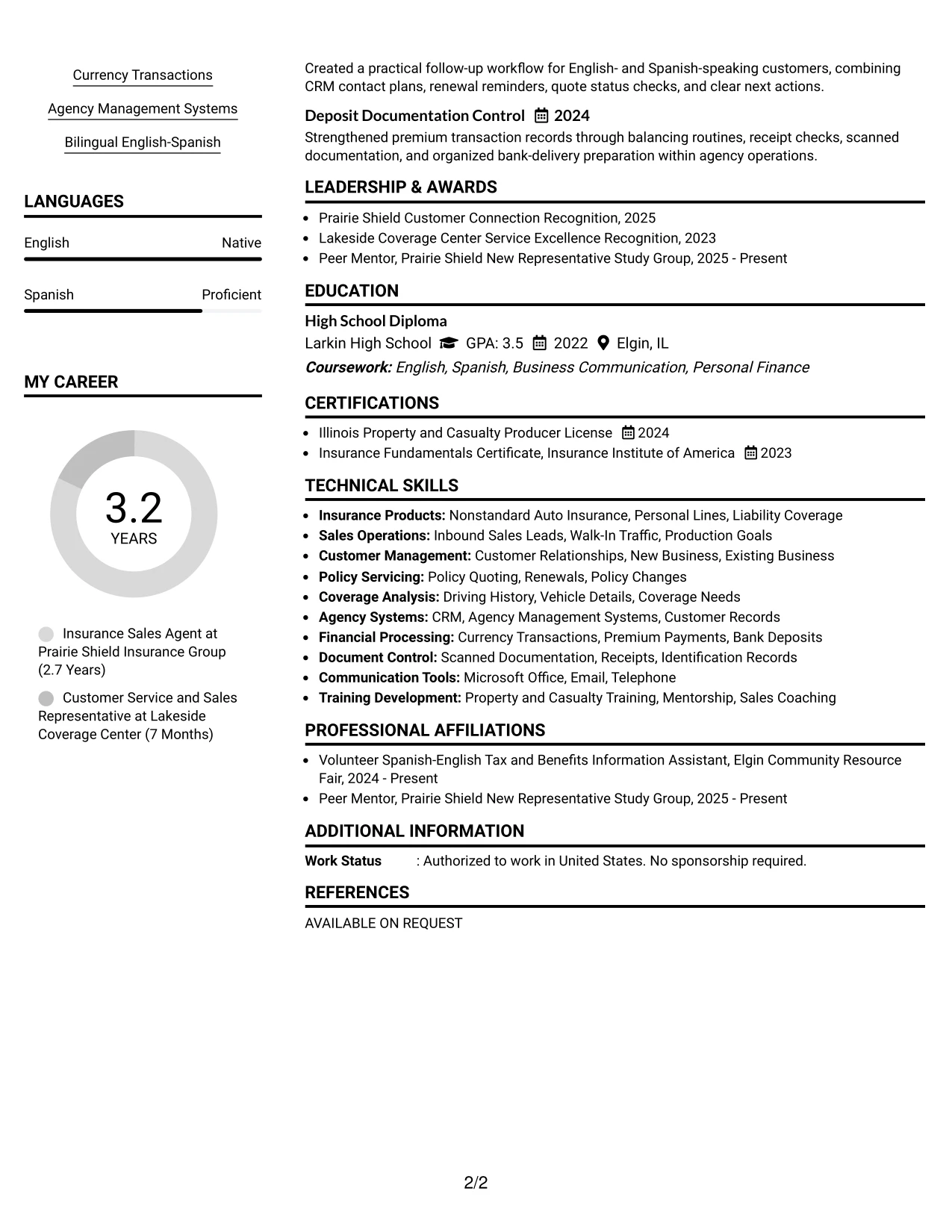
Why the Left Aligned Header Clean Two Column Format Works for a Resume
- The left-aligned header gives the document a direct professional start.
- Two columns separate qualification keywords from detailed evidence.
- Experience bullets can explain both customer outcomes and careful processes.
- Skills and systems are available for fast review beside work history.
- The license section supports the role with a specific credential.
- Bilingual communication appears as a usable service strength.
- Clean bullet structure makes actions and responsibilities easy to compare.
Best For
- Applications where evidence should lead the review from the first content section.
- Candidates with detailed work bullets and several supporting qualifications.
- Resumes that need side-by-side access to skills, languages, and licenses.
- Readers who prefer a clean header and predictable two-column navigation.
- Applications combining customer relationships with transaction documentation.
- Documents where keyword visibility matters without sacrificing readable detail.
- A practical layout for presenting sales, service, and insurance operations together.
#22 Simple Two Column Format Resume Example
Space is shared between detailed employment evidence and compact qualification groups, giving the resume a steady, efficient rhythm. The Simple Two Column Format avoids unnecessary visual complexity and lets the target role, experience, skills, and license remain visible together.
A focused main area can cover policy quoting, customer relationships, follow-up, and currency transactions, while the secondary area holds systems, languages, education, projects, and certifications. This makes the format useful for a complete application with several relevant evidence types.

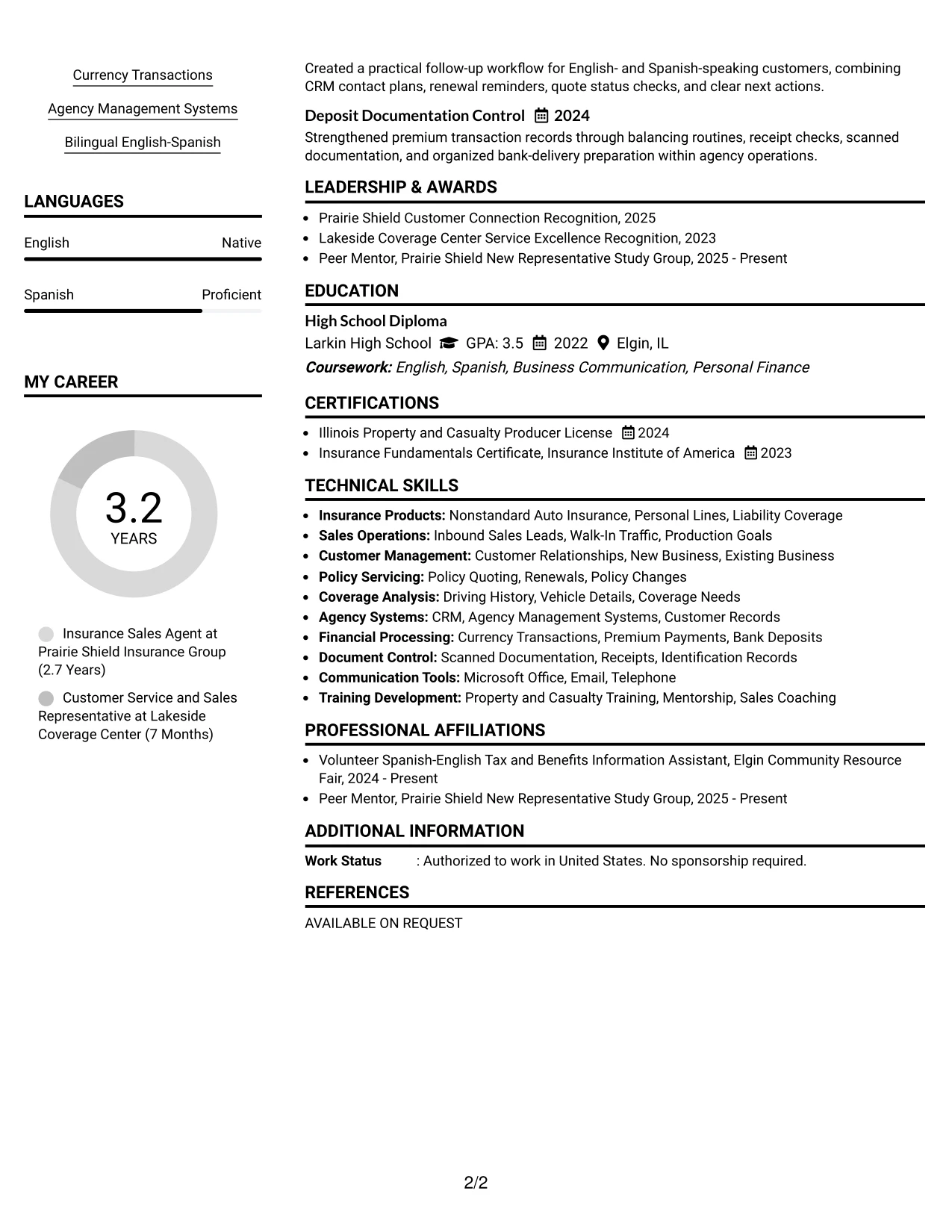
Why the Simple Two Column Format Works for a Resume
- Balanced columns prevent supporting qualifications from being buried.
- The main column gives work history enough room for clear bullets.
- The secondary column keeps skills, licenses, and languages accessible.
- A simple hierarchy supports quick review without visual distractions.
- Projects demonstrate repeatable follow-up and documentation practices.
- Recognition and activities add evidence of service and peer support.
- The format presents sales, customer service, and operational strengths together.
Best For
- Applications that need efficient use of page space across several sections.
- Candidates combining substantial experience with licenses, projects, and activities.
- Resumes where a compact skills column supports a detailed main column.
- Readers who want customer-facing evidence and qualifications visible at once.
- Applications that include both relationship building and transaction control.
- Documents that need a simple structure for screen-based review.
- A complete presentation for insurance sales and customer service experience.
#23 Accent Divider Modern Two Column Format Resume Example
For an Insurance Sales Agent - Customer Service application, this two-column format gives contact details and key skills a clear starting point while keeping experience easy to review. Accent dividers separate personal lines sales, customer service, licensing, and transaction work without crowding the page.
The resume can place CRM, agency management systems, bilingual service, and coverage education in a focused skills area. Experience bullets then show more than 100 monthly opportunities, premium transaction accuracy, timely follow-up, and customer-focused recommendations. The clean structure also supports ATS-friendly text when headings and keywords remain simple.
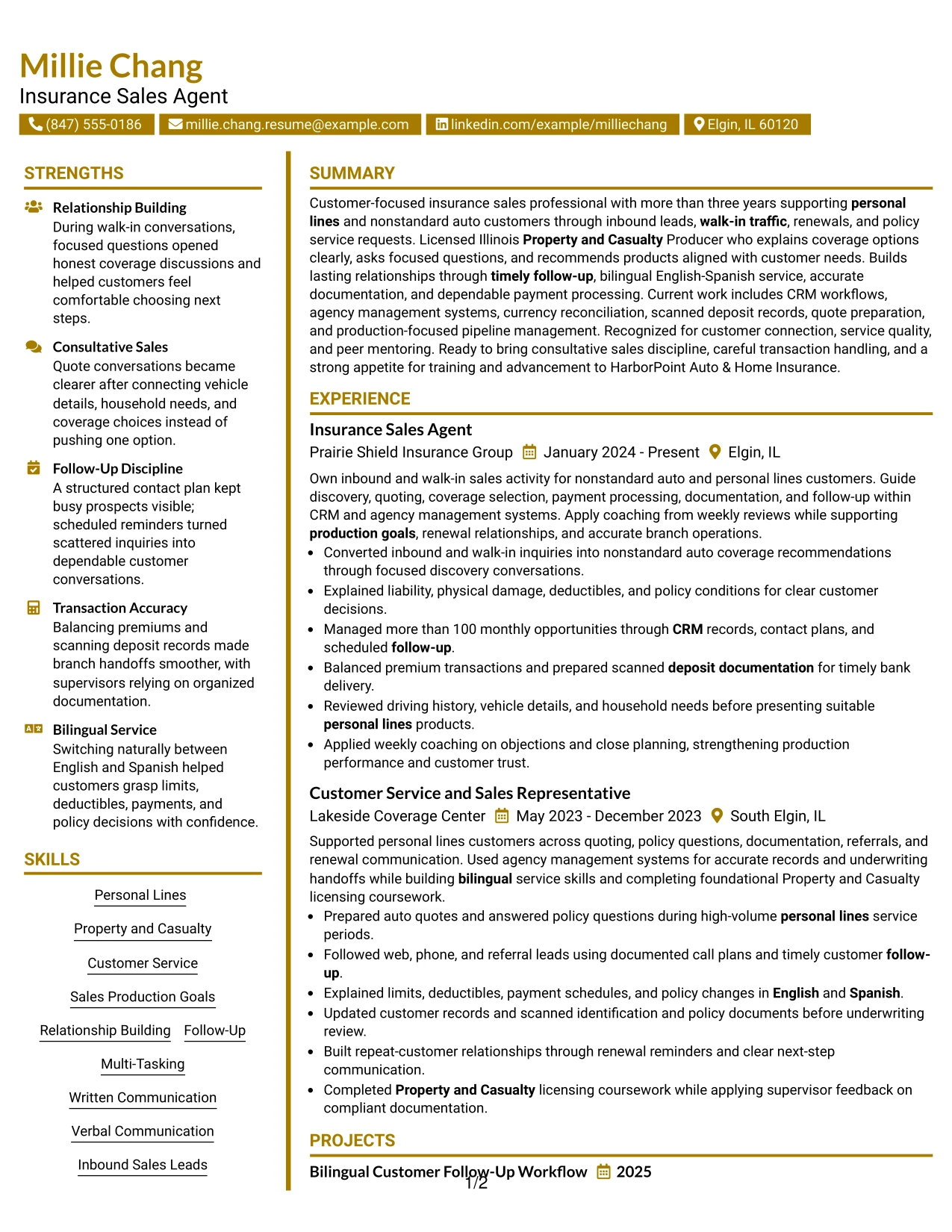
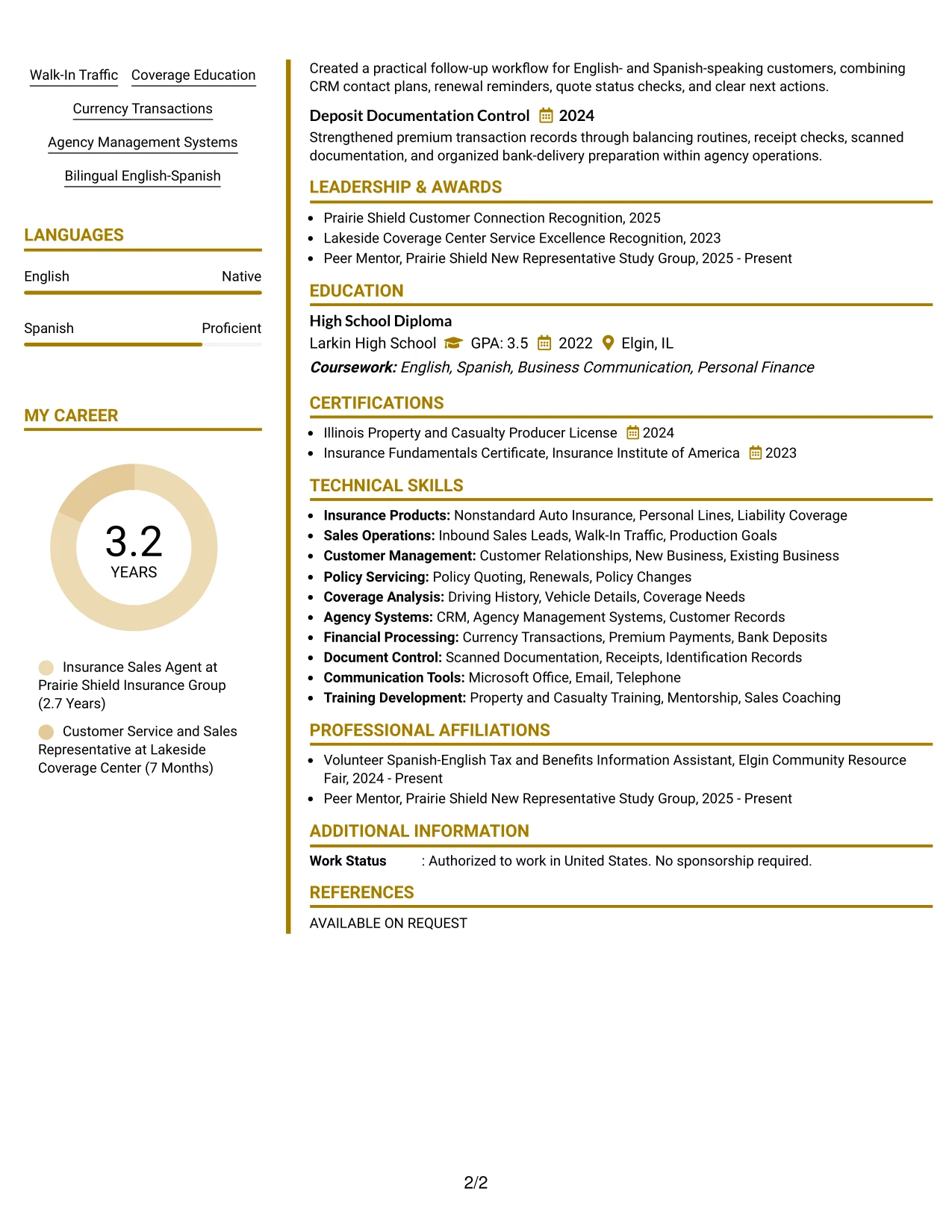
Why the Accent Divider Modern Two Column Format Works for a Resume
- Two columns organize contact details, skills, licenses, and experience efficiently.
- Accent dividers help readers move between major resume sections.
- A focused skills area surfaces Personal Lines, Property and Casualty, CRM, and bilingual service quickly.
- Experience bullets provide measurable evidence through more than 100 monthly opportunities.
- The format gives payment processing and deposit documentation a visible place without interrupting the work history.
- Clear section labels support fast recruiter scanning and ATS parsing.
- The balanced design presents both customer relationship work and operational accuracy.
Best For
- Applicants who need a compact way to separate skills from detailed experience.
- Resumes that combine customer-facing results with careful administrative work.
- Candidates using CRM, agency management systems, and other keyword-rich qualifications.
- Applications where licenses and certifications should be visible without taking over the page.
- Readers who benefit from quick access to bilingual service and coverage knowledge.
- Job searches that require clear follow-up, quoting, and transaction-handling evidence.
- Applicants who want a modern visual structure while keeping resume text easy to scan.
#24 Shaded Labels Clean Two Column Format Resume Example
A restrained hierarchy helps a reader identify the resume's role target, work history, licenses, and core qualifications at a glance. Shaded labels give each section a clear visual marker, while the two-column structure keeps supporting details close to the content they explain.
For this insurance sales resume, the layout can connect personal lines experience with Property and Casualty licensing, English-Spanish service, policy quoting, and production-focused follow-up. Strong bullets add proof through customer recommendations, documented pipelines, accurate currency handling, and recognition for customer connection and service quality.
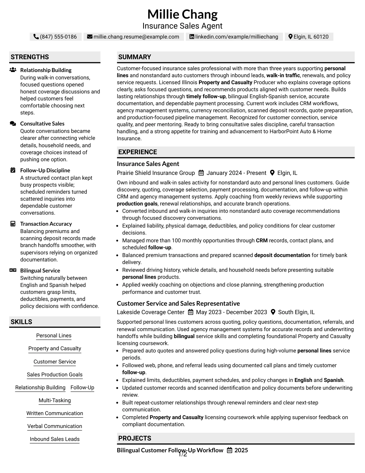
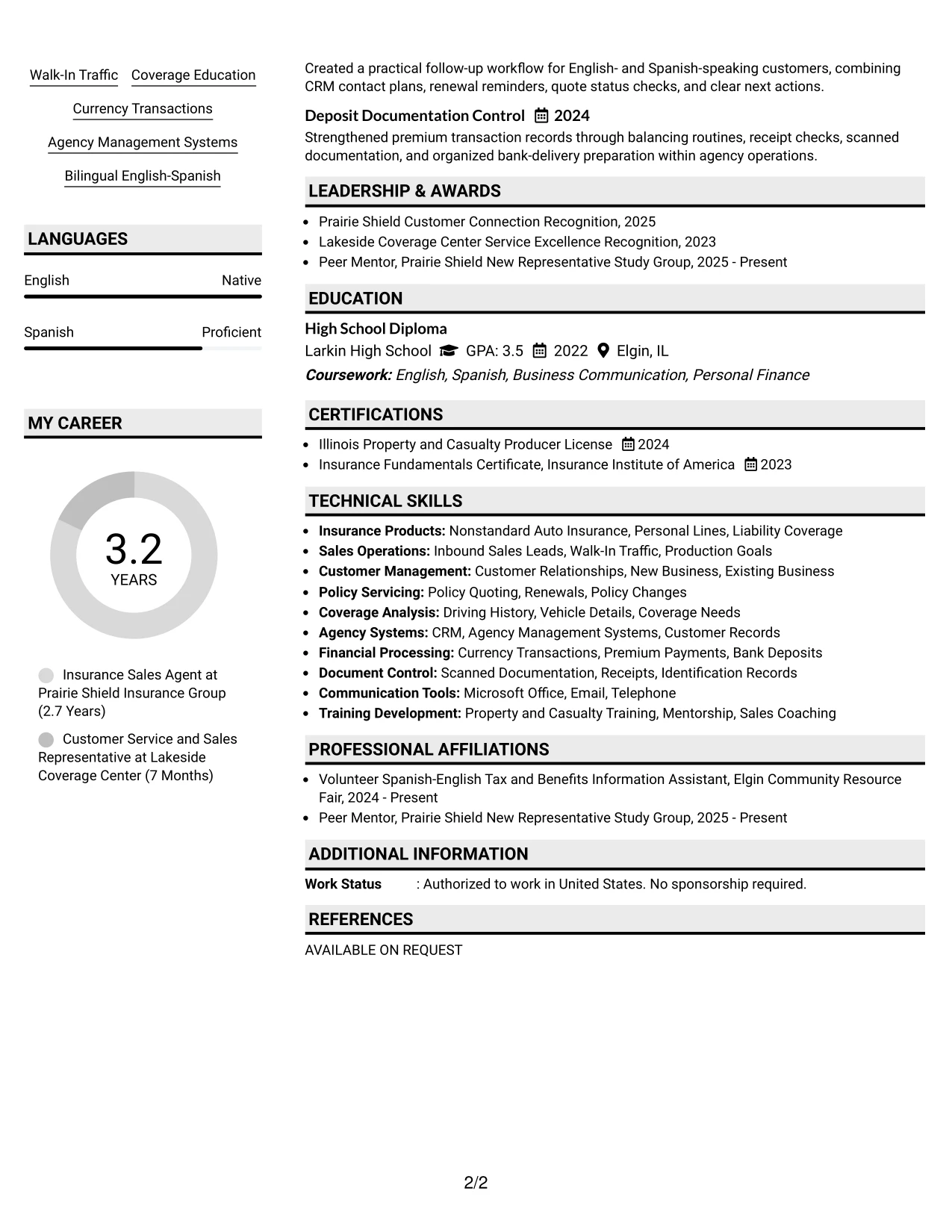
Why the Shaded Labels Clean Two Column Format Works for a Resume
- Shaded labels create a consistent path through summary, skills, experience, education, and certifications.
- Two columns keep supporting qualifications visible beside detailed employment evidence.
- The hierarchy aligns well with a customer service and sales role that values both relationships and accuracy.
- Keywords such as nonstandard auto, policy quoting, follow-up, and agency systems remain easy to locate.
- Bullets can show how coverage was explained without burying the relevant insurance terms.
- Licenses and certificates receive dedicated attention in a compact structure.
- Simple labels and familiar headings support both human review and ATS reading.
Best For
- Resumes that need a clear link between role requirements and supporting qualifications.
- Applicants with several related skill groups that benefit from side-by-side organization.
- Professionals who want licenses, languages, and systems visible during a quick review.
- Applications where customer service evidence should sit close to sales and policy details.
- Readers who prefer strong section markers instead of long blocks of text.
- Candidates balancing current experience, earlier service work, and continuing training.
- Resume submissions that need visual polish without complex graphics or dense decoration.
#25 Photo Header Color Accent International Format Resume Example
The Photo Header Color Accent International Format places the candidate's identity, contact details, and professional target in a strong opening area, followed by a single-column reading path. Color accents can distinguish the summary, skills, experience, education, and licenses while the photo creates a recognizable header.
The resume content should still carry the main evidence: more than three years supporting personal lines customers, an Illinois Property and Casualty Producer License, bilingual English-Spanish service, and more than 100 monthly opportunities managed through CRM records. Consistent headings and standard text help preserve ATS readability beneath the visual header.
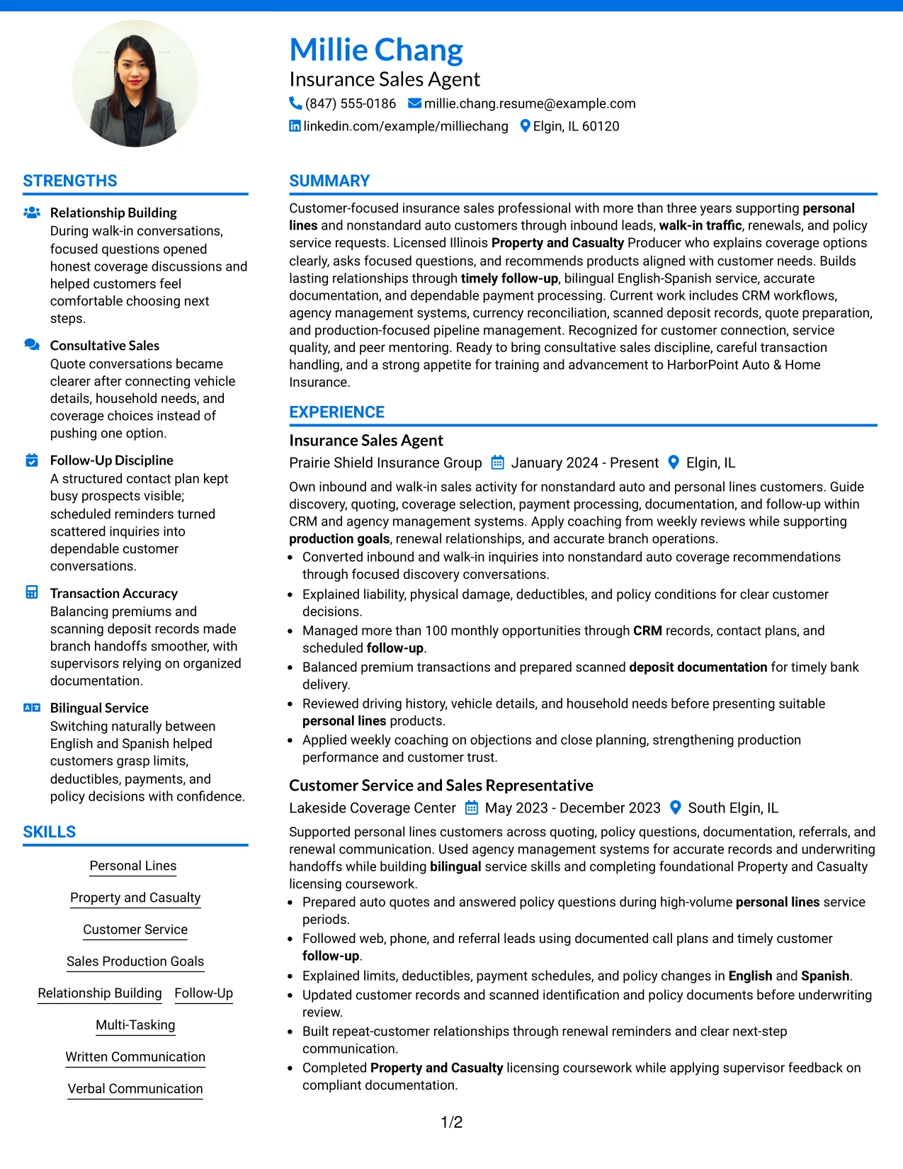
Why the Photo Header Color Accent International Format Works for a Resume
- A single column gives the summary and employment history a direct top-to-bottom sequence.
- The photo header makes contact information and the target role easy to identify.
- Color accents separate skills, licenses, education, and experience without adding long text blocks.
- The opening summary presents insurance sales, customer service, and bilingual qualifications together.
- Bullets can highlight CRM pipeline management and accurate premium transactions in review-ready language.
- Standard section headings help ATS tools interpret the document despite the visual header.
- The format gives recognition, certifications, and community service room after core experience.
Best For
- Applicants who want a strong personal header followed by a straightforward reading order.
- Resume users applying where a photo is accepted and adds useful professional context.
- Professionals combining customer service, sales production, and licensing evidence.
- Applications that need one continuous path from summary through recent experience.
- Candidates with bilingual qualifications that should appear near the top of the page.
- Readers who value visible color grouping for skills, certifications, and work history.
- Resumes that include awards or service activities after the main employment section.
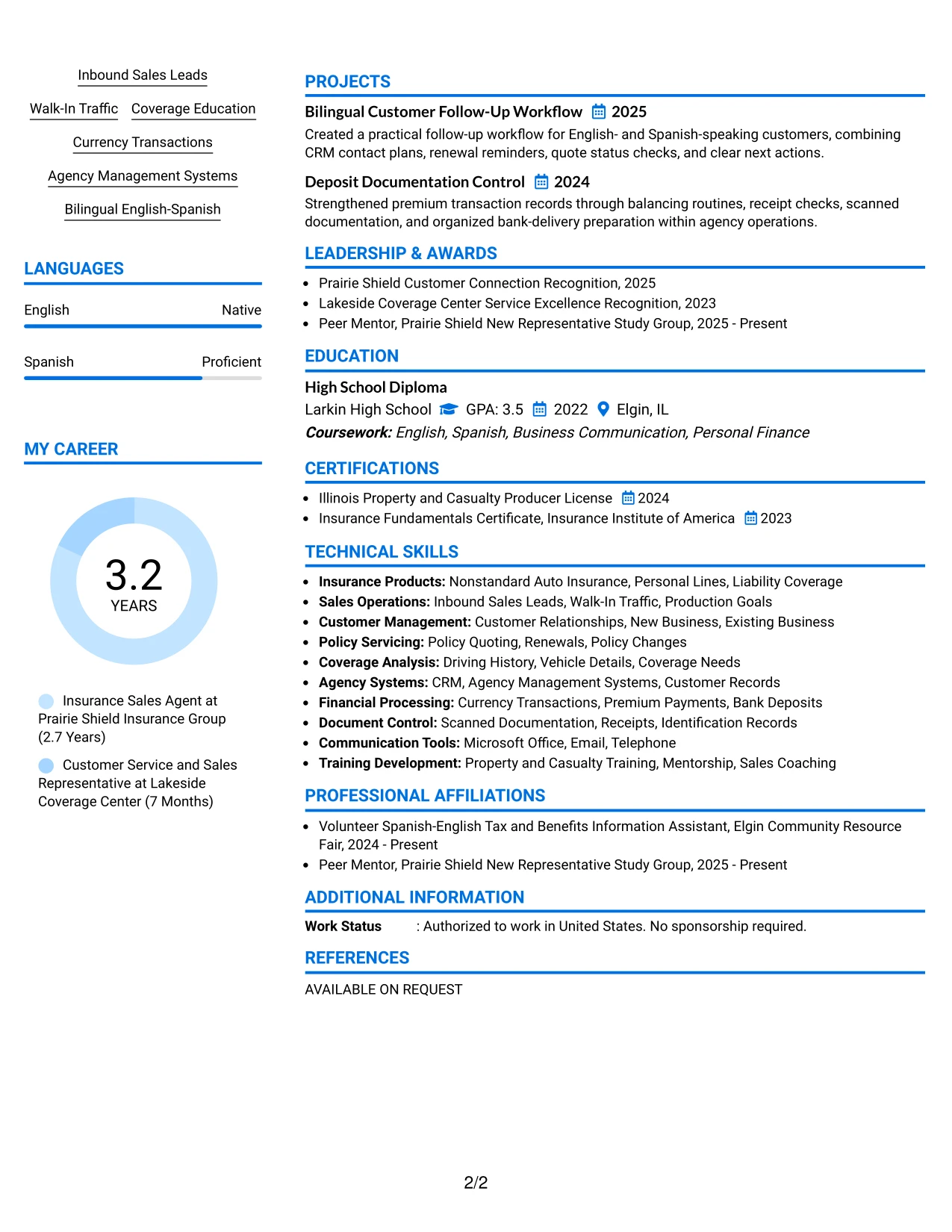
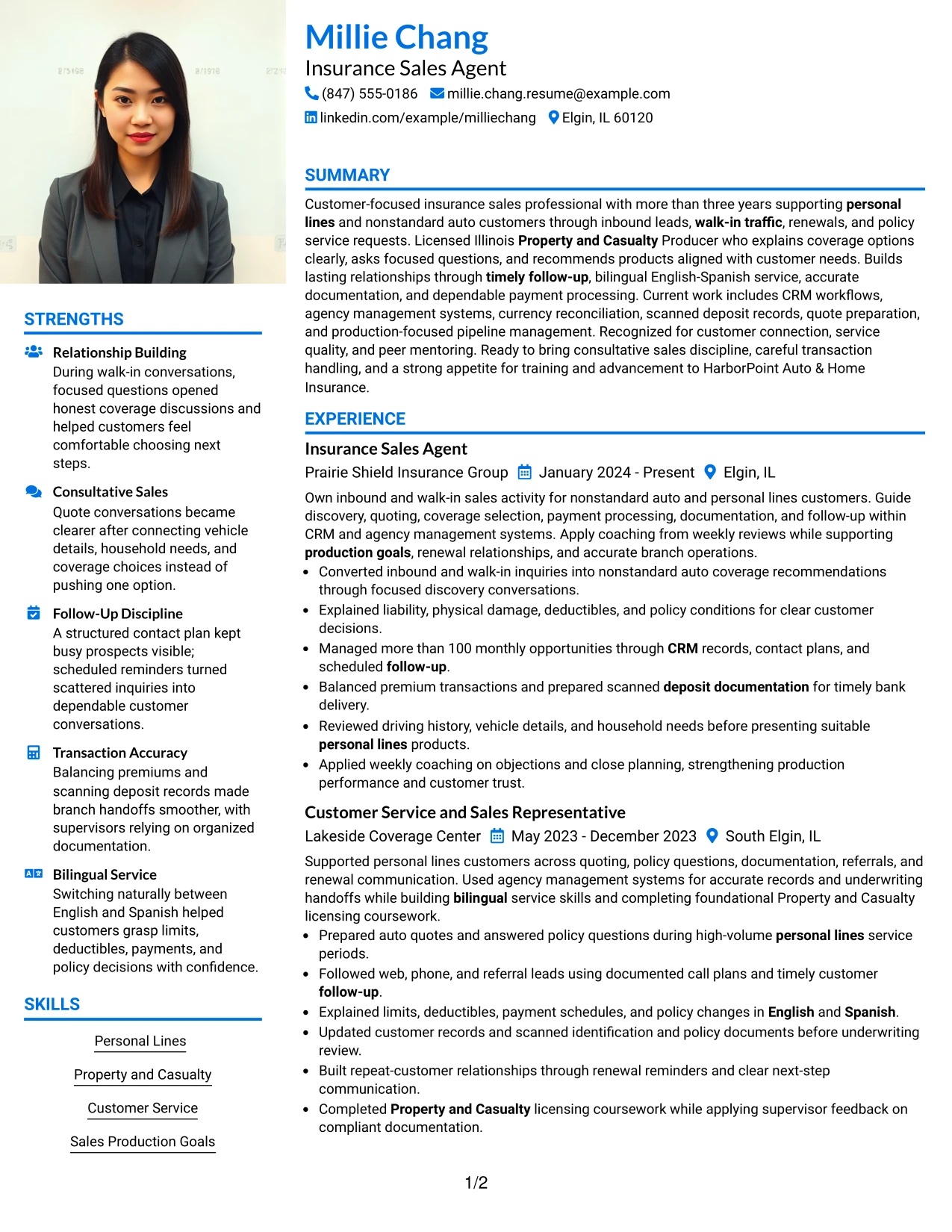
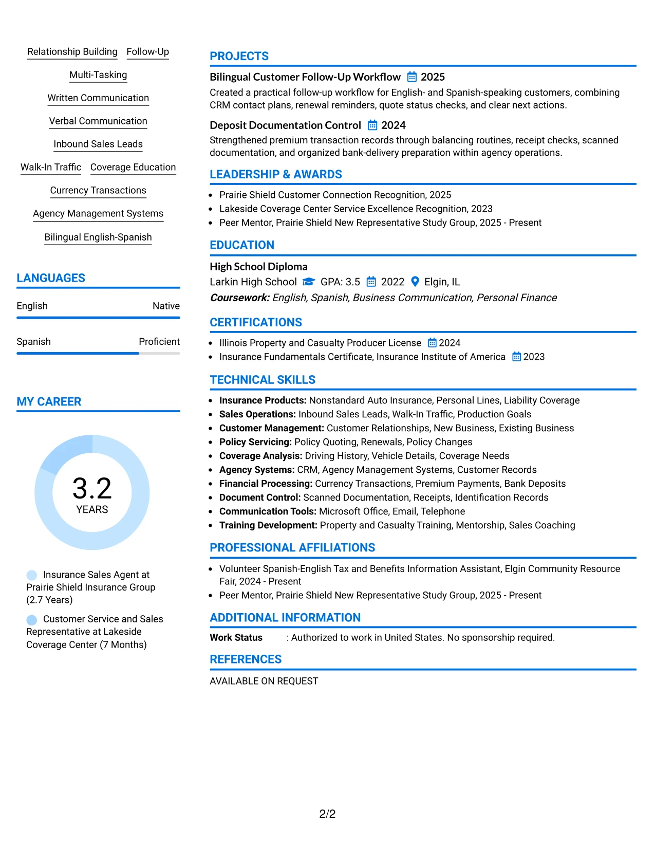
#26 Large Profile Photo International Two Column Format Resume Example
Readers can move from the large profile area to a compact qualifications column and then into the detailed work history. This navigation pattern makes the resume's identity, target role, languages, and certifications visible before the reader reaches the longer evidence sections.
The two-column design can hold skills, licenses, and education in one area while giving experience bullets room to explain quoting, coverage recommendations, follow-up, payment processing, and documentation. For this profile, the larger photo should support the header, not replace measurable evidence such as the 100-plus monthly opportunity pipeline.
Why the Large Profile Photo International Two Column Format Works for a Resume
- The large profile area creates an immediate visual entry point for the document.
- A supporting column can group languages, licenses, certifications, and focused skills.
- The main column provides space for detailed bullets from both insurance roles.
- The format separates customer-facing sales work from transaction and documentation responsibilities.
- More than 100 monthly opportunities can stand out as a specific workload indicator.
- Coverage education, renewal follow-up, and policy service remain easy to find in the experience section.
- Clear text hierarchy helps readers review the content even when the header is visually prominent.
Best For
- Applicants who want a prominent personal header with substantial room for work history.
- Resume users whose qualifications divide naturally into a short sidebar and detailed main column.
- Professionals presenting licenses, languages, and certifications alongside customer service results.
- Applications that need several experience bullets without making the page feel crowded.
- Candidates with both relationship-building evidence and operational control responsibilities.
- Readers who prefer a visual entry point before reviewing detailed employment content.
- Resumes where a photo is appropriate and the remaining sections must carry the proof.
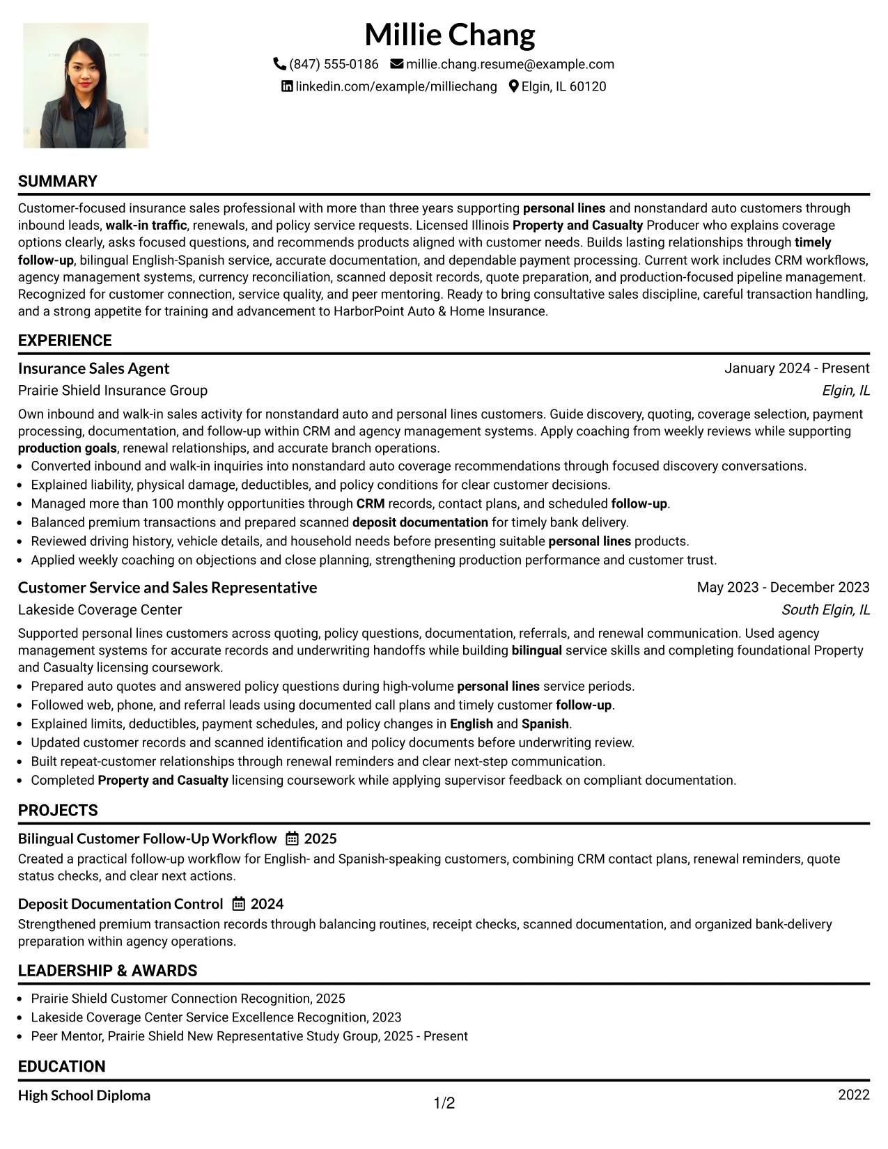
#27 One Column Format with Photo Resume Example
Evidence receives priority in this one-column format: the summary states the insurance sales value, and the experience section follows with direct proof. A photo and centered header can introduce the document, but the main reading path remains focused on work history, licenses, skills, and measurable responsibilities.
The resume can show inbound and walk-in lead conversion, coverage explanations, CRM follow-up, currency reconciliation, and scanned deposit records in a sequence that is easy to trace. Education, certifications, awards, projects, and bilingual service can follow without competing with the strongest employment evidence.
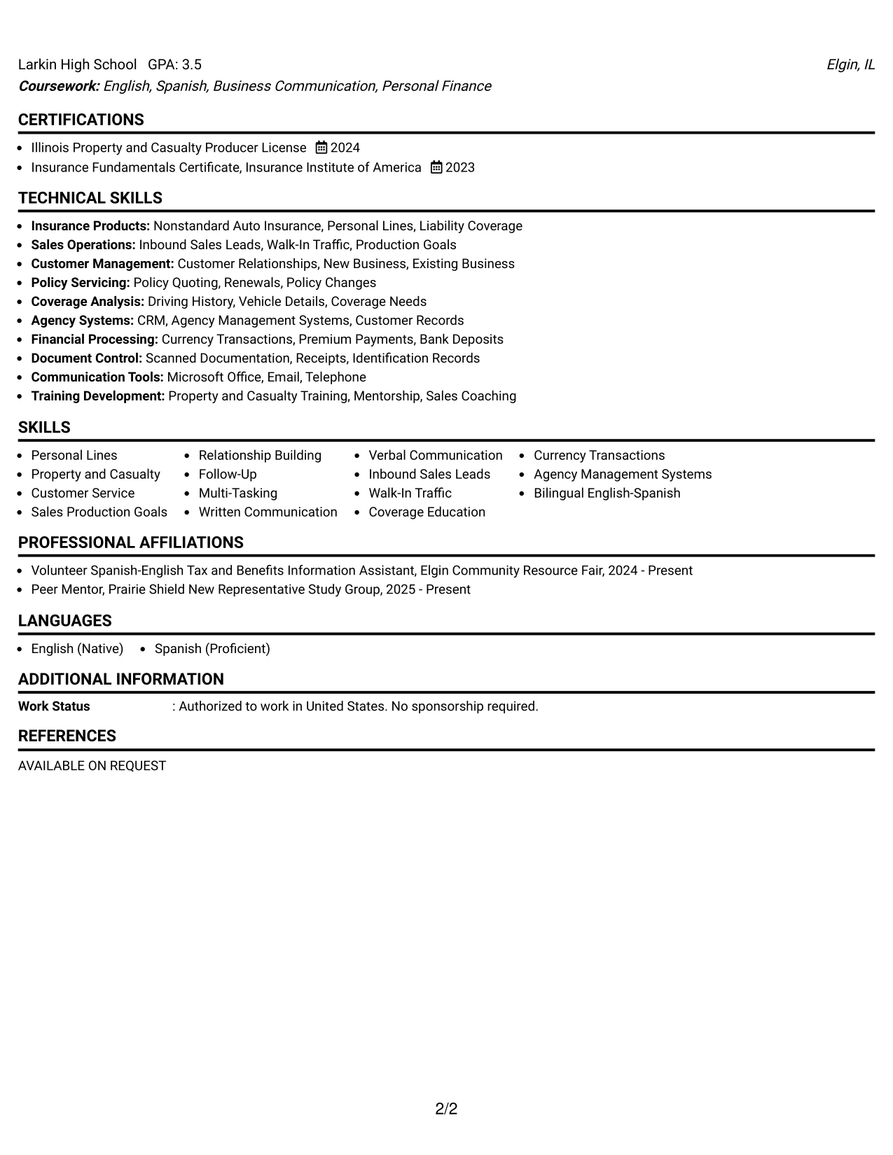
Why the One Column Format with Photo Works for a Resume
- A single column gives employment evidence the largest uninterrupted reading path.
- The photo header identifies the candidate while the text sections carry the qualifications.
- Bullets can explain discovery conversations, coverage choices, and customer follow-up in order.
- The format supports clear placement of the Illinois Property and Casualty Producer License.
- CRM pipeline work and currency reconciliation can appear as separate, scannable achievements.
- Projects such as Bilingual Customer Follow-Up Workflow can add relevant supporting evidence.
- Awards and community activity remain easy to review after core experience and education.
Best For
- Applicants who want the resume's work evidence to read in one continuous sequence.
- Professionals with detailed bullets that need full-width space for clarity.
- Applications where sales outcomes and service responsibilities should appear before secondary sections.
- Candidates presenting licenses, projects, and awards after a strong employment record.
- Readers who prefer chronological review over sidebar navigation.
- Resume users applying where a photo is suitable but content remains the main decision factor.
- Documents that need room for customer conversations, transaction controls, and follow-up details.
#28 One Column Format with Photo Right Resume Example
Content is balanced across a clean one-column page, with the photo placed to the right so the name, target role, and contact details remain easy to read. This arrangement keeps the top section open while allowing the summary and experience to establish professional value before supporting information appears.
The resume can use full-width bullets for policy quoting, customer education, renewal retention, documented follow-up, and deposit controls. A right-side photo adds visual structure, while standard headings preserve a practical review path for licenses, education, skills, projects, and recognition.
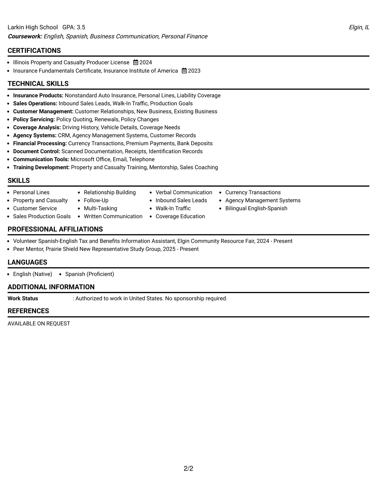
Why the One Column Format with Photo Right Works for a Resume
- Right-side placement keeps the primary contact and role information visually balanced.
- The one-column body gives each experience bullet enough width for complete meaning.
- The summary can connect customer service, sales production, licensing, and bilingual communication.
- Full-width sections support clear descriptions of quoting, renewals, and policy service.
- Skills and tools remain searchable when written as standard text under clear headings.
- Projects provide extra evidence of follow-up workflow and deposit documentation control.
- The format separates visual identity from the detailed proof employers need to review.
Best For
- Applicants who want a balanced header without placing the photo before every contact detail.
- Professionals whose experience bullets need broad one-column space.
- Applications that combine sales, service, compliance-minded records, and customer education.
- Candidates who need room for projects and recognition below the main employment section.
- Readers who prefer a calm page with a clear top-to-bottom review path.
- Resume users applying where a photo is suitable but should remain secondary to qualifications.
- Documents presenting several related sections without using a sidebar.
#29 One Column Boxed Contact Header Format Resume Example
For a practical application, the boxed contact header puts the target role, location, phone, email, and LinkedIn details in one reliable place before the reader reaches the resume content. The one-column body then supports a direct review of the summary, experience, skills, licenses, education, and awards.
This structure fits an insurance sales resume because the evidence can build in a logical order: inbound lead conversion, coverage recommendations, CRM pipeline control, currency transactions, and bilingual customer service. Simple boxes should frame information, while standard bullets and headings keep the document readable for ATS tools.
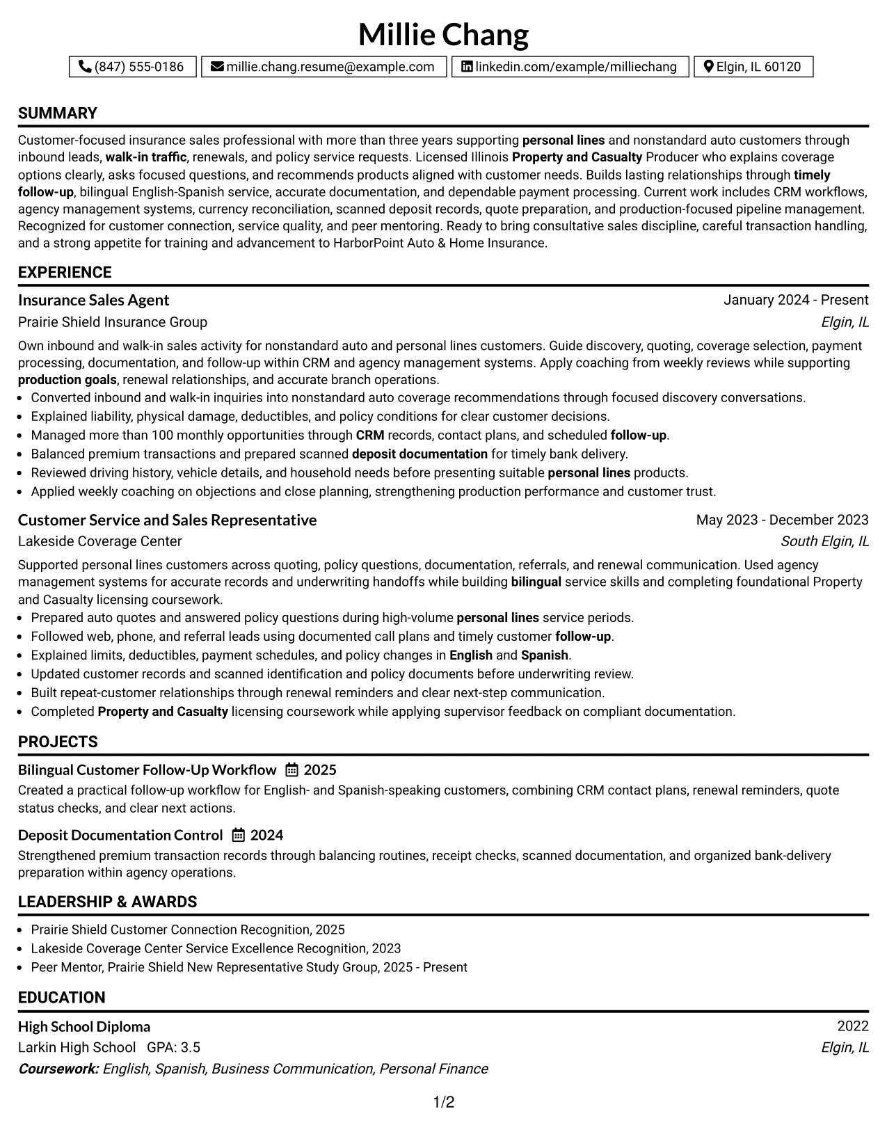
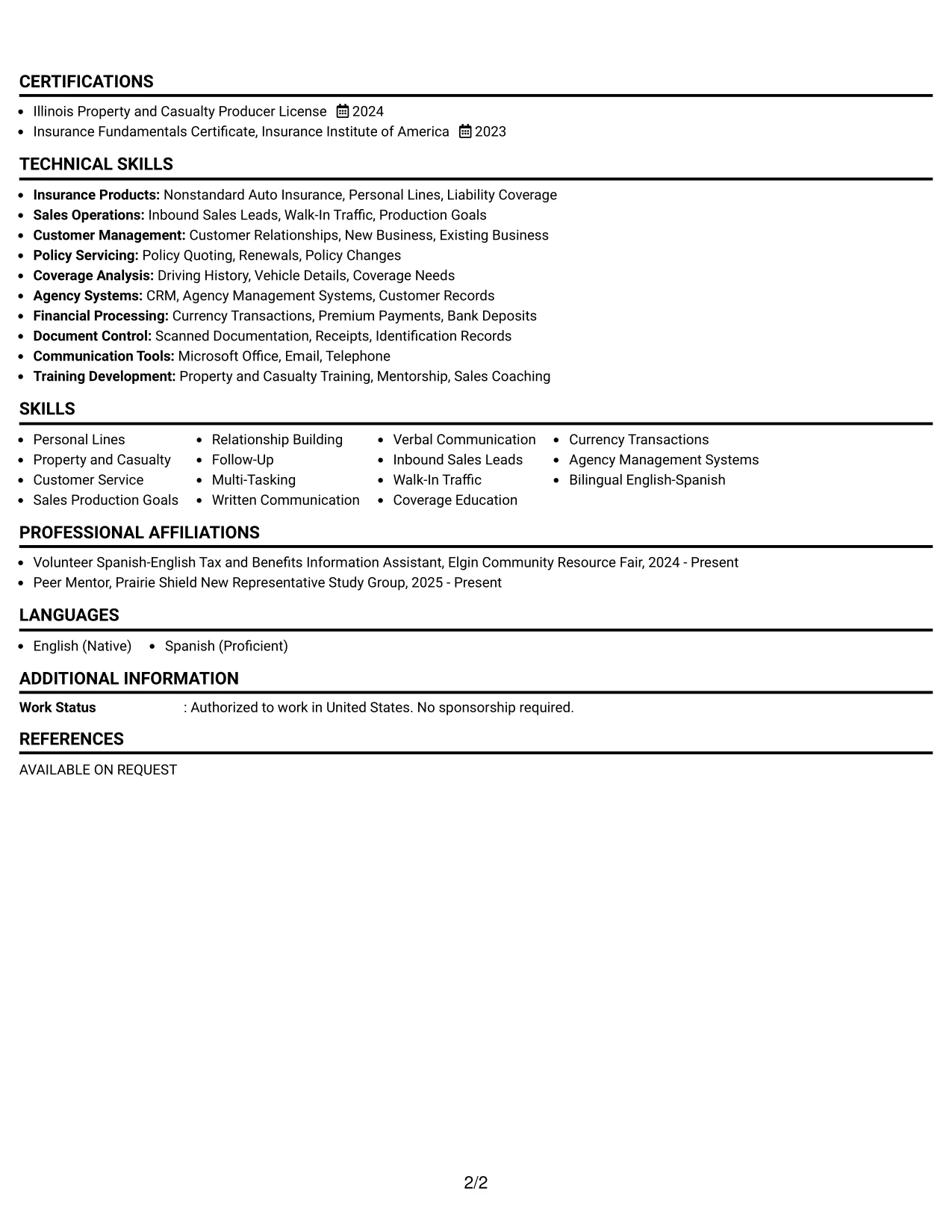
Why the One Column Boxed Contact Header Format Works for a Resume
- The boxed header makes essential contact information quick to verify.
- A single column keeps work history in a familiar chronological order.
- The summary can target customer service and insurance sales without a crowded opening.
- Experience bullets show both relationship building and accurate financial documentation.
- A dedicated skills section can list CRM, agency systems, coverage education, and languages.
- Certifications and education remain easy to locate below the core employment evidence.
- The restrained box treatment adds structure without depending on complex visual elements.
Best For
- Applicants who want contact details clearly separated from the resume body.
- Professionals seeking a familiar one-column structure for customer-facing applications.
- Applications where chronology and straightforward section order matter most.
- Candidates with a focused set of licenses, skills, and related experience.
- Readers who need to confirm phone, email, and location before reviewing qualifications.
- Resume users balancing strong service evidence with careful transaction responsibilities.
- Documents intended to remain simple, searchable, and easy to print.
#30 One Column Shaded Contact Header Format Resume Example
The shaded contact header gives the resume a polished first impression while keeping the visual hierarchy restrained. A reader can identify the target role and contact details first, then move through the summary, recent experience, skills, licenses, education, and recognition in one column.
This format aligns well with a role that combines relationship building and careful process work. The resume can emphasize nonstandard auto coverage, personal lines service, English and Spanish communication, scheduled follow-up, more than 100 monthly opportunities, and accurate premium documentation without scattering those keywords across separate panels.
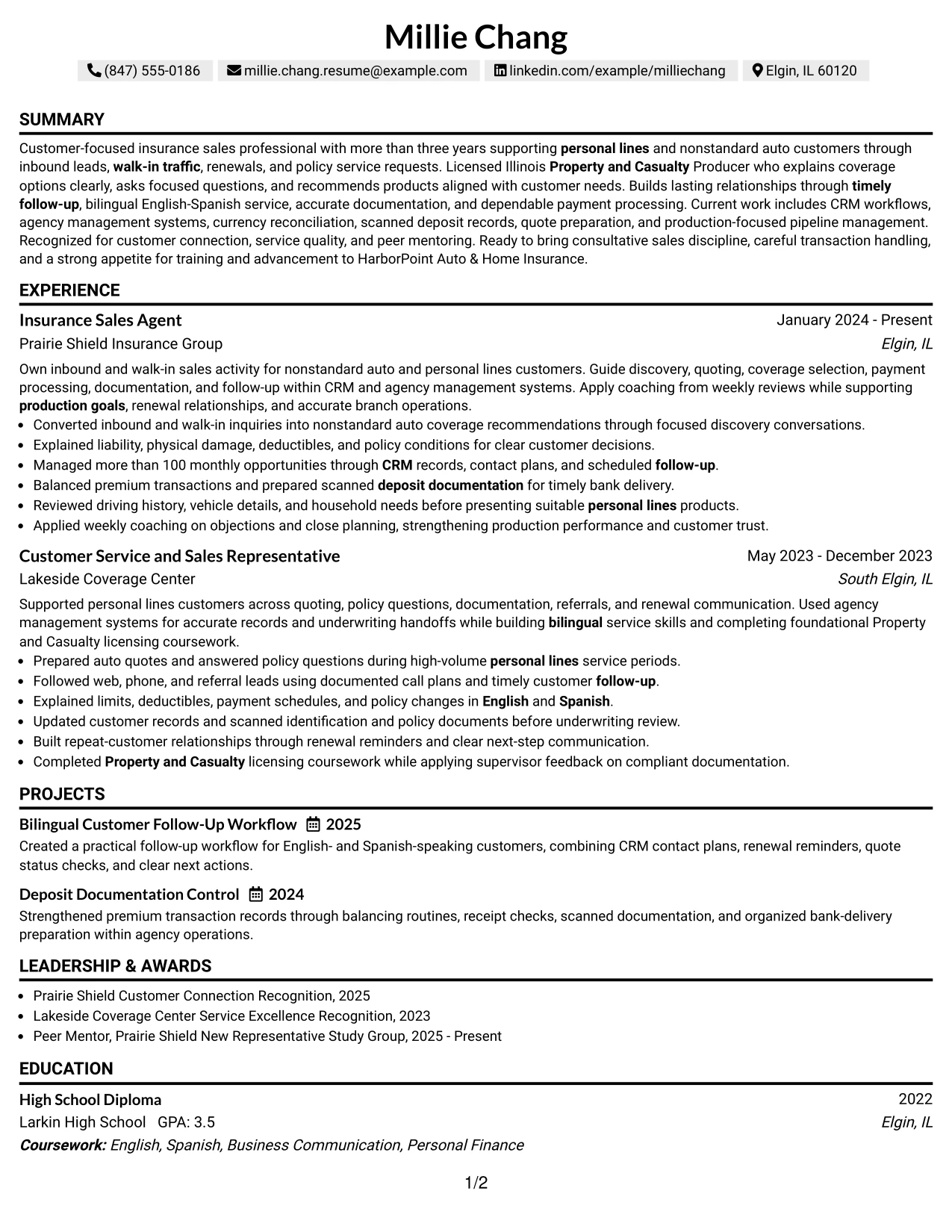
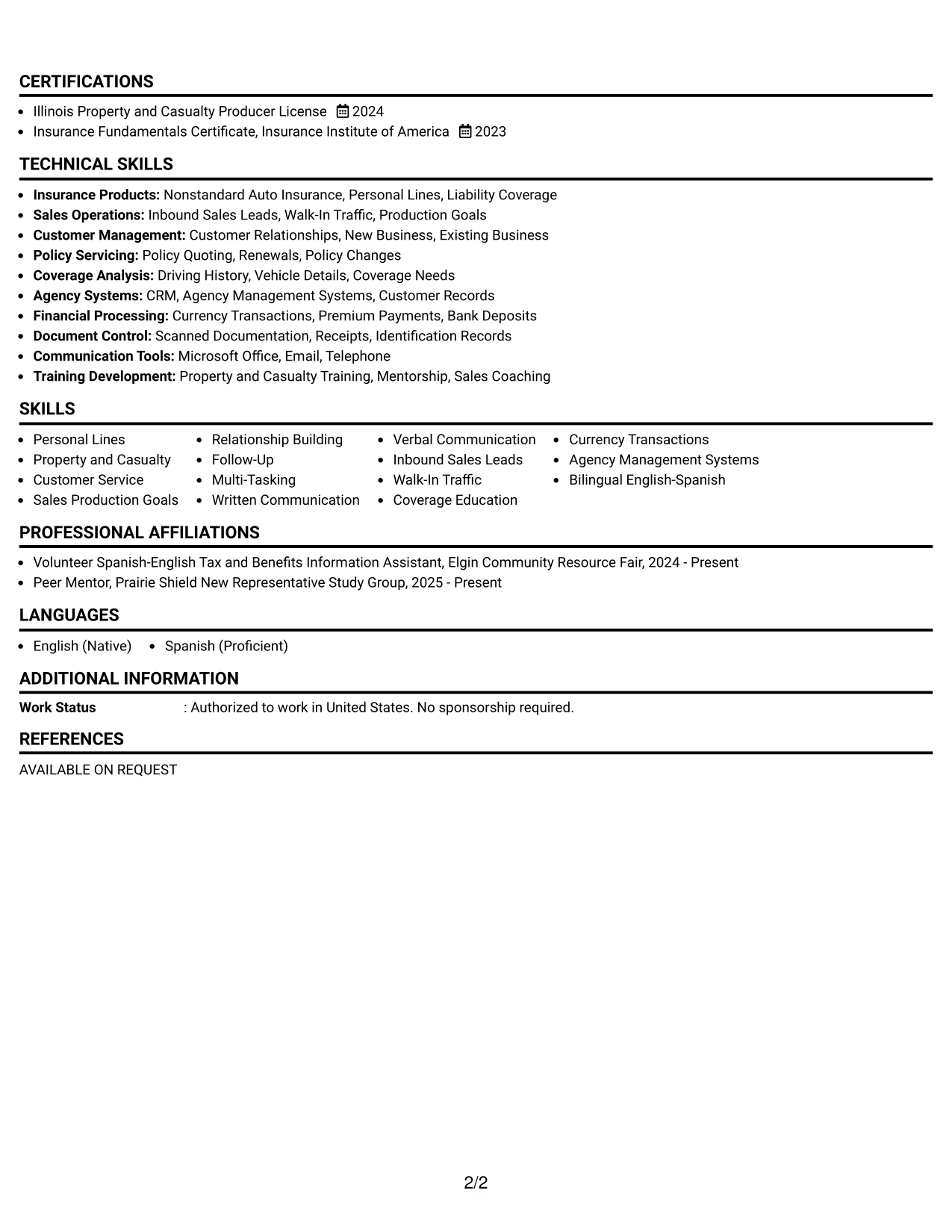
Why the One Column Shaded Contact Header Format Works for a Resume
- The shaded header distinguishes contact information without overpowering the qualifications.
- The one-column structure supports a steady review from summary to work history.
- Role-aligned keywords appear naturally in the summary, bullets, skills, and license sections.
- The layout gives recent experience enough space to explain sales and service responsibilities.
- More than 100 monthly opportunities adds concrete scale to the employment evidence.
- Recognition and peer mentoring can reinforce customer connection and continued development.
- Clear text sections remain useful for ATS parsing and human review.
Best For
- Applicants who want a polished header with a simple, familiar document structure.
- Professionals aligning a resume closely with customer service and sales requirements.
- Candidates who need recent work history to carry most of the qualification story.
- Applications where bilingual service and licensing should appear in several relevant sections.
- Readers who prefer subtle section emphasis rather than strong graphic treatments.
- Resume users showing both production activity and accurate administrative follow-through.
- Documents that need a professional look while preserving straightforward ATS text.
#31 Boxed Contact Header with Job Title Format Resume Example
The boxed contact header with job title format starts with a direct statement of professional focus, then organizes the resume into familiar sections. The title helps the reader connect the summary and experience to Insurance Sales Agent - Customer Service before reviewing the supporting qualifications.
A clear sequence can present recent insurance sales work, earlier customer service and sales experience, certifications, education, skills, projects, and awards. The strongest bullets should retain concrete evidence such as quote preparation, coverage explanations, documented follow-up, more than 100 monthly opportunities, and scanned deposit documentation.
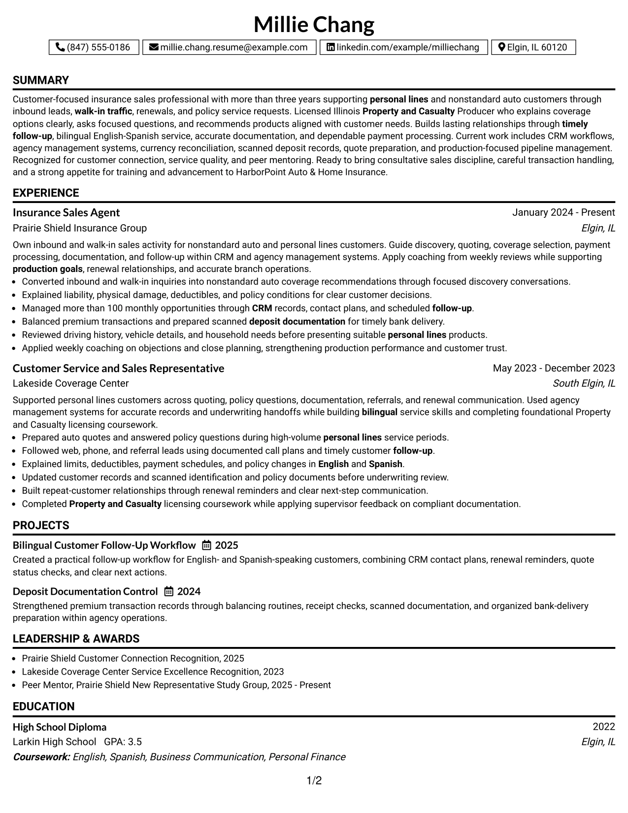
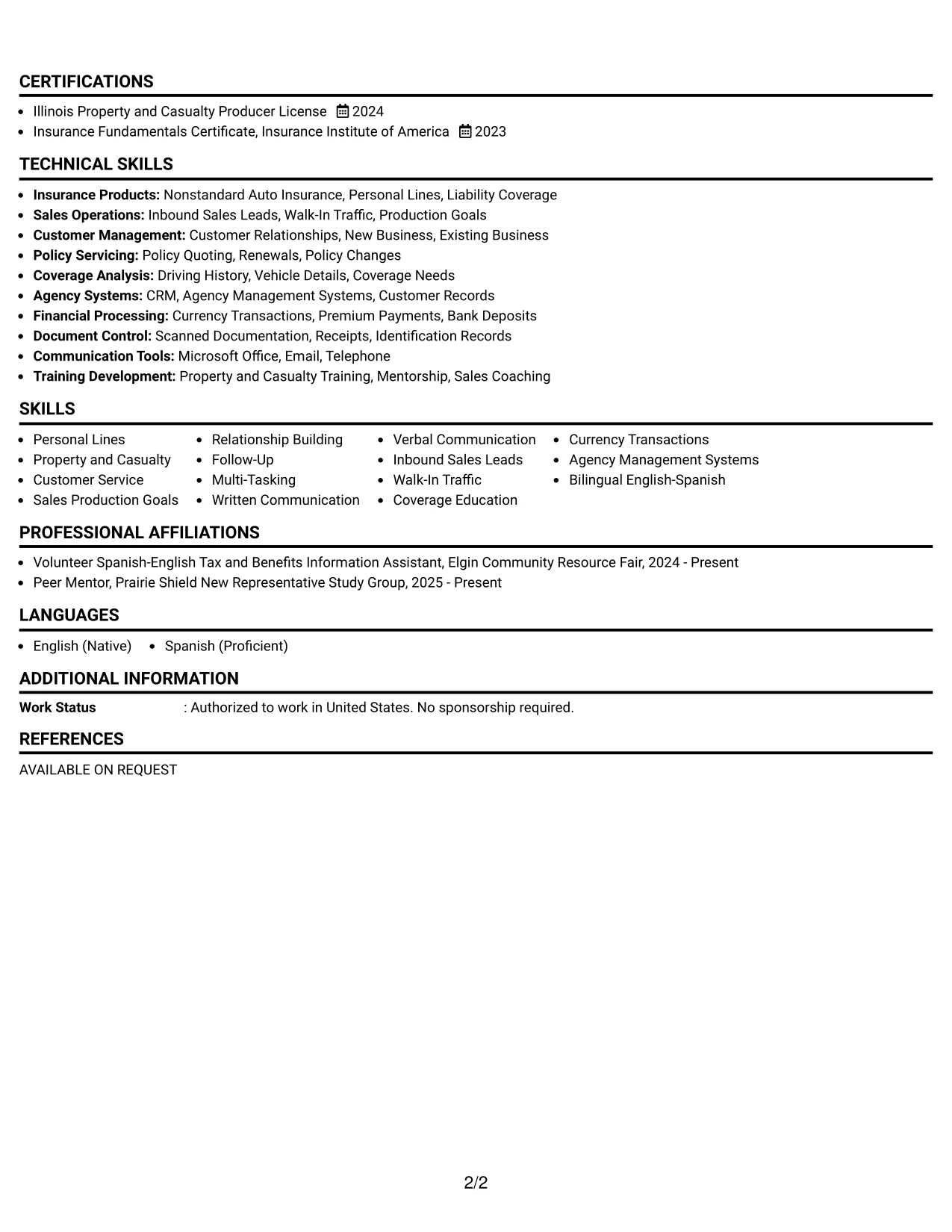
Why the Boxed Contact Header with Job Title Format Works for a Resume
- The job title appears early, reducing uncertainty about the resume's target.
- A boxed contact area keeps personal details separate from professional evidence.
- The one-column structure supports chronological work history and consistent bullet scanning.
- The summary can connect personal lines knowledge with customer service and sales discipline.
- Specific responsibilities show quoting, coverage education, payment handling, and follow-up.
- Licenses and certificates reinforce readiness for insurance-focused work.
- Projects and recognition add supporting proof without interrupting the employment sequence.
Best For
- Applicants who want the intended role stated clearly near the top of the page.
- Professionals with closely related positions that need a direct title bridge.
- Applications where chronological experience should remain the main review path.
- Candidates combining policy knowledge with customer communication and transaction accuracy.
- Readers who scan the header first and then expect conventional resume sections.
- Resume users adding projects, awards, or activities after core qualifications.
- Documents that need a clear target while keeping the rest of the design familiar.
#32 Plain Professional Layout with Job Title & Shaded Labels Resume Example
Readers can follow the resume from its stated job title into the summary, recent experience, earlier experience, and supporting sections without changing reading direction. Shaded labels provide gentle signposts for skills, education, licenses, projects, awards, and activities while the plain professional layout keeps attention on the content volume.
This structure gives the insurance background enough room for detailed bullets and related keywords. It can show inbound and walk-in traffic, nonstandard auto and personal lines, CRM records, renewal follow-up, bilingual explanations, premium balancing, and ongoing licensing development in a complete but organized review path.
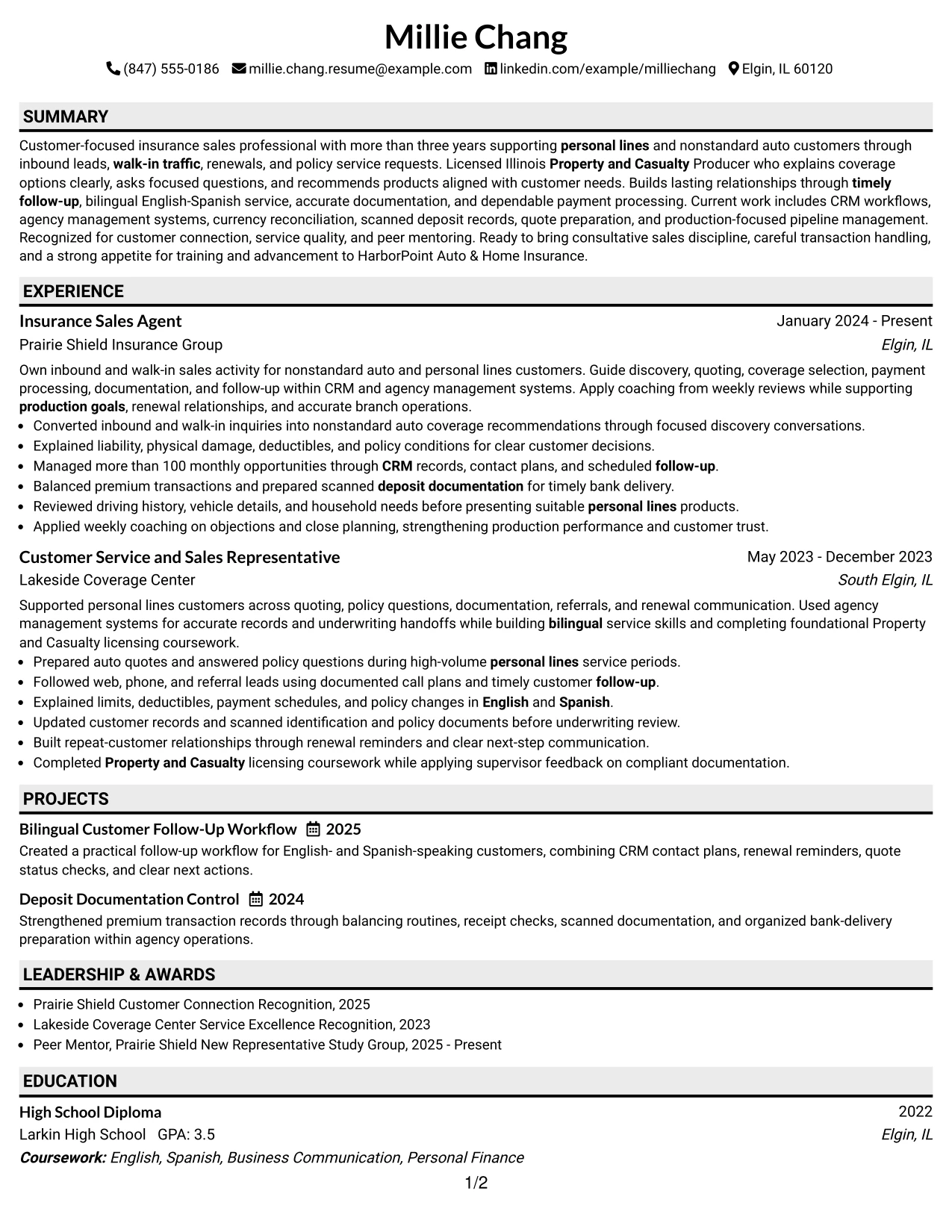
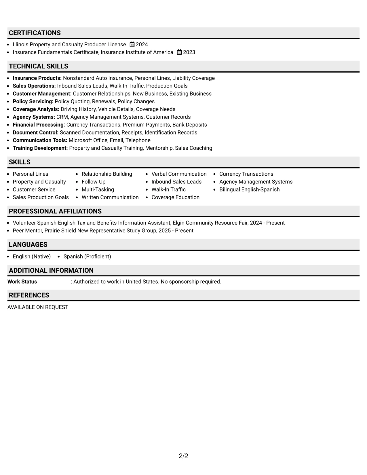
Why the Plain Professional Layout with Job Title & Shaded Labels Works for a Resume
- The direct reading path works well for a resume with two related insurance positions.
- Shaded labels divide a larger content set without creating a distracting visual system.
- The job title frames the summary and experience around the intended application.
- Full-width bullets allow complete explanations of coverage, payments, and customer follow-up.
- Skills, tools, languages, and certifications can be grouped under recognizable labels.
- Projects and activities add evidence of workflow design, mentoring, and bilingual community service.
- The plain treatment supports ATS extraction and careful human review.
Best For
- Applicants with a larger amount of related content that needs orderly presentation.
- Professionals whose recent and earlier roles both contribute meaningful evidence.
- Applications requiring detailed bullets for customer service, quoting, and transaction control.
- Candidates who want labels to guide readers through many supporting sections.
- Readers who value full-width text and a predictable review sequence.
- Resume users including projects, awards, activities, education, and certifications together.
- Documents where plain formatting and content volume matter more than visual effects.
#33 Classic One Column Resume Format Resume Example
Evidence leads the page in this classic one-column format, beginning with a focused summary and continuing through reverse-chronological experience. The familiar structure lets the reader assess insurance sales results, customer service responsibilities, licensing, and skills without learning a new navigation pattern.
For this resume, the strongest proof includes more than three years in personal lines and nonstandard auto support, more than 100 monthly opportunities managed, bilingual English-Spanish service, accurate currency reconciliation, and recognized customer connection. Projects, education, certifications, and activities can follow in clearly labeled sections.
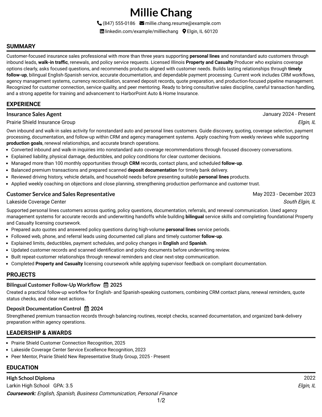
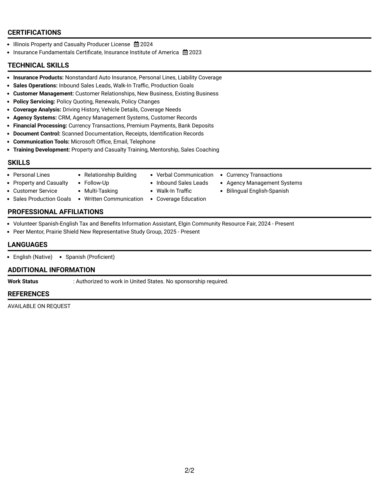
Why the Classic One Column Resume Format Works for a Resume
- The familiar structure lets readers find summary, experience, education, and skills quickly.
- Reverse-chronological experience gives recent insurance work the strongest position.
- Standard bullets make workload, customer service, and transaction evidence easy to compare.
- The format supports ATS-friendly headings and searchable insurance keywords.
- Licenses and certificates can appear in a dedicated section near the core qualifications.
- Projects and community activities provide additional proof of follow-up and bilingual service.
- A classic layout keeps attention on achievements instead of decorative elements.
Best For
- Applicants who want a dependable format recognized across customer service and sales hiring.
- Professionals whose recent experience provides the clearest evidence of fit.
- Applications where ATS parsing and conventional section order are important.
- Candidates with measurable workload, licensing, and service details to present directly.
- Readers who prefer a familiar chronological review with minimal visual interruption.
- Resume users adding projects, recognition, languages, and activities after employment history.
- Documents that should emphasize evidence, keywords, and clear bullet points over styling.
Why Build Your Insurance Sales Agent - Customer Service Resume with ResumeInMinutes
ResumeInMinutes helps you turn insurance sales and customer service work into a focused resume that shows relationship building, coverage knowledge, follow-up discipline, and dependable branch operations.
- Clear ATS-friendly resume formats
- Readable section hierarchy
- Insurance keyword guidance
- Organized experience and skills sections
- Projects, licenses, and education presentation
- Free PDF resume previews
Build a resume that gives practical evidence of customer conversations, quote preparation, renewal follow-up, payment accuracy, documentation control, and continued training for the Insurance Sales Agent - Customer Service role.
See Also
- 33 Small Business Customer Service Representative Resume Templates with Example 2026 (ATS-Optimized)
- 33 Dispatcher and Customer Service Representative Resume Templates with Example 2026 (ATS-Optimized)
- 33 Call Center Customer Service Representative Resume Templates with Example 2026 (ATS-Optimized)
- 33 BDC Customer Service Representative Resume Templates with Example 2026 (ATS-Optimized)
- 33 Virtual Customer Service Representative Resume Templates with Example 2026 (ATS-Optimized)
- 33 CDHP and COBRA Customer Service Representative Resume Templates with Example 2026
- 30+ Customer Service Representative Cover Letter Templates with Example 2026
- 33 Insurance Agent Resume Templates with Example 2026 (ATS-Optimized)
- 30+ Lead Customer Service Representative Cover Letter Templates with Example 2026
- 30+ Customer Service Representative - Bilingual Cover Letter Templates with Example 2026
Frequently Asked Questions
Are these Insurance Sales Agent - Customer Service resume templates ATS-friendly?
Yes. They use readable headings, organized sections, and relevant terms such as personal lines, Property and Casualty, nonstandard auto insurance, CRM, follow-up, and coverage education.
Are these various resumes?
No. The guide presents one Insurance Sales Agent - Customer Service resume example in distinct formats and design styles.
What should an Insurance Sales Agent - Customer Service resume include?
Include a focused summary, insurance experience, customer service results, sales and follow-up skills, licenses or certificates, education, relevant projects, systems, and bilingual language skills when applicable.
Can I download the resume templates as PDFs?
Yes. Each resume design offers a free PDF download so you can review the layout and choose a format that supports clear scanning.
Which resume style is best for an Insurance Sales Agent - Customer Service position?
A clean one-column or simple two-column format usually works well because it keeps experience, skills, licenses, and customer-facing results easy to find and parse.
How can I show insurance sales results without overstating my background?
Use accurate details from your work, such as monthly opportunity volume, quote activity, follow-up routines, renewal support, payment processing, documentation, and recognition. Add numbers only when you can verify them.
Should I include a photo on my resume?
For U.S. applications, a no-photo resume is usually the safer choice. Use the space for relevant experience, insurance keywords, licenses, and measurable work evidence.
Can I customize these resume templates?
Yes. You can adjust the resume text, section order, format, design style, and PDF layout to match your Insurance Sales Agent - Customer Service experience and qualifications.