33 Remote Insurance Sales Representative Resume Templates with Example 2026 (ATS-Optimized)
This guide shows you how to build a clear, focused Remote Insurance Sales Representative resume. You will learn how to organize your evidence so readers can quickly understand your sales, client service, and remote-work strengths.
Strong resumes for this role connect provided-lead follow-up, virtual client meetings, benefit presentations, enrollment support, and renewal conversations to specific results. They also use simple section headings, concise bullet points, and relevant terms such as insurance sales, consultative selling, CRM documentation, electronic applications, and client relationship management.
The examples below present one target resume in 33 layouts, with format guidance to help you compare readable designs, improve ATS parsing, and select a professional structure for your application.
What Makes a Great Remote Insurance Sales Representative Resume in 2026
A strong resume is focused, easy to scan, and built around evidence of client guidance, lead conversion, enrollment accuracy, renewal care, and dependable follow-through.
Use keywords such as benefit presentations, virtual client meetings, insurance license, consultative selling, CRM documentation, electronic applications, and client retention when they match your background.
The examples shown below are intentionally detailed to demonstrate a range of experiences, skills, accomplishments and relevant keywords. We prefer detailed resumes as they provide more context to the hiring managers and also help the ATS systems identify relevant qualifications and score your resume better for a match. But the length of a resume is an individual choice. If you want a one page resume, just keep the most relevant experience and information for the job. Note: Resume examples are created for educational purposes; references to real organizations do not imply affiliation or endorsement.
#1 Plain Two Column Format Resume Example
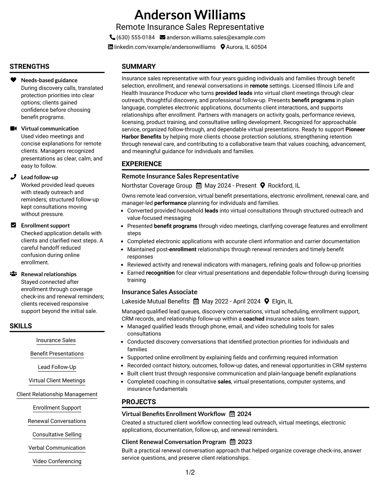
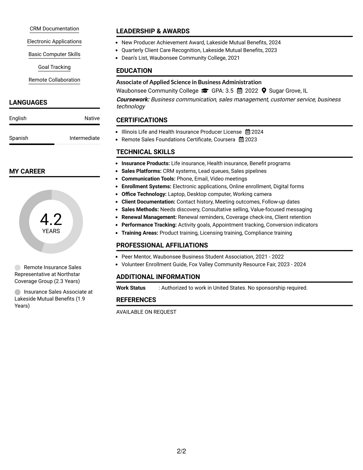
The Plain Two Column Format organizes the resume into a clear primary column and a compact supporting column. The main area can carry the professional summary, experience, projects, and measurable results, while the secondary area surfaces skills, licenses, education, and tools for quick review.
For a Remote Insurance Sales Representative resume, this structure gives both ATS-friendly text and fast visual scanning. Standard headings such as Insurance Sales, Virtual Client Meetings, Electronic Applications, CRM Documentation, and Renewal Conversations remain easy to find without crowding the experience section.
Resume Snapshot
- Licensed Illinois Life and Health Insurance Producer with four years of insurance sales experience.
- Experience with provided leads, virtual consultations, benefit presentations, enrollment support, and renewal follow-up.
- Education includes an Associate of Applied Science in Business Administration from Waubonsee Community College.
- Key tools and methods include CRM systems, video meetings, electronic applications, needs discovery, and consultative selling.
Why the Plain Two Column Format Works for a Resume
- Creates a strong hierarchy between detailed work history and supporting qualifications.
- Keeps high-value keywords visible near the top and side of the page.
- Gives experience bullets enough room to explain client guidance and enrollment work.
- Supports separate sections for skills, certifications, education, projects, and awards.
- Makes remote sales evidence easy to scan, including virtual meetings and lead follow-up.
- Preserves a straightforward structure that can support recruiter review and ATS parsing.
Resume Keywords
- Remote Insurance Sales Representative
- Insurance Sales
- Benefit Presentations
- Lead Follow-Up
- Virtual Client Meetings
- Enrollment Support
- Renewal Conversations
- Client Relationship Management
#2 Simple One Column Format Resume Example
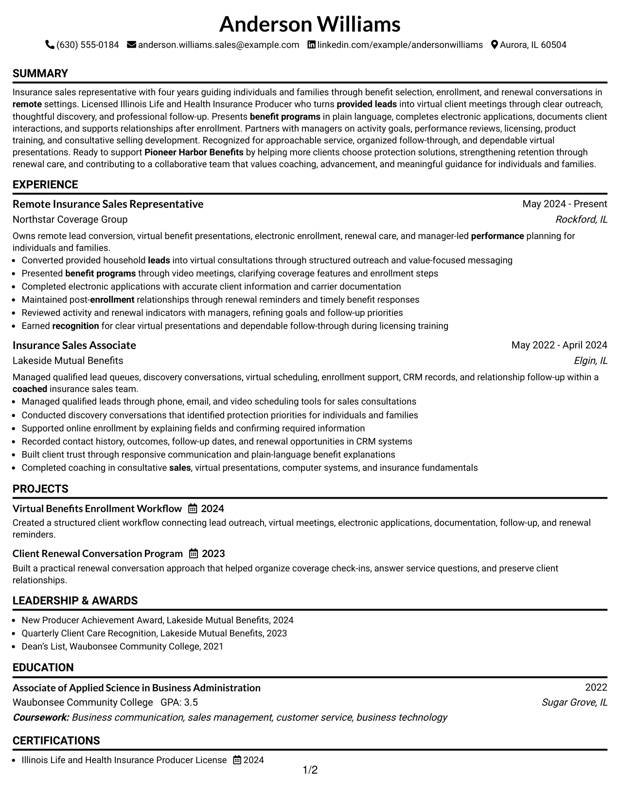
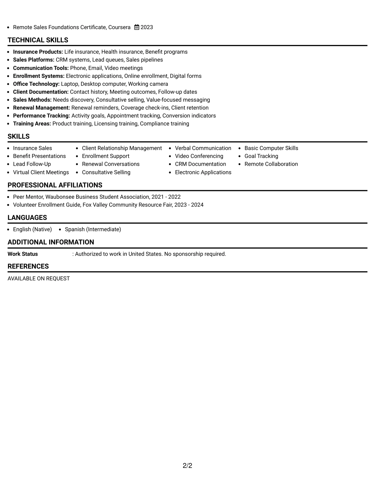
Recruiters move from the name and target role into the summary, experience, education, certifications, and skills in one steady vertical path. The Simple One Column Format removes side-to-side movement, so each section appears in the same reading order on screen or in a parsed text view.
That sequence works well when the resume needs to present several related details without splitting them across columns. Four years of insurance sales experience, virtual client meetings, electronic enrollment, renewal care, and manager-led goal setting can appear as a connected record supported by clear bullet points.
Why the Simple One Column Format Works for a Resume
- Gives ATS systems a predictable order for headings and resume text.
- Lets recruiters review the summary, experience, and skills without jumping between columns.
- Provides room for multiple bullets under each insurance sales position.
- Keeps projects, awards, education, and licenses in a consistent vertical structure.
- Makes dates, employers, job titles, and locations easy to compare.
- Supports a detailed resume while keeping section hierarchy simple.
Best For
- Resumes with several experience bullets that need full-width reading space
- Candidates who want one uninterrupted path from summary to skills
- Applications reviewed mainly in digital or parsed text formats
- Work histories that include projects, awards, licenses, and education
- Documents that need room for detailed enrollment and client-service evidence
- Readers who prefer familiar top-to-bottom navigation
- Resumes combining sales activity, relationship care, and administrative follow-through
#3 Clean Two Column Sidebar Format Resume Example
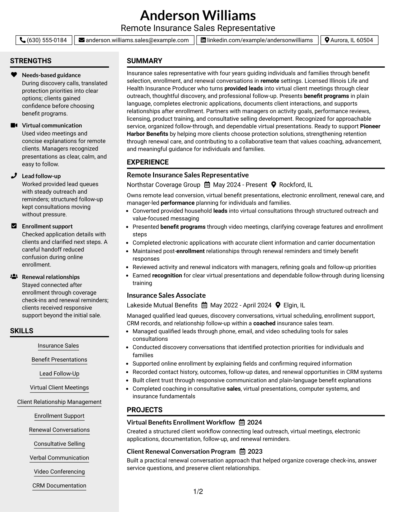
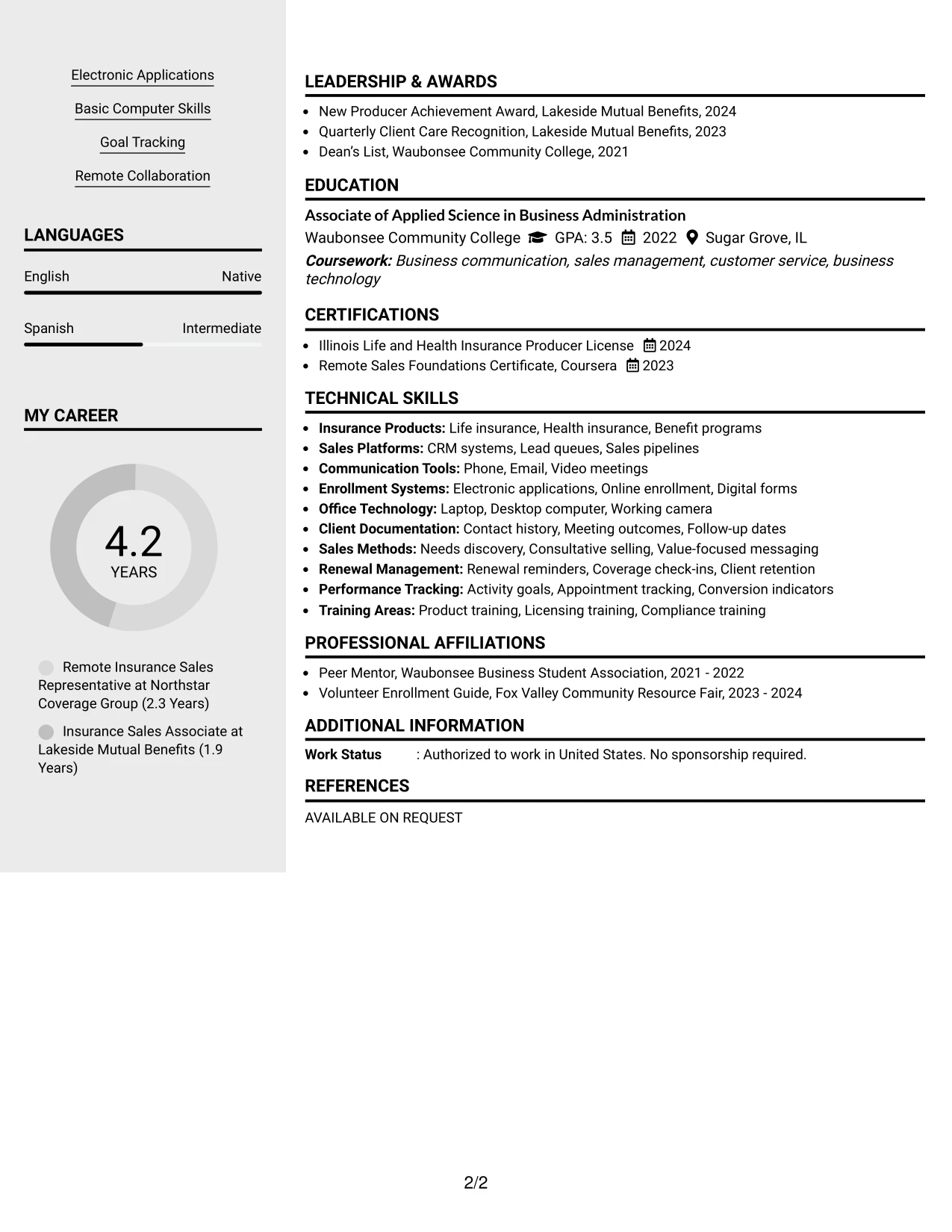
Provided leads, virtual consultations, benefit presentations, and renewal follow-up receive priority in this resume example because they show direct evidence of the target work. The Clean Two Column Sidebar Format then places supporting skills, licenses, tools, and education in a controlled sidebar for quick confirmation.
The experience column can use action-led bullets to show how clients were guided, how electronic applications were completed, and how CRM records were maintained. The sidebar reinforces that evidence with terms such as Consultative Selling, Video Conferencing, Basic Computer Skills, and Illinois Life and Health Insurance Producer License.
Why the Clean Two Column Sidebar Format Works for a Resume
- Puts outcome-focused experience before secondary qualification details.
- Uses the sidebar to confirm licenses, skills, education, and communication tools.
- Helps reviewers connect each sales responsibility with a relevant capability.
- Supports concise bullets about lead queues, discovery conversations, and enrollment.
- Keeps technical and administrative terms visible without interrupting the work history.
- Creates a clear evidence trail from client contact to documentation and renewal care.
Best For
- Resumes where work evidence should lead the reader immediately
- Candidates who need a compact place for licenses and supporting skills
- Applications that benefit from separating proof of performance from qualification details
- Sales documents with both client-facing bullets and process-oriented responsibilities
- Readers comparing experience evidence with tools, methods, and credentials
- Resumes that need a focused sidebar without reducing the main work area
- Roles requiring clear proof of communication, documentation, and follow-up
#4 Two Column Format Resume Example
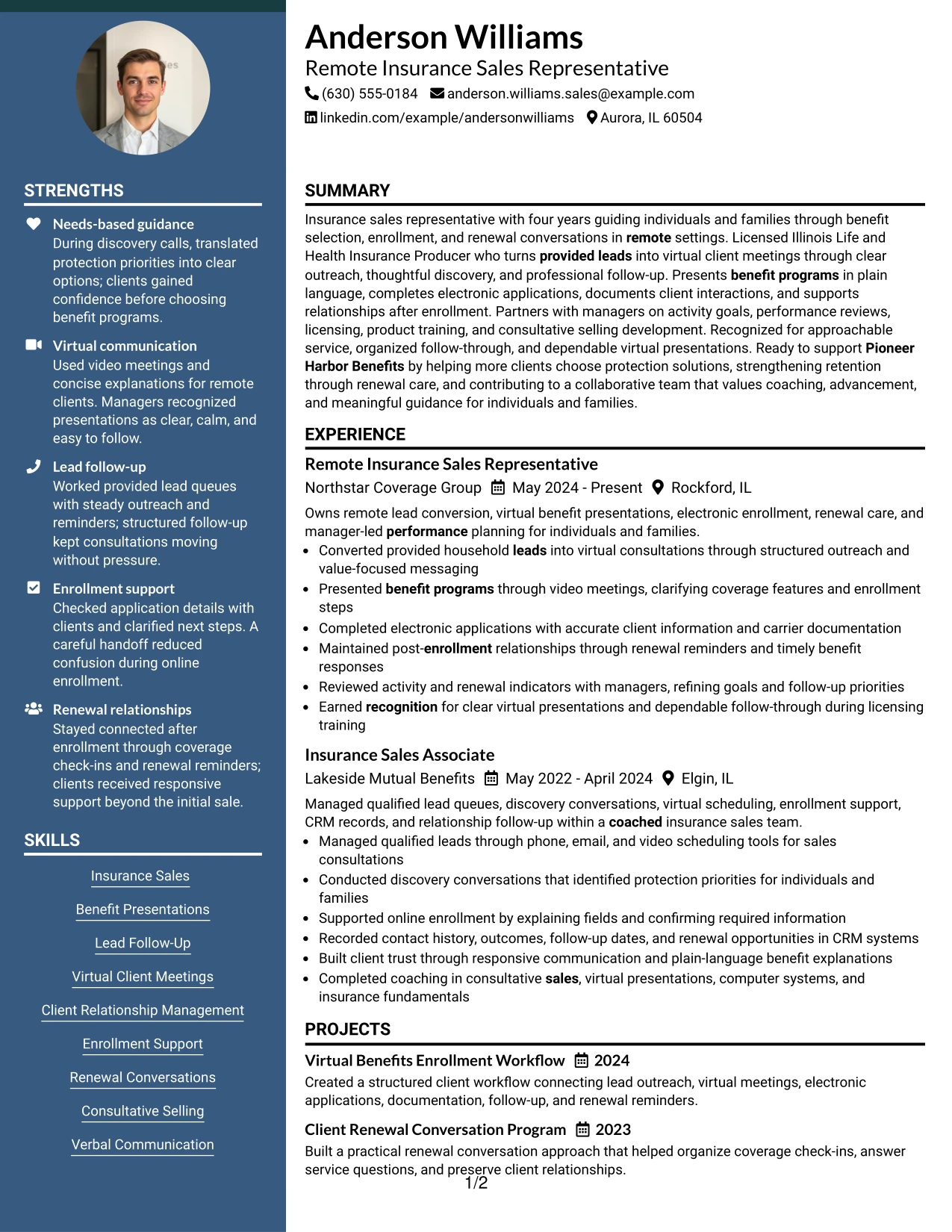
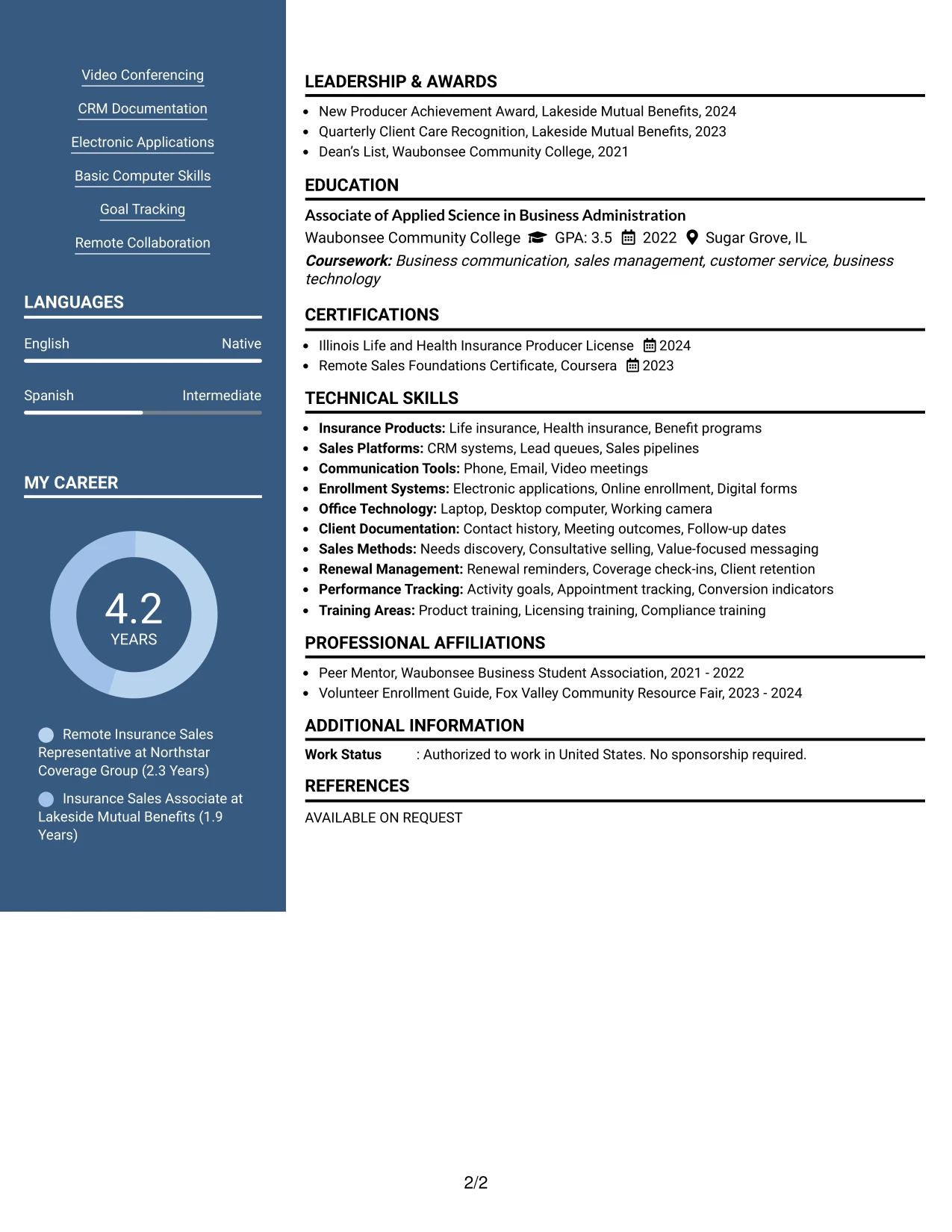
Content is balanced between detailed experience and compact qualification sections, giving the resume a practical structure for a focused application. One column can explain lead conversion, benefit presentations, enrollment, and renewal relationships, while the other presents skills, certifications, education, and selected projects.
For the Pioneer Harbor Benefits application, this balance keeps the target role and remote sales evidence prominent without hiding supporting details. It also gives projects such as Virtual Benefits Enrollment Workflow and Client Renewal Conversation Program a defined place beside the core employment record.
Why the Two Column Format Works for a Resume
- Balances detailed experience with fast access to skills and credentials.
- Creates a visible place for projects that demonstrate enrollment and renewal processes.
- Allows certifications and education to remain near the experience they support.
- Makes remote collaboration, video meetings, and CRM work easy to locate.
- Prevents a long list of skills from overwhelming the work history.
- Supports a targeted application while preserving useful supporting information.
- Gives recruiters a compact view of both client-facing and process-based strengths.
Best For
- Applications that need both detailed work history and compact supporting sections
- Resumes combining employment, projects, certifications, and education
- Candidates presenting a focused target role with several related qualifications
- Documents where remote work methods should sit beside client-service evidence
- Readers who want quick access to skills without losing bullet detail
- Applications with a mix of sales activity, enrollment tasks, and renewal work
- Resumes that need balanced page use rather than a single long text column
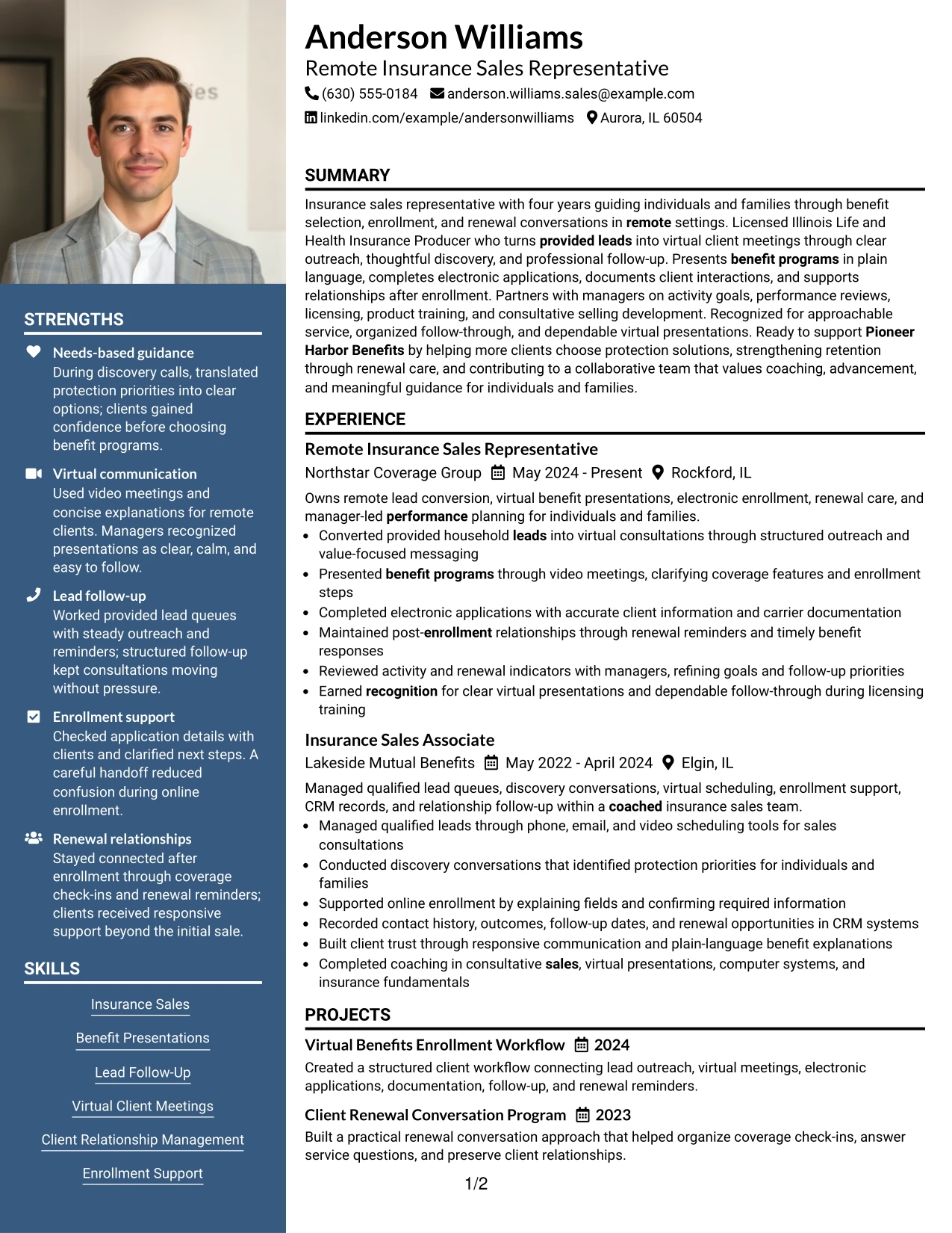
#5 Photo Header Two Column Format Resume Example
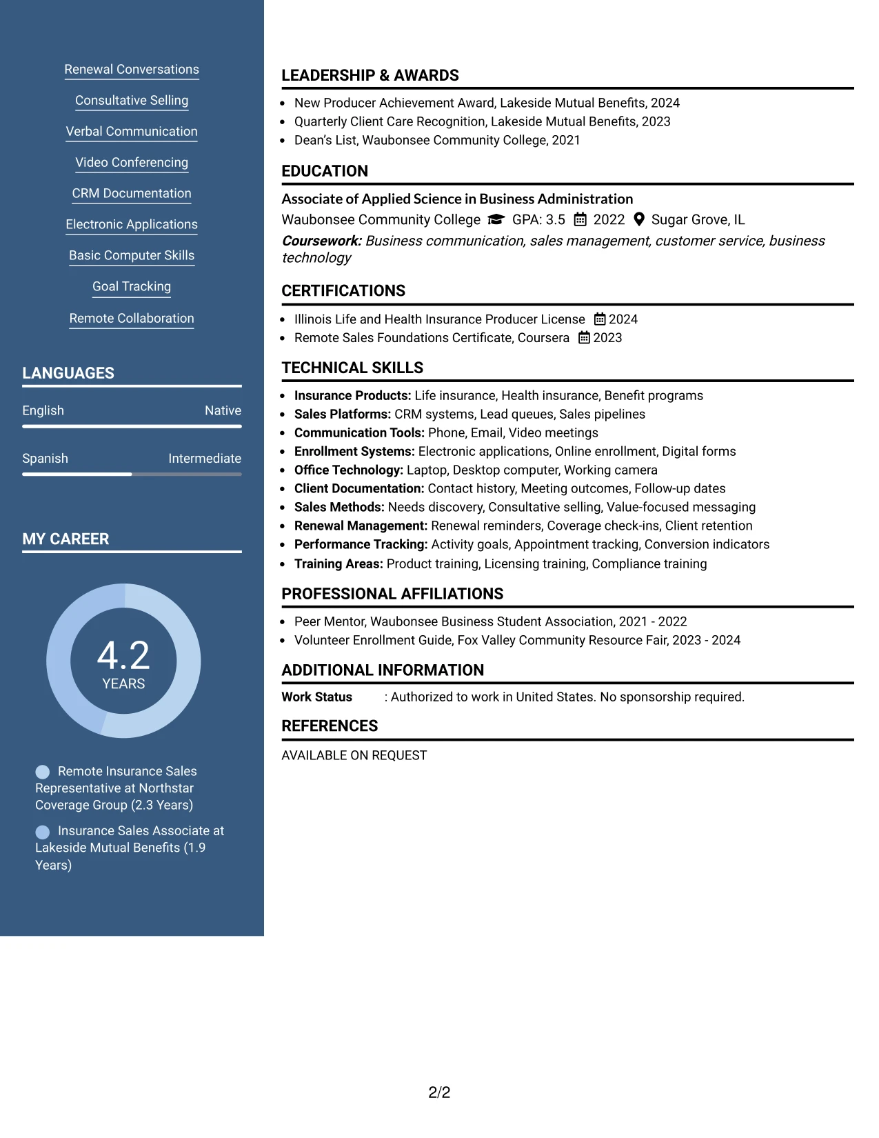
For an application that benefits from a more personal visual introduction, the Photo Header Two Column Format places the contact area and optional photo treatment above a balanced resume body. The image should remain professional and secondary to the target role, summary, experience, and searchable qualifications.
The two-column body can give the main column to virtual sales achievements and client support while the other column holds skills, licensing, education, and tools. That arrangement keeps the Illinois license, CRM documentation, electronic applications, and renewal conversations visible without taking space from the work history.
Why the Photo Header Two Column Format Works for a Resume
- Creates a defined header for contact details and professional identity.
- Keeps the photo treatment separate from the evidence used to assess qualifications.
- Uses two columns to balance work history with skills and credentials.
- Supports a concise summary followed by readable experience bullets.
- Gives licenses, tools, education, and projects a clear supporting area.
- Helps the resume feel polished while keeping relevant keywords in text.
- Works best when the application context accepts a visual header and the image is appropriate.
Best For
- Applications where a professional visual header is accepted and useful
- Candidates who want contact details and target role separated from body content
- Resumes pairing substantial experience evidence with a compact qualifications area
- Documents that need room for licensing, tools, education, and selected projects
- Readers who value a polished first view before reviewing detailed bullets
- Applications where client-facing presentation is part of the professional context
- Resumes that can use visual identity without replacing searchable text
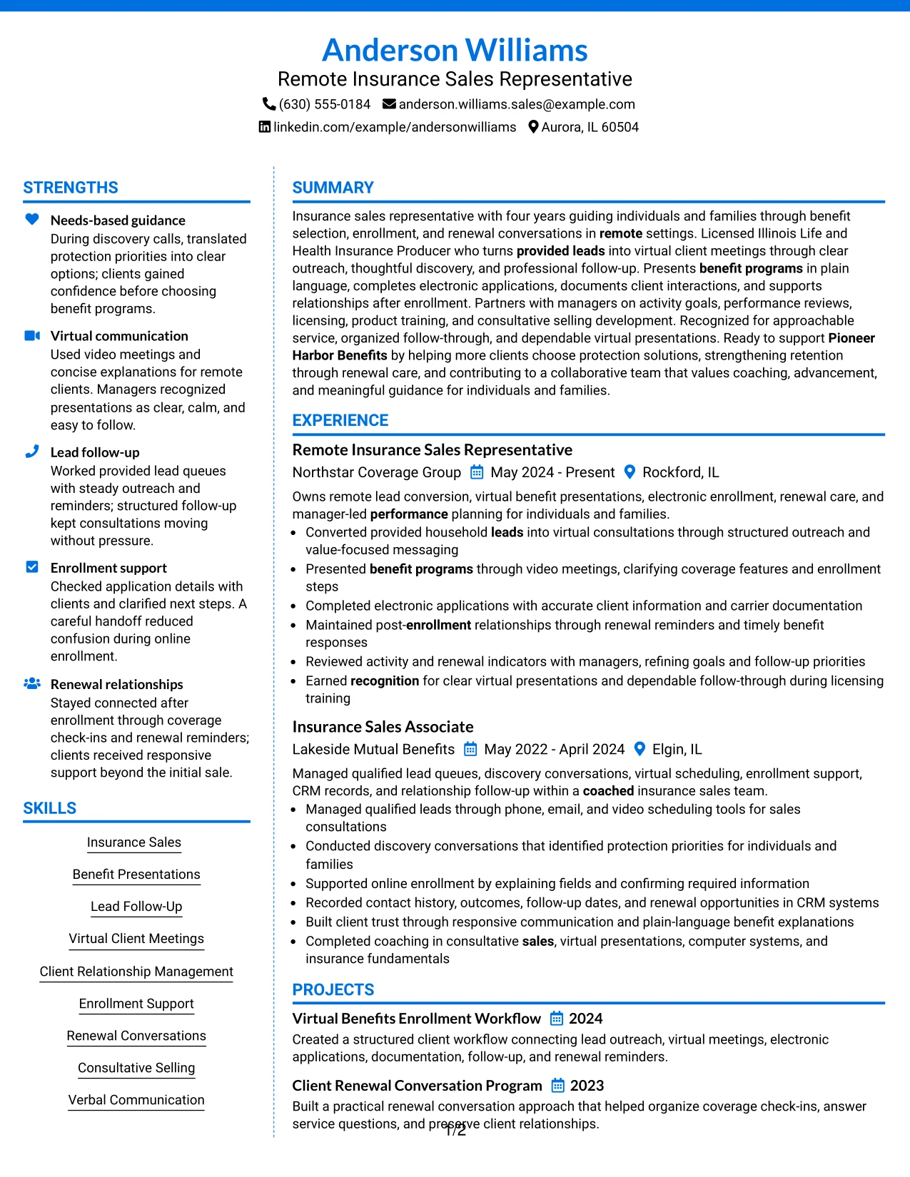
#6 Colored Two Column Format Resume Example
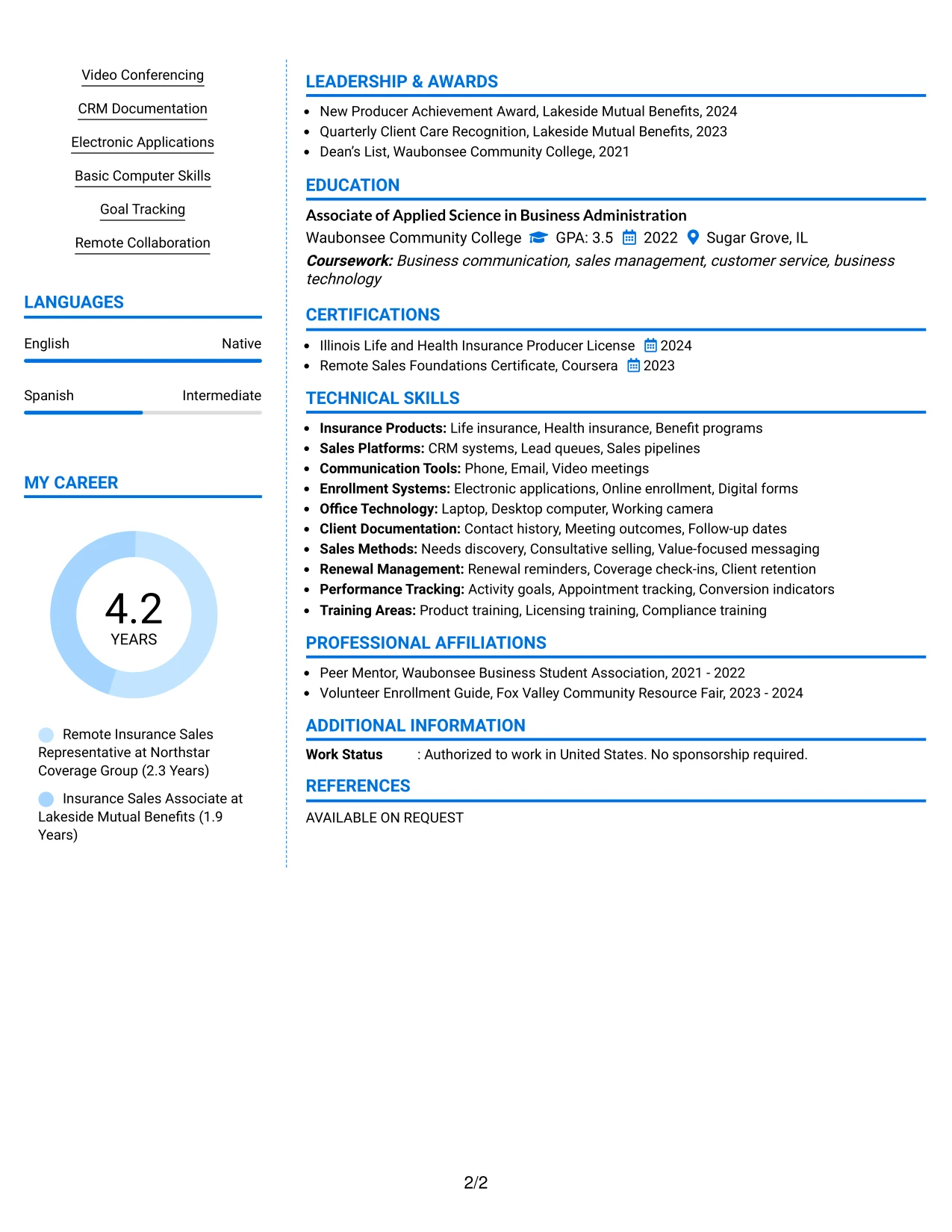
A restrained visual hierarchy helps the target role, summary, and strongest sales evidence stand out before the reader reaches supporting details. The Colored Two Column Format uses color to separate sections, while the text still carries the key information about provided leads, virtual presentations, enrollment, and renewal care.
A focused main column can show the progression from Insurance Sales Associate to Remote Insurance Sales Representative. The supporting column can group skills, certifications, education, awards, and activities so the reader can confirm role alignment without losing the chronological work record.
Why the Colored Two Column Format Works for a Resume
- Uses visual separation to guide attention toward the target role and summary.
- Shows career progression through a readable chronological experience section.
- Groups supporting credentials so they do not compete with achievement bullets.
- Keeps insurance sales, virtual communication, and enrollment terms easy to find.
- Provides room for awards and activities that reinforce client care and service.
- Maintains a professional structure while adding modest visual distinction.
Best For
- Applications that welcome restrained color while keeping text as the main evidence
- Candidates who want career progression to remain easy to follow
- Resumes needing clear separation between work history and supporting credentials
- Client-facing applications where presentation and organization both matter
- Documents with awards, activities, licenses, and skills that need compact grouping
- Readers who scan by section before reviewing individual bullet points
- Roles where virtual communication and relationship care should be visible early
#7 Stylish Two Column Designer Format Resume Example
The Stylish Two Column Designer Format gives each resume section a deliberate place: the main column carries the summary and evidence-rich experience, while the sidebar organizes skills, certifications, education, and selected supporting details. Its designer treatment should guide scanning, not compete with the content.
This structure suits a resume that must show both consultative selling and careful process work. Bullets can cover discovery conversations, benefit explanations, electronic applications, CRM documentation, and renewal reminders, while the sidebar reinforces the license, remote sales certificate, and relevant tools.
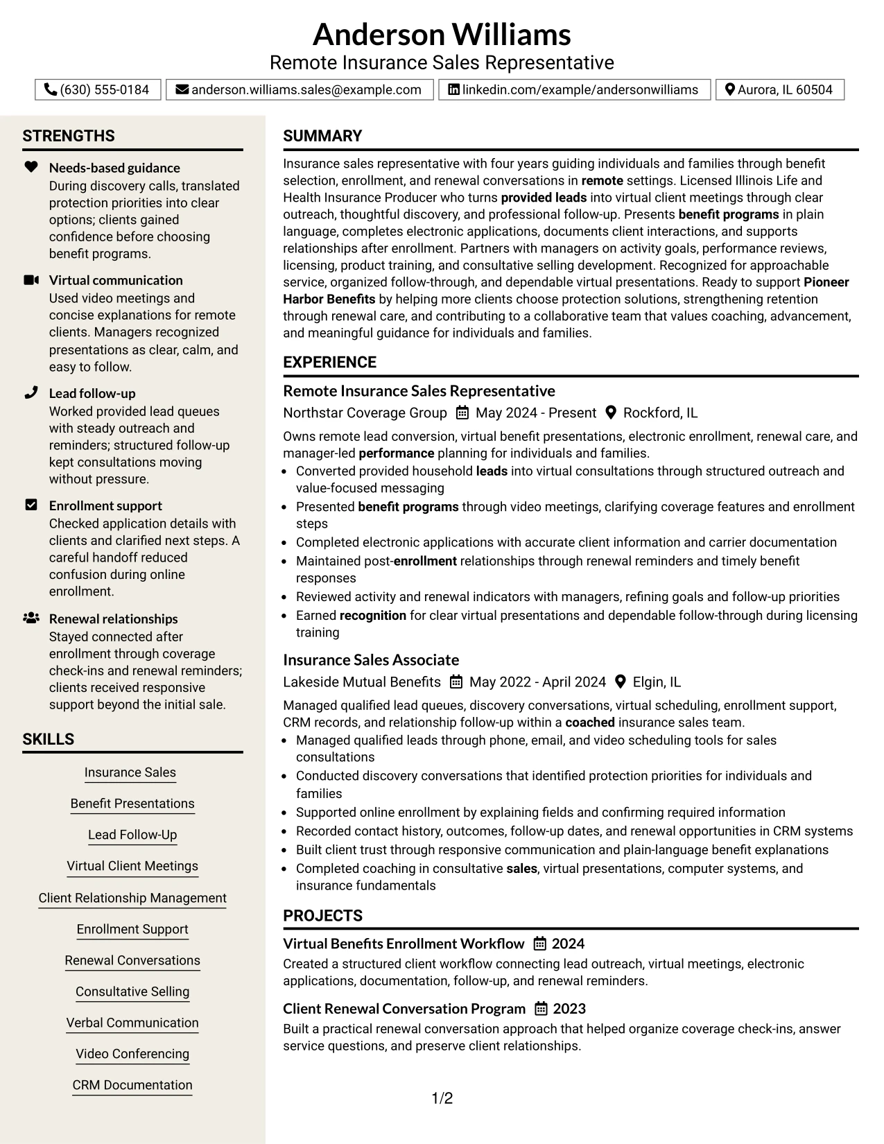
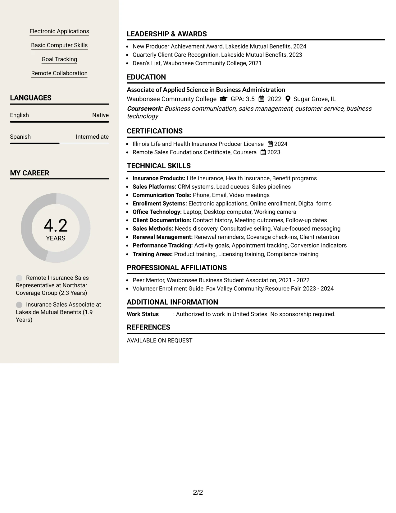
Why the Stylish Two Column Designer Format Works for a Resume
- Creates a strong visual map for summary, experience, and supporting sections.
- Keeps action-led bullets in the main reading area where evidence receives attention.
- Uses the sidebar for concise keywords, licenses, education, and tools.
- Makes projects and awards easier to include without breaking the work history.
- Supports varied evidence, from client conversations to accurate documentation.
- Adds design distinction while preserving recognizable resume section order.
- Helps a reviewer scan first and read the strongest bullets in more detail.
Best For
- Resumes that need a designed presentation with a clear information map
- Candidates combining client-facing results with detailed process evidence
- Applications where skills and credentials should be visible in a compact sidebar
- Documents with enough supporting material to justify two-column organization
- Readers who scan section labels before studying experience bullets
- Resumes including projects, awards, and activities alongside employment history
- Professional applications that can use style without sacrificing text clarity
#8 Modern Icon Format Resume Example
Recruiters can follow a single vertical path while small section markers help distinguish contact details, experience, education, skills, and certifications. The Modern Icon Format keeps the content in one column, so icons serve as navigation aids rather than substitutes for searchable headings or keywords.
That approach supports a full account of lead follow-up, virtual client meetings, benefit presentations, electronic applications, and renewal conversations. Clear text bullets remain central, while the visual markers make a longer resume easier to divide into reviewable sections.
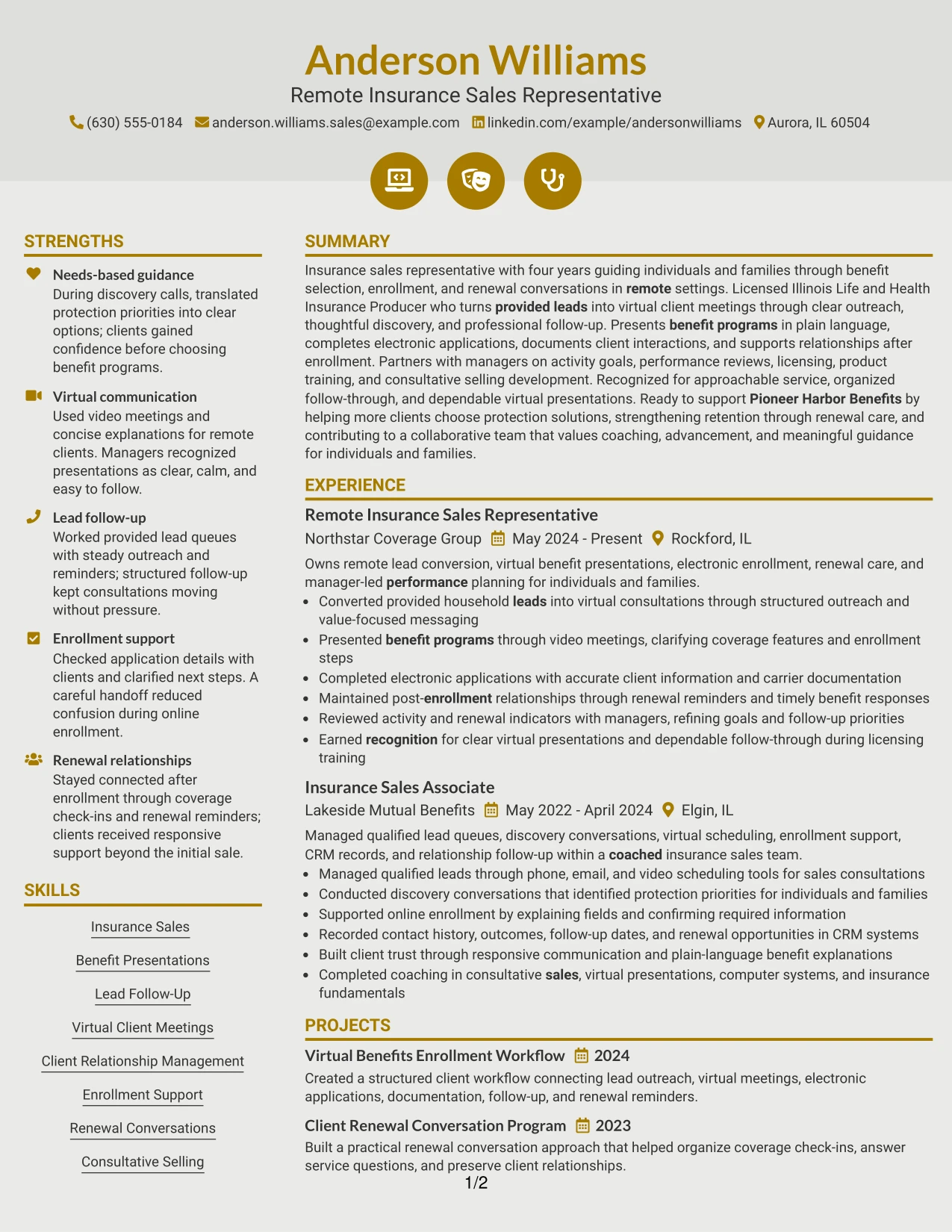
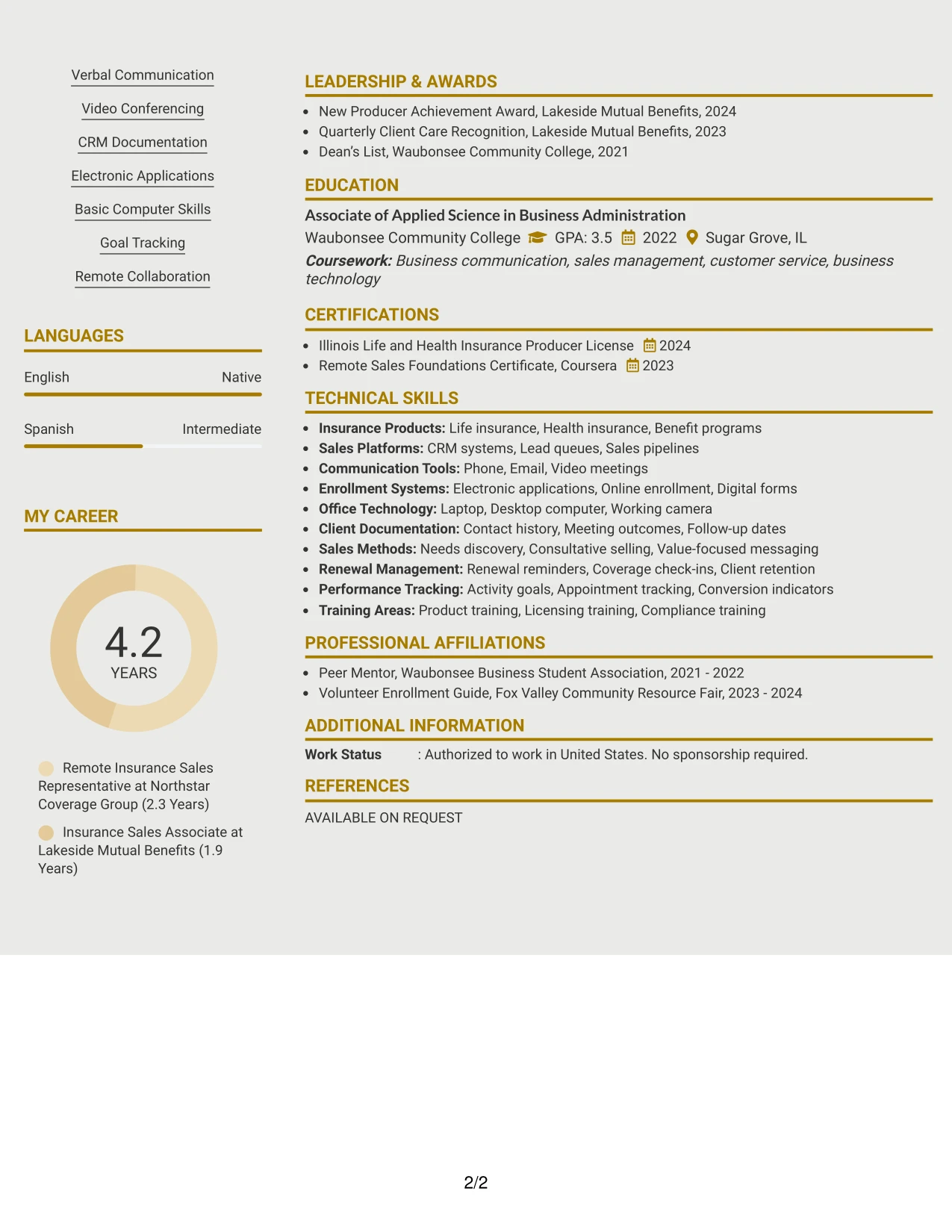
Why the Modern Icon Format Works for a Resume
- Keeps all resume content in one ATS-friendly reading sequence.
- Uses simple visual markers to separate sections without creating extra columns.
- Provides full-width space for detailed experience bullets and project descriptions.
- Makes a broad skills list easier to divide into readable groups.
- Supports clear transitions between work history, education, licenses, and awards.
- Helps readers locate virtual sales, enrollment, and CRM evidence quickly.
- Maintains a modern presentation while keeping text more important than decoration.
Best For
- Resumes with a wide range of sections that need visible separation
- Candidates who prefer one-column reading with modest visual navigation
- Applications requiring full-width bullets for client and process evidence
- Documents with several skills, tools, licenses, projects, and awards
- Readers who scan by visual section cues before reading full details
- Resumes that need modern styling without a sidebar or split reading path
- Applications where searchable text must remain more important than graphics
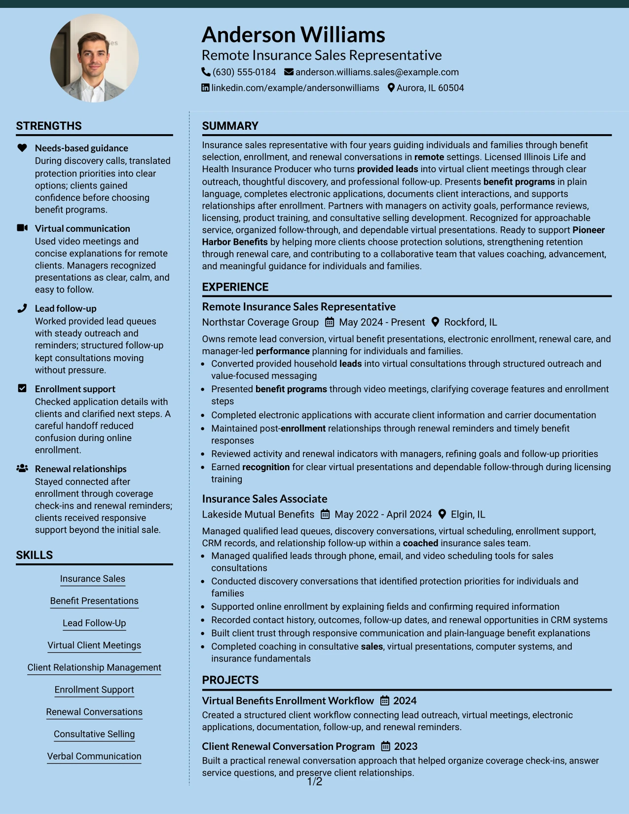
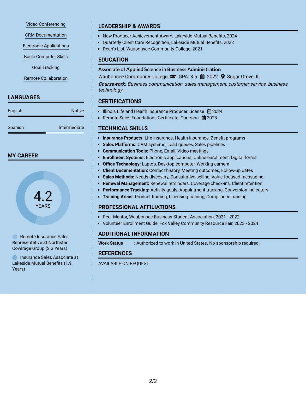
#9 Modern Full Background Two Column Format Resume Example
Provided leads, virtual client meetings, enrollment support, and renewal care form the evidence base of this resume. The Modern Full Background Two Column Format can give that evidence a strong main area while using the second column for skills, certifications, education, and supporting keywords.
The background treatment should remain controlled so text contrast and ATS-readable content stay strong. A reviewer can then connect work bullets such as completing electronic applications and documenting CRM activity with the supporting terms that match the Remote Insurance Sales Representative role.
Why the Modern Full Background Two Column Format Works for a Resume
- Gives primary experience evidence a clear area of emphasis.
- Keeps supporting keywords and credentials grouped for quick confirmation.
- Allows detailed bullets to explain client guidance, enrollment, and renewal work.
- Creates a strong visual frame without removing standard resume headings.
- Helps connect CRM documentation and electronic applications to sales responsibilities.
- Supports a targeted role while keeping education, awards, and projects accessible.
- Requires careful contrast so visual styling never reduces text readability.
Best For
- Applications where experience evidence should receive the strongest visual emphasis
- Candidates who need a clear place for supporting keywords and credentials
- Resumes combining client guidance with accurate enrollment documentation
- Documents that benefit from visual framing while retaining standard section labels
- Readers who compare primary work evidence with a compact qualifications column
- Applications with projects or awards that need visibility without crowding experience
- Roles where follow-through and relationship care should be supported by process detail
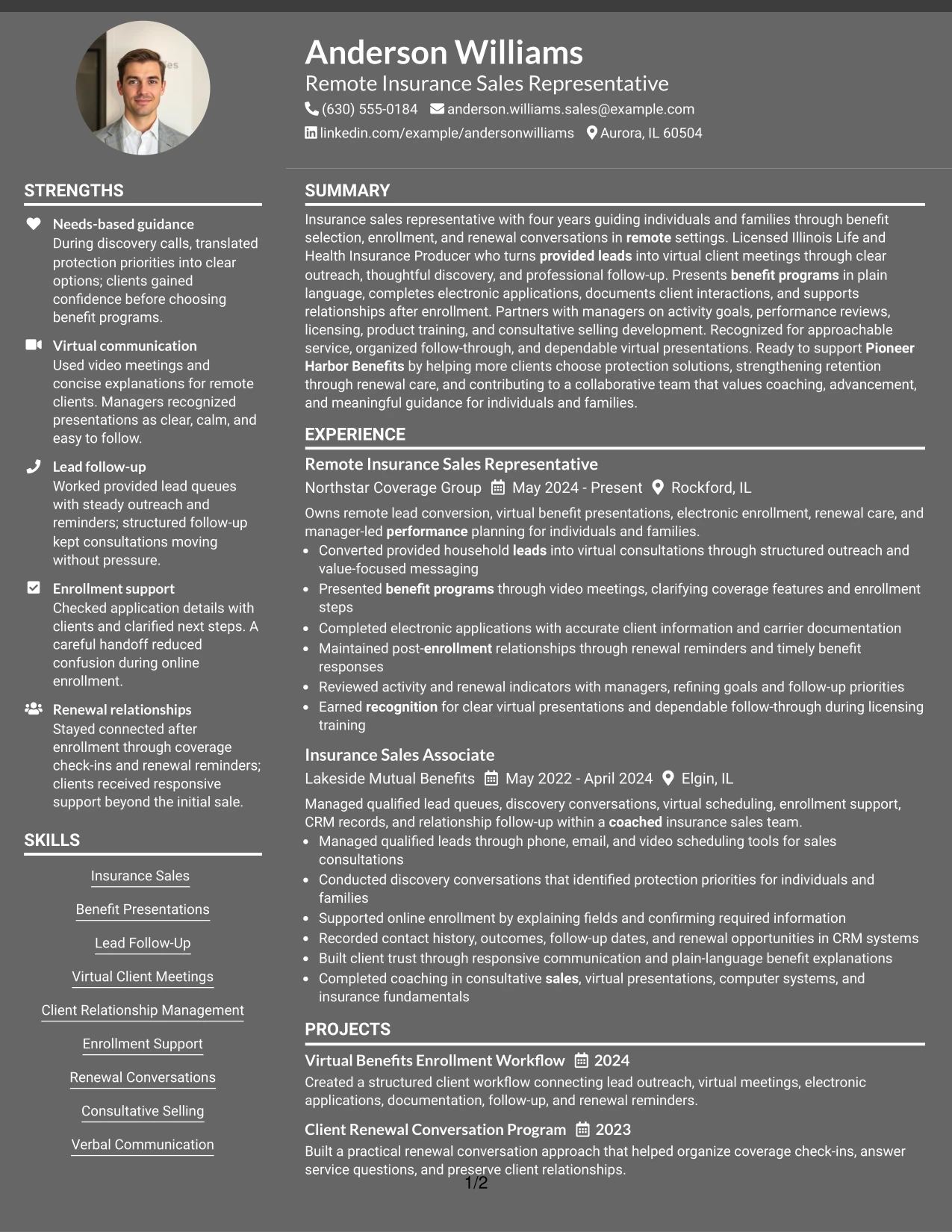
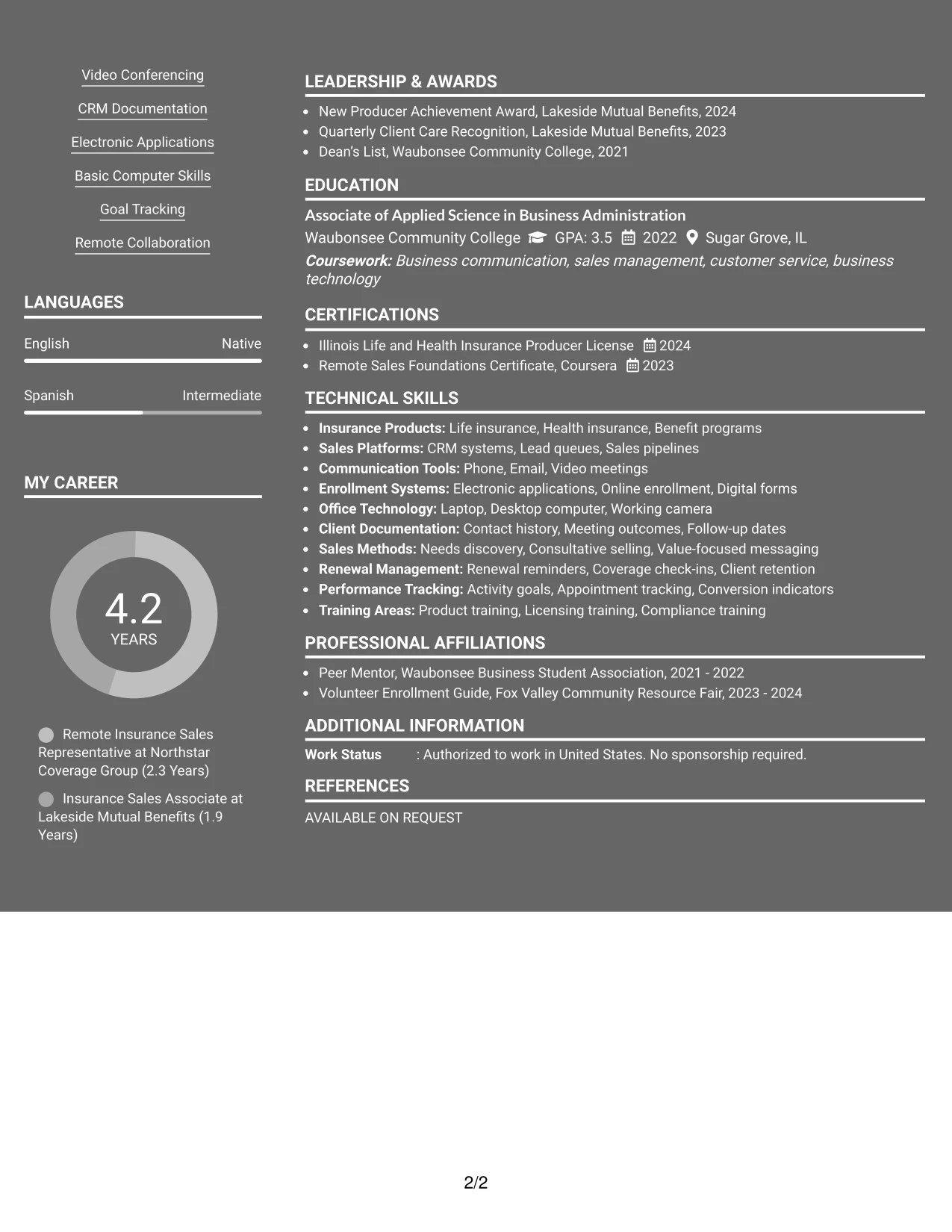
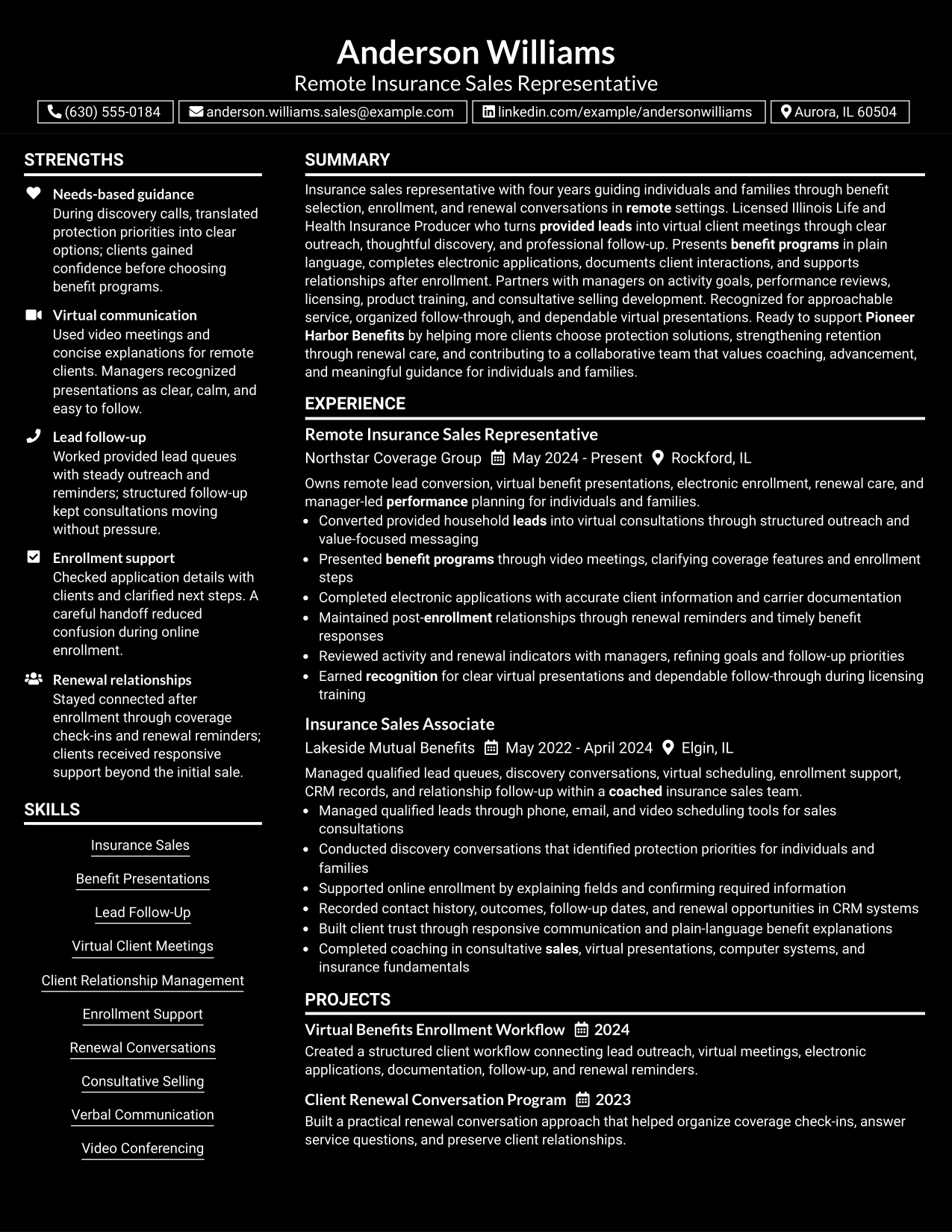
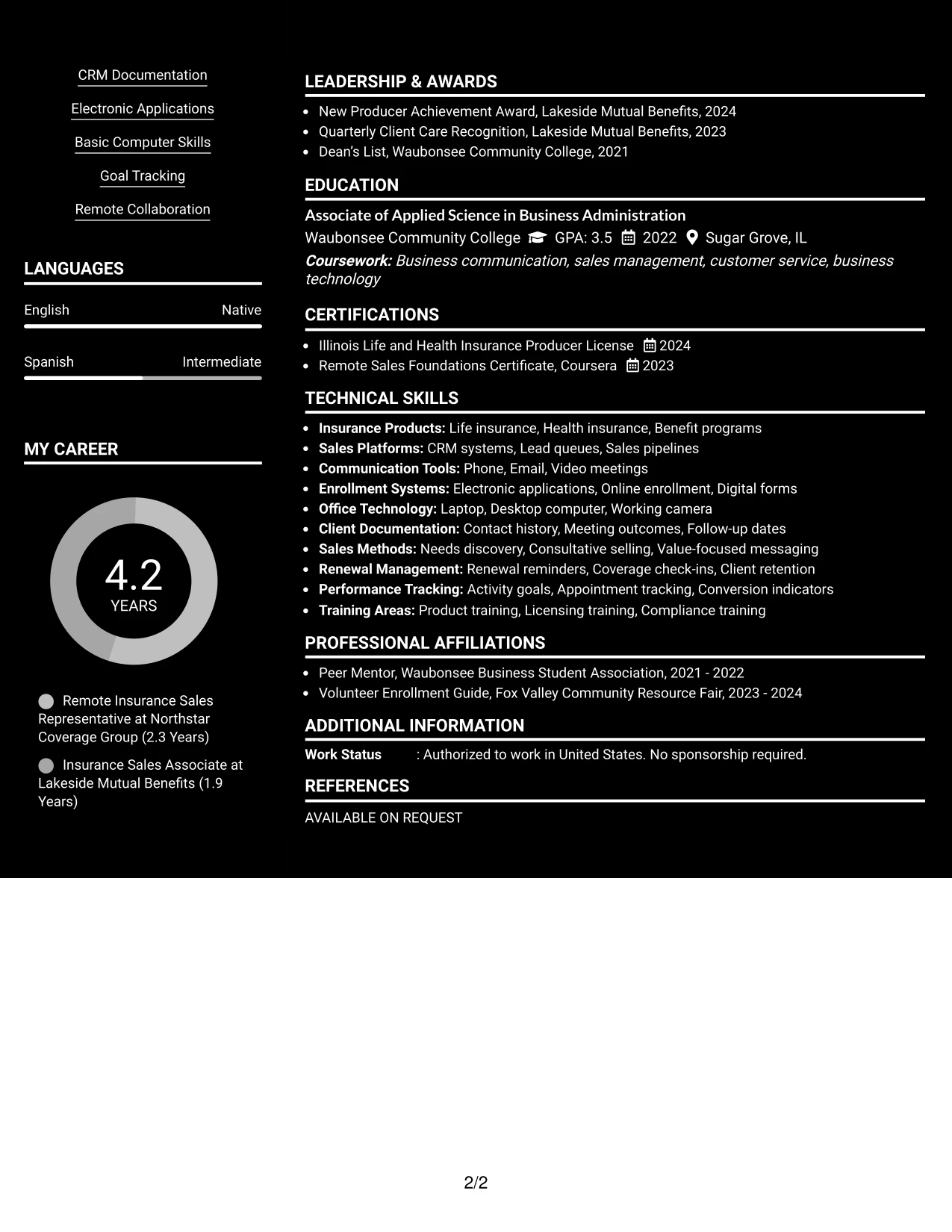
#10 Dark Mode Two Column Format Resume Example
A balanced page can give the main column to the summary and employment record while the supporting column carries skills, licenses, education, projects, and awards. The Dark Mode Two Column Format needs careful contrast, clear labels, and enough spacing so the resume remains comfortable to review.
For Anderson Williams, the layout can present remote insurance sales experience as the central record and place supporting qualifications beside it. The result keeps virtual presentations, client relationship management, enrollment support, and renewal conversations available during a quick review.
Why the Dark Mode Two Column Format Works for a Resume
- Separates detailed experience from supporting qualifications in a balanced page structure.
- Can create a distinctive presentation for a digital resume review.
- Keeps the target role and summary prominent above the two-column body.
- Provides a dedicated area for skills, licensing, education, and projects.
- Supports concise bullets that show lead follow-up and client relationship work.
- Requires readable contrast, consistent spacing, and standard text headings.
- Works best when the visual treatment remains secondary to ATS-friendly content.
Best For
- Digital applications where a distinctive but controlled presentation is appropriate
- Candidates who want detailed experience balanced against a compact qualifications area
- Resumes with enough supporting credentials to justify a two-column body
- Applications where virtual sales and relationship work should lead the review
- Readers who value strong visual separation between primary and secondary content
- Documents that can maintain clear contrast and comfortable reading at screen size
- Targeted resumes that need style while preserving standard headings and keywords
#11 Dark Mode Box Header Format Resume Example
A practical application-focused header can identify the target role, contact details, and summary before the reader reaches a single-column record of experience. The Dark Mode Box Header Format uses boxed section labels to create visual order, while the resume text explains lead follow-up, virtual meetings, enrollment, documentation, and renewal care.
Because all content follows one main reading path, the format can carry the complete work history without forcing the reviewer to move across columns. Skills, licenses, education, projects, awards, and activities can appear after the experience section with clear headings and consistent spacing.
Why the Dark Mode Box Header Format Works for a Resume
- Places the target role and summary in a clear application-focused header.
- Uses boxed labels to divide a complete single-column resume into manageable sections.
- Gives experience bullets enough width for client guidance and process details.
- Keeps licenses, education, projects, awards, and activities easy to locate.
- Supports consistent scanning from the professional summary through skills.
- Can look distinctive while preserving a familiar chronological work history.
- Needs strong contrast and restrained boxes so design does not obscure resume text.
Best For
- Applications needing a clear target-role header before detailed evidence
- Candidates who prefer a single reading path with visible section boundaries
- Resumes with substantial experience bullets and several supporting sections
- Digital documents where boxed labels improve screen scanning
- Readers who want the full work history reviewed before skills and credentials
- Applications combining sales, enrollment, documentation, and renewal responsibilities
- Documents that can support a dark visual treatment without reducing text clarity
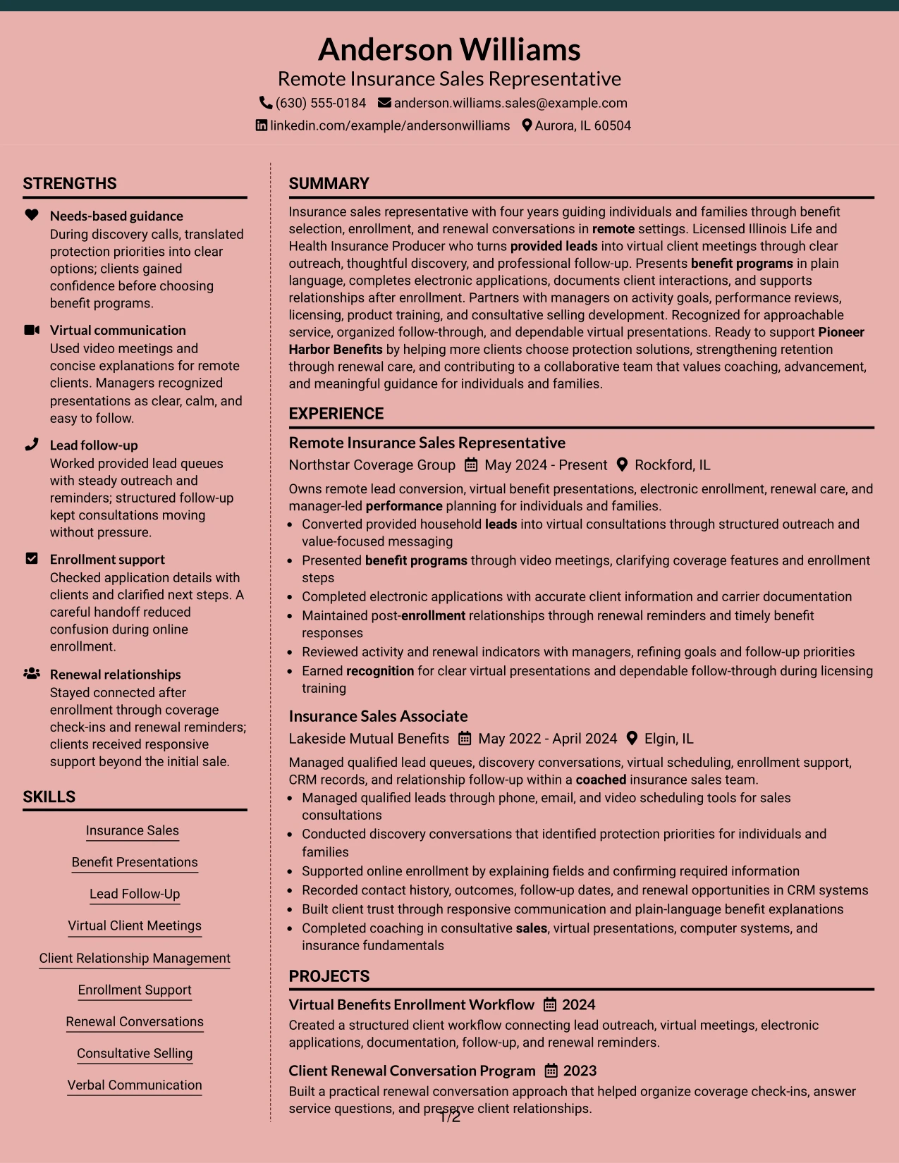
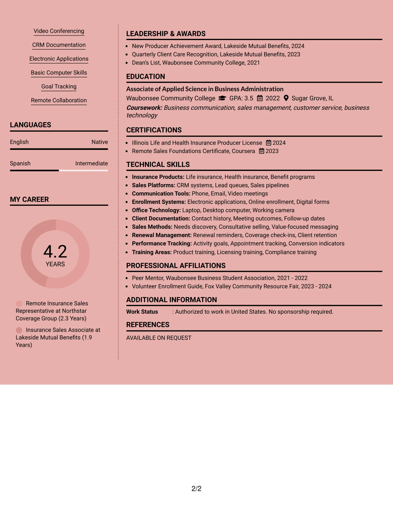
#12 Resume Example: Elegant Full Background Two Column Format
A restrained visual hierarchy gives this resume a polished, professional impression while keeping the content easy to review. The two-column structure separates core skills and credentials from experience, projects, and measurable work evidence.
For a Remote Insurance Sales Representative resume, the format can place the Illinois Life and Health Insurance Producer License, benefit presentations, CRM documentation, and virtual client meetings in clear supporting areas. The main column can then show lead conversion, electronic enrollment, renewal care, and manager-reviewed activity goals in scannable bullets.
#12 Why the Elegant Full Background Two Column Format Works for a Resume
- The two-column hierarchy lets recruiters find skills and experience without reading every line.
- A focused header gives the target role clear placement near the top of the resume.
- Separate areas can organize certifications, education, and technical tools without crowding the work history.
- Experience bullets can show provided-lead conversion, virtual presentations, and enrollment support as direct evidence.
- The format supports ATS-friendly wording when standard section labels and plain text keywords are used.
- Projects such as Virtual Benefits Enrollment Workflow can add useful proof beyond employment history.
- A balanced page helps present remote collaboration, renewal conversations, and CRM documentation without overloading one section.
#12 Best For
- Resumes that need a polished two-column presentation without sacrificing clear section order
- Candidates who want skills, certifications, and tools visible beside detailed experience evidence
- Applications where recruiters need to scan virtual meetings, enrollment support, and renewal work quickly
- Professional resumes that combine employment history with relevant projects and awards
- Documents that benefit from a strong top-level role alignment and a calm visual hierarchy
- Remote applications that need readable keywords for ATS review and human screening
- Candidates presenting several related evidence types, including client service, sales activity, and compliance training
#13 Resume Example: Creative Two Tone Format
The Creative Two Tone Format uses one clear content path, with color contrast helping readers distinguish headings from supporting details. Its single-column flow keeps the professional summary, experience, education, projects, certifications, and skills in a predictable order.
That structure works well for a resume that must connect provided leads to virtual consultations, benefit presentations, electronic applications, and renewal follow-up. Standard headings and direct bullets preserve ATS readability while the two-tone treatment gives important sections visual separation.
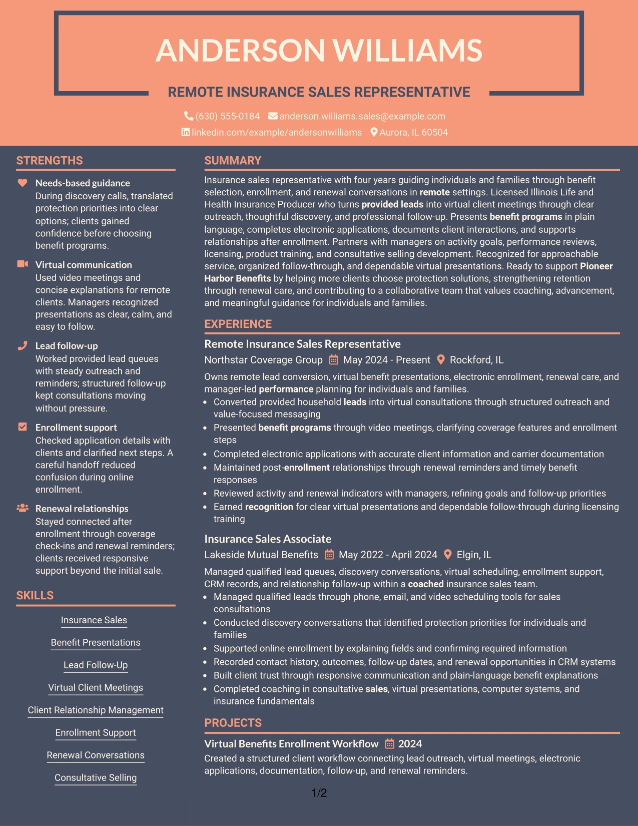
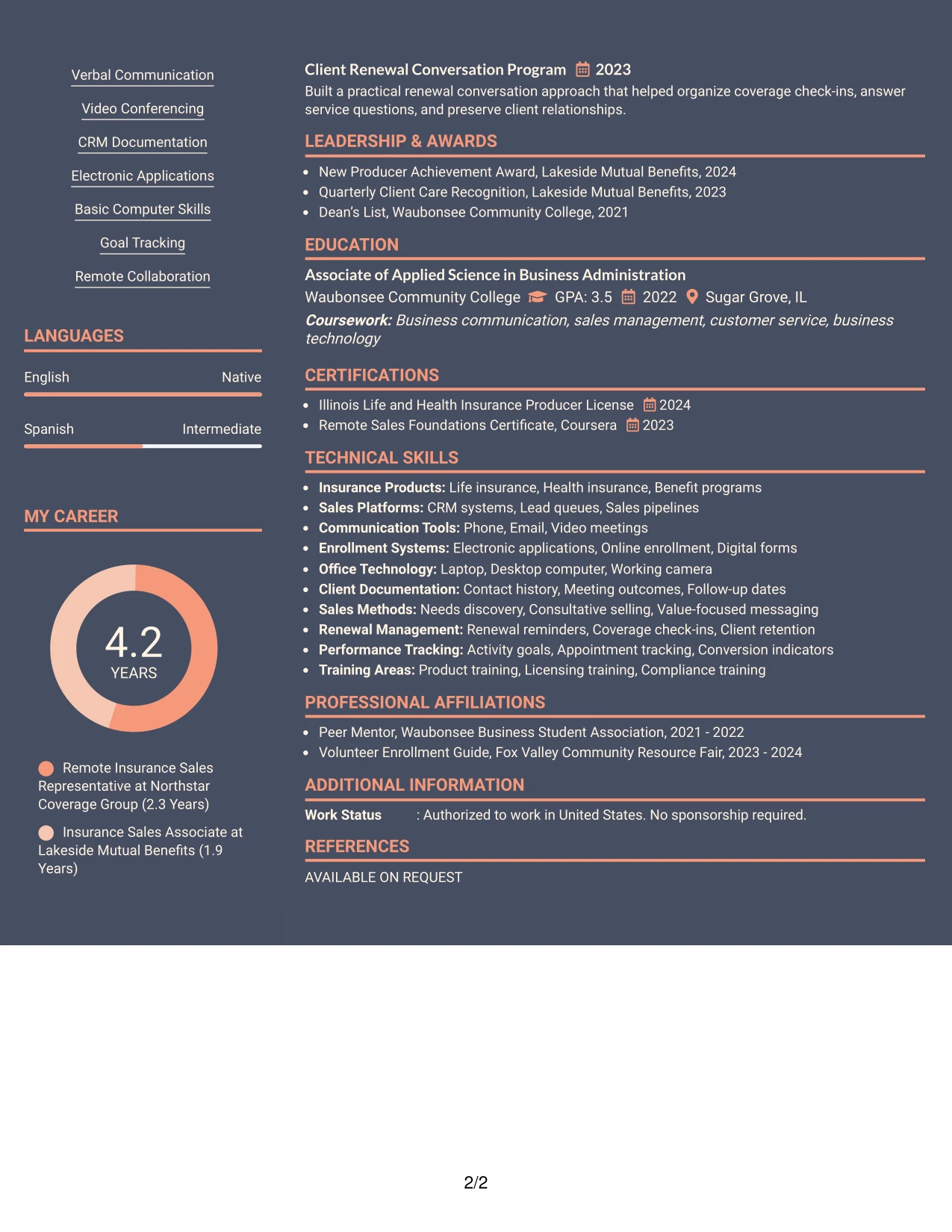
#13 Why the Creative Two Tone Format Works for a Resume
- A single reading path makes the professional summary and work history easy to follow.
- Two-tone section labels help recruiters locate skills, certifications, and education during a quick review.
- The layout gives each employment entry room for action-focused bullets.
- Clear ordering supports keywords such as benefit presentations, consultative selling, and client relationship management.
- The format can show projects without interrupting the main experience narrative.
- Simple section boundaries help ATS systems interpret standard resume content.
- The design adds visual distinction while keeping evidence, dates, and employers easy to compare.
#13 Best For
- One-page resumes that need a clear top-to-bottom review path
- Applications where ATS-readable headings matter as much as visual distinction
- Candidates combining two related insurance roles with projects, awards, and certifications
- Resumes that rely on concise bullets to show outreach, enrollment, and follow-through
- Readers who need to compare employers, dates, and responsibilities quickly
- Documents that need visible separation between core skills and detailed work evidence
- Professional applications seeking a creative touch without a complex navigation pattern
#14 Resume Example: Minimal Header Format
Recruiters can move from the centered header to the summary, recent experience, skills, and supporting credentials in a direct sequence. The simple navigation keeps the target role and contact details visible before the reader reaches the evidence.
This format gives the resume enough room to explain lead management, discovery conversations, virtual client meetings, enrollment documentation, and renewal support. Education, licenses, projects, and awards can follow in compact sections so the document remains focused without omitting useful qualifications.
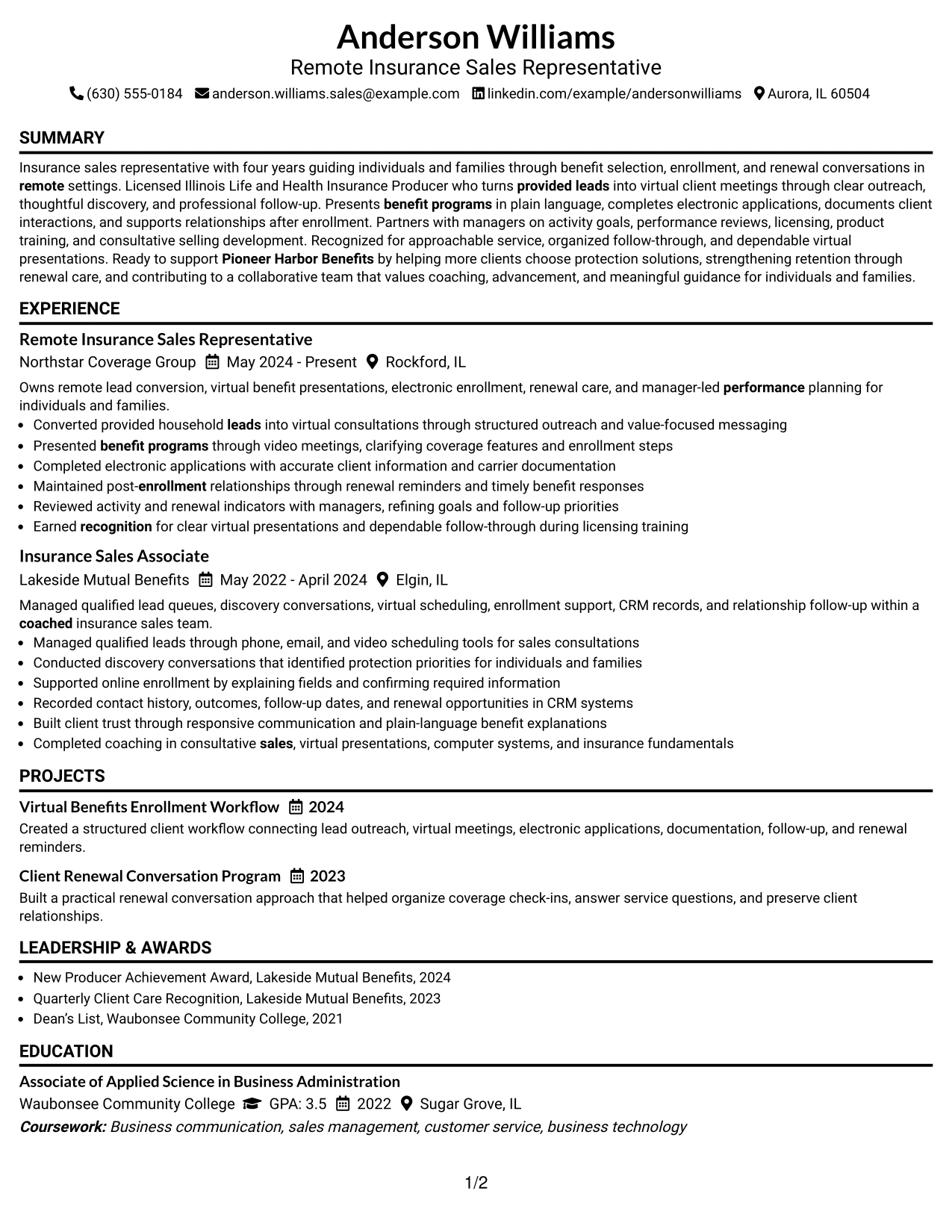
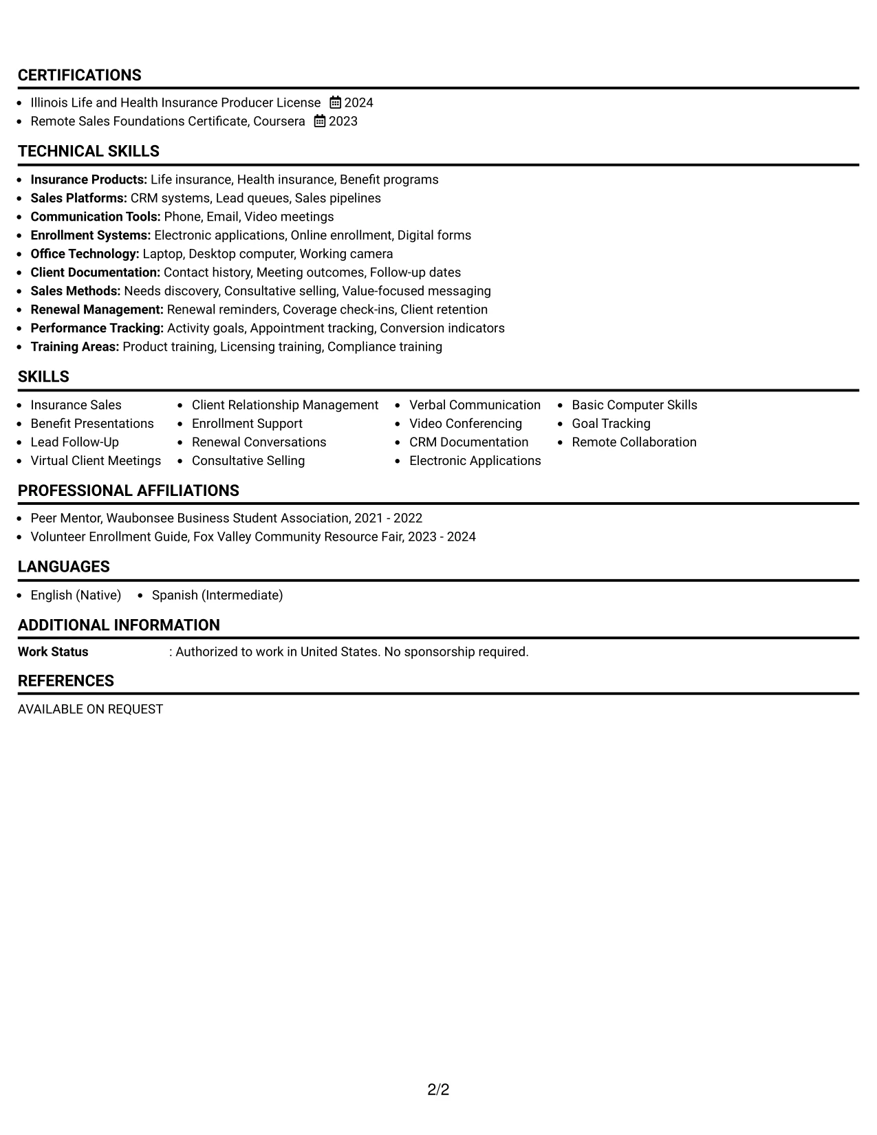
#14 Why the Minimal Header Format Works for a Resume
- A clean header establishes the role target before the first experience section.
- The single-column sequence supports fast review on screens and printed pages.
- Recent experience can receive the most space because it appears early in the document.
- Skills and tools remain easy to locate through concise, familiar section labels.
- Projects and awards can be included without competing with the employment record.
- The format supports direct bullets that connect actions to client and sales outcomes.
- Simple spacing helps preserve readable ATS text and consistent keyword placement.
#14 Best For
- Resumes with a focused employment history and a clear target role
- Screen-based review where a direct vertical sequence reduces reader effort
- Candidates who need room for detailed bullets without adding side-column navigation
- Applications that place recent remote sales work before education and supporting sections
- Documents combining core skills, projects, awards, and licenses in a compact order
- ATS submissions that benefit from conventional headings and predictable content flow
- Readers who prefer a quiet presentation with emphasis on qualifications rather than decoration
#15 Resume Example: Plain One Column with Shaded Labels
The strongest evidence appears first in the work history: lead conversion, virtual benefit presentations, accurate electronic applications, and renewal follow-up. Those bullets give recruiters concrete examples of how the resume supports the target role.
Shaded labels then divide the professional summary, experience, projects, education, certifications, awards, and skills into recognizable blocks. The plain one-column structure keeps the evidence readable and gives role-specific keywords a consistent place without relying on decorative elements.
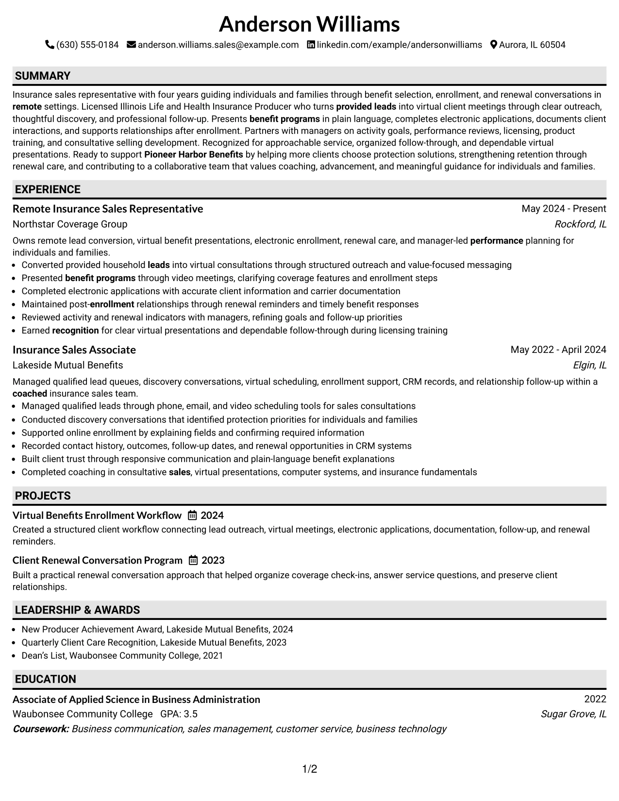
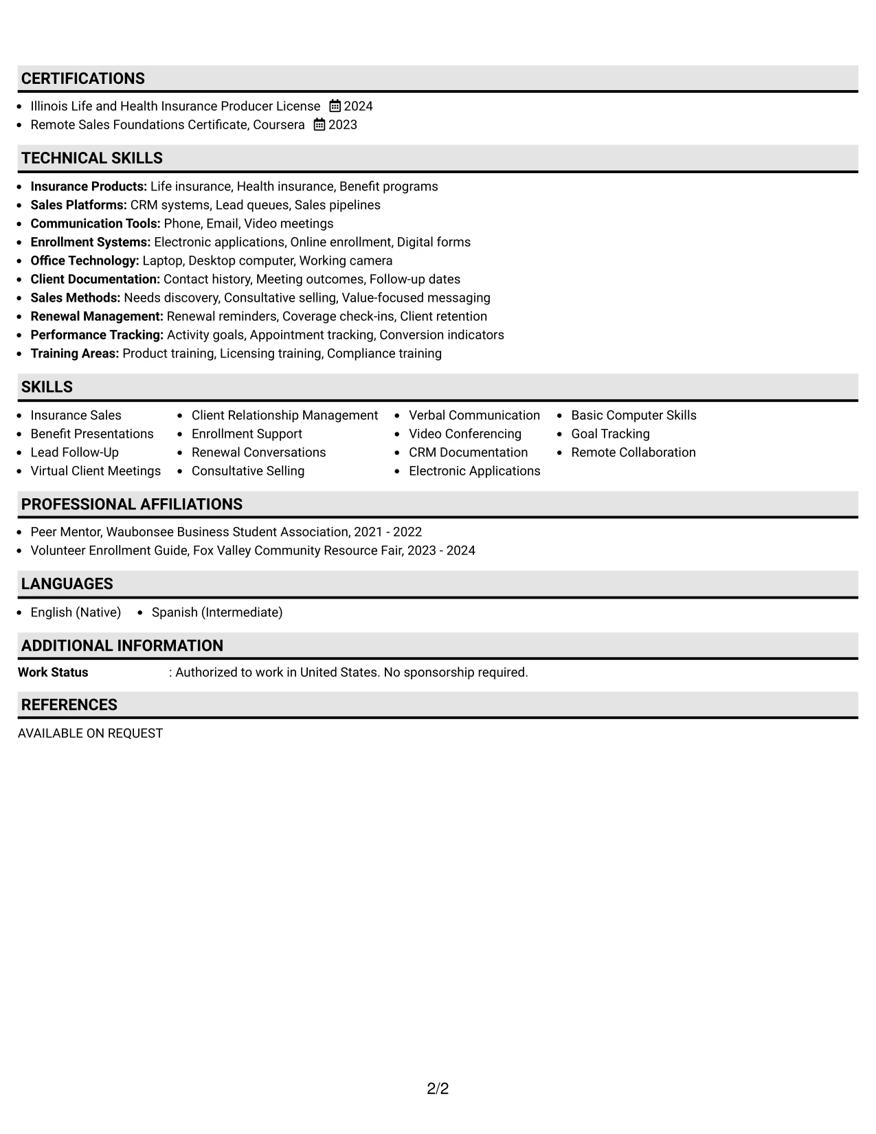
#15 Why the Plain One Column with Shaded Labels Works for a Resume
- Action-led bullets put sales and client-service evidence ahead of less relevant detail.
- Shaded labels make each resume section easy to identify during a fast scan.
- The one-column design keeps dates, employers, roles, and responsibilities in one review path.
- Skills such as lead follow-up, renewal conversations, and CRM documentation can be matched to experience bullets.
- Education and licensing remain visible as separate qualification evidence.
- Project entries can reinforce process knowledge in virtual enrollment and renewal care.
- Plain formatting supports reliable ATS parsing and straightforward recruiter comparison.
#15 Best For
- Resumes where documented actions and responsibilities should lead the review
- Applications that need strong separation between evidence types without extra columns
- Candidates showing licenses, projects, awards, and work history in a simple sequence
- ATS-focused submissions using standard labels and direct keyword placement
- Readers comparing sales activity, enrollment work, and relationship follow-up across roles
- Documents that favor factual presentation over decorative design
- Candidates who want shaded section cues while keeping the page easy to print and scan
#16 Resume Example: Text/Fang Style
Content is balanced through measured spacing, compact sections, and a steady text rhythm. That balance lets the resume include a professional summary, two insurance sales positions, projects, education, licenses, awards, activities, and skills without making any one area feel crowded.
For a practical remote application, the format can give detailed bullets to virtual presentations, needs discovery, enrollment support, CRM records, and renewal conversations. Supporting sections remain concise, allowing the strongest evidence to carry the review while preserving relevant qualifications.
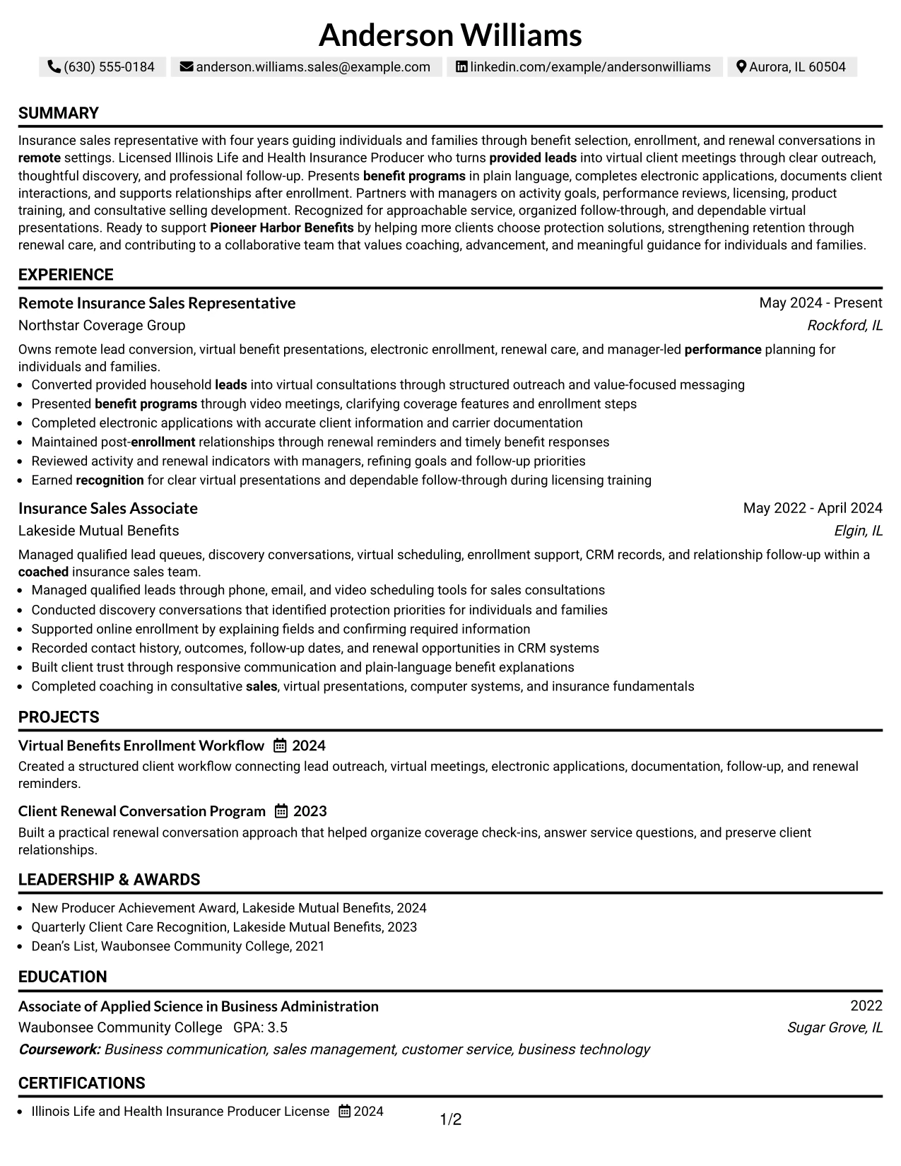
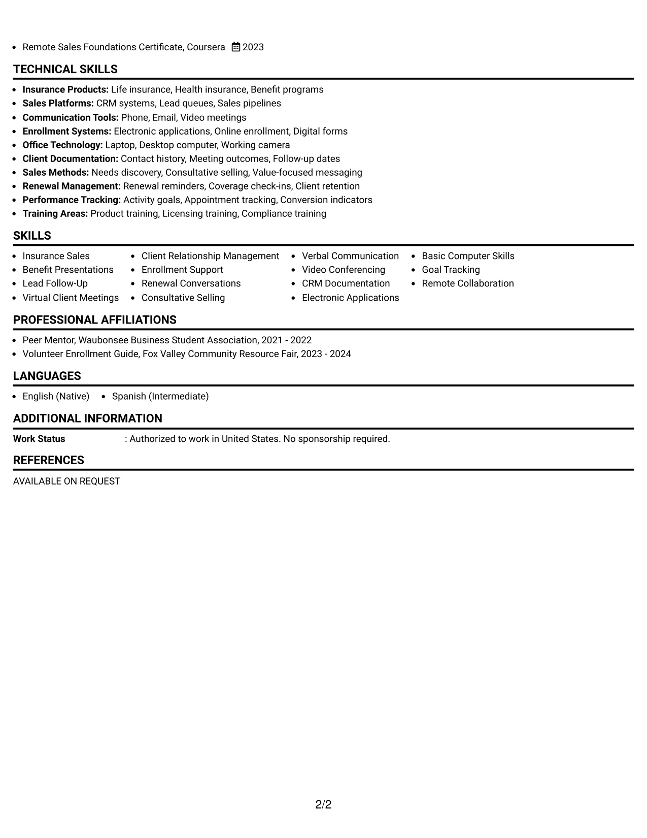
#16 Why the Text/Fang Style Works for a Resume
- Balanced spacing helps a longer qualification set remain readable.
- The format supports detailed experience bullets without losing a clear section order.
- Projects can show repeatable workflows that complement employment evidence.
- Licenses and certificates can be separated from education for quick verification.
- Skills and tools can be grouped to reinforce both ATS terms and human review.
- Compact supporting sections leave more room for client-facing accomplishments.
- The structure fits applications that require both sales evidence and careful documentation detail.
#16 Best For
- Applications that need several evidence categories but still require disciplined page balance
- Candidates with related roles, projects, credentials, activities, and awards to present
- Remote-work resumes where communication, documentation, and follow-up all need space
- Readers reviewing detailed responsibilities alongside compact supporting qualifications
- Documents that benefit from text clarity rather than strong visual effects
- Applications requiring a complete skills and tools section without pushing experience too far down
- Candidates who want a measured layout for both client-facing and administrative evidence
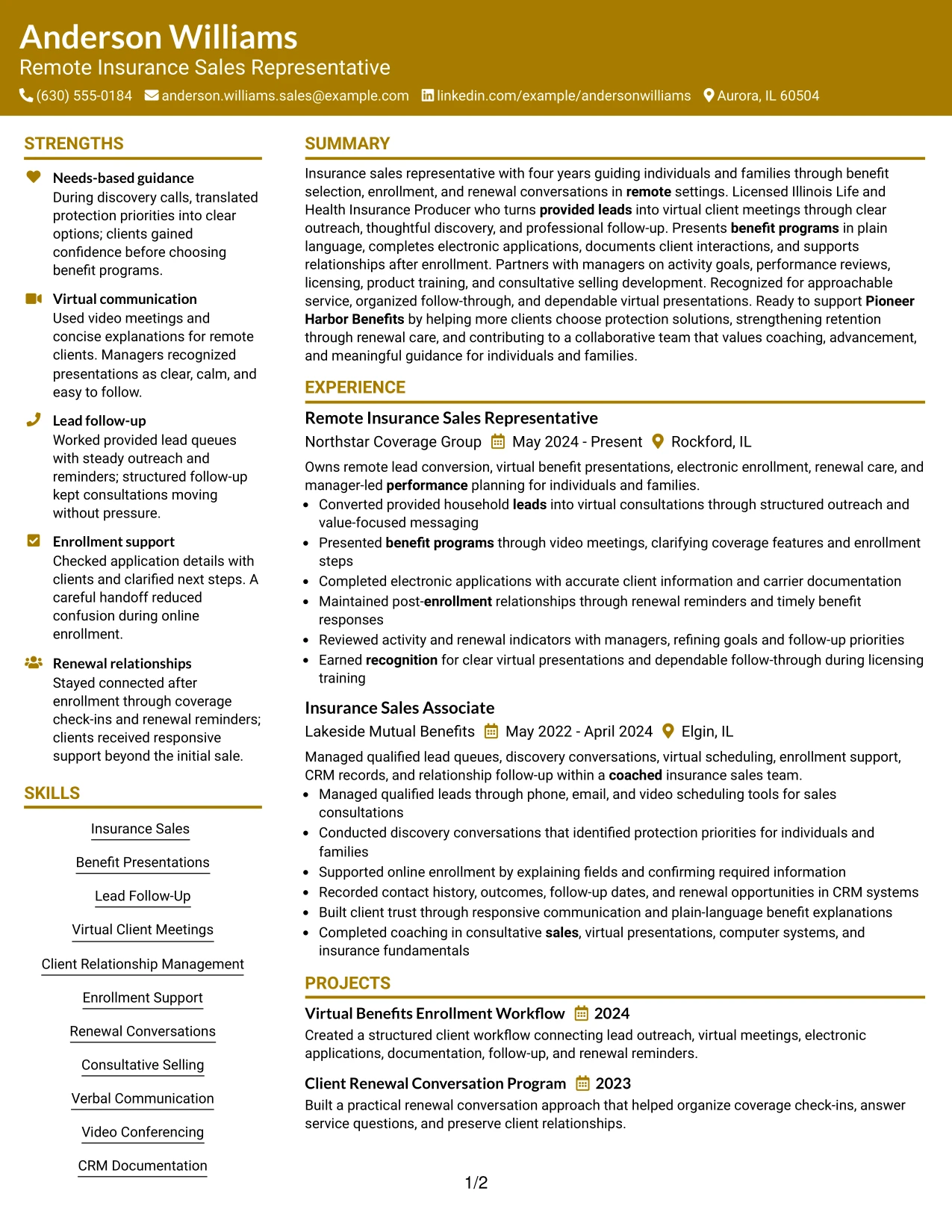
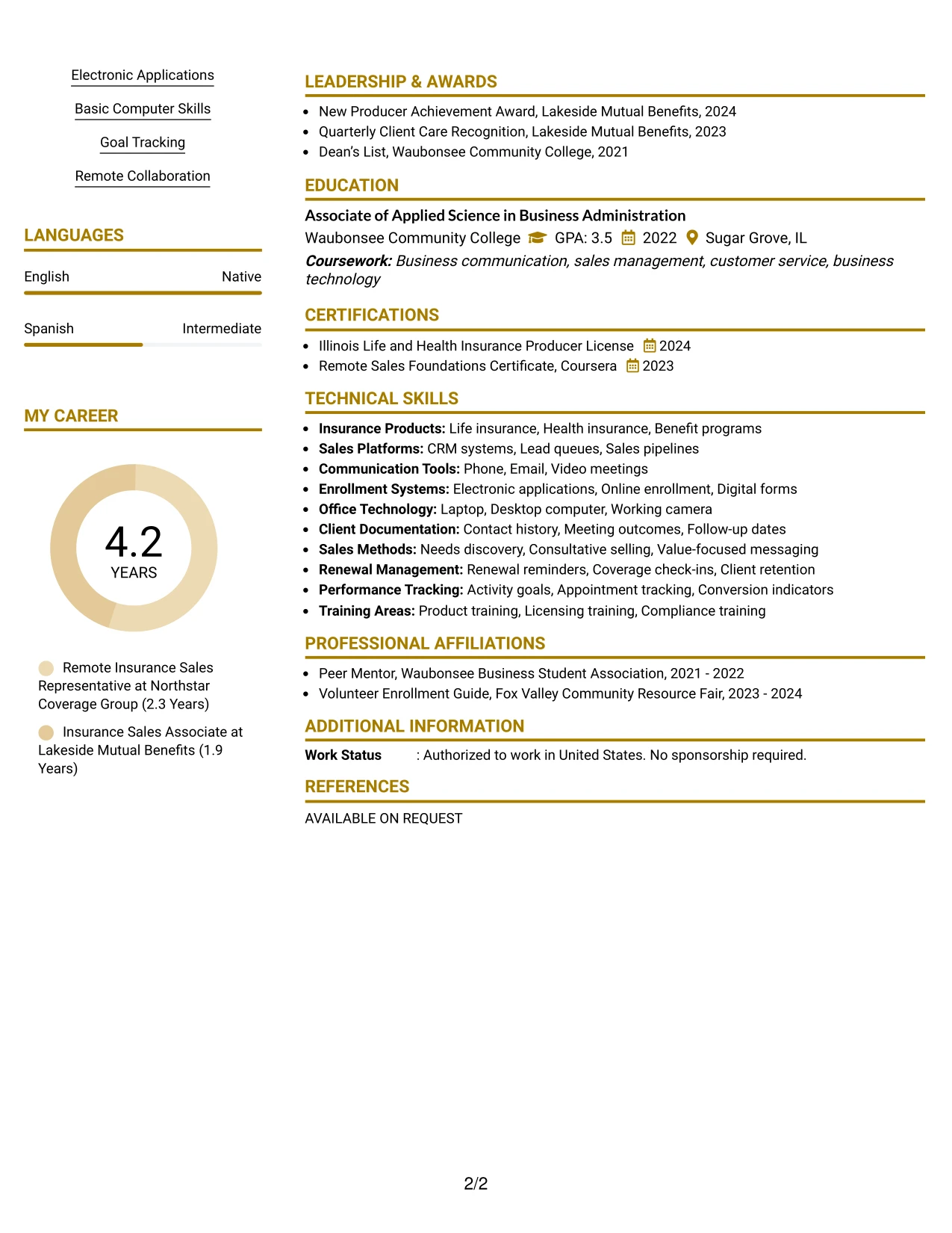
#17 Resume Example: Bold Color Header Professional Format
A practical application review benefits from a strong header that identifies the target role, contact details, and professional summary immediately. The rest of the page can stay orderly so the visual emphasis does not compete with work history or ATS-readable content.
The bold color header creates a clear entry point for a resume focused on provided leads, virtual client meetings, benefit programs, enrollment, and client relationships. Experience bullets, certifications, projects, and skills then provide the detailed proof behind the initial role alignment.
#17 Why the Bold Color Header Professional Format Works for a Resume
- A distinct header helps the target role stand out during the first review.
- Professional color emphasis can separate identity details from the evidence below.
- The single-column structure keeps experience and skills in a familiar order.
- Bullets can connect provided-lead outreach with scheduled virtual consultations.
- A visible skills section supports searches for CRM documentation, video conferencing, and consultative selling.
- Certifications and projects add proof without distracting from the employment record.
- The format can present a confident visual entry while preserving clear resume mechanics.
#17 Best For
- Applications where the target role should be visible at the first point of review
- Candidates wanting one controlled visual accent with conventional resume organization
- Remote sales resumes that need to connect outreach, meetings, enrollment, and follow-up
- Documents where the header must carry strong identification while the body carries evidence
- ATS submissions that require standard text sections beneath a distinctive top area
- Readers who value clear role alignment before reviewing detailed employment bullets
- Candidates balancing professional presentation with a practical, evidence-led structure
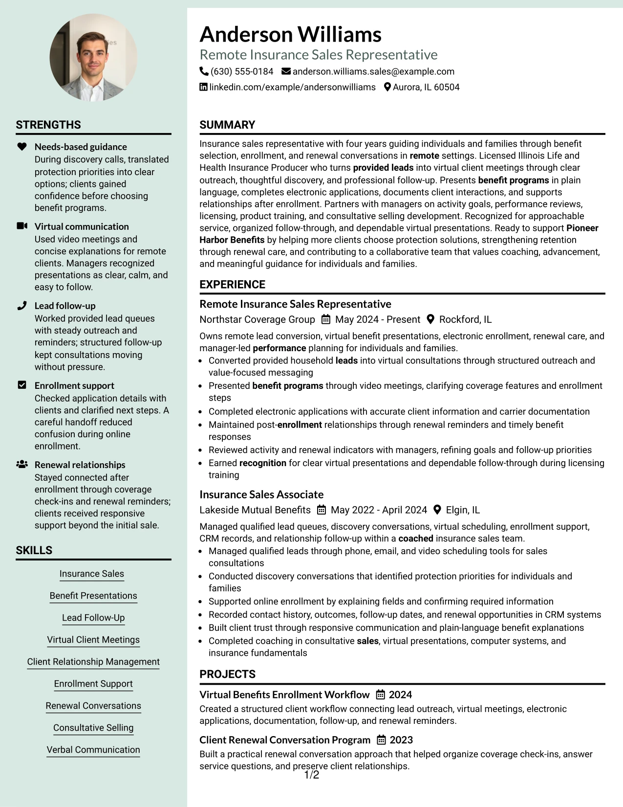
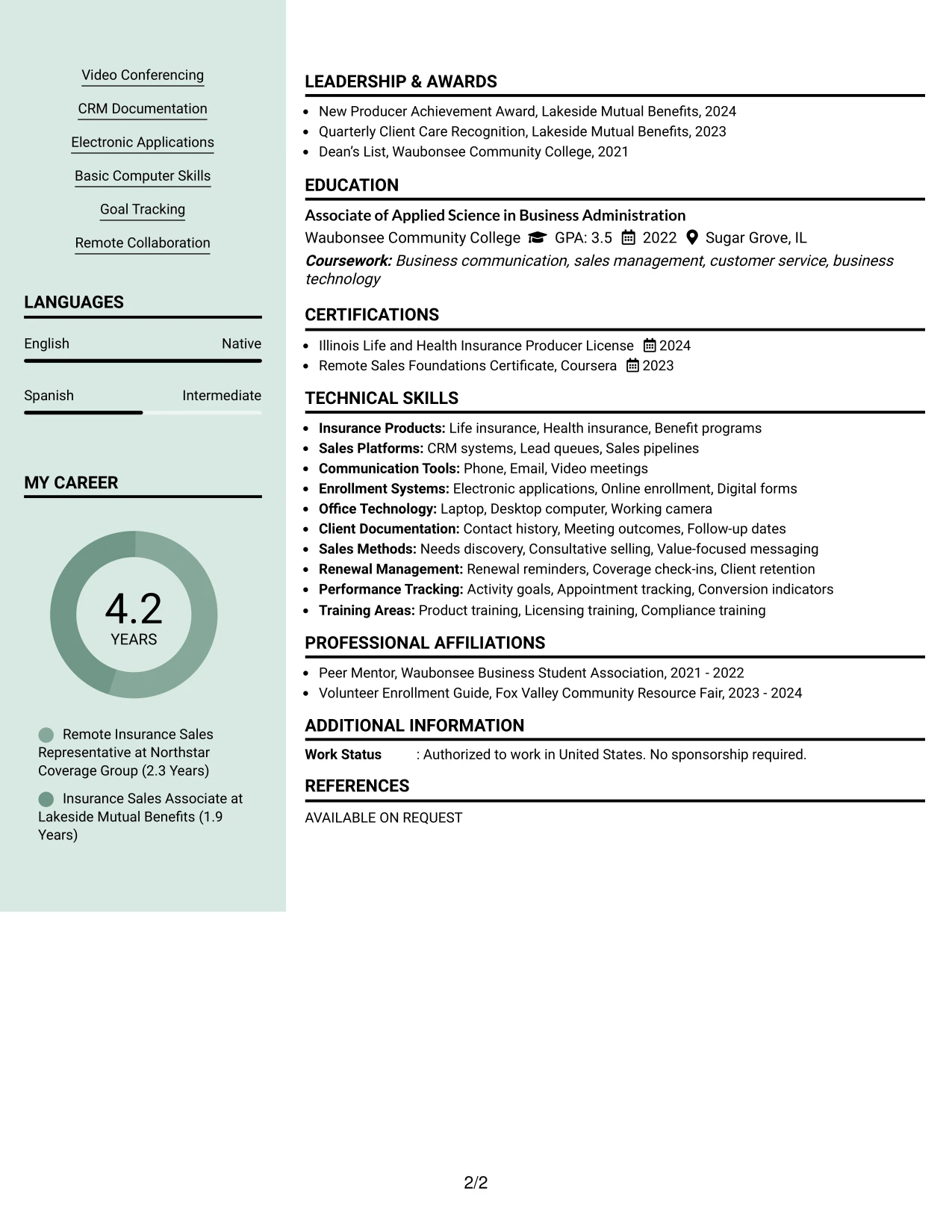
#18 Resume Example: Photo Header Color Sidebar Format
A restrained color sidebar and photo header create a recognizable visual identity while the main area carries the resume evidence. The sidebar can keep contact details, skills, and credentials together, allowing the experience section to remain focused on results and responsibilities.
For this remote sales application, the main content can explain virtual benefit presentations, electronic applications, renewal reminders, and manager-reviewed activity indicators. The photo should remain professional and secondary to the license, sales evidence, client relationship work, and ATS-relevant terms.
#18 Why the Photo Header Color Sidebar Format Works for a Resume
- The sidebar gives contact details and supporting qualifications a consistent home.
- The main content area preserves room for detailed experience bullets.
- A professional photo can support a personal-brand presentation when the application context allows it.
- Color separation helps readers distinguish skills and credentials from employment evidence.
- The format can show virtual communication and client relationship strengths without burying work history.
- Projects and certifications can fit in the sidebar or supporting area when kept concise.
- Standard text headings remain important for ATS review despite the visual treatment.
#18 Best For
- Applications where a professional personal presentation is appropriate and a photo is accepted
- Candidates who want supporting skills and credentials separated from detailed experience
- Resumes needing a clear visual distinction between contact information and work evidence
- Client-facing applications where virtual communication and approachable service are relevant
- Documents that combine role history with projects, licenses, awards, and technical tools
- Readers who benefit from a sidebar for quick qualification checks
- Candidates prepared to keep the photo professional while giving primary space to evidence
#19 Resume Example: Top Left Header Color Accent Format
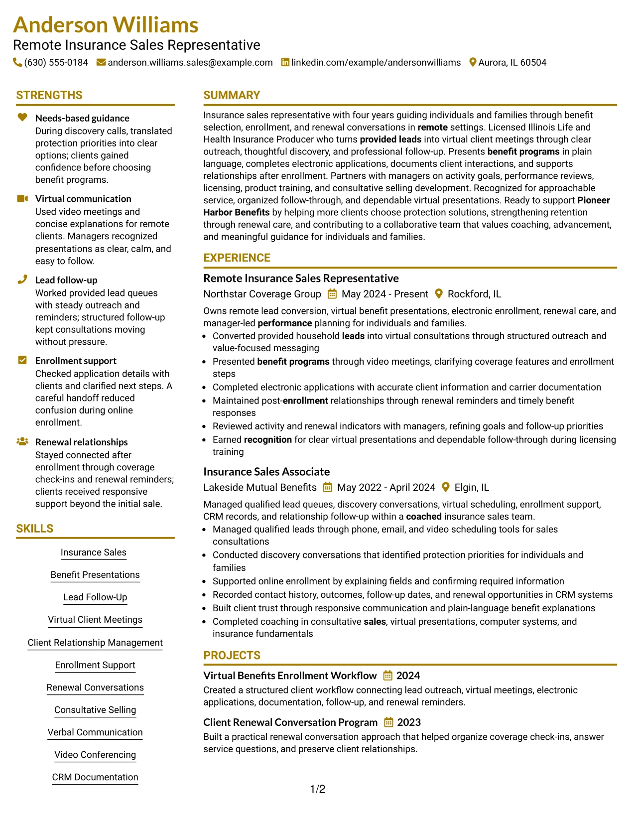
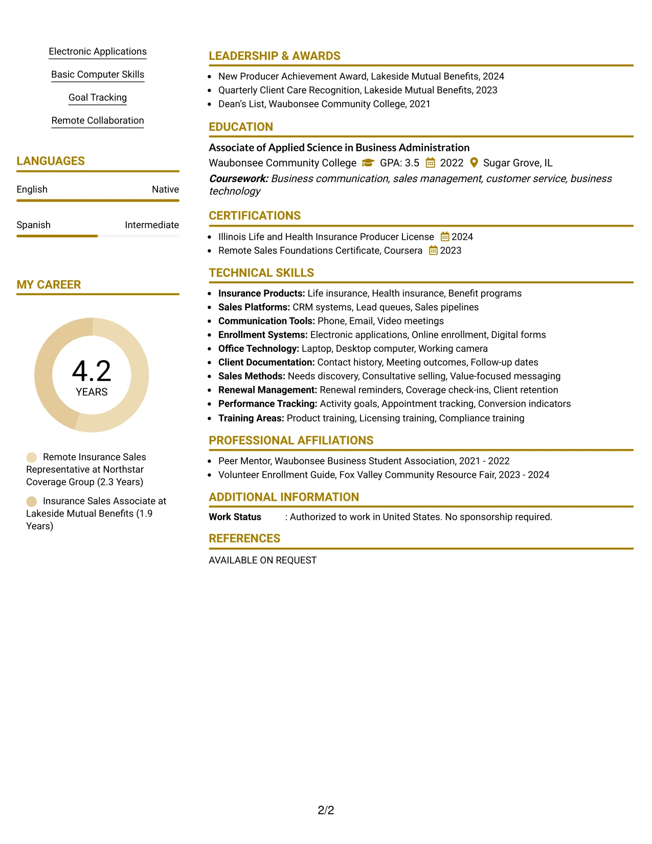
The Top Left Header Color Accent Format establishes the resume identity at the upper left, then moves through the summary, experience, projects, education, credentials, and skills in a familiar sequence. The accent gives section boundaries enough contrast without changing how recruiters scan the document.
That straightforward structure suits evidence such as qualified-lead management, discovery conversations, online enrollment support, CRM records, and post-enrollment follow-up. Clear bullets and standard keywords keep the resume useful for both ATS screening and a quick human review.
#19 Why the Top Left Header Color Accent Format Works for a Resume
- The upper-left starting point matches common reading behavior and supports quick orientation.
- A restrained accent separates sections without creating a complex navigation system.
- The single-column flow gives experience bullets a consistent position.
- Skills and certifications can be found quickly after the main evidence.
- Standard keywords remain connected to the bullets that demonstrate them.
- Projects can add process evidence while staying within the same review path.
- The format combines visual clarity with practical ATS-friendly organization.
#19 Best For
- Resumes that need a familiar top-left entry point for fast screening
- Applications using one-column organization with a modest visual accent
- Candidates who want skills, credentials, and projects to follow experience naturally
- ATS-sensitive submissions where section order and standard wording must remain clear
- Readers comparing duties and evidence across more than one related position
- Documents that need visual separation without a sidebar or complex page structure
- Candidates seeking a professional format that keeps the focus on documented work
#20 Resume Example: Centered Header Classic Two Column Format
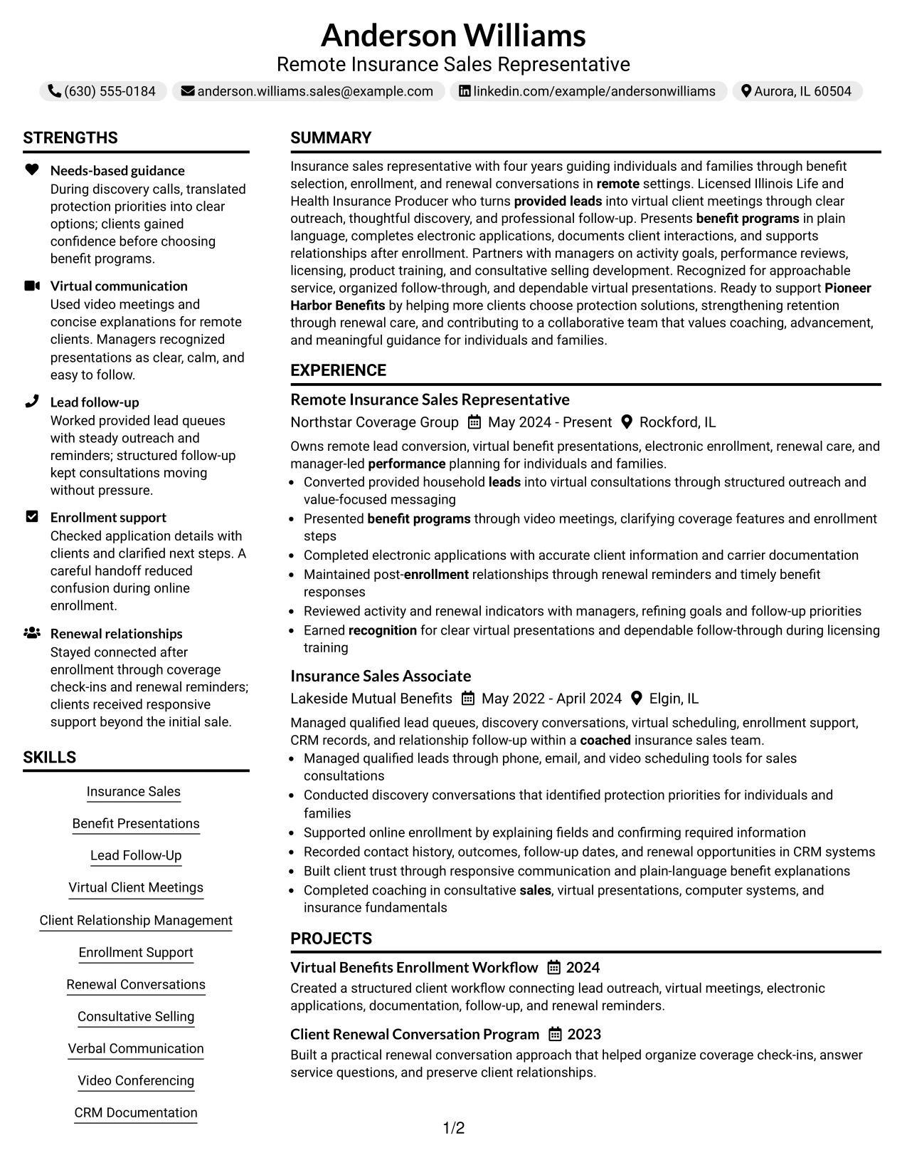
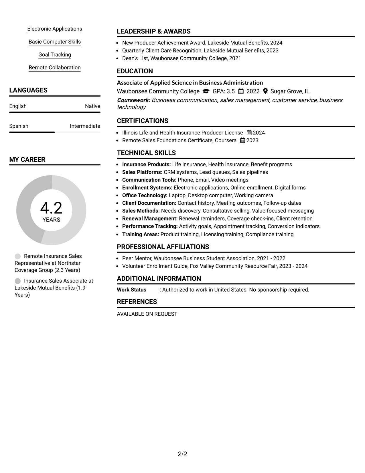
Readers can begin with the centered header, then use the two-column structure to review supporting qualifications and detailed experience in parallel. That navigation is useful when a resume must show a substantial work record while keeping skills, education, licenses, projects, and awards easy to find.
The classic presentation gives the main column room for remote insurance sales accomplishments, including virtual consultations, benefit explanations, accurate applications, renewal care, and activity reviews. A supporting column can hold skills and credentials without reducing the clarity of the achievement bullets.
#20 Why the Centered Header Classic Two Column Format Works for a Resume
- The centered header gives the document a formal, balanced starting point.
- Two columns allow detailed experience and supporting qualifications to remain visible together.
- A larger main area can carry multiple bullets for each relevant position.
- The supporting column can group skills, licenses, education, awards, and activities.
- Readers can confirm keywords without leaving the page section that contains the related evidence.
- Projects can reinforce workflow and renewal knowledge in a compact supporting block.
- The format handles a fuller resume while preserving clear visual landmarks.
#20 Best For
- Resumes with enough content to benefit from parallel experience and qualification areas
- Candidates presenting two related roles plus projects, licenses, awards, and activities
- Applications where a formal centered header supports a polished first impression
- Readers who want skills and credentials available while reviewing work history
- Documents with detailed bullets that need a wider primary column
- Remote applications combining sales, enrollment, relationship, and documentation evidence
- Candidates who need content volume without extending every section into a long single column
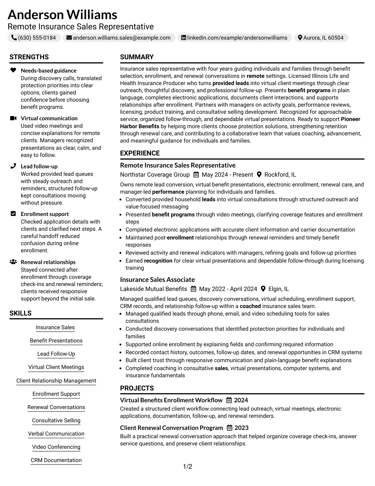
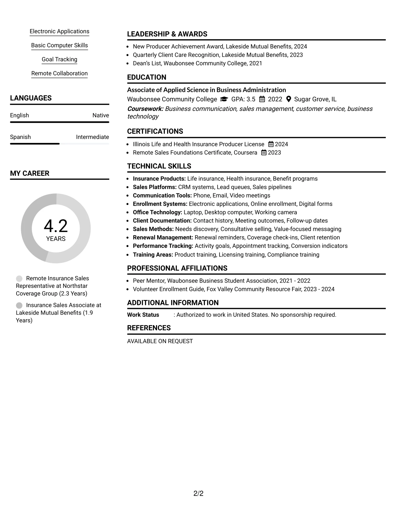
#21 Resume Example: Left Aligned Header Clean Two Column Format
The strongest evidence can lead the review through a left-aligned header and a clean two-column hierarchy. Recruiters can see the role target and summary first, then compare detailed work bullets with a compact record of skills, credentials, and supporting information.
This arrangement is effective for showing lead queues, needs-based discovery, virtual scheduling, online enrollment, CRM documentation, and renewal opportunities. The clean division keeps evidence types distinct while allowing the resume to include education, projects, recognition, and activities.
#21 Why the Left Aligned Header Clean Two Column Format Works for a Resume
- A left-aligned header places the target role in a familiar review position.
- The main column can prioritize action and service evidence from recent employment.
- A supporting column keeps certifications, education, skills, and awards easy to verify.
- The format separates sales activity from documentation and technical tools without hiding either.
- Bullets can show how lead follow-up connects to consultations and enrollment.
- Projects and activities can support credibility without interrupting the employment sequence.
- Clean spacing makes the document suitable for both screen review and careful comparison.
#21 Best For
- Applications where proven actions should receive the largest visual area
- Candidates needing separate spaces for experience evidence and qualification details
- Resumes that combine lead management, enrollment work, client care, and documentation
- Readers who compare skills and licenses while reviewing detailed employment bullets
- Documents with supporting projects and activities that should remain visible but secondary
- ATS-conscious submissions using clear labels inside a structured two-column page
- Candidates seeking a clean presentation for multiple evidence types without visual clutter
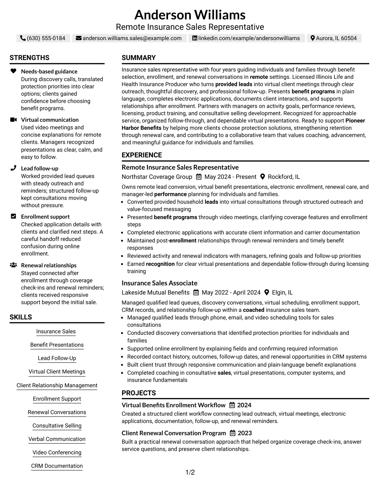
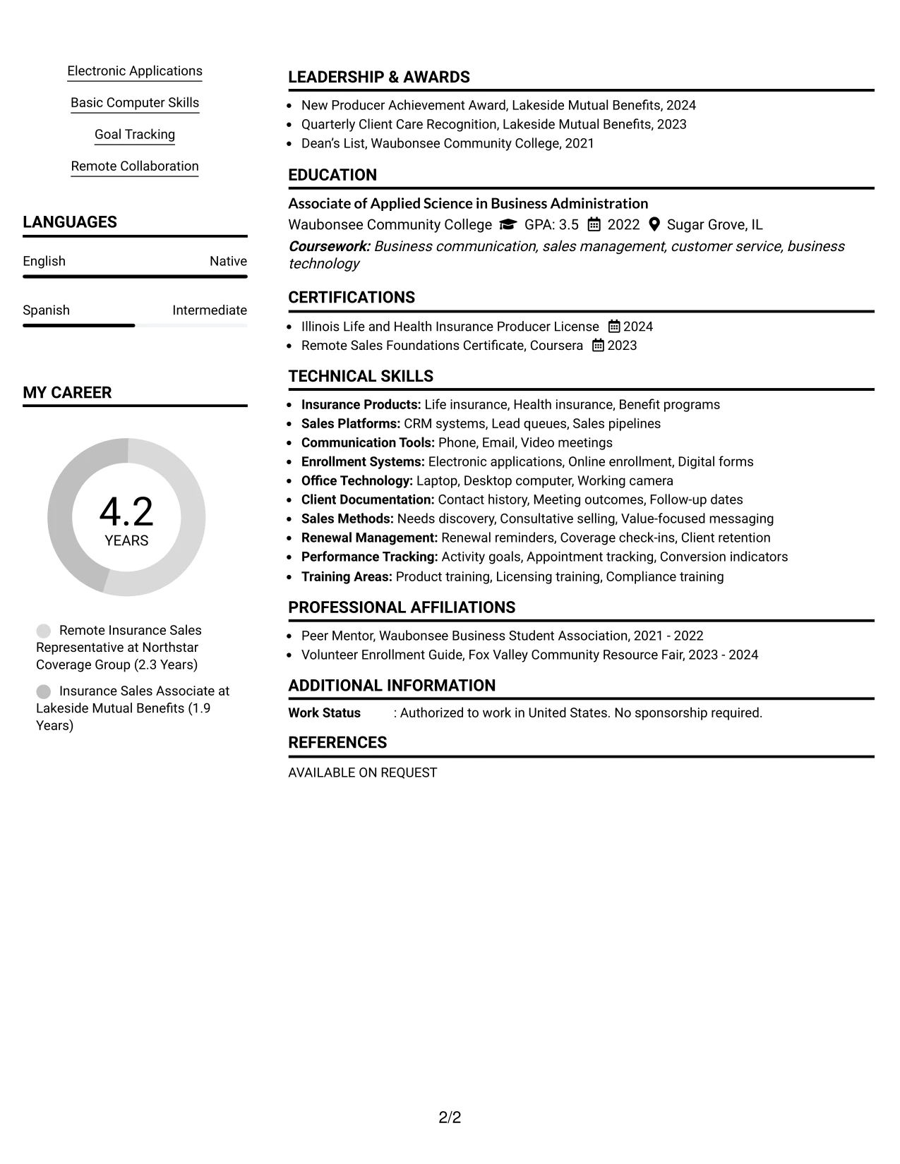
#22 Resume Example: Simple Two Column Format
Content is balanced between a primary evidence column and a compact supporting column, giving the resume a practical application-ready structure. The simple two-column format keeps the main work record prominent while making skills, education, certifications, and projects easy to locate.
For a Remote Insurance Sales Representative application, the main area can show provided-lead outreach, benefit presentations, electronic applications, renewal reminders, and performance reviews. The supporting area can reinforce those bullets with insurance sales skills, CRM tools, licenses, and relevant recognition.
#22 Why the Simple Two Column Format Works for a Resume
- A clear split gives detailed experience priority while preserving quick access to qualifications.
- The primary column can carry concise bullets with actions and relevant outcomes.
- The supporting column can group licenses, education, skills, awards, and tools.
- Simple visual markers help readers move between evidence and supporting keywords.
- The format works well when projects need visibility but should not interrupt employment history.
- A balanced page can present remote collaboration, client care, and documentation skills together.
- Conventional labels and readable text support ATS review within the two-column design.
#22 Best For
- Applications needing a practical division between work evidence and supporting qualifications
- Candidates with concise experience bullets plus several credentials or skill groups
- Remote-work resumes that must show communication, documentation, and follow-through together
- Readers who want quick access to licenses and tools during experience review
- Documents including projects and recognition without giving them the same weight as employment
- Candidates seeking two-column efficiency with a simpler presentation than a highly styled layout
- ATS-aware applications that keep standard labels and evidence visible in a compact page structure
#23 Accent Divider Modern Two Column Format Resume Example
For a remote insurance sales application, this format gives recruiters a quick path to the target role, core skills, and recent experience. Accent dividers separate the two columns while keeping lead follow-up, virtual client meetings, enrollment support, and renewal conversations easy to locate.
The resume can place contact details, certifications, and skills in a compact column beside the summary, work history, projects, and education. Square bullets support short achievement statements, while clear section order keeps ATS terms such as benefit presentations, CRM documentation, and electronic applications visible.
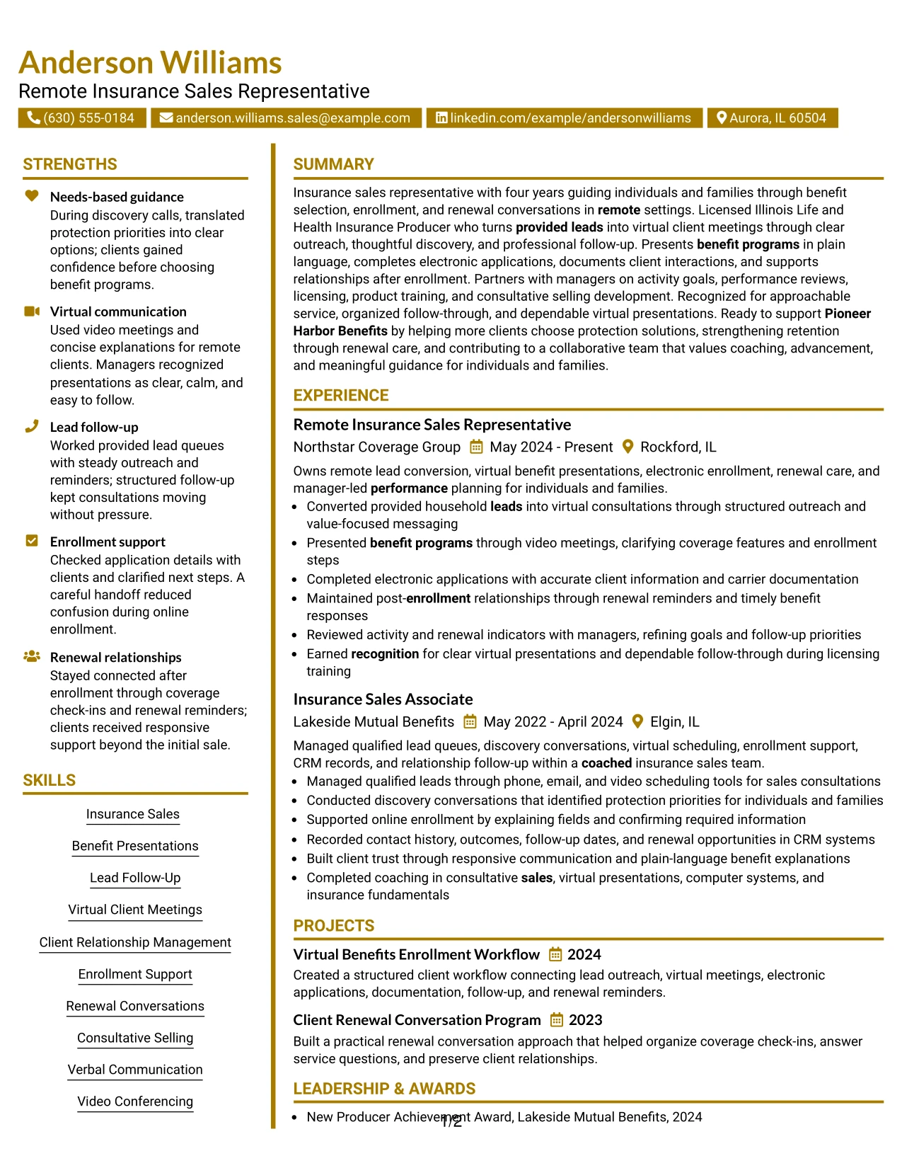
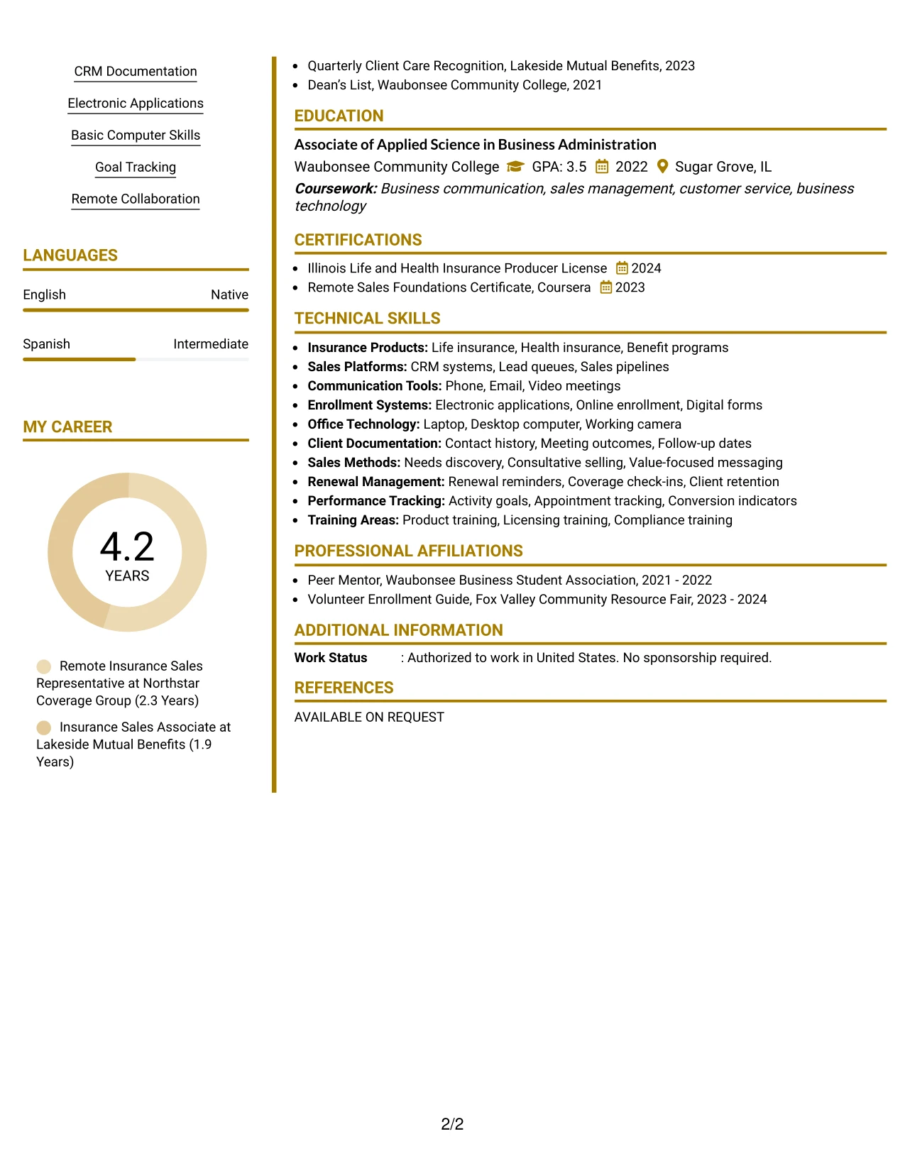
Why the Accent Divider Modern Two Column Format Works for a Resume
- Two columns create a clear division between supporting details and career evidence.
- Accent dividers guide scanning without replacing standard resume section headings.
- Square bullets make experience statements easy to review quickly.
- The summary can connect four years of insurance sales experience to remote client service.
- Skills such as consultative selling and video conferencing remain visible near the top.
- Projects can show a structured benefits enrollment workflow beyond regular job duties.
- Licenses, education, awards, and activities fit into a compact supporting area.
Best For
- Applicants who want a compact two-column structure for skills and supporting credentials.
- Resumes that need quick separation between contact details and detailed work history.
- Candidates presenting several relevant sections without adding unnecessary pages.
- Remote applications where virtual meetings, CRM work, and follow-up need early visibility.
- Readers who prefer short, divided content blocks over long uninterrupted sections.
- Documents that combine employment evidence with projects, licenses, and community activities.
- Job searches where ATS-friendly wording must remain readable in a modern visual format.
#24 Shaded Labels Clean Two Column Format Resume Example
A restrained visual hierarchy helps recruiters identify the role, summary, and strongest qualifications before reviewing the full work history. Shaded labels give each resume section a clear entry point without adding visual noise.
The two-column structure supports a focused skills area beside detailed experience, education, projects, and certifications. For this application, that balance makes the Illinois Life and Health Insurance Producer License, lead management, enrollment work, and renewal care easy to connect with the target requirements.
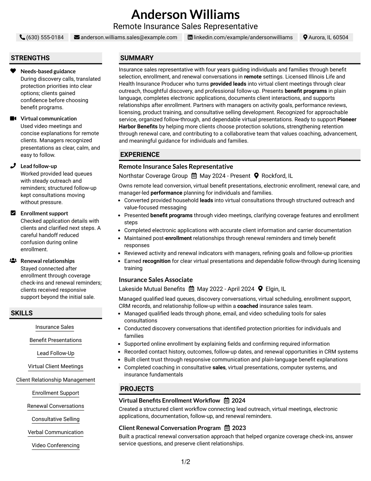
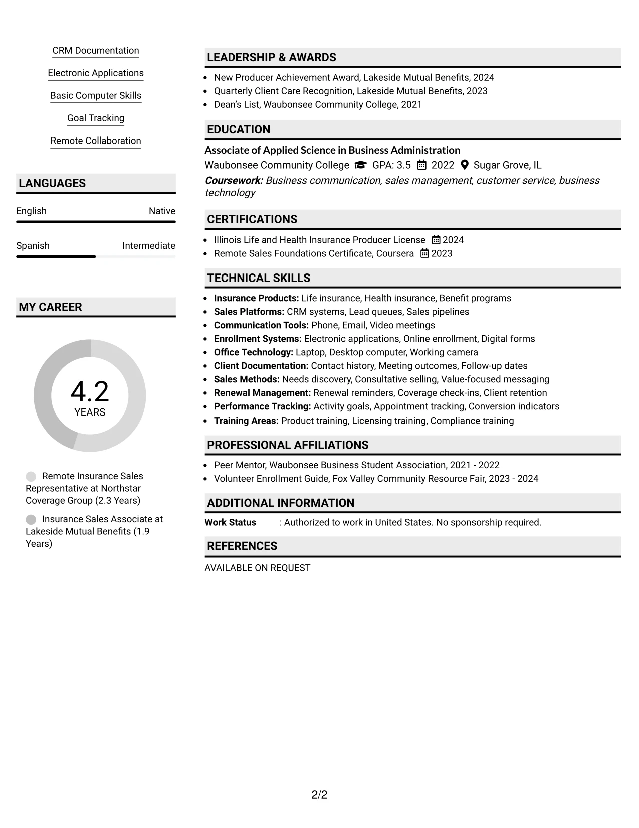
Why the Shaded Labels Clean Two Column Format Works for a Resume
- Shaded labels create consistent markers for summary, skills, experience, and education.
- A clean two-column grid keeps related information together for faster review.
- The layout gives the target role clear prominence near the contact information.
- Relevant insurance and remote-work terms can appear in both the summary and skills area.
- Experience bullets provide evidence of lead conversion, virtual presentations, and documentation.
- The format leaves room for certifications and awards without hiding them in dense text.
- Simple visual treatment supports professional review while preserving standard resume structure.
Best For
- Applications that need clear alignment between a target role and supporting qualifications.
- Readers who scan labeled sections before deciding which work history bullets to study.
- Resumes pairing a focused skills column with fuller descriptions of recent responsibilities.
- Candidates who need to show both client-facing work and careful administrative follow-through.
- Remote sales applications where communication, enrollment, and relationship care should stand together.
- Documents that benefit from visual grouping without relying on complex graphics or charts.
- Job seekers who want a polished format that keeps role-specific keywords easy to find.
#25 Photo Header Color Accent International Format Resume Example
The Photo Header Color Accent International Format places the resume identity, contact details, and professional direction at the top, followed by a straightforward sequence of qualifications. Color accents distinguish sections while the photo header adds a personal visual element when appropriate for the application context.
A single-column flow gives the summary, experience, projects, education, certifications, and skills room to develop in full-width sections. That structure supports detailed bullets about provided leads, benefit presentations, electronic applications, manager coaching, and renewal conversations without forcing key evidence into narrow columns.
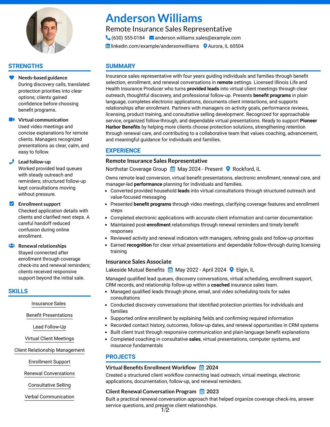
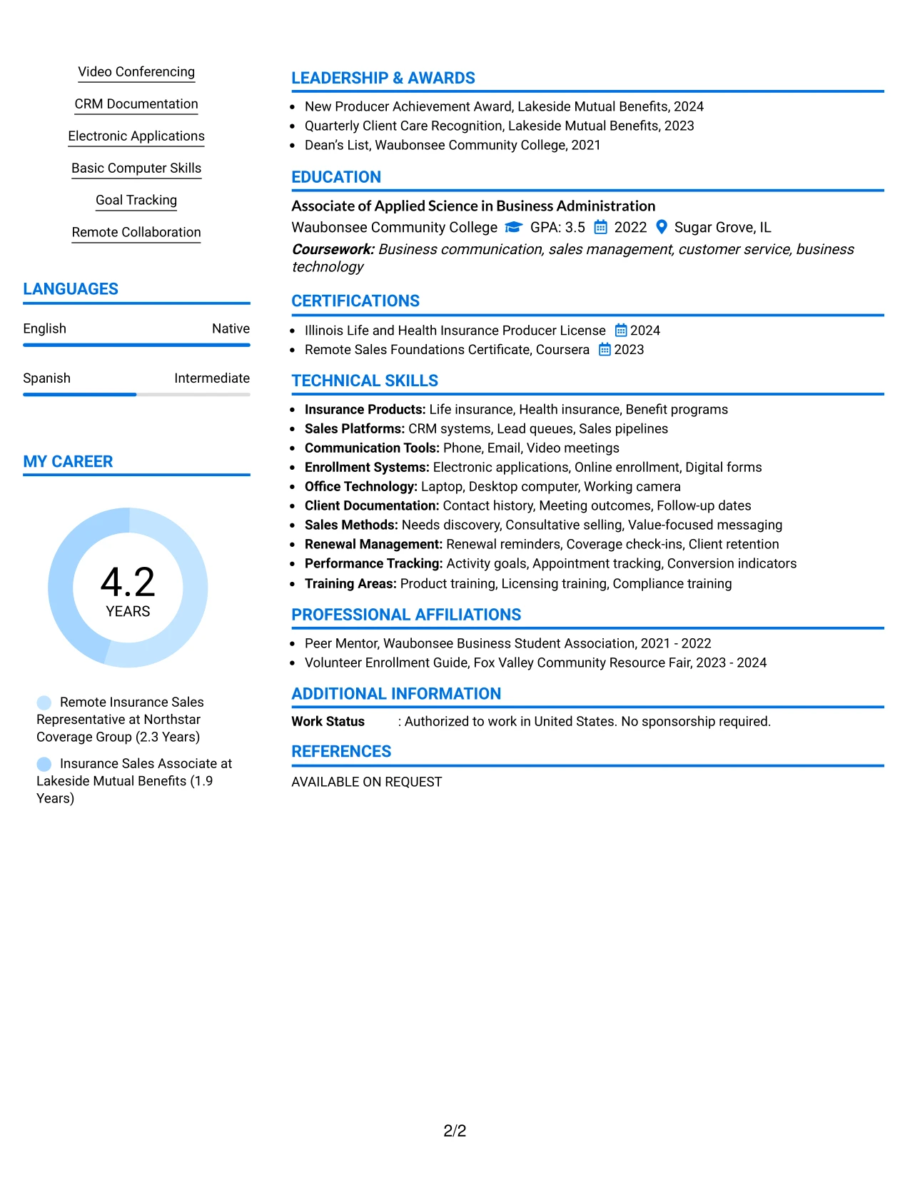
Why the Photo Header Color Accent International Format Works for a Resume
- The photo header creates a strong first visual point for the resume identity and role.
- A single-column structure keeps the reading path predictable from summary to experience.
- Color accents separate sections while preserving familiar resume headings.
- Full-width bullets can explain client discovery, enrollment support, and follow-up clearly.
- The skills section can include CRM documentation, video conferencing, and goal tracking.
- Projects add evidence of workflow design and renewal conversation planning.
- Certifications and awards remain easy to locate after the main work history.
Best For
- Applications where a personal header is suitable and the document should feel visually complete.
- Resumes with detailed experience bullets that benefit from full-width reading space.
- Candidates combining employment history with projects, licenses, awards, and activities.
- International-style presentation preferences that allow a prominent identity area.
- Remote client-service roles requiring clear evidence of communication and organized follow-through.
- Readers who want one continuous path through qualifications rather than side-column jumps.
- Documents where color can distinguish sections without replacing searchable text.
#26 Large Profile Photo International Two Column Format Resume Example
Recruiters can move from the large profile area to the role title, summary, and key skills before reviewing the detailed evidence in the main column. The secondary column can hold contact details, licenses, and tools, while the wider area carries experience, projects, and education.
This format gives a high-volume resume enough room to show four years of insurance sales work without making every section compete for space. Full bullets can explain virtual presentations, electronic enrollment, CRM records, renewal care, and performance reviews while the visual hierarchy keeps important qualifications easy to return to.
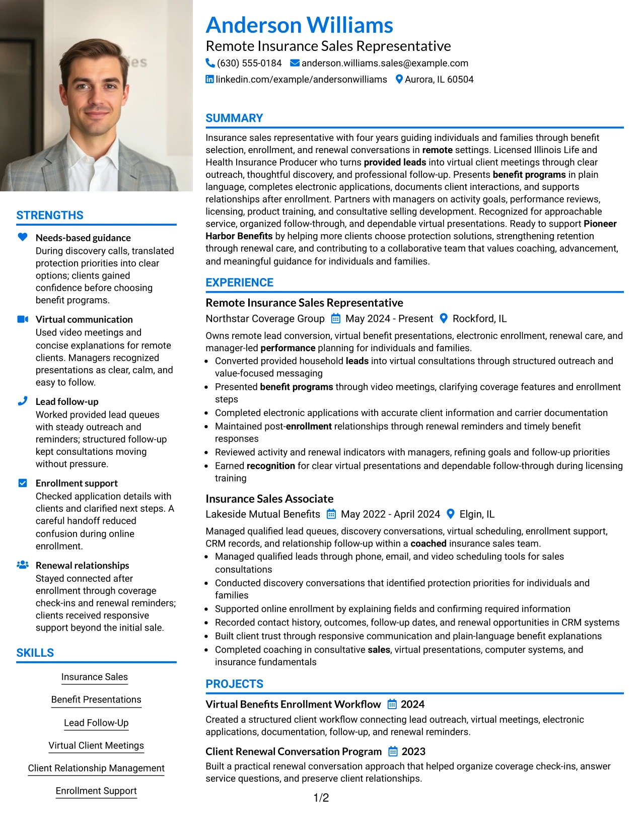
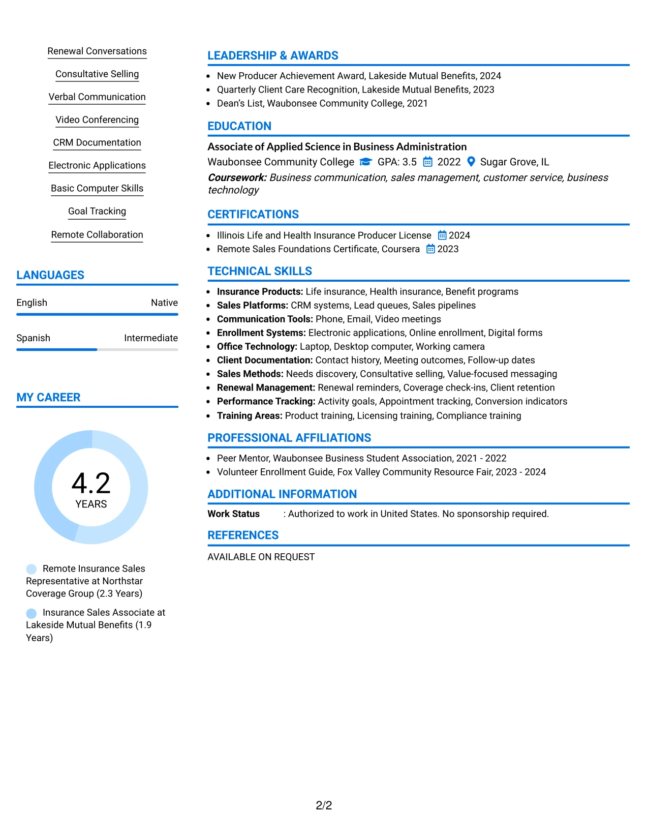
Why the Large Profile Photo International Two Column Format Works for a Resume
- The large profile area establishes a clear identity and professional starting point.
- Two columns separate quick-reference credentials from detailed career evidence.
- A wider main column supports complete bullets for recent and earlier roles.
- The summary can connect remote sales experience with client guidance and retention work.
- Licenses and certificates can stay visible without interrupting the experience sequence.
- Projects provide additional evidence of enrollment workflow and renewal planning.
- The layout can accommodate substantial content while preserving distinct section boundaries.
Best For
- Resumes with enough employment, project, and credential detail to require strong content distribution.
- Applications where a prominent personal profile area fits the expected presentation style.
- Candidates who need a wide main column for consultative sales and service achievements.
- Documents separating quick-reference licenses and tools from fuller work history.
- Remote roles where virtual communication and post-enrollment support need detailed explanation.
- Readers who review the identity area first and then move into evidence by column.
- Applications combining professional experience with education, awards, and community involvement.
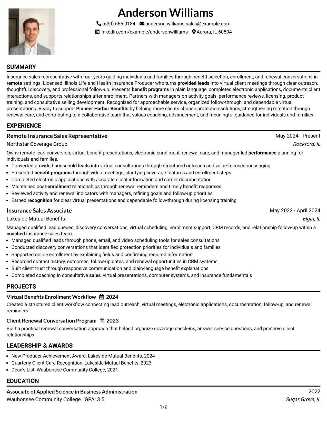
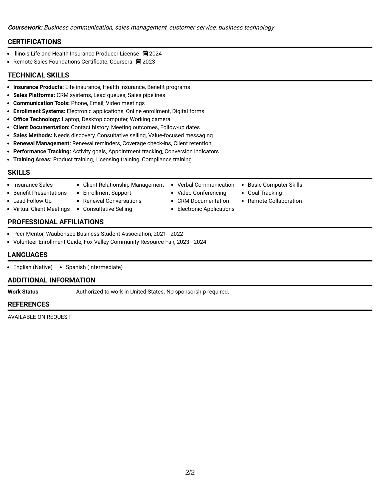
#27 One Column Format with Photo Resume Example
Evidence receives priority in this one-column resume, so the strongest proof appears in a direct sequence after the header and summary. The photo can support the identity area, while the page gives equal reading width to experience bullets, projects, education, certifications, and skills.
That structure works well for showing how provided leads became virtual consultations and how client support continued through enrollment and renewals. A recruiter can review the Illinois license, awards, manager coaching, and measurable activity indicators without moving between separate content tracks.
Why the One Column Format with Photo Works for a Resume
- One-column reading keeps evidence in a single, predictable sequence.
- The header and photo make the document identity easy to recognize at the start.
- Experience bullets receive full width for clear action and outcome statements.
- The summary can place remote insurance sales, licensing, and client guidance together.
- Projects add practical proof of enrollment and renewal process knowledge.
- Certifications and awards reinforce credibility after the main experience section.
- Skills remain searchable because they are presented as standard text rather than visual graphics.
Best For
- Applications where direct, evidence-led reading matters more than complex visual grouping.
- Resumes that need full-width bullets for lead conversion and client support examples.
- Candidates presenting a personal header alongside a complete chronological work history.
- Roles where licensing, enrollment accuracy, and renewal care need visible proof.
- Readers who prefer to evaluate experience before scanning secondary credentials.
- Documents that include projects and awards but still need a simple review path.
- Applications where a photo is acceptable and the rest of the resume should remain orderly.
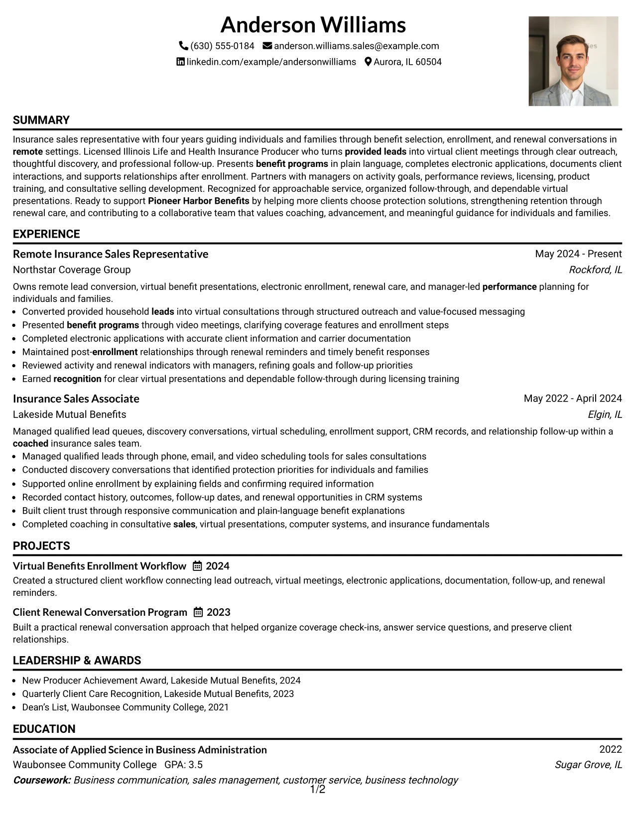
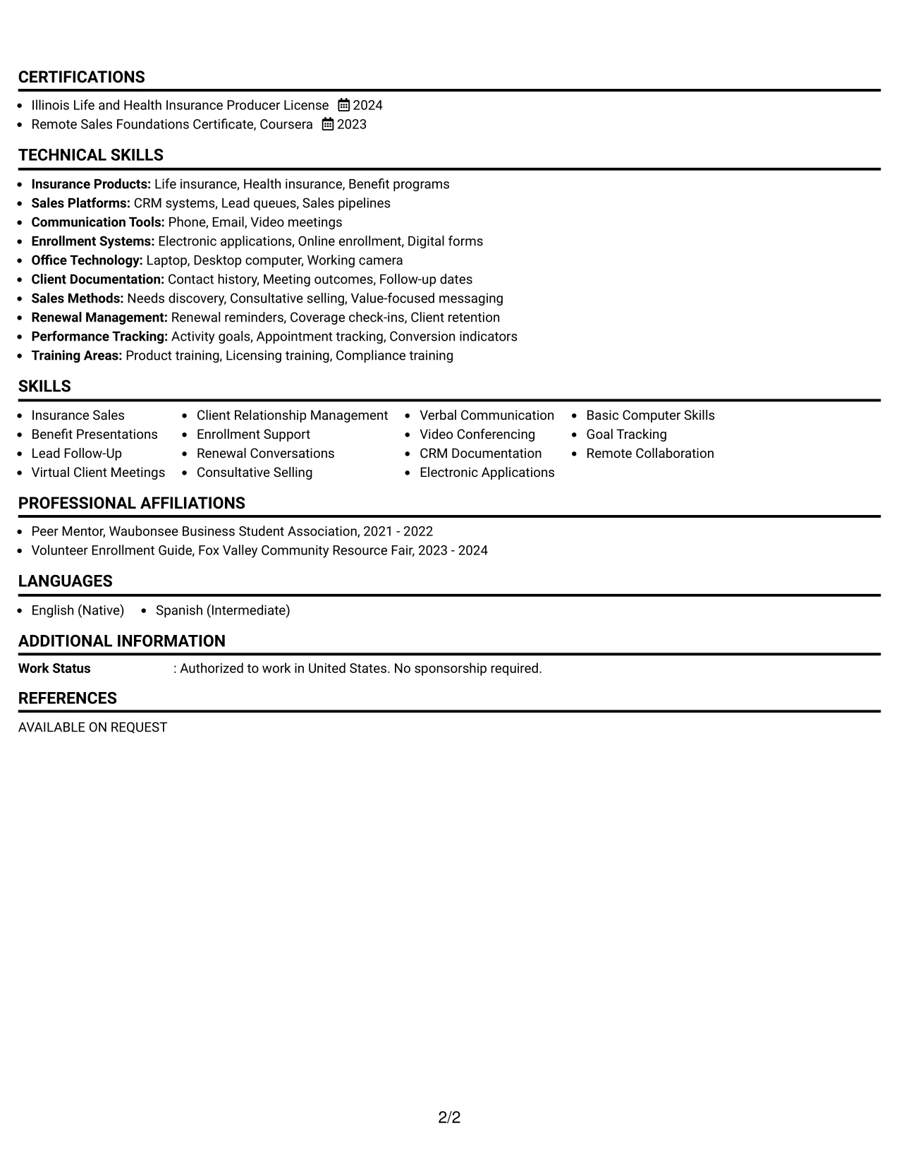
#28 One Column Format with Photo Right Resume Example
Balanced spacing allows the contact area and right-side photo to establish a clear header without crowding the resume body. Below it, a single column gives the recruiter one steady path through the summary, work history, projects, education, certifications, and skills.
The format suits a practical remote application because the main content can connect client meetings, electronic applications, CRM documentation, and follow-up in chronological order. A right-positioned photo adds visual balance while the text remains the primary source of qualification evidence.
Why the One Column Format with Photo Right Works for a Resume
- A right-positioned photo balances the header without interrupting the text flow.
- Single-column sections give every experience bullet the same reading width.
- The summary can state the target role and remote insurance background immediately.
- Chronological employment history shows progression from associate work to representative duties.
- Projects can reinforce the connection between outreach, enrollment, and renewal activity.
- Skills and tools remain easy to scan near the end of the document.
- Balanced spacing prevents the header from competing with evidence in the resume body.
Best For
- Remote applications needing a calm, balanced header with a clear text-first body.
- Candidates who want chronological experience to remain the main review path.
- Resumes connecting sales outreach, virtual meetings, and enrollment administration in order.
- Readers who value even spacing and consistent full-width sections.
- Documents where the header needs visual balance but the qualification evidence must stay dominant.
- Applications that include supporting projects and licenses without a second content column.
- Professional profiles where a photo is appropriate and does not replace searchable resume text.
#29 One Column Boxed Contact Header Format Resume Example
For a practical remote sales application, the boxed contact header makes the target role and contact information easy to confirm before the recruiter reviews the resume evidence. The remaining content follows one clean vertical path, which reduces visual distractions during an initial scan.
The format gives full width to the professional summary, experience bullets, projects, education, certifications, awards, activities, and skills. That space supports clear statements about lead queues, discovery conversations, benefit programs, online enrollment, and renewal opportunities.
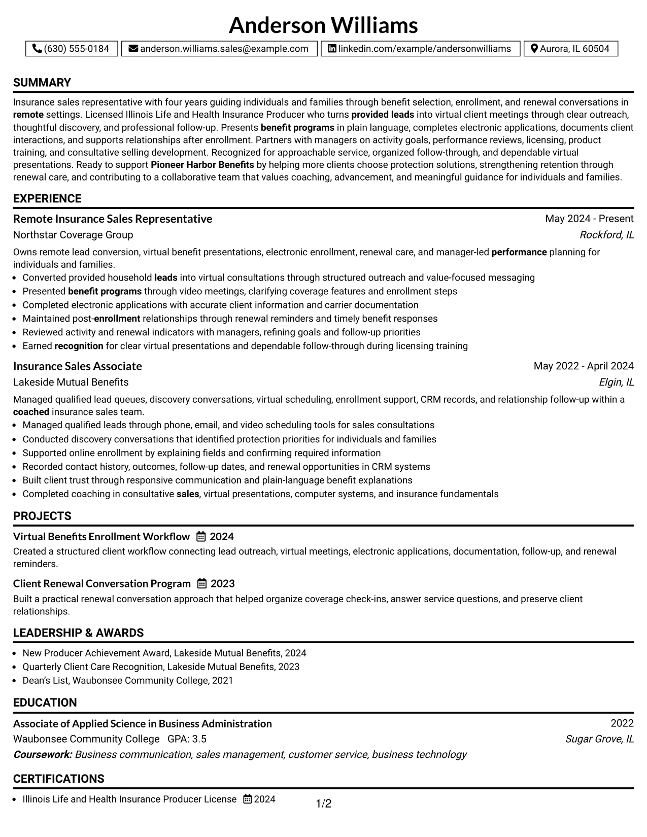
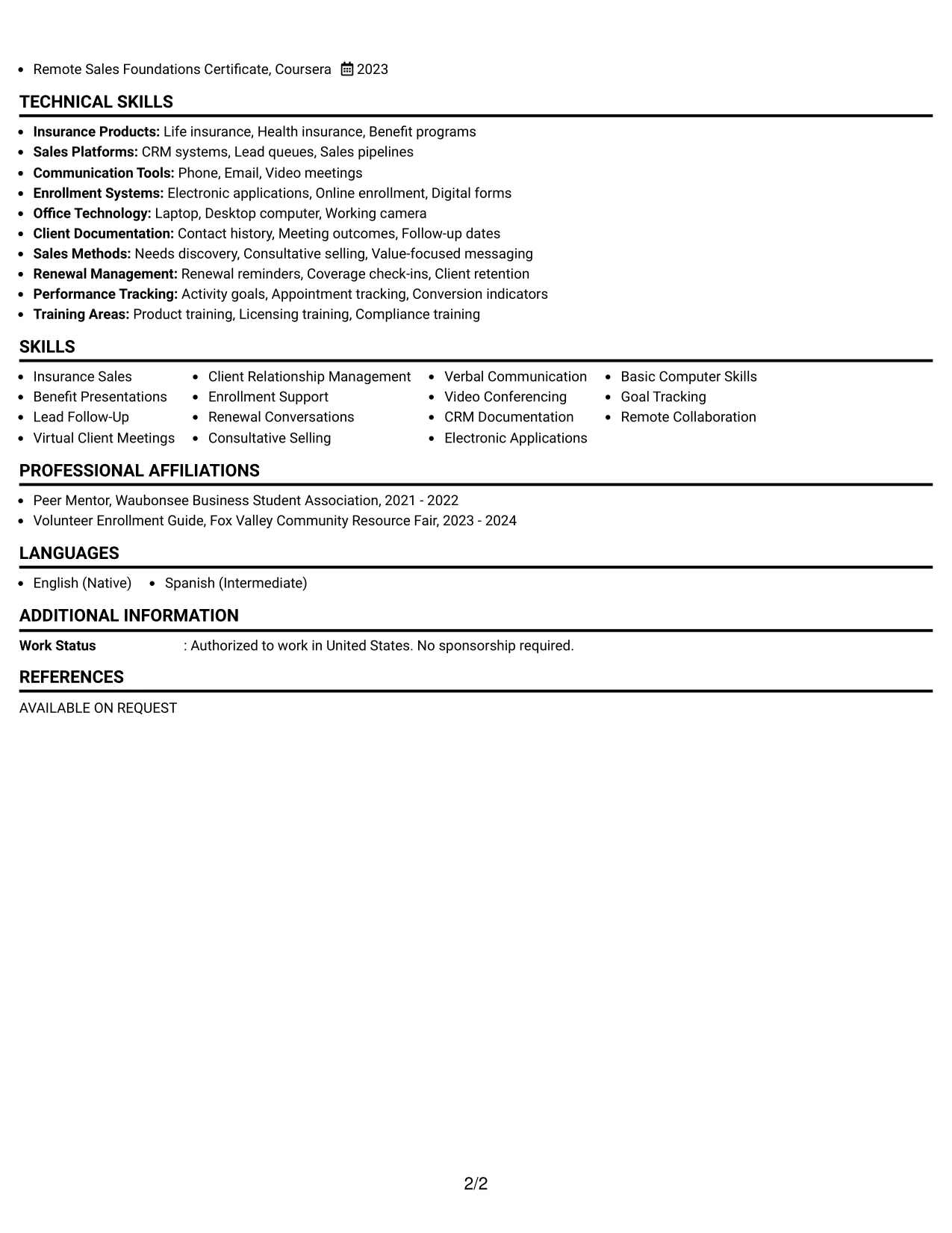
Why the One Column Boxed Contact Header Format Works for a Resume
- The boxed header groups contact details and the target role in one visible area.
- A single column supports a familiar top-to-bottom recruiter review.
- Full-width bullets make client-facing and administrative duties equally readable.
- The summary can present four years of experience without competing with side content.
- Experience sections can show both current responsibilities and earlier sales foundations.
- Projects and volunteer enrollment work add relevant evidence without disrupting the main flow.
- The format remains simple enough for standard parsing and text-based review.
Best For
- Applications that need a clear contact block before detailed resume content begins.
- Candidates preferring a traditional one-column reading path with a defined header.
- Documents with several experience bullets that should remain easy to compare.
- Remote sales resumes combining client conversations, enrollment work, and renewal follow-up.
- Readers who want projects, education, and certifications placed in a familiar sequence.
- ATS-conscious applications where contact details and role wording need a stable location.
- Job searches requiring a professional layout without extra columns or decorative elements.
#30 One Column Shaded Contact Header Format Resume Example
A shaded contact header gives the resume a restrained visual impression and lets the reviewer identify the target role before moving into the evidence. The single-column structure keeps section labels, dates, employers, and bullets aligned for a calm and efficient scan.
Anderson Williams's experience can then be presented in a clear sequence, from insurance sales associate work to current remote representative responsibilities. The layout leaves room for the license, Remote Sales Foundations Certificate, projects, awards, and skills that support a qualified application to Pioneer Harbor Benefits.
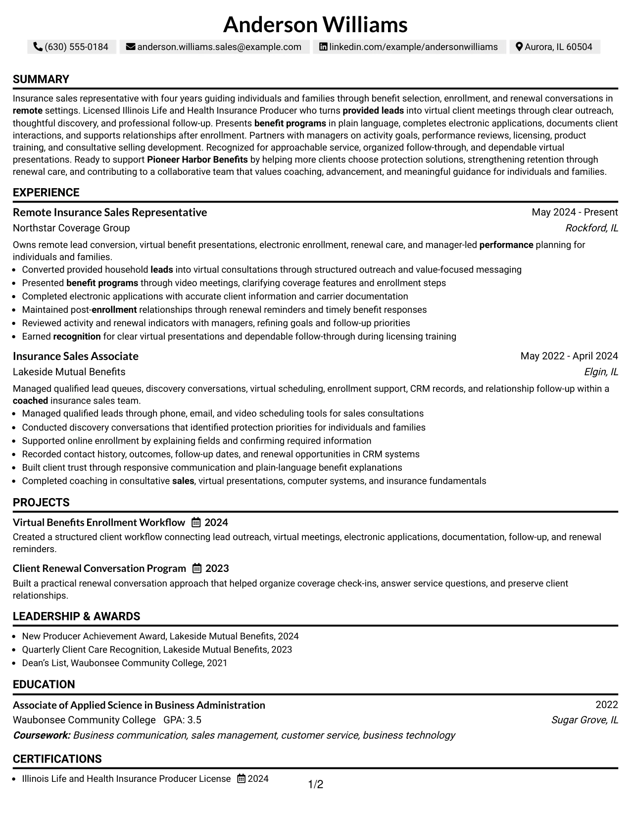
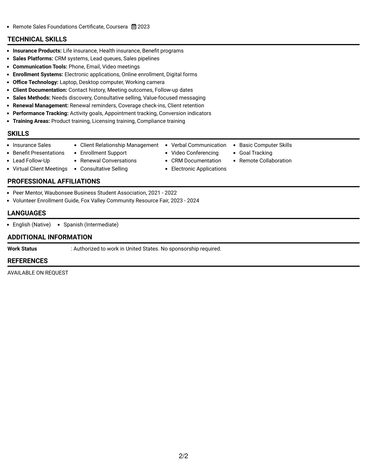
Why the One Column Shaded Contact Header Format Works for a Resume
- The shaded header separates contact information from the body without adding a second column.
- Consistent section alignment helps recruiters compare employers, dates, and responsibilities.
- The summary can connect licensed insurance work with remote client guidance.
- Full-width bullets support clear explanations of presentations, applications, and renewals.
- Projects show repeatable workflows rather than only listing regular job duties.
- Credentials and awards remain visible in a structured lower section.
- The restrained design supports professional review and straightforward text parsing.
Best For
- Applications that benefit from a calm header and a clearly ordered evidence trail.
- Resumes where dates, employers, and responsibilities need easy side-by-side comparison within one column.
- Candidates showing progression from insurance sales associate to remote representative work.
- Documents that include licenses, certificates, projects, awards, and activities.
- Remote roles requiring clear evidence of virtual presentations and client follow-through.
- Readers who prefer shaded section cues without a busy graphic treatment.
- ATS-focused applications that still need modest visual distinction at the top.
#31 Boxed Contact Header with Job Title Format Resume Example
The boxed contact header and prominent job title establish the resume's purpose before the reader reaches the supporting sections. Standard headings then organize the summary, experience, projects, education, certifications, awards, activities, and skills in a consistent one-column order.
This structure is useful when the target role must be clear at first glance. The body can support that title with evidence of provided-lead outreach, needs discovery, benefit presentations, electronic applications, CRM records, renewal reminders, and manager-led goal reviews.
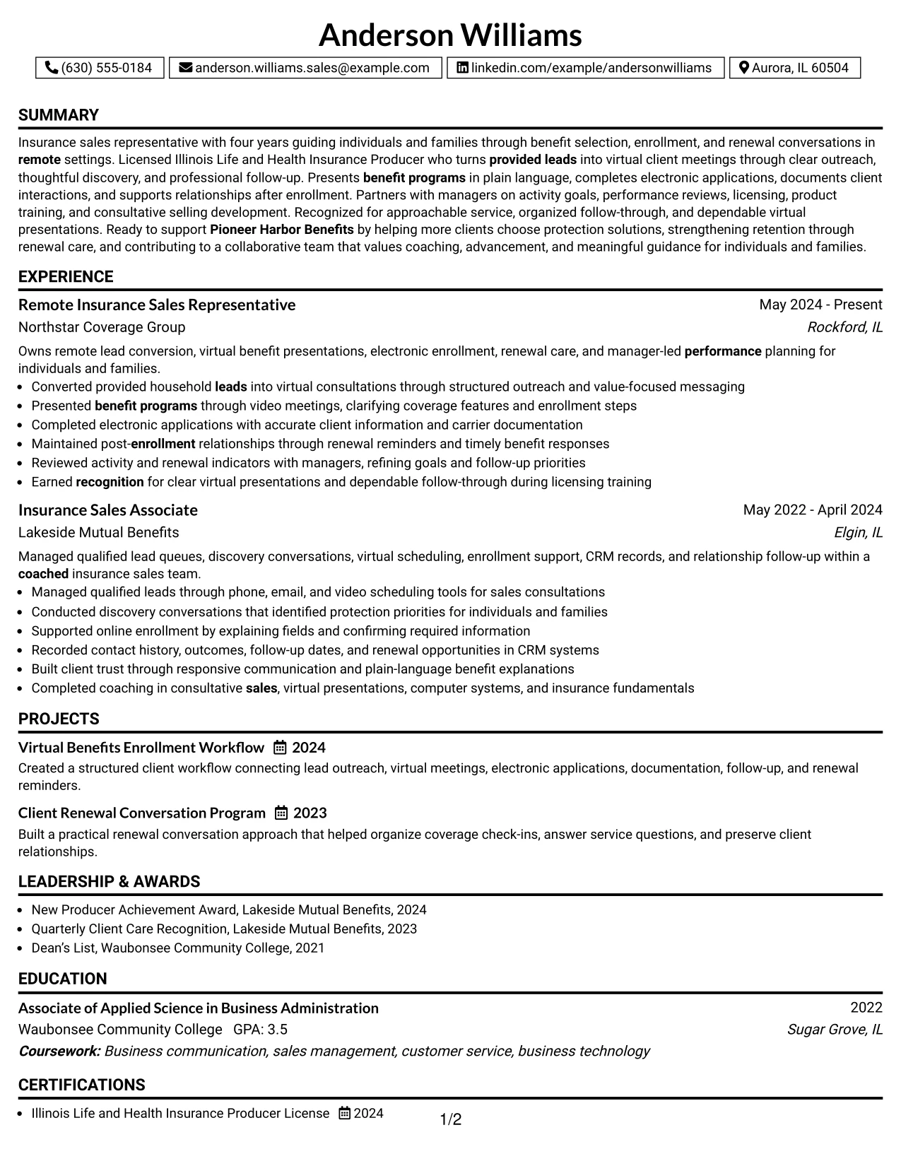
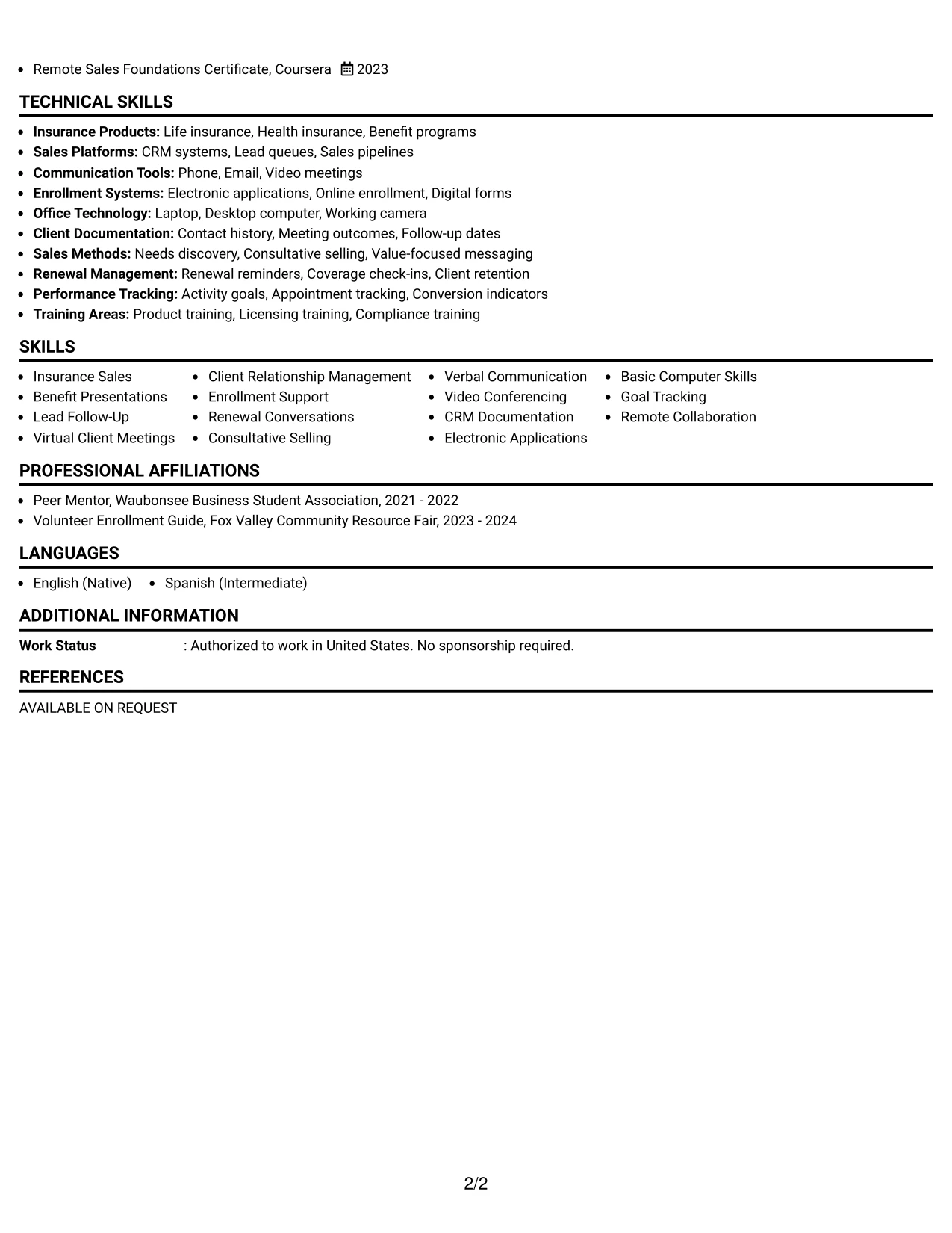
Why the Boxed Contact Header with Job Title Format Works for a Resume
- The job title in the header gives the document an immediate role focus.
- A boxed contact area keeps essential details separate from career evidence.
- One-column organization supports standard chronological resume review.
- The summary can match the target title with licensing and remote sales experience.
- Bullets provide specific proof of outreach, discovery, enrollment, and renewal work.
- Projects can demonstrate process ownership beyond the listed employment duties.
- The skills section reinforces searchable terms such as CRM documentation and goal tracking.
Best For
- Applications where the target role should be unmistakable before the work history begins.
- Resumes using a familiar one-column structure for fast recruiter comparison.
- Candidates who need to connect a job title with specific sales and service evidence.
- Documents with detailed bullets covering both client interaction and application accuracy.
- Remote positions where provided leads and virtual meetings are central review terms.
- Readers scanning for skills, licenses, and projects after confirming the target role.
- ATS-friendly submissions that need a defined title and stable contact placement.
#32 Plain Professional Layout with Job Title & Shaded Labels Resume Example
Recruiters can move from the clearly stated job title into the summary, then review experience and supporting credentials through consistent shaded labels. The plain professional treatment keeps attention on the content volume rather than on decorative design.
A single column gives the resume space to show two insurance sales roles, two workflow projects, education, licensing, awards, activities, and a broad skills list. The sequence also makes it easy to connect provided leads, virtual presentations, enrollment documentation, renewal care, and performance tracking.
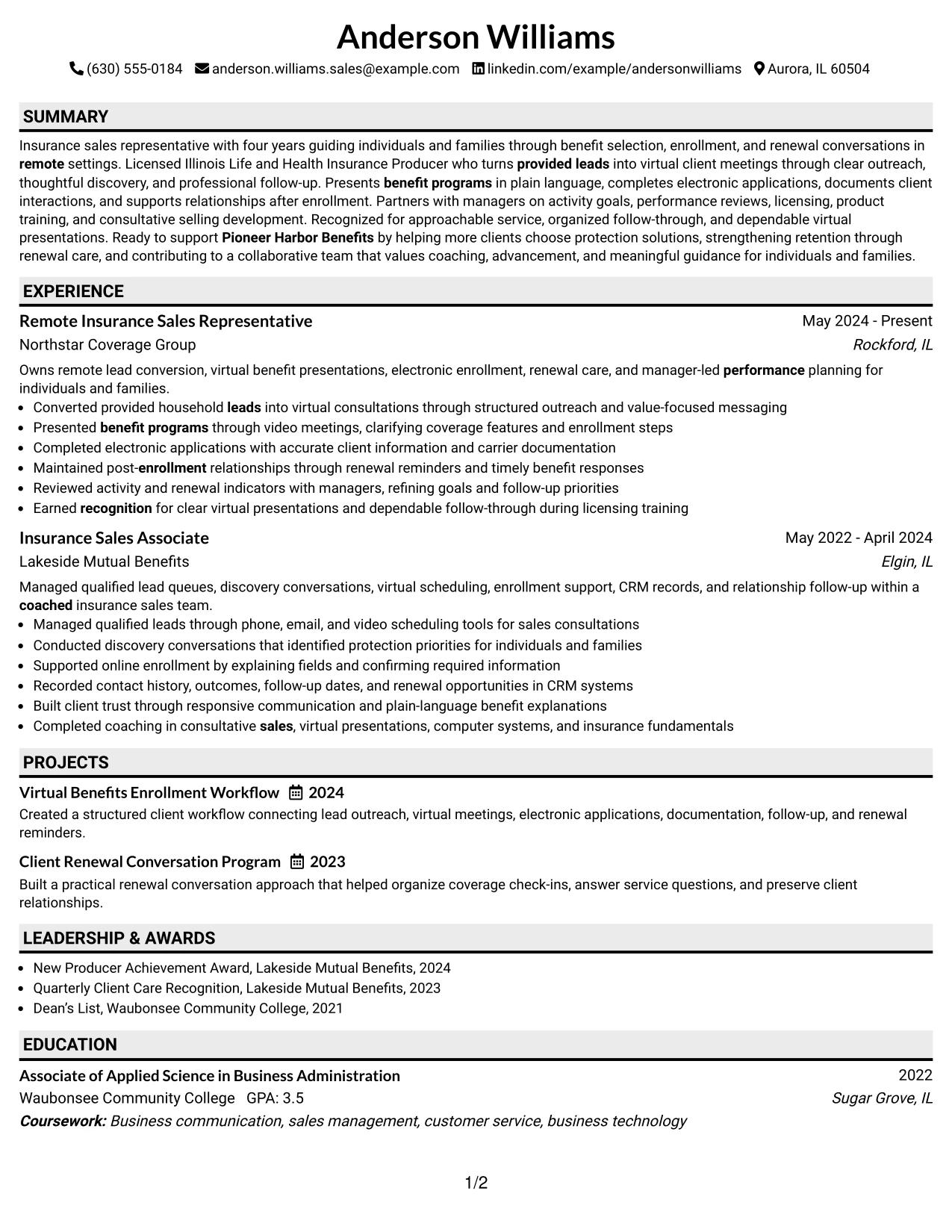
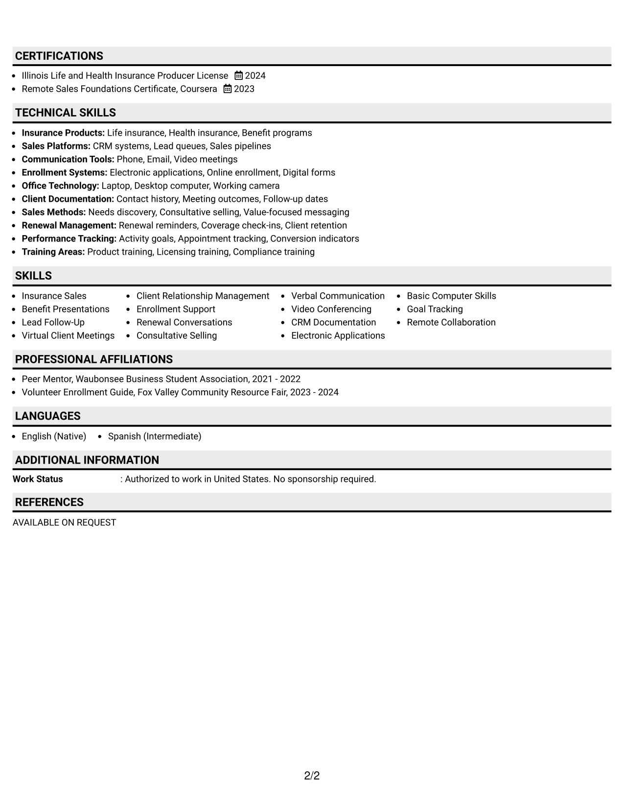
Why the Plain Professional Layout with Job Title and Shaded Labels Works for a Resume
- The job title sets a direct context before the recruiter reads the summary.
- Shaded labels create reliable navigation across a long one-column document.
- Full-width sections support detailed bullets across two insurance sales roles.
- The layout can hold projects, education, licenses, awards, and activities without sidebars.
- Skills remain easy to scan because they are grouped under a clear standard heading.
- The format supports ATS review by keeping content in a simple reading order.
- Evidence of lead work, enrollment, renewals, and manager collaboration stays connected.
Best For
- Resumes with substantial content that need strong navigation without a two-column design.
- Applications where the job title must lead into a detailed, role-focused summary.
- Candidates combining two related positions with projects and several supporting sections.
- Documents that need room for licensing, awards, activities, and a broad skills inventory.
- Readers who scan labeled sections to manage a longer evidence set efficiently.
- Remote sales applications requiring both client-service detail and performance tracking.
- Professional submissions favoring plain formatting, searchable terms, and clear hierarchy.
#33 Classic One Column Resume Format Resume Example
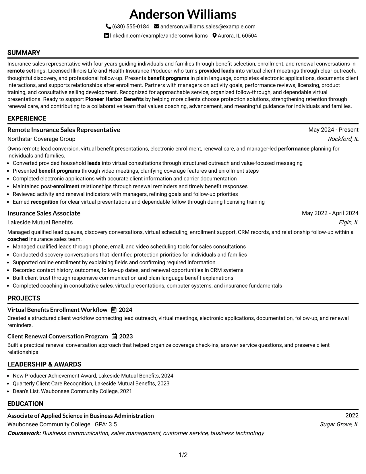
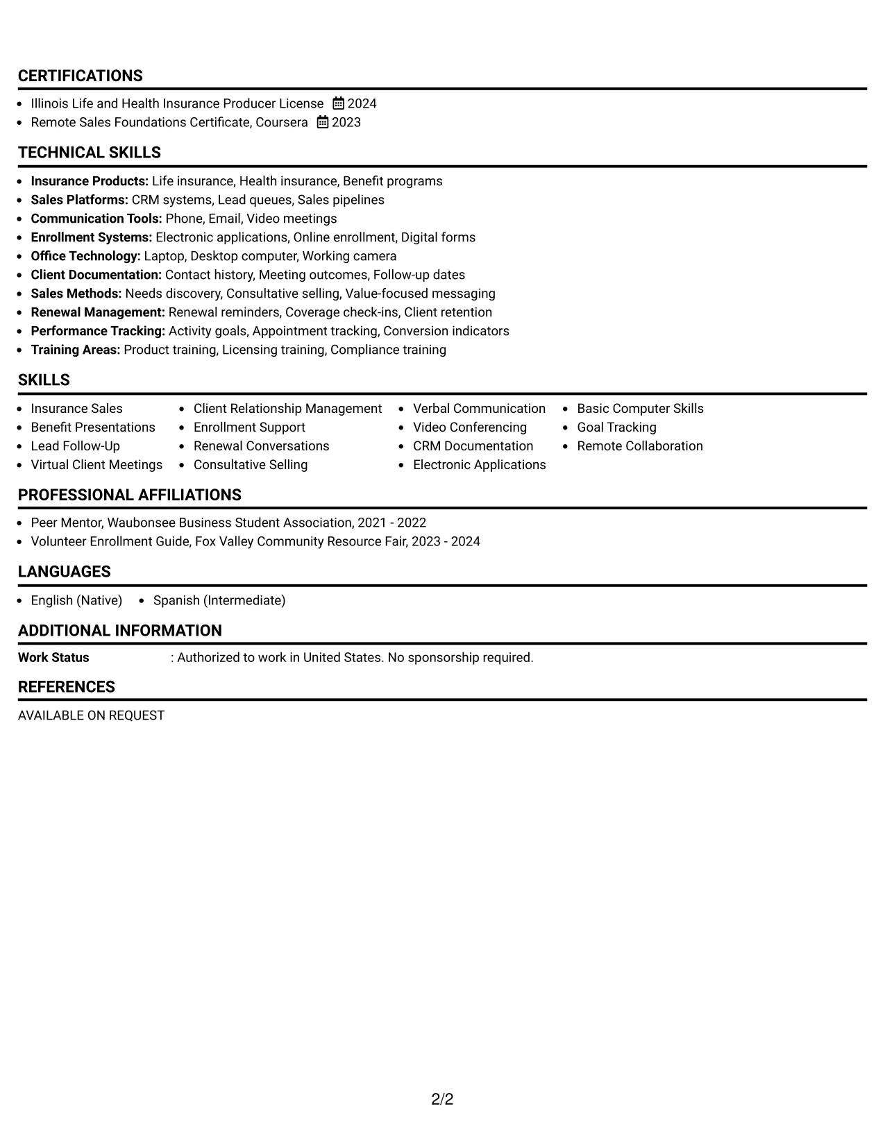
The strongest evidence appears first in the resume's summary and employment bullets, giving the reviewer a direct view of insurance sales experience and current remote responsibilities. A classic one-column order then supports a steady review of projects, education, licenses, awards, activities, and skills.
This format keeps the document familiar and highly readable while still presenting role-specific detail. Recruiters can see how lead follow-up, needs-based guidance, virtual meetings, electronic applications, CRM documentation, and renewal conversations support the Remote Insurance Sales Representative application.
Why the Classic One Column Resume Format Works for a Resume
- A classic sequence puts summary and employment evidence at the center of the review.
- One-column reading reduces navigation effort for recruiters and ATS tools.
- Standard headings make education, certifications, awards, and skills easy to locate.
- Bullets show clear actions across lead follow-up, presentations, enrollment, and renewals.
- Projects add evidence of organized workflows and client retention support.
- The format presents four years of experience without relying on visual effects.
- Role-specific keywords remain in searchable text throughout the resume.
Best For
- Applications that prioritize proven responsibilities and achievements over visual novelty.
- Candidates who want a familiar format for recruiters, managers, and ATS systems.
- Resumes where employment evidence should be reviewed before supporting credentials.
- Remote insurance applications featuring lead follow-up, virtual meetings, and enrollment work.
- Documents that need a dependable structure for projects, education, licenses, and awards.
- Readers comparing career history through consistent dates, titles, and bullet points.
- Job searches where clear keywords and straightforward evidence are the main presentation goals.
Why Build Your Remote Insurance Sales Representative Resume with ResumeInMinutes
ResumeInMinutes helps you turn insurance sales experience into a structured resume that is easy to review and adapt. You can present lead follow-up, virtual communication, benefit guidance, enrollment work, tools, licenses, and measurable achievements in the right order.
- Professional resume formats
- ATS-friendly section structure
- Role-specific keyword guidance
- Clear experience and skills presentation
- Free PDF resume previews
- Resume customization support
Use the layouts to emphasize needs discovery, provided-lead outreach, video meetings, electronic applications, CRM records, renewal reminders, licensing, training, and collaboration with managers. Keep each bullet precise and show the value of your work whenever the document provides evidence.
See Also
- 33 Entry Level Sales Representative Resume Templates with Example 2026 (ATS-Optimized)
- 33 Sales Representative - Medical Products Resume Templates with Example 2026 (ATS-Optimized)
- 33 Junior Digital Sales Representative Resume Templates with Example 2026 (ATS-Optimized)
- 30+ Insurance Customer Service Representative Cover Letter Templates with Example 2026
- 30+ Remote Account Representative Cover Letter Templates with Example 2026
- 33 Sales Development Representative Resume Templates with Example 2026 (ATS-Optimized)
- 30+ Sales Representative - Medical Products Cover Letter Templates with Example 2026
- 33 Licensed Medicare Insurance Agent (Remote) Resume Templates with Example 2026 (ATS-Optimized)
- 33 Sales Representative - Laboratory Automation Resume Templates with Example 2026 (ATS-Optimized)
- 33 Remote Healthcare Customer Service Representative Resume Templates with Example 2026 (ATS-Optimized)
Frequently Asked Questions
Are these Remote Insurance Sales Representative resume templates ATS-friendly?
Yes. The layouts use clear headings and readable structures. Match relevant terms such as insurance sales, benefit programs, virtual meetings, enrollment, CRM documentation, and renewal support to your experience.
Are these various resumes?
No. The guide presents one Remote Insurance Sales Representative resume example in different format and design options.
What should a Remote Insurance Sales Representative resume include?
Include a focused summary, insurance sales experience, lead follow-up, virtual client meetings, benefit presentations, enrollment support, renewal conversations, skills, licenses, certifications, education, projects, and relevant tools.
Can I download the resume templates as PDFs?
Yes. Each design provides a free PDF preview so you can review the layout and choose a format that supports clear resume scanning.
Which resume style is best for a Remote Insurance Sales Representative position?
A clean one-column format or a simple two-column format usually works well. Prioritize readable headings, consistent dates, concise bullets, and ATS-friendly text over decorative elements.
Can professionals with varied experience still create a strong resume?
Yes. Highlight transferable evidence such as client communication, provided-lead follow-up, needs discovery, electronic applications, CRM records, virtual presentations, and organized service follow-through.
Should I include a photo on my resume?
For most U.S. applications, leave the photo off your resume. Use the available space for relevant qualifications, insurance licensing, skills, and measurable work evidence.
Can I customize these resume templates?
Yes. You can adjust the resume text, section order, format, and PDF layout to reflect your insurance sales experience, licenses, tools, projects, and target position.