33 Software Engineer Intern - C# .NET Desktop Resume Templates with Example 2026 (ATS-Optimized)
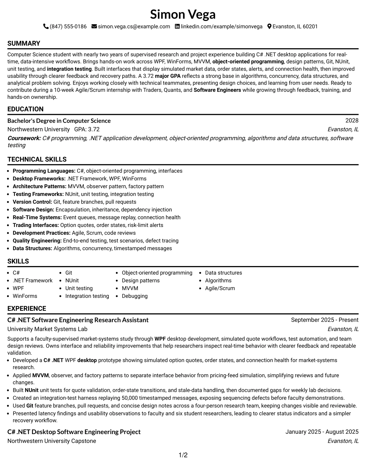
This guide shows you how to build a clear, focused Software Engineer Intern - C# .NET Desktop resume that is easy to review and adapt. It presents the document in 33 layouts and explains how to organize your evidence for a technical internship.
Strong resumes for this role connect C# and .NET desktop development to reliable software behavior. The examples show how to present WPF and WinForms work, object-oriented design, testing, source control, real-time data workflows, and team communication in a concise format.
You will learn how to structure a summary, education section, project and experience bullets, skills list, certifications, and measurable technical evidence. The format notes also show how clean hierarchy and role-specific keywords support ATS matching and fast resume review.
What Makes a Great Software Engineer Intern - C# .NET Desktop Resume in 2026
An effective resume for this internship is specific, evidence-based, and easy to scan. Each section should help a reviewer confirm technical readiness, learning ability, and the quality of the candidate's work without searching through dense paragraphs.
- Use a focused summary that names C#, .NET desktop development, and the type of software work you want to support.
- Describe research, coursework, and projects with action verbs, clear responsibilities, and measurable details such as test cases, replayed messages, team size, or review results.
- Group relevant skills so tools and methods are easy to find, including WPF, WinForms, MVVM, design patterns, Git, NUnit, unit testing, and integration testing.
- Show how you handled real-time events, validation, error conditions, interface feedback, debugging, or maintainability rather than listing tasks alone.
Role-specific keyword alignment can include Software Engineer Intern, C# .NET, .NET Framework, Windows desktop applications, WinForms, WPF, object-oriented programming, design patterns, Git, NUnit, unit testing, integration testing, Agile/Scrum, real-time trading applications, and analytical problem solving. Use these terms only where the resume evidence supports them, and keep the wording natural for both ATS parsing and human review.
The resume examples below use an evidence-first approach so formatting supports role-specific clarity, ATS matching, and fast review for a Software Engineer Intern - C# .NET Desktop resume.
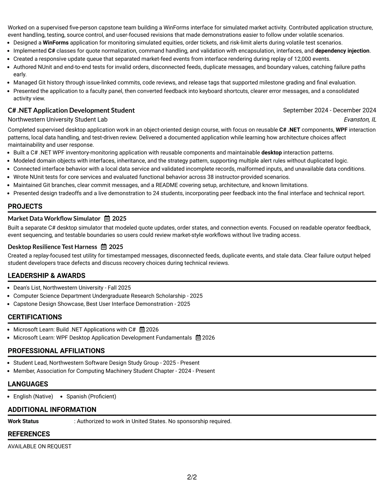
#1 Simple One Column Format Resume Example
Simple One Column Format places the resume content in a clear top-to-bottom order. Contact details, the professional summary, skills, experience, projects, education, certifications, and awards each receive a defined position. That structure helps a recruiter scan the document quickly and lets ATS software read the section hierarchy with fewer layout barriers.
For the Software Engineer Intern - C# .NET Desktop application, the strongest evidence can appear in concise bullets: C# .NET desktop development, WPF and WinForms work, NUnit testing, Git collaboration, and replay results involving 50,000 timestamped messages. The single column also gives project and academic details enough width to show both technical choices and measurable scope.
Why the Simple One Column Format Works for a Resume
- A single reading path supports fast recruiter scanning.
- Standard section order improves ATS parsing.
- Full-width bullets leave room for technical detail.
- Experience bullets can pair tools with measurable results.
- Projects remain easy to find below professional experience.
- Skills can use familiar keyword groupings without crowding.
- Education, certifications, and awards stay visible in a logical sequence.
Best For
- Resumes that need a direct, top-to-bottom reading order.
- ATS-focused applications using standard section headings.
- Candidates presenting several technical projects with detailed bullets.
- Documents where long achievement statements need full page width.
- Applications that combine experience, education, projects, and certifications.
- Readers who prefer predictable navigation between resume sections.
- Early-career resumes that need space for academic evidence and hands-on work.
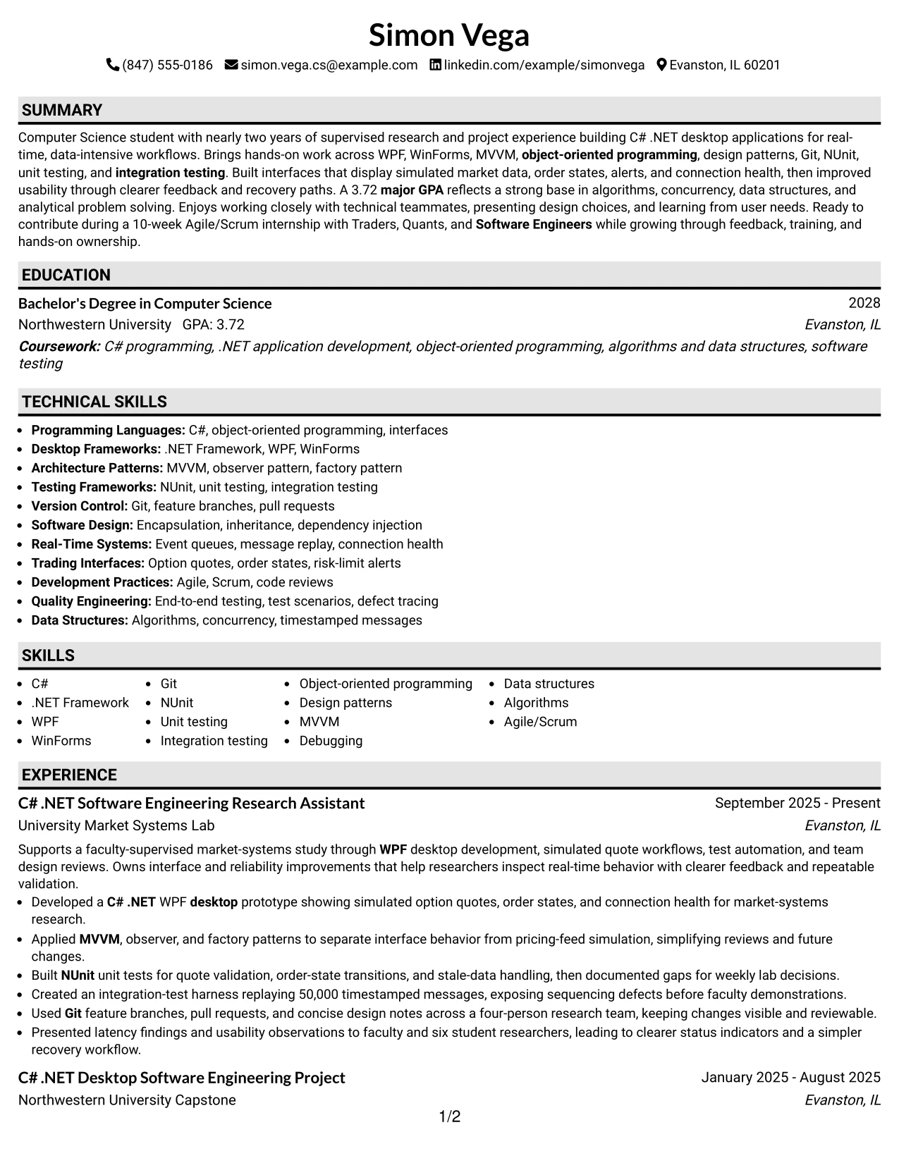
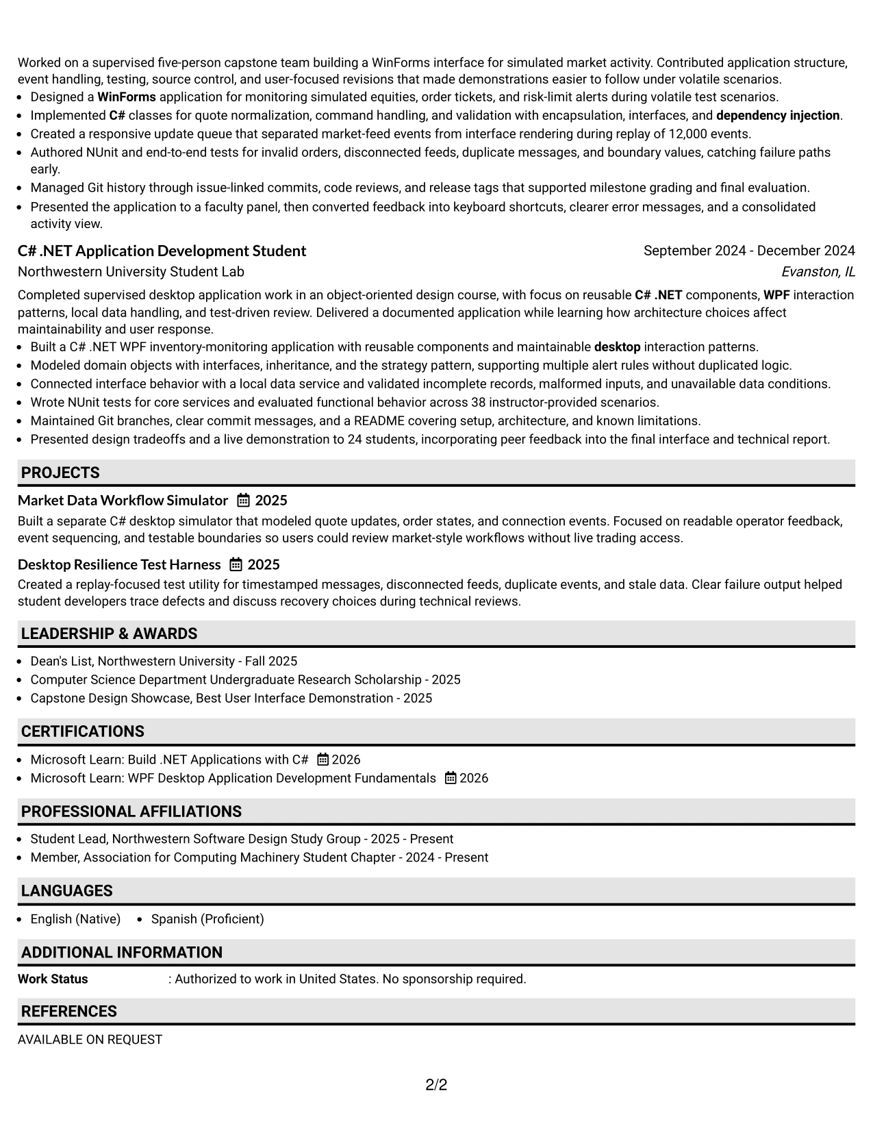
#2 Plain One Column with Shaded Labels Resume Example
Recruiters move through this resume from one labeled section to the next, using the shaded labels as visual signposts. The one-column flow keeps the summary, skills, experience, projects, and education in a familiar sequence while giving each group a clear boundary. This is useful when the document contains substantial academic and project-based content.
The format can carry a detailed evidence set without forcing related information into narrow side areas. Bullets can explain WPF and WinForms work, MVVM and design patterns, NUnit coverage, Git practices, and message-replay testing. Consistent labels also help a reviewer confirm that the resume addresses C# .NET, desktop development, testing, teamwork, and analytical problem solving.
Why the Plain One Column with Shaded Labels Works for a Resume
- Shaded labels separate high-volume content into readable groups.
- A familiar one-column structure supports ATS-friendly extraction.
- Experience bullets can remain complete rather than heavily shortened.
- Skills are easy to compare with job-description keywords.
- Projects receive enough width for tools, methods, and outcomes.
- Education and certifications are not hidden in a crowded sidebar.
- The visual markers help reviewers return to key sections quickly.
Best For
- Resumes with several sections that need strong visual separation.
- Applications where experience bullets carry detailed technical context.
- Candidates combining coursework, research, projects, and formal employment.
- Readers who scan by section label before reading individual bullets.
- Documents that need a plain presentation with modest visual guidance.
- ATS-conscious submissions that still benefit from human-readable grouping.
- Applications requiring a clear record of tools, testing, and development practices.
#3 One Column Format with Photo Right Resume Example
Evidence receives priority in this resume layout. The main column can present the professional summary, experience bullets, projects, skills, and education in a strong sequence, while the right-side photo area adds a defined visual point without taking over the page. The result keeps technical accomplishments central to the review.
For this target role, the resume can lead with desktop application work, robust unit and integration testing, design patterns, Git, and real-time workflow projects. Bullets such as the 50,000-message integration replay and the 12,000-event update queue show scope and reliability. A photo should remain professionally appropriate and secondary to the resume evidence.
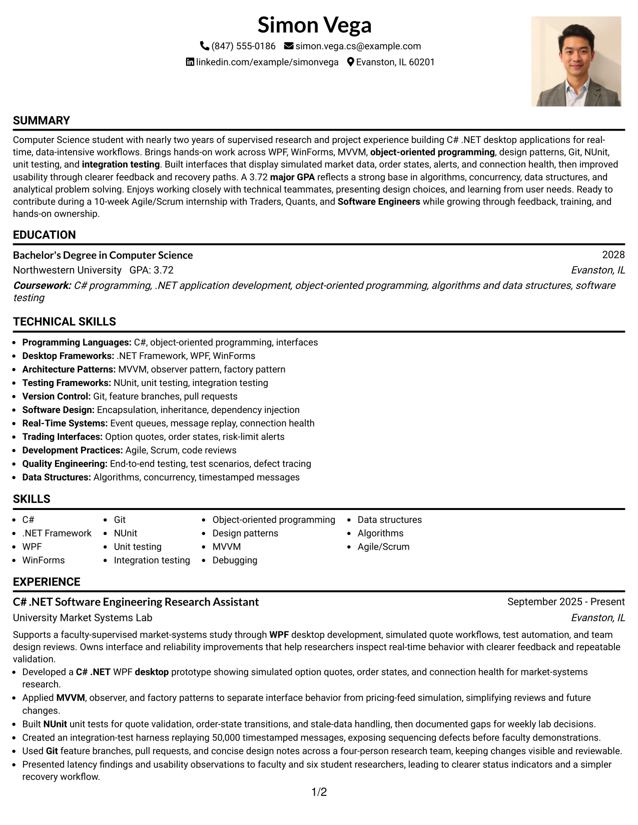
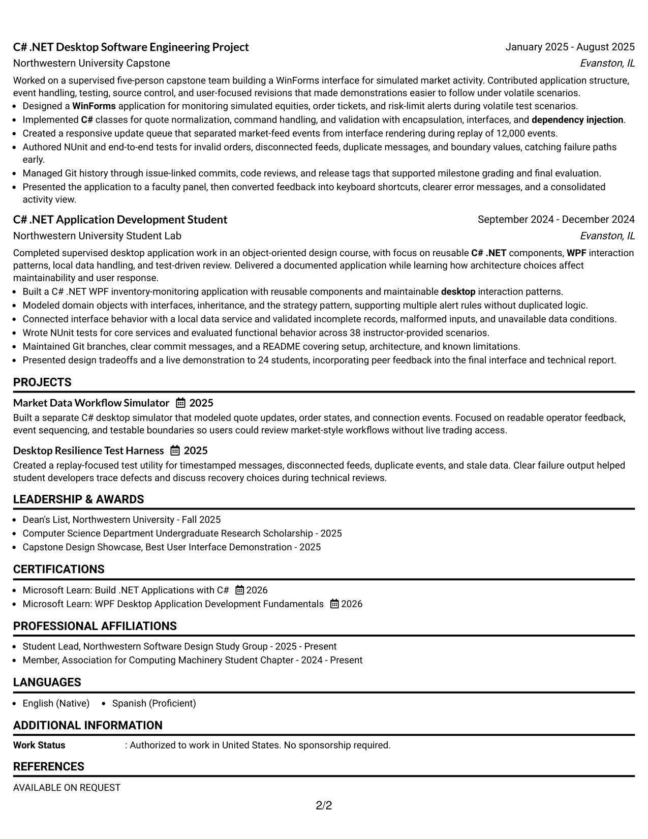
Why the One Column Format with Photo Right Works for a Resume
- The main column gives evidence more space than decorative elements.
- A right-side photo area creates a defined visual anchor.
- Technical keywords remain in a straightforward reading order.
- Full-width bullets support clear descriptions of testing and architecture.
- Projects can show both application purpose and implementation detail.
- The hierarchy keeps experience and skills more prominent than the image.
- Consistent headings support quick comparison during resume review.
Best For
- Applications where a restrained photo area is professionally appropriate.
- Resumes that need one strong column for technical evidence.
- Candidates showing both project depth and clearly documented tools.
- Documents where measurable testing scope should remain easy to spot.
- Readers who want visual identity without a multi-column text structure.
- Portfolios or application packets using a consistent personal presentation.
- Resumes that benefit from separating visual identity from work history.
#4 Clean Two Column Sidebar Format Resume Example
Content is balanced between a broad main column and a compact sidebar. The main area can hold the summary, experience, and project bullets, while the sidebar groups contact details, skills, education, certifications, or awards. That division gives a recruiter a quick reference area without reducing the space available for achievement evidence.
For a Software Engineer Intern - C# .NET Desktop resume, the sidebar can surface C#, .NET Framework, WPF, WinForms, Git, NUnit, and design patterns. The main column can then explain interface behavior, test coverage, message replay, and team presentations. This supports a practical review need: confirming technical fit quickly, then checking how the candidate applied those skills.
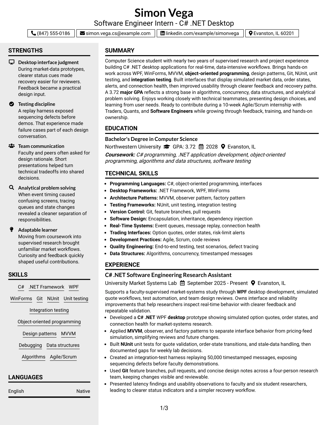
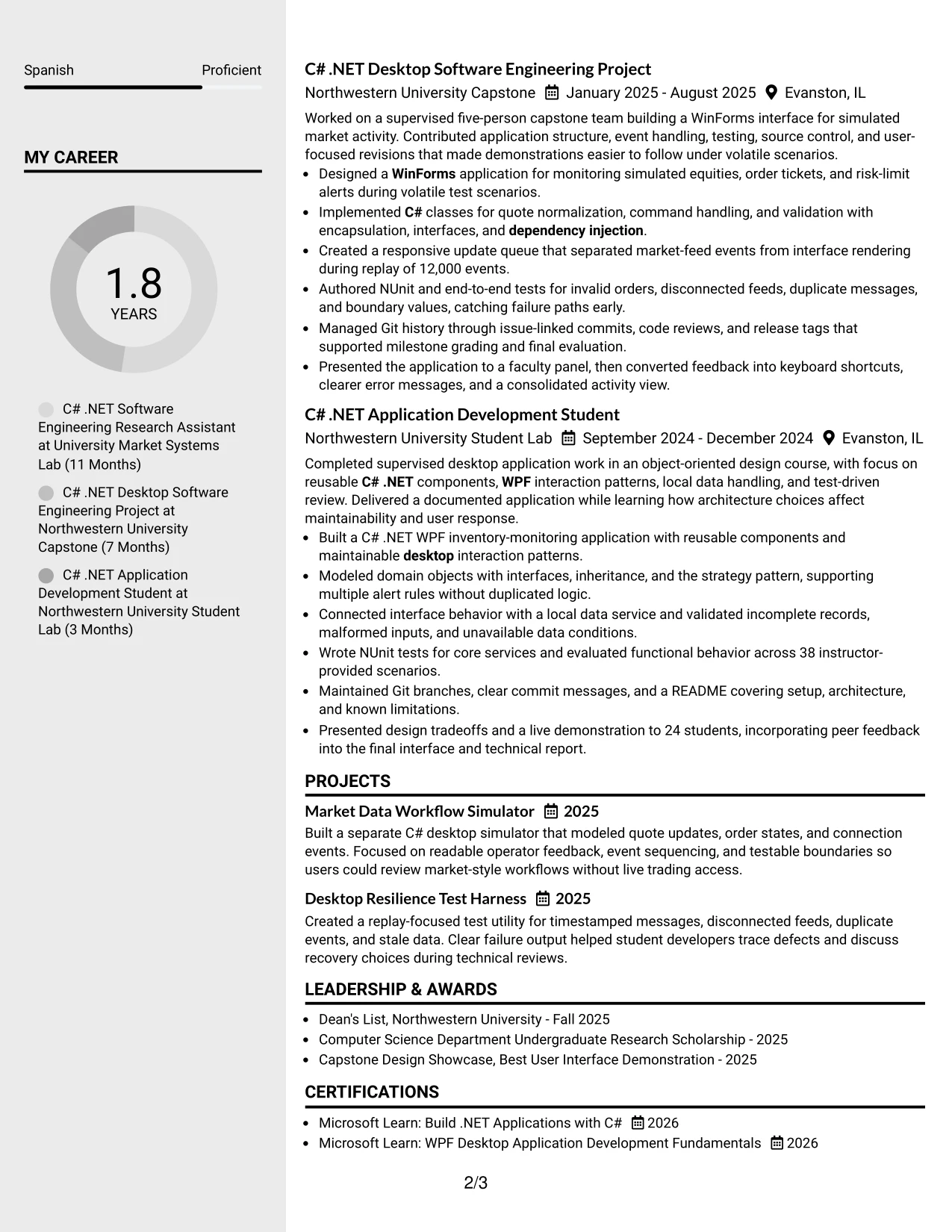
Why the Clean Two Column Sidebar Format Works for a Resume
- The sidebar gives fast access to core skills and credentials.
- The main column protects space for experience and project bullets.
- Separated content areas support quick technical qualification checks.
- Bullets can show methods, tools, and outcomes in one view.
- Education and certifications can remain visible without interrupting experience.
- The structure suits applications where keyword review comes before detail.
- A clear contrast between reference data and evidence improves navigation.
Best For
- Applications where a reviewer needs rapid access to skills and education.
- Resumes pairing a concise reference sidebar with detailed experience.
- Candidates with certifications, awards, and technical tools to group together.
- Documents reviewed first for keywords and then for achievement evidence.
- Applications that need clear separation between credentials and work history.
- Readers who prefer a compact summary area beside fuller project details.
- Resumes where team, testing, and architecture evidence deserves the main column.
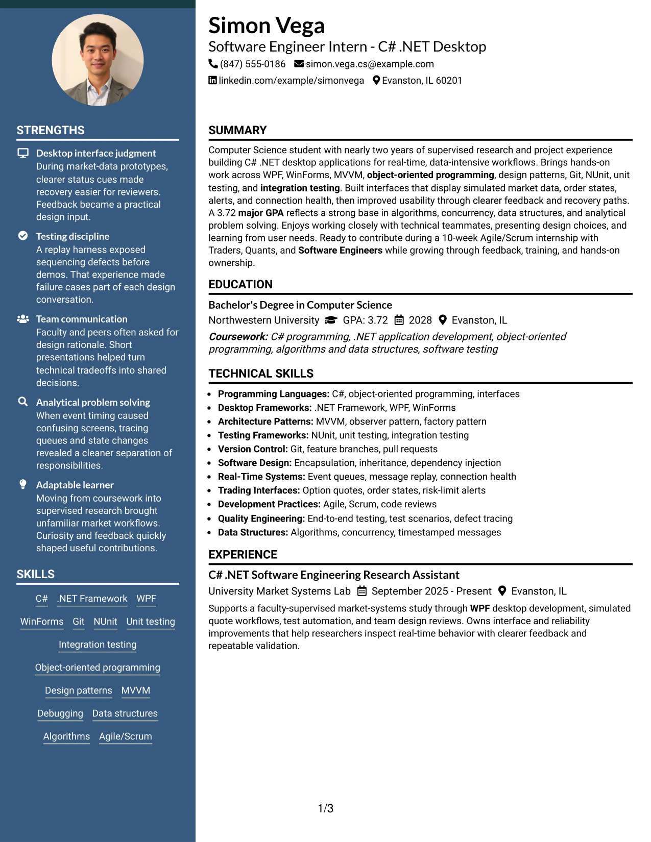
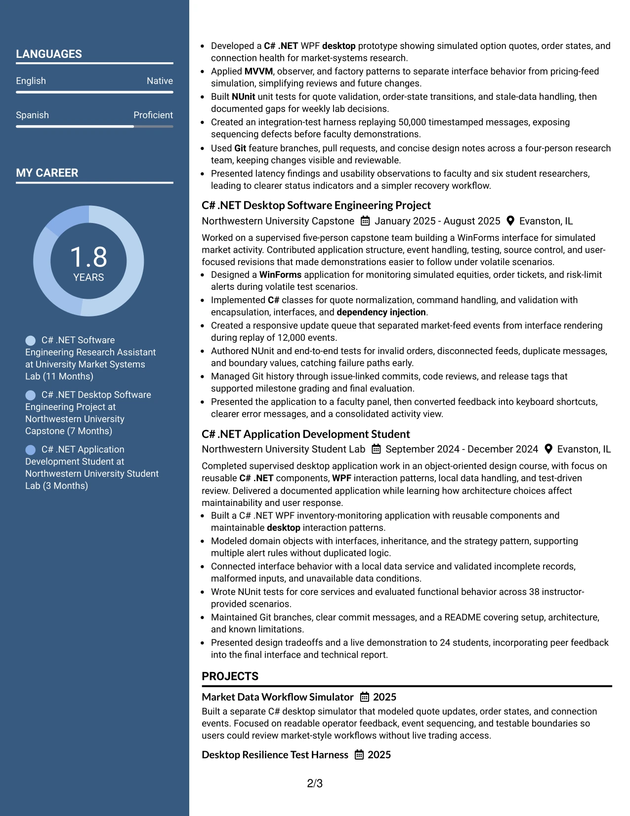
#5 Two Column Format Resume Example
A practical application often requires both quick qualification and enough detail to evaluate the work. Two Column Format addresses that need by distributing compact information, such as skills and education, alongside fuller experience and project content. The visual balance can make a long technical resume easier to review without losing section hierarchy.
The resume can place C# .NET, WPF, WinForms, Git, NUnit, and Agile/Scrum in a concise area, then use the larger area for outcomes and implementation choices. Strong bullets include the 50,000 timestamped-message replay, 38 test scenarios, and improvements to status indicators and recovery workflows. Standard headings and careful spacing remain important for PDF and ATS review.
Why the Two Column Format Works for a Resume
- Two areas let readers compare skills with applied experience.
- Compact sections reduce repeated scanning across a long resume.
- The wider content area supports detailed achievement bullets.
- Technical tools can stay visible while projects receive context.
- Measured evidence stands out when it is separated from reference details.
- Balanced spacing helps prevent education and certifications from being buried.
- Clear headings preserve resume structure for both people and ATS tools.
Best For
- Resumes that must balance quick skills review with detailed evidence.
- Applications combining multiple projects with a focused technical skills area.
- Candidates who want tools visible without repeating them in every bullet.
- Documents with measurable results that benefit from visual separation.
- Readers comparing qualifications, projects, and education side by side.
- PDF resumes needing a structured but approachable presentation.
- Applications where both technical breadth and implementation depth matter.
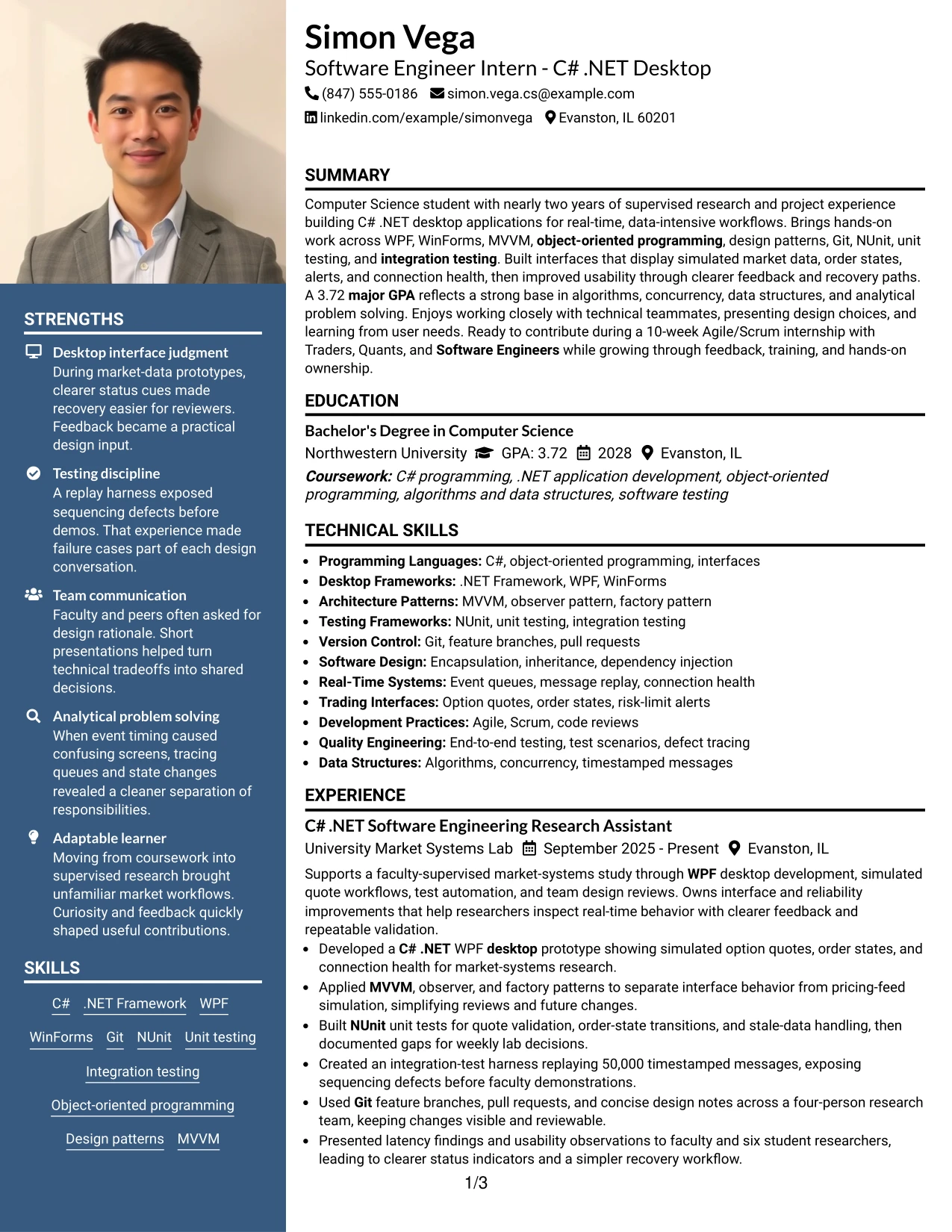
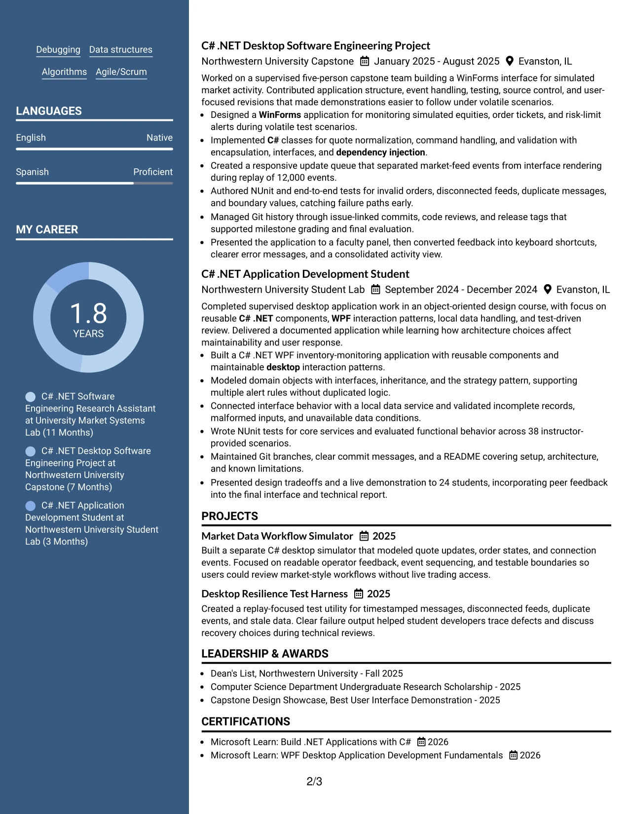
#6 Photo Header Two Column Format Resume Example
A restrained visual hierarchy gives this resume a polished first impression while keeping the content organized in two columns. The photo header can identify the document quickly, and the columns can separate compact qualifications from detailed experience, projects, and education. Technical evidence should still control the review rather than the visual treatment.
For the target internship, the resume can align the role with C# .NET desktop development, WinForms and WPF, unit and integration testing, Git, and object-oriented design. The main content can show real project ownership through simulated market interfaces, test harnesses, and presentations. Use the photo header only when it fits the application context and local hiring expectations.
Why the Photo Header Two Column Format Works for a Resume
- The header creates a clear document identity at first scan.
- Two columns separate quick-reference details from fuller evidence.
- A defined photo area can support a polished personal presentation.
- Technical keywords remain grouped for efficient qualification review.
- Experience bullets retain room for architecture and testing details.
- Project evidence can sit beside education without a long visual block.
- The hierarchy keeps the photo secondary to skills and achievements.
Best For
- Applications where a professional photo header is suitable and expected.
- Resumes needing a strong first-page identity with organized content.
- Candidates presenting technical projects alongside a compact skills area.
- Documents where role-related keywords should be easy to locate.
- Readers who value visual structure but still need detailed work evidence.
- Portfolios or direct-review settings with more room for personal branding.
- Applications that benefit from separating credentials from project narratives.
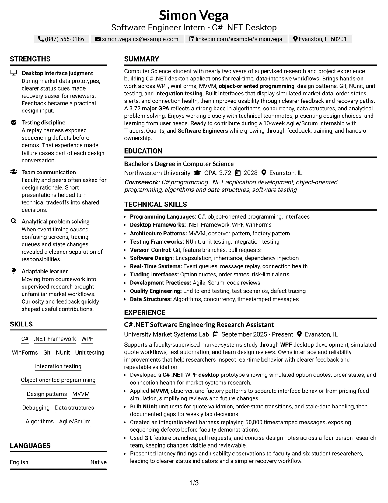
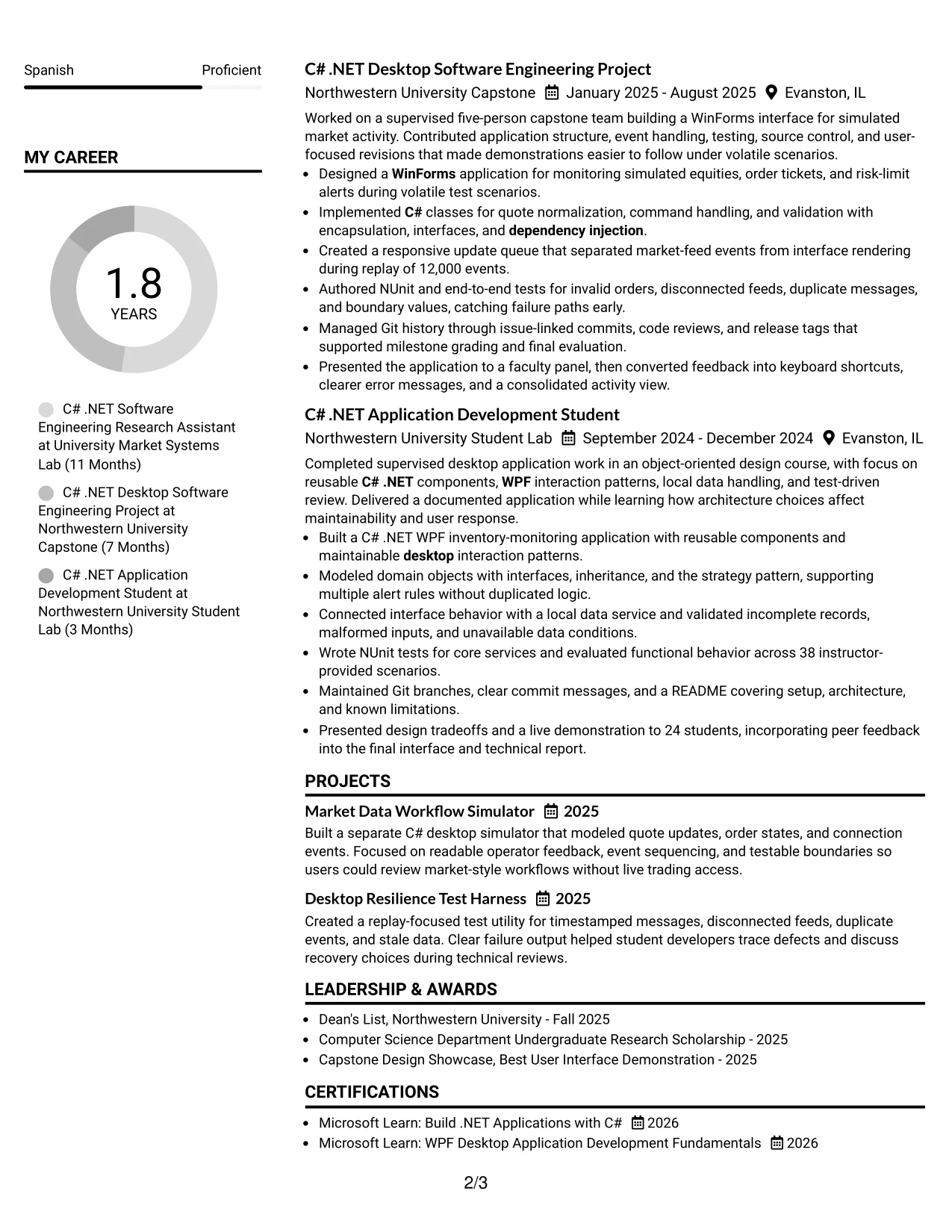
#7 Simple Two Column Format Resume Example
Simple Two Column Format keeps the page efficient without making the information feel dense. One area can hold compact skills, education, certifications, and awards, while the other presents the summary, experience, and projects. Familiar headings and short bullets help the recruiter move from a qualification check to supporting evidence.
The layout suits a resume that must show both technical range and applied results. C#, .NET Framework, WPF, WinForms, MVVM, Git, NUnit, and integration testing can be listed clearly, while the experience area explains design patterns, event queues, defect tracing, and team reviews. The result is a focused presentation of capabilities relevant to desktop software development.
Why the Simple Two Column Format Works for a Resume
- The simple split reduces visual clutter on a content-rich page.
- Skills and education can be checked without interrupting experience review.
- Short bullets make technical contributions easier to scan.
- Projects can show purpose, tools, and testing in a compact structure.
- Standard labels support reliable ATS and recruiter interpretation.
- The format keeps credentials visible beside evidence of application.
- Consistent spacing helps readers distinguish each resume section.
Best For
- Resumes needing an efficient split between credentials and evidence.
- Applications with a broad technical skills list and several projects.
- Candidates who want concise bullets rather than large text blocks.
- Readers moving quickly between education, tools, and experience.
- Documents where testing and architecture details need clear placement.
- ATS-aware PDF resumes using recognizable headings and restrained columns.
- Applications that value a clean record of collaboration and delivery.
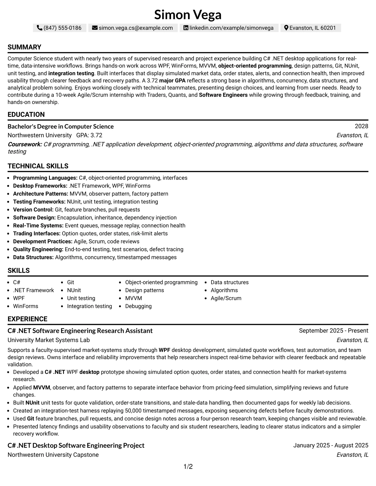
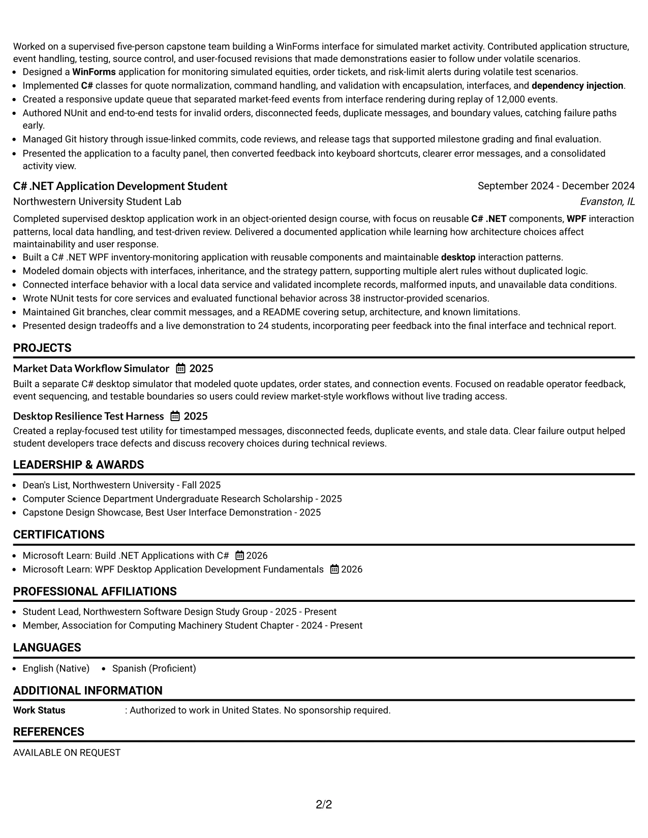
#8 Text/Fang Style Resume Example
Readers can move through this text-focused resume in a steady sequence, with each section carrying enough detail to support a careful review. The one-column structure gives experience and project descriptions room to explain technical decisions, while consistent text treatment prevents visual elements from competing with the evidence.
That space is useful for documenting C# .NET desktop work in precise bullets. The resume can connect WPF and WinForms to interface behavior, MVVM and dependency injection to maintainable design, and NUnit to repeatable testing. It can also preserve results such as 50,000 replayed messages, 12,000 events, and 38 evaluated scenarios without compressing the facts.
Why the Text/Fang Style Works for a Resume
- A text-led structure gives technical descriptions room to breathe.
- The one-column path supports careful review of experience bullets.
- Consistent treatment keeps tools and outcomes visually connected.
- Projects can include context without relying on decorative panels.
- Detailed testing evidence remains easy to locate and compare.
- Standard headings make the document practical for ATS processing.
- The format supports a complete account of academic and supervised work.
Best For
- Resumes where detailed technical explanations are more important than decoration.
- Applications with several projects that need clear context and outcomes.
- Candidates documenting architecture, testing, and implementation choices.
- Readers who prefer a steady, text-first review process.
- Documents that must retain several measurable evidence points.
- Applications combining research, coursework, and project experience.
- ATS-conscious resumes using full-width bullets and familiar section labels.
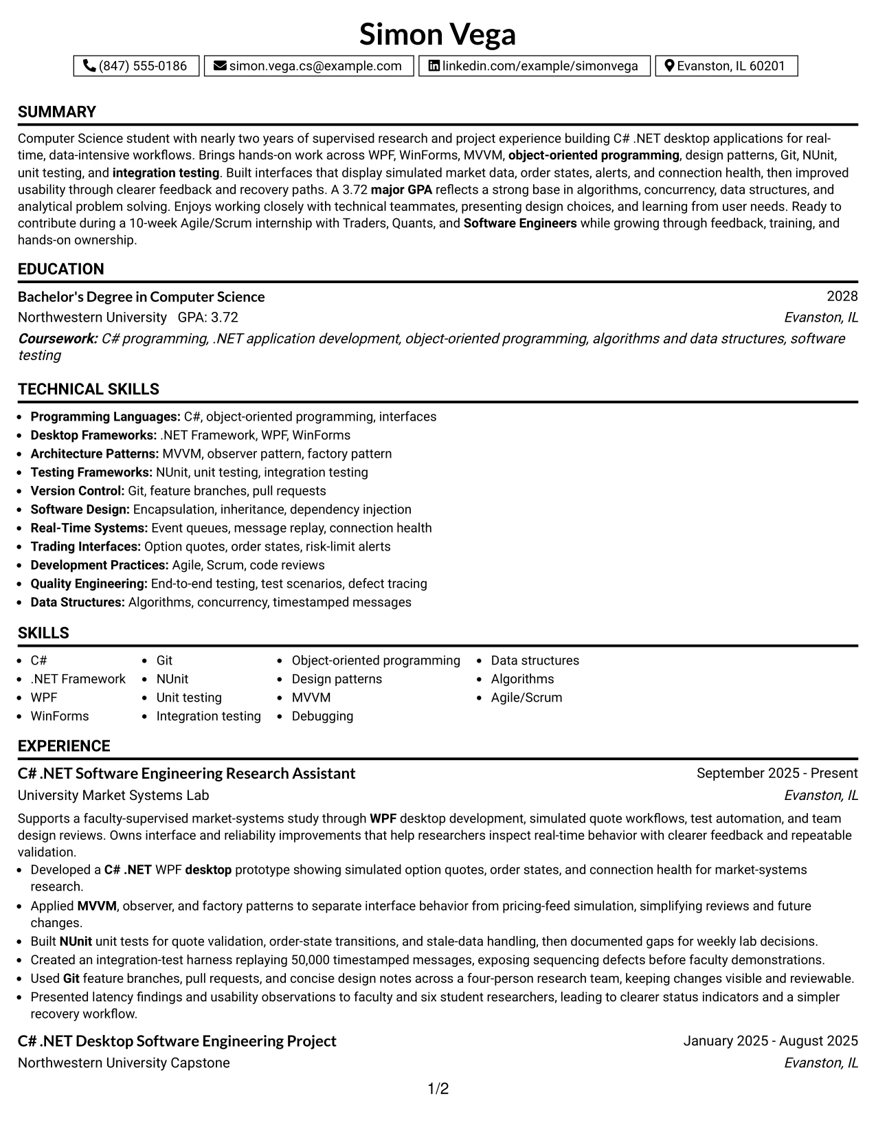
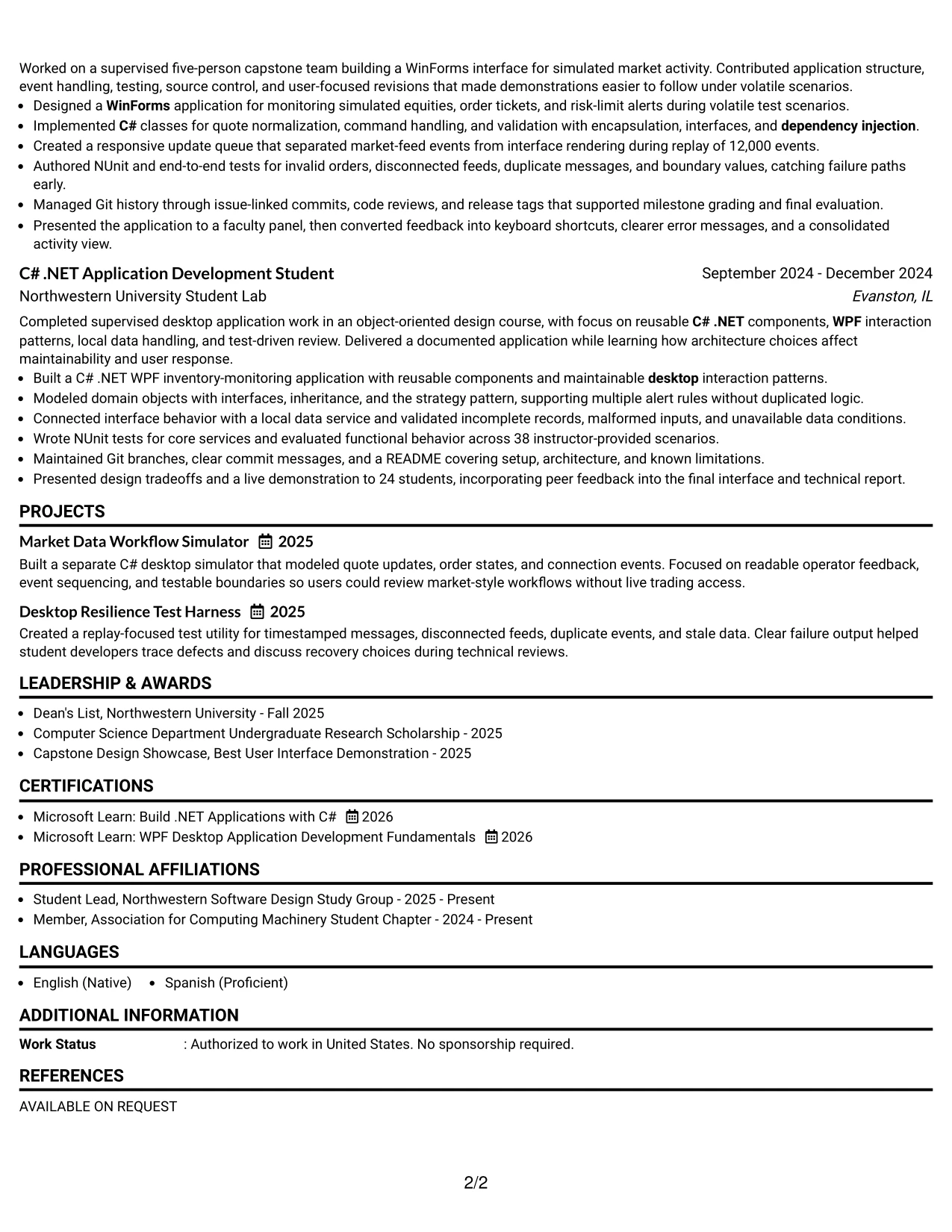
#9 One Column Boxed Contact Header Format Resume Example
The strongest evidence can begin directly below a clearly boxed contact header. Once contact details are confirmed, the recruiter can move through the summary, skills, experience, projects, and education in one uninterrupted column. The header gives the page a defined starting point while the body remains focused on qualifications.
This arrangement is well suited to a resume that must establish technical relevance quickly. The content can feature C#, .NET Framework, WPF, WinForms, Git, NUnit, and object-oriented programming, followed by bullets on quote workflows, order states, validation, and integration testing. Measurable details make the evidence easier to assess during a short review.
Why the One Column Boxed Contact Header Format Works for a Resume
- The boxed header makes contact details easy to verify.
- A single body column supports predictable recruiter scanning.
- Technical keywords appear in a clear, standard sequence.
- Full-width bullets provide room for measurable outcomes.
- Experience and projects can build evidence without side-column limits.
- Skills remain connected to the work that demonstrates them.
- The layout separates identification from the qualifications review.
Best For
- Applications where contact details must be immediately visible.
- Resumes using a direct one-column sequence for fast review.
- Candidates whose strongest value is shown through detailed evidence bullets.
- Documents with technical projects that need full-width descriptions.
- Readers checking role keywords before reviewing implementation results.
- PDF submissions that benefit from a clearly defined top section.
- Applications combining testing, desktop interfaces, and academic credentials.
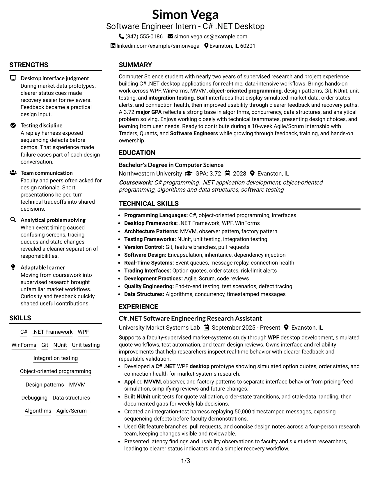
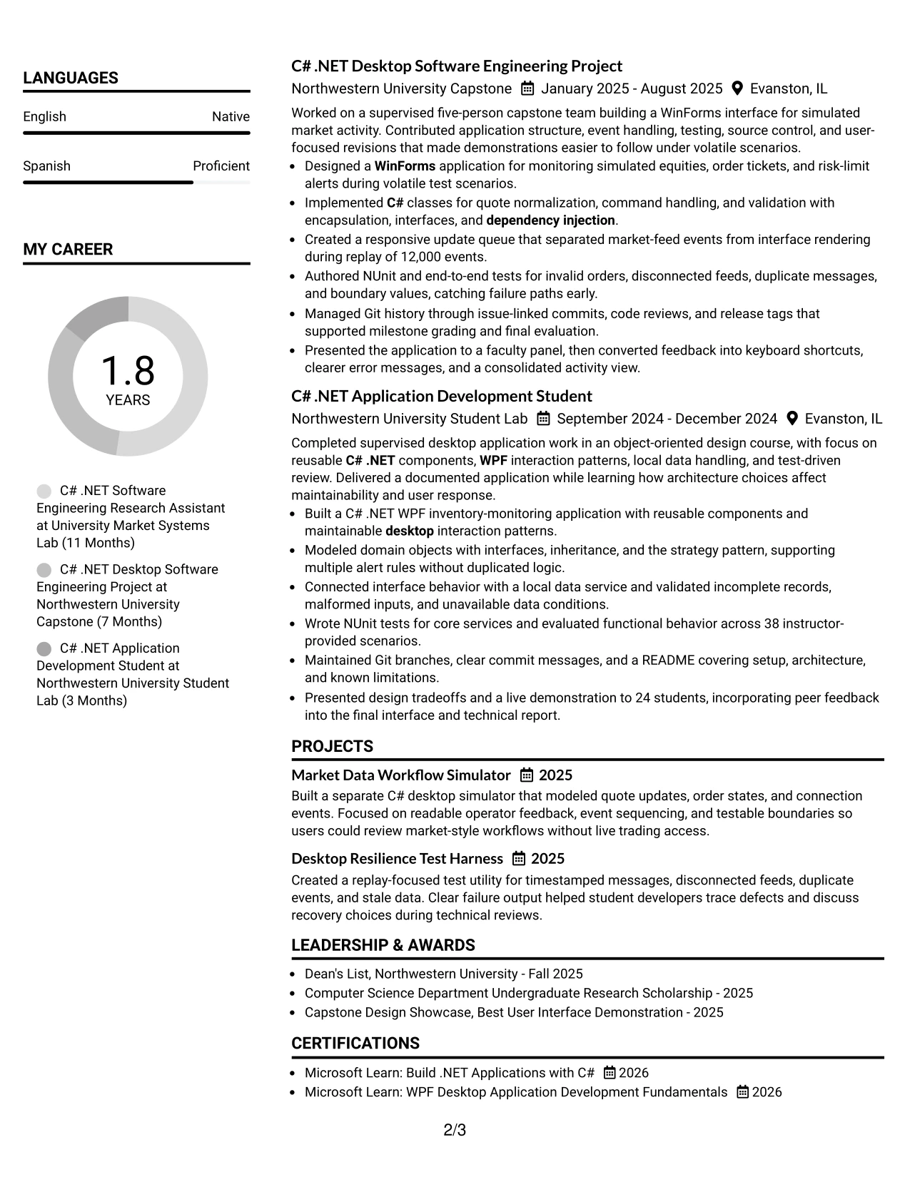
#10 Plain Two Column Format Resume Example
Balanced content distribution helps a recruiter review both quick qualifications and supporting evidence. Plain Two Column Format can place contact details, skills, education, certifications, and other concise facts in one area, while the other carries the summary, experience, and projects. The plain treatment keeps the focus on readable content rather than visual decoration.
A short resume snapshot can reinforce the core case: Computer Science study, a 3.72 major GPA, C# .NET desktop work, WPF and WinForms experience, NUnit testing, Git, and real-time workflow projects. Role-specific keywords should appear naturally in headings, skills, and bullets so the document supports both ATS matching and human review.
Resume Snapshot
- Computer Science student graduating in 2028 with a 3.72 major GPA.
- Nearly two years of academic, project-based, and supervised research development.
- Hands-on C# .NET desktop work with WPF, WinForms, MVVM, and design patterns.
- Testing and collaboration evidence using NUnit, integration testing, Git, and Agile/Scrum practices.
Why the Plain Two Column Format Works for a Resume
- The two-column balance supports both fast review and deeper reading.
- A snapshot gives the recruiter a concise qualification summary.
- Skills and credentials remain visible without crowding experience bullets.
- Plain styling keeps keywords easy to identify and interpret.
- Projects can show real-time workflows, tools, and measurable scope.
- Standard text structure supports ATS parsing and PDF readability.
- The format makes education and certifications easy to compare with experience.
Resume Keywords for Software Engineer Intern - C# .NET Desktop
- Software Engineer Intern
- C# .NET
- .NET Framework
- Windows desktop applications
- WinForms and WPF
- unit testing and integration testing
- Git and NUnit
- object-oriented programming and design patterns
#11 Colored Two Column Format Resume Example
A restrained color hierarchy can guide attention while two columns keep the resume balanced. One column can present compact skills, education, certifications, and awards; the other can carry the summary, experience, projects, and measurable results. Color should mark section boundaries, not replace familiar headings or reduce text contrast.
For this application, the resume can use the visual separation to connect role keywords with proof. C# .NET, WPF, WinForms, MVVM, Git, and NUnit belong in the quick-reference area, while bullets explain quote displays, order-state validation, message replay, and interface improvements. Clear contrast and a PDF-safe layout remain essential for reliable review.
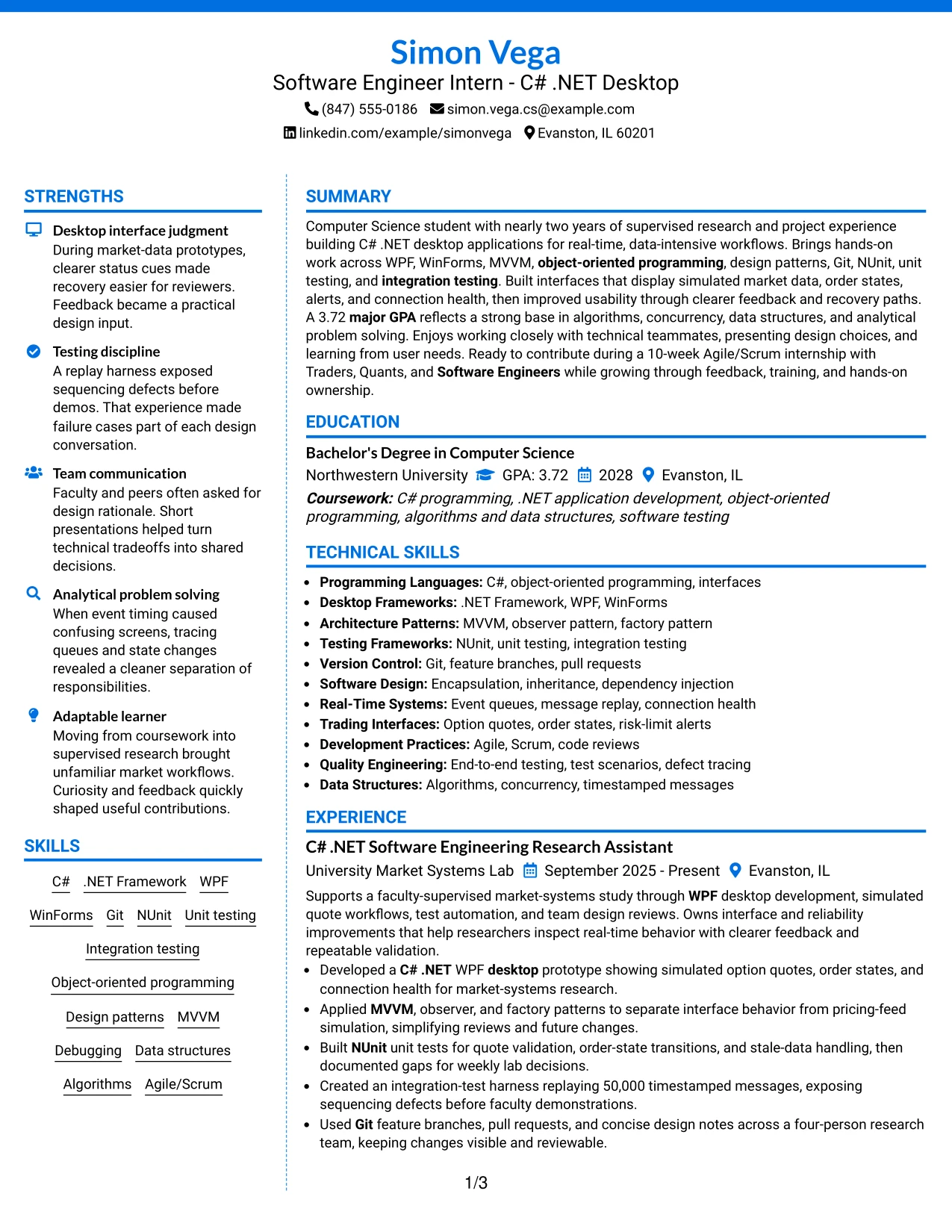
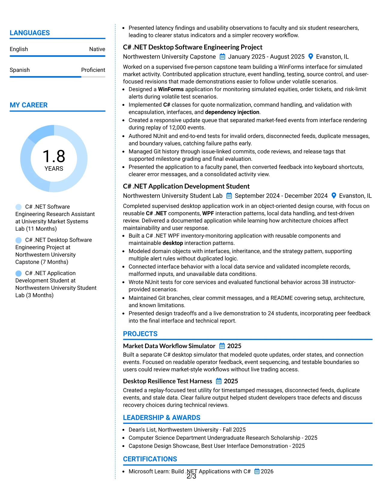
Why the Colored Two Column Format Works for a Resume
- Color creates section boundaries that support quick navigation.
- Two columns separate compact qualifications from detailed evidence.
- The main content area can show tools, methods, and measurable results.
- Skills remain visible without repeating every keyword in experience bullets.
- Projects can receive emphasis through placement rather than decoration.
- Familiar headings preserve ATS and recruiter usability.
- Controlled contrast keeps the document readable in PDF form.
Best For
- Resumes needing light visual distinction without a highly decorative design.
- Applications where skills and credentials should stay visible beside evidence.
- Candidates presenting technical projects with measurable testing scope.
- Readers who use visual cues to move between resume sections.
- Documents that need a clear split between reference information and achievements.
- PDF applications where color remains restrained and text contrast is strong.
- Applications combining desktop development, collaboration, and academic proof.
#12 One Column Shaded Contact Header Format Resume Example
A restrained visual hierarchy gives the resume a clear professional presence without adding visual noise. The shaded contact header places the target role, contact details, and professional summary where recruiters can find them quickly.
One-column spacing keeps the full story in a single reading path. Experience bullets, projects, education, certifications, and skills can appear in a logical order, while terms such as C#, .NET, WPF, WinForms, NUnit, Git, and Agile/Scrum remain easy for ATS tools to parse.
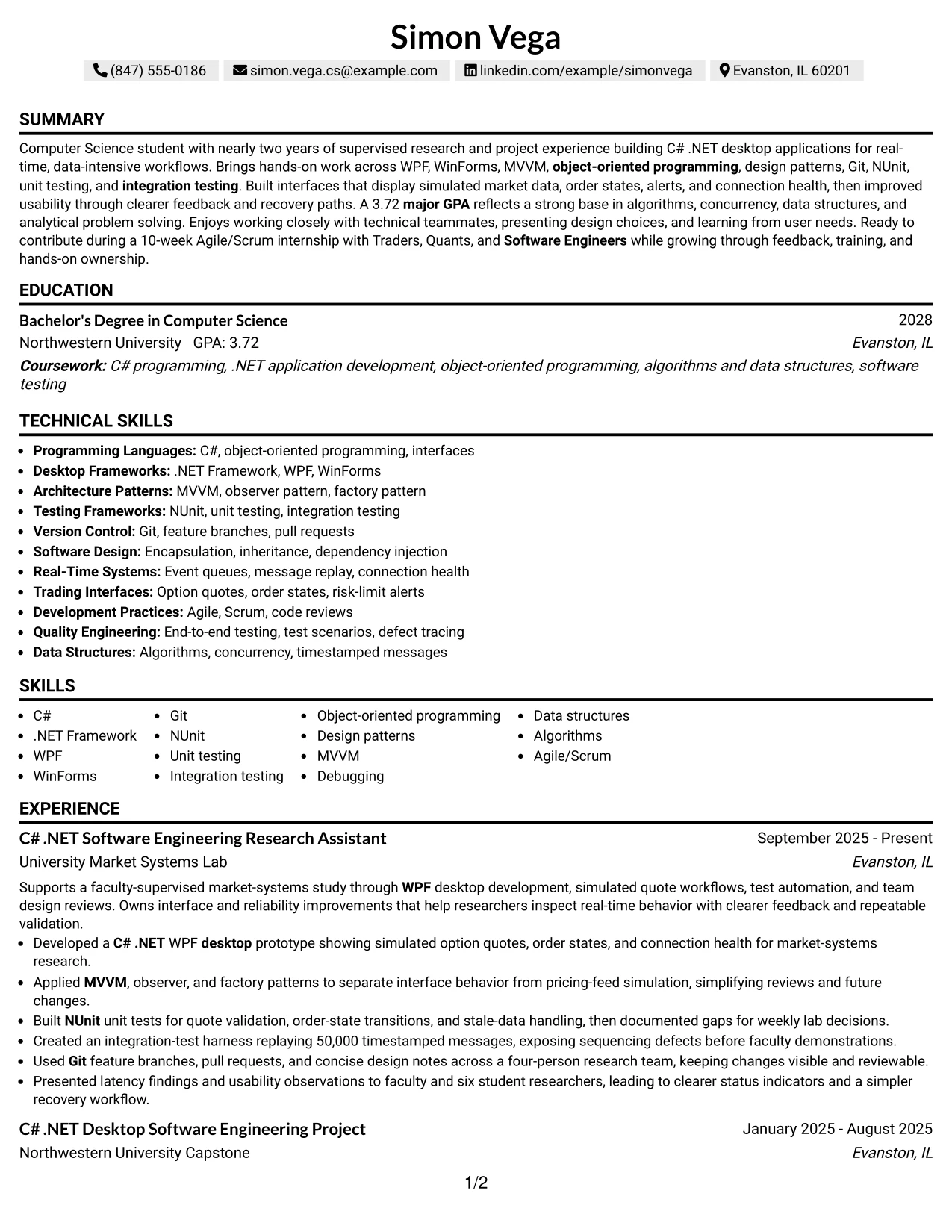
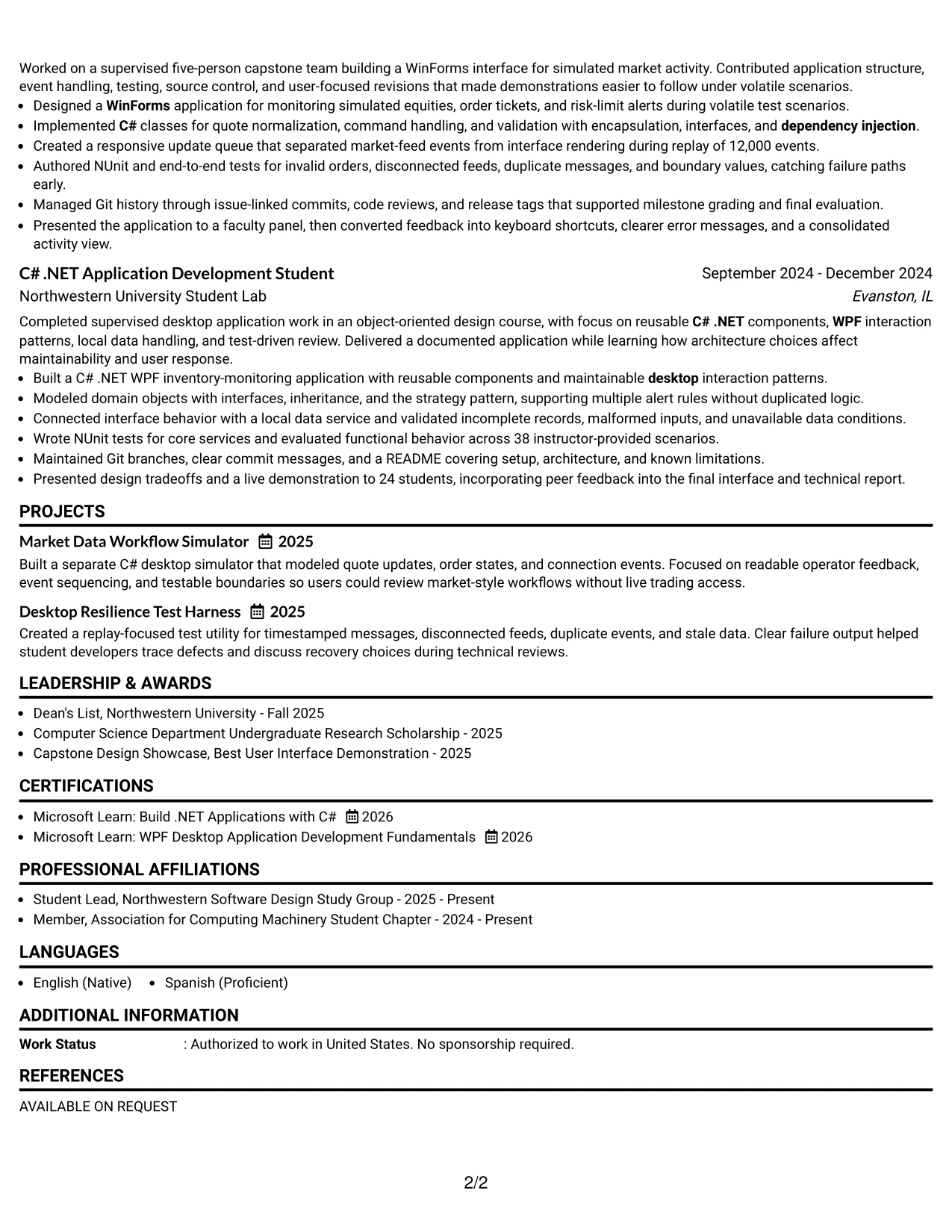
Why the One Column Shaded Contact Header Format Works for a Resume
- The centered header makes the target role visible at the start of the review.
- A single column supports reliable ATS reading from top to bottom.
- Shaded labels separate summary, experience, projects, education, and skills without heavy decoration.
- Short bullet points keep technical work easy to scan.
- Measured evidence such as 50,000 timestamped messages and 12,000 replayed events adds credibility.
- The format gives projects and certifications enough room without crowding the page.
- A focused skills section can reinforce C# .NET desktop keywords found in the job description.
Best For
- Resumes that need a direct match between the target role and the opening summary.
- Applicants who want one uninterrupted reading path for ATS and recruiter review.
- Technical resumes with several distinct sections but limited need for visual separation.
- Candidates who need room for project bullets, testing details, and measurable results.
- Applications where clear contact details and PDF readability matter.
- Documents that balance academic background with supervised research and project experience.
- Roles where keywords must remain visible in standard section headings and bullet text.
#13 Boxed Contact Header with Job Title Format Resume Example
The format starts with a boxed contact header that identifies the target role and gives the resume a firm visual entry point. The box can contain the name, contact information, LinkedIn profile, and a concise summary without taking space from the evidence below.
After the header, clearly labeled sections guide a fast review of experience, projects, education, certifications, and skills. Standard terms such as object-oriented programming, design patterns, Git, NUnit, unit testing, and integration testing support both keyword matching and human evaluation.
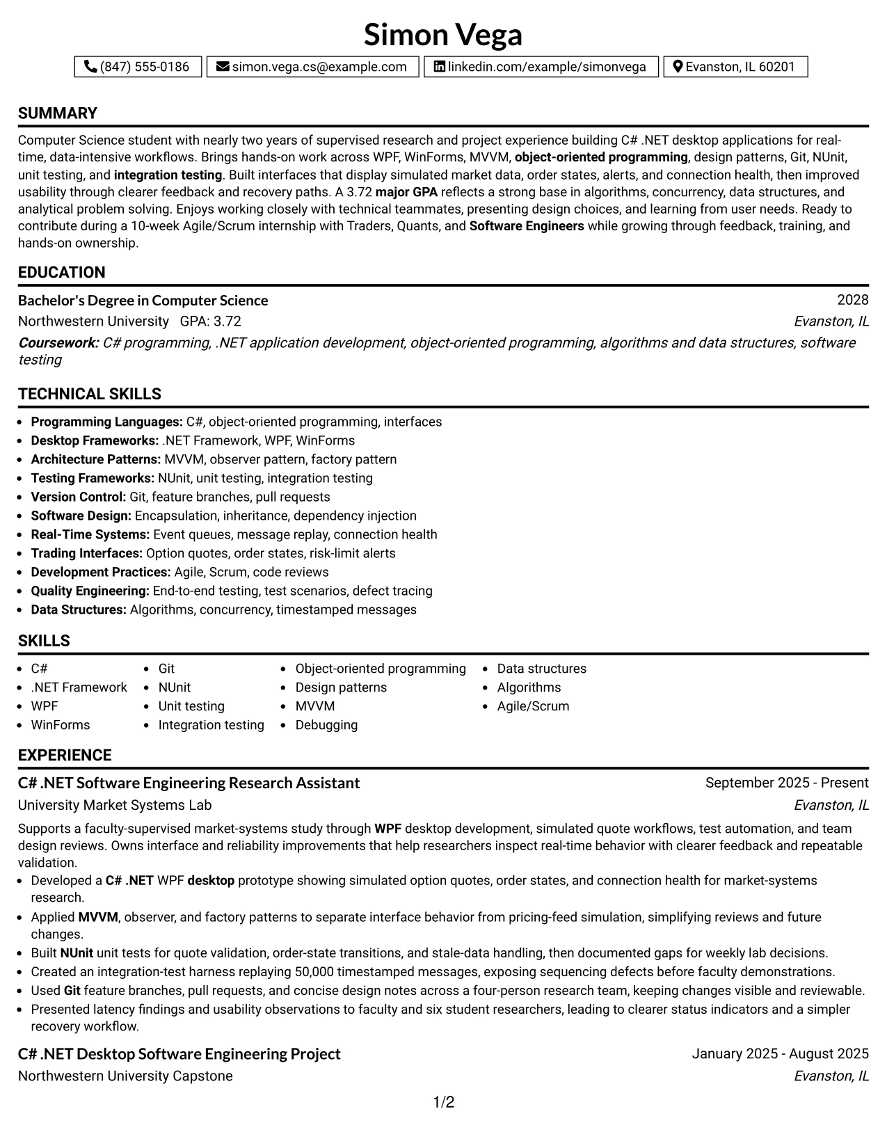
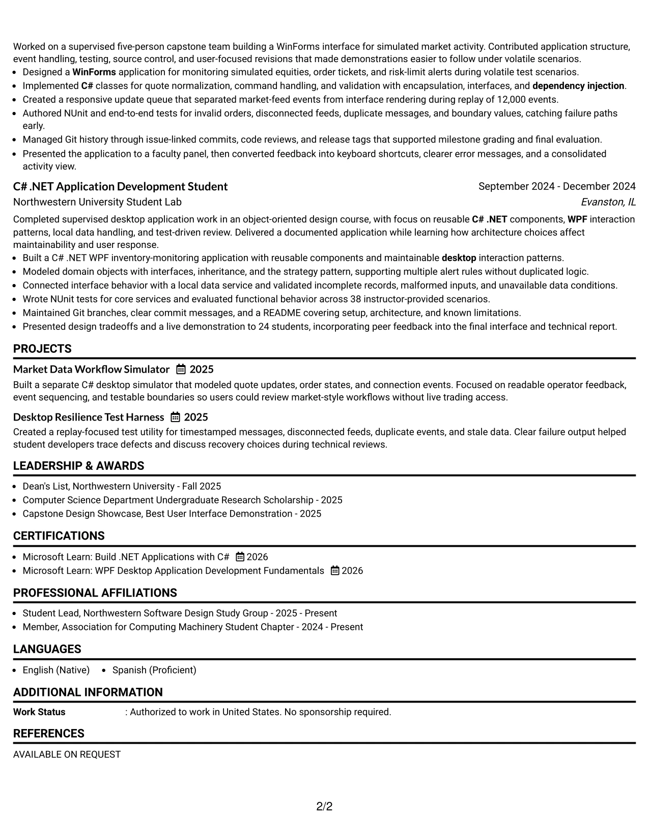
Why the Boxed Contact Header with Job Title Format Works for a Resume
- The job title in the header confirms the application context immediately.
- A boxed contact area keeps essential details together and easy to locate.
- Clear section labels help reviewers move from summary to evidence without guesswork.
- One-column organization supports dependable ATS extraction.
- Bullets can show action, technical method, and result in a compact structure.
- Projects remain visible instead of being buried beneath education.
- The layout gives technical keywords a consistent place in the summary and skills sections.
Best For
- Applications that benefit from a strong job-title reference before the first resume section.
- Resumes submitted as PDFs where a stable one-column structure reduces parsing risk.
- Candidates who need a visible division between contact information and career evidence.
- Technical documents with a focused set of projects, certifications, and academic details.
- Readers who scan headings first and return to bullets for proof.
- Applications that require both a professional summary and a detailed skills inventory.
- Resumes where consistent spacing matters more than complex visual design.
#14 Stylish Two Column Designer Format Resume Example
Recruiter movement is straightforward: the narrow sidebar provides contact details, skills, certifications, or education, while the wider column carries the summary, experience, and projects. This division lets the reviewer identify key qualifications before reading the detailed bullets.
The two-column structure suits a resume with substantial technical evidence. A careful balance keeps measurable results, testing work, architecture choices, and team contributions in the main column while related keywords stay available in the sidebar.
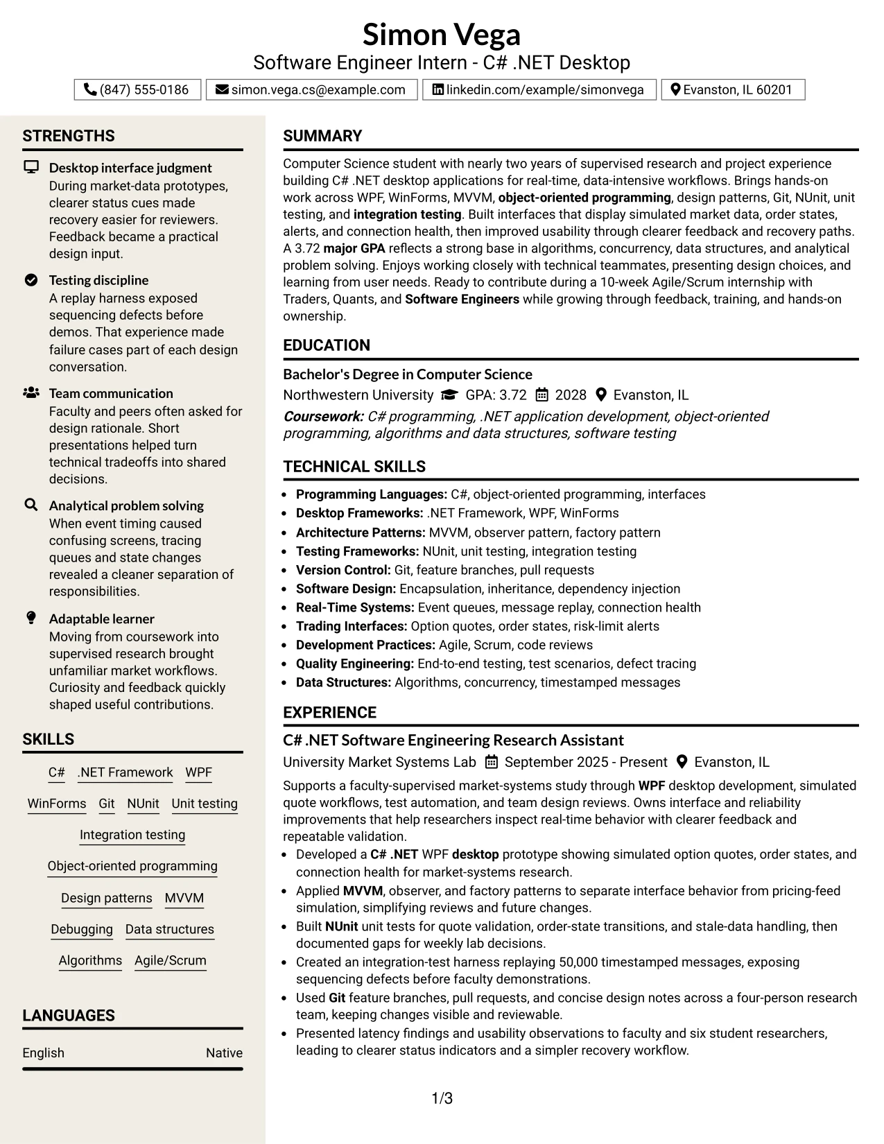
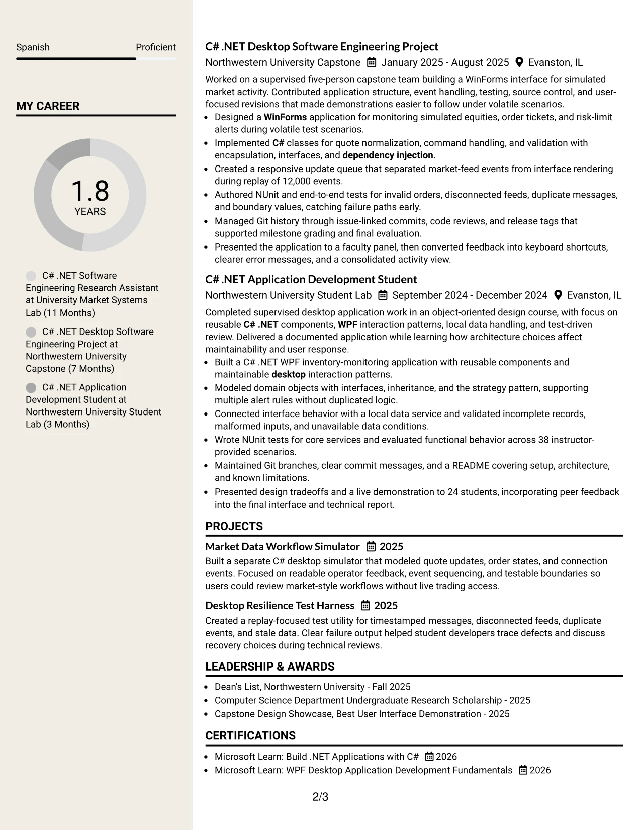
Why the Stylish Two Column Designer Format Works for a Resume
- The sidebar gives fast access to C#, .NET, WPF, WinForms, Git, and NUnit.
- The main column preserves enough width for readable achievement bullets.
- Separate columns distinguish quick facts from supporting evidence.
- Projects can sit beside experience without forcing excessive page length.
- Visual markers help reviewers locate education, certifications, and activities.
- The format supports a larger skills inventory without interrupting the experience narrative.
- Careful text contrast and simple labels keep the design usable when exported to PDF.
Best For
- Resumes with enough content to justify a sidebar and a wider evidence column.
- Applicants who want skills and certifications visible during the first scan.
- Documents that combine research work, capstone projects, and coursework.
- Readers who prefer quick qualification checks before detailed experience review.
- Applications with multiple technical categories that benefit from grouping.
- Candidates presenting measurable test, replay, or team results in a broader main column.
- PDF resumes that need visual organization while retaining conventional section names.
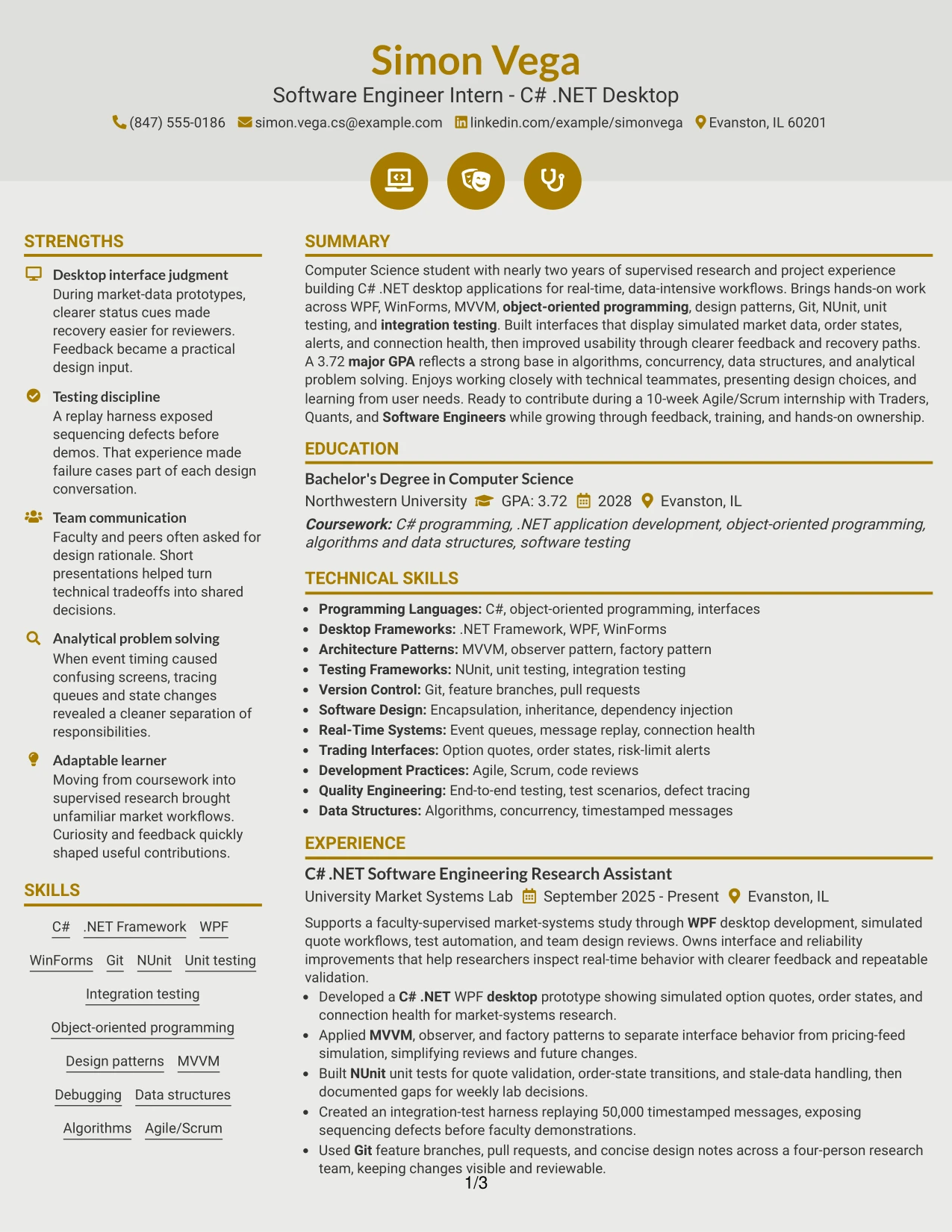
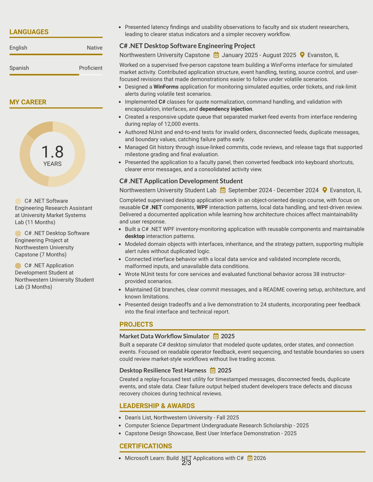
#15 Modern Icon Format Resume Example
The evidence receives priority over decoration. Experience bullets show what was built, which tools were used, and how the work was tested, while small section icons help readers locate information without replacing standard text labels.
A centered, modern structure can present C# .NET desktop work, WPF and WinForms projects, NUnit testing, Git practices, education, and certifications in a compact sequence. The strongest bullets retain specific proof, including replay volumes, test coverage, and user-facing improvements.
Why the Modern Icon Format Works for a Resume
- Experience bullets remain the main source of qualification evidence.
- Icons provide quick visual cues while text labels preserve clarity.
- Technical tools appear near the achievements that demonstrate their use.
- Specific volumes such as 50,000 messages and 38 test cases strengthen the record.
- Projects can show architecture, event handling, and desktop interface work.
- The layout gives awards and certifications a clear but secondary position.
- A restrained icon system can improve navigation without interfering with ATS-readable text.
Best For
- Resumes that need to show built work before listing broad skill claims.
- Applicants with strong project evidence and several technical methods to explain.
- Documents where testing results and event volumes should stand out during review.
- Readers who appreciate quick section cues but still need conventional text.
- Applications combining desktop development, architecture patterns, and user feedback.
- Candidates who want projects and certifications visible without large graphic elements.
- PDF submissions that use simple icons as navigation aids rather than as content.
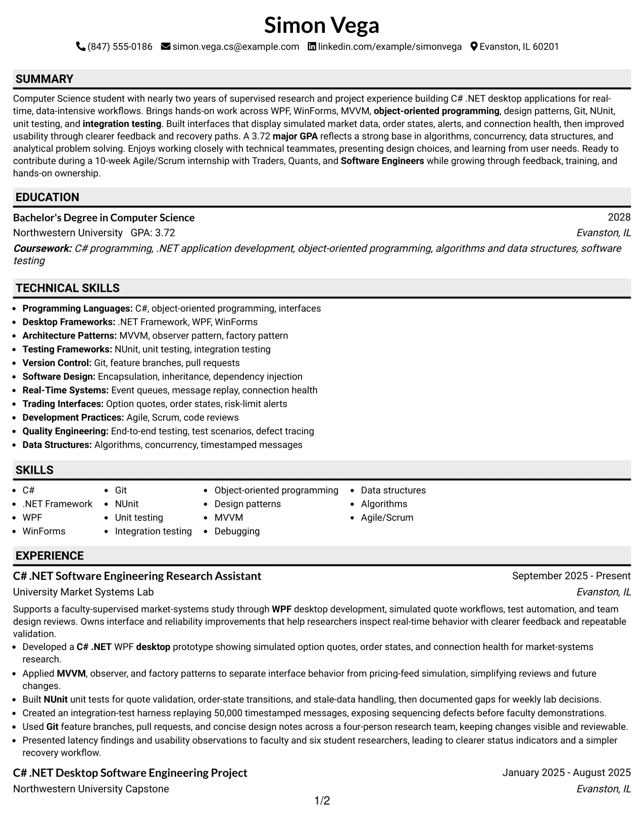
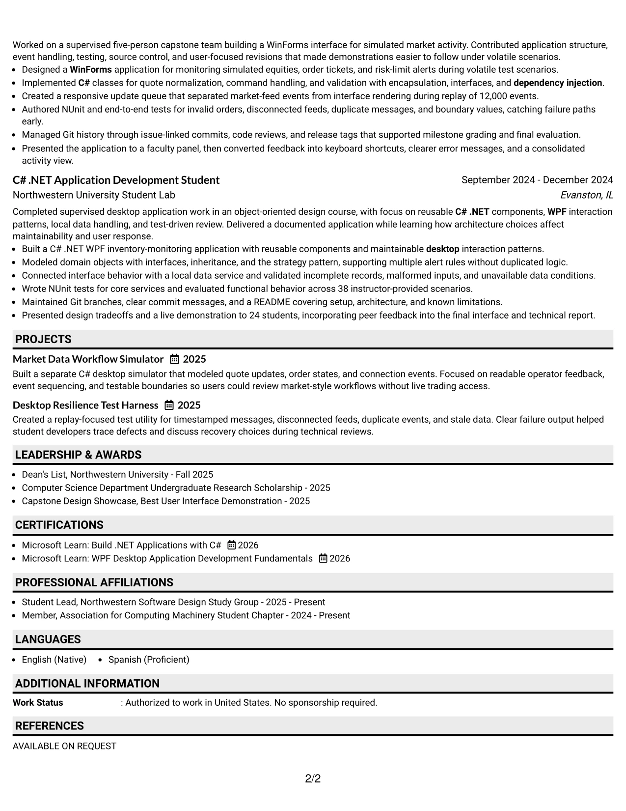
#16 Plain Professional Layout with Job Title and Shaded Labels Resume Example
Content is balanced through familiar section labels and moderate spacing. The opening area identifies the target role and summary, while the body gives experience and projects enough room for technical bullets without creating a crowded page.
Shaded labels provide structure without distracting from the facts. This approach works well for a PDF resume that must present C# .NET, WPF, WinForms, testing, Git, education, certifications, and measurable project results in a practical order.
Why the Plain Professional Layout with Job Title and Shaded Labels Works for a Resume
- The job title connects the document to the intended application.
- Shaded labels create clear transitions between resume sections.
- Plain typography supports fast reading and reliable PDF display.
- Experience bullets can connect tools to specific implementation work.
- Projects provide additional proof of architecture and testing ability.
- Education and a 3.72 major GPA remain easy to verify.
- The structure keeps job-description keywords visible without keyword stuffing.
Best For
- Applications that call for a practical resume with a clear target role.
- PDF documents where dependable spacing and familiar labels are important.
- Applicants who need to combine education, research, projects, and certifications.
- Technical resumes that rely on bullet evidence rather than visual effects.
- Reviewers who want to confirm qualifications in a predictable sequence.
- Documents that must show both skills and the work behind those skills.
- Candidates who prefer a professional format that keeps attention on content.
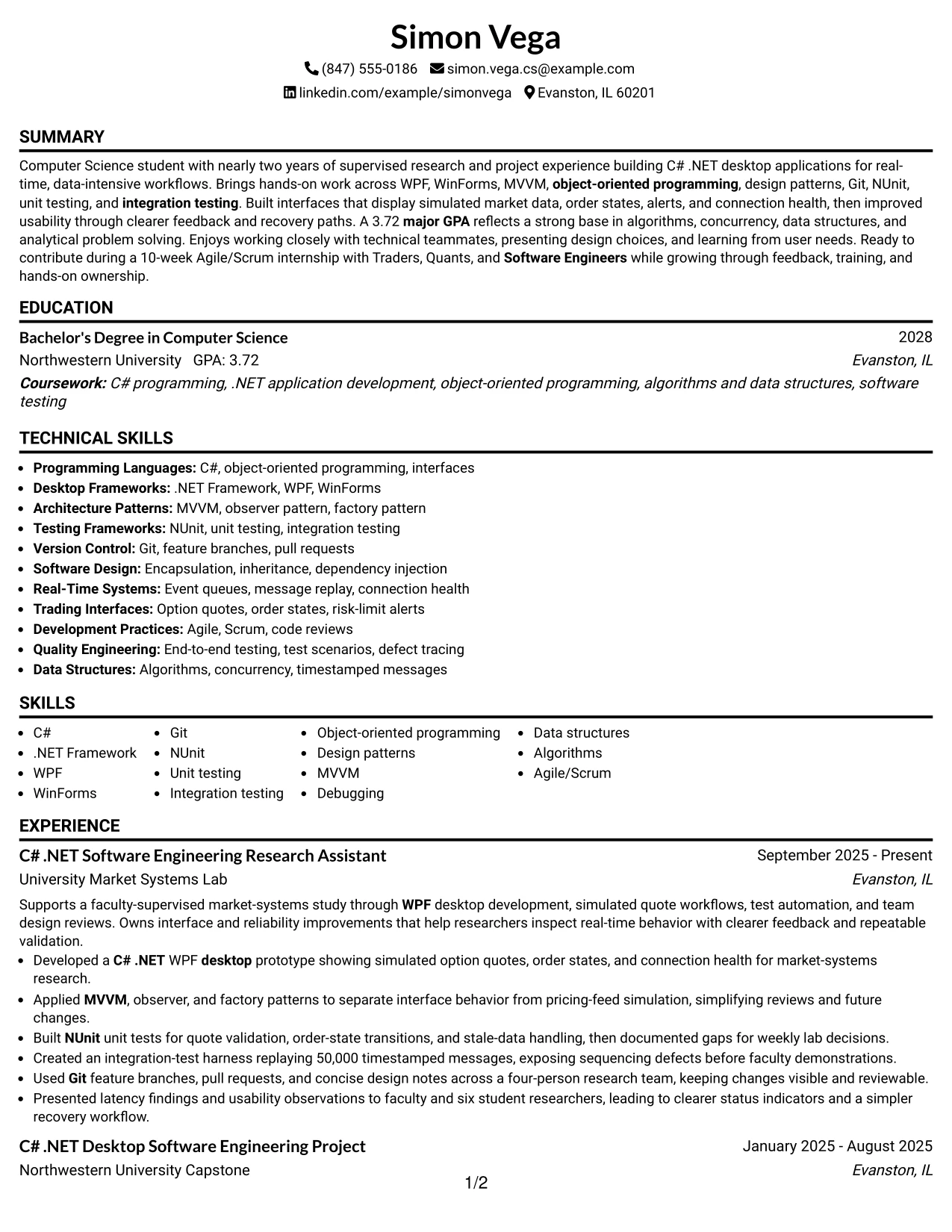
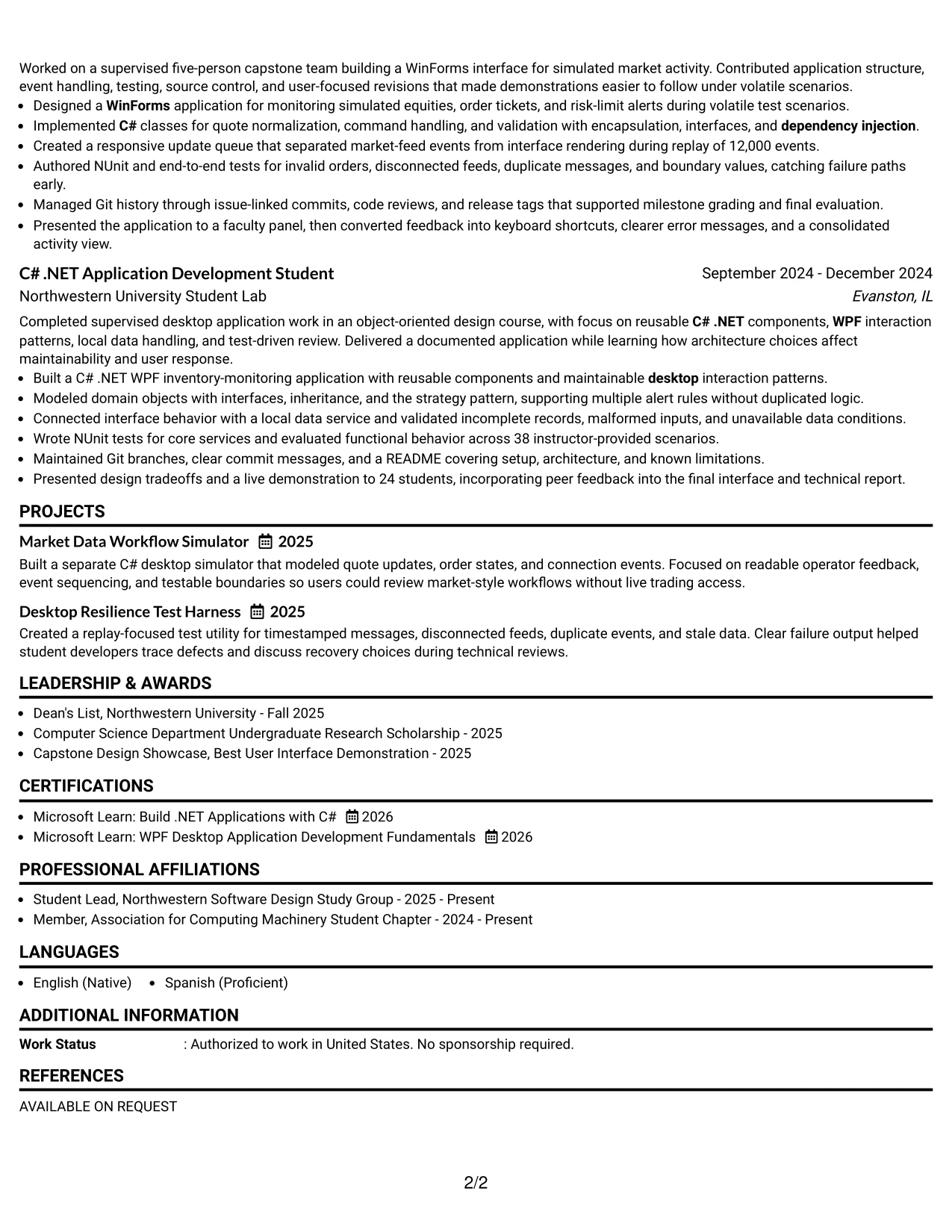
#17 Classic One Column Resume Format Resume Example
For a practical application, a classic one-column resume offers a dependable way to present academic work, supervised research, and projects in sequence. Recruiters can review the summary, experience, education, certifications, and skills without adjusting to a complex visual system.
Traditional hierarchy also supports ATS needs. Strong bullets can describe MVVM, dependency injection, NUnit, integration testing, Git, and real-time message handling while keeping dates, organizations, and measurable results easy to identify.
Why the Classic One Column Resume Format Works for a Resume
- Conventional headings make the document familiar to recruiters and ATS software.
- A single column keeps dates, titles, organizations, and bullets aligned.
- The format gives academic and project experience equal structural importance.
- Technical methods can be stated directly beside the work they support.
- Measurable results improve the strength of otherwise early-career evidence.
- Education and certifications fit naturally after the experience section.
- The restrained design keeps attention on problem solving, testing, and communication.
Best For
- Internship applications that combine university study with hands-on project work.
- Applicants who need a familiar structure for recruiter and ATS review.
- Resumes where dates and role titles should be easy to compare.
- Candidates presenting technical experience through concise achievement bullets.
- PDF submissions that require consistent rendering across systems.
- Documents with a focused number of sections and a clear chronological path.
- Applications where evidence and readability matter more than visual novelty.
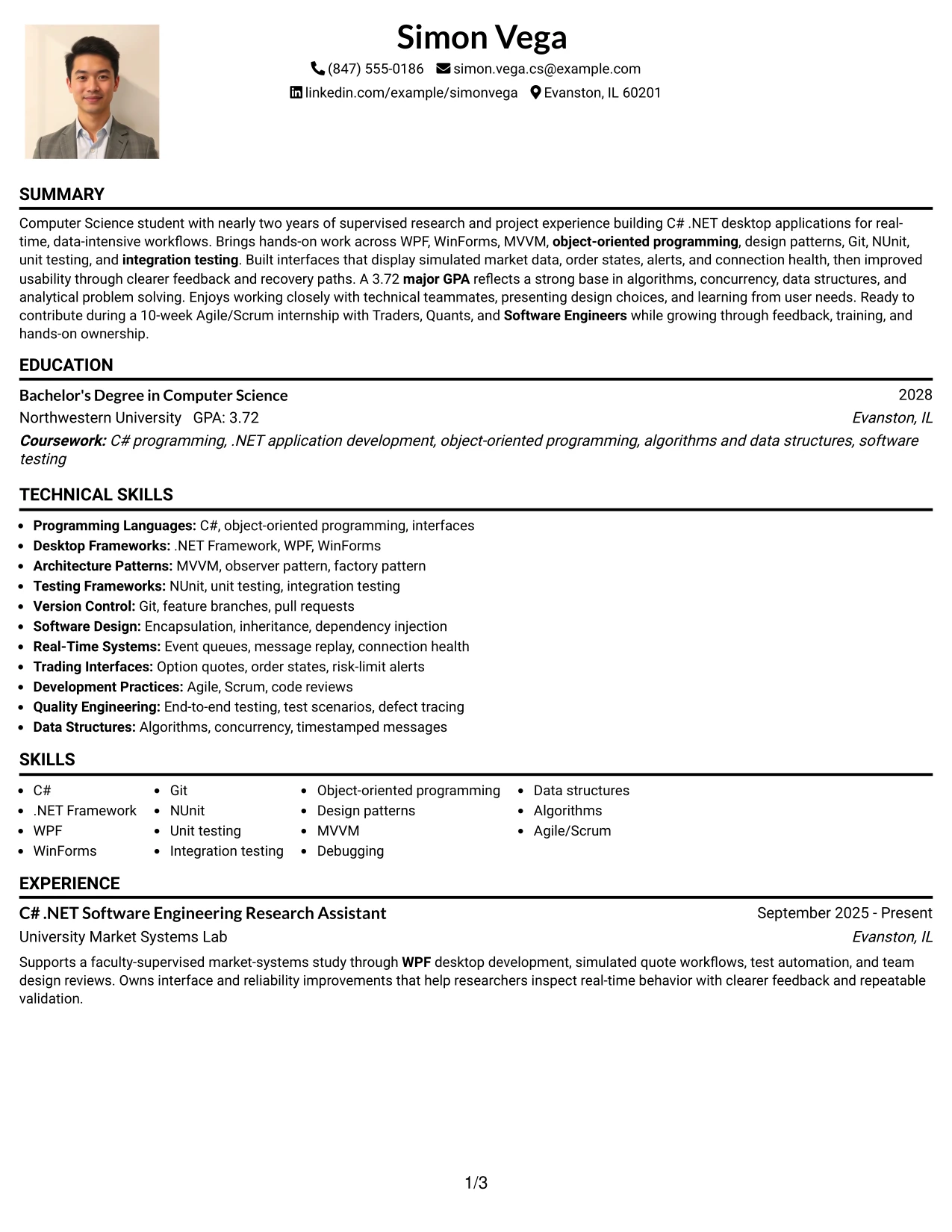
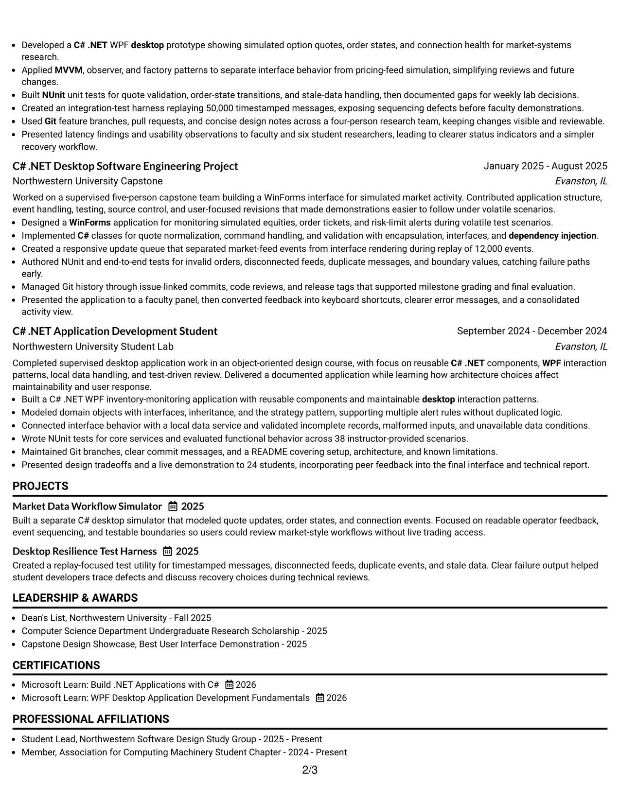
#18 One Column Format with Photo Resume Example
A restrained one-column hierarchy keeps the resume focused on role alignment while allowing the contact area to include a professional photo when appropriate for the application context. The summary can state the target role, technical focus, and strongest qualifications before the reader reaches the evidence.
The main body remains easy to scan. Experience, projects, education, certifications, awards, and skills follow one path, with C# .NET desktop development, WPF, WinForms, Git, NUnit, and testing terms placed where both recruiters and ATS tools can find them.
Why the One Column Format with Photo Works for a Resume
- The top area can combine identity, contact details, target role, and a professional photo.
- A single reading path keeps experience and project evidence organized.
- The summary provides an early match to the Software Engineer Intern requirements.
- Technical keywords appear in standard sections rather than only in visual elements.
- Bullets can show testing, architecture, interface work, and measurable replay results.
- Education and certifications remain easy to locate after the practical evidence.
- The format works best when the application or regional convention supports a photo.
Best For
- Applications where a professional photo is accepted and useful for the presentation context.
- Resumes that need a direct role match before detailed technical evidence.
- Applicants who prefer one-column reading for experience, projects, and education.
- Documents with a compact body that leaves room for a balanced contact area.
- Candidates combining academic credentials with supervised desktop development.
- PDF resumes where standard text sections must remain easy to parse.
- Applications that benefit from a polished personal presentation without multi-column complexity.
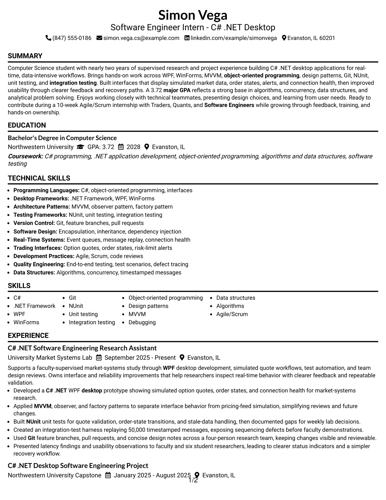
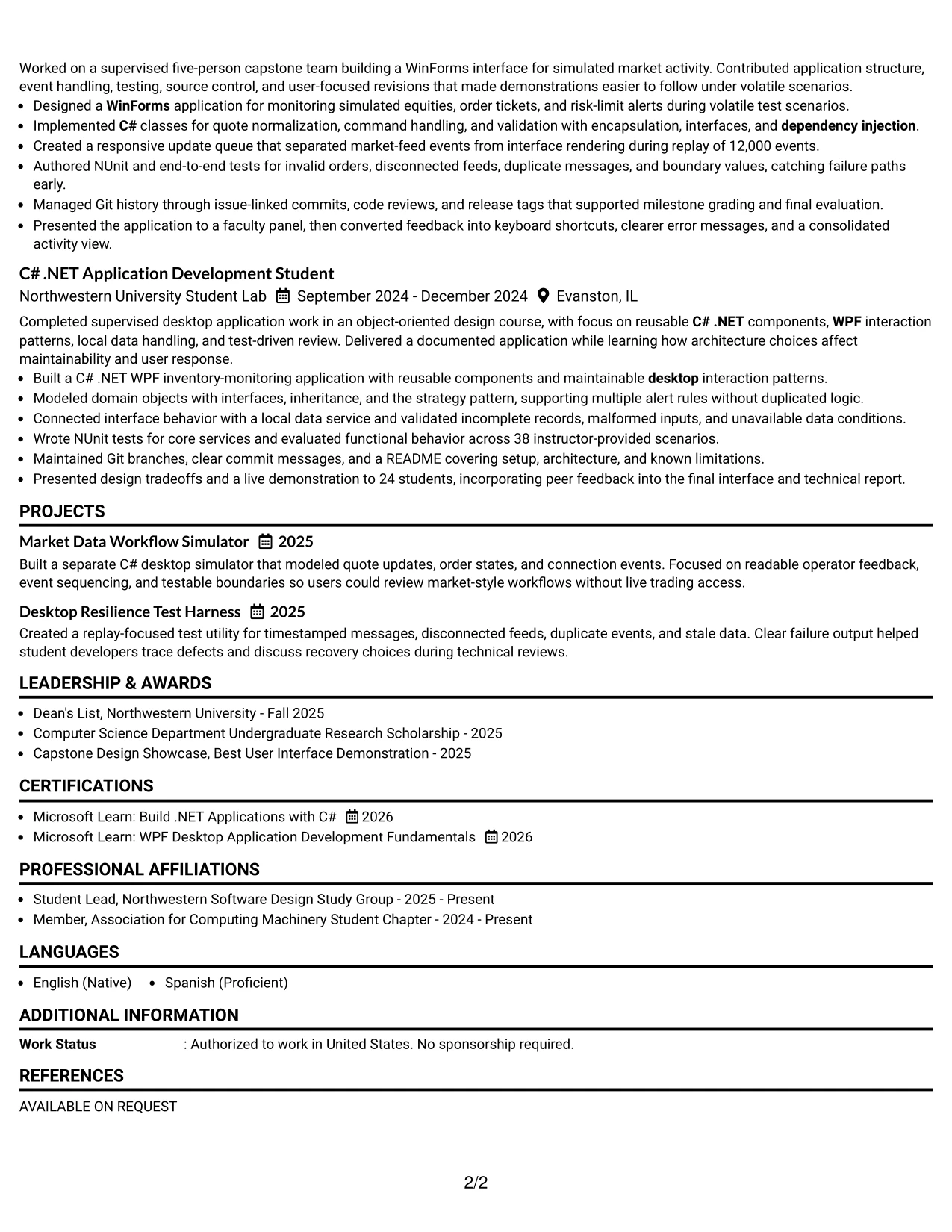
#19 Minimal Header Format Resume Example
The format structure is intentionally simple: a compact header identifies the candidate and target role, then standard resume sections carry the detail. This removes visual competition and lets the reviewer move directly into the summary, experience, projects, education, and skills.
Minimal presentation does not mean minimal evidence. The resume can still show 50,000-message replay testing, 12,000-event processing, design patterns, Git collaboration, NUnit tests, certifications, and a 3.72 major GPA in a clean one-column sequence.
Why the Minimal Header Format Works for a Resume
- A compact header leaves more space for substantive resume content.
- Standard section order supports quick recruiter and ATS navigation.
- One-column alignment keeps role dates and bullet points easy to follow.
- The design gives measurable results more attention than decorative elements.
- Projects can extend the technical story without competing with experience.
- Skills remain concise and searchable when grouped with familiar labels.
- The format supports a professional PDF that is simple to review and share.
Best For
- Resumes where content volume should take priority over a large header.
- Applicants who want a clean first scan of role, summary, and experience.
- Technical documents with measurable project details to preserve.
- PDF applications that need a low-risk, conventional structure.
- Candidates who want projects and education included without visual crowding.
- Reviewers who favor direct section labels and compact contact information.
- Applications where ATS extraction and human readability must work together.
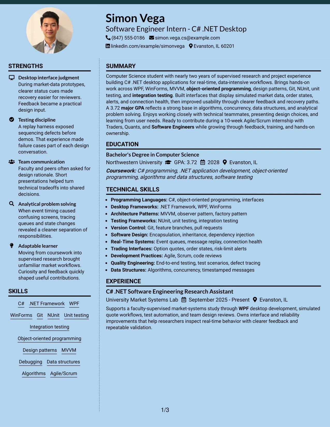
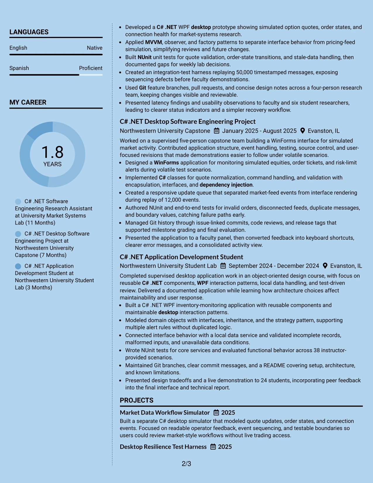
#20 Modern Full Background Two Column Format Resume Example
Recruiters can begin with the sidebar for contact details, skills, education, or certifications, then move to the broader column for summary, experience, and projects. This navigation pattern supports both a quick qualification check and a deeper review of technical evidence.
The full background gives the two-column design a strong visual identity, so text contrast and section labels must remain clear. Simon Vega’s resume content fits the structure because it includes several project and research bullets, specific testing results, and a focused set of desktop development skills.
Why the Modern Full Background Two Column Format Works for a Resume
- The sidebar keeps high-value keywords visible during the first scan.
- The wider column provides space for detailed research and project bullets.
- Separate content zones help distinguish profile facts from supporting evidence.
- The format can accommodate skills, certifications, activities, and awards without one long list.
- Measured results remain readable when placed in the broader experience column.
- Clear contrast is essential for dates, headings, and ATS-relevant text.
- The structure supports a polished PDF while retaining standard resume content.
Best For
- Resumes with enough evidence to benefit from a sidebar and a full main column.
- Applicants who want skills and education available before the detailed work history.
- Documents combining research, capstone work, course projects, and independent projects.
- Readers who review quick facts first and achievement bullets second.
- Applications where content volume calls for deliberate two-column distribution.
- Candidates who want a modern visual system while keeping resume sections explicit.
- PDF submissions that can preserve strong contrast and readable text in both columns.
#21 Dark Mode Two Column Format Resume Example
The evidence receives priority in the main column, where experience and projects can explain implementation choices, testing practices, and measurable results. A secondary column can hold skills, education, certifications, and activities for quick reference.
Dark mode creates a strong presentation, but the resume must preserve contrast and readable type. Standard terms such as C#, .NET Framework, WPF, WinForms, Git, NUnit, MVVM, and Agile/Scrum should remain visible as text so the design supports rather than replaces ATS and recruiter review.
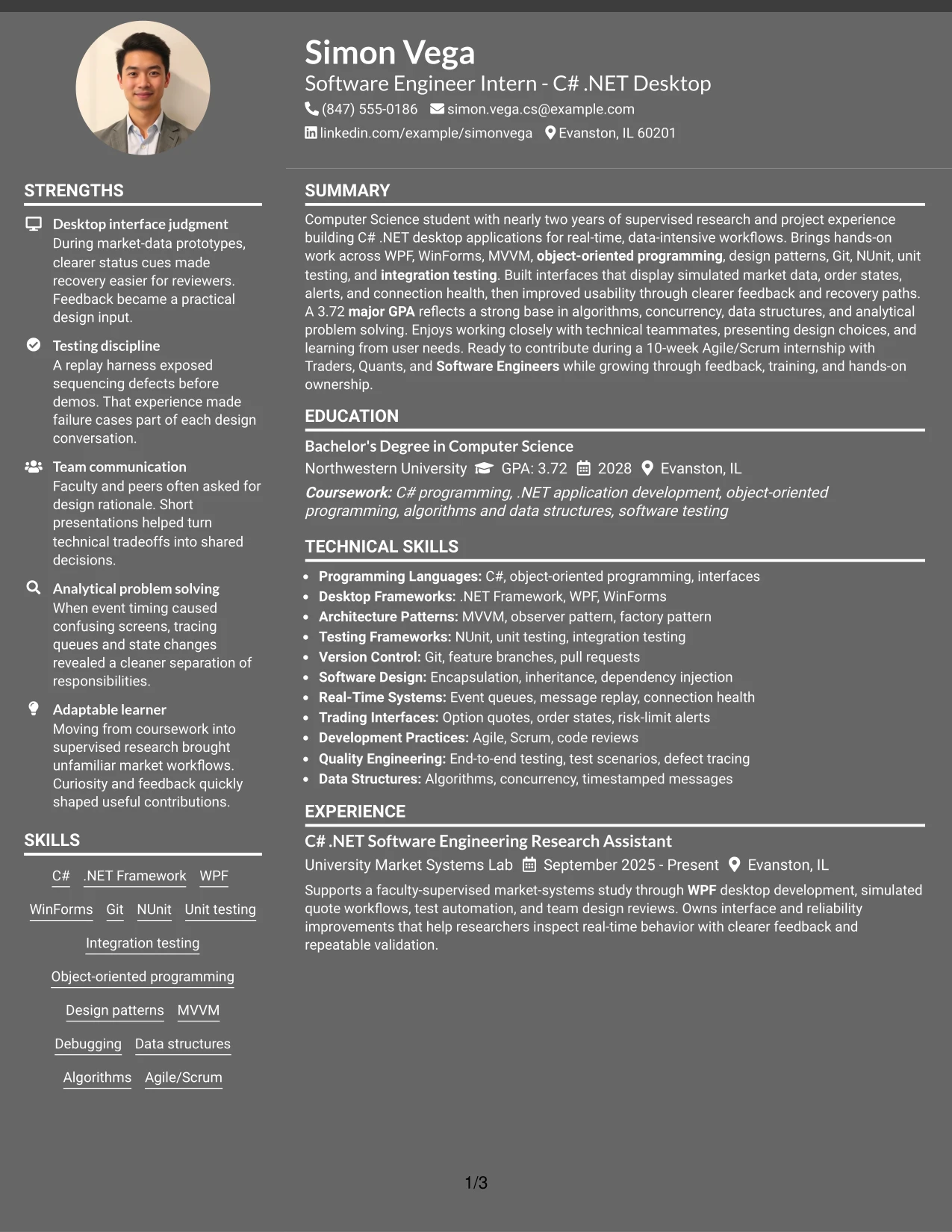
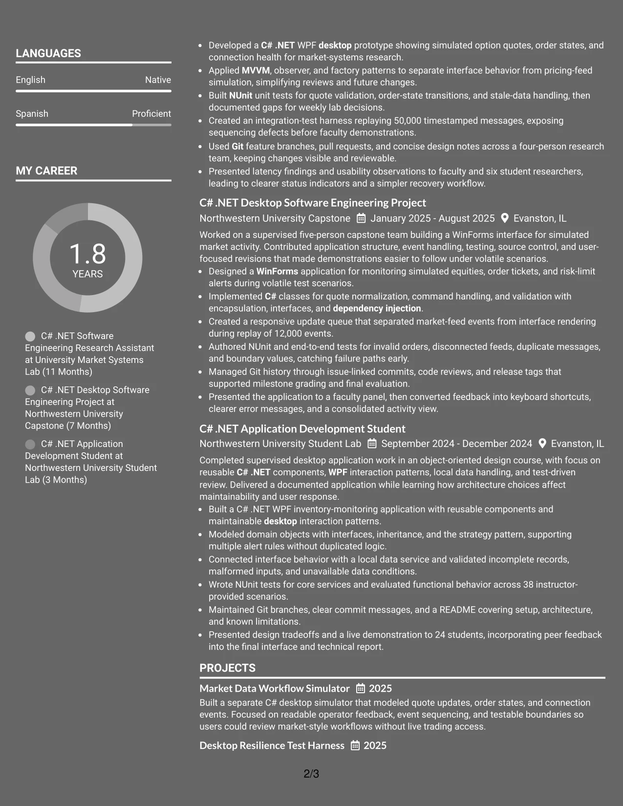
Why the Dark Mode Two Column Format Works for a Resume
- The main column gives achievement bullets the greatest space and emphasis.
- The sidebar makes technical skills and education available at a glance.
- Two-column grouping helps separate evidence from reference information.
- Specific testing and message-replay results add substance to the visual design.
- Project entries can show both desktop interface work and software architecture.
- High contrast protects readability across screens and PDF exports.
- Text-based labels keep the resume understandable to ATS tools and human reviewers.
Best For
- Applicants whose strongest qualification is detailed project or research evidence.
- Resumes that need a visible distinction between skills and work examples.
- Documents with a substantial technical inventory but a focused main narrative.
- Readers comfortable with a modern presentation and clear high-contrast text.
- Applications where testing, architecture, and interface results deserve emphasis.
- Candidates who want education and certifications accessible without interrupting experience.
- PDF resumes that can maintain contrast, spacing, and text clarity after export.
#22 Dark Mode Box Header Format Resume Example
Content is balanced through a strong boxed header and a single-column body. The header establishes the target role and contact details, while the sections below give summary, experience, projects, education, certifications, and skills a consistent vertical rhythm.
Dark styling can add distinction, but the information hierarchy must remain practical. Clear labels and concise bullets make qualifications such as C# .NET, WinForms, WPF, integration testing, Git, and Agile/Scrum easy to review in a PDF.
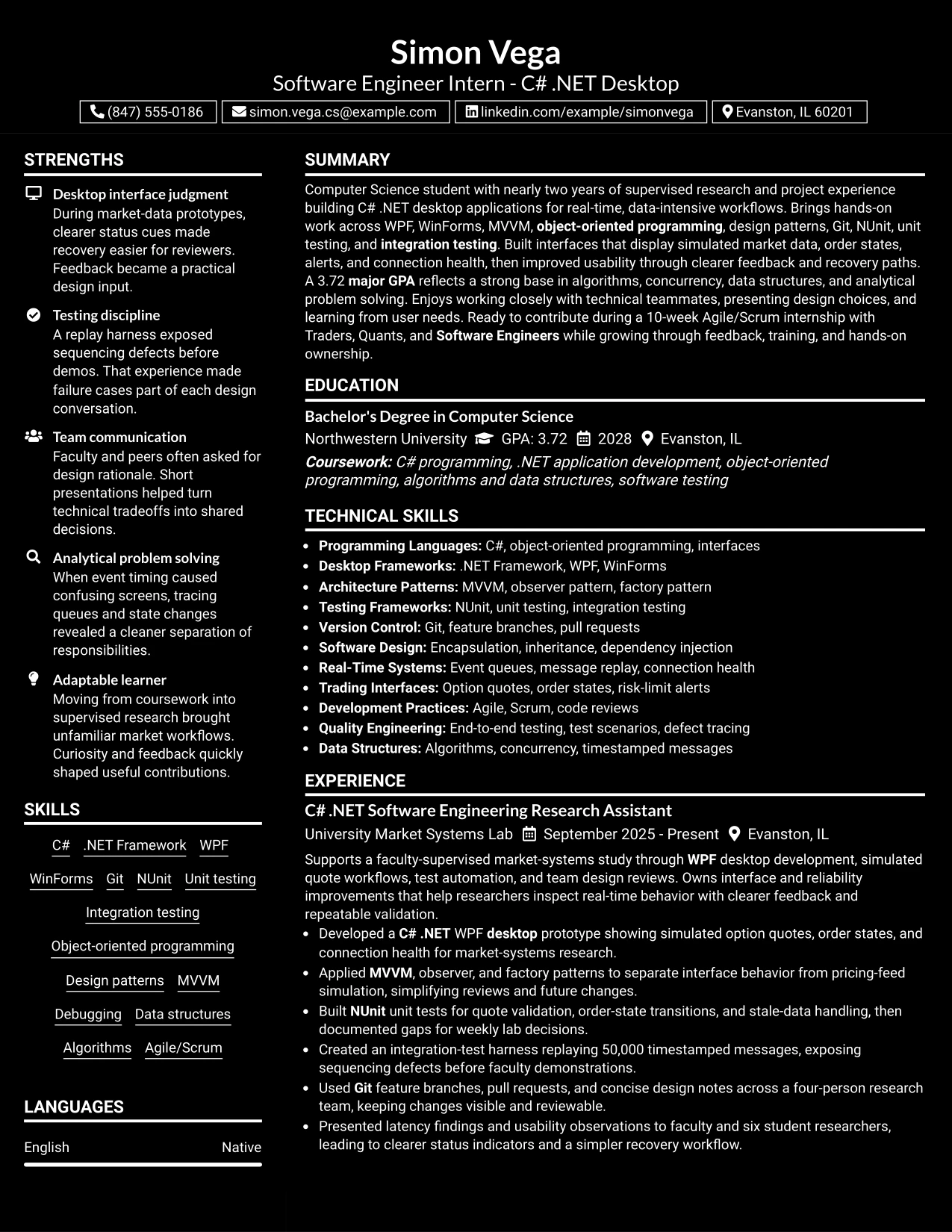
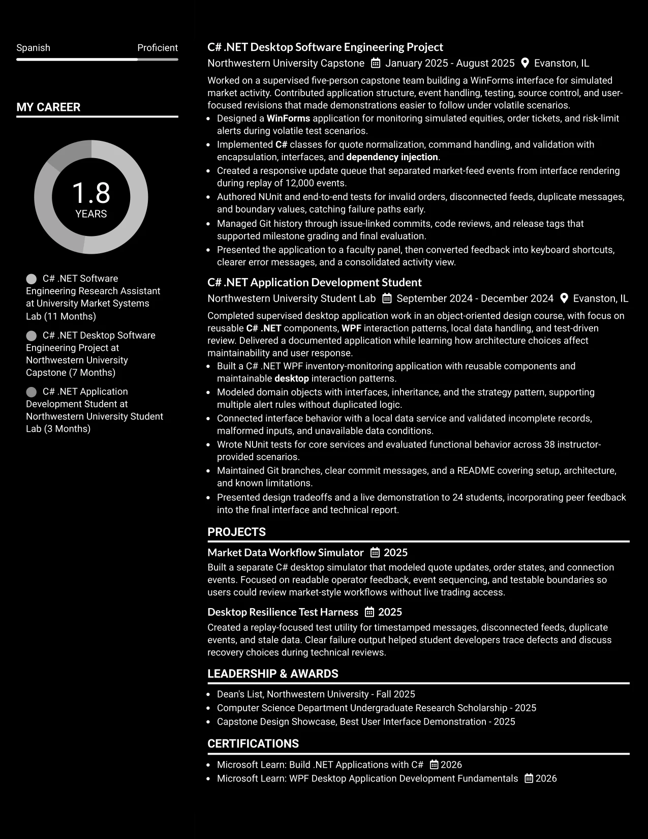
Why the Dark Mode Box Header Format Works for a Resume
- The boxed header creates a clear starting point for role and contact details.
- A single-column body keeps the review path direct and predictable.
- Dark styling can distinguish the document while strong contrast protects readability.
- Shaded or boxed labels help separate technical sections without long paragraphs.
- Experience bullets can connect implementation methods to observable results.
- Projects, certifications, and awards remain visible in a balanced sequence.
- The format works best when exported with accessible contrast and standard text.
Best For
- Applications that need a clear target role before the resume evidence begins.
- Applicants who want a modern look with a straightforward one-column body.
- PDF documents where consistent section spacing supports quick review.
- Candidates presenting several technical categories without a sidebar.
- Resumes that combine measurable results with education and project details.
- Readers who value strong hierarchy but do not need a complex page structure.
- Applications where contrast, concise labels, and ATS-readable text are essential.
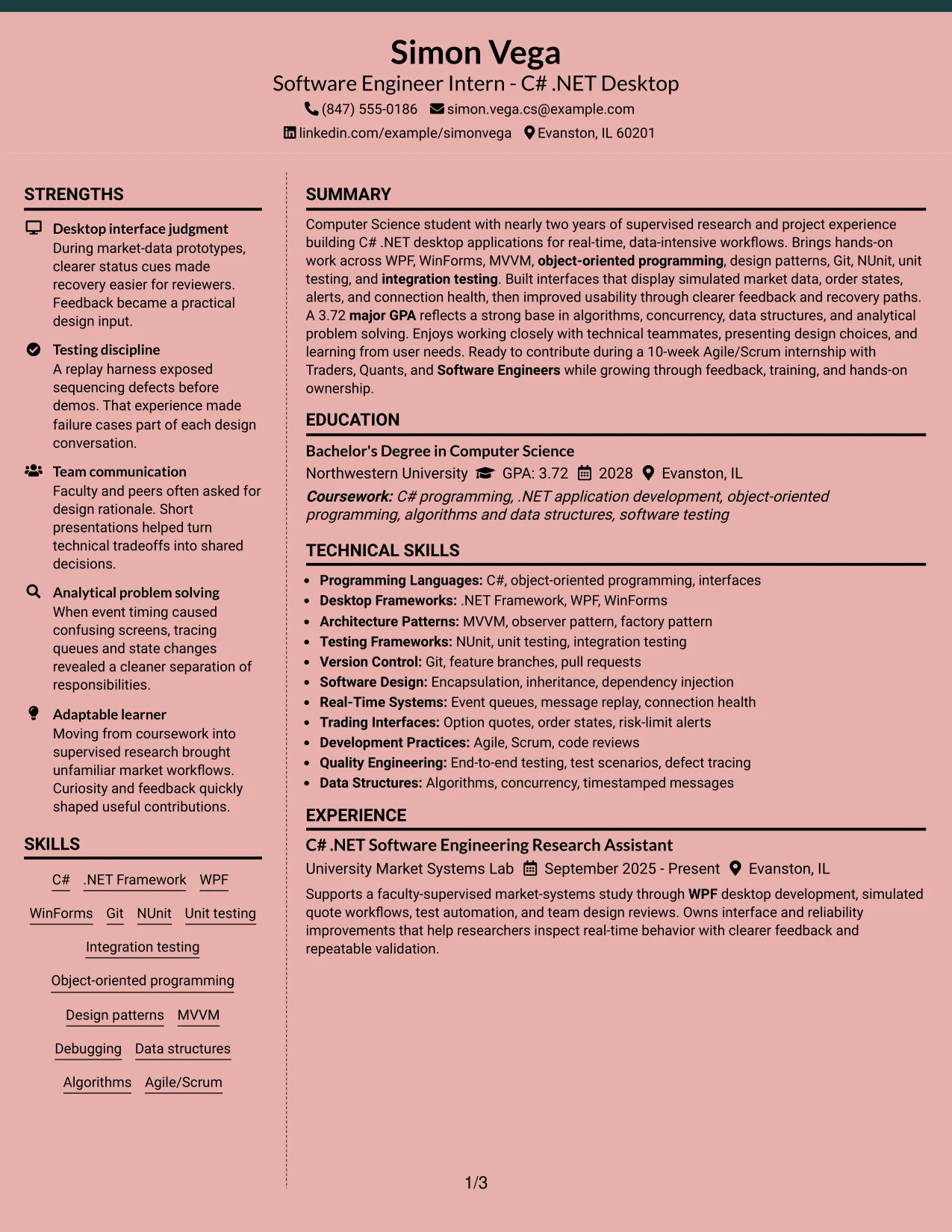
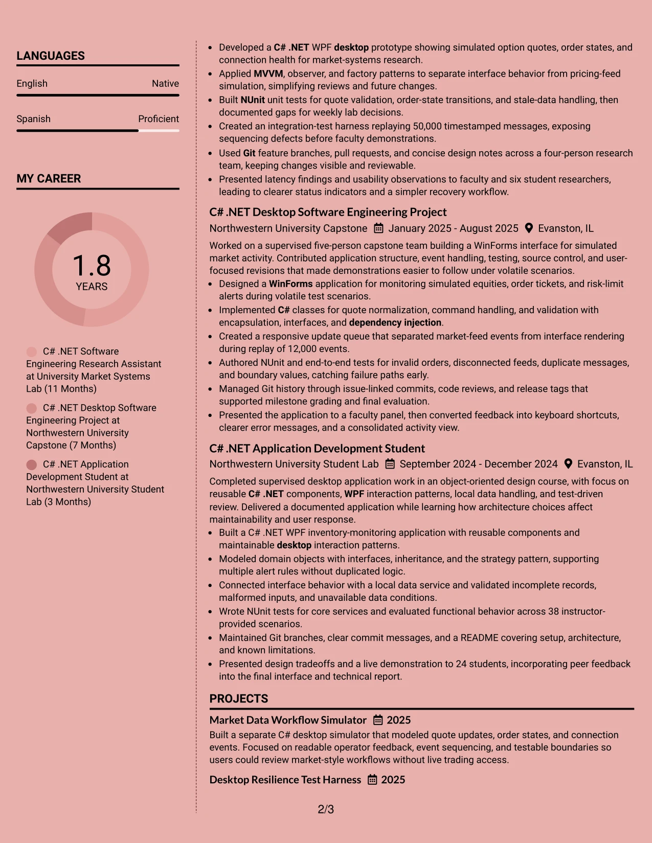
#23 Elegant Full Background Two Column Format Resume Example
For a Software Engineer Intern - C# .NET Desktop application, this two-column resume format gives technical evidence a clear home without making the page feel crowded. The wider column can carry the summary and experience bullets, while the narrower column groups education, certifications, and skills.
The structure supports quick review of C# .NET, WPF, WinForms, NUnit, Git, and design patterns. Strong bullets can also show measurable evidence, including a 50,000-message replay, a 12,000-event update queue, and a 3.72 major GPA.
Why the Elegant Full Background Two Column Format Works for a Resume
- Two columns separate experience from supporting qualifications.
- A clear summary introduces desktop development and real-time application work.
- Skills can be grouped so ATS terms remain easy to find.
- Experience bullets place tools beside the work where they were used.
- Testing evidence appears as concrete work, not as a disconnected keyword list.
- Project sections can show both interface design and software reliability.
- Balanced spacing helps recruiters scan technical details without losing the document hierarchy.
Best For
- Resumes that need to show technical experience and education on one page.
- Applicants who want a strong visual hierarchy with two distinct content areas.
- Documents that combine projects, certifications, skills, and experience.
- Technical resumes with several tools that benefit from grouped skill labels.
- Applications where measurable testing or message-replay results should stand out.
- Readers who prefer a structured page over long uninterrupted sections.
- ATS-conscious resumes that keep standard headings and readable text.
- Candidates presenting both software projects and supervised research work.
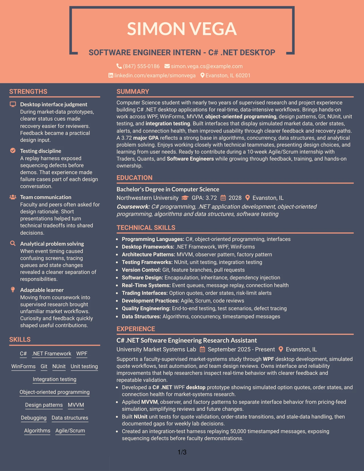
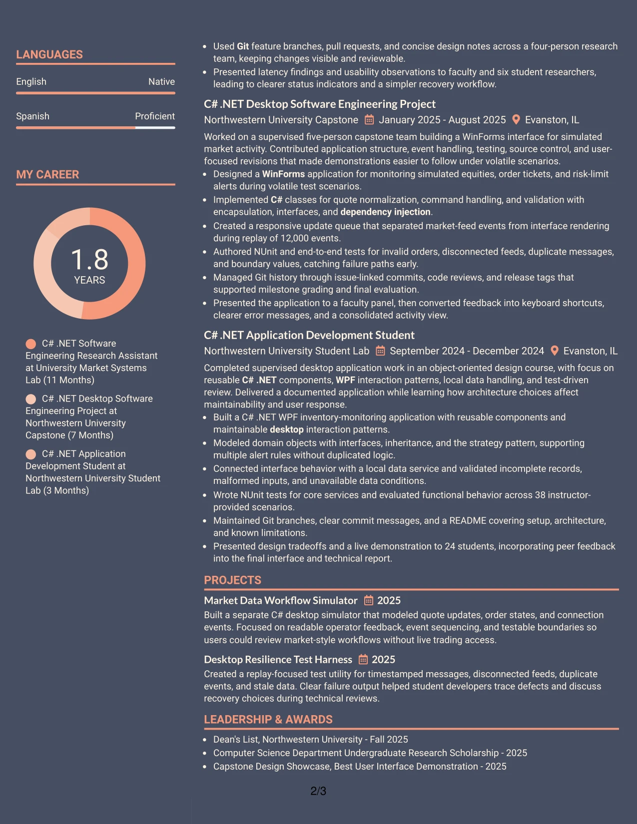
#24 Creative Two Tone Format Resume Example
A restrained visual hierarchy helps a technical resume feel distinctive while keeping the content easy to inspect. The Creative Two Tone Format can use color contrast to separate the summary, experience, projects, education, and skills without replacing standard resume headings.
For this Software Engineer Intern - C# .NET Desktop resume, the content remains grounded in C#, .NET, WinForms, WPF, Git, NUnit, and real-time workflows. Short bullets connect each keyword to evidence such as test coverage, event replay, design patterns, and team presentations.
Why the Creative Two Tone Format Works for a Resume
- Two visual tones create separation without requiring complex graphics.
- Standard headings keep the resume readable for both people and ATS tools.
- The summary can connect desktop development with analytical problem solving.
- Project and experience bullets provide proof behind technical keywords.
- A focused skills area makes C# and .NET easy to locate.
- Color can guide attention to section starts while leaving text dominant.
- The format supports a polished presentation for a technical internship application.
Best For
- Technical resumes that need visual distinction while keeping text primary.
- Applicants with projects and experience that should remain equally visible.
- Applications where a compact skills section must be found quickly.
- Documents that benefit from clear color separation between major sections.
- Candidates who want project evidence to support, rather than repeat, the skills list.
- Resumes reviewed on screen where section boundaries need gentle visual cues.
- ATS-aware applications using simple text and familiar resume organization.
- Readers who value a modern appearance without a dense graphic layout.
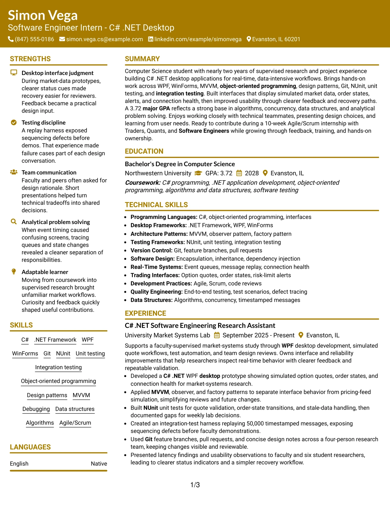
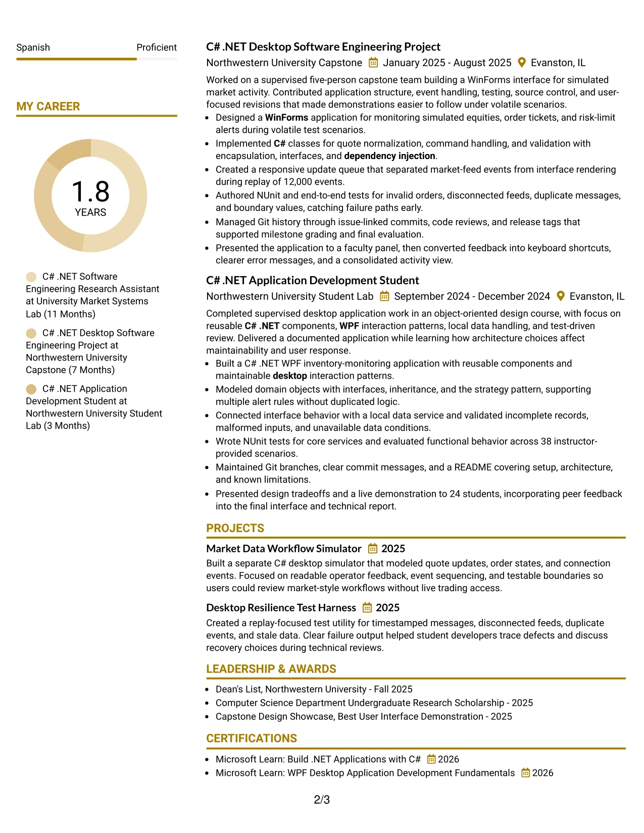
#25 Bold Color Header Professional Format Resume Example
The Bold Color Header Professional Format puts the resume title and section hierarchy at the front of the review. That structure makes the target role, professional summary, and first experience entries easy to identify before the reader reaches supporting sections.
The body can then present C# .NET desktop work in a conventional order: summary, experience, projects, education, certifications, and skills. Bullets retain useful proof, including NUnit testing, MVVM, dependency injection, 50,000 timestamped messages, and a 3.72 GPA.
Why the Bold Color Header Professional Format Works for a Resume
- A strong header gives the document an immediate professional anchor.
- Standard section order supports fast recruiter scanning.
- The summary can match the target role without becoming a long paragraph.
- Bold section labels make experience and project evidence easy to locate.
- Technical skills remain searchable when written as text-based keywords.
- Action-led bullets show development, testing, collaboration, and results.
- The format keeps visual emphasis controlled so accomplishments remain central.
Best For
- Resumes that need the target role to be clear at the top of the page.
- Applicants seeking a professional presentation for a technical internship.
- Documents with several experience entries that need consistent section markers.
- Applications where ATS-readable headings matter as much as visual polish.
- Candidates who want measurable results visible within conventional bullet lists.
- Resumes combining supervised research, academic projects, and certifications.
- Readers who scan from the header directly into the summary and latest work.
- Technical applications that require a clean distinction between skills and evidence.
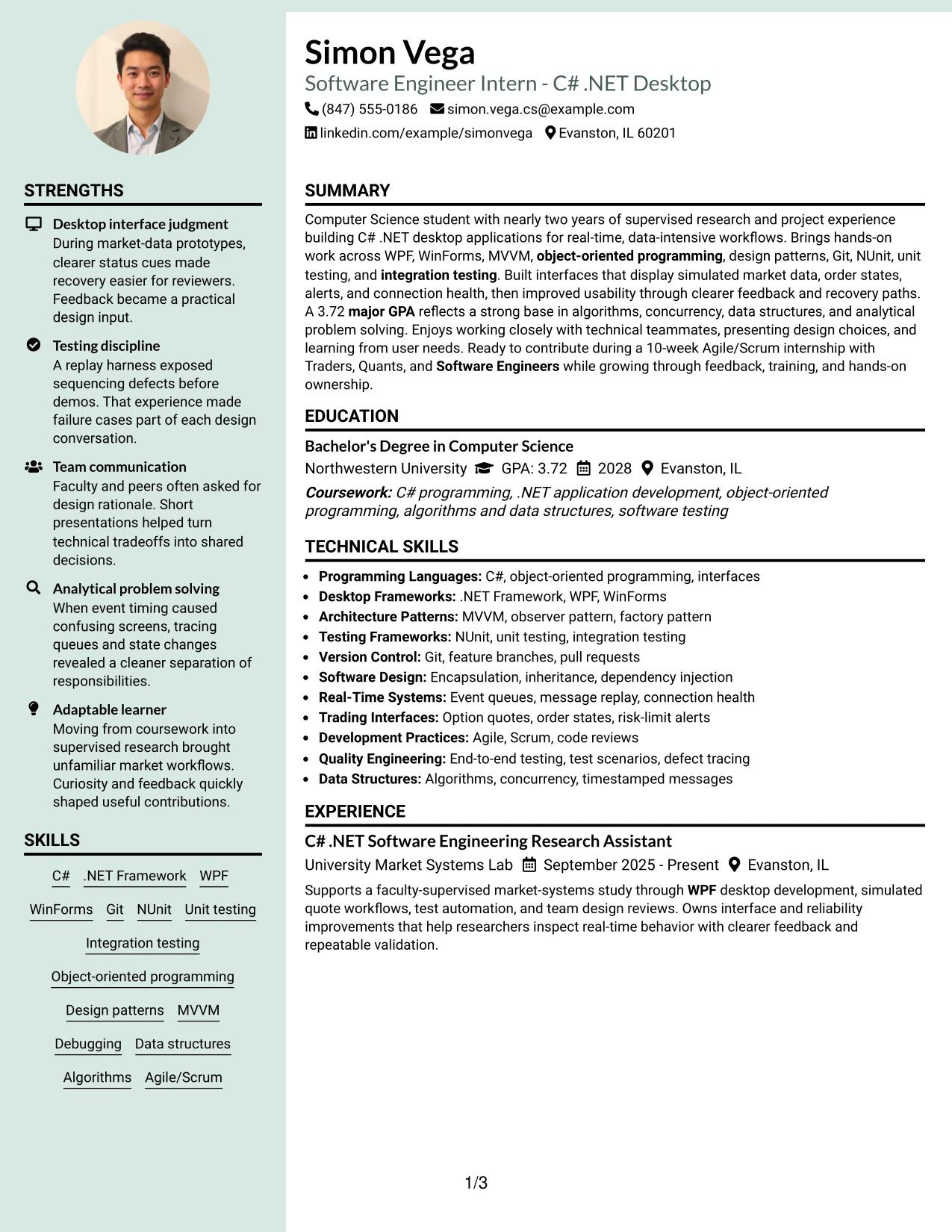
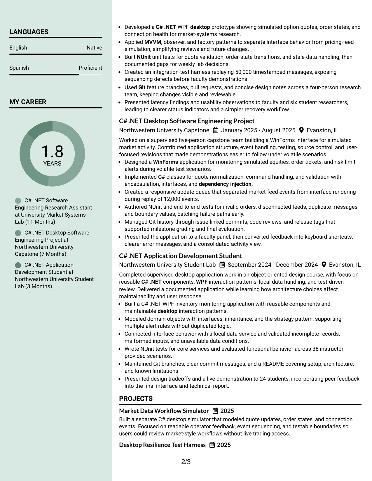
#26 Photo Header Color Sidebar Format Resume Example
Recruiters can move from the header to the summary, then through experience and projects before checking the sidebar for education, certifications, and skills. That reading path keeps the strongest evidence in the main column while the sidebar holds useful reference details.
For this Software Engineer Intern - C# .NET Desktop resume, the main content can emphasize WPF and WinForms applications, NUnit tests, Git workflows, and real-time message handling. A professional photo header may support identity and presentation, but it should not compete with the technical evidence.
Why the Photo Header Color Sidebar Format Works for a Resume
- The main column gives experience bullets enough room for context.
- A sidebar keeps education, certifications, and skills compact.
- The reading order leads with the summary and most recent work.
- Color cues help readers return to key section starts.
- The header can identify the document while preserving a professional tone.
- Testing and project results stay in the primary content area.
- The layout supports a detailed resume without making every section look equal.
Best For
- Resumes with substantial experience bullets and a shorter supporting sidebar.
- Applicants who want identity and contact details clearly separated from evidence.
- Documents that include both project work and formal education.
- Applications where grouped skills should remain visible during experience review.
- Candidates who need room to explain testing, architecture, and interface decisions.
- Screen-based review where a consistent reading path improves navigation.
- Professional resumes that use a photo only when appropriate for the application context.
- Technical applications balancing detailed work history with compact qualifications.
#27 Top Left Header Color Accent Format Resume Example
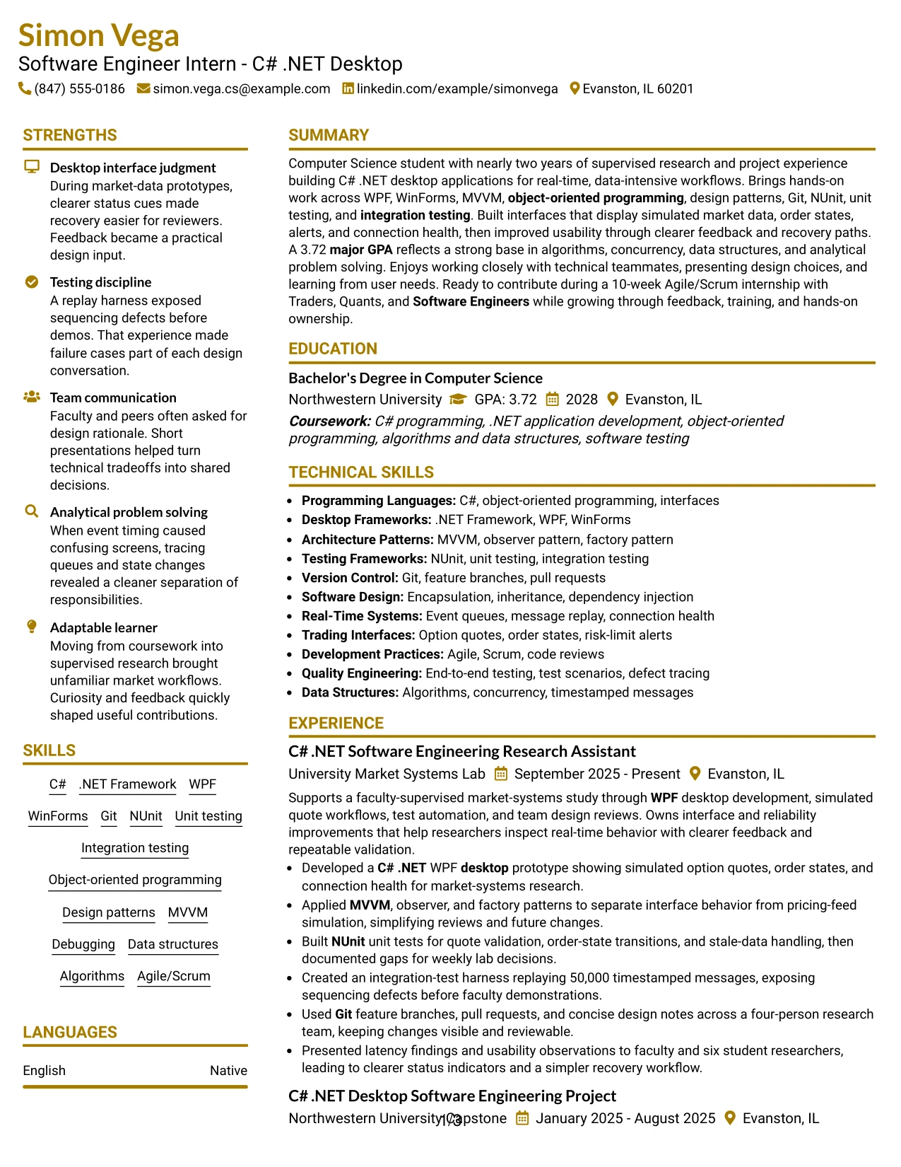
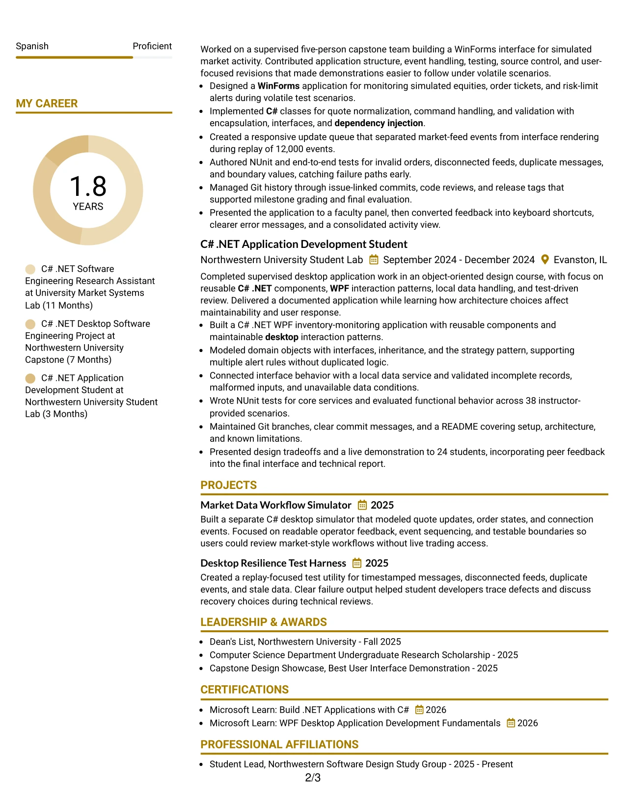
The strongest evidence should appear early: desktop applications built, testing completed, and results that show reliable technical judgment. A top-left header then gives that evidence a clear identity before the reader moves through the rest of the resume.
This format suits a focused Software Engineer Intern - C# .NET Desktop application because the content can lead with C# .NET, WPF, WinForms, and software testing. Bullets can support those terms with the 50,000-message harness, 38 test cases, Git collaboration, and user-focused interface revisions.
Why the Top Left Header Color Accent Format Works for a Resume
- The opening area directs attention to the target role and summary.
- Experience bullets can lead with the most relevant technical evidence.
- A restrained accent separates sections without reducing text readability.
- ATS-friendly wording remains in standard resume content blocks.
- Project details can demonstrate architecture, validation, and event handling.
- Measured scope gives recruiters a quick way to assess contribution.
- The format supports a direct connection between skills and documented results.
Best For
- Resumes where the latest technical evidence should receive early attention.
- Applicants who want a direct, businesslike page structure.
- Documents with strong project results that should not be buried below skills.
- Applications requiring visible links between tools and completed work.
- Candidates presenting test counts, replay volumes, or other concrete scope.
- Readers who scan the top-left area before deciding where to read next.
- ATS-focused resumes using plain text, standard headings, and concise bullets.
- Technical applications that benefit from a small visual accent rather than heavy decoration.
#28 Centered Header Classic Two Column Format Resume Example
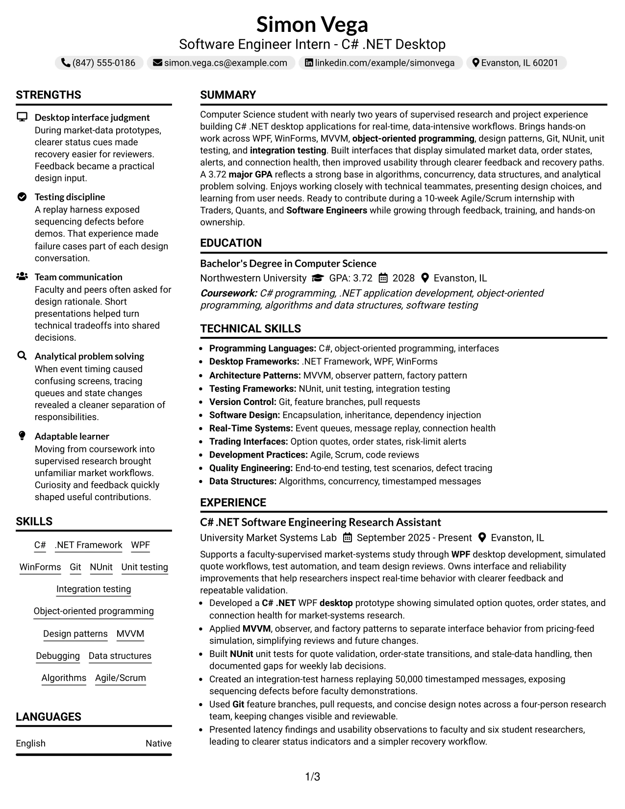
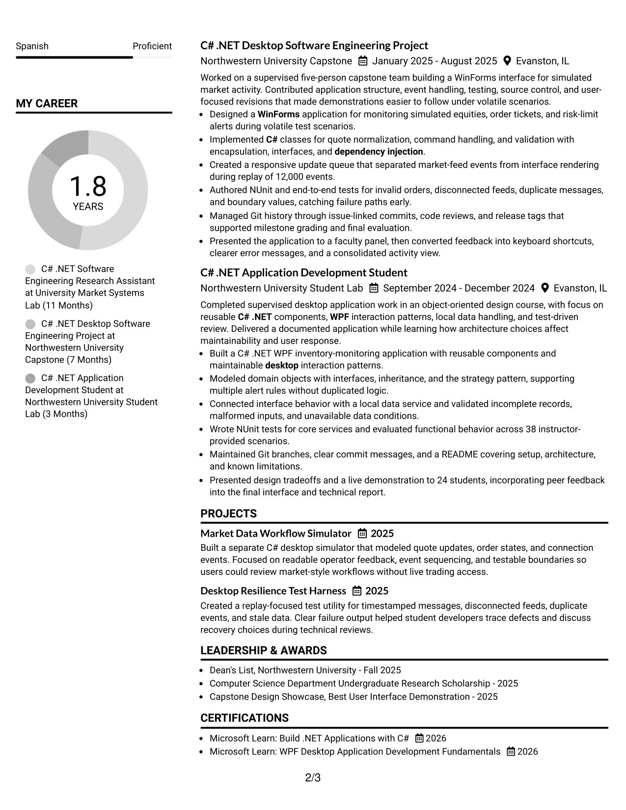
Balanced content distribution helps this resume serve both a quick screen and a detailed review. The centered header establishes the document, while two columns allow experience and projects to share attention with education, certifications, and skills.
For an application to Crescent Peak Trading, the resume can show C# .NET desktop work alongside evidence of testing, real-time data handling, and team presentation. Classic bullets keep the content accessible and make terms such as Agile/Scrum, NUnit, MVVM, and WinForms easy to verify.
Why the Centered Header Classic Two Column Format Works for a Resume
- A centered header creates a calm, recognizable starting point.
- Two columns distribute detailed and supporting content efficiently.
- Classic bullets make responsibilities and results easy to compare.
- Skills can sit near experience without interrupting the main evidence.
- Education and certifications remain visible for internship review.
- The layout can show projects without creating a separate visual block for each one.
- Simple section labels support reliable ATS parsing and human scanning.
Best For
- Resumes that must balance academic information with practical project work.
- Applicants using a classic presentation for a structured technical application.
- Documents with enough content to benefit from two-column organization.
- Applications where education, GPA, and certifications need steady visibility.
- Candidates who want project bullets reviewed alongside experience bullets.
- Readers who prefer centered identification with familiar resume sections below.
- ATS-conscious documents that avoid unusual text placement and decorative elements.
- Technical resumes that need efficient use of page space without sacrificing clarity.
#29 Left Aligned Header Clean Two Column Format Resume Example
A practical application resume should make contact details, target role, current work, and supporting qualifications easy to find. The left-aligned header starts that process, and the clean two-column structure keeps the review moving from the summary and experience to skills, education, and certifications.
For this Software Engineer Intern - C# .NET Desktop resume, the page can present detailed bullets on WPF, WinForms, integration testing, Git, and design patterns without losing academic context. Consistent spacing helps each section contribute to the hiring decision.
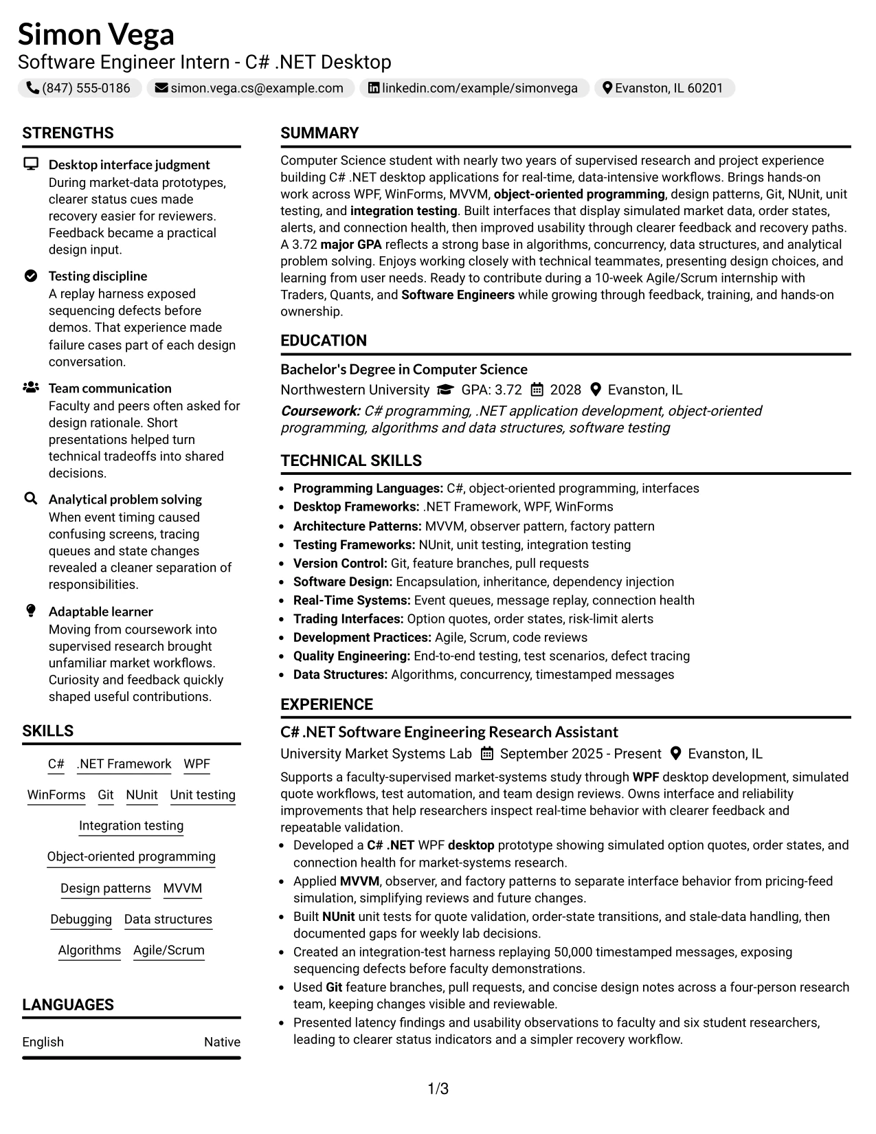
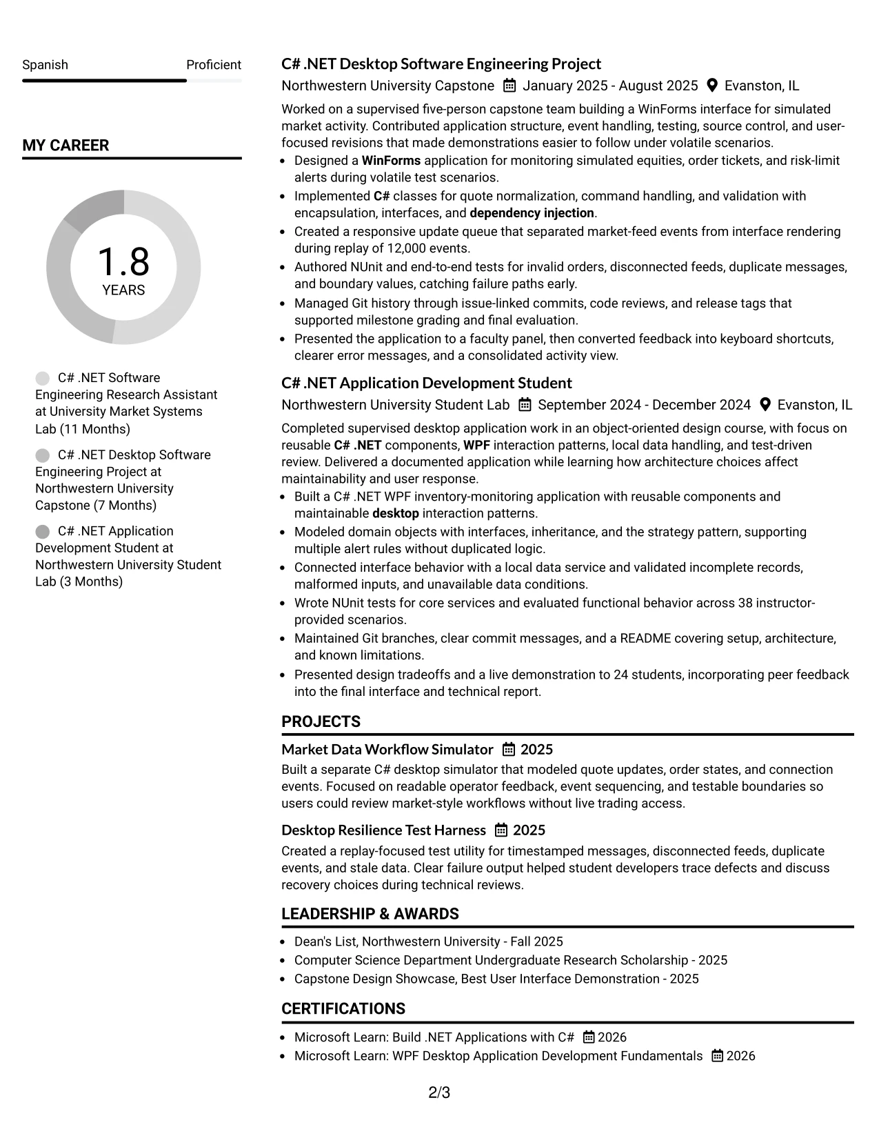
Why the Left Aligned Header Clean Two Column Format Works for a Resume
- Left alignment supports a familiar reading path from top to bottom.
- Two columns give technical work and supporting details separate space.
- Clean spacing prevents dense bullets from blending together.
- The summary can connect the target role to relevant development experience.
- Skills remain easy to scan when grouped by technical category.
- Projects can add evidence without repeating every experience bullet.
- The format presents a complete internship resume in an efficient structure.
Best For
- Resumes designed for fast, practical review by technical recruiters.
- Applicants who need clear separation between work evidence and qualifications.
- Documents combining supervised research, capstone work, and coursework.
- Applications where a left-to-right structure supports predictable navigation.
- Candidates with several related tools that need organized skill grouping.
- Readers who value clean spacing and direct section labels.
- ATS-aware resumes that keep content in conventional reading order.
- Technical applications that need efficient use of space with no visual clutter.
#30 Accent Divider Modern Two Column Format Resume Example
A modern but restrained hierarchy can make a technical resume feel focused and current. Accent dividers separate the summary, experience, projects, education, and skills, while the two-column structure helps the reader connect role alignment with supporting qualifications.
The content shows Simon Vega's fit for Software Engineer Intern - C# .NET Desktop work through C# .NET applications, NUnit tests, message replay, MVVM, and Git collaboration. The visual treatment adds direction, while the bullets carry the evidence.
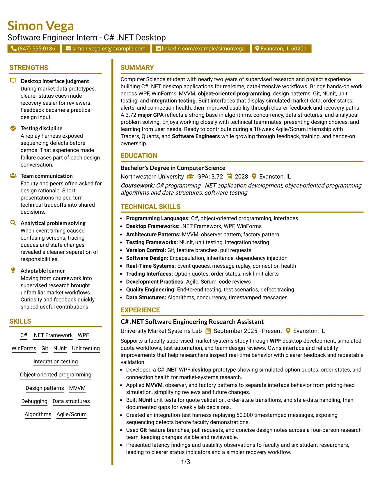
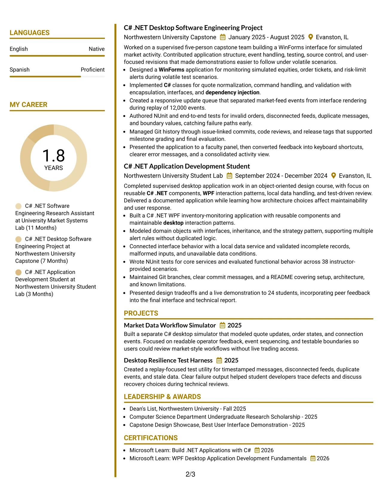
Why the Accent Divider Modern Two Column Format Works for a Resume
- Accent dividers create clear boundaries between related resume sections.
- Two columns allow technical evidence and supporting facts to work together.
- The modern structure helps the target role remain visible during scanning.
- Bullets can show both implementation choices and measurable scope.
- A separate skills area keeps ATS terms easy to locate.
- Projects add depth for a candidate with academic and research experience.
- The format uses visual guidance without letting design replace substance.
Best For
- Technical resumes seeking a modern presentation with disciplined structure.
- Applicants whose project and research work should align clearly with the target role.
- Documents where dividers can improve navigation across several short sections.
- Applications that need both detailed bullets and a compact skills area.
- Candidates showing architecture decisions, test practices, and interface results.
- Readers who scan by section and want visual markers for each content group.
- ATS-conscious resumes that keep the modern treatment text-based and simple.
- Internship applications where academic evidence needs to read as practical preparation.
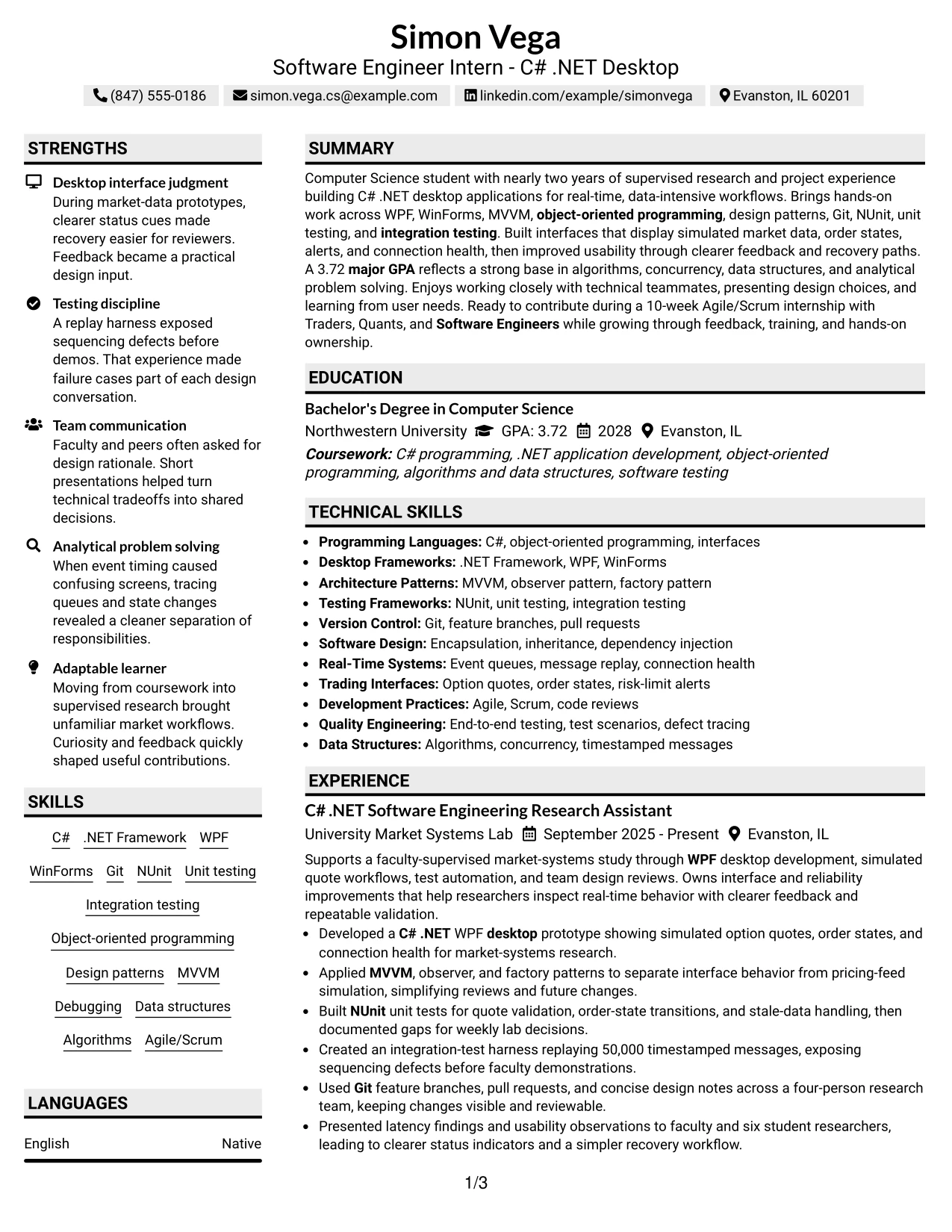
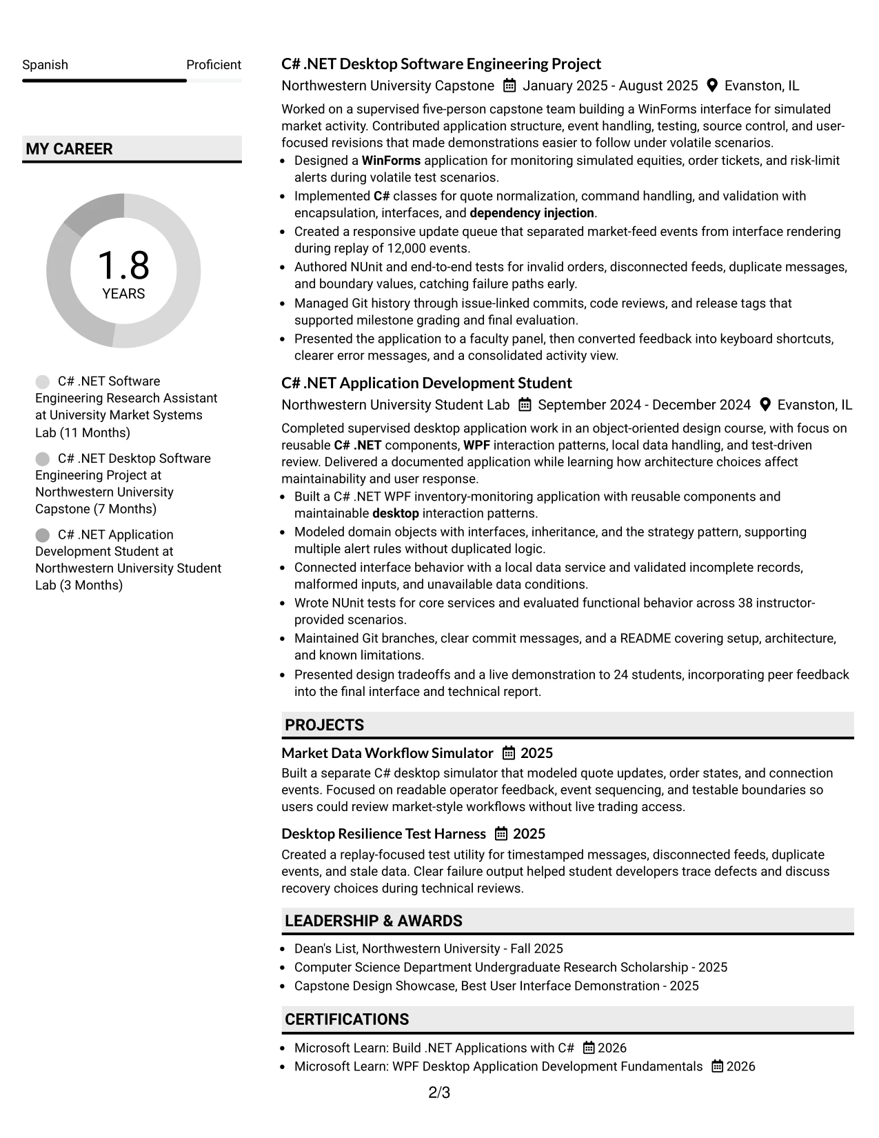
#31 Shaded Labels Clean Two Column Format Resume Example
The Shaded Labels Clean Two Column Format organizes the resume through clear section markers and predictable blocks. Experience and projects can occupy the main area, while skills, education, certifications, and honors remain grouped for quick reference.
That structure supports a resume built around C# .NET desktop development and measurable testing work. Recruiters can find WPF, WinForms, NUnit, Git, design patterns, and real-time workflows without searching through decorative text or repeated statements.
Why the Shaded Labels Clean Two Column Format Works for a Resume
- Shaded labels make each section easy to identify at a glance.
- Two columns organize detailed work and supporting qualifications efficiently.
- Consistent blocks help recruiters compare experience entries.
- The summary can establish technical direction before the evidence begins.
- Skills are grouped in a way that supports keyword scanning.
- Education, GPA, certifications, and honors receive dedicated visibility.
- Clean presentation keeps attention on actions, tools, and results.
Best For
- Resumes that need strong labels for quick section-by-section scanning.
- Applicants with multiple categories of technical qualifications.
- Documents where experience bullets should remain separate from skills and education.
- Applications that benefit from visible grouping without a busy design.
- Candidates who want testing results and architecture work easy to compare.
- Readers reviewing resumes on screen or in a short initial scan.
- ATS-conscious documents using familiar headings and readable text blocks.
- Technical applications that need a polished layout for mixed academic evidence.
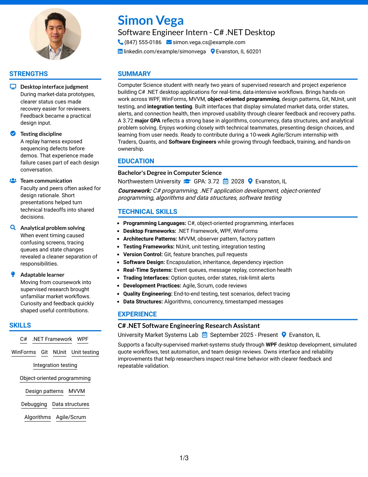
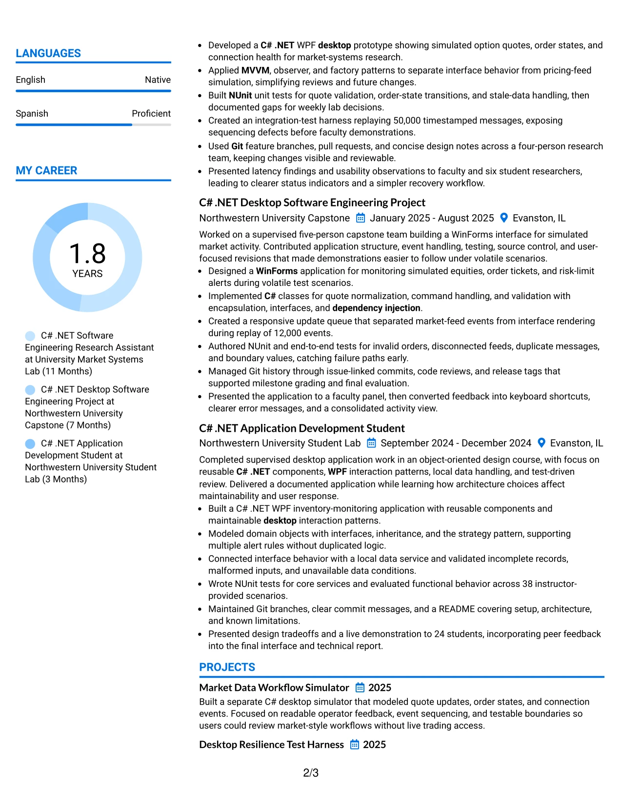
#32 Photo Header Color Accent International Format Resume Example
Readers can start at the header, confirm the target role and contact details, then move through the summary and experience before checking the grouped supporting sections. Color accents help mark that route, while the photo header adds a clear personal identifier when appropriate.
The resume content remains focused on C# .NET desktop development, WPF, WinForms, NUnit, Git, and real-time workflows. Education, certifications, projects, and language information can be included without weakening the evidence from research and capstone work.
Why the Photo Header Color Accent International Format Works for a Resume
- The header combines identification with a clear starting point for review.
- Color accents guide readers through several compact content blocks.
- The summary and experience sections can carry the most detailed evidence.
- A photo may be suitable where local application norms support it.
- Skills and languages can remain visible as separate reference information.
- Projects help demonstrate practical ability beyond formal employment history.
- The format supports a polished resume with broad supporting detail.
Best For
- Resumes used in settings where a professional photo is an accepted convention.
- Applicants who need to present technical evidence with language information.
- Documents combining projects, research, education, certifications, and activities.
- Applications where color cues improve navigation across many short sections.
- Candidates who want the latest experience to remain the main proof of ability.
- Readers who need contact, skills, and supporting details easy to revisit.
- Internationally oriented resume presentations that still use clear English headings.
- Technical applications requiring a personal header without a crowded main column.
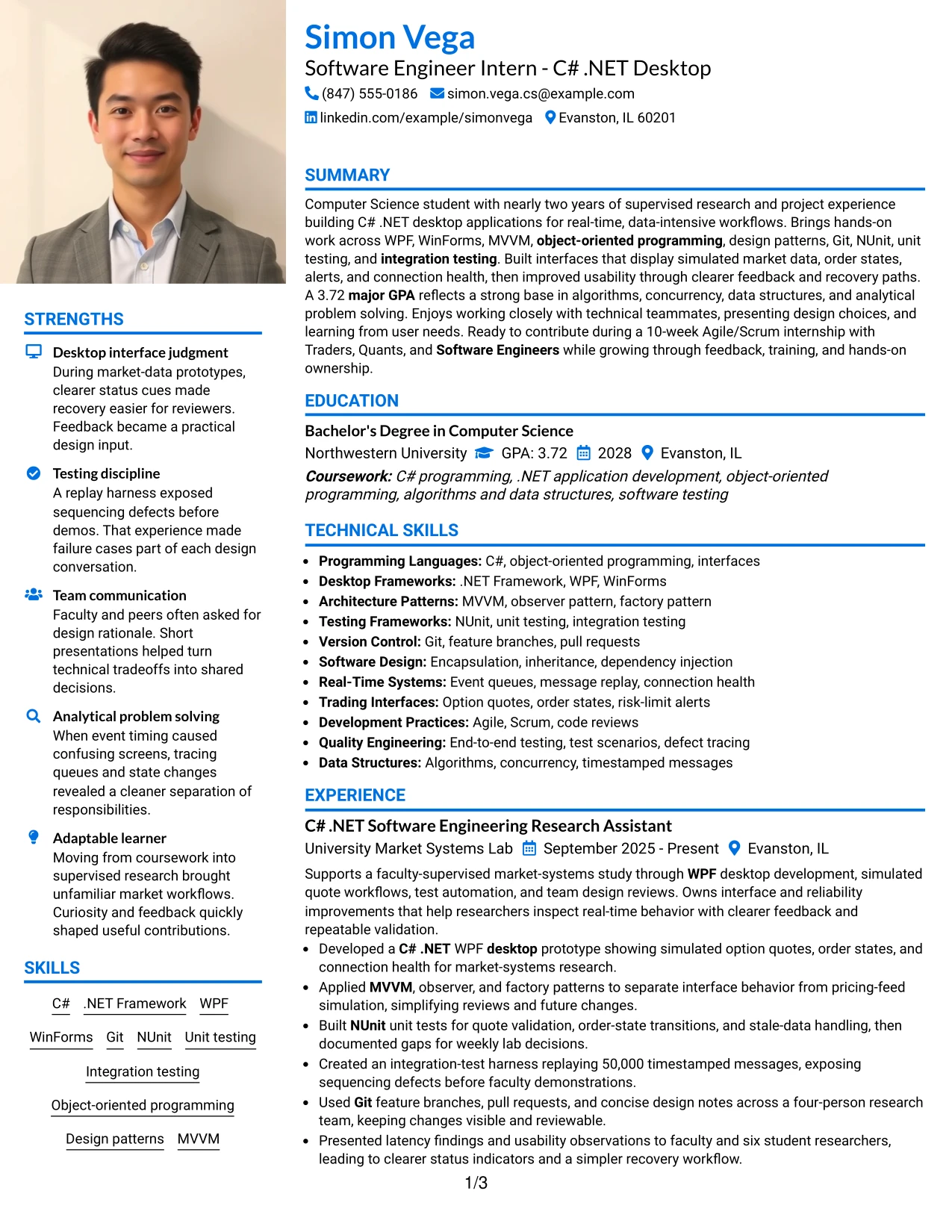
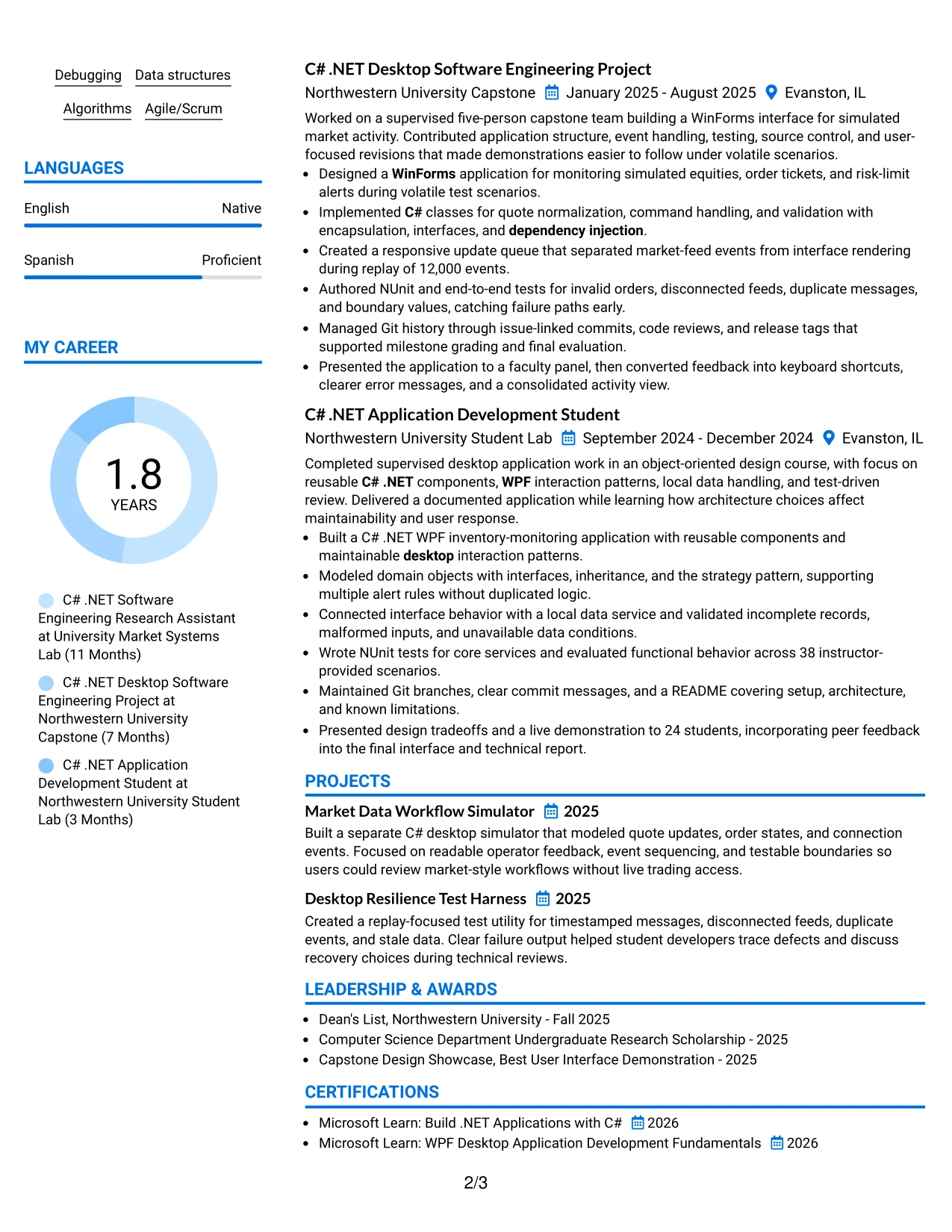
#33 Large Profile Photo International Two Column Format Resume Example
The strongest technical evidence should lead the review, with experience bullets showing what was built, tested, and improved. A large profile header can establish identity, while the two-column structure gives projects, skills, education, certifications, and activities room to support that evidence.
For the Software Engineer Intern - C# .NET Desktop application, the resume can emphasize C# .NET, WPF, WinForms, NUnit, Git, and real-time message handling. The profile area should remain visually controlled so results such as 50,000-message replay and 38 test cases stay prominent.
Why the Large Profile Photo International Two Column Format Works for a Resume
- The main evidence remains centered on experience and project results.
- Two columns provide space for a broad set of supporting qualifications.
- A large profile area can identify the document in photo-appropriate contexts.
- Technical keywords remain organized instead of spread across long paragraphs.
- Testing, architecture, and interface work can each receive focused bullets.
- Education and certifications stay visible without interrupting the evidence flow.
- The structure supports a detailed resume while preserving a clear priority order.
Best For
- Resumes used in regions or contexts where a professional profile photo is expected.
- Applicants with substantial project evidence and several supporting categories.
- Documents that need space for skills, education, certifications, and activities.
- Applications where measurable testing or replay results should dominate the review.
- Candidates presenting both technical depth and a broader academic profile.
- Readers who want a clear main column with reference details alongside it.
- International resume versions that require orderly presentation of varied information.
- Technical applications where a large identity area can be balanced with strong text evidence.
Why Build Your Software Engineer Intern - C# .NET Desktop Resume with ResumeInMinutes
ResumeInMinutes helps technical students and early-career applicants turn coursework, supervised research, and software projects into a structured resume. The layout keeps technical evidence visible while making the document simple to scan and customize.
- ATS-friendly section structure
- Clean resume layouts
- Role-specific keyword guidance
- Project and skills organization
- Technical achievement bullet support
- Free PDF resume previews
Use the examples to show how C# .NET desktop applications, WPF and WinForms interfaces, NUnit testing, Git collaboration, design patterns, and real-time data projects can be organized for a Software Engineer Intern - C# .NET Desktop application.
See Also
- 33 AI Fullstack Software Engineer-Intern Resume Templates with Example 2026 (ATS-Optimized)
- 33 AI Fullstack Software Engineer Resume Templates with Example 2026 (ATS-Optimized)
- 33 AI Platform & Integrations Software Engineer Resume Templates with Example 2026 (ATS-Optimized)
- 33 AI Software Engineer Intern Resume Templates with Example 2026 (ATS-Optimized)
- 33 Applied AI/ML Software Engineer Resume Templates with Example 2026 (ATS-Optimized)
- 33 Backend Software Engineer Intern Resume Templates with Example 2026 (ATS-Optimized)
- 7 C, C++ Software Engineer II Resume Templates with Example
- 33 C++ Software Engineer Resume Templates with Example 2026 (ATS-Optimized)
- 30+ Software Engineer Intern - C# .NET Desktop Cover Letter Templates with Example 2026
- 30+ AI Fullstack Software Engineer Cover Letter Templates with Example 2026
Frequently Asked Questions
Are these Software Engineer Intern - C# .NET Desktop resume templates ATS-friendly?
Yes. They use readable headings, straightforward sections, and relevant terms such as C#, .NET, WPF, WinForms, NUnit, unit testing, integration testing, Git, and Agile/Scrum.
Are these different resumes?
No. The guide presents one Software Engineer Intern - C# .NET Desktop resume example in multiple layouts and design themes so you can compare presentation options.
What should a Software Engineer Intern - C# .NET Desktop resume include?
Include a targeted summary, education, relevant research or project experience, technical skills, measurable development evidence, testing work, certifications, and activities that show teamwork or communication.
Can I download the resume templates as PDFs?
Yes. Each resume style provides a free PDF download so you can preview the format and choose a layout for your application.
Which resume style works best for a C# .NET desktop software engineering internship?
A simple one-column layout or a restrained two-column layout usually works well. Choose clear headings, consistent dates, readable bullets, and enough space for technical projects and testing evidence.
Can a student with limited professional experience create a strong resume?
Yes. Coursework, supervised research, capstone projects, desktop applications, testing utilities, Git contributions, presentations, and measurable project details can provide credible evidence of readiness.
Should I include a photo on my resume?
For U.S. applications, a no-photo resume is generally the safer choice. Use a photo only when it is customary or specifically expected in the relevant location or industry.
Can I customize these resume templates?
Yes. ResumeInMinutes allows you to edit the resume text, layout, design style, and PDF format for your Software Engineer Intern - C# .NET Desktop application.