33 Junior Frontend Developer - JavaScript Resume Templates with Example 2026 (ATS-Optimized)
This guide shows you how to build a clear, focused Junior Frontend Developer - JavaScript resume. It helps you organize your evidence, match the role, and compare professional formats across 33 resume layouts.
A strong resume for this role should make your frontend work easy to verify. Use a direct summary, clear section headings, concise bullet points, and a skills section that reflects HTML5, CSS3, JavaScript, React or Vue.js, responsive design, and API integration.
The examples below show how to present Figma and Sketch design translation, reusable components, accessibility, cross-browser testing, performance work, Git workflows, education, certifications, and frontend projects without making the page difficult to scan.
What Makes a Great Junior Frontend Developer - JavaScript Resume in 2026
A good resume is keyword-aligned, evidence-first, and built for fast review. Put the target role near the top. Then show what you built, which tools you used, and how you tested or improved the result.
- Write a focused summary that names the Junior Frontend Developer - JavaScript role and your strongest frontend capabilities.
- Use experience and project bullets to show responsive interfaces, reusable components, design implementation, and user-facing features.
- List relevant tools clearly, including HTML5, CSS3, JavaScript, React, Vue.js, Figma, Sketch, REST APIs, JSON, Git, and browser testing tools.
- Support your claims with evidence such as 18 converted design screens, six responsive views, eight usability testers, 25 presentation attendees, or a 40-record test scenario when those details are accurate.
Match the job description with natural resume keywords. For this role, useful terms include responsive web interfaces, user-facing features, Figma, Sketch, cross-browser compatibility, performance optimization, API integration, accessibility, Lighthouse, Chrome DevTools, Firefox Developer Tools, and Git. Place these terms in the summary, skills, experience, and project sections where the evidence supports them.
The resume examples below use an evidence-first approach so formatting supports role-specific clarity, ATS matching, and fast review for a Junior Frontend Developer - JavaScript application.
#1 Simple One Column Format Resume Example
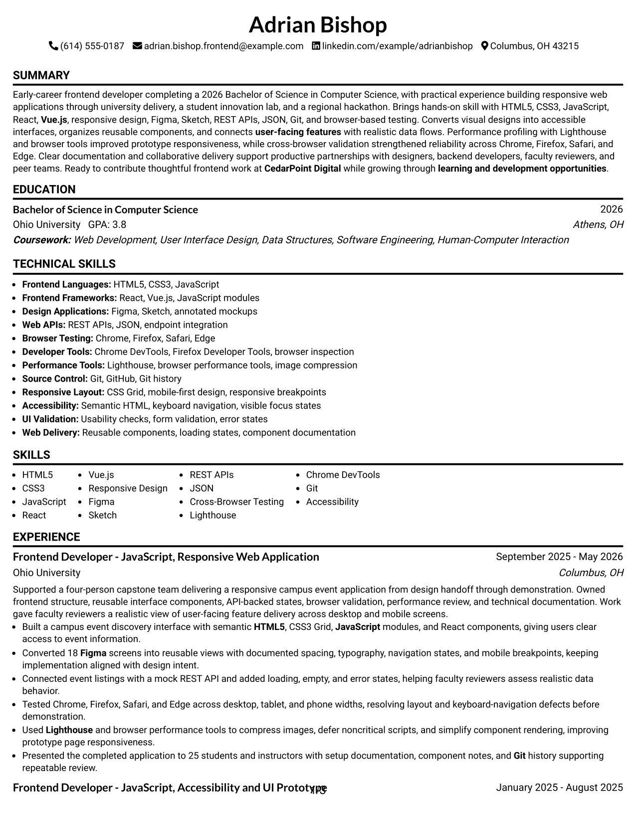
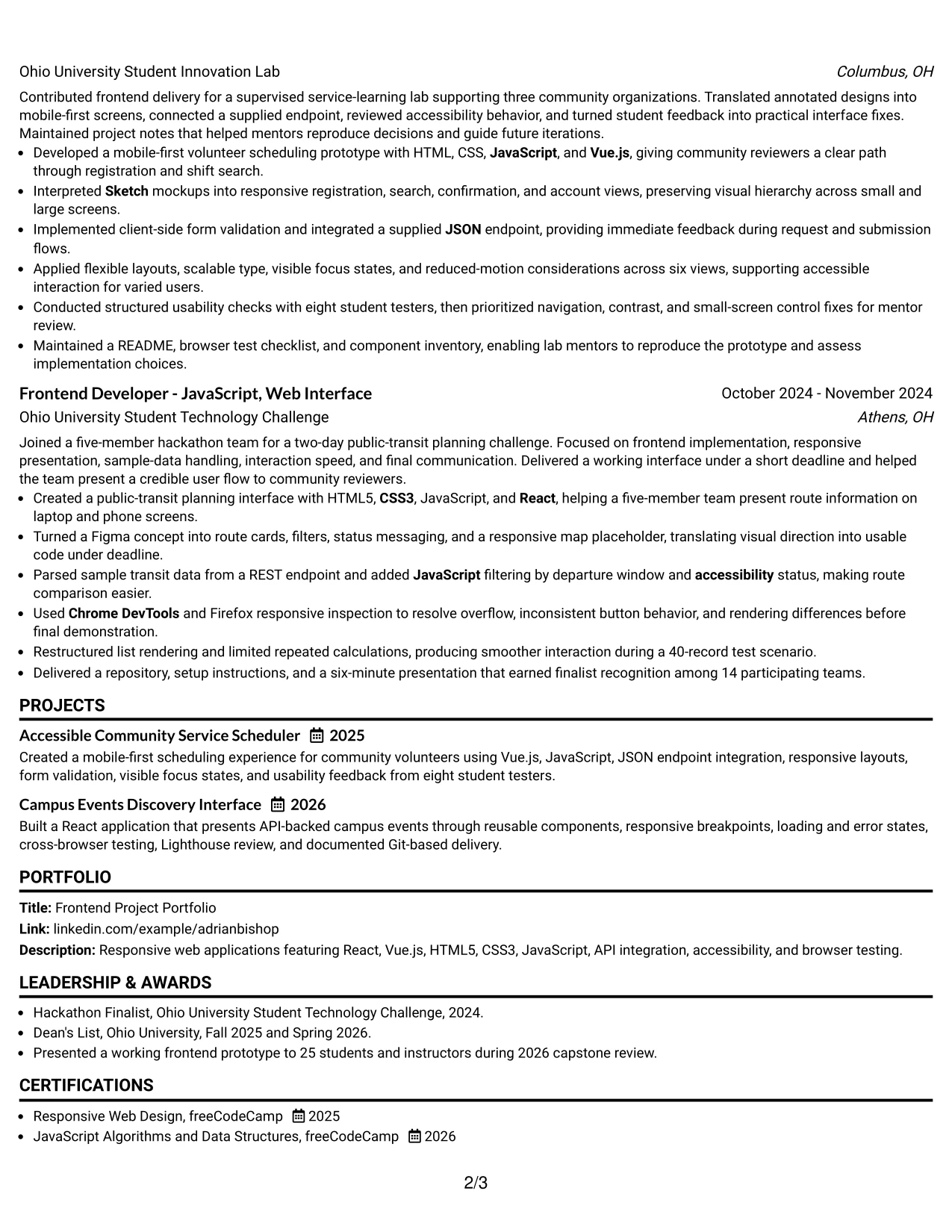
Simple One Column Format puts the resume in a direct reading order: contact details, summary, experience, projects, education, certifications, and skills. That structure helps a reviewer move from the target role to the strongest evidence without searching across side panels.
For a Junior Frontend Developer - JavaScript resume, one clear column gives HTML5, CSS3, JavaScript, React, Vue.js, responsive design, API integration, and browser testing enough room to stand out. Project bullets can show 18 Figma screens, six tested views, eight usability testers, and a 40-record performance check.
Why the Simple One Column Format Works for a Resume
- A single reading path supports fast recruiter scanning.
- Standard section order helps ATS tools identify headings and dates.
- Full-width bullets give measurable project results enough space.
- Technical skills remain easy to find near the summary or experience.
- Projects can carry detail without crowding a narrow sidebar.
- Education, certifications, and honors stay visible in the same hierarchy.
- The format presents responsive design, API work, testing, and performance evidence clearly.
Best For
- One-column reading when every section should follow a clear sequence
- ATS-focused applications that need familiar headings and strong parsing
- Resumes with several project bullets and technical details
- Candidates who want measurable results to receive full line length
- Portfolio-led applications where projects need room for context
- Applications that require skills, education, certifications, and activities in one flow
- Readers reviewing the document on smaller screens
- A direct, low-distraction presentation for a Junior Frontend Developer - JavaScript application
#2 Plain One Column with Shaded Labels Resume Example
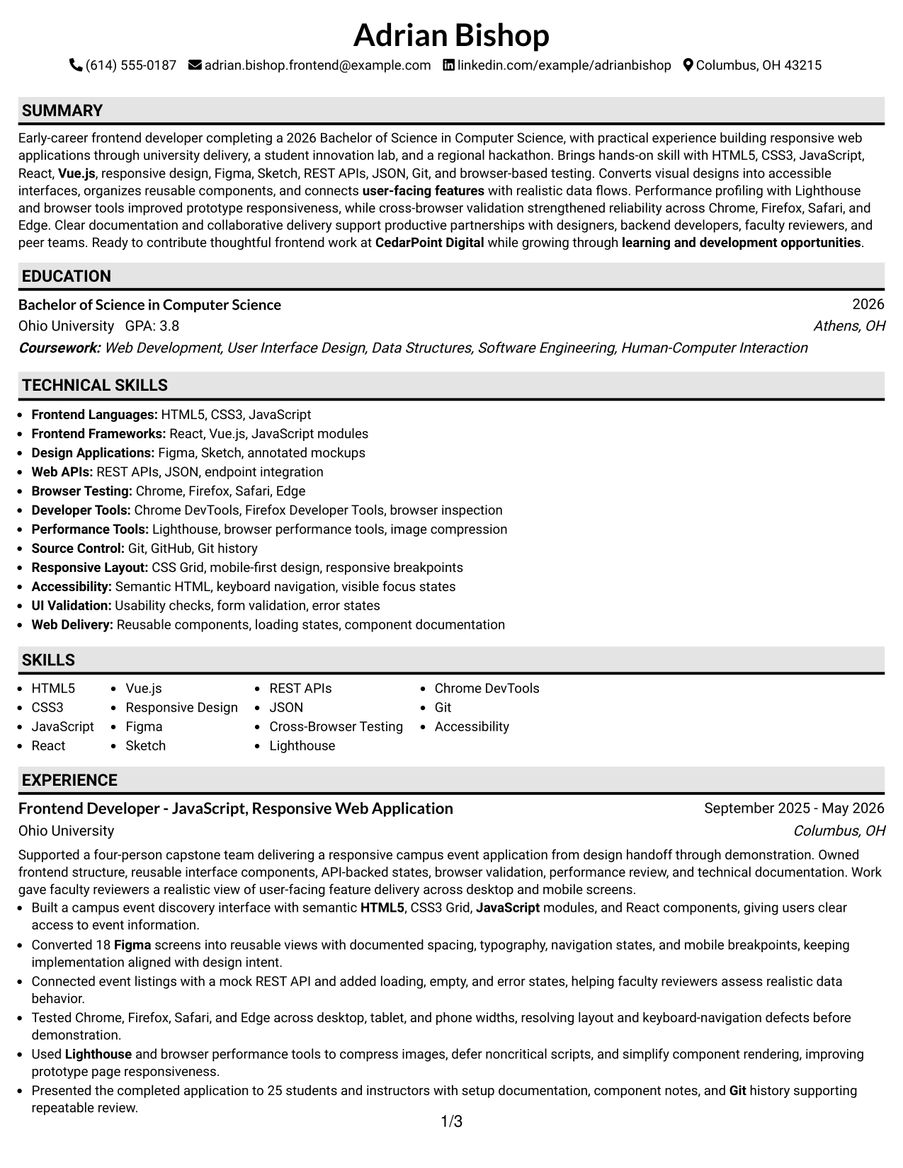
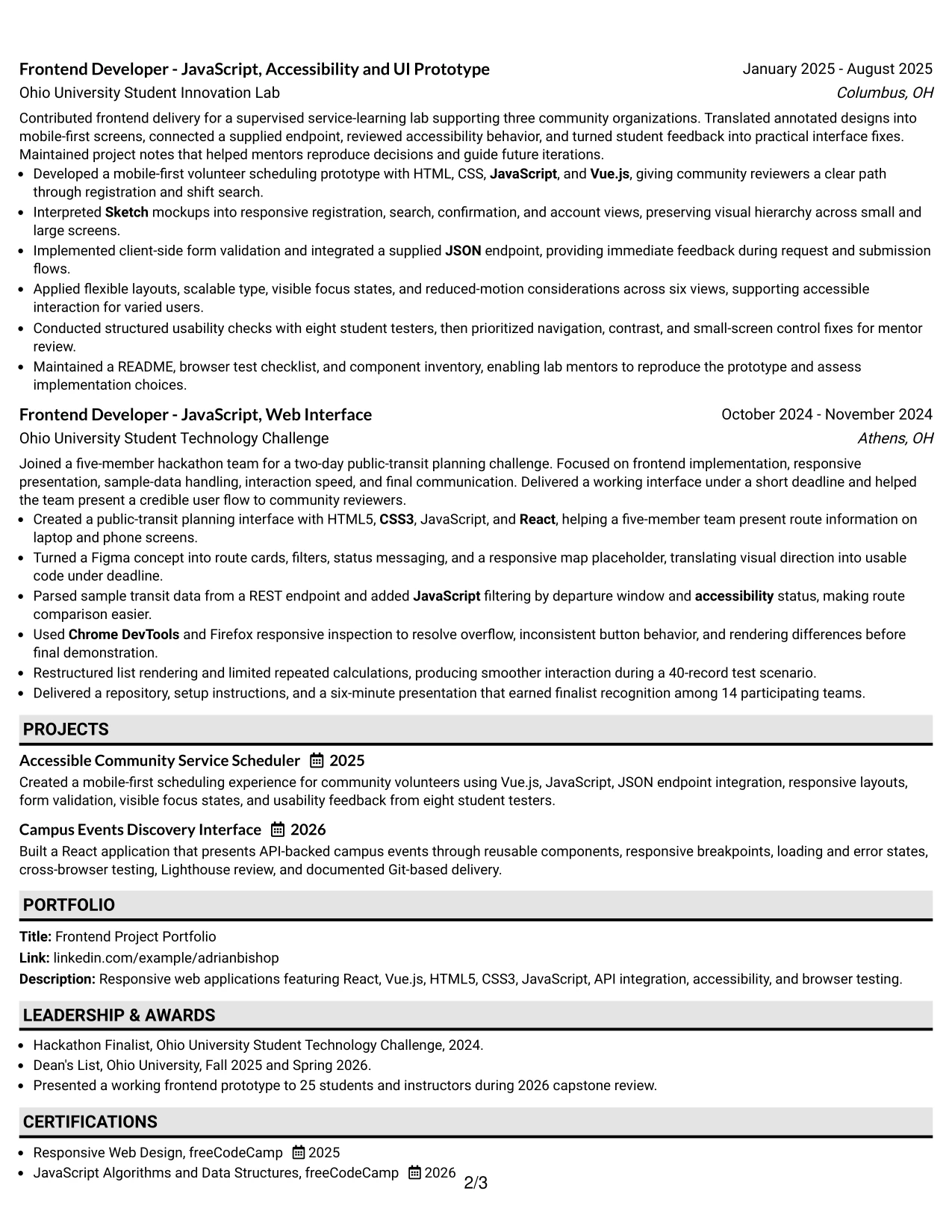
Recruiters can move from the summary to experience, projects, education, and skills in a steady top-to-bottom path. Shaded labels mark each section without breaking that sequence, so the reader sees both the category and its supporting details quickly.
The resume has enough room for practical evidence: React and Vue.js work, Figma and Sketch translation, REST API states, cross-browser testing, accessibility checks, and Lighthouse review. Long project entries remain readable because the labels separate content without using a second column.
Why the Plain One Column with Shaded Labels Works for a Resume
- Shaded labels make section changes easy to spot.
- One column keeps dates, employers, projects, and bullets in a predictable order.
- The format gives detailed experience bullets full-width space.
- Clear labels help ATS software distinguish skills from work history.
- Technical terms can appear naturally in both skills and achievement bullets.
- Projects, certifications, and education remain easy to locate.
- The restrained styling keeps attention on evidence rather than decoration.
Best For
- Applications with substantial project and experience detail
- Readers who prefer visible section markers without a complex layout
- ATS submissions that benefit from one-column parsing
- Resumes combining academic delivery, lab work, and a hackathon project
- Candidates who need room for tools, methods, and measurable outcomes
- Applications where certifications and education should remain prominent
- Digital review on screens where a simple vertical path is easier to follow
- A structured resume for a Junior Frontend Developer - JavaScript role
#3 One Column Format with Photo Right Resume Example
The strongest evidence receives priority at the start: the professional summary, frontend projects, and technical experience appear before supporting sections. A photo at the right can provide a defined visual anchor, while the main text remains in one readable column.
That space supports concrete proof such as reusable React components, 18 converted Figma screens, API-backed loading and error states, testing across Chrome, Firefox, Safari, and Edge, and performance work with Lighthouse. Keep the photo professional and secondary to the resume's searchable content.
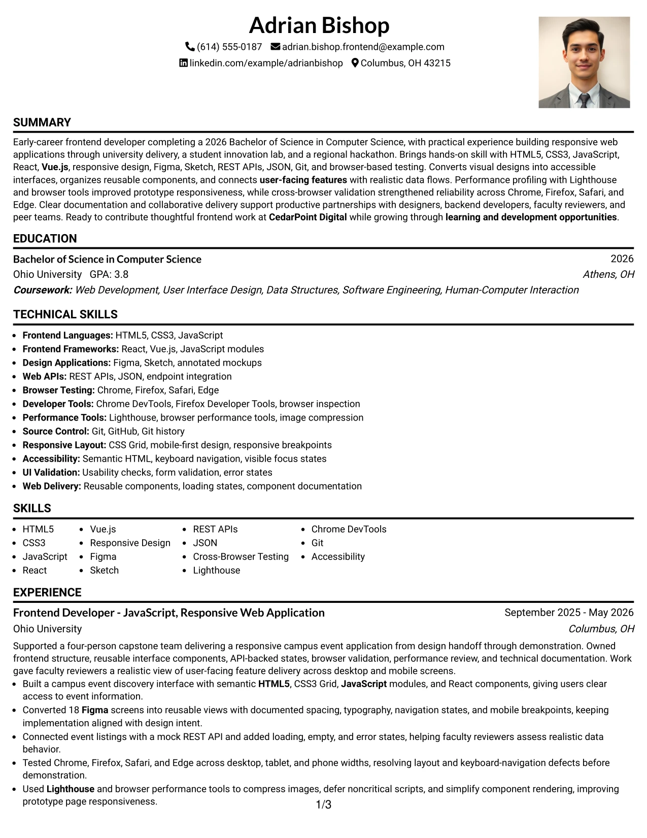
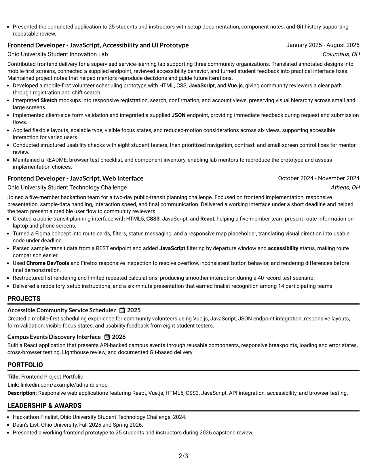
Why the One Column Format with Photo Right Works for a Resume
- The main column gives evidence more space than decorative elements.
- A right-side photo creates a clear header anchor without splitting the body.
- Project bullets can explain design translation, API integration, and testing.
- One-column section order remains easy for ATS review when text is selectable.
- The summary can connect frontend skills to the target role immediately.
- Full-width experience entries support detailed technical results.
- The photo should remain consistent with a professional application and never replace qualifications.
Best For
- Applications where a defined personal header supports the presentation
- Resumes that need a single, evidence-first reading path
- Portfolio-focused documents with detailed project descriptions
- Candidates presenting design translation alongside implementation results
- Reviewers who want technical experience before education and supporting sections
- Applications where cross-browser and performance evidence needs full-width bullets
- A polished digital resume with a visible but secondary photo
- A Junior Frontend Developer - JavaScript resume that leads with project proof
#4 Clean Two Column Sidebar Format Resume Example
Content is balanced between a narrow sidebar and a wider main area. The sidebar can hold contact details, skills, certifications, or education, while the main column carries the summary, experience, and project bullets that need more room.
For this application, that division keeps HTML5, CSS3, JavaScript, React, Vue.js, Git, accessibility, and performance tools visible at a glance. The main area can then prove those keywords through API integration, responsive layouts, browser validation, and documented project delivery.
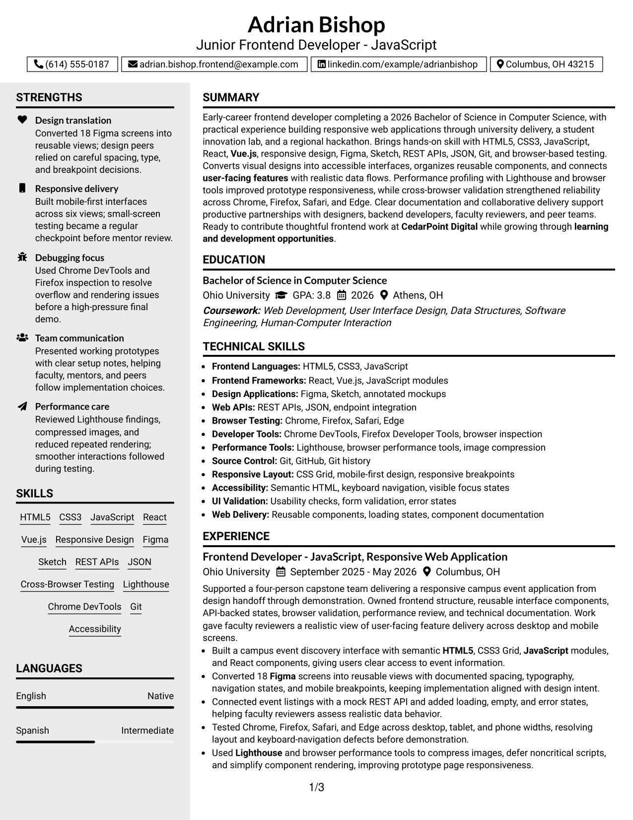
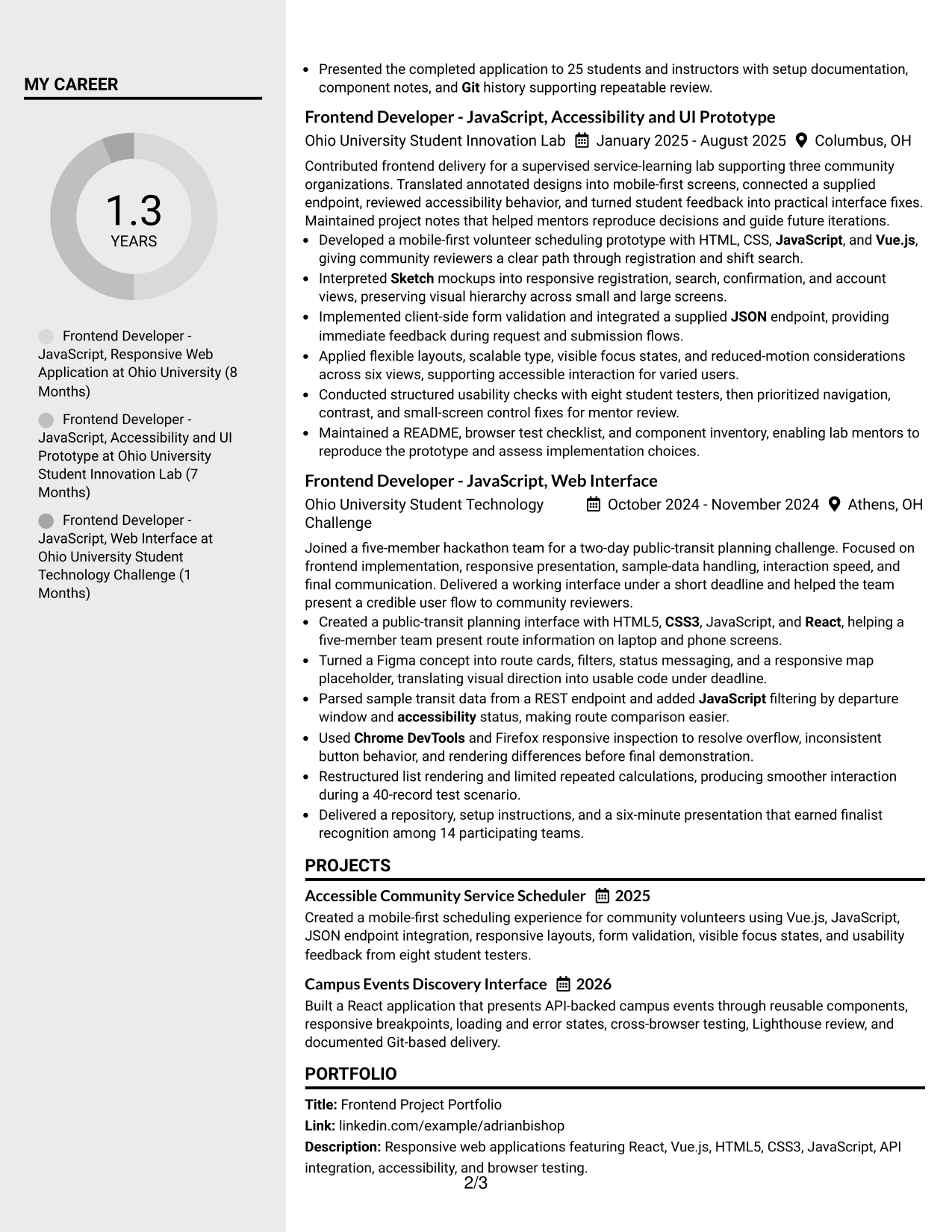
Why the Clean Two Column Sidebar Format Works for a Resume
- The sidebar exposes core skills before the reader reaches detailed history.
- The wide column protects achievement bullets from tight wrapping.
- Separate areas distinguish quick facts from supporting evidence.
- A restrained sidebar can hold certifications and education without hiding them.
- Project details show where technical keywords were used.
- The layout supports fast review while preserving useful context.
- Clear hierarchy helps a digital reader move between skills and proof.
Best For
- Applications needing quick access to a technical skills list
- Resumes with a strong mix of tools, certifications, and project evidence
- Digital reviewers who scan a sidebar before reading experience
- Candidates balancing concise profile facts with detailed implementation bullets
- Documents that need a separate place for education and credentials
- Applications where responsive design and testing keywords should be visible early
- Readers who value visual separation without heavy decoration
- A two-column resume for a Junior Frontend Developer - JavaScript application
#5 Two Column Format Resume Example
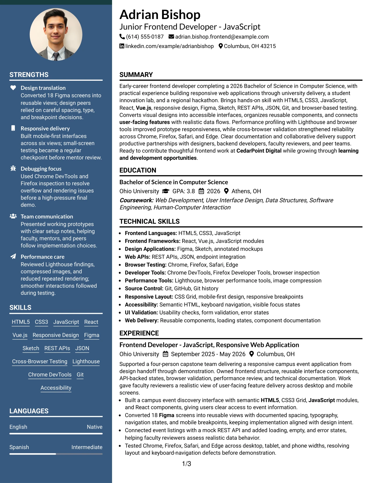
A practical application review often starts with a quick check of the summary, skills, and portfolio evidence. Two Column Format supports that review by placing concise qualification details beside the fuller experience and project record.
The structure fits a frontend resume with both breadth and proof. One area can list Figma, Sketch, REST APIs, Git, accessibility, and browser tools; the other can explain the 2026 capstone, the volunteer scheduler, and the finalist hackathon interface through clear action bullets.

Why the Two Column Format Works for a Resume
- The layout lets reviewers compare skills with related project evidence.
- A compact column keeps high-value keywords visible during an initial scan.
- The main column preserves room for results and technical decisions.
- Separate blocks reduce the need to repeat tools in every bullet.
- Projects can sit beside education or certifications without losing hierarchy.
- The format supports a portfolio link while keeping experience central.
- Balanced spacing makes a detailed early-career resume easier to review.
Best For
- Applications reviewed through a fast skills-to-evidence comparison
- Resumes that combine a portfolio, technical skills, and project history
- Candidates with several tools but limited space for repeated descriptions
- Documents where education and certifications need a defined supporting area
- Digital applications that benefit from visible keywords near the top
- Readers who want concise facts beside fuller achievement bullets
- A balanced presentation of design, coding, testing, and API work
- A Junior Frontend Developer - JavaScript resume with varied project evidence
#6 Photo Header Two Column Format Resume Example
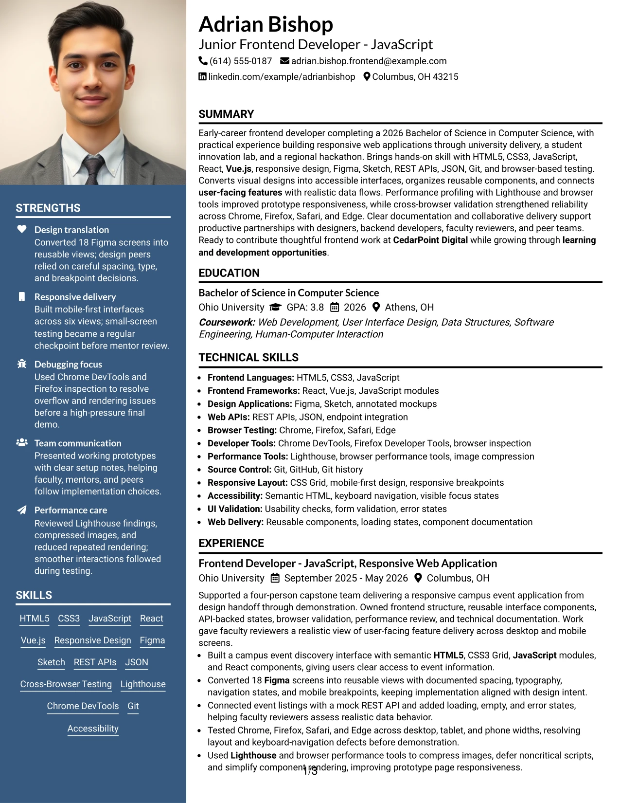
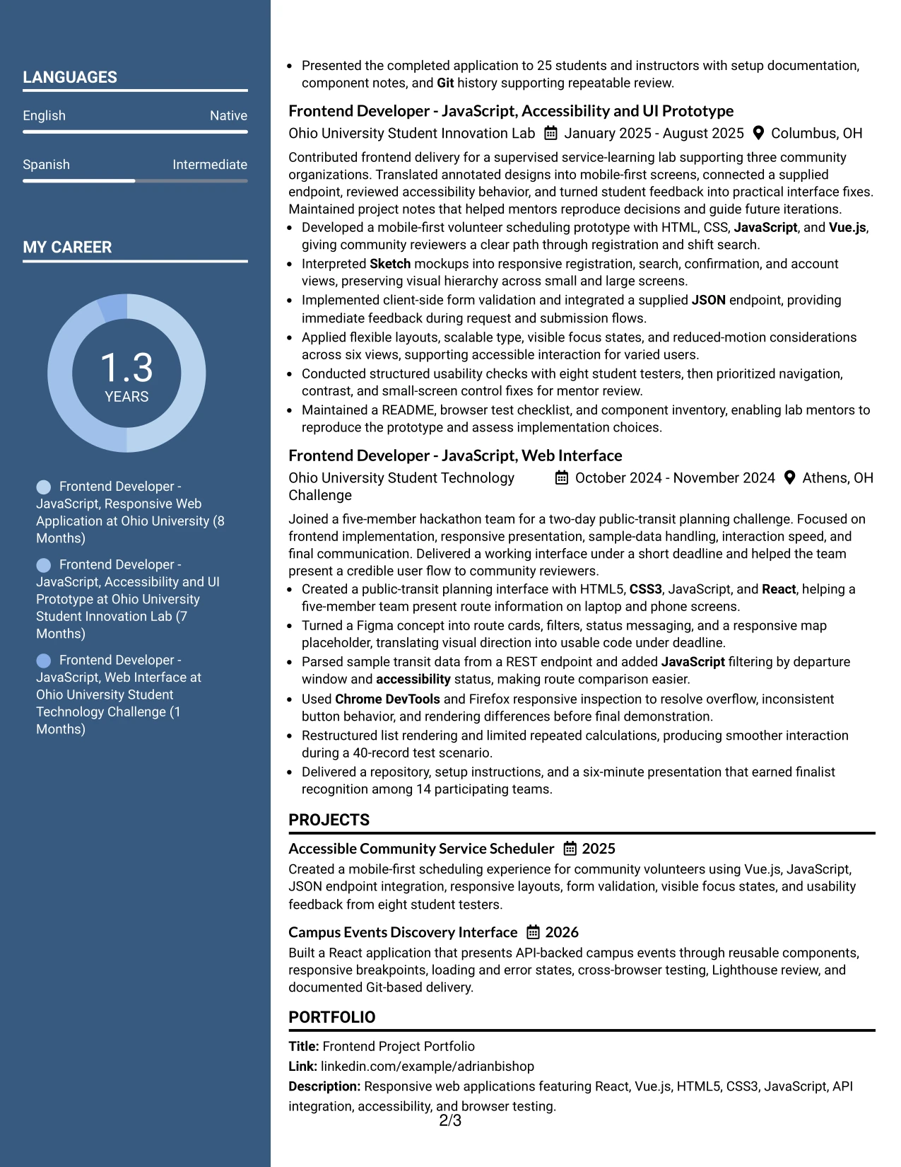
A restrained visual hierarchy puts the contact header and professional photo in a clear first position, then divides supporting facts from detailed resume evidence. The photo should be clean, current, and secondary; the two-column body must still make skills, projects, and dates easy to find.
This format can align the target role with a focused technical profile. A sidebar may surface JavaScript, React, Vue.js, responsive design, accessibility, and Git, while the main column documents Figma implementation, API integration, cross-browser fixes, and performance improvements.
Why the Photo Header Two Column Format Works for a Resume
- The header creates a clear first impression without taking over the document.
- Two columns separate quick qualifications from detailed experience.
- A photo can support identity in settings where it is professionally appropriate.
- The main area gives project bullets space to show implementation and results.
- The sidebar keeps technical keywords visible during a quick review.
- The hierarchy links the target role to relevant frontend evidence.
- Text sections must remain selectable and readable for digital and ATS use.
Best For
- Applications where a professional photo is accepted and useful
- Documents needing a strong header with compact qualification details
- Candidates pairing a visible personal presentation with portfolio evidence
- Digital resumes where skills should sit beside detailed project history
- Applications that need clear separation between tools and achievement bullets
- Reviewers who want role alignment visible before reading the full record
- A polished layout for design-aware technical applications
- A Junior Frontend Developer - JavaScript resume with clear two-column hierarchy
#7 Simple Two Column Format Resume Example
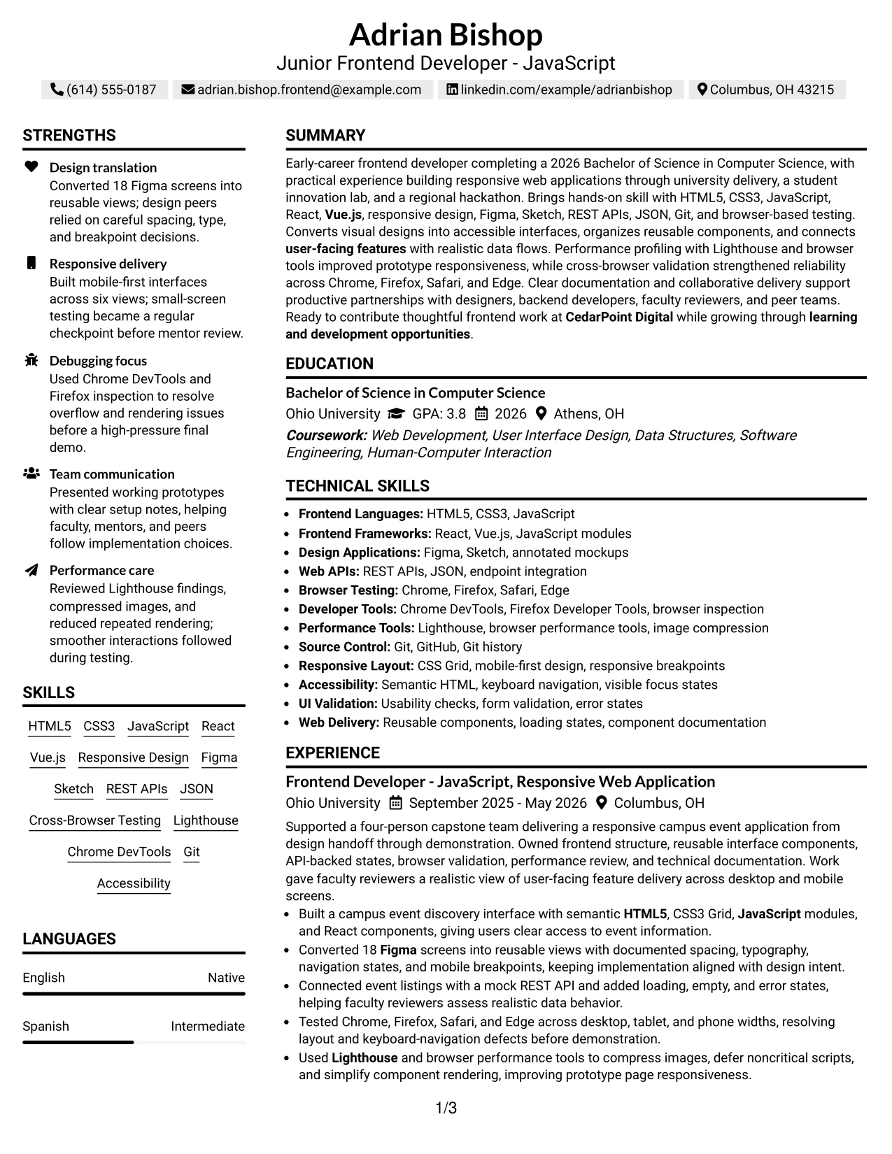
Simple Two Column Format organizes the resume into a compact information area and a broader evidence area. It keeps contact details, skills, education, or certifications easy to scan while reserving more width for experience and project bullets.
The result is useful for showing both technical range and actual delivery. The compact side can list HTML5, CSS3, JavaScript, React, Vue.js, REST APIs, and Git. The main side can show responsive interfaces, accessible states, browser testing, and performance work with concrete project context.
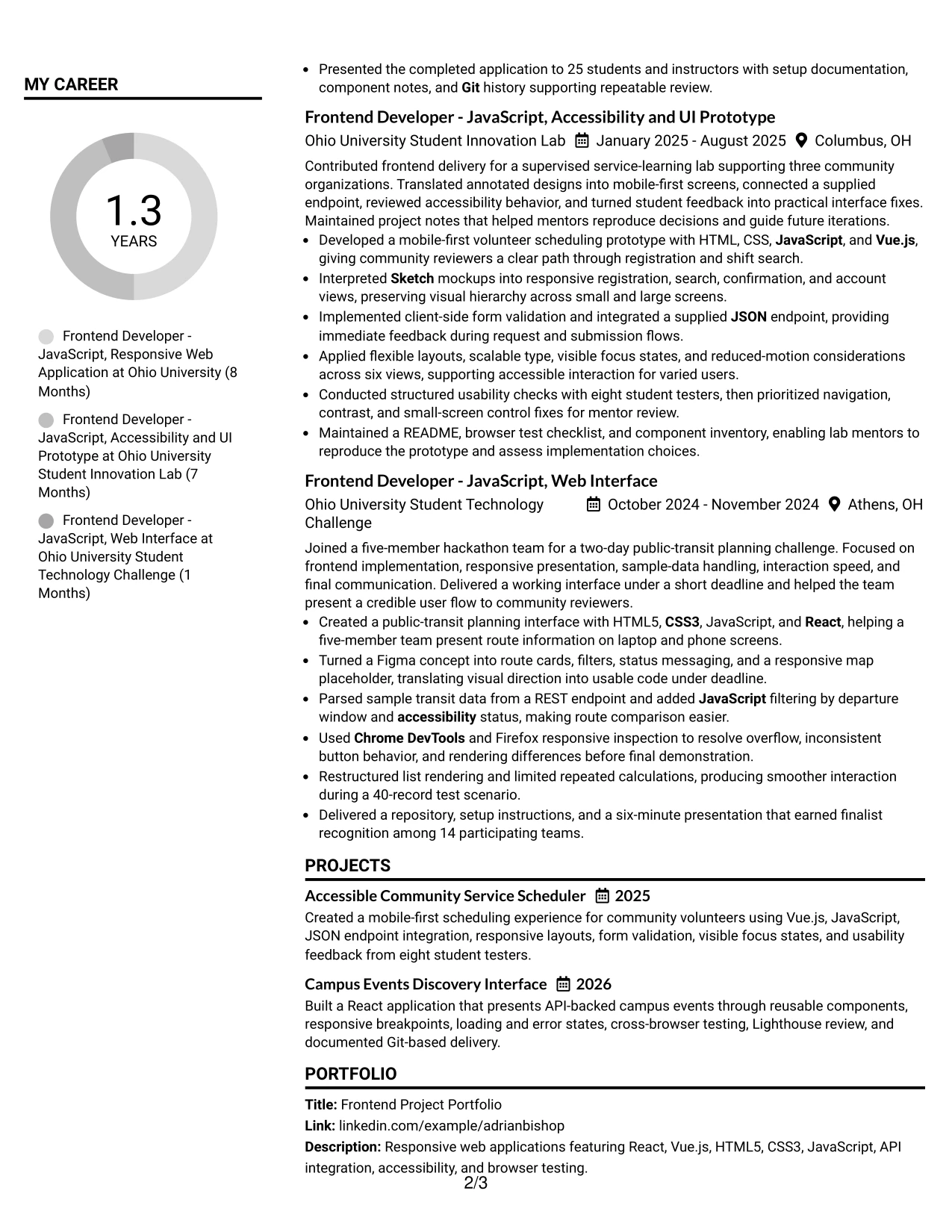
Why the Simple Two Column Format Works for a Resume
- A simple split makes core qualifications visible quickly.
- The broad column supports complete action and result bullets.
- Technical skills can be grouped without overwhelming the experience section.
- Projects remain connected to the tools used to build them.
- Education and certifications have a clear but supporting position.
- The format uses familiar text sections that remain easy to parse.
- Visual simplicity keeps attention on frontend evidence and measurable work.
Best For
- Applications needing a compact skills area and detailed main record
- Resumes with several related frontend tools to group clearly
- Candidates who want project evidence to remain the visual focus
- Documents combining education, certifications, and practical delivery
- Readers scanning for keywords before checking the supporting bullets
- Applications that need clear separation without a decorative sidebar
- Digital review where short blocks and full-width bullets work together
- A simple two-column resume for a Junior Frontend Developer - JavaScript role
#8 Text/Fang Style Resume Example
Readers move through a continuous text-first sequence, with each resume section clearly separated and easy to follow. The format favors complete descriptions, so a reviewer can understand the setting, tools, action, and result behind each project.
That makes room for the capstone, innovation lab, and hackathon work without reducing the evidence to isolated keywords. Bullets can explain reusable components, responsive breakpoints, REST and JSON data flows, usability checks with eight testers, and smoother interaction in a 40-record scenario.
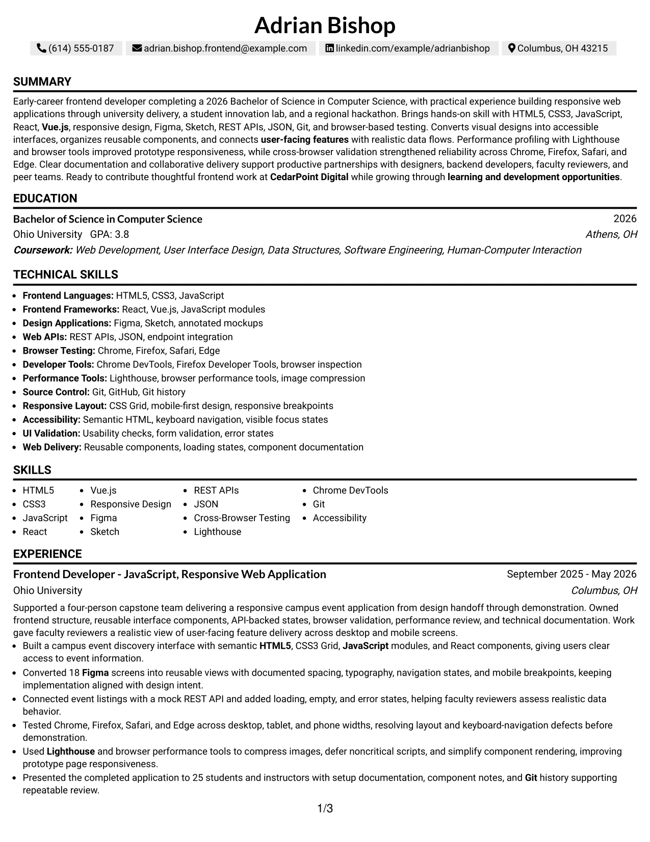
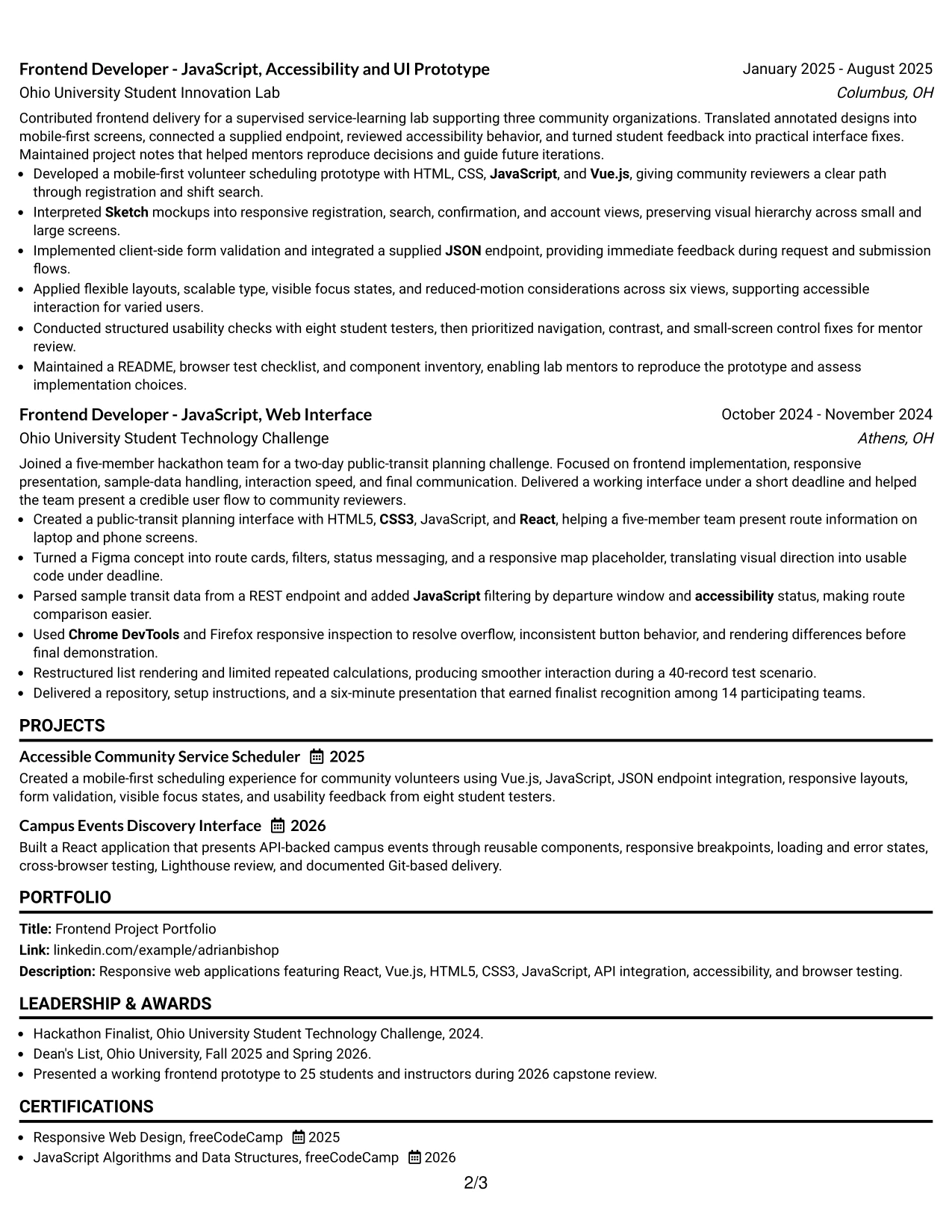
Why the Text/Fang Style Works for a Resume
- A text-first flow supports detailed review of project decisions.
- Full-width content gives each bullet room for context and results.
- The sequence makes dates and project progression easy to follow.
- Technical terms appear alongside the work that demonstrates them.
- Longer descriptions can explain accessibility and testing methods clearly.
- The format supports a portfolio-led resume with several substantial projects.
- Clear section breaks prevent dense content from becoming difficult to scan.
Best For
- Applications where project context matters as much as tool names
- Resumes with detailed academic, lab, and challenge-based delivery
- Candidates who need space to explain decisions, testing, and outcomes
- Readers who prefer a continuous text path over a compact sidebar
- Portfolio documents with multiple projects requiring distinct descriptions
- Applications where accessibility and usability evidence needs explanation
- Documents that benefit from full-width technical bullets
- A content-rich resume for a Junior Frontend Developer - JavaScript application
#9 One Column Boxed Contact Header Format Resume Example
The evidence starts below a boxed contact header, giving the reviewer immediate access to the target role, summary, and strongest experience. The box defines contact information without taking space from the one-column resume body.
This structure is strong for measurable project proof. The body can show 18 Figma screens, six responsive views, eight student testers, 25 presentation attendees, and a 40-record performance scenario. Skills, education, certifications, and the portfolio then follow in a clear order.
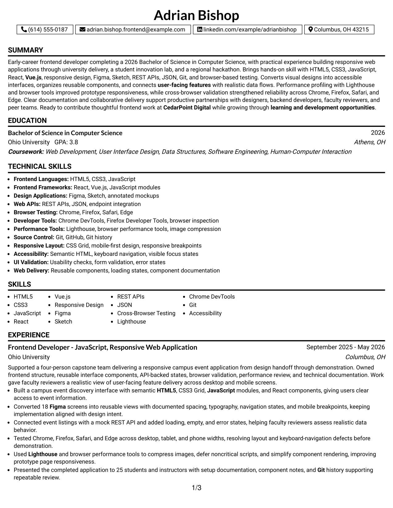
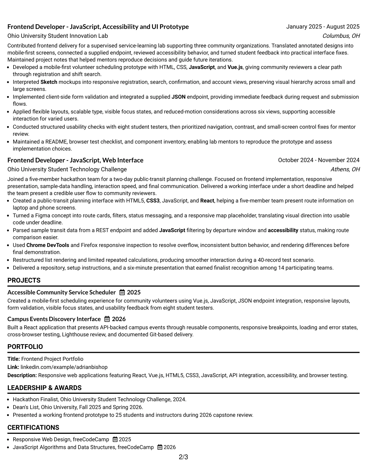
Why the One Column Boxed Contact Header Format Works for a Resume
- The boxed header makes contact details and role information easy to confirm.
- One-column content keeps evidence in a familiar ATS-friendly sequence.
- Full-width bullets display numbers and technical results clearly.
- The summary can connect the portfolio to the target role before experience begins.
- Projects receive enough room for tools, actions, and outcomes.
- Supporting sections remain visible without competing with the main evidence.
- The defined header adds structure while keeping the body plain and readable.
Best For
- Applications that need contact details separated from the evidence
- Resumes where measurable project results should lead the review
- ATS submissions using a straightforward one-column body
- Candidates with a portfolio and several technical project examples
- Documents that need clear space for tools, education, and certifications
- Readers checking role alignment before reviewing the complete history
- Digital applications where a distinct header improves navigation
- A Junior Frontend Developer - JavaScript resume built around project proof
#10 Plain Two Column Format Resume Example
For a practical application review, the resume should connect the target role, technical keywords, and project evidence without making the reader hunt for any of them. Plain Two Column Format supports that need by placing concise facts beside the fuller record.
Adrian Bishop's resume can use the compact side for skills, education, certifications, and portfolio details while the main side carries responsive application work, API integration, accessibility, browser testing, and performance results. Keep the keyword list aligned with the job description and supported by project bullets.
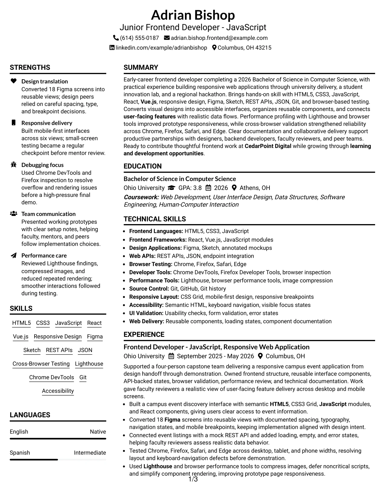
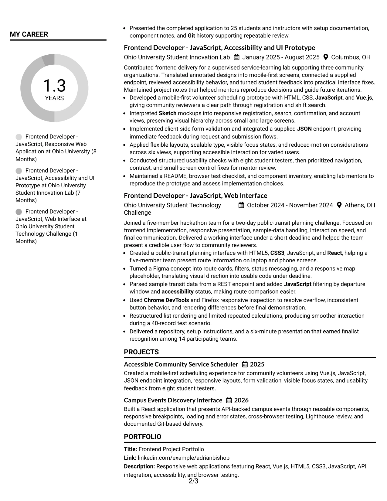
Resume Snapshot
- Target role: Junior Frontend Developer - JavaScript
- Core stack: HTML5, CSS3, JavaScript, React, and Vue.js
- Evidence: responsive projects, Figma and Sketch translation, API integration, and browser testing
- Education and credentials: 2026 Bachelor of Science in Computer Science plus two freeCodeCamp certifications
Why the Plain Two Column Format Works for a Resume
- The two-column structure separates quick facts from detailed proof.
- A plain design supports reliable ATS reading and human scanning.
- The snapshot can confirm the target role and core stack immediately.
- The main column gives experience bullets enough space for results.
- Keywords remain useful because project evidence explains their application.
- Education and certifications stay visible without crowding technical history.
- The format is easy to edit as new frontend work is added.
Resume Keywords
- Junior Frontend Developer - JavaScript
- HTML5
- CSS3
- JavaScript
- React
- Vue.js
- Responsive Design
- Figma
- Sketch
- REST APIs
- Cross-Browser Testing
- Lighthouse
- Accessibility
- Git
- Performance Optimization
#11 Colored Two Column Format Resume Example
For an application that needs quick visual direction, a restrained color system can separate the sidebar from the main resume record. The color should guide the eye, not compete with the summary, experience, projects, education, or skills.
The two-column structure supports a strong visual fit for a frontend portfolio resume. A sidebar can group JavaScript, React, Vue.js, Figma, Sketch, accessibility, Git, and testing tools. The main column can show how those skills produced responsive interfaces, API-backed states, cross-browser fixes, and performance improvements.
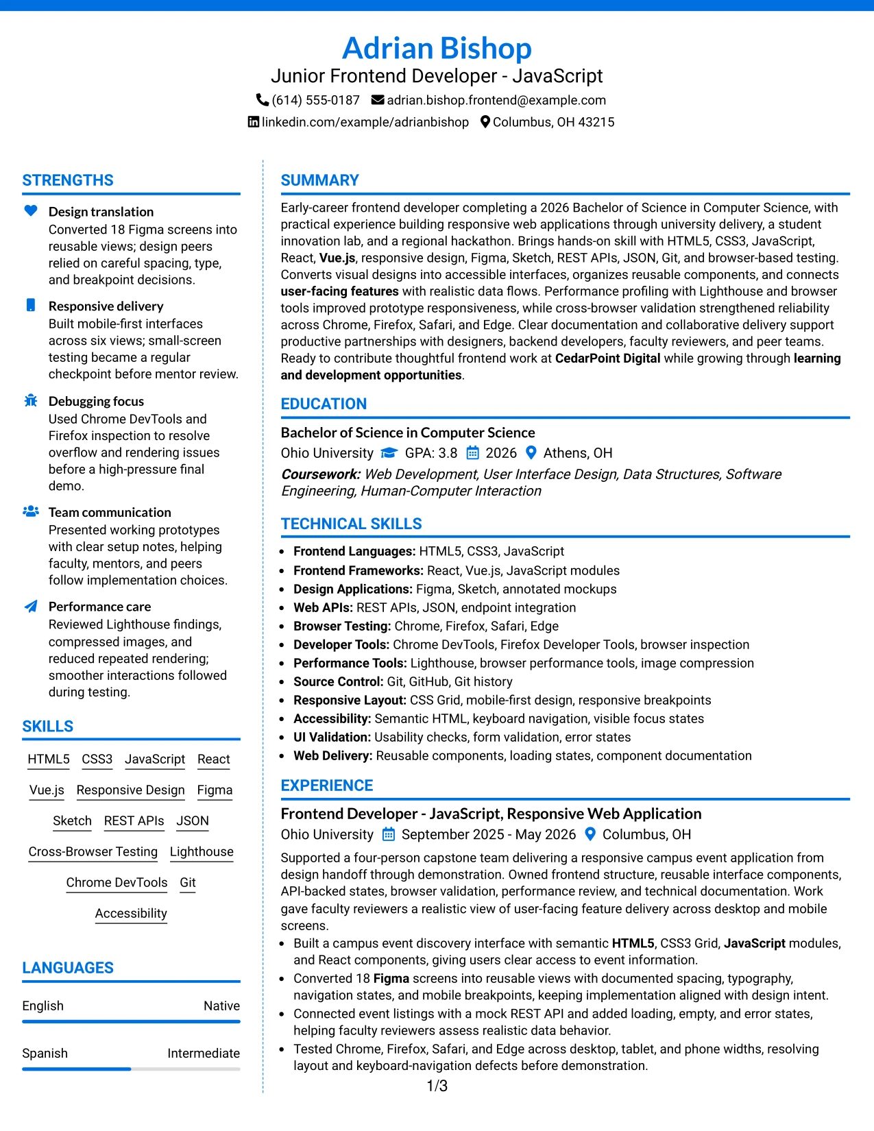
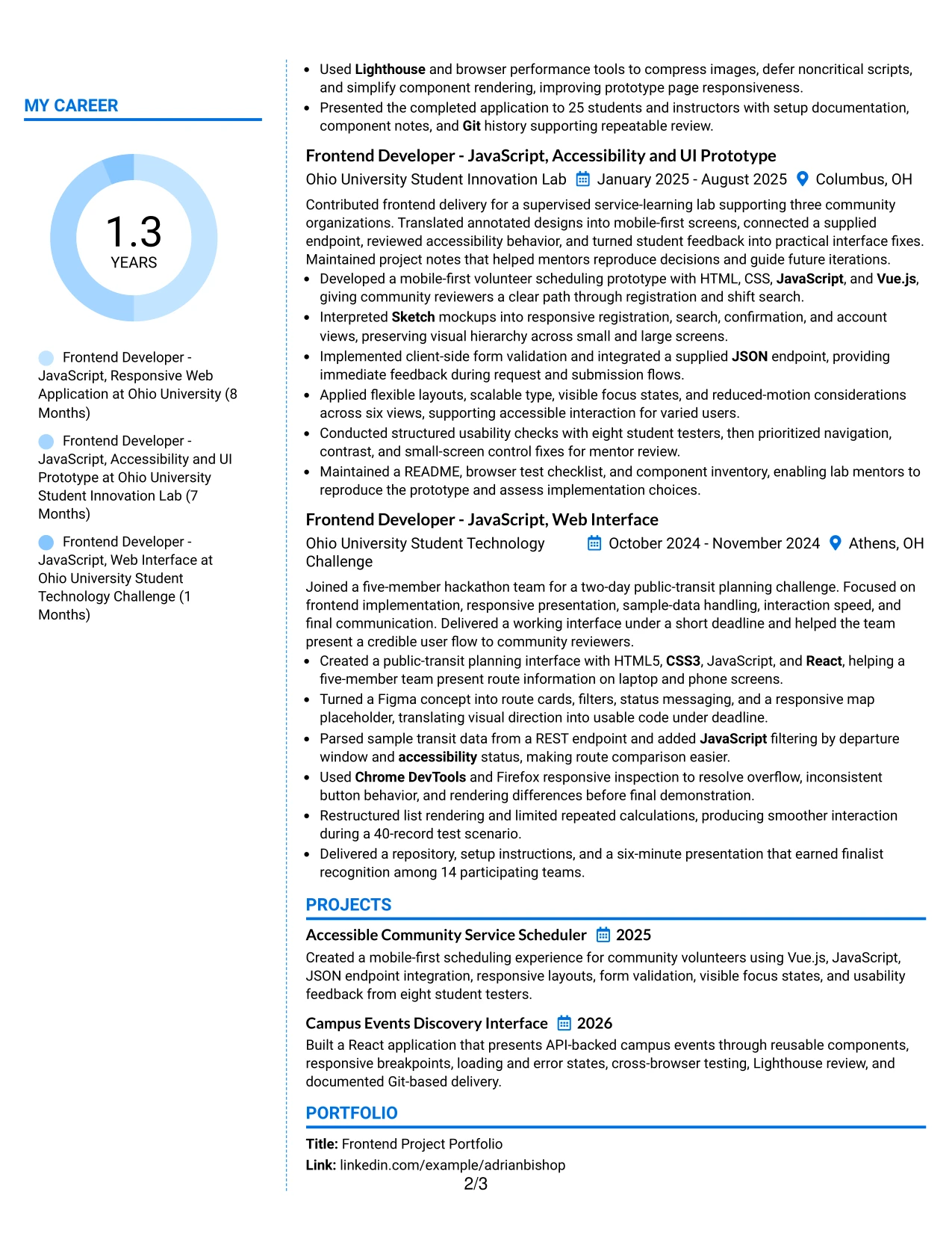
Why the Colored Two Column Format Works for a Resume
- Controlled color helps readers identify sections quickly.
- The main column keeps achievement bullets wider than sidebar content.
- A grouped sidebar makes the technical stack visible at first glance.
- Projects demonstrate the skills instead of leaving them as unsupported keywords.
- The format gives a portfolio-oriented resume a clear visual hierarchy.
- Education, certifications, and honors can occupy a defined supporting area.
- Simple text structure keeps the design readable in digital review.
Best For
- Portfolio applications where visual hierarchy supports technical proof
- Candidates who want a defined skills area beside detailed project work
- Digital resumes using restrained color to guide section scanning
- Documents combining frontend tools, testing methods, and measurable results
- Applications where design translation and implementation should appear together
- Readers who value visual separation but still need a plain text structure
- Resumes presenting a modern interface focus without excessive decoration
- A visually organized Junior Frontend Developer - JavaScript application
#12 One Column Shaded Contact Header Format Resume Example
A restrained visual hierarchy gives the resume a professional first impression before the reader reaches the work history. The shaded contact header keeps contact details and the target role easy to identify without adding visual clutter.
For a Junior Frontend Developer - JavaScript application, the single-column flow supports clear evidence: HTML5, CSS3, JavaScript, React, Vue.js, responsive design, API integration, browser testing, and performance work. The format keeps projects, education, certifications, and measurable results in a direct review path.
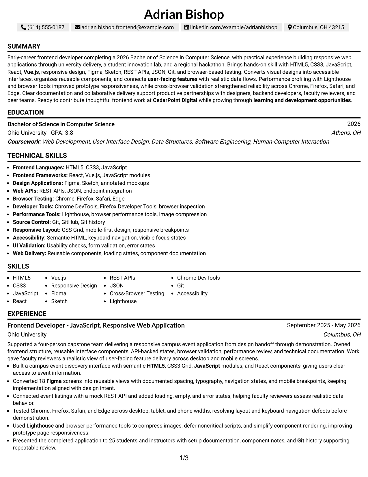
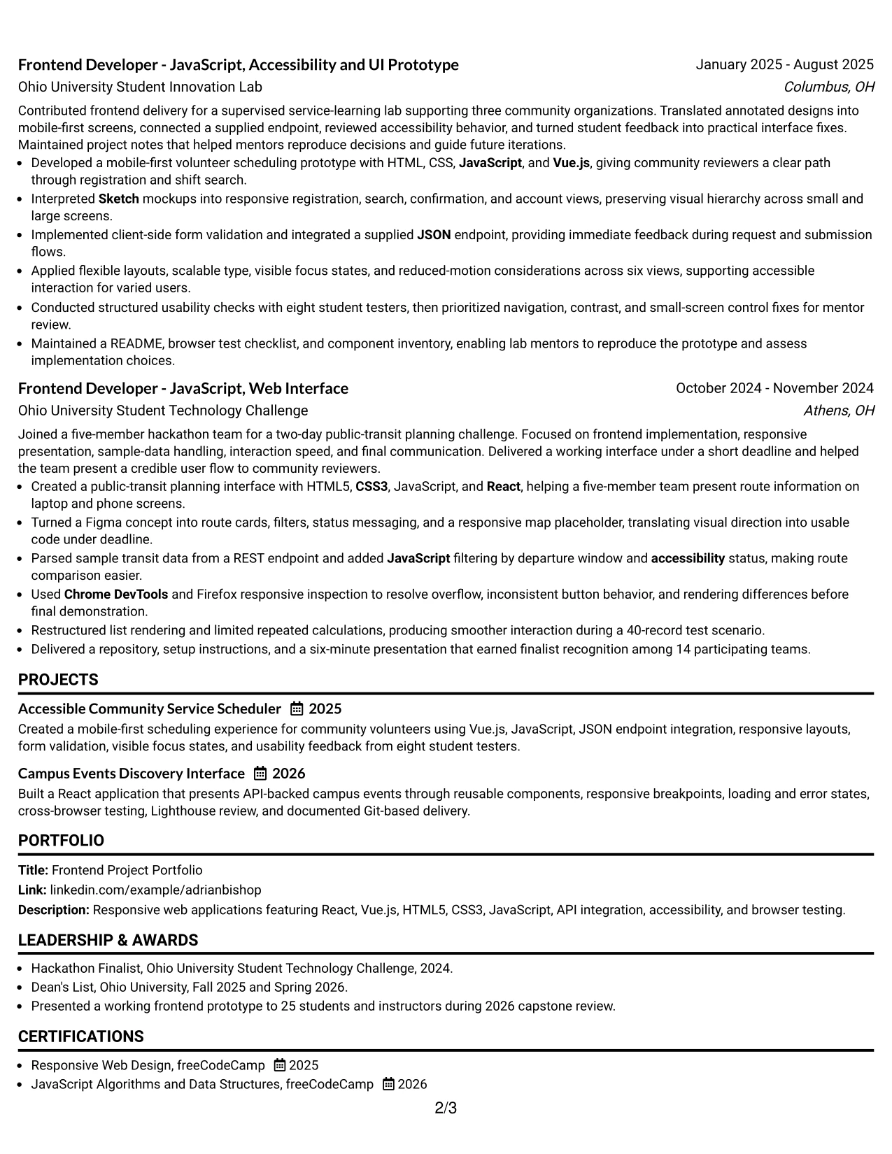
Why the One Column Shaded Contact Header Format Works for a Resume
- A centered contact header makes the name, location, phone, email, and LinkedIn details easy to find.
- One-column organization gives ATS systems a clean reading order.
- The shaded header separates contact information from the resume content below.
- A visible role title helps connect the resume to the Junior Frontend Developer - JavaScript opening.
- Project bullets can show technical evidence without being squeezed into narrow columns.
- Skills and tools remain easy to scan as the reader moves down the page.
- Education, certifications, awards, and activities fit naturally after the strongest frontend evidence.
Best For
- Applicants who want one clear reading path from contact details to experience.
- Resumes that need strong ATS readability without giving up a polished header.
- Candidates presenting several frontend projects with detailed bullet points.
- Applications where skills, tools, and project results need equal page space.
- Readers who prefer familiar resume organization and quick section recognition.
- Documents that must show design translation, API integration, and browser testing in sequence.
- Early-career resumes that use education and projects to support role alignment.
#13 Boxed Contact Header with Job Title Format Resume Example
The Boxed Contact Header with Job Title Format places the role target and contact details in a defined top section. The rest of the resume can then present summary, experience, projects, skills, education, and certifications in a familiar one-column structure.
That structure is useful when a recruiter needs to confirm the target role first and then verify the evidence. The resume can connect 18 Figma screens, API-backed states, cross-browser testing, Lighthouse review, and responsive interfaces to the Junior Frontend Developer - JavaScript requirements.
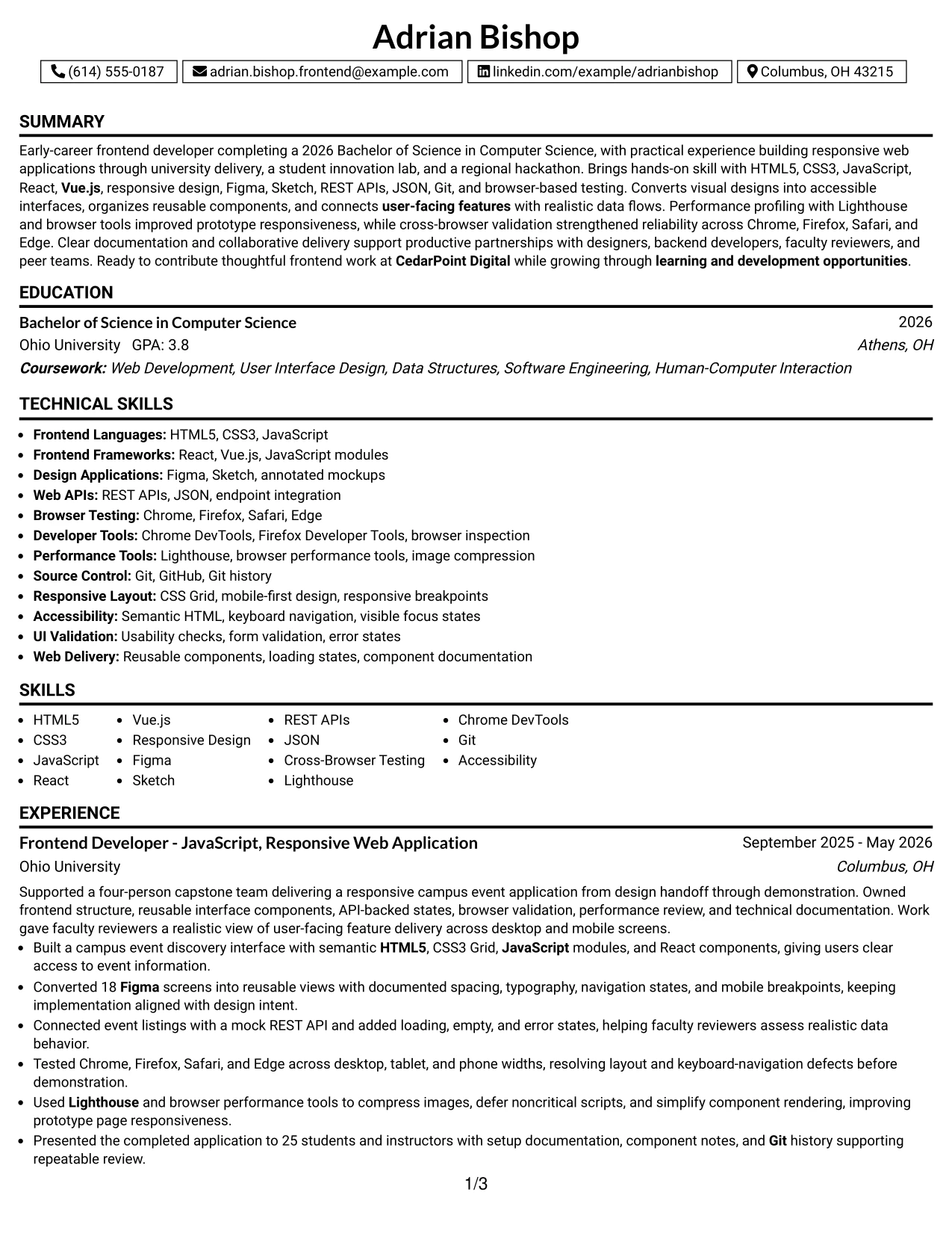
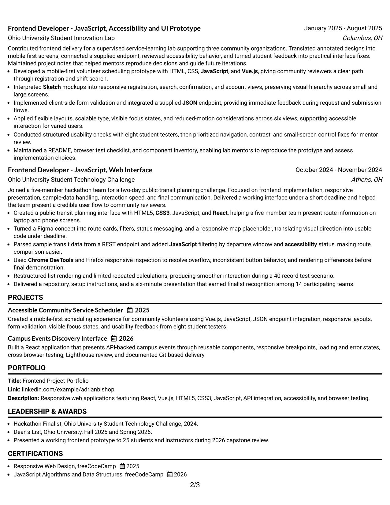
Why the Boxed Contact Header with Job Title Format Works for a Resume
- The boxed header creates an immediate starting point for contact details and the target role.
- A one-column structure supports predictable ATS parsing.
- The job title is separated from later sections, so the application target is not buried.
- Experience bullets can carry technical keywords such as JavaScript, React, Vue.js, and REST APIs.
- Projects can show portfolio evidence without competing with a side column.
- Education and certifications remain visible in the same continuous scan.
- The format supports measurable details such as 18 Figma screens, six views, eight testers, and 25 presentation attendees.
Best For
- Applications that need the target role stated clearly at the top.
- Resumes built for quick ATS and recruiter review in a standard sequence.
- Candidates with project bullets that need room for technical detail.
- Documents combining academic delivery, lab work, and a hackathon project.
- Applicants who want design, development, testing, and performance evidence grouped by section.
- Resume versions tailored to one role while keeping the overall structure stable.
- Readers who value strong labels and familiar navigation over decorative elements.
#14 Stylish Two Column Designer Format Resume Example
Readers move through this resume by using the wider content area for experience and projects, then checking the supporting information in the side column. That separation helps technical work receive detail while skills, education, certifications, and contact information stay available for quick reference.
The two-column design can hold substantial evidence without making every section compete for the same horizontal space. It supports a frontend resume that includes reusable components, responsive layouts, API states, accessibility checks, Git workflows, and browser validation.
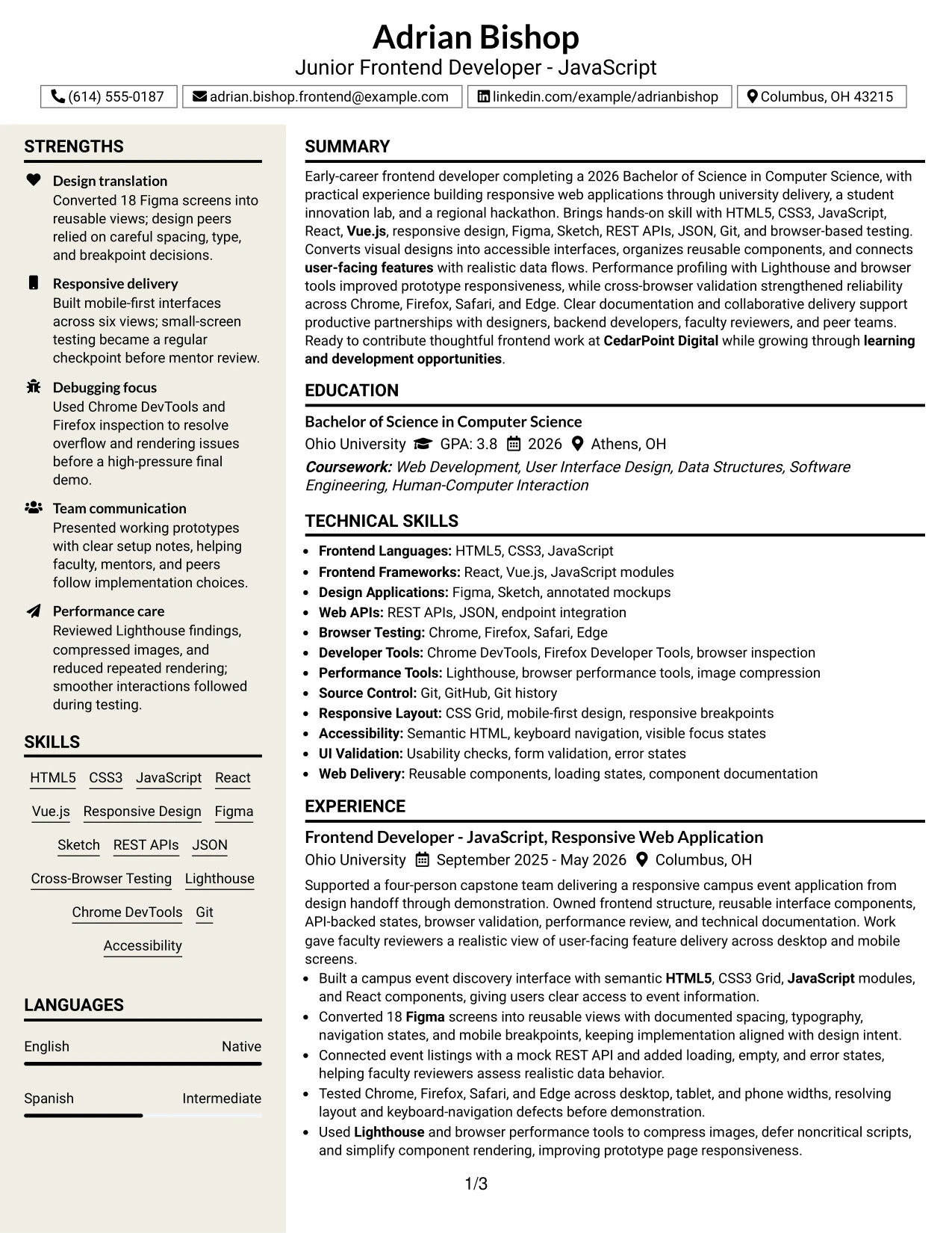
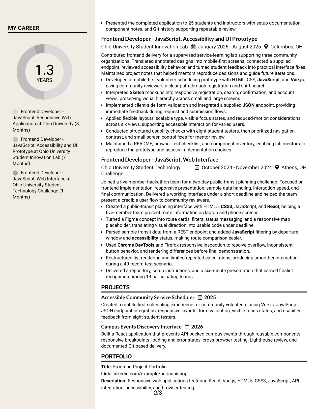
Why the Stylish Two Column Designer Format Works for a Resume
- Two columns separate detailed evidence from supporting resume information.
- The wider section can give experience and projects enough room for complete bullets.
- A sidebar can group skills, tools, certifications, or education for fast lookup.
- The format supports a larger technical keyword set without creating a long skills block.
- Readers can compare project results with the tools used to produce them.
- The design gives portfolio-oriented work a clear place alongside employment or academic experience.
- A defined visual hierarchy helps readers return to key sections during a fast review.
Best For
- Resumes with several projects and enough evidence to justify a wider content area.
- Applicants who need detailed experience on one side and compact skills on the other.
- Documents that combine technical tools, certifications, education, and project results.
- Portfolio-focused applications where project scope must remain visible.
- Readers who scan for keywords first and review achievement bullets second.
- Candidates with related frontend work spread across university, lab, and challenge projects.
- Applications needing more content density than a basic one-column page provides.
#15 Modern Icon Format Resume Example
The strongest evidence comes first: responsive interfaces, design implementation, API integration, browser validation, and performance review. The Modern Icon Format can then use visual section cues to make that evidence easier to locate without replacing clear resume text.
For this application, the content shows practical frontend delivery through React and Vue.js projects, 18 converted Figma screens, six responsive views, cross-browser testing, Lighthouse work, and documented Git-based releases. Icons support navigation; the bullets carry the proof.
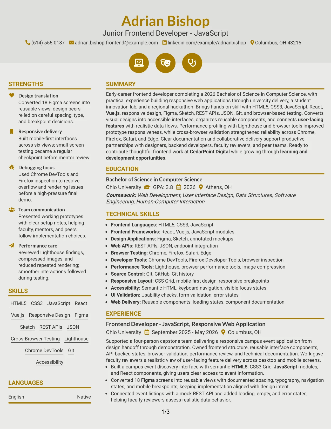
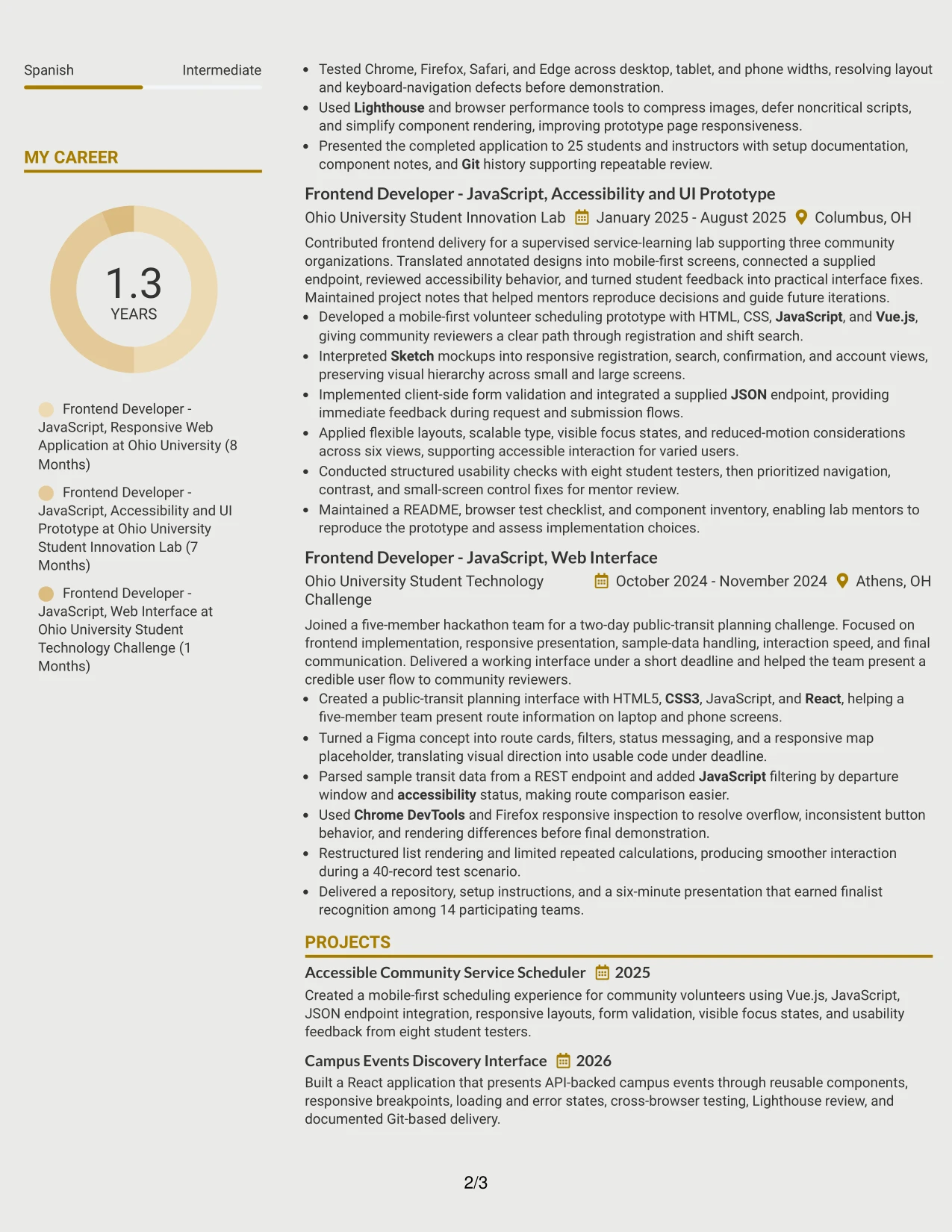
Why the Modern Icon Format Works for a Resume
- Experience bullets remain the main source of evidence, with icons supporting section recognition.
- Visual cues help readers locate skills, projects, education, and certifications quickly.
- The format can highlight technical capabilities without relying on long prose.
- Project entries can connect tools to results such as API states, performance changes, and usability fixes.
- A clear hierarchy keeps icons from replacing ATS-readable text.
- Frontend evidence stays organized by action, technology, and outcome.
- The structure suits a resume that needs both quick scanning and credible project detail.
Best For
- Resumes where technical evidence should lead before supporting details.
- Applicants using projects to demonstrate working interfaces and practical delivery.
- Documents that need quick visual cues for skills, tools, education, and certifications.
- Portfolio applications with several distinct pieces of frontend work.
- Readers who scan section markers before studying individual bullets.
- Candidates showing both implementation skills and validation methods.
- Applications that benefit from visual organization while retaining searchable text.
#16 Plain Professional Layout with Job Title & Shaded Labels Resume Example
Content is balanced through a simple one-column page with a clear job title and shaded section labels. The result gives each resume section enough separation while keeping the reader focused on experience, projects, skills, education, and results.
This practical layout fits an application that must show technical range without visual distraction. It can present HTML5, CSS3, JavaScript, React, Vue.js, responsive design, REST APIs, accessibility, testing, and performance optimization in a direct sequence.
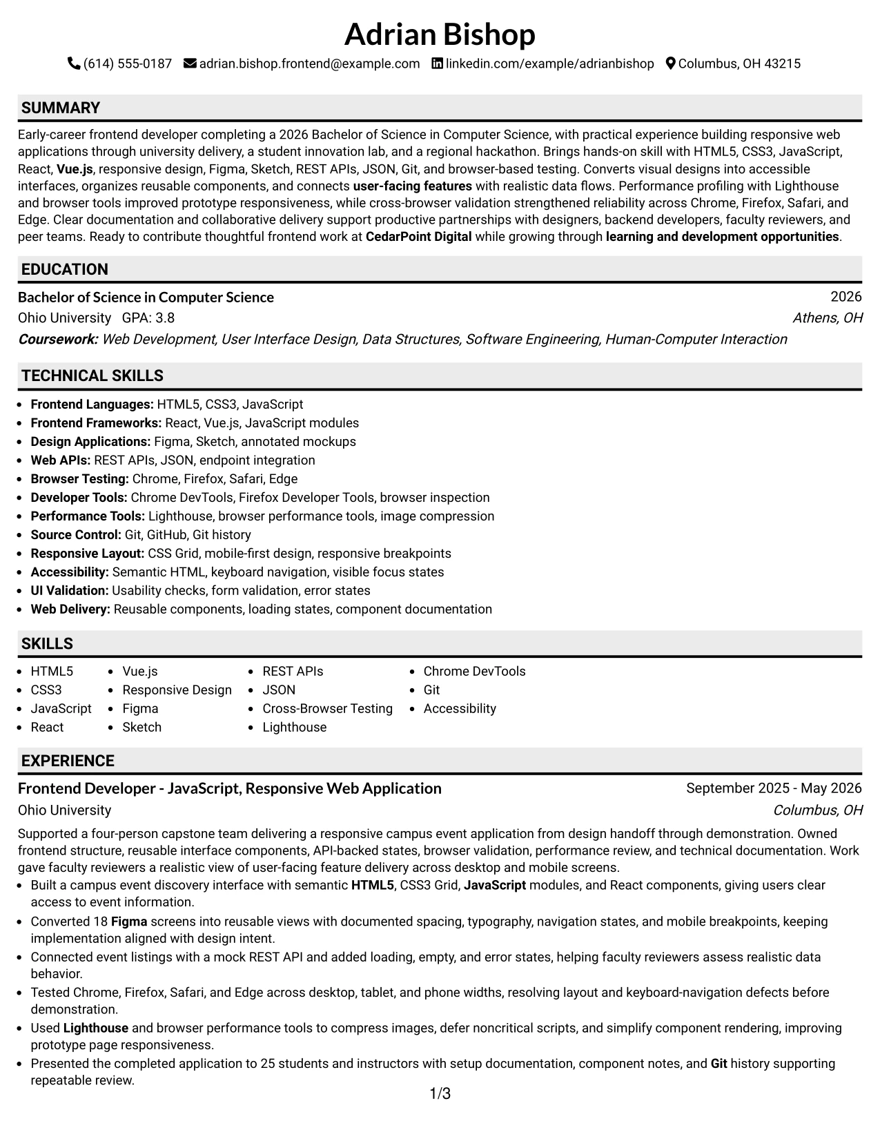
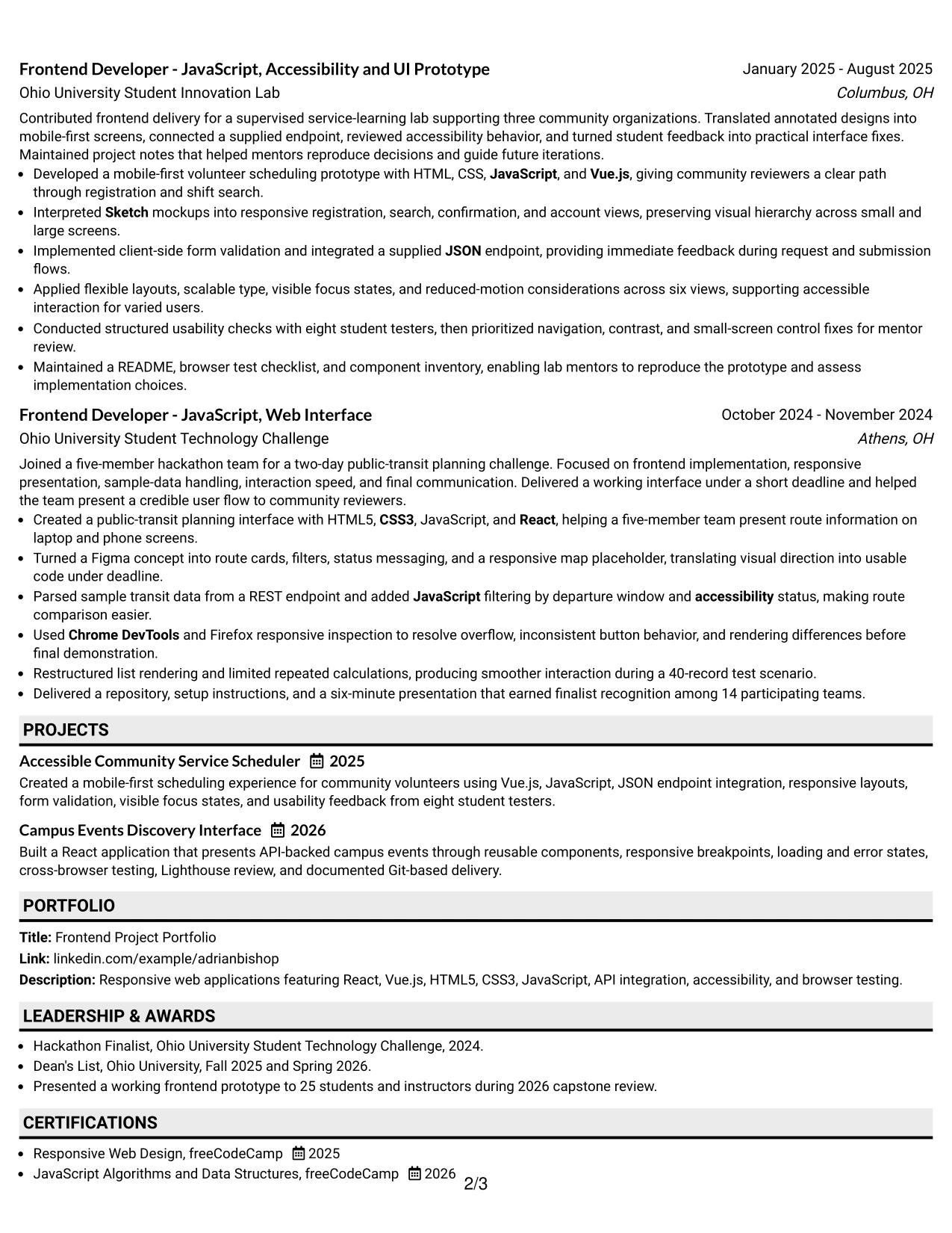
Why the Plain Professional Layout with Job Title & Shaded Labels Works for a Resume
- Shaded labels make each resume section easy to identify.
- The one-column arrangement keeps content in a reliable reading order.
- The job title gives the application a clear point of reference.
- Plain presentation leaves room for action-focused experience bullets.
- Skills and tools can be grouped without competing with decorative elements.
- Projects can show technical scope, testing, and measurable review details.
- The format works well when clarity matters more than visual styling.
Best For
- Applications requiring a direct, professional resume presentation.
- Candidates who want section labels to guide a fast review.
- Documents with detailed bullets that need uninterrupted line width.
- Resumes connecting frontend tools to testing, accessibility, and performance results.
- Applicants submitting the same core resume across structured application systems.
- Readers who prefer practical organization over decorative design.
- Project-based resumes where education and certifications must remain easy to locate.
#17 Classic One Column Resume Format Resume Example
For a standard application review, a familiar one-column resume makes the main facts easy to find. The reader can move from the summary to experience, projects, skills, education, certifications, awards, and activities without adjusting to a complex layout.
That predictable structure gives the frontend evidence room to speak clearly. Bullets can show React and Vue.js delivery, Figma and Sketch implementation, API integration, cross-browser compatibility, Lighthouse review, accessibility, and performance optimization.
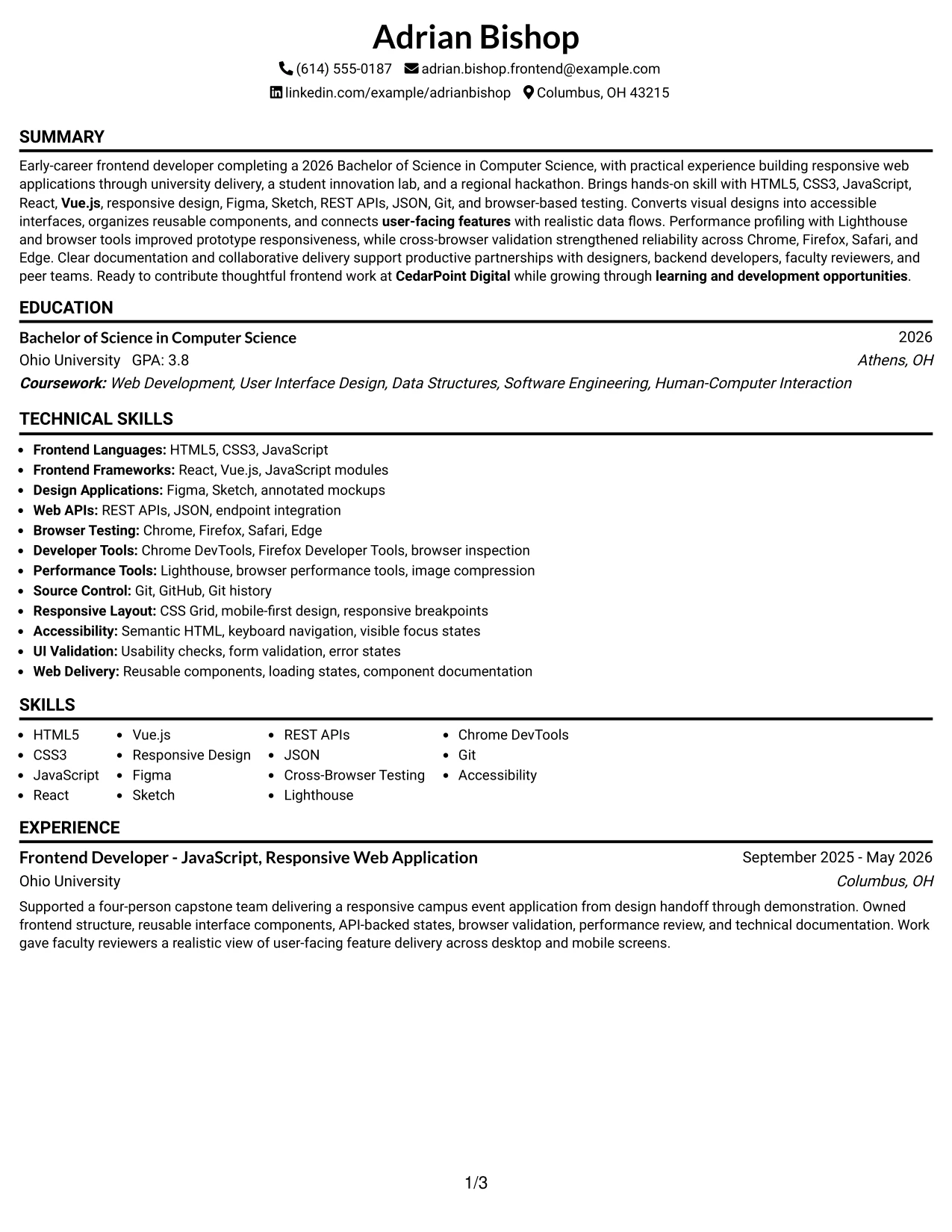
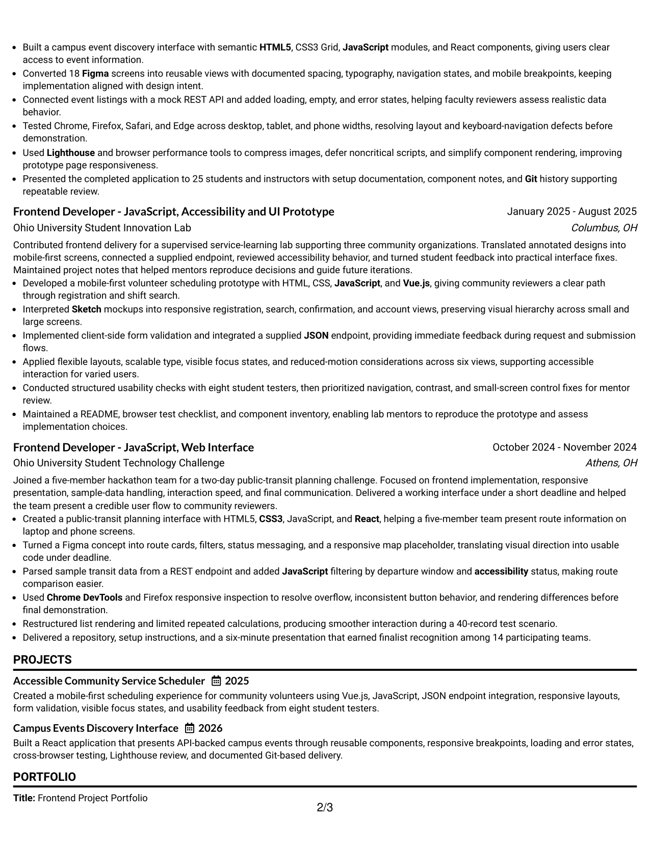
Why the Classic One Column Resume Format Works for a Resume
- A familiar order reduces the time needed to locate core resume sections.
- One column provides a clean path for ATS parsing and recruiter scanning.
- Experience bullets can explain actions, tools, and outcomes in full.
- Projects remain prominent for a portfolio-based application.
- Skills can reinforce keywords already supported by the experience section.
- Education, certifications, awards, and activities fit into a proven structure.
- The format keeps attention on evidence rather than visual effects.
Best For
- Standard online applications that favor a familiar resume structure.
- Applicants who need reliable ATS reading across different systems.
- Candidates using project work as a central form of professional evidence.
- Documents with a clear sequence from summary through supporting sections.
- Readers who want to verify tools and results without navigating columns.
- Resumes that must include education, certifications, awards, and activities.
- Applications where straightforward presentation supports trust and quick review.
#18 One Column Format with Photo Resume Example
A clear visual hierarchy keeps the resume readable while the top area provides space for contact details and professional presentation. The one-column structure then carries the reader through summary, frontend experience, projects, skills, education, certifications, and awards.
Role alignment remains the priority. The content supports a Junior Frontend Developer - JavaScript application with responsive web applications, React, Vue.js, Figma, Sketch, REST APIs, accessibility, browser testing, and performance work presented in a direct sequence.
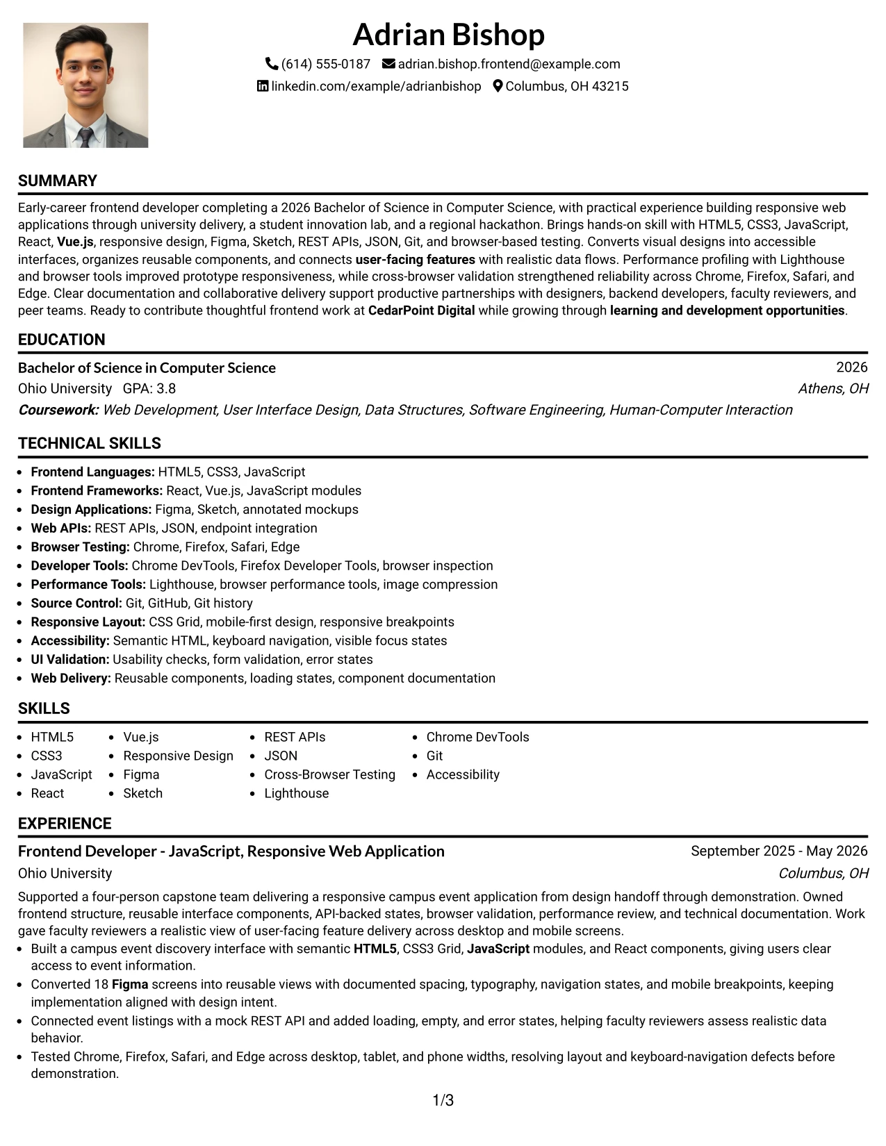
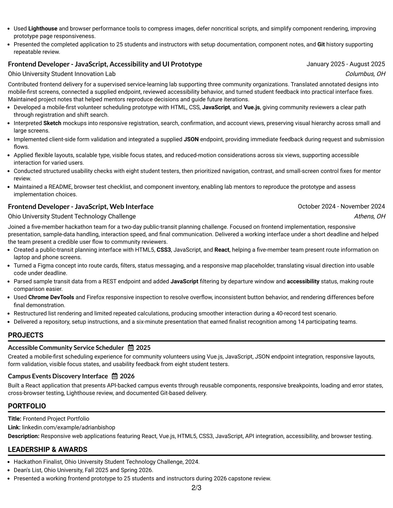
Why the One Column Format with Photo Works for a Resume
- The one-column reading path keeps resume information easy to follow.
- The top section gives contact details and the target role strong visibility.
- A consistent sequence supports ATS-friendly text extraction.
- Technical skills can be reinforced through project and experience bullets.
- Portfolio work has room to show interfaces, API behavior, testing, and documentation.
- Education and certifications remain connected to the technical evidence.
- The format can support professional presentation while keeping content central.
Best For
- Applicants who want a single, orderly resume flow with a stronger personal presentation.
- Applications where contact details and the target role need immediate visibility.
- Candidates whose projects provide the main proof of frontend capability.
- Documents that need room for responsive design and API integration details.
- Readers who review experience first and supporting credentials afterward.
- Resumes combining academic projects, lab delivery, and challenge results.
- Applicants who can maintain a professional visual presentation consistent with application expectations.
#19 Minimal Header Format Resume Example
The Minimal Header Format starts with a compact contact and role area, then moves directly into the resume evidence. Its simple organization helps readers scan the summary, experience, projects, skills, education, and certifications without unnecessary visual stops.
The content can match the target application with precise keywords and proof. Here, that includes HTML5, CSS3, JavaScript, React, Vue.js, responsive design, Figma, Sketch, REST APIs, cross-browser testing, Git, accessibility, and Lighthouse.
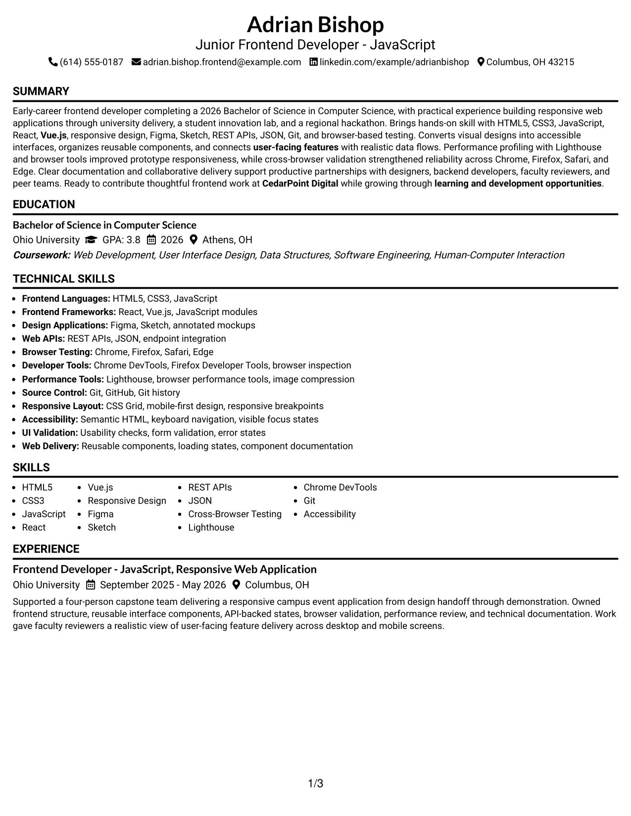
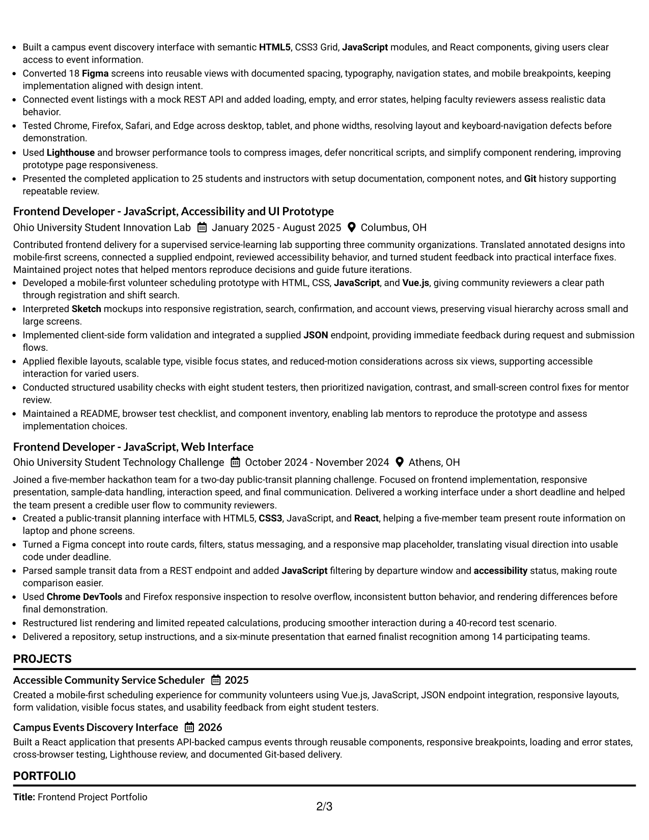
Why the Minimal Header Format Works for a Resume
- A compact header leaves more room for substantive resume content.
- The one-column order supports fast scanning and dependable ATS parsing.
- The target role can appear near the contact information without dominating the page.
- Experience bullets remain easy to read from left to right.
- Projects can carry portfolio evidence and measurable details.
- A focused skills section reinforces the language used in the experience.
- The restrained structure keeps the reader on actions, tools, and results.
Best For
- Applicants who want maximum content clarity with a compact opening area.
- Resumes submitted through ATS platforms that reward simple text structure.
- Candidates with several technical keywords to present in a controlled order.
- Documents where project bullets need more space than decorative elements.
- Readers who want to move quickly from contact details to evidence.
- Applications combining frontend projects with education and certifications.
- Resume versions that need a clean base for targeted keyword updates.
#20 Modern Full Background Two Column Format Resume Example
Readers can start with the main column for summary, experience, and projects, then use the secondary column to confirm skills, education, certifications, and supporting details. Adrian Bishop's resume benefits from this division because the technical evidence is substantial but still needs quick keyword access.
The two-column structure supports both depth and speed. Detailed bullets can show 18 Figma screens, API-backed states, eight usability testers, a 40-record performance scenario, and a finalist recognition while the supporting column keeps the tool set visible.
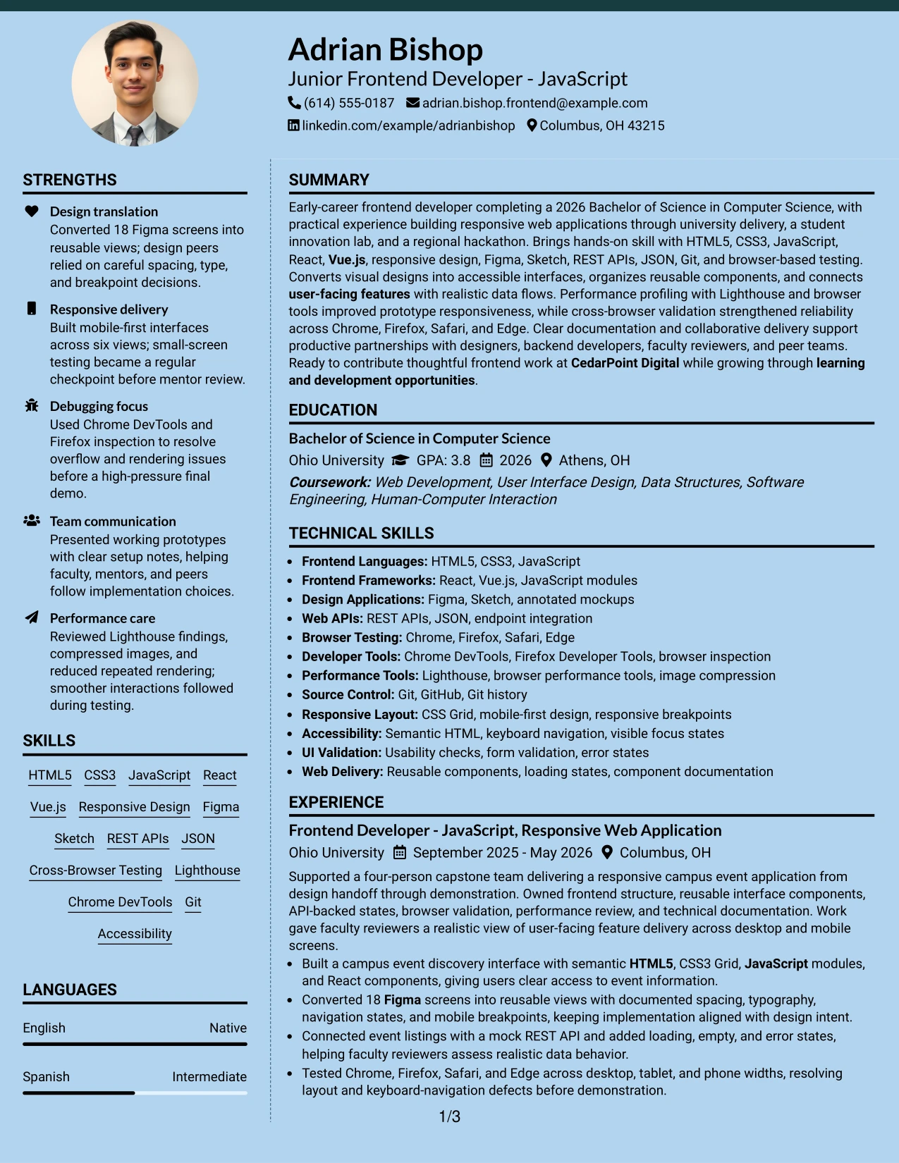
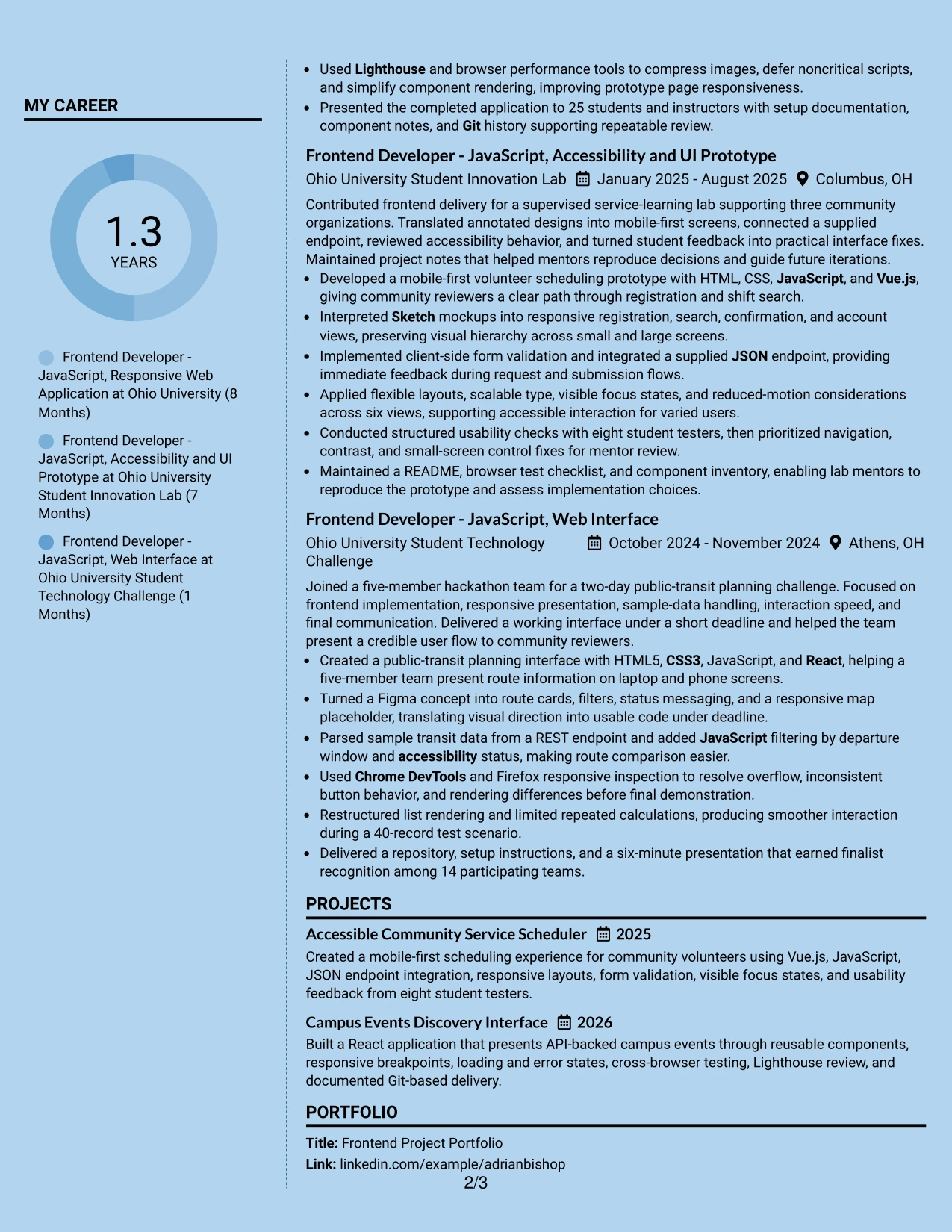
Why the Modern Full Background Two Column Format Works for a Resume
- The main column can carry detailed experience and project evidence.
- The secondary column provides a quick reference for skills, education, certifications, and awards.
- Two-column navigation helps readers separate proof from supporting information.
- The format accommodates multiple projects without forcing every item into a narrow list.
- Technical keywords remain visible during a fast review.
- Metrics such as 18 screens, eight testers, and 40 records can stand out within fuller content.
- The structure supports a polished presentation while preserving resume hierarchy.
Best For
- Resumes with enough project detail to benefit from two distinct content areas.
- Applicants who need technical evidence in the main column and keywords nearby.
- Portfolio applications showing several interfaces, data flows, and validation methods.
- Documents that include measurable project scope without hiding supporting credentials.
- Readers who alternate between achievement bullets and a skills reference.
- Candidates combining education, certifications, awards, and substantial project work.
- Applications where content volume calls for stronger visual distribution.
#21 Dark Mode Two Column Format Resume Example
The strongest proof should remain easy to find against a dark visual setting. A two-column structure can place detailed experience and projects in one area while keeping skills, tools, education, certifications, and awards available in the other.
This format suits a resume with varied technical evidence. The content connects responsive interfaces, reusable components, API integration, accessibility, cross-browser testing, Lighthouse review, and Git-based delivery to the requirements for a Junior Frontend Developer - JavaScript role.
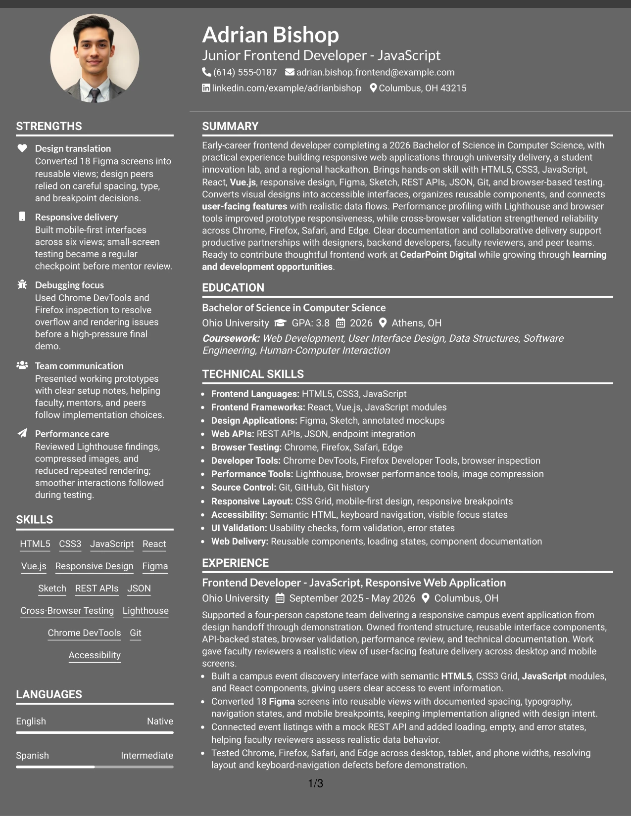
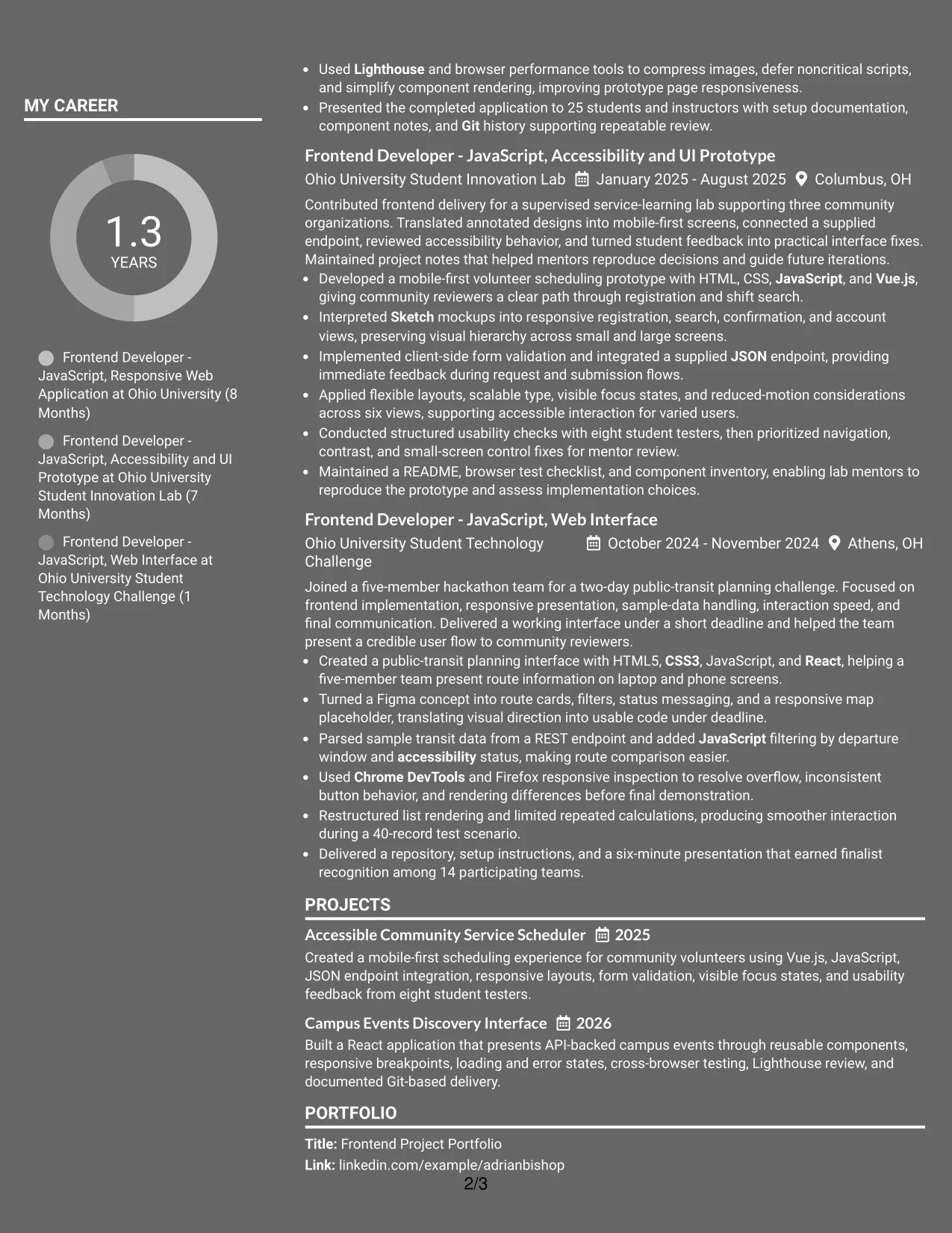
Why the Dark Mode Two Column Format Works for a Resume
- The two-column structure separates core evidence from supporting resume details.
- A strong contrast treatment can create clear section boundaries when text remains readable.
- Experience and projects have room for action-focused technical bullets.
- A secondary area can hold skills, tools, education, and certifications for quick access.
- The format supports a broad frontend keyword set without a single crowded list.
- Project results can be reviewed alongside the technologies and methods used.
- Readable text hierarchy keeps the dark presentation from overpowering the evidence.
Best For
- Applicants seeking a distinctive presentation while keeping two-column organization.
- Resumes with a large technical skills set and detailed project evidence.
- Portfolio submissions where visual polish supports, but does not replace, clear proof.
- Documents separating experience results from tools, education, and certifications.
- Readers who scan for frontend keywords before reviewing project depth.
- Candidates showing accessibility, testing, API, and performance evidence together.
- Applications suited to a modern visual treatment with careful text contrast.
#22 Dark Mode Box Header Format Resume Example
Content is balanced by giving the top box clear authority while keeping the sections below orderly and readable. The header identifies the candidate and target role, and the resume body then presents the summary, experience, projects, skills, education, certifications, and results.
A dark presentation can still support practical application needs when the text hierarchy remains clear. The resume uses that structure to feature JavaScript, React, Vue.js, responsive design, Figma, Sketch, REST APIs, browser testing, accessibility, and performance optimization.
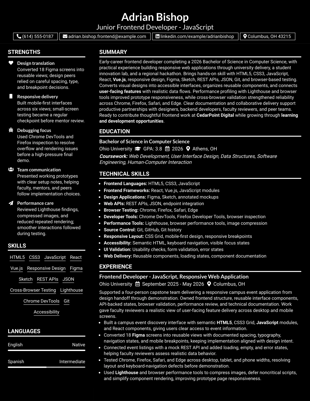
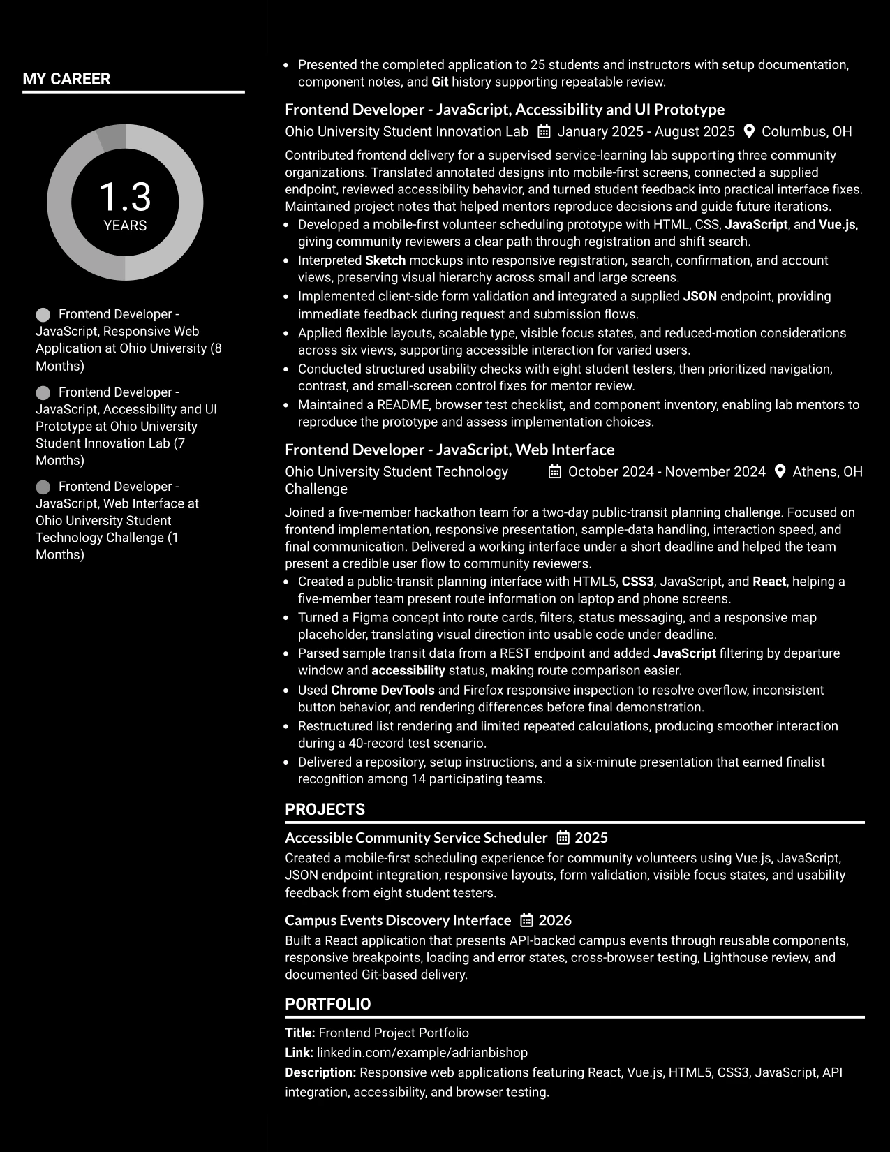
Why the Dark Mode Box Header Format Works for a Resume
- The box header gives contact details and the target role a strong starting position.
- A clear body structure keeps the resume easy to scan after the header.
- Section separation helps ATS and readers distinguish summary, experience, projects, and skills.
- The format can present technical keywords without requiring a side column.
- Project bullets retain space for tools, testing methods, and measurable results.
- Education, certifications, awards, and activities remain part of the same organized flow.
- Careful contrast and simple labels keep the visual treatment professional and readable.
Best For
- Applications that need a clear top section and a distinctive but organized presentation.
- Applicants wanting the target role and contact details identified immediately.
- Candidates with technical projects that need uninterrupted bullet space.
- Documents that must show frontend tools, API work, testing, and performance in sequence.
- Readers who prefer one main reading path with strong section boundaries.
- Resume versions combining project evidence with education and certifications.
- Applications where visual confidence matters but searchable resume text remains essential.
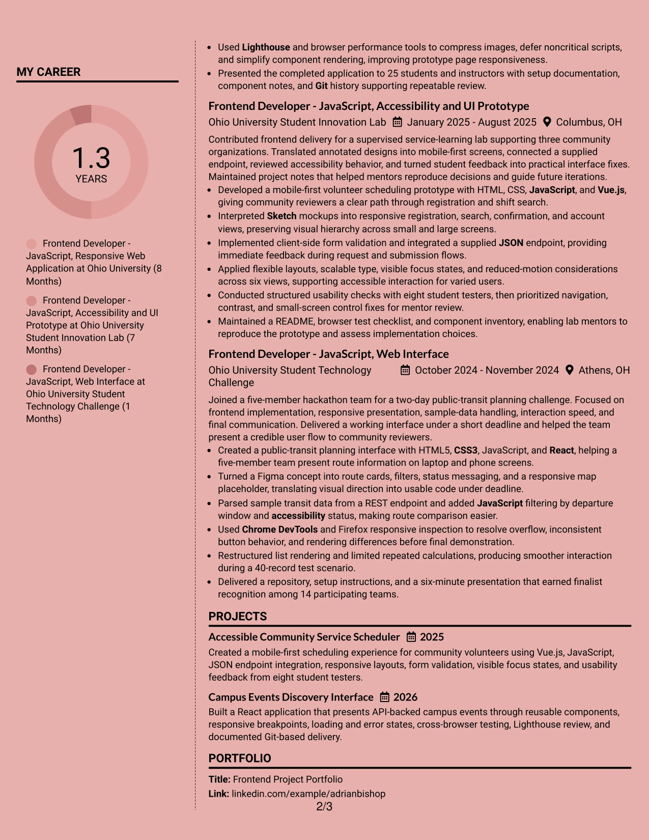
#23 Elegant Full Background Two Column Format
For a resume that must show projects, technical skills, and education without feeling crowded, the Elegant Full Background Two Column Format creates a clear working order. One column can carry contact details, skills, tools, and certifications while the wider column presents the summary, experience, and projects.
That structure suits a Junior Frontend Developer - JavaScript resume with several academic projects and detailed technical evidence. The full-width background treatment adds visual polish, while the two-column hierarchy keeps HTML5, CSS3, JavaScript, React, Vue.js, API integration, browser testing, and measurable project results easy to locate.
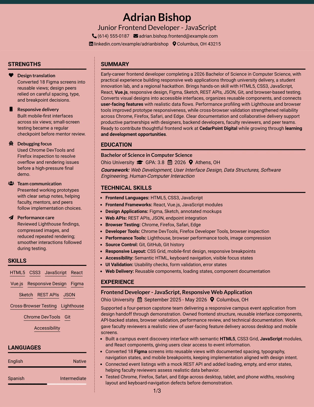
Why the Elegant Full Background Two Column Format Works for a Resume
- Two columns separate supporting details from the main experience record.
- The wider content area gives project bullets enough room for technical context.
- A strong background treatment adds distinction without changing the resume's section order.
- Skills and tools remain visible while the reader reviews experience and education.
- Bullets can show evidence such as 18 Figma screens, six views, and a 40-record test scenario.
- Clear headings help readers find projects, certifications, awards, and portfolio information.
- The layout supports a focused resume while keeping the document suitable for ATS review when text remains selectable and headings stay standard.
Best For
- Resumes that need a polished visual presence with a clear two-column information split.
- Candidates presenting both detailed project work and a broad technical skills list.
- Applications where education, certifications, and tools need quick access beside experience.
- Portfolio-focused resumes that must give project evidence enough reading space.
- Readers who prefer a distinct sidebar for supporting resume sections.
- Documents that benefit from strong visual grouping without adding extra pages.
- Early-career applications with several relevant projects but limited traditional employment history.
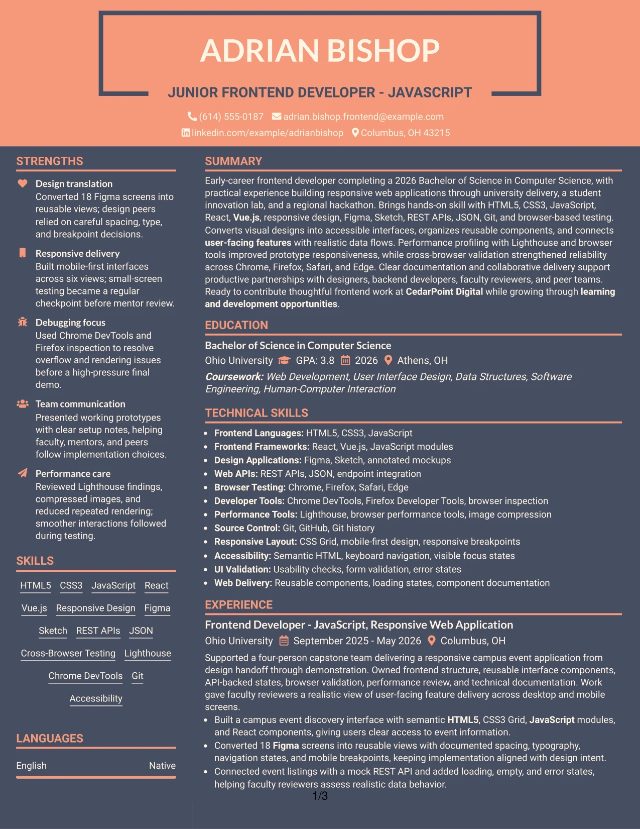
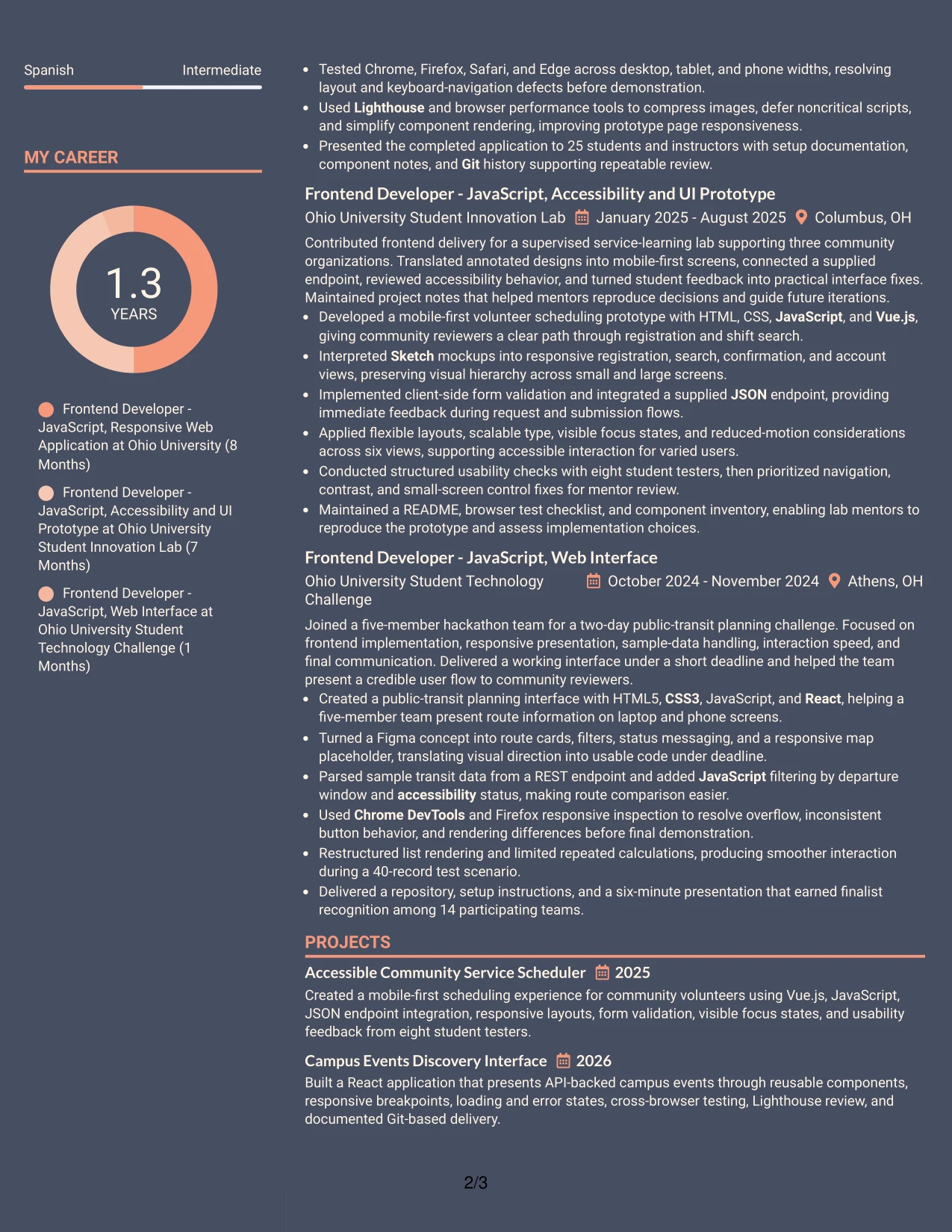
#24 Creative Two Tone Format
A restrained visual hierarchy gives the Creative Two Tone Format its value. The color change can distinguish the contact and skills area from the main record, while standard headings keep the resume easy to follow. The design remains useful when creative detail must support, not hide, technical evidence.
For this resume, the two-tone treatment can frame responsive applications, React and Vue.js work, Figma and Sketch translation, API integration, and browser testing. Short bullets and clear section labels keep the visual treatment from competing with the portfolio projects and 2026 Computer Science degree.
Why the Creative Two Tone Format Works for a Resume
- Two visual tones create clear separation between resume sections without adding complex navigation.
- The single-column flow keeps experience and project bullets in a natural reading order.
- Color can draw attention to skills while the main body preserves evidence detail.
- Standard section headings help surface HTML5, CSS3, JavaScript, React, and Vue.js.
- Project bullets can connect design work to working code and API-backed features.
- The format gives portfolio information a visible place near the core experience.
- A controlled color system keeps the resume distinctive while supporting readable, ATS-friendly text.
Best For
- Frontend applications where visual awareness should support strong technical content.
- Resumes that need one continuous reading path from summary through projects and education.
- Candidates translating Figma or Sketch work into working interfaces and reusable components.
- Portfolio-led applications that need project names and outcomes to stand out.
- Readers scanning for responsive design, browser testing, and API integration evidence.
- Documents that need visual distinction without a dense sidebar or complex page structure.
- Applications where a clean color contrast can separate skills from detailed experience.
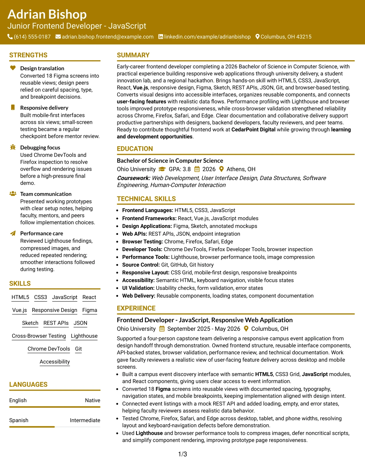
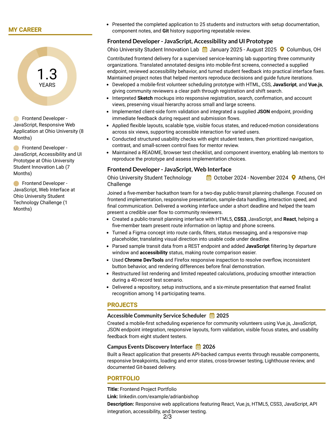
#25 Bold Color Header Professional Format
The Bold Color Header Professional Format places the resume identity and core target information at the top, then moves directly into structured content. This format is practical when a reader needs to confirm the role, summary, skills, and recent project evidence quickly.
A bold header can establish a firm starting point for a Junior Frontend Developer - JavaScript resume. Below it, standard sections can present the 2026 degree, frontend experience, certifications, portfolio projects, and results such as cross-browser defect resolution, performance review, and finalist recognition.
Why the Bold Color Header Professional Format Works for a Resume
- The top header makes the target role and contact details easy to confirm.
- A single-column structure keeps the resume order simple for both people and ATS tools.
- Bold section breaks help separate summary, experience, projects, education, and skills.
- The format gives technical keywords a consistent place beneath the opening summary.
- Bullets can lead with action and finish with evidence, such as 25 presentation attendees.
- A strong header adds professional presence without taking space from project details.
- The layout works well when the resume must communicate readiness for user-facing feature work quickly.
Best For
- Resumes that need immediate role and contact recognition at the top of page one.
- Applications reviewed through fast scans of summary, skills, and recent experience.
- Candidates with project bullets that need a direct, professional presentation.
- Documents where ATS-readable headings and a simple content order are priorities.
- Frontend applications combining academic delivery, portfolio work, and certifications.
- Readers who need to compare technical keywords with concrete implementation evidence.
- Resumes that benefit from one strong visual entry point followed by conventional sections.
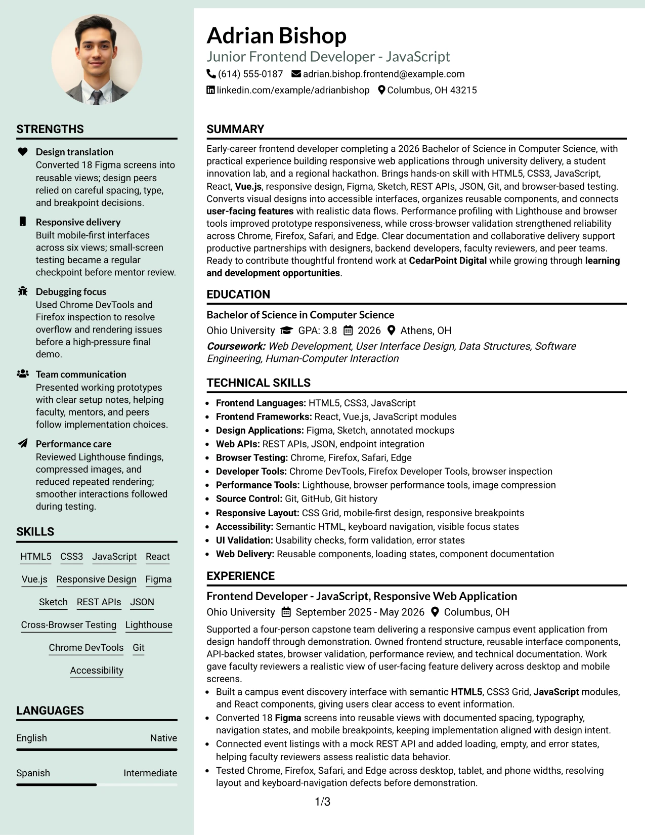
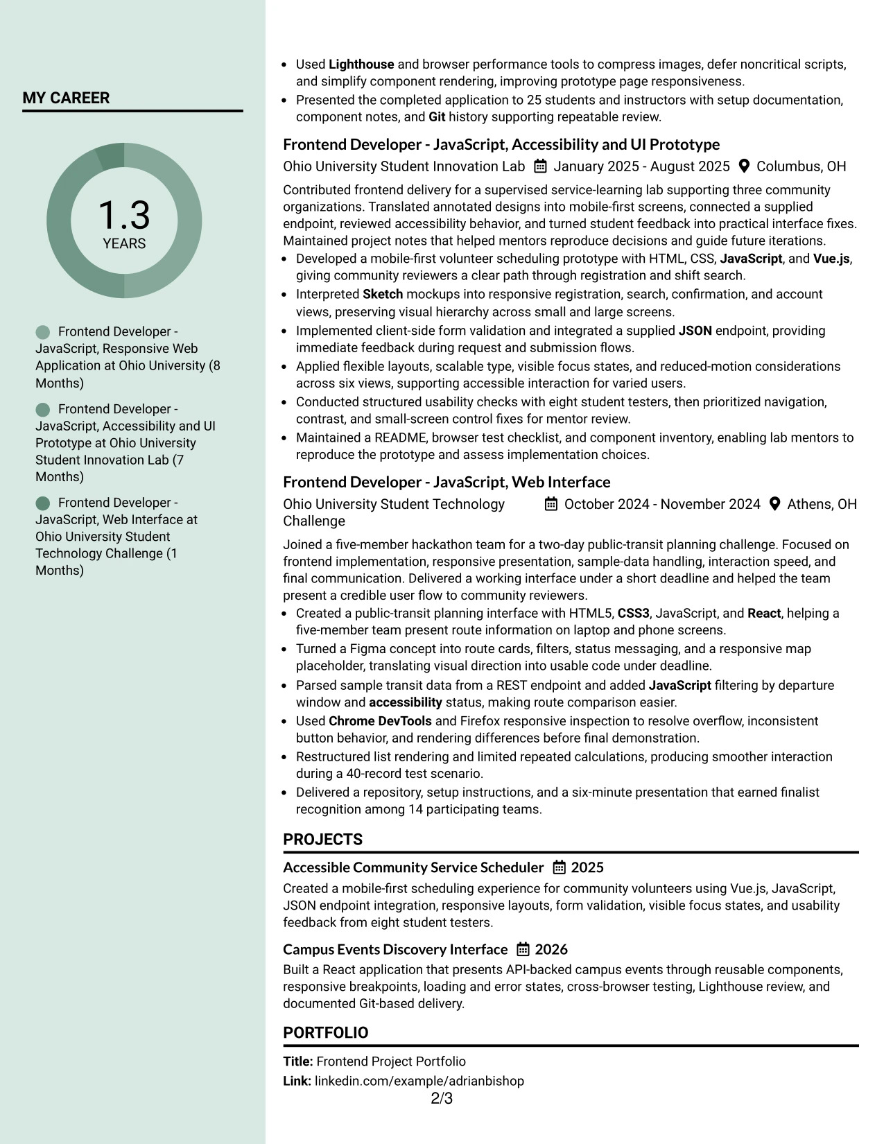
#26 Photo Header Color Sidebar Format
Readers can move from the photo header to the contact details, summary, skills, and then the main experience sections in a controlled path. The color sidebar gives supporting information a fixed location, while the main column carries the strongest project and employment evidence.
For this resume, the photo header can introduce a portfolio-focused Junior Frontend Developer - JavaScript profile, followed by responsive applications, React and Vue.js work, API integration, certifications, and education. The main content has room for detailed bullets, including 18 converted Figma screens and testing across four browsers.
Why the Photo Header Color Sidebar Format Works for a Resume
- The header establishes identity and role before the reader reaches detailed sections.
- A sidebar keeps contact details, skills, tools, and certifications together.
- The main column gives experience and projects the largest share of reading space.
- Color helps the reader distinguish supporting information from achievement bullets.
- Technical evidence remains visible through details such as API states and keyboard-navigation fixes.
- The photo can support a personal brand when it is appropriate for the application and region.
- Clear section labels help balance visual presentation with ATS-readable resume content.
Best For
- Applications where a personal presentation element is accepted and useful.
- Resumes with enough project and experience detail to justify a wider main content area.
- Candidates who need a fixed sidebar for skills, tools, contact details, and certifications.
- Portfolio submissions where identity and project evidence should appear together.
- Readers who scan supporting qualifications first and then review detailed bullets.
- Documents that combine visual presentation with concrete browser, API, and performance results.
- Applications where color grouping can make a longer content set easier to navigate.
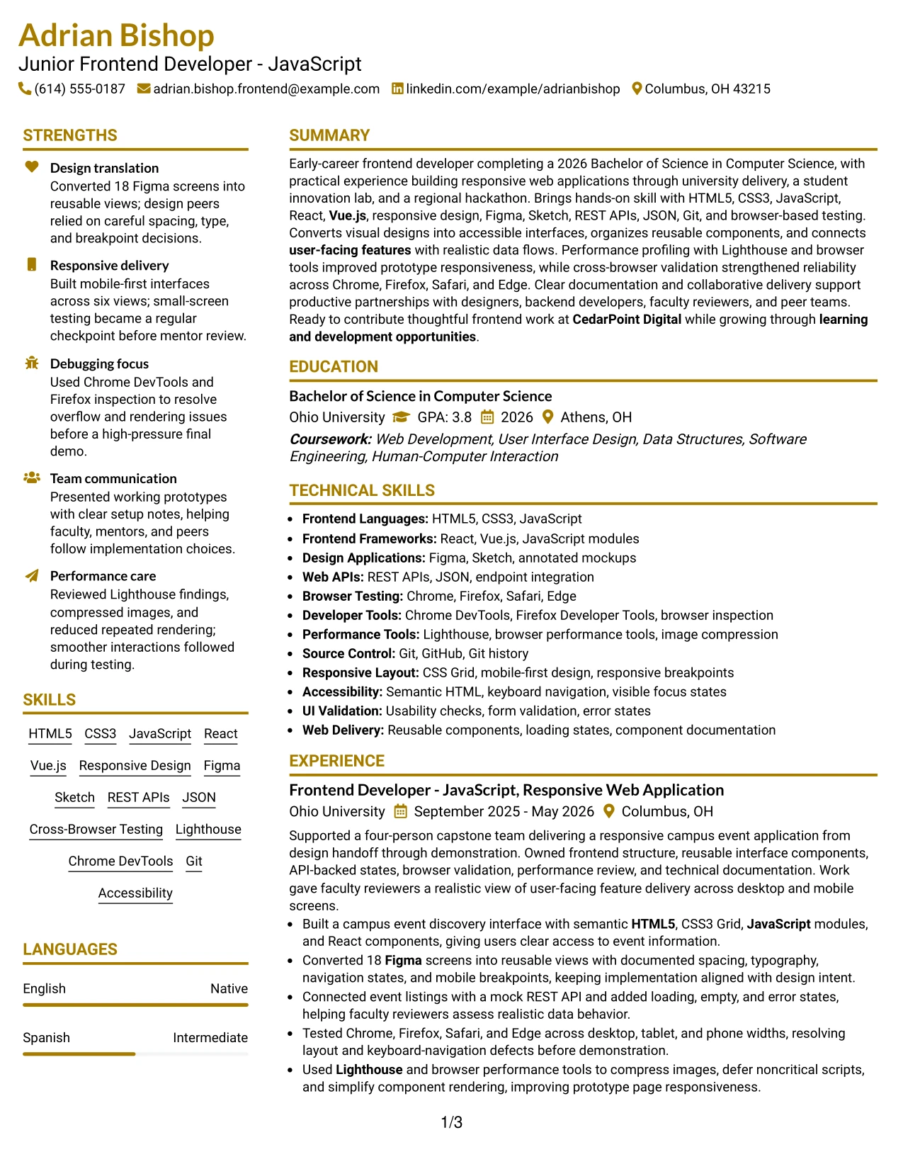
#27 Top Left Header Color Accent Format
The strongest evidence should appear early: responsive interfaces, design translation, API work, browser validation, and performance improvements. The Top Left Header Color Accent Format supports that priority by giving the identity block a clear starting point and leaving the body open for evidence-led sections.
The resume can then connect each skill to a real project bullet. HTML5, CSS3, JavaScript, React, Vue.js, Figma, Sketch, Lighthouse, and Git are supported by documented work across university delivery, a student innovation lab, and a hackathon.
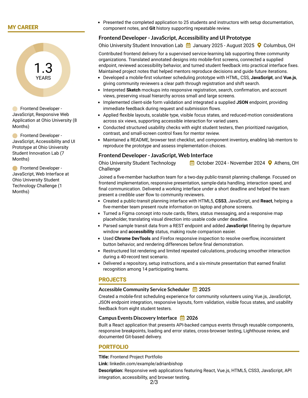
Why the Top Left Header Color Accent Format Works for a Resume
- The top-left header gives the reader an immediate reference point for role and contact details.
- An accent color adds hierarchy without taking attention from evidence.
- A single-column body supports a complete review of experience from newest to oldest.
- Skills are stronger because the resume links them to projects and implementation results.
- Bullets can show design translation, API behavior, browser checks, and performance work.
- The open body area supports education, certifications, awards, and portfolio details.
- Simple text flow helps ATS systems identify standard resume sections and keywords.
Best For
- Evidence-led resumes where project results should follow the summary without delay.
- Candidates who need to prove skills through responsive applications and working prototypes.
- Applications that value design handoff, API integration, and cross-browser compatibility.
- Documents requiring a clean path from technical summary to detailed experience bullets.
- Portfolio resumes that use measurable scope such as screen counts, tester counts, or team size.
- Readers who want a modest visual accent but need the content to remain primary.
- Applications where standard sections must stay easy to parse and compare.
#28 Centered Header Classic Two Column Format
Balanced content distribution helps this resume serve both quick review and detailed reading. The centered header establishes a calm entry point, while two columns divide supporting qualifications from the experience and project record without losing the overall sequence.
That balance fits a resume with a Computer Science degree, three frontend delivery settings, certifications, and a portfolio. The columns can keep skills, tools, and education compact while giving project bullets room to explain React components, Vue.js views, REST endpoints, accessibility checks, and performance work.
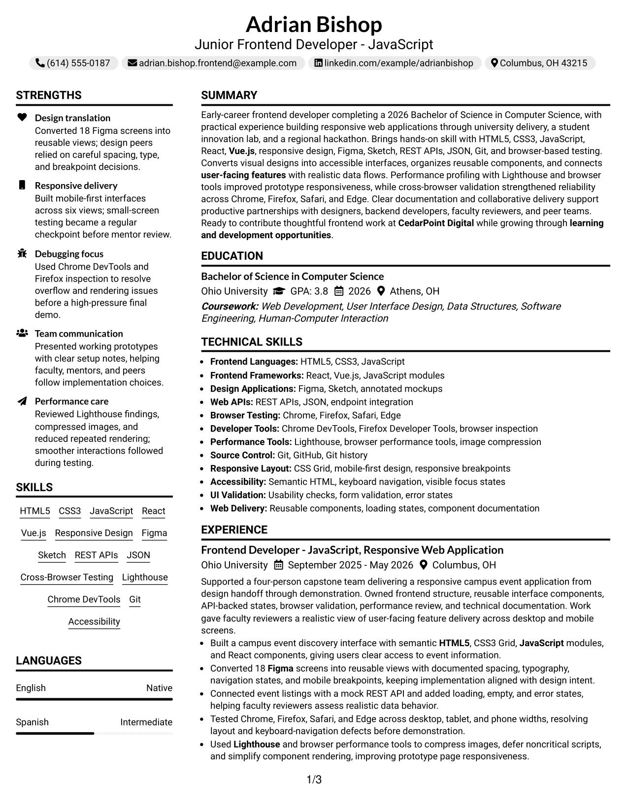
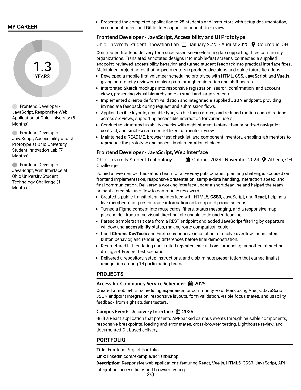
Why the Centered Header Classic Two Column Format Works for a Resume
- The centered header gives role, contact information, and portfolio details equal visual weight.
- Two columns reduce unused space while keeping supporting sections easy to find.
- The main content column can carry detailed experience and project bullets.
- A classic structure works well for education, certifications, awards, and activities.
- Technical keywords remain grouped instead of being scattered through the page.
- Evidence such as eight testers and 14 hackathon participants adds credibility to concise bullets.
- The format is useful when a resume must show breadth without relying on a long introduction.
Best For
- Applications needing a balanced presentation of skills, education, and project experience.
- Candidates with several supporting sections that should remain visible beside the main record.
- Resumes that combine portfolio projects with certifications and academic honors.
- Readers who prefer a centered identity block and a familiar two-column structure.
- Documents with enough technical evidence to fill a main column without excessive length.
- Frontend applications where responsive design and API work need concise supporting context.
- Applications requiring a polished format while keeping standard resume sections recognizable.
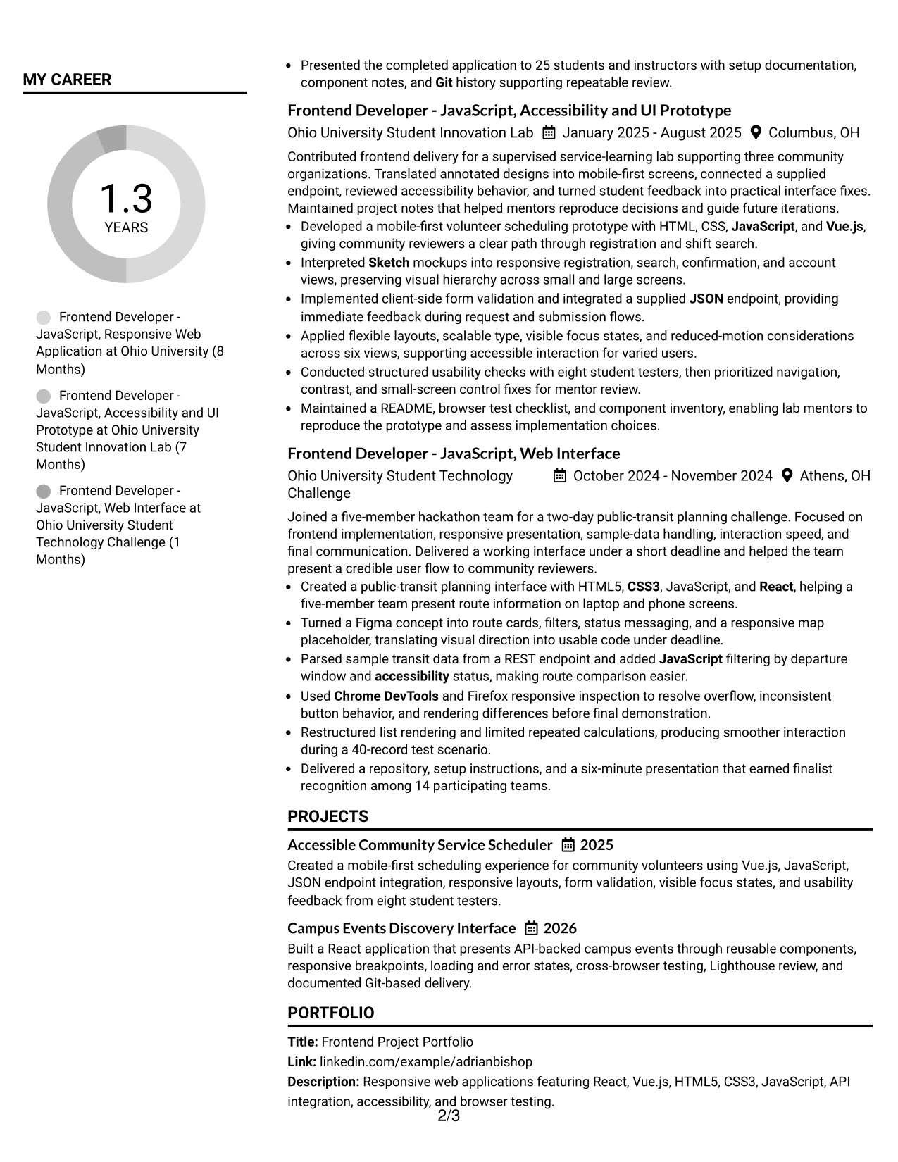
#29 Left Aligned Header Clean Two Column Format
For a practical application, the Left Aligned Header Clean Two Column Format puts role, contact details, and resume content in a direct line of sight. The left edge gives every section a consistent starting point, which helps a reader move from the summary into skills, projects, and experience.
The two-column design is a strong match for this frontend resume because it can hold tools and certifications in a narrow area while preserving detailed bullets in the main area. Results from Figma implementation, browser testing, Lighthouse review, API integration, and usability checks remain visible without making the page feel crowded.
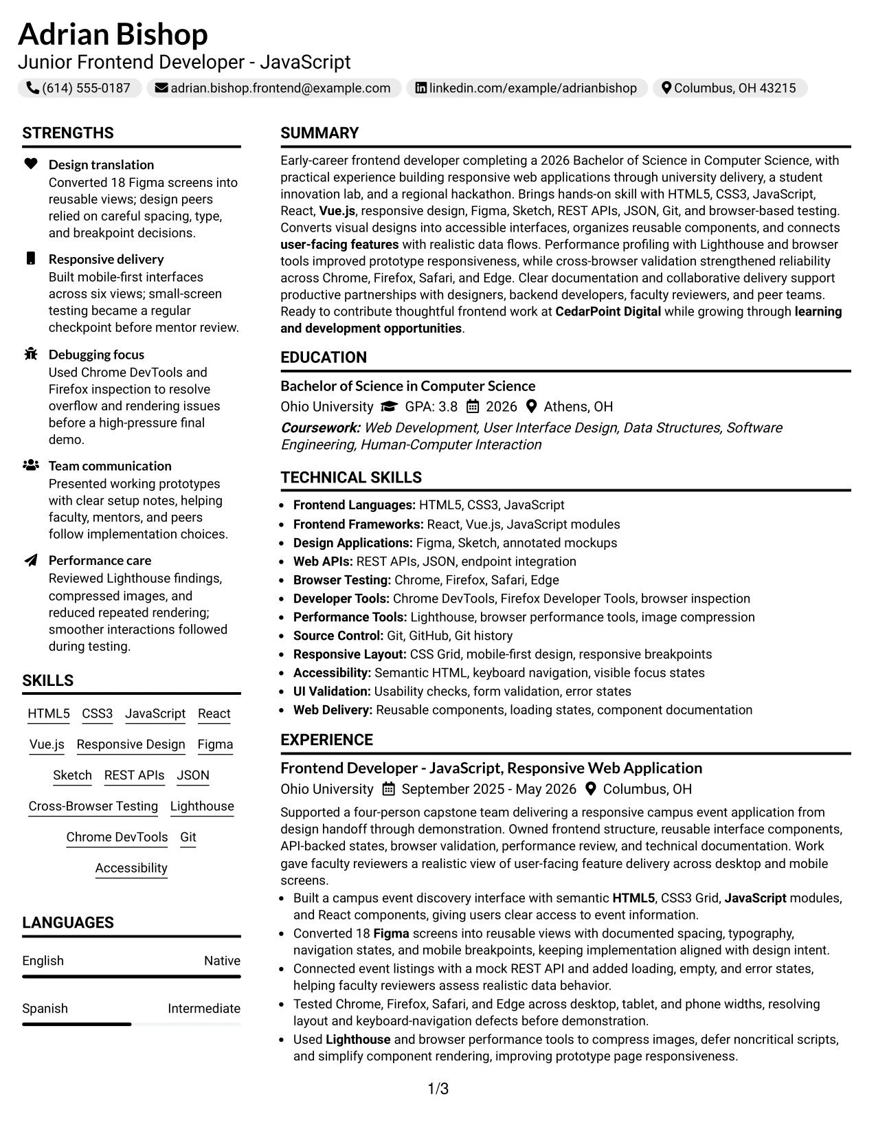
Why the Left Aligned Header Clean Two Column Format Works for a Resume
- Left alignment creates a predictable scan path from the header through every section.
- The two-column structure gives supporting qualifications a compact, stable location.
- The main column protects space for detailed project and experience bullets.
- Clean spacing makes technical terms easier to compare during a quick review.
- The format can show tools such as Git, Chrome DevTools, and Lighthouse beside related evidence.
- Separate areas help keep education, certifications, and portfolio details from interrupting experience.
- A restrained layout supports readable text and standard ATS section recognition.
Best For
- Resumes needing a direct, orderly scan from contact details to project evidence.
- Candidates with a substantial skills and tools list beside detailed frontend work.
- Applications that require clear comparison of design, testing, API, and performance experience.
- Portfolio documents where project bullets must remain readable at normal page size.
- Readers who value consistent alignment over decorative page elements.
- Applications combining academic projects, certifications, and practical delivery evidence.
- Documents that need a clean two-column structure without reducing technical detail.
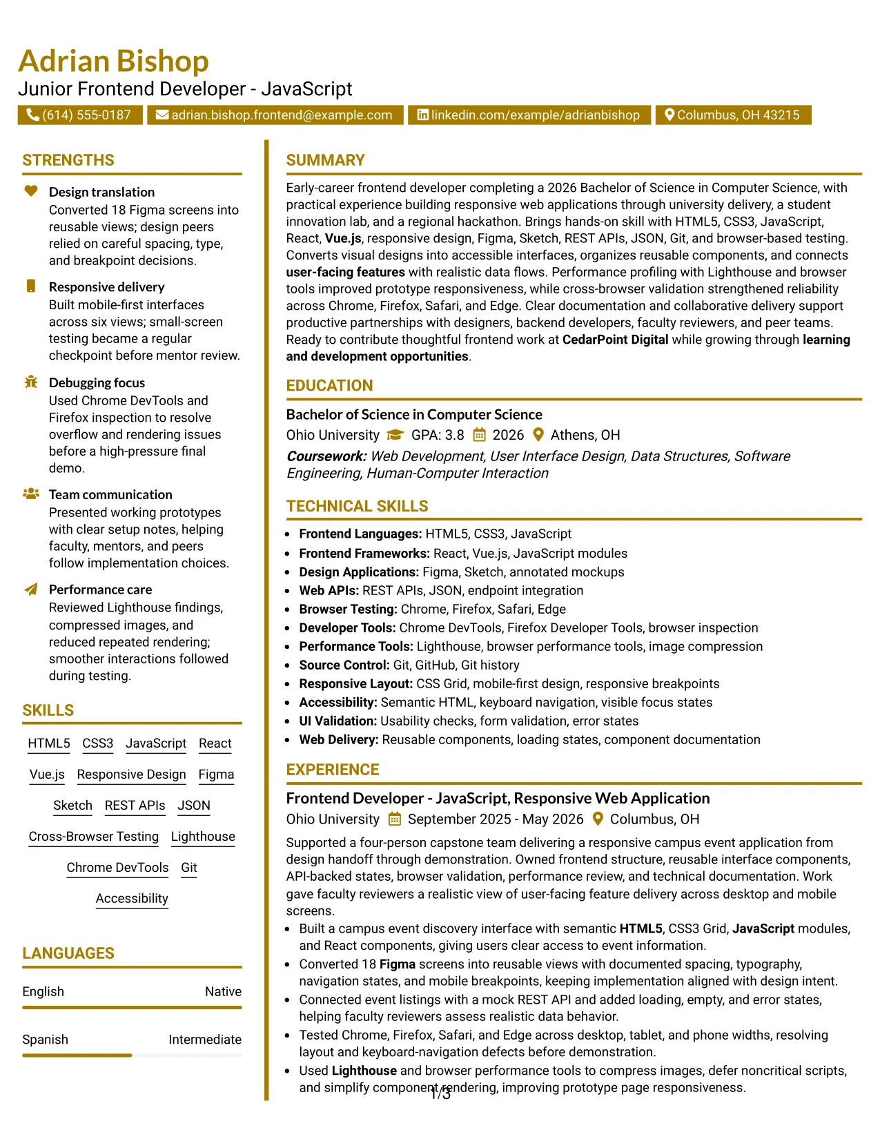
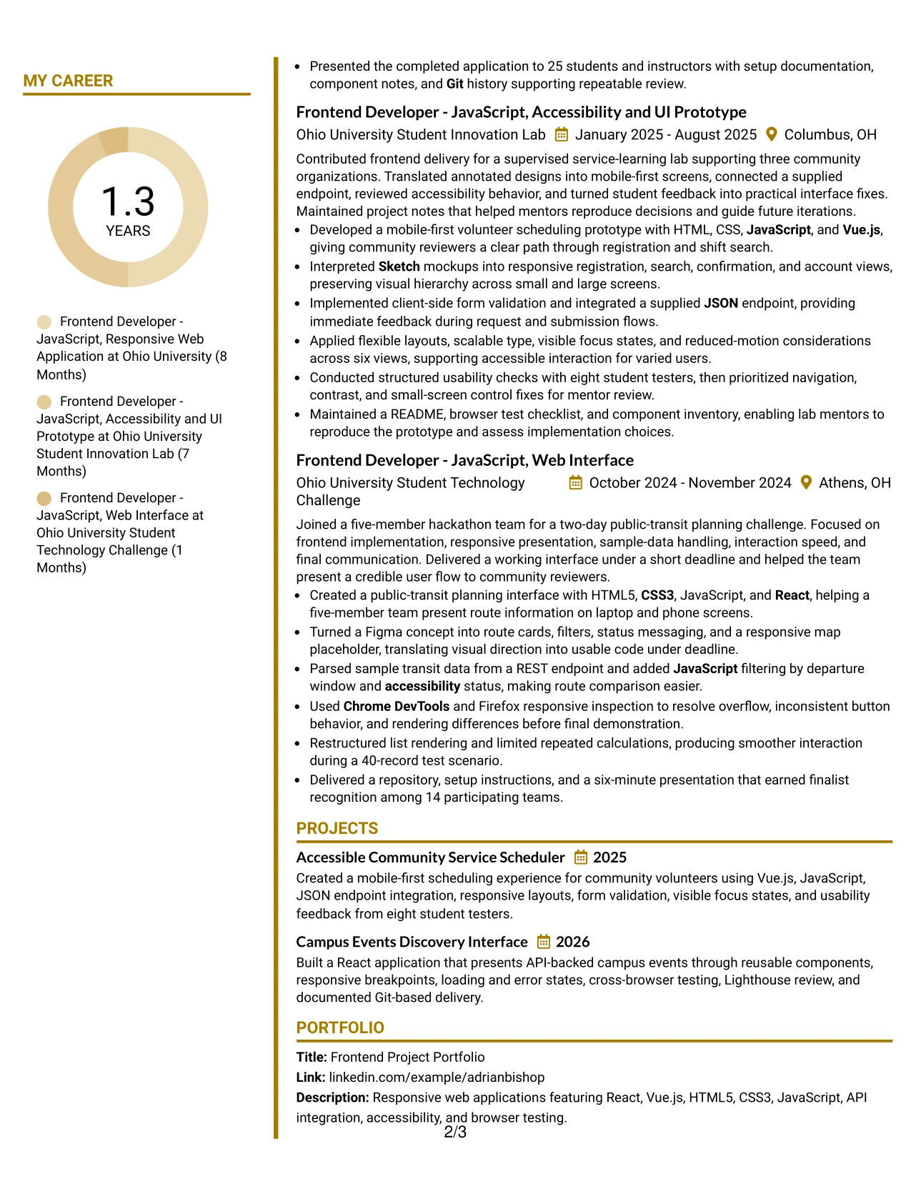
#30 Accent Divider Modern Two Column Format
Clear modern hierarchy gives the Accent Divider Modern Two Column Format its character. Dividers can separate the resume's major areas, while the two-column arrangement keeps skills and supporting details close to the main experience record. The result is visual order without a long block of uninterrupted text.
Adrian Bishop's resume can use that structure to connect a Junior Frontend Developer - JavaScript target with concrete proof: 18 Figma screens converted, six responsive views tested, eight student usability testers, and a 40-record performance scenario. Each divider should support scanning, not replace standard headings or strong bullets.
Why the Accent Divider Modern Two Column Format Works for a Resume
- Accent dividers show where summary, skills, experience, projects, and education begin.
- Two columns keep supporting details near the evidence they help explain.
- The modern structure gives measurable project scope a visible place in the page hierarchy.
- Short bullets remain easy to scan when each one carries one clear result.
- The layout supports role keywords such as responsive design, React, Vue.js, and REST APIs.
- Portfolio and certification details can be separated without competing with experience.
- Standard text headings preserve resume usability even when dividers add visual distinction.
Best For
- Frontend resumes that need a modern structure around measurable project evidence.
- Applications where design translation and responsive delivery should be easy to compare.
- Candidates organizing technical skills beside a detailed record of project contributions.
- Portfolio-focused documents with several numbers, screens, views, or testing results.
- Readers who benefit from visual breaks between related resume sections.
- Applications seeking a current presentation without sacrificing standard resume hierarchy.
- Documents where a two-column layout can show both evidence and supporting qualifications efficiently.
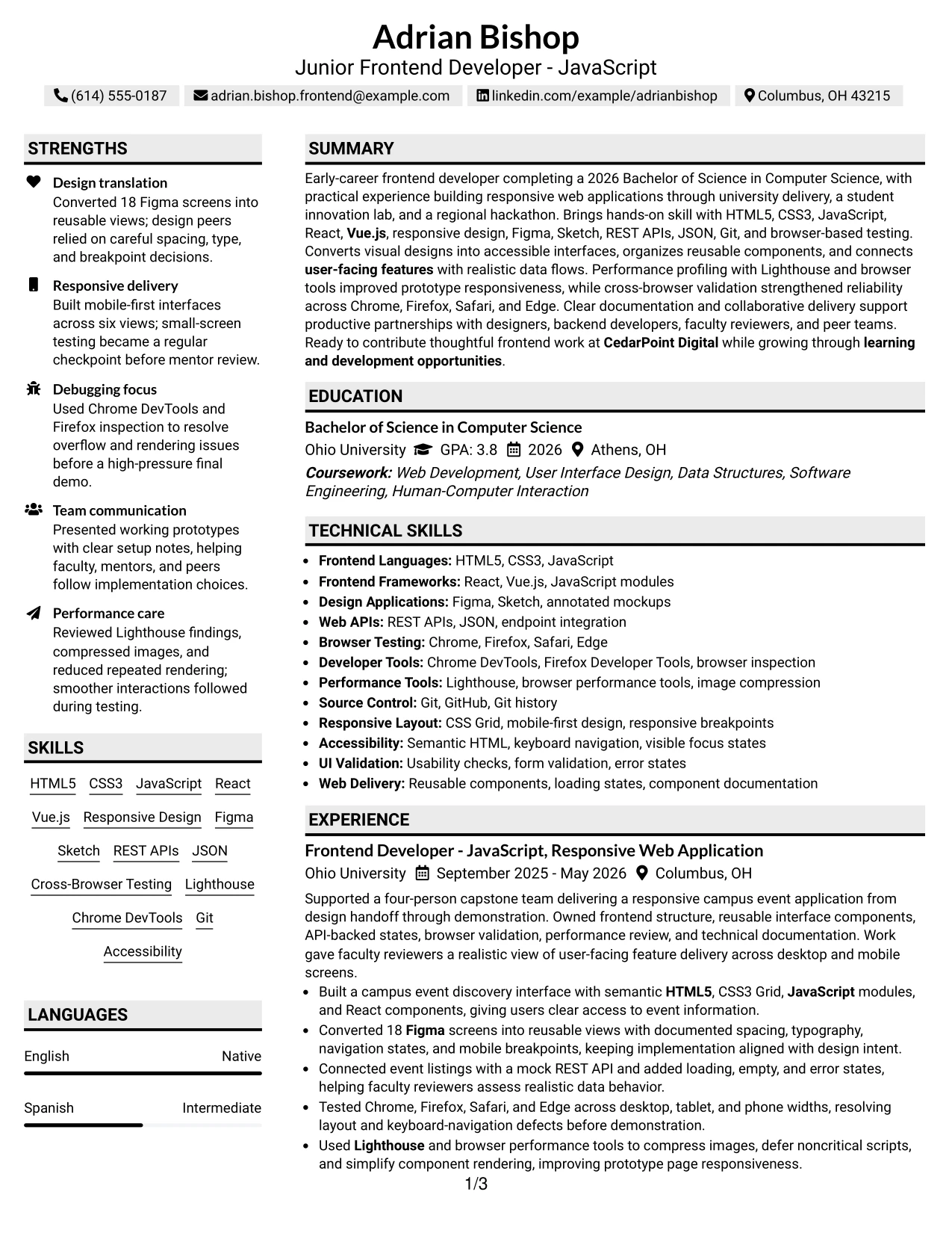
#31 Shaded Labels Clean Two Column Format
The Shaded Labels Clean Two Column Format uses clear section labels to organize the resume before the reader studies individual bullets. A two-column structure can place skills, tools, and education in one area while the main area carries experience, projects, and measurable delivery evidence.
This approach works for a technical resume with many related terms. Labels can group HTML5, CSS3, JavaScript, React, Vue.js, Figma, Sketch, REST APIs, browser testing, accessibility, performance tools, and Git so the reader sees both the keyword and the proof behind it.
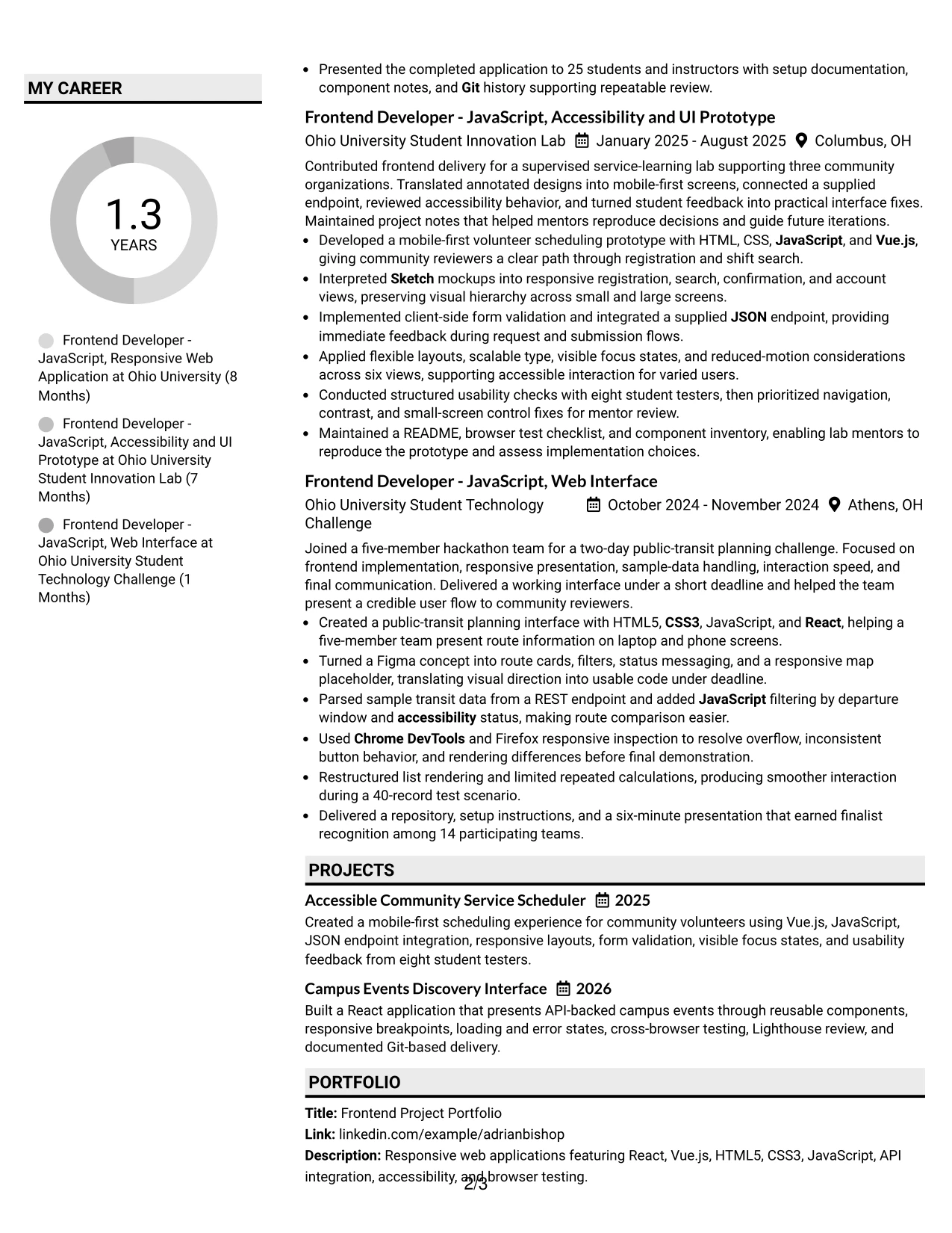
Why the Shaded Labels Clean Two Column Format Works for a Resume
- Shaded labels make each resume section easy to locate during a fast scan.
- Two columns reduce repetition by grouping related skills and supporting details.
- The main column provides room for action-focused experience and project bullets.
- Grouped labels help connect keywords to evidence instead of presenting an unqualified list.
- The structure supports clear separation of education, certifications, awards, and portfolio work.
- Measurable details such as 25 attendees and 14 participants remain easy to identify.
- Clean text treatment keeps the document readable and suitable for ATS parsing.
Best For
- Resumes with many technical keywords that need clear grouping and labels.
- Applications where a quick scan must reveal both skills and supporting project proof.
- Candidates presenting experience, portfolio work, certifications, and academic honors together.
- Documents that benefit from a compact sidebar for education, tools, or credentials.
- Readers comparing frontend frameworks, design applications, APIs, and testing methods.
- Applications with measurable project details that should stand out inside concise bullets.
- Resumes requiring strong organization without a highly decorative page treatment.
#32 Photo Header Color Accent International Format
Readers can start with the photo header, confirm the role and contact details, then move through the summary, technical skills, experience, and education. Color accents can mark each section while the single-column flow keeps the complete record in a predictable order.
For this resume, that order supports a frontend portfolio with React and Vue.js projects, responsive design, Figma and Sketch implementation, REST APIs, accessibility, and browser testing. The photo header can add personal presentation, while the body still gives priority to project bullets, certifications, awards, and documented results.
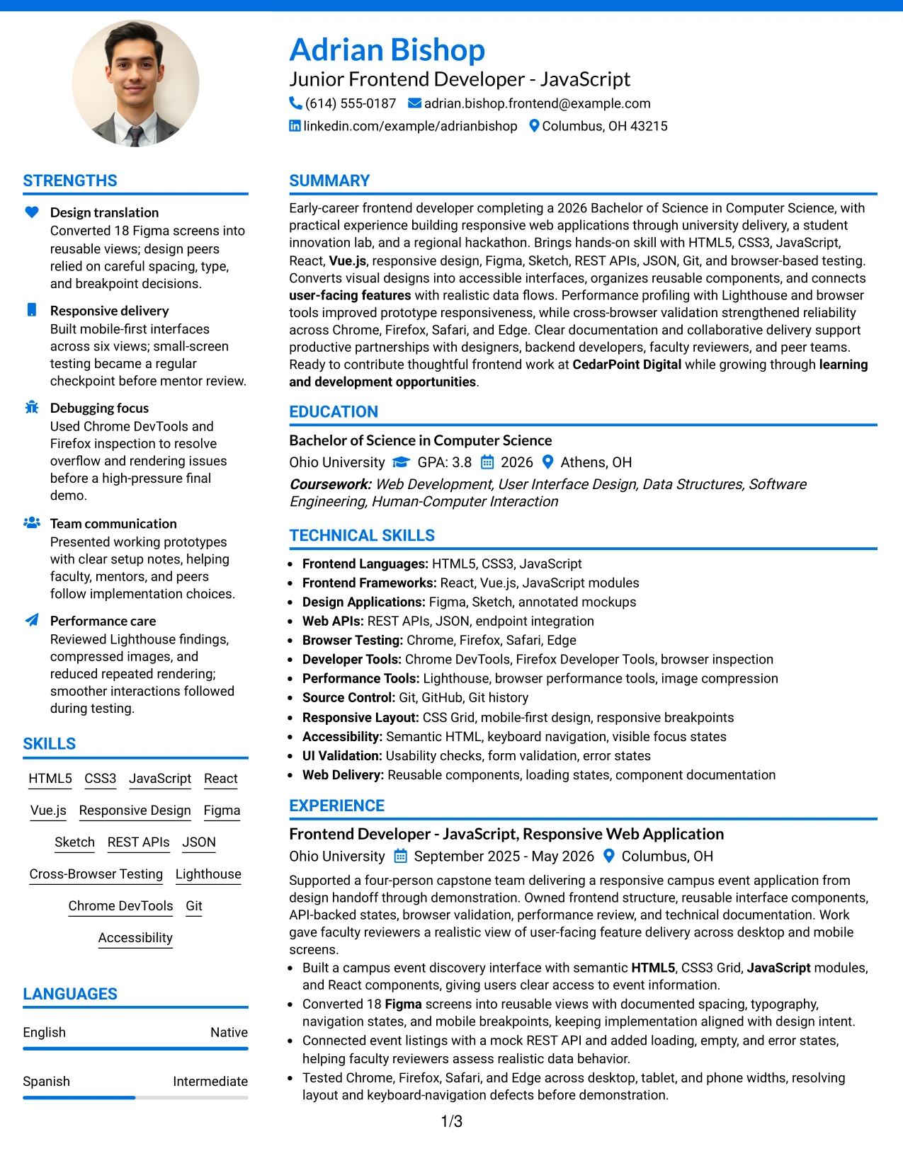
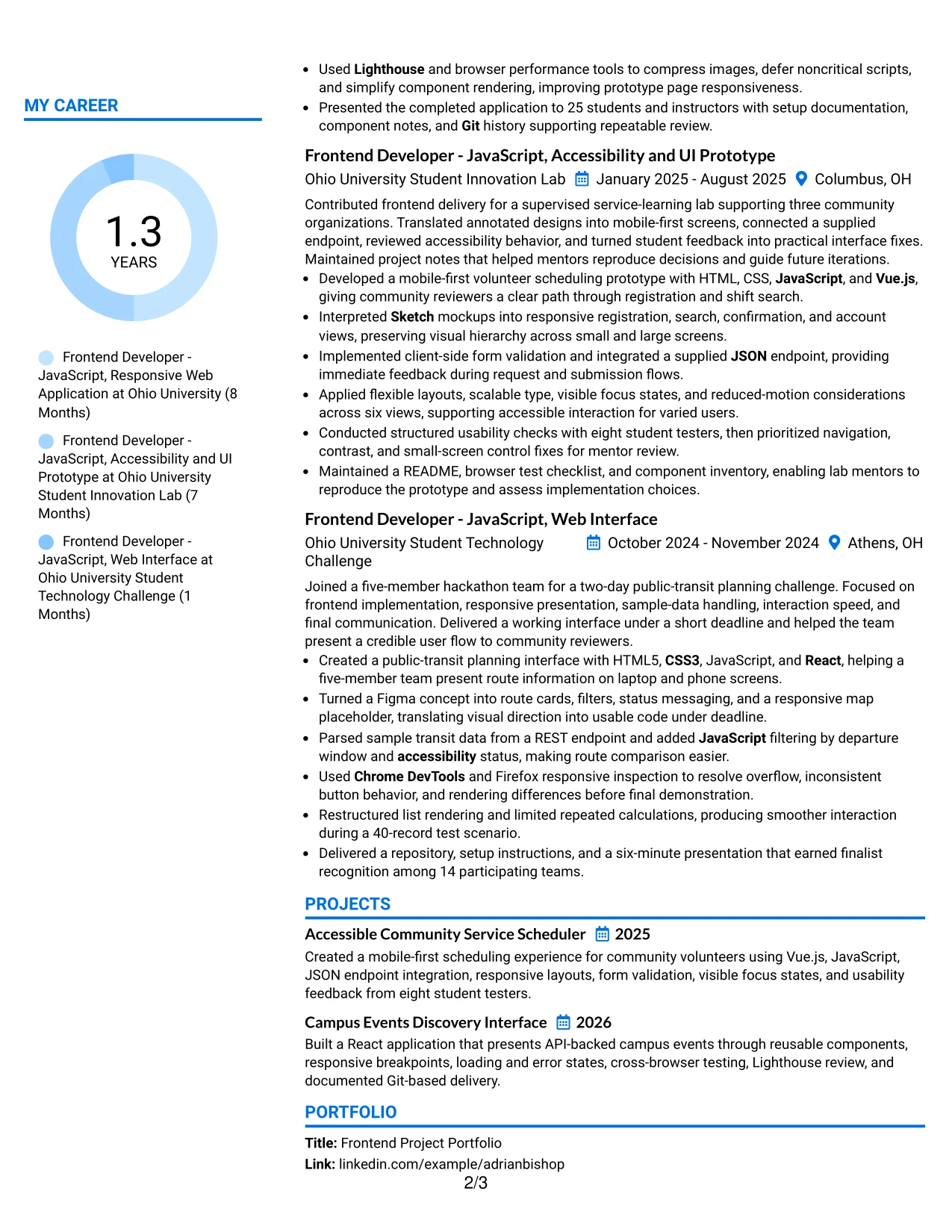
Why the Photo Header Color Accent International Format Works for a Resume
- The header brings identity, target role, and contact details together at the start.
- A single-column structure supports a complete review across all resume sections.
- Color accents can distinguish skills, experience, projects, education, and certifications.
- The photo can be useful when personal presentation is expected for the application or region.
- Project bullets retain space for technical detail and measurable scope.
- A visible portfolio section supports review of responsive web applications and working prototypes.
- Consistent headings keep the resume understandable across different readers and ATS systems.
Best For
- Applications where a personal presentation element is appropriate for the region or field.
- Resumes that need one complete reading path through a broad technical record.
- Candidates combining portfolio projects, certifications, awards, and academic experience.
- Documents where color accents can guide readers through many single-column sections.
- Readers reviewing frontend frameworks, design tools, APIs, accessibility, and testing in sequence.
- Portfolio applications that need project descriptions to remain prominent under the header.
- Resumes requiring a distinctive presentation while preserving clear text hierarchy.
#33 Large Profile Photo International Two Column Format
The strongest evidence should lead the review, even with a large profile photo. A two-column structure can keep the summary, skills, and contact details organized near the visual header while the wider area presents experience, projects, education, and measurable results.
This format can support a frontend resume with substantial project detail. The main content can show 18 Figma screens, six core views, eight usability testers, four tested browsers, and a 40-record scenario, while the supporting column groups React, Vue.js, REST APIs, accessibility, Lighthouse, Git, and certifications.
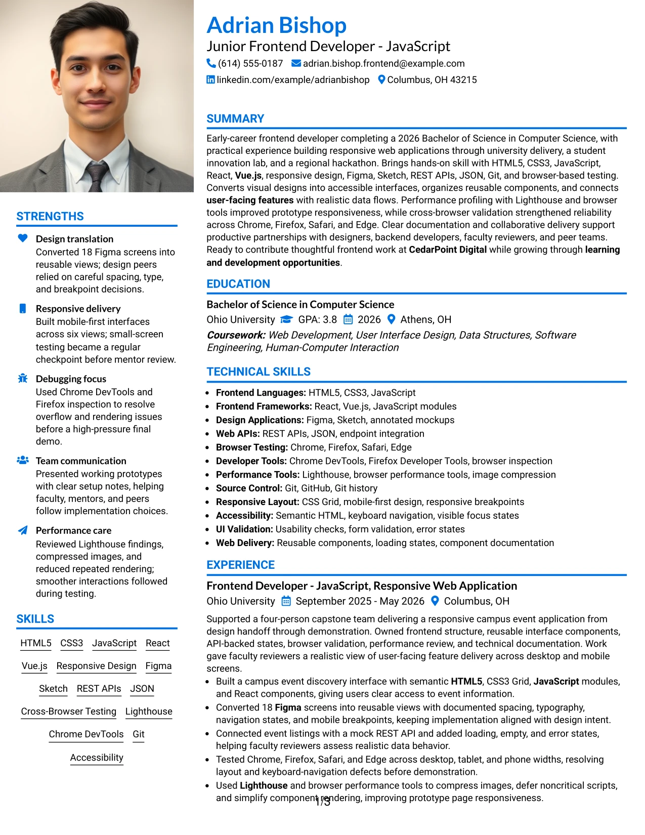
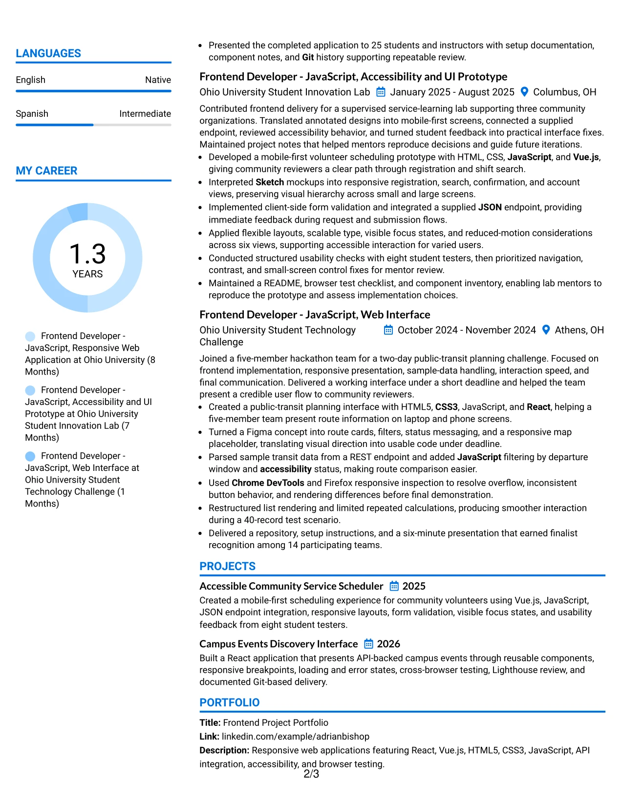
Why the Large Profile Photo International Two Column Format Works for a Resume
- The large profile photo gives the document a strong identity area before the evidence sections.
- Two columns allow supporting skills and credentials to sit beside detailed experience.
- The main column can carry measurable results without forcing bullets into a narrow space.
- Project evidence remains central through screen counts, tester feedback, browser coverage, and test scenarios.
- Grouped technical terms help readers locate frameworks, APIs, tools, and accessibility knowledge.
- The format can give portfolio and education details clear space without removing achievement bullets.
- Standard headings and selectable text remain important for ATS review and digital sharing.
Best For
- Applications where a prominent personal presentation element is expected and appropriate.
- Resumes with high evidence volume that need a wide main column for project bullets.
- Candidates showing several frontend projects with measurable testing and delivery details.
- Portfolio submissions that must present identity, technical scope, and project outcomes together.
- Readers who want supporting skills and certifications visible beside the main record.
- Applications where two-column organization can handle both detailed work and broad qualifications.
- Documents requiring strong visual identity while keeping evidence and standard resume sections clear.
Why Build Your Junior Frontend Developer - JavaScript Resume with ResumeInMinutes
ResumeInMinutes helps you turn frontend projects, technical skills, education, certifications, and documented results into a resume that is easy to scan and update.
- ATS-friendly resume layouts
- Clear resume section structure
- Role-specific keyword organization
- Project and skills presentation
- Free PDF resume previews
- Resume customization support
Use the format to show practical frontend evidence: responsive web applications, React or Vue.js work, design handoffs, REST API connections, browser validation, accessibility checks, performance reviews, and Git-based delivery. Keep the content precise and connected to the target role.
See Also
- 33 Associate JavaScript Frontend Developer Resume Templates with Example 2026 (ATS-Optimized)
- 33 Frontend Developer Internship - JavaScript Resume Templates with Example 2026 (ATS-Optimized)
- 33 Lead JavaScript Frontend Developer Resume Templates with Example 2026 (ATS-Optimized)
- 33 Frontend / Backend Developer Intern Resume Templates with Example 2026 (ATS-Optimized)
- 33 Front End Web Applications Developer - Mid-Level JavaScript Resume Templates with Example 2026 (ATS-Optimized)
- 33 AI Automation Engineer / Full-Stack Developer Resume Templates with Example 2026 (ATS-Optimized)
- 33 AI Engineer / Applied AI Developer Resume Templates with Example 2026 (ATS-Optimized)
- 33 AI Engineer, Developer Experience Resume Templates with Example 2026 (ATS-Optimized)
- 30+ Associate JavaScript Frontend Developer Cover Letter Templates with Example 2026
- 30+ Frontend Developer Internship - JavaScript Cover Letter Templates with Example 2026
Frequently Asked Questions
Are these Junior Frontend Developer - JavaScript resume templates ATS-friendly?
Yes. The layouts use readable headings and organized sections. Support them with accurate keywords such as HTML5, CSS3, JavaScript, React, Vue.js, responsive design, API integration, and cross-browser testing.
Are these different resumes?
No. The guide presents one resume example in different layouts and design themes. Choose the format that keeps your skills, projects, experience, and education easiest to scan.
What should a Junior Frontend Developer - JavaScript resume include?
Include a targeted summary, technical skills, frontend experience or projects, education, certifications, and measurable evidence. Highlight responsive interfaces, React or Vue.js, design implementation, APIs, accessibility, testing, and performance work when supported by your background.
Can I download the resume templates as PDFs?
Yes. Each resume style provides a free PDF download so you can review the layout before choosing and customizing your format.
Which resume style is best for a Junior Frontend Developer - JavaScript application?
A simple one-column layout is usually the safest choice for ATS parsing and quick review. A clean two-column format can also work when it keeps the main experience and project evidence easy to follow.
How can I show frontend experience from projects?
Describe the interface, tools, and result in each bullet. For example, explain how you converted Figma screens, built reusable React components, connected a REST API, tested multiple browsers, or improved performance with Lighthouse.
Should I include a photo on my resume?
Include a photo only when it is expected in your country, region, or industry. For U.S. applications, a no-photo resume is generally the safer option.
Can I customize these resume templates?
Yes. Update the resume text, sections, layout, design style, and PDF format to present your Junior Frontend Developer - JavaScript skills and evidence accurately.