143 Cloud Engineer Interview Questions & Answers

90 top • 9 Amazon • 3 Apple • 9 Google • 7 Meta • 8 Microsoft • 9 Netflix • 8 NVIDIA

Cloud Engineer icon

Questions with Detailed ExplanationsWith Detailed Explanations

(Last Updated: September 3, 2026)

51. How would you back up and restore etcd for a self-managed Kubernetes control plane?Containers And KubernetesHard

Question Details

Describe a recovery procedure for loss or corruption of the control-plane data store. Cover consistent snapshot creation, encryption and secure storage, certificate and version compatibility, quorum shutdown, restore into a clean data directory, control-plane reconfiguration, API verification, workload reconciliation, and regular recovery testing.

Short Interview Answer (30-60 seconds)

At a high level, the goal is to recover the Kubernetes control plane safely after etcd data is lost or corrupted. The main challenge is restoring one consistent etcd quorum without mixing old and restored state. I would explain three flows: take and protect a consistent snapshot, restore every etcd member into a clean data directory, then restart and verify the control plane. The trade-off is that the Kubernetes API stays unavailable during recovery, so regular restore testing is essential.

Detailed Explanation

The goal is to recover the Kubernetes control plane after its main data store is lost or corrupted. The difficult part is that several etcd members work together as one cluster. We must not mix old member data with restored data. We also need a backup that is protected from theft or accidental deletion. The diagram organizes recovery into three main stages. First, create and protect a snapshot. Second, shut down the old quorum and restore every member. Third, restart Kubernetes, verify the API, and check workloads.

Useful Questions to Ask the Interviewer
  1. What RPO is required, meaning how much recent data can we lose?
  2. What RTO is required, meaning how quickly must the control plane return?
  3. How often should snapshots and restore drills run?
  4. Where should encrypted snapshots be stored and retained?
  5. Are we restoring the same control-plane nodes or replacement nodes?
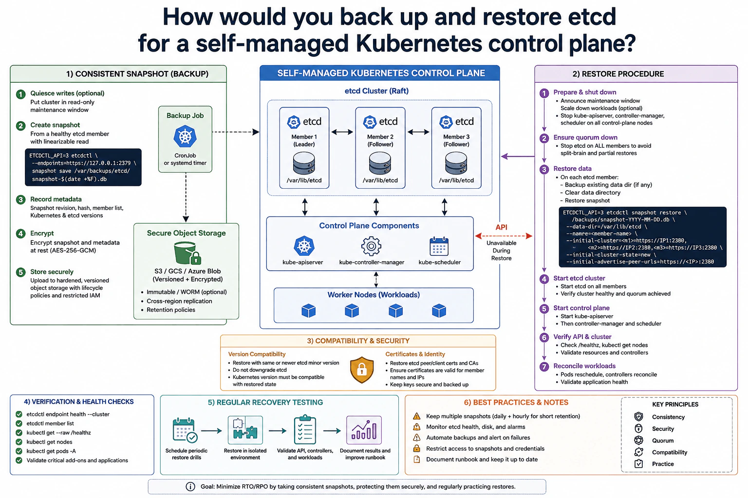
How would you back up and restore etcd for a self-managed Kubernetes control plane? diagram
How to Explain It in an Interview
1. Create a consistent snapshot

I would first check that the etcd cluster is healthy. A snapshot from a healthy member gives a consistent point-in-time copy of etcd data. Quiescing Kubernetes writes can reduce change during a maintenance window, but it is optional because the etcd snapshot itself is consistent. I would save the snapshot and record useful metadata such as its revision, hash, member information, Kubernetes version, and etcd version.

2. Encrypt and store the backup securely

Next, I would protect the snapshot before treating it as a recovery copy. The diagram encrypts the snapshot and metadata at rest with AES-256-GCM. It then stores them in versioned secure object storage such as S3, GCS, or Azure Blob. Access should be restricted through IAM. The diagram also shows optional immutable or WORM storage, cross-region replication, retention policies, and several retained snapshots. These controls protect the backup from deletion, corruption, and unauthorized access.

3. Shut down the old quorum

For recovery, I would stop kube-apiserver, kube-controller-manager, kube-scheduler, and then etcd on all control-plane members. The important rule is that the old etcd quorum must be fully down before restored members start. This prevents old and restored state from running at the same time. I would also confirm version compatibility and verify the etcd peer and client certificates, certificate authorities, member names, and member IP addresses.

4. Restore every etcd member

On each member, I would first save the old data directory for investigation if needed. Then I would restore into a clean /var/lib/etcd directory. Each restored member gets its correct member name and peer URL. All members must use the same initial cluster membership, cluster token, and intended cluster state. After all members are prepared, I would start etcd on every node and verify endpoint health, the member list, and that quorum is healthy.

5. Restart, verify, and recover workloads

Once etcd is healthy, I would bring the control plane back in the diagram's order: kube-apiserver first, then kube-controller-manager and kube-scheduler. The Kubernetes API is unavailable during the restore. After startup, I would check /healthz, nodes, pods, resources, controllers, and critical add-ons. Kubernetes controllers then compare desired state with the running cluster and recreate or reschedule work where needed. Finally, I would validate application health and regularly repeat the complete restore in an isolated environment.

Practical Insights

The benefit is that a consistent etcd snapshot gives the control plane a known recovery point. Encryption, versioned storage, restricted access, and multiple snapshots make that recovery copy safer. The downside is that restoration needs careful coordination. Every old etcd member must stay stopped while the restored cluster is created. Member names, peer addresses, certificates, and software versions must also fit the restore plan. The Kubernetes API is unavailable during this process. Taking snapshots more often can reduce data loss, but it creates more backup work and storage use. Regular restore drills reduce the chance of surprises during a real outage.

Why Interviewers Ask This

Interviewers want to see whether you understand that etcd holds the Kubernetes control plane's critical state. They are testing operational judgment, not just command memorization. A strong answer should connect consistent snapshots, secure storage, quorum safety, version and certificate checks, clean restoration, controlled startup, API verification, workload recovery, and regular testing. This shows that you can plan a complete recovery procedure rather than only create a backup file.
Interviewer may ask next
What would you change if the business could tolerate only a few minutes of etcd data loss?

I would keep the same recovery design, but I would take consistent snapshots much more often. The main change is the backup schedule because RPO means how much recent data we can afford to lose. If snapshots run every few minutes, the newest usable recovery point is much closer to the failure.

I would still check etcd health and verify each snapshot before storing it. Every snapshot would still be encrypted and uploaded to versioned secure object storage. I would retain several copies rather than replacing the previous backup immediately. That gives us an older recovery point if the newest snapshot already contains corrupted state.

I would also alert when a scheduled backup fails and keep running isolated restore drills. A backup frequency target is useful only if the backups can actually be restored.

The downside is more storage, more backup activity, and more operational monitoring. It does not remove the need for quorum-safe restoration or API downtime during recovery.

What would you do if the original control-plane nodes were lost and etcd had to be restored onto replacement nodes?

I would use the same restore flow, but node identity becomes more important. Each replacement etcd member must use the intended member name, peer URL, initial cluster membership, cluster token, and clean data directory shown in the recovery plan.

Before starting the restored cluster, I would verify the etcd peer and client certificates and their certificate authorities. The certificates must be valid for the member names and network addresses that the replacement nodes will use. I would also confirm that the etcd and Kubernetes versions are compatible with the restored state.

After preparing every member, I would start etcd on all nodes and verify endpoint health, membership, and quorum. Only after etcd is healthy would I bring back kube-apiserver, kube-controller-manager, and kube-scheduler. I would then check the API, nodes, resources, controllers, pods, and applications.

The downside is extra certificate, identity, and network configuration work, which can increase recovery time.

52. How would you upgrade a production Kubernetes cluster safely?Containers And KubernetesHard

Question Details

Plan an upgrade across control plane, node pools, add-ons, APIs, and workloads. Include version-skew rules, deprecated API discovery, backups, staging validation, surge or replacement nodes, PodDisruptionBudgets, draining, rollback boundaries, observability, and proof that both platform and applications remain healthy.

Short Interview Answer (30-60 seconds)

At a high level, I would upgrade the cluster in small, verified steps instead of changing everything together. The main challenge is keeping both Kubernetes and the applications healthy while versions change underneath them. I would divide the work into preparation, controlled execution, and validation. I would check version skew and deprecated APIs, test in staging, back up important state, upgrade the control plane and node pools carefully, then verify workloads and SLOs. The trade-off is a slower upgrade in exchange for safer recovery.

Detailed Explanation

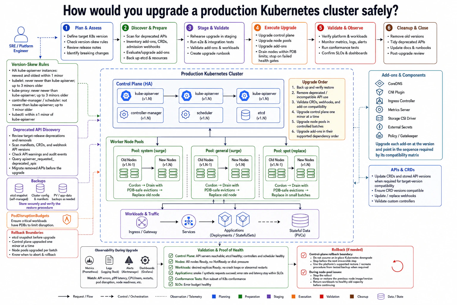
The goal is to move a production Kubernetes cluster to a newer version without causing an avoidable outage. The hard part is that the control plane, worker nodes, add-ons, APIs, and applications depend on each other. We should not change everything at once. The diagram solves this by preparing first, testing in staging, changing production in order, and checking health after each step. Rollback boundaries are understood before production.

Useful Questions to Ask the Interviewer
  1. Is the control plane self-managed or managed by a cloud provider?
  2. Which Kubernetes version are we running, and what is the target version?
  3. Which workloads have strict availability or disruption limits?
  4. Which add-ons, CRDs, and webhooks must remain compatible during the upgrade?
How would you upgrade a production Kubernetes cluster safely? diagram
How to Explain It in an Interview
1. Prepare before touching production

I would start by proving that the target version is compatible. I would review release notes and version-skew rules. kubelet and kube-proxy must not be newer than kube-apiserver and may be up to three minors older. controller-manager and scheduler may be one minor older, and kubectl stays within one minor version.

I would find deprecated APIs. I would review removals, scan manifests, CRDs, and webhook API versions, inspect warnings and audit events, and query apiserver_requested_deprecated_apis. Incompatible API use must be migrated first.

2. Back up and rehearse

Before upgrading, I would create the backups shown in the diagram. For a self-managed control plane, that includes an etcd snapshot. I would also protect cluster configuration, manifests, and PV or application data when needed. I would store backups safely and verify the restore procedure.

Then I would rehearse in staging. I would run end-to-end and integration tests, validate workloads and add-ons, and finish the upgrade runbook.

3. Upgrade control plane and node pools

I would upgrade the control plane one minor version at a time. Then I would move through worker node pools in controlled batches. The system and general pools use surge capacity, so new nodes become Ready before old nodes are removed. The spot pool uses replacement nodes in small batches.

For each old node, I would cordon it, then drain it with evictions that respect PodDisruptionBudgets. A PodDisruptionBudget limits how many application Pods may be unavailable together. I would validate health before continuing.

4. Handle add-ons and APIs by compatibility

CoreDNS, the CNI Plugin, Ingress Controller, Metrics Server, Storage CSI Driver, External Secrets, and Policy or Gatekeeper must match the target version. I would upgrade each where its compatibility matrix requires. CRDs, stored API versions, webhooks, and custom controllers must also be validated.

5. Prove health and respect rollback boundaries

After each step, I would watch metrics, logs, alerts, dashboards, API errors, latency, CPU, memory, restarts, Pod disruption, and node readiness. API servers must remain reachable. etcd, controllers, and the scheduler must stay healthy. Desired workload replicas must be Ready without abnormal restarts.

I would run smoke or synthetic requests and confirm error rate and latency stay within SLOs. If a health gate fails, I would stop. For node-pool problems, I would keep or restore the previous node version and return workloads to healthy old capacity. I would not assume an in-place control-plane downgrade is safe. Recovery must use the platform's supported restore or recreate procedure from a tested backup.

Practical Insights

The benefit is that each change has a clear checkpoint. Surge nodes let new capacity become healthy before old nodes are removed. PodDisruptionBudgets also reduce the chance of draining too many application Pods together. The downside is that this process takes more time and may temporarily need extra node capacity. Add-ons, CRDs, and webhooks can make the sequence harder because their supported versions may differ. Rollback is another limit. Node-pool changes are usually easier to reverse than control-plane changes. We accept the slower process because small batches, tested backups, and health gates make failures easier to contain.

Why Interviewers Ask This

Interviewers want to see whether you treat a Kubernetes upgrade as a production change, not just a version command. They are testing whether you understand dependencies, version compatibility, safe node draining, backups, disruption limits, monitoring, and recovery boundaries. A strong answer also shows good judgment about testing before production, stopping when health checks fail, and proving that both the platform and the applications remain healthy.

Interviewer may ask next
What would you change if a critical workload cannot tolerate any planned Pod disruption during the node upgrade?

I would keep the same upgrade design, but I would be more careful about capacity before draining that workload's nodes. I would first confirm that enough healthy replicas can run on other nodes. For a surge pool, I would bring the new nodes up and make sure they are Ready before touching the old nodes.

Then I would cordon one old node and let Kubernetes drain it using normal eviction rules. The PodDisruptionBudget must still be respected. I would not force-delete critical Pods just to make the upgrade continue. If the budget blocks the drain, I would stop and find the reason. The workload may need more replicas, more available capacity, or a corrected disruption policy.

After the Pods move, I would run the same smoke tests, error-rate checks, latency checks, and SLO checks shown in the diagram. Only then would I continue with another node. The downside is that this needs more temporary capacity and makes the upgrade slower.

What would you do if an important add-on is not compatible with the target Kubernetes version?

I would stop before upgrading the cluster to a version that breaks that add-on. The diagram treats add-on compatibility as part of preparation, so this problem should be found before the production control-plane change.

I would check the add-on's compatibility matrix and identify a version that works with the planned Kubernetes upgrade. The same check applies to CoreDNS, the CNI Plugin, Ingress Controller, Metrics Server, Storage CSI Driver, External Secrets, and Policy or Gatekeeper. I would also validate related CRDs, stored API versions, and webhooks because they may depend on APIs that change during the upgrade.

I would test the compatible combination in staging and run workload checks before production. In production, I would upgrade the add-on at the point required by its dependency order and validate health again. If no supported combination exists, I would delay the Kubernetes upgrade rather than knowingly break the cluster. The downside is that the upgrade may wait while the add-on is upgraded, reconfigured, or replaced.

53. What is cloud observability, and how does it differ from basic monitoring?Observability And TroubleshootingEasy

Question Details

Define observability as the ability to understand a system's internal state from its outputs. Compare it with monitoring known conditions, explain the roles of metrics, logs, traces, events, and context, and describe how a Cloud Engineer would use them together to investigate an unfamiliar production failure.

Short Interview Answer (30-60 seconds)

Monitoring tells me when a known condition is wrong using predefined rules or thresholds. Observability helps me understand why an unfamiliar problem is happening by correlating metrics, logs, traces, events, and context. I use those signals together to prove the cause, fix it safely, and verify recovery.

Detailed Explanation

See the Code while reading this explanation.

Cloud observability means having enough information from a running system to understand what is happening inside it without guessing. Basic monitoring is more limited: it watches conditions we already know to check and warns us when they cross a limit. The important difference appears when a new failure happens. Instead of relying on one warning, an engineer gathers different kinds of evidence, connects them into one story, tests possible explanations, finds the supported cause, makes a small safe change, and checks that users are getting a healthy service again.

Useful Questions to Ask the Interviewer
  1. Should I explain observability conceptually, or also walk through an unfamiliar production failure?
  2. Should I include how metrics, logs, traces, events, and context are correlated?
  3. Would you like me to discuss SLOs, alerting, sampling, cost, and telemetry quality as well?
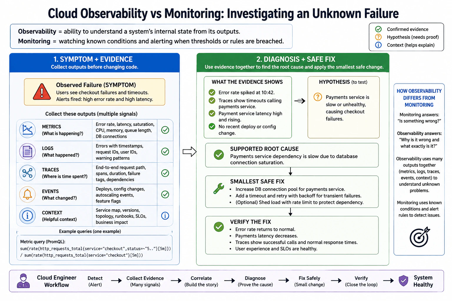
What is cloud observability, and how does it differ from basic monitoring? diagram
How to Explain It in an Interview

Start with the practical distinction. Monitoring answers known questions such as, "Is the error rate too high?" It watches predefined conditions and alerts when rules or thresholds are breached. Observability is broader. It is the ability to understand a system's internal state from its outputs, which lets an engineer investigate questions that were not predicted in advance.

The main signals work together:

  1. Metrics are numerical measurements over time. Examples include error rate, latency, CPU, memory, queue length, saturation, and database connection usage. They are good for showing that behavior changed, how much it changed, and when it changed.
  2. Logs are timestamped records of discrete events. They can include request IDs, errors, warnings, and useful application details. They help explain what happened around a failure.
  3. Traces follow a request across services and dependencies. Their spans show where time was spent, which calls were slow, and which dependency failed.
  4. Events describe important state changes such as deployments, configuration changes, failovers, autoscaling activity, or feature-flag changes.
  5. Context gives meaning to all of the signals. Examples include service name, version, environment, region, topology, ownership, runbooks, SLOs, request IDs, and trace IDs.

The key idea is correlation. One signal alone normally does not prove the root cause. I connect signals using consistent attributes such as service name, environment, region, version, request ID, and trace ID. I also check whether the telemetry is complete and trustworthy before drawing conclusions.

For the production-failure example in the diagram, users report checkout failures and timeouts. Monitoring detects the known symptoms because error rate and latency are high. Before changing code or infrastructure, I collect multiple outputs. Metrics show the error-rate and latency increase and let me inspect resource and dependency saturation. Logs give timestamped errors and request identifiers. Traces show that checkout requests are timing out when they call the payments service. Events show whether a recent deployment, configuration change, failover, or autoscaling event occurred. Context tells me which service version, region, topology, SLO, and ownership information applies.

I then separate confirmed evidence from hypotheses. The diagram shows confirmed evidence such as the error-rate spike, trace timeouts while calling the payments service, high payments-service latency, and no recent deployment or configuration change. A reasonable hypothesis is that the payments service is slow or unhealthy and is causing checkout failures. Further evidence supports the root cause shown in the diagram: the payments service dependency is slow because database connections are saturated.

Only after the cause is supported by evidence do I change the system. The diagram uses the smallest safe correction: increase the database connection pool for the payments service, add sensible timeout and retry behavior with backoff for transient failures, and optionally shed load with rate limiting to protect the dependency. Increasing a connection pool must be capacity-tested against database connection limits because an oversized pool can move the bottleneck to the database instead of removing it.

Finally, I verify the result instead of assuming the change worked. Error rate should return to normal, payments latency should decrease, traces should show successful calls with normal response times, and user-facing SLIs and SLOs should show healthy service behavior. I also watch for side effects such as higher database saturation, excessive retries, or renewed dependency pressure.

For production observability, I define meaningful SLIs and SLOs before choosing alert thresholds. An SLI is a measured indicator of service health, such as successful-request rate or request latency. An SLO is the target for that indicator. Alerts should be symptom-based and actionable, with clear ownership, severity, runbook context, and controls that reduce noise.

There are important tradeoffs. More telemetry gives more diagnostic detail but increases ingestion, network, storage, retention, and query cost. Trace sampling reduces cost but can hide rare failures or create sampling bias. High-cardinality attributes can make metric systems expensive and difficult to query. Longer retention helps historical investigations but costs more. Clock skew can make events appear in the wrong order. Missing telemetry can lead to false conclusions. Credentials, tokens, personal information, and sensitive payloads must be redacted before telemetry is exported or stored.

A strong Cloud Engineer therefore follows the same flow shown in the diagram: detect the alert, collect evidence from many signals, correlate those signals into a story, diagnose by proving the cause, fix safely with the smallest change, verify recovery, and confirm that the system is healthy again.

Technical Approach
  1. Define the user-visible objective and the SLIs and SLOs that represent healthy behavior.
  2. Use monitoring rules and dashboards to detect known symptoms such as elevated error rate or latency.
  3. When an unfamiliar failure appears, collect metrics, logs, traces, events, and relevant context before changing the system.
  4. Correlate the signals using consistent attributes such as service, environment, region, version, request ID, and trace ID.
  5. Build a timeline and separate confirmed evidence from hypotheses.
  6. Test each hypothesis against multiple signals rather than trusting one metric, log entry, or trace.
  7. Identify the root cause only when the available evidence supports it.
  8. Apply the smallest safe correction while respecting dependency limits and failure behavior.
  9. Verify recovery with error rate, latency, traces, user-facing SLIs, SLOs, and dependency health.
  10. Continue watching for side effects and update alerts, dashboards, runbooks, or instrumentation if the incident exposed an observability gap.
Practical Insights

There is no algorithmic Big-O cost for this conceptual problem, but observability has real data and operational costs. Collecting more logs and traces increases network traffic, ingestion, storage, retention, and query cost. High-cardinality attributes can make metric systems expensive. Trace sampling lowers cost but can miss rare failures or bias what operators see. Longer retention helps historical investigations but costs more. More alerts and dashboards also require maintenance. The goal is to keep enough high-quality telemetry to answer important production questions without collecting unnecessary or sensitive data.

Code
# Signal: calculate the checkout 5xx error ratio over the last five minutes.
# Collection point: this assumes an HTTP request counter is exported by the checkout service.
# Attributes: filter by service="checkout" and 5xx status codes while keeping labels controlled to avoid high cardinality.
# Aggregation: sum request rates before dividing so the result represents the overall checkout error ratio.
# Diagnostic intent: detect the failure symptom; this metric alone must not be treated as proof of root cause.
# Verification: after the safe change, this ratio should return to the normal SLI range defined for the service.
sum(rate(http_requests_total{service="checkout",status=~"5.."}[5m]))
/
sum(rate(http_requests_total{service="checkout"}[5m]))
Why Interviewers Ask This

Interviewers want to know whether the candidate understands the difference between detecting a known problem and investigating an unknown one. They are also testing whether the candidate can combine multiple telemetry signals, avoid guessing from one signal, distinguish confirmed evidence from a hypothesis, identify a supported root cause, make a safe correction, and verify recovery using service-health signals.

Common interview mistakes

Common mistakes are treating monitoring and observability as the same thing; saying observability is only metrics, logs, and traces without explaining correlation; assuming one signal proves the root cause; changing code or infrastructure before collecting evidence; treating a hypothesis as confirmed evidence; creating alerts before defining meaningful service-health indicators; alerting on every infrastructure fluctuation instead of user-visible symptoms; using inconsistent service, region, version, request, or trace attributes; ignoring missing telemetry, sampling bias, clock skew, retention, ingestion cost, and high cardinality; storing secrets or sensitive payloads in telemetry; using retries without backoff or limits; increasing a database connection pool without checking database capacity; and declaring success without verifying user-facing SLIs, latency, error rate, traces, and dependency health.

Interview tip

Start with one simple sentence: monitoring detects known bad conditions, while observability helps explain unknown problems. Then walk through metrics, logs, traces, events, and context as one correlated investigation. Clearly separate evidence from hypotheses, explain the smallest safe correction, and finish by showing how you verify real service recovery.

Interviewer may ask next
How would you investigate a sudden checkout failure when the existing dashboard only shows high error rate and latency?

I would treat the alert as the symptom, not the root cause. First, I would confirm the user-visible impact and the time and scope of the failure. Then I would correlate metrics, logs, traces, events, and context. I would use traces to see which service or dependency is consuming time, logs to find errors for the same requests, metrics to check latency and saturation, events to identify recent changes or failovers, and context such as service version, region, request IDs, and trace IDs to connect the evidence. In the diagram's example, traces and latency evidence point toward the payments service, and additional evidence supports database connection saturation. I would only then make the smallest safe correction and verify that error rate, latency, traces, and the SLO return to healthy levels.

What are the main tradeoffs when increasing observability coverage?

The main tradeoff is diagnostic value versus cost and complexity. More telemetry can make unknown failures easier to explain, but logs and traces increase ingestion, network, storage, retention, and query cost. High-cardinality attributes can make metric systems expensive. Sampling reduces trace volume but can hide rare failures or bias what operators see. More dashboards and alerts require maintenance and can create noise. Telemetry can also expose sensitive data if attributes or payloads are not controlled. I would define useful SLIs and investigation needs first, instrument the important service paths, keep correlation attributes consistent, sample intentionally, control cardinality and retention, redact sensitive data, and test that alerts and dashboards represent real user-visible service health.

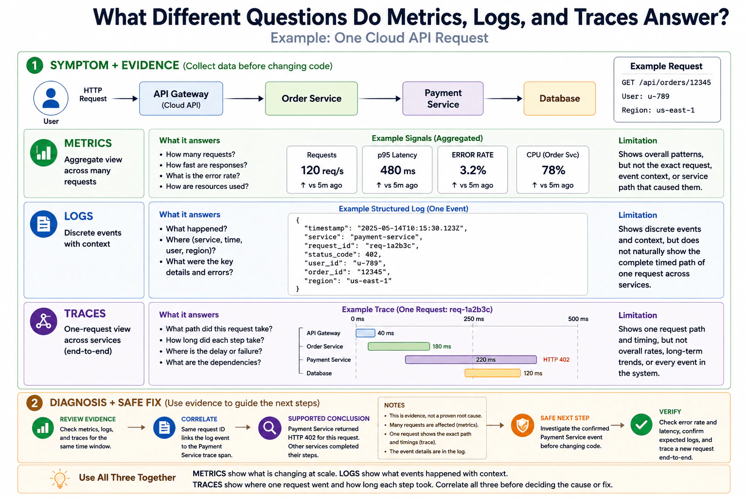
54. What different questions do metrics, logs, and traces answer?Observability And TroubleshootingEasy

Question Details

Use a cloud API request as the example. Explain what aggregate metrics reveal about rates and resource behavior, what structured logs reveal about discrete events and context, and what distributed traces reveal about one request across services, including the limitations of relying on any single signal.

Short Interview Answer (30-60 seconds)

Metrics answer what is changing across many requests. Logs answer what individual events happened and with what context. Traces answer where one request went and how long each step took. Use all three together because no single signal gives the complete picture.

Detailed Explanation

When an online service has a problem, one view is usually not enough to understand it. One view shows the overall pattern across many requests. Another records individual things that happened and useful details about them. A third follows one request from start to finish and shows where time was spent. Each view answers a different question. Looking at only one can hide important facts. A safer approach is to compare the views, connect information about the same request, and gather enough evidence before deciding what caused the problem or changing the application.

Useful Questions to Ask the Interviewer
  1. Should I explain the signals conceptually, or also show how they are correlated during troubleshooting?
  2. Should I include the limitations of using each signal by itself?
  3. May I use one cloud API request moving through several services as the example?
What different questions do metrics, logs, and traces answer? diagram
How to Explain It in an Interview

Start with the practical distinction: metrics show system behavior at scale, logs show discrete events with context, and traces show the end-to-end path of one request.

1. Metrics: What is changing across many requests?

Metrics are numeric measurements summarized over time. They answer questions such as:

  • How many requests are arriving?
  • How fast are responses?
  • What is the error rate?
  • How are resources such as CPU being used?

In the diagram, the example aggregate signals are 120 requests per second, p95 latency of 480 ms, an error rate of 3.2%, and 78% CPU usage for the Order Service. These values describe behavior across many requests rather than one particular request.

The limitation is that metrics show overall patterns but normally do not identify the exact request, event context, or service path behind the change. Aggregation can hide individual outliers. Very high-cardinality labels can also increase storage and query cost, so metric dimensions must be chosen carefully.

2. Logs: What happened in a specific event?

A structured log records one discrete event using named fields. It answers questions such as:

  • What happened?
  • Which service recorded it?
  • When did it happen?
  • Which request, user, order, or region was involved?
  • What status or other event details were recorded?

The diagram shows a Payment Service event containing a timestamp, service name, request ID req-1a2b3c, HTTP status code 402, user ID, order ID, and region. These fields provide event context that aggregate metrics do not provide.

The limitation is that logs do not naturally show the complete timed path of one request through every service. Logs can also create significant ingestion, indexing, storage, and retention cost. Sensitive values such as credentials, tokens, personal data, and private payloads must be redacted. Consistent request IDs and resource attributes make correlation much easier.

3. Traces: Where did one request go, and where was time spent?

A distributed trace follows one request across service boundaries. Each operation is represented by a span, and the spans together show the request path and timing. A trace answers questions such as:

  • What path did this request take?
  • How long did each step take?
  • Where was a delay or failure observed?
  • What dependencies participated in the request?

In the diagram, the request moves through API Gateway, Order Service, Payment Service, and Database. The visible span durations are 40 ms, 180 ms, 220 ms, and 120 ms. The Payment Service span is marked with HTTP 402.

A trace does not by itself prove why the service returned that response. It shows the path, timing, and recorded span information for that request. Traces also do not replace aggregate rates, long-term trends, or every event in the system. Sampling may mean that some requests are not retained, and biased sampling can make uncommon failures harder to find.

4. Correlate the signals before deciding the cause

The safest investigation uses the signals together. First review metrics for the same time window to understand how broadly the symptom affects the service. Then inspect structured logs for event-level context. Finally inspect the trace for the same request to understand its path and timing.

For the diagram example, request ID req-1a2b3c links the Payment Service log event to the Payment Service trace span. The supported conclusion is that the Payment Service returned HTTP 402 for that request. The evidence does not prove a deeper root cause. Other services completed their visible steps, so the next safe action is to investigate the confirmed Payment Service event before changing code.

5. Verify after any correction

After making a justified correction, check the same signals again. Confirm that error rate and latency behave as expected, verify that the expected logs appear, and trace a new request end-to-end. Also consider missing telemetry, retention windows, clock skew between systems, sampling, ingestion cost, aggregation, and privacy. No single signal should be treated as proof of root cause.

The key interview message is simple: metrics show what is changing at scale, logs show what events happened with context, and traces show where one request went and how long each step took. Correlate all three before deciding the cause or fix.

Technical Approach
  1. Start with the observed symptom and the relevant time window.
  2. Review aggregate metrics for request rate, latency, error rate, and resource behavior to understand the overall pattern.
  3. Find structured logs from the same time window and use stable fields such as request ID and service name to identify relevant events.
  4. Open the distributed trace for the same request ID and inspect the request path, span timing, and recorded status.
  5. Correlate the three signals and separate confirmed evidence from hypotheses.
  6. Investigate the component supported by the evidence before making a code or configuration change.
  7. After any correction, verify error rate and latency, confirm expected logs, and trace a new request end-to-end.
Practical Insights

Metrics are usually compact because many requests are summarized into numeric time series, but too many label combinations can create high cardinality and increase storage and query cost. Logs usually contain much more event data, so ingestion, indexing, retention, and search can become expensive. Traces can generate many spans, so sampling and retention are commonly used to control cost. Correlation also adds maintenance work because services need consistent request IDs, timestamps, and resource attributes. Poor sampling, missing telemetry, short retention, or clock differences can make an investigation incomplete.

Why Interviewers Ask This

Interviewers want to know whether the candidate understands the purpose and limitations of the three main observability signals. A strong Cloud Engineer should know when aggregate behavior is useful, when event-level context is needed, and when an end-to-end request path is needed. The question also tests whether the candidate correlates evidence instead of assuming that one metric, log entry, or trace proves a root cause.

Common interview mistakes

Common mistakes include treating metrics, logs, and traces as interchangeable; assuming a metric identifies the exact failing request; expecting one log entry to show the full service path; assuming a slow or failed trace span automatically proves the root cause; and changing code before correlating evidence. Other mistakes include inconsistent request IDs, very high-cardinality metric labels, logging sensitive information, ignoring trace sampling, overlooking retention limits, missing telemetry or clock skew, and collecting large amounts of telemetry without a clear diagnostic purpose.

Interview tip

Use one simple sentence for each signal: metrics show patterns across many requests, logs show individual events with context, and traces show the path and timing of one request. Then state one limitation of each and finish by saying that you correlate all three before deciding the cause or fix.

Interviewer may ask next
How would you correlate metrics, logs, and traces during a real incident?

Start with the affected time window and the symptom visible in metrics, such as a rise in error rate or latency. Use consistent service attributes and a request or trace ID to find structured log events from that period. Then open the distributed trace for the same request and inspect its service path, span timing, and recorded status. Treat the combined information as evidence, not automatic proof of a root cause. In the diagram example, req-1a2b3c connects the Payment Service log event with its trace span and supports the conclusion that the Payment Service returned HTTP 402 for that request. Further investigation is still required before changing code.

What problems can sampling or aggregation cause when troubleshooting?

Aggregation can hide individual requests because metrics summarize many observations into rates, percentiles, or other values. Trace sampling can mean that the exact request you need was not retained, and biased sampling can underrepresent uncommon failures. Logs may also be unavailable because of collection failures or retention limits. Operators should understand collection and retention policies, use consistent correlation attributes, monitor telemetry pipelines, and avoid assuming that missing evidence means an event did not happen.

55. What are the four golden signals, and how would you use them for a cloud API?Observability And TroubleshootingEasy

Question Details

Define latency, traffic, errors, and saturation for one HTTP API and its main dependency. Explain how you would select units, separate successful from failed work, choose meaningful percentiles, identify a saturation resource, and connect each signal to a user-visible service objective.

Short Interview Answer (30-60 seconds)

The four golden signals are latency, traffic, errors, and saturation. For a cloud API, measure them for both the HTTP service and its main dependency, separate successful and failed request work, use meaningful latency percentiles, watch the true limiting resource, and tie the signals to user-facing SLOs.

Detailed Explanation

This question asks how you would watch one service and the main thing it depends on so you can tell whether users are having a good experience. You need to explain four simple ideas: how long work takes, how much work arrives, how often work fails, and how close important resources are to being full. You should also explain which measurements are useful, how to separate good results from bad ones, how to notice unusually slow requests, what resource may become overloaded, and how all of this connects to promises made to users.

Useful Questions to Ask the Interviewer
  1. Which user journey or API operation is most important to protect?
  2. What is the API's main dependency, and which dependency resource is most likely to become constrained?
  3. What user-facing latency or reliability SLOs already exist?
  4. Should the measurements be reported for the whole API, individual routes, or both?
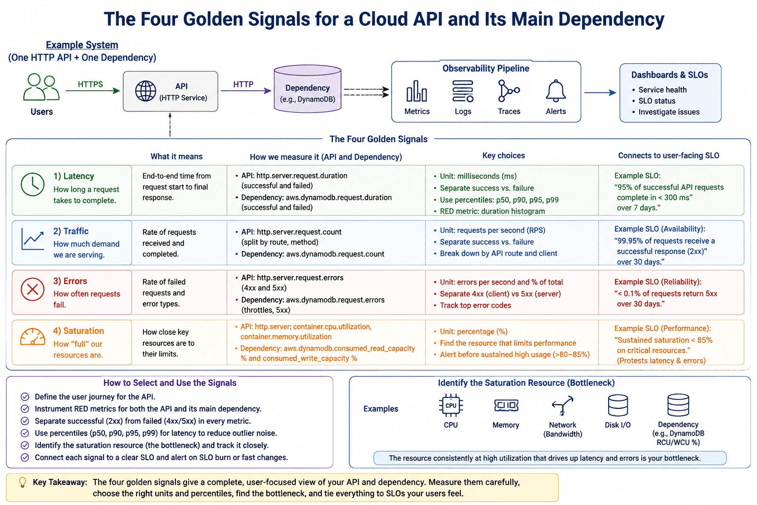
What are the four golden signals, and how would you use them for a cloud API? diagram
How to Explain It in an Interview

I would start with the user-visible objective, then measure the four golden signals for both the HTTP API and its main dependency. In the diagram, users send HTTPS requests to the API, the API makes an HTTP call to a dependency such as DynamoDB, and telemetry from the service and dependency feeds an observability pipeline containing metrics, logs, traces, and alerts. Dashboards then show service health, SLO status, and evidence for investigation.

1. Latency

Latency means how long work takes. For the API, measure the end-to-end time from the start of the request until the final response. For the dependency, measure how long the dependency operation takes. Milliseconds are a practical unit for an HTTP API.

Do not look only at an average. Use percentiles such as p50, p90, p95, and p99. p50 shows a typical request, while p95 and p99 show slower tail behavior. Also separate successful requests from failed requests because a fast failure should not make successful user experience look better than it really is.

The diagram shows illustrative measurements named http.server.request.duration for the API and aws.dynamodb.request.duration for the dependency. The exact metric name depends on the instrumentation and backend, but the meaning should stay the same. A user-facing example is: 95% of successful API requests complete in less than 300 ms over 7 days.

2. Traffic

Traffic means how much demand the service is handling. For an HTTP API, a useful unit is requests per second, or RPS. For the dependency, measure its request or operation rate as well.

Break traffic down by useful dimensions such as route, method, and client when those dimensions are bounded and operationally useful. Separate successful and failed request counts so operators can see whether growing demand is healthy traffic or failing traffic. Traffic gives important context: a latency or error increase during a large demand spike means something different from the same symptom at normal demand.

The diagram shows illustrative request-count measurements named http.server.request.count and aws.dynamodb.request.count. Traffic itself is usually context rather than a user-visible objective, but it helps explain whether the service can continue meeting an availability objective such as 99.95% successful 2xx responses over 30 days.

3. Errors

Errors mean how often requests or dependency operations fail. Measure both the number or rate of failures and the error percentage relative to total traffic. The percentage is important because ten failures during one hundred requests is very different from ten failures during one million requests.

Separate 4xx client responses from 5xx server responses instead of treating them as one problem. Also track important dependency failures such as throttling or server-side failures independently. The diagram shows illustrative measurements named http.server.request.errors and aws.dynamodb.request.errors.

A clear user-facing reliability objective could be: fewer than 0.1% of requests return 5xx responses over 30 days. That directly connects the error signal to whether users can complete their tasks successfully.

4. Saturation

Saturation means how close a limiting resource is to its useful capacity. Do not automatically choose CPU. First identify which resource can actually constrain the system.

For the API, possible saturation resources include CPU, memory, concurrency, network bandwidth, or disk I/O. The diagram highlights container.cpu.utilization and container.memory.utilization as examples. For the DynamoDB dependency example, useful capacity indicators include consumed read capacity and consumed write capacity relative to available capacity.

Measure saturation as a percentage when that representation makes sense. The important resource is the one that repeatedly approaches its useful limit while latency, throttling, or errors also increase. That makes it a bottleneck hypothesis, not automatic proof of root cause. The diagram uses sustained utilization around 80-85% as an example warning area and shows an example operational objective of keeping sustained saturation below 85% on critical resources. This protects the user-facing latency and error SLOs by leaving capacity headroom for bursts.

How the Signals Work Together

I would use the four signals together, not separately. Latency tells me whether users are waiting. Traffic tells me how much demand exists. Errors tell me whether requests are failing. Saturation tells me whether an important resource is running out of headroom.

The practical flow is:

  1. Define the important user journey and its latency or reliability SLO.
  2. Instrument rate, errors, and duration for the API and its main dependency.
  3. Separate successful 2xx work from failed 4xx and 5xx work where that distinction is meaningful.
  4. Use latency percentiles such as p50, p90, p95, and p99 rather than only averages.
  5. Identify the real saturation resource instead of assuming which resource is the bottleneck.
  6. Send metrics, logs, and traces into the observability platform and correlate them during investigation.
  7. Use dashboards to show service health and SLO status.
  8. Alert on meaningful user-visible degradation, SLO burn, or fast changes rather than every small resource spike.

Metrics are the main source for the four golden signals. Logs provide event details, and traces show the path from the API into the dependency. They help diagnose why a signal changed, but one metric, log, or trace alone should not be treated as proof of root cause.

Tradeoffs and Operational Risks

More dimensions such as route, client, and status code make troubleshooting easier, but too many values create high cardinality and higher ingestion cost. Keeping more logs and traces increases storage and retention cost. Trace sampling reduces cost but can miss rare failures or create sampling bias. Missing telemetry, inconsistent resource attributes, and clock skew can make correlation difficult. Credentials, tokens, personal data, and sensitive payloads must be removed or redacted before telemetry is stored.

Verification

I would test the monitoring design in a safe environment. Generate known successful requests, controlled failures, dependency load, and resource pressure. Confirm that latency percentiles, request rates, error ratios, and saturation measurements change as expected. Check that traces connect the API to its dependency, dashboards reflect real service health, and alerts fire and recover at the intended conditions. This verifies that the monitoring system represents what users actually experience.

Technical Approach
  1. Define the important user journey and its user-facing latency or reliability SLO.
  2. Identify the HTTP API and its main dependency, such as the DynamoDB example in the diagram.
  3. Measure API and dependency latency in milliseconds and separate successful from failed requests.
  4. Use meaningful latency percentiles such as p50, p90, p95, and p99 instead of relying only on averages.
  5. Measure traffic as request or operation rate, normally requests per second for the API, and break it down by bounded, useful dimensions such as route or method.
  6. Measure errors as both a rate and a percentage of total traffic. Separate 4xx client responses from 5xx server responses and track dependency failures independently.
  7. Identify the resource that can actually limit performance, such as CPU, memory, concurrency, network, disk I/O, or dependency capacity.
  8. Treat sustained high utilization that coincides with rising latency or errors as a bottleneck hypothesis and verify it with supporting telemetry.
  9. Send metrics, logs, traces, and alerts into the observability platform and show service health and SLO status on dashboards.
  10. Alert on meaningful SLO burn, user-visible degradation, or fast changes rather than every small metric movement.
  11. Test the design with successful traffic, controlled failures, dependency pressure, and resource pressure, then confirm that dashboards and alerts represent real service behavior.
Practical Insights

There is no useful Big-O time or memory complexity for this monitoring design. The important costs are operational. More metrics, labels, logs, and traces increase telemetry volume, ingestion, storage, and retention cost. High-cardinality dimensions can make metric systems expensive and harder to query. Keeping every trace is also costly, so sampling may be needed, but sampling can hide rare failures. More dashboards and alert rules add maintenance work. The goal is to collect the smallest set of signals that accurately represents user health while keeping enough detail to investigate problems.

Why Interviewers Ask This

This question tests whether a Cloud Engineer can turn service telemetry into a small, useful monitoring design. A strong answer correctly defines the four golden signals, chooses appropriate units and latency percentiles, measures both the API and its main dependency, separates successful from failed request work, identifies the real constrained resource, and explains how the signals support SLOs, dashboards, alerts, and troubleshooting without treating any one signal as proof of root cause.

Common interview mistakes

Common mistakes are monitoring only the API and ignoring its main dependency; using average latency instead of percentiles; mixing successful responses with fast failures when calculating user latency; treating all 4xx and 5xx responses as the same kind of error; reporting error counts without considering total traffic; assuming CPU is always the saturation resource; treating traffic alone as proof of service health; creating alert thresholds before defining user-facing SLOs; using unbounded route or client values and creating high metric cardinality; alerting on every resource spike instead of user-visible symptoms; treating one golden signal as proof of root cause; and collecting credentials, tokens, personal data, or sensitive payloads in telemetry.

Interview tip

Start with the user SLO, then explain latency, traffic, errors, and saturation in that order. For each signal, give its meaning, a useful unit, how you would measure both the API and dependency, and why users care. Finish by explaining success-versus-failure separation, latency percentiles, bottleneck identification, and how metrics, logs, traces, dashboards, and alerts work together.

Interviewer may ask next
How would you identify which resource should be used for the saturation signal?

Do not choose CPU automatically. List the resources that can limit the service, such as CPU, memory, concurrency, network bandwidth, disk I/O, or dependency capacity. Measure their utilization and trends, then correlate sustained high utilization with rising latency, throttling, or errors. In the diagram's DynamoDB example, consumed read or write capacity can be more useful than API CPU if database capacity is the actual constraint. The resource that repeatedly approaches its useful limit while user-visible performance degrades becomes the strongest bottleneck hypothesis, which should then be verified with additional telemetry.

Why use latency percentiles such as p95 or p99 instead of only average latency?

An average can hide slow requests because many fast requests pull the number down. A percentile describes the experience of a specific portion of requests. For example, p95 latency means 95% of measured requests completed at or below that duration while 5% were slower. p50 shows the typical experience, while p95 and p99 expose slower tail behavior. Measure successful and failed requests separately so fast failures do not make the service appear faster. Choose the SLO percentile based on the user experience that matters and make sure enough observations exist for the percentile to be meaningful.

56. How do an SLI, SLO, and SLA differ?Observability And TroubleshootingEasy

Question Details

Use service availability as the example. Explain the measured indicator, the internal target and evaluation window, and the external contractual commitment. Include how exclusions, aggregation, error budgets, and consequences must be defined so the three terms are not used interchangeably.

Short Interview Answer (30-60 seconds)

SLI is what you measure, SLO is the internal target for that measurement over a defined window, and SLA is the external contractual promise. For availability, define the calculation, exclusions, aggregation, error budget, scope, and consequences so the three terms are not used interchangeably.

Detailed Explanation

This question asks you to explain three different ways of describing whether a service is working well. First, you need a number that shows what users actually experienced. Second, your team needs a goal for how reliable the service should be during a stated period. Third, customers may receive a written promise with a defined result if that promise is missed. You should also explain exactly what is counted, what is left out, how results are combined, how much failure is acceptable, and what happens when an internal goal or customer promise is missed.

Useful Questions to Ask the Interviewer
  1. Should I use request-based availability as the measured example?
  2. Should I assume the internal target and customer contract can use different percentages and evaluation windows?
  3. Should I explain how maintenance windows, third-party outages, force majeure events, and testing or synthetic traffic are handled as exclusions?
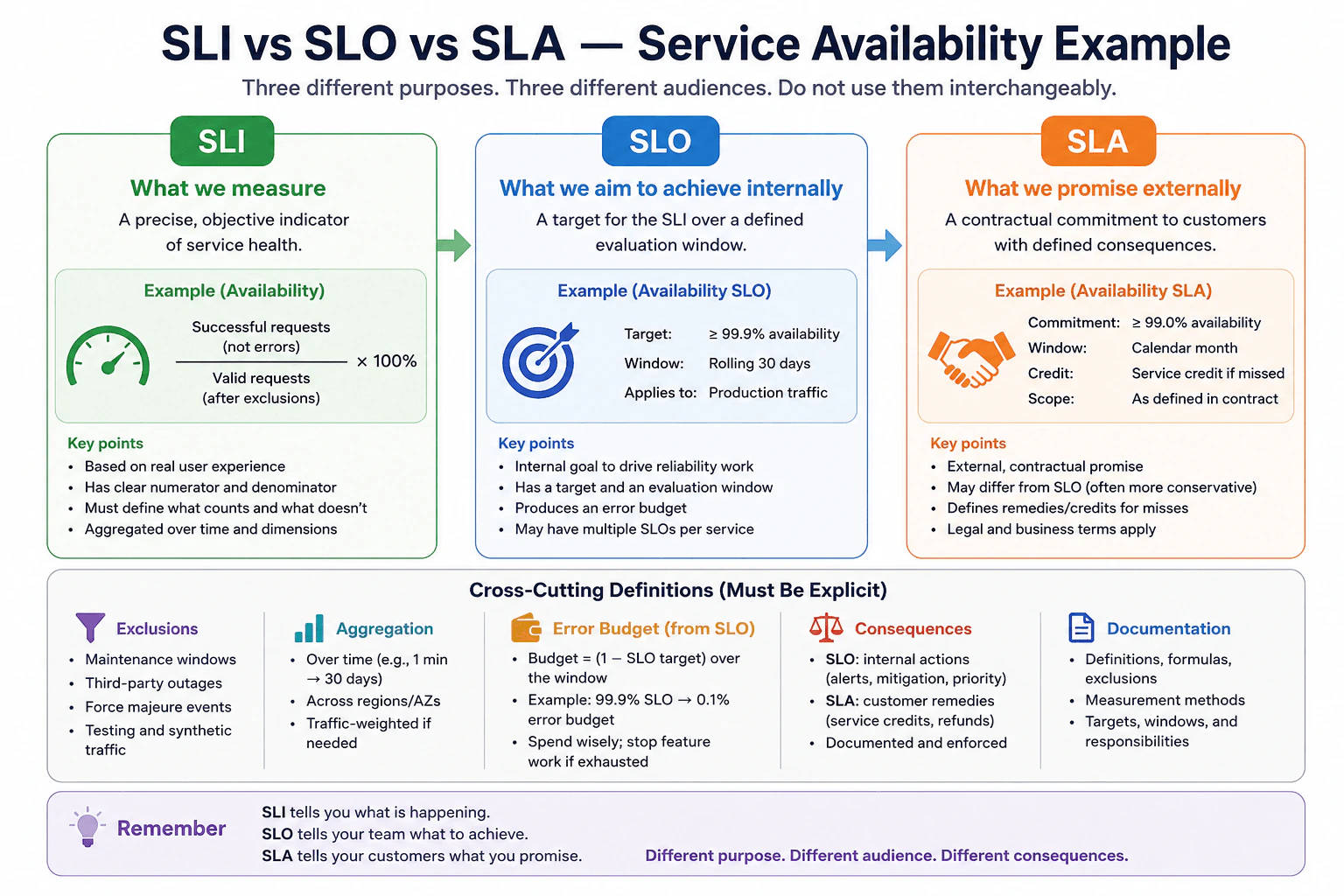
How do an SLI, SLO, and SLA differ? diagram
How to Explain It in an Interview

An SLI, or Service Level Indicator, is the actual measured value. For service availability, a useful SLI is the percentage of valid requests that are served successfully. A simple example is successful requests divided by valid requests after defined exclusions, multiplied by 100. The numerator, denominator, exclusions, and aggregation method must be explicit so the result is repeatable and comparable.

An SLO, or Service Level Objective, is an internal target for an SLI over a defined evaluation window. In the diagram, the example target is at least 99.9% availability over a rolling 30-day window for production traffic. The SLO guides engineering reliability work. It also creates an error budget. For a 99.9% SLO, the allowed failure fraction is 0.1% over the same evaluation window. Teams can use remaining error budget to balance reliability with changes and feature work. If the budget is exhausted or is being consumed too quickly, the team can reduce risky changes and prioritize reliability work.

An SLA, or Service Level Agreement, is an external contractual commitment to customers. In the diagram, the example is at least 99.0% availability over a calendar month, with scope defined in the contract and a service credit if the commitment is missed. The SLA may intentionally differ from the internal SLO in its target, evaluation window, scope, exclusions, and consequences. Its measurement rules and remedies must be defined in the customer agreement.

Exclusions must be explicit and defined in advance. Examples shown in the diagram include maintenance windows, third-party outages, force majeure events, and testing or synthetic traffic. Whether any of these are excluded depends on the written definition; they should not simply be removed after an incident to improve the reported percentage.

Aggregation must also be explicit. Availability might be combined over time, across regions or availability zones, and may be traffic-weighted when appropriate. Different aggregation methods can produce different percentages from the same underlying events, so the method must be documented.

The key distinction is simple: SLI tells you what is happening, SLO tells the engineering team what reliability level to achieve internally, and SLA tells customers what is contractually promised. They have different purposes, audiences, evaluation rules, and consequences, so they must not be used interchangeably.

Technical Approach
  1. Define the user-visible service behavior to measure, such as successful valid requests.
  2. Define the SLI formula, including numerator, denominator, exclusions, and aggregation method.
  3. Set an internal SLO target and evaluation window, such as at least 99.9% availability over a rolling 30 days.
  4. Derive the error budget from the SLO over that same window and define engineering actions for rapid or complete budget consumption.
  5. Define the external SLA separately, including its availability target, evaluation window, covered customers, scope, exclusions, measurement rules, and contractual remedies.
  6. Document all definitions so the SLI, SLO, and SLA remain related but are never treated as interchangeable.
Practical Insights

There is little algorithmic complexity in defining these terms, but measurement has operational and maintenance cost. Availability data must be collected and retained for the required evaluation windows. Aggregating results across endpoints, regions, or availability zones adds processing and operational work. High-cardinality dimensions can increase telemetry cost. Teams must maintain SLI definitions, exclusions, SLO targets, error-budget calculations, dashboards, and SLA rules. Different SLO and SLA windows may require separate calculations. Poor definitions create extra human cost because engineers and customers can interpret the same outage differently.

Why Interviewers Ask This

Interviewers want to know whether you can separate actual measurement, an internal reliability objective, and an external contractual promise. They also test whether you understand that availability percentages are meaningful only when the calculation, evaluation window, exclusions, aggregation method, error budget, scope, and consequences are clearly defined.

Common interview mistakes

Common mistakes are calling the measured availability percentage an SLO instead of an SLI; treating an SLO as a customer contract; assuming SLO and SLA targets or evaluation windows must be identical; quoting 99.9% without defining the time window; using total requests without defining which requests are valid; changing exclusions after an outage; averaging percentages across regions without defining the aggregation method; calculating an error budget using a different scope or window from its SLO; and describing an SLA as only another reliability target without mentioning contractual scope and customer-facing consequences.

Interview tip

Use one availability example from start to finish. Say: SLI is the measured percentage, SLO is the internal target over a defined window, and SLA is the external contractual promise with consequences. Then mention exclusions, aggregation, error budget, scope, and remedies. This shows that the percentages alone are not enough.

Interviewer may ask next
How is an error budget related to an SLO?

An error budget is the amount of unreliability allowed by the SLO during the same evaluation window. For a 99.9% availability SLO, the allowed failure fraction is 0.1% over that window. Teams use the remaining budget to balance reliability against releases and other changes. If the budget is exhausted or is being consumed too quickly, the team can reduce risky changes and prioritize reliability work. The error budget belongs to the internal SLO process; it is not the customer remedy defined by an SLA.

Why must exclusions and aggregation rules be defined explicitly?

Because the same service events can produce different availability percentages depending on what is counted and how results are combined. Maintenance windows, third-party outages, force majeure events, or testing traffic may be excluded only when the definition says so. Regional or availability-zone results may also be combined using traffic weighting or another documented method. Defining these rules in advance makes the SLI repeatable, keeps the SLO meaningful, and reduces disputes about SLA calculations and service credits.

57. How would you investigate checkout failures when the main dashboards are green?Observability And TroubleshootingMedium

Question Details

Customers report failed checkouts, but host CPU, memory, and aggregate HTTP success dashboards remain normal. Available evidence includes edge status codes, payment-provider latency, application logs, traces, deployment events, queue depth, and regional metrics. Build a diagnostic order, state what each signal can prove, identify an immediate mitigation, and keep the root-cause conclusion separate until evidence supports it.

Short Interview Answer (30-60 seconds)

Start from the customer symptom, preserve failing request IDs, define scope, and safely reproduce when possible. Correlate edge codes, provider latency, traces, logs, queues, regions, and deployments. Test hypotheses against healthy requests, contain reversibly, prove the cause, apply the smallest fix, then verify and monitor.

Detailed Explanation

Customers are reporting that purchases fail even though the usual health screens look normal. The goal is to find where the checkout path breaks without guessing. I would first save identifiers from failed requests and determine when, where, and for whom the failures occur. I would compare failed purchases with successful ones and reproduce the problem safely when possible. Then I would follow the failed checkout through each system boundary. If customers are still being affected, I would use a reversible action to reduce the impact while continuing to collect evidence.

Useful Questions to Ask the Interviewer
  1. Are failures affecting every checkout or only particular regions, endpoints, user groups, or payment paths?
  2. Do failed checkout reports include request or correlation IDs that can connect edge, trace, and application evidence?
  3. Was there a recent deployment, configuration change, or dependency event near the start of the failures?
  4. Is there a known safe rollback or alternate route that can reduce customer impact during the investigation?
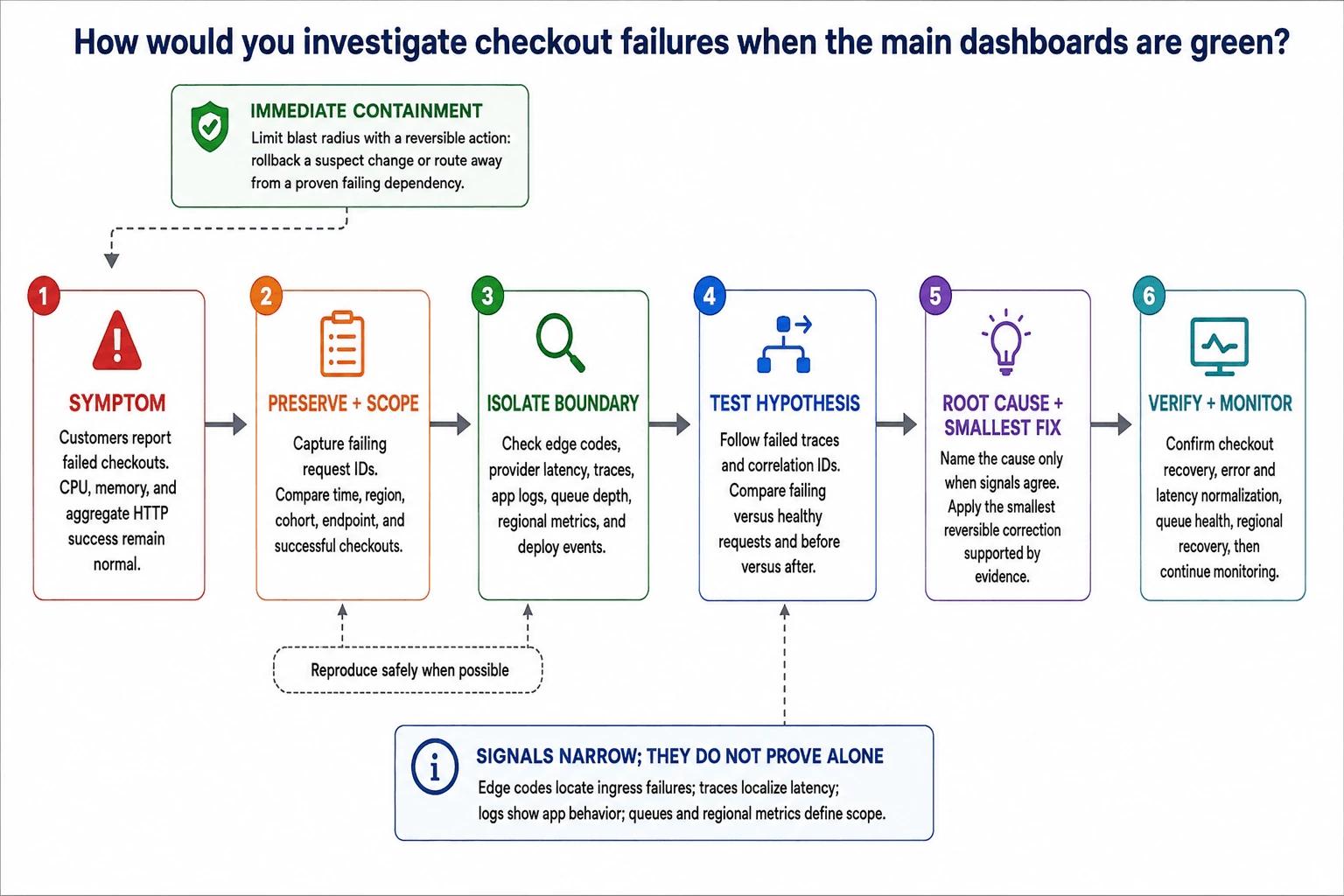
How would you investigate checkout failures when the main dashboards are green? diagram
How to Explain It in an Interview

I would use a six-stage evidence-first flow.

1. Symptom

The customer-visible symptom is failed checkout. Healthy CPU, memory, and aggregate HTTP-success dashboards do not disprove that symptom because averages can hide failures in a specific path, region, cohort, or dependency.

2. Preserve + Scope

Before making changes, I preserve failing request or correlation IDs. I compare failures by time, region, user cohort, endpoint, and successful versus failed checkouts. This defines the blast radius and gives me evidence that can be correlated across systems.

When it is safe and practical, I reproduce the failure with a controlled request. Reproduction is diagnostic evidence, not a reason to weaken production safeguards.

3. Isolate Boundary

I check the available signals in a boundary-oriented order. Edge status codes can locate failures at ingress before application processing. Payment-provider latency can show that an external payment boundary is slow, but it does not by itself prove the provider caused the checkout failure. Distributed traces can localize where request time or errors appear across services. Application logs show what the application observed. Queue depth can expose asynchronous backlog. Regional metrics define whether the impact is localized or widespread. Deployment events let me compare failure timing with recent changes.

Signals narrow the problem; they do not prove root cause alone. I correlate them using request IDs, consistent time windows, and comparable healthy requests.

4. Test Hypothesis

I follow failed traces and correlation IDs end to end. I compare failing requests with healthy requests and compare behavior before and after the incident began. A suspected provider problem, deployment regression, queue issue, or regional dependency remains a hypothesis until multiple independent observations consistently support it. If evidence disproves a hypothesis, I reject it and continue narrowing the boundary.

Immediate Containment

If customer impact is significant, I use the smallest reversible action supported by evidence. For example, I can roll back a suspect recent change, or route traffic away from a dependency that has been proven to be failing when the architecture provides a supported healthy path. Containment reduces blast radius; it is not proof of root cause.

5. Root Cause + Smallest Fix

I name the cause only when correlated signals agree. I then apply the smallest reversible or low-risk correction supported by that evidence. I avoid broad changes, disabling validation, swallowing failures, or removing telemetry just to make symptoms disappear.

6. Verify + Monitor

After the correction, I verify that checkout success recovers, error and latency behavior normalizes, queues are healthy, and affected regions recover. I compare the same signals used during diagnosis so verification is tied to the original failure. I continue monitoring because a short improvement is not enough to prove lasting recovery.

The main tradeoff is speed versus certainty. During customer impact, reversible containment may happen before the exact root cause is known. Root-cause declaration still waits for consistent evidence. Telemetry also has limits: sampling can miss rare traces, aggregation can hide localized failures, high-cardinality attributes can increase cost, clocks can differ between systems, and sensitive request data must be redacted.

Technical Approach
  1. Confirm the customer-visible checkout failure despite healthy aggregate dashboards.
  2. Preserve failing request or correlation IDs.
  3. Define scope by time, region, cohort, endpoint, and failed versus successful checkouts.
  4. Reproduce safely when possible.
  5. Isolate the failing boundary using edge status codes, payment-provider latency, traces, application logs, queue depth, regional metrics, and deployment events.
  6. Form hypotheses from evidence rather than assumptions.
  7. Follow failed traces and correlation IDs and compare failing versus healthy requests and before-versus-after behavior.
  8. Reject hypotheses that the evidence disproves.
  9. Use a reversible containment action when customer impact requires it.
  10. Declare root cause only when correlated signals consistently support it.
  11. Apply the smallest safe correction.
  12. Verify checkout recovery, error and latency normalization, queue health, and regional recovery.
  13. Continue monitoring for recurrence.
Practical Insights

There is no important algorithmic Big-O cost here. The main costs are operational. More logs and traces increase telemetry ingestion, storage, query, and retention cost. Trace sampling lowers cost but can miss rare checkout failures. High-cardinality fields can make telemetry expensive, so request identifiers and resource attributes should be controlled. Looking across several regions and signals also takes operator time. Missing telemetry or clock skew can make correlation harder. Sensitive payloads, credentials, tokens, and personal data must be redacted. Consistent correlation IDs, resource attributes, retention policies, and runbooks reduce maintenance effort.

Why Interviewers Ask This

This question tests whether a Cloud Engineer can investigate a customer-visible production failure when broad dashboards appear healthy. It evaluates evidence preservation, blast-radius definition, signal correlation, fault-boundary isolation, hypothesis testing, safe containment, disciplined root-cause reasoning, and post-fix verification. A strong candidate understands that healthy aggregate CPU, memory, or HTTP-success dashboards can hide a narrow checkout-path failure and that one observability signal alone does not prove root cause.

Common interview mistakes

Common mistakes are trusting green CPU and memory dashboards more than the customer symptom; checking only aggregate HTTP success; changing production before preserving request evidence; treating one signal as proof; investigating logs, traces, queues, regions, and deployment events separately instead of correlating them; assuming a payment provider, queue, region, or deployment is the cause without confirmation; treating successful mitigation as proof of root cause; making a broad irreversible change instead of a small reversible one; ignoring successful requests as a comparison group; and declaring recovery without checking the same customer-facing and boundary signals used during diagnosis.

Interview tip

Present the answer as one disciplined flow: symptom, preserve and scope, isolate the boundary, test hypotheses, contain reversibly when needed, prove root cause, apply the smallest fix, then verify and monitor. Say explicitly that observability signals narrow the search but do not prove root cause by themselves.

Interviewer may ask next
What would you do if traces show high payment-provider latency only in one region?

I would treat that as evidence that narrows the problem to a regional payment boundary, not as final proof. I would correlate the failed traces with edge status codes, provider latency, application logs, successful requests in other regions, and the incident time window. If those signals consistently show that a particular regional dependency is failing, I would use a supported reversible containment action such as routing affected traffic to a proven healthy path if the architecture allows it. Then I would verify checkout recovery, errors, latency, queue health, and regional behavior.

What if rolling back the latest deployment immediately reduces checkout failures?

The rollback is useful containment and makes the deployment a stronger hypothesis, but it does not by itself prove the exact root cause. I would compare failing traces, application logs, request behavior, and deployment timing before and after the rollback. If the correlated evidence consistently ties the failure to the change, I would identify the precise cause, apply the smallest durable correction, retest the checkout path, verify recovery with the same signals, and continue monitoring for recurrence.

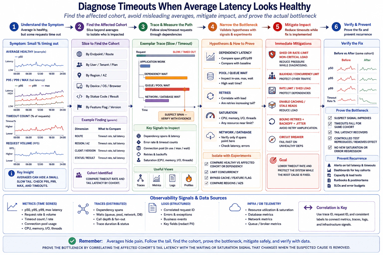
58. How would you diagnose timeouts when average latency still looks healthy?Observability And TroubleshootingMedium

Question Details

A service meets its average-latency target, but a small group of requests times out. Available signals include p50, p95, p99 and maximum latency, request volume, timeout counts, dependency spans, connection-pool metrics, retries, and saturation. Explain how you would locate the affected cohort, avoid misleading averages, mitigate impact, and prove the actual bottleneck.

Short Interview Answer (30-60 seconds)

I would investigate the tail, not the average. I would find the affected cohort, compare p95, p99, maximum latency and timeouts, trace where those requests wait, correlate pool pressure, retries and saturation, mitigate safely, then verify that changing the suspected cause improves that same cohort.

Detailed Explanation

Some requests are failing because they take too long, even though most requests finish quickly enough to make the overall average look normal. I first want to find exactly which group of requests is affected instead of changing the whole service blindly. Then I follow where those slow requests spend their time and compare them with requests that work normally. I reduce user impact while investigating. Finally, I change or isolate only the suspected problem and check whether the same failing group becomes healthy. That gives evidence that I found the actual bottleneck.

Useful Questions to Ask the Interviewer
  1. What timeout limit applies, and is it enforced by the client, gateway, application, or a dependency?
  2. Can I segment requests by route, region or availability zone, client or version, and result status?
  3. Do traces contain dependency spans and waiting time, and how are slow or failed requests sampled?
  4. Are connection-pool in-use, maximum, acquisition-wait, retry, queue, and saturation metrics available?
  5. Is there a defined SLI or SLO for timeout rate or tail latency that I should use for verification?
How would you diagnose timeouts when average latency still looks healthy? diagram
How to Explain It in an Interview
1. Start with the user-visible symptom

The important symptom is that a small percentage of requests time out. A healthy average does not disprove that problem because many fast requests can hide a small slow tail.

I would start with the smallest useful signal set:

  • p50, p95, p99, and maximum latency to understand the latency distribution.
  • Timeout count and timeout rate to measure the actual failure symptom.
  • Request volume to see whether the problem changes with traffic level.

I would explicitly avoid treating p50 as the average. The median and the arithmetic mean are different statistics. Either one can look healthy while p95, p99, maximum latency, and timeout behavior are unhealthy.

2. Define the service-health objective

The SLI, or service-level indicator, should represent what users experience. For this incident, useful SLIs are timeout rate and tail latency for the relevant request class. The SLO, or service-level objective, is the acceptable target for those SLIs.

Alerts should therefore be symptom-based and actionable, such as sustained timeout-rate or tail-latency degradation. They should include ownership, severity, runbook context, and enough duration or aggregation to avoid noise from isolated spikes.

3. Find the affected cohort

Next I would slice the traffic instead of looking only at service-wide averages. Useful bounded dimensions include:

  • Route or endpoint.
  • Region or availability zone.
  • Client type or version.
  • Status or result class.
  • Feature or release version when that dimension is available and bounded.

For each cohort, I would compare timeout rate and tail latency. The goal is to identify a group whose behavior is materially worse than healthy traffic.

I would control metric cardinality. Arbitrary user IDs, request IDs, raw URLs with unbounded values, and similar fields should not become normal metric labels. Request IDs and trace IDs are better used in traces or structured logs for correlation.

4. Trace slow and timed-out requests

After locating the cohort, I would inspect representative slow or timed-out distributed traces. A trace shows the request path across components, while spans represent individual operations and their durations.

I would separate elapsed time into categories consistent with the diagram:

  • Application work.
  • Dependency wait.
  • Queue or connection-pool wait.
  • Network or database wait.

The longest span is only a suspect. I would compare affected traces with healthy traces and look for the same waiting pattern appearing repeatedly in the affected cohort.

Sampling matters. Rare timeouts can be underrepresented by sampling, so missing traces do not prove that a slow path did not occur. I would verify the sampling policy and, when supported, retain enough slow or failed traces for diagnosis without collecting unnecessary sensitive data.

5. Correlate the suspect with supporting signals

I would test evidence-based hypotheses rather than jumping to a root-cause claim.

For dependency latency, I would compare the dependency span's p95 and p99 with its healthy baseline.

For connection-pool or queue pressure, I would inspect connections in use, configured maximum, acquisition wait time, and queue depth. A pool near its maximum is not proof by itself. Growing acquisition or queue wait that aligns with the affected requests is much stronger evidence.

For retries, I would correlate retry rate with request volume, timeout rate, and tail latency. Retries can amplify load and make an already slow dependency worse.

For saturation, I would examine CPU, memory pressure, I/O, thread or worker availability, and other relevant capacity limits. A high utilization number alone does not prove causation; the timing must align with the affected requests and observed waits.

For network or database investigation, I would follow the evidence from spans and related telemetry rather than assuming those layers are responsible.

Metrics tell me what is changing. Traces help show where time is spent. Structured logs provide correlated request context. Infrastructure and database telemetry help confirm resource and dependency behavior. No single signal proves the root cause by itself.

6. Isolate the strongest hypothesis safely

I would compare healthy and affected cohorts or dependencies and use the smallest safe experiment available. Depending on the evidence, I might:

  • Compare healthy versus affected cohorts or dependencies.
  • Temporarily limit concurrency in a controlled test.
  • Bypass a suspect cache or feature path when that is safe and relevant.
  • Compare behavior across regions or availability zones.

The goal is to change one meaningful variable where practical and see whether the suspect wait or saturation signal and the timeout symptom change together.

7. Mitigate impact while diagnosing

If users are being harmed, I would reduce pressure before waiting for complete root-cause certainty.

Possible mitigations, only when appropriate to the system, include:

  • Shed or rate-limit non-critical load.
  • Use bulkheads or concurrency limits to protect other traffic.
  • Use caching or safe stale reads when product semantics allow it.
  • Use bounded retries with backoff and jitter to avoid retry amplification.
  • Use a circuit breaker for an unhealthy dependency when failing fast is safer than allowing requests to pile up.

These are containment measures, not proof of root cause. I would not blindly increase timeout values because that can turn quick failures into longer queues and greater resource pressure.

8. Prove the bottleneck

I would call the bottleneck proven only when the evidence forms a consistent causal chain.

The suspect signal should improve when the suspected cause is removed, reduced, or isolated. For the same affected cohort:

  • The suspect wait or saturation signal improves.
  • Timeout rate falls back toward its target.
  • Tail latency recovers.
  • A controlled test reproduces or removes the effect when practical.
  • No new saturation or error regression appears elsewhere.

This is stronger than simply noticing that two graphs increased at the same time.

9. Verify and prevent recurrence

After recovery, I would keep dashboards for the important cohorts and monitor timeout rate, tail latency, connection-pool behavior, retries, and saturation where they are relevant.

I would refine actionable alerts for the user-visible SLIs, validate them with controlled tests, review capacity and load tests, and update the troubleshooting runbook and incident notes. Operators should be able to correlate metrics, traces, logs, and infrastructure telemetry using consistent service attributes plus trace or request identifiers where appropriate.

Assumptions and tradeoffs

This approach assumes there is enough correlation between metrics, traces, logs, and infrastructure telemetry to follow an affected request. Missing telemetry can create blind spots. Sampling can hide rare failures. Excessive metric dimensions increase cardinality and ingestion cost. Longer retention improves historical comparisons but increases storage cost. Clock skew can make cross-service timing harder to interpret. Logs and traces must redact credentials, tokens, personal information, and sensitive payloads.

The key interview takeaway is: averages can hide the tail. Find the affected cohort, follow where those requests wait, correlate that wait with supporting telemetry, mitigate safely, and prove the bottleneck by showing that the same cohort improves when the suspected cause is removed or isolated.

Technical Approach
  1. Confirm the symptom with timeout rate, timeout count, request volume, and the latency distribution instead of trusting the average alone.
  2. Define timeout-rate and tail-latency SLIs and their expected SLO targets.
  3. Slice traffic by bounded dimensions such as route, region or AZ, client or version, and result status to locate the affected cohort.
  4. Compare p50, p95, p99, maximum latency, and timeout rate for the affected cohort against healthy traffic.
  5. Inspect representative slow or timed-out traces and divide elapsed time into application work, dependency wait, queue or pool wait, and network or database wait.
  6. Correlate the suspect span with connection-pool in-use, maximum and acquisition-wait metrics, retries, request load, queues, and resource saturation.
  7. Test the strongest hypothesis with a controlled comparison or small isolation experiment while avoiding unrelated changes.
  8. Mitigate user impact with bounded, reversible controls such as load shedding, concurrency limits, safe caching or stale reads, bounded retries, or a circuit breaker when appropriate.
  9. Apply the smallest correction supported by evidence.
  10. Verify that the suspect signal improves, the same cohort's timeout rate returns toward target, tail latency recovers, a controlled test supports causality, and no new error or saturation regression appears.
  11. Refine dashboards, symptom-based alerts, load tests, and the troubleshooting runbook.
Practical Insights

The main cost is operational rather than algorithmic. More metric dimensions make cohort analysis easier, but too many unique label values create high cardinality and higher monitoring cost. More traces provide better diagnostic evidence but increase collection, transport, storage, and query cost, so sampling may be necessary. Longer retention makes historical comparison easier but costs more storage. Extra instrumentation also adds maintenance work. A practical design keeps metrics low-cardinality, preserves enough slow and failed traces for diagnosis, correlates signals with consistent attributes, and stores only useful operational context.

Why Interviewers Ask This

This question tests whether the candidate understands that averages can hide tail failures and whether they can use multiple observability signals to isolate a small affected cohort. It also evaluates whether the candidate distinguishes evidence from hypotheses, correlates metrics and traces across service boundaries, mitigates customer impact safely, and proves a bottleneck with controlled verification instead of guessing from a single dashboard or metric.

Common interview mistakes

Common mistakes are trusting the average and ignoring p95, p99, maximum latency, and timeout rate; treating p50 as the average; looking only at service-wide data instead of locating the affected cohort; declaring the longest trace span to be the root cause without supporting evidence; treating high CPU or pool utilization alone as proof; ignoring tracing-sampling bias; adding request IDs or user IDs as unbounded metric labels; allowing retries to amplify load; increasing timeout values without understanding the wait; changing several variables at once and losing causal evidence; and declaring success without verifying the same affected cohort after the correction.

Interview tip

Present the diagnosis as an evidence chain: tail symptom, affected cohort, request trace, correlated wait or saturation signal, safe mitigation, controlled test, smallest correction, and verification. Emphasize that no single metric proves the cause and that the same failing cohort must improve when the suspected bottleneck is removed or isolated.

Interviewer may ask next
What if p99 latency is high but traces for timed-out requests are missing?

I would first check the tracing and sampling design. Rare slow requests may be excluded by sampling, so missing traces are not evidence that the slow path does not exist. I would continue using timeout metrics, cohort dimensions, and correlated structured logs, then safely adjust diagnostic sampling so enough slow or failed requests are retained when the platform supports it. I would control telemetry volume and avoid sensitive payload collection. Once representative traces are available, I would compare affected and healthy requests and continue the same evidence-based bottleneck test.

How would you distinguish connection-pool exhaustion from a slow downstream dependency?

I would correlate the same affected cohort across traces and connection-pool metrics. Pool exhaustion should usually show increasing acquisition or queue wait, connections near the configured maximum, and requests spending significant time waiting before the downstream operation starts. A slow downstream dependency should show more time inside the dependency span itself. Either condition can contribute to the other, so I would compare healthy and affected periods, run a controlled capacity or dependency test when safe, and confirm that the corresponding wait signal and timeout rate improve together.

59. How would you respond when a deployment rapidly burns a 99.9% error budget?Observability And TroubleshootingHard

Question Details

Within minutes of a release, short- and long-window burn-rate alerts fire for a 99.9% availability SLO. Available evidence includes release markers, error classes, request volume, regional and version breakdowns, traces, dependency health, and rollback status. Define the incident decision path, immediate mitigation, validation of recovery, budget accounting, and the evidence needed to connect the release to the failure.

Short Interview Answer (30-60 seconds)

I would protect users first and prefer a safe rollback to the last known good version. Then I would scope the incident and correlate release markers with version, region, errors, traffic, traces, dependencies, and rollback status. I would validate recovery using the availability SLI and configured burn-rate alerts, then account for the actual budget consumed.

Detailed Explanation

A new release is followed within minutes by signs that the service is failing much faster than its reliability promise allows. The first goal is to protect users, not to spend too long proving the exact cause. I would decide whether undoing the release is safe, reduce the affected area if needed, and compare what changed with where the failures appear. I would use several independent pieces of evidence instead of trusting one signal. After service health improves, I would confirm that the recovery lasts, calculate how much reliability allowance was used, and record the evidence and corrective actions.

Useful Questions to Ask the Interviewer
  1. Is the 99.9% availability SLO measured over a 30-day window?
  2. Is rollback to the last known good deployment tested and considered safe?
  3. What short- and long-window burn-rate thresholds are configured for this SLO?
  4. Can we compare the new and previous versions by region, error class, request volume, and user impact?
  5. Are traces, dependency-health signals, release markers, and rollback status available during the incident?
How would you respond when a deployment rapidly burns a 99.9% error budget? diagram
How to Explain It in an Interview

I would organize the response as six steps: symptom, contain, scope and evidence, test the release hypothesis, validate recovery, then account and prevent.

1. Symptom

The immediate symptom is that both short- and long-window burn-rate alerts fire within minutes of a deployment for a 99.9% availability SLO. A service-level indicator, or SLI, is the actual measurement of service health, such as the proportion of successful eligible requests. The service-level objective, or SLO, is the target for that indicator.

If the SLO uses a 30-day window, 99.9% availability leaves a 0.1% error budget, which is about 43 minutes and 12 seconds. One minute of complete unavailability would consume about 2.3% of that monthly budget. That shows why a sustained fast burn requires action within minutes.

A burn rate describes how quickly the error budget is being consumed compared with the allowed rate. Short- and long-window alerts complement each other: the short window detects a fast incident quickly, while the long window helps show that the impact is sustained rather than only a brief spike. I use the organization's configured thresholds rather than inventing universal values.

2. Contain

I protect users before doing deep diagnosis when impact is material. If rollback is safe and fast, I prefer a rollback to the last known good deployment because it is a direct, reversible way to remove the recent change.

If rollback is unsafe or unavailable, I choose the smallest reversible mitigation supported by evidence. Depending on the system, that could mean limiting affected traffic, disabling a reversible change, or isolating an affected path. I avoid making several unrelated changes at once because that increases risk and destroys diagnostic clarity. I also communicate the mitigation and current status to incident stakeholders.

3. Scope and Evidence

While containment is happening, I confirm the SLO and current error-budget burn and define the blast radius by service, region, and deployed version.

I collect the evidence named in the scenario: release markers, error classes, request volume, regional and version breakdowns, traces, dependency health, and rollback status. I compare these signals using consistent timestamps and deployment identifiers where available.

Metrics summarize behavior across many requests but can hide individual failures. Traces show request paths and errors but may be sampled. Dependency-health signals help test whether another service could explain the incident. Missing telemetry, aggregation, sampling bias, and clock skew can weaken the evidence, so no single signal should be treated as proof.

4. Test the Release Hypothesis

I align the release marker with the beginning of the error increase. Then I compare the new version with the previous version and break failures down by region, error class, and request volume. I use traces to see whether new errors or latency appear on paths exercised by the changed version, and I check dependency health to test alternative explanations.

The connection to the release becomes stronger when several independent signals agree. For example, the new version is materially worse than the prior version, affected regions or instances line up with the rollout, errors start near the release, and rollback or reversion coincides with recovery. Timing alone is correlation, not proof.

If both old and new versions fail similarly, or dependency health deteriorated independently of the rollout, I would weaken or reject the release hypothesis and investigate that alternative fault boundary instead.

5. Validate Recovery

After rollback or another mitigation, I do not declare success from one improving graph. I verify that the configured burn-rate alerts clear or fall below their configured thresholds and that the availability SLI returns to its target.

I keep observing for an appropriate period based on the alert windows, traffic pattern, and service behavior. Errors and user impact should return toward baseline. I also recheck version and regional slices, traces, dependency health, and the final rollback or mitigation status. Recovery should be visible across several independent signals, not only one dashboard panel.

6. Account and Prevent

After recovery, I calculate the actual error budget consumed from the availability SLI over the incident interval. Depending on how the SLI is defined, that can be based on measured bad events or measured unavailable time. I then update the remaining error budget using those observed values rather than estimates invented during the incident.

I record the incident timeline, mitigation actions, release evidence, and why the release hypothesis was accepted or rejected. Post-incident work should review rollout safeguards, SLO-based rollout controls, burn-rate alert behavior, runbook gaps, and observability gaps. Corrective actions need owners and should be tracked to completion.

The main tradeoff is speed versus certainty. During a rapid error-budget burn, waiting for perfect root-cause proof can increase user impact. A known-safe rollback is therefore often the best immediate action, while deeper diagnosis continues using preserved evidence. At the same time, rollback should not be treated as automatically safe; rollback status and operational risk must be checked first.

Technical Approach
  1. Confirm that the short- and long-window alerts correspond to the 99.9% availability SLO and assess current user impact.
  2. Protect users immediately. Prefer a safe rollback to the last known good deployment.
  3. If rollback is unsafe or unavailable, apply the smallest reversible containment supported by evidence.
  4. Define scope by service, region, version, error class, request volume, and affected users.
  5. Collect and correlate release markers, error classes, request volume, regional and version breakdowns, traces, dependency health, and rollback status.
  6. Test the release hypothesis by comparing the new version with the previous version and checking whether multiple independent signals align with the rollout.
  7. Reject or weaken the release hypothesis when evidence points elsewhere, such as equal failure across versions or independent dependency degradation.
  8. Validate recovery using the availability SLI, configured burn-rate thresholds, errors, user impact, version and regional slices, traces, dependency health, and mitigation status.
  9. Calculate actual error-budget consumption from measured SLI data over the incident interval.
  10. Record the timeline and evidence, review rollout and observability gaps, and track corrective actions to completion.
Practical Insights

The main cost is operational rather than algorithmic. Engineers need enough telemetry and deployment metadata to compare versions, regions, errors, traffic, traces, and dependencies quickly. More telemetry improves evidence but increases ingestion, storage, cardinality, and maintenance cost. Trace sampling reduces cost but can miss rare failures. Longer retention helps later investigation but costs more. Alert rules, dashboards, rollback automation, runbooks, and deployment safeguards also require ongoing maintenance. During the incident, delay is especially expensive because a fast burn can consume a large part of the allowed error budget in minutes.

Why Interviewers Ask This

This question tests whether a Cloud Engineer can respond to a fast SLO failure without guessing. The interviewer wants to see fast user protection, sound rollback judgment, correct use of error budgets and burn-rate alerts, evidence-based release correlation, multiple-signal diagnosis, recovery validation, and disciplined post-incident accounting and prevention.

Common interview mistakes

Common mistakes are delaying containment while searching for perfect root-cause proof; assuming the release caused the incident only because it happened first; treating one metric, trace, or log signal as proof; inventing universal burn-rate thresholds instead of using the configured alert policy; making several unrelated mitigation changes at once; rolling back without checking whether rollback is safe; declaring recovery after only one signal improves; ignoring version, region, request-volume, dependency, or rollback-status evidence; failing to calculate actual error-budget consumption; and not recording the incident timeline and corrective actions.

Interview tip

Present the answer as a clear decision path: identify the SLO symptom, protect users, scope the incident, test the release hypothesis with multiple signals, validate sustained recovery, then account for the budget and prevent recurrence. Emphasize that safe rollback is preferred when appropriate, but release timing alone never proves causation.

Interviewer may ask next
What would you do if rollback is unavailable or considered unsafe?

I would reduce the blast radius with the smallest reversible action supported by evidence instead of forcing a risky rollback. Depending on the system, that could mean limiting affected traffic, disabling a reversible change, or isolating the affected path. I would continue comparing versions, regions, error classes, request volume, traces, dependency health, and rollback status. After applying the mitigation, I would validate recovery using the availability SLI, configured burn-rate thresholds, errors, user impact, dependency health, and version or regional breakdowns.

How would you connect the deployment to the failure without confusing correlation with causation?

I would combine several independent signals. I would align the release marker with error onset, compare the new and previous versions, examine regional and version-specific failure rates, check request-volume changes, inspect traces, and verify dependency health. The release hypothesis becomes much stronger when the new version is worse than the prior version and rollback or reversion coincides with recovery. If both versions fail similarly or a dependency deteriorated independently, I would weaken or reject the release hypothesis and investigate the alternative boundary.

60. What is disaster recovery, and how does it differ from high availability?Reliability And Disaster RecoveryEasy

Question Details

Define high availability as maintaining service through expected component failures and disaster recovery as restoring service after a major disruptive event. Compare failure scope, RTO, RPO, redundancy, backups, replication, failover, failback, and testing, and explain why a highly available design can still have an inadequate disaster-recovery plan.

Short Interview Answer (30-60 seconds)

At a high level, high availability and disaster recovery protect against different failure sizes. High availability keeps the service running through expected component failures. Disaster recovery restores the service after a major event, such as losing a region. I would compare them through failure scope, recovery targets, data protection, failover, and testing. HA uses same-region redundancy and fast failover. DR adds another region, replication, backups, and planned recovery. The trade-off is more protection, but also more cost and operational work.

Detailed Explanation

High availability and disaster recovery answer two different questions. High availability asks how the service keeps running when normal components fail. Disaster recovery asks how the service comes back after a much larger event. The difficult part is that strong protection against server or Availability Zone failures does not automatically protect against losing a whole region. The diagram separates these concerns clearly. It shows a Primary Region for normal service and a separate DR Region for major recovery. It then compares recovery time, possible data loss, redundancy, replication, backups, failover, failback, and testing.

Useful Questions to Ask the Interviewer
  1. Which failures must the service survive with little interruption?
  2. What RTO, or recovery-time target, does the business require?
  3. What RPO, or acceptable data-loss target, is required?
  4. Should regional disaster failover be automatic or require approval?
  5. How often should we run a complete disaster-recovery drill?
What is disaster recovery, and how does it differ from high availability? diagram
How to Explain It in an Interview
1. Separate the failure scope

I would start by separating common failures from major disasters. High availability handles expected problems such as a failed server, disk, network switch, or Availability Zone. Its goal is to keep the service running with little or no interruption.

Disaster recovery covers a much larger failure. Examples include losing an entire data center or region. Its goal is to restore the service after that disruptive event.

2. Explain the high-availability design

During normal operation, users enter the Primary Region through the Load Balancer. Traffic is spread across multiple App Servers. The region also contains redundant database and storage resources.

The diagram shows fast, automatic failover for these local failures. Its example RTO is seconds to minutes. Its RPO is very low and described as near-zero data loss, not guaranteed zero loss. Replication inside the region is synchronous or near-synchronous. Backups exist, but they are not the main HA mechanism.

3. Explain the disaster-recovery design

The Primary Region also protects against larger events by sending data to the DR Region. The diagram uses asynchronous cross-region replication, so the standby copy may be slightly behind the primary data. Regular backups are also stored in another region.

The DR Region contains standby application, database, and storage resources. If a major disaster affects the Primary Region, traffic is routed to the DR Region. Replicated data and backups help restore the service.

4. Compare RTO, RPO, failover, and failback

HA normally aims for a lower RTO because local failover is fast. The diagram shows seconds to minutes. DR has a higher RTO, shown as minutes to hours depending on the plan.

DR may also accept a higher RPO because asynchronous replication can leave some recent data uncopied. The diagram shows possible data loss from seconds to hours. Regional failover may be planned or automated, but it is slower. After recovery, failback to the Primary Region is carefully planned.

5. Explain testing and why HA alone is not enough

HA needs frequent, lightweight testing, such as failure drills for servers or Availability Zones. DR needs full recovery drills, usually performed less often.

A service can therefore be highly available inside one region and still have poor disaster recovery. If that whole region fails, same-region redundancy cannot save it. The main lesson is to design and test HA and DR separately because they protect against different failure scopes.

Practical Complexity & Trade-offs

The benefit of HA is fast protection from common failures. Redundant servers, databases, storage, and automatic failover can keep a small problem from becoming an outage. The downside is that these copies may still be inside one region. DR adds another region, cross-region replication, and backups. That protects against much larger failures. The downside is extra cost and more operational work. Recovery can also take longer. Because the diagram uses asynchronous replication between regions, some recent data may not have reached the DR Region when a disaster happens. Regular DR testing is also necessary to prove the recovery plan works.

Why Interviewers Ask This

Interviewers ask this question to test your judgment about failure scope and recovery needs. They want to see whether you understand that uptime during normal component failures is different from recovery after a major disaster. They also check whether you can explain RTO, RPO, redundancy, backups, replication, failover, failback, and testing without treating them as the same thing. The key insight is that good HA does not automatically mean good DR.

Interviewer may ask next
What would change if the business required a much lower RPO after a regional disaster?

I would keep the same Primary Region and DR Region design, but I would focus on making the cross-region data copy stay closer to the primary data. RPO means how much recent data the business can accept losing after a failure. In this diagram, replication to the DR Region is asynchronous, so the standby copy can be slightly behind.

A lower RPO means that delay must be reduced and watched closely. I would measure how far behind the DR Database and Storage replicas are and compare that value with the required RPO. Backups would still remain part of the design. Replication provides a recent working copy, while backups protect data that may need to be restored separately.

During failover, the recovery process should also verify how current the DR data is before service resumes. The downside is higher cost and more operational pressure because tighter cross-region replication targets are harder to maintain.

How would you prove that the disaster-recovery plan actually works?

I would run a full DR drill using the same recovery path shown in the diagram. I would start with normal service in the Primary Region. Then I would simulate a major regional failure and route traffic to the DR Region.

The test would verify that the standby App Servers, Database, and Storage can provide service. I would check that replicated data is usable and that the separate backups can be restored when needed. I would measure the real recovery time and compare it with the RTO. I would also measure how much recent data was unavailable and compare that result with the RPO.

After the Primary Region becomes healthy, I would test the planned failback process and return traffic safely. This proves both directions of recovery. The downside is that full DR drills require coordination, time, and standby capacity, so the diagram shows them happening less often than normal HA testing.

More questions load as you scroll

Disclaimer: This interview guide is for educational and informational purposes only. It is designed to help readers prepare, but it does not guarantee any interview result, hiring decision, offer, or outcome. Interview questions, hiring criteria, and preferred answers can vary by employer, interviewer, industry, location, and time. The examples and explanations reflect the authors' research and judgment, are provided without warranties of any kind, and should not be treated as the only correct approach. Diagrams are simplified illustrations intended to highlight the main components and their interactions; actual systems and implementations may be more complex. Alternative approaches may be equally valid or better suited to a particular question, context, or interviewer. To the fullest extent permitted by applicable law, the author, contributors, and publisher are not liable for decisions made, actions taken, or losses incurred based on this guide.

Content Accuracy and Verification: To the fullest extent permitted by applicable law, we do not represent or warrant that interview guides, questions, answers, examples, or diagrams are accurate, complete, current, error-free, or suitable for any particular purpose. You are responsible for independently reviewing and verifying the information before relying on it.